Still stuck?
Search didn't turn up an answer, or the steps didn't match what you're seeing.
Vision
Write down where the company is going and what it stands for.
People
Set up who is on your team, what each seat owns, and how you review performance.
- Add People to Your Team Add an existing org member to a team, email-invite someone new with a personal note, track and cancel a pending invitation, and set a standing invitation note for the team or the org. 4 steps
- Accountability Chart Read and edit the org's single Accountability Chart — focus a branch, define a seat's five roles, rename, assign, add, move and archive seats, print the chart, and have the assistant build one. 12 steps
- Formal Reviews Run a formal review or quarterly conversation end to end — grant reviews-admin rights, build a question template, start a review, write both sides, sign it off, and print the record. 6 steps
- Sign-up and Social Sign-in — Signing In and Creating Your Account Type whatever you remember into one field — your login name or your email. 8 steps
- Sign-up and Social Sign-in — Two-Factor Authentication and Staying Signed In Your account can ask for more than a password. Turn on two-factor authentication in your own security settings, and every password sign-in after that needs a code too. 7 steps
- Password Reset Getting back into a locked-out account starts with one field. Type your login name or your email — whichever one you actually remember — and you'll see the same message every… 3 steps
Traction
Pick the few things the team must finish this quarter and track them.
- Rocks & Milestones Run one quarter of team Rocks — open the Traction board, set a Rock under its one-year goal, break it into milestones, flip On/Off Track weekly, and carry unfinished Rocks into the next quarter. 8 steps
- Personal Rocks Set a private quarterly rock for yourself in the Personal Planner, keep its On/Off Track status honest each week, and choose who — nobody, specific people, or a whole team — can see it. 5 steps
- My Work You want confidence that the most important things are moving forward with impact every day. No numbered steps
- Custom The Custom view is your own board, on your own terms. You name the columns, and you decide which To-Do goes where — there's no fixed status list to fight with. 9 steps
- Sequencer The Sequencer is one ordered list — everything you're working on, top to bottom. It's the view you land on by default. 3 steps
- Day/Week Day/Week lays your work out by when it's due — Today, This Week, Next Week, Later — in four matching columns. 8 steps
- Quadrants Quadrants sorts your work by urgency against importance instead of by date — four boxes, plus a "Not categorized" list on the side for anything you haven't sorted yet. 6 steps
- Rocks The Rocks view is where your quarter's goals live alongside your day-to-day work. 7 steps
- Timeline The Timeline view lays your work out by due date — this week, next week, and everything after — so you can see what's coming without scanning a list and doing the date math… No numbered steps
- Outbox The Outbox — labeled Assigned by Me in the app's own navigation — is the one list of everything you've personally asked other people to do. 7 steps
- Inbox (Assigned to Me) The Inbox — labeled Assigned to Me in the app's own navigation — is the one list of everything someone else has asked of you, from anywhere in ResultKit. 3 steps
- Opening and Editing in the Item Sheet Click any item — on a Level 10 board, a project, a roadmap, or your own My Work — and it opens in one panel, right over the page you were on. 6 steps
- Comments and Steps in the Item Sheet The item sheet holds more than the Details tab. Comments keeps every conversation about the work attached to the work itself, and Steps breaks it into smaller pieces without… 4 steps
- Alignment and Where Your Work Appears The last tab in the item sheet, Alignment/Spaces, answers two questions about a piece of work: what it's for, and everywhere it currently lives. 3 steps
- Creating and Applying Labels Open the label picker from any item and you'll see up to three groups — Personal, Team: {your team}, and, inside a project, Project: {your project}. No numbered steps
- Sharing a Team Label Across Teams A team admin can push one label down through every team beneath theirs, instead of remaking it on each one — from your organization's root team all the way to the bottom of its… No numbered steps
- The Compass Dock The Compass dock is a shared mechanism, not one screen — the shots below are captured from My Work, but everything described applies wherever the dock opens (the Level 10 board, a… No numbered steps
- The Team Tab The Team tab answers a question the other views can't: what else is open on my team? 5 steps
- Swimlane Roadmaps — Finding, Sharing, and Managing Roadmaps A swimlane roadmap lays real projects and work out in rows. Every card on it is the actual item — move it and the item's date moves too. 7 steps
- Swimlane Roadmaps — The Vertical View Vertical turns your roadmap's lanes and stages on their side. Instead of lanes running as rows with a stage's cards inside each one, every stage becomes its own column, holding… 7 steps
- Swimlane Roadmaps — Working the Roadmap Once work is on a swimlane roadmap, you can move it by dragging it. You can also add new work straight from the grid. 10 steps
- Swimlane Roadmaps — The Calendar A roadmap's Calendar puts real dates under the work, not just quarters. It reads the same cards four ways — Day grid, Agenda, Spans, and Deadlines. 11 steps
Data
Track the handful of weekly numbers that tell you whether the plan is working.
- Scorecard Work your team's weekly Scorecard — record numbers, add and configure Measurables, auto-fill one from a connected data source, roll several into one, and review the same rows in your Level 10, prep and 1-on-1s. 12 steps
- FAQ: Personal Measurables vs. the Team Scorecard This comes up frequently now that we've got personal Measurables out: when should I use a personal measurable, versus putting one on the team scorecard? No numbered steps
Meetings
Run the weekly meeting, work the issues list, and keep your 1:1s tidy.
- Level 10 Meeting Run a weekly Level 10 from prep through the final rating — work the agenda in order, post headlines, read the scorecard and rocks, turn issues into to-dos, plus the Kanban, To-Do Ownership and Extras tabs. 9 steps
- Issues Work the team's Issues list — read it, add to it, raise issues from prep or from inside the Level 10, turn a discussed issue into an owned to-do, move issues between the weekly and long-term lists, and complete one. 9 steps
- Archive a One-on-One Archive a 1:1 from either the list or the 1:1 itself, show archived 1:1s with the Archived toggle, and unarchive one. No numbered steps
- 3-Step Prep Your team's weekly Level 10 Meeting goes better when everyone arrives with their own week already accounted for. 4 steps
- Quarterly Meetings — The Quarterly Plan The business plan your team came to review usually lives in another tab, while the meeting runs on without it. 5 steps
- Quarterly Meetings — Running the Quarterly Agenda The Quarterly screen runs your quarter's planning meeting from one agenda. 7 steps
- Quarterly Meetings — Scoring and Documenting the Meeting At the end of a Quarterly, everyone rates how it went. The team also writes down what actually happened — wins, what went well, and what's next. 4 steps
- Quarterly Meetings — Next Steps, Printing, and Finding Your Meeting The working part of a Quarterly Meeting ends with a review and a plan for what comes next. 6 steps
Pages
Write team documents and decide who outside the team can read them.
- Publish a Page to the Web Publish a single page to a public link, choose between "Anyone with the link" and "Anyone with a ResultKit login", see what each visitor gets, spot what your team has published, and unpublish. 6 steps
- ResultKit Pages — Finding, Creating, and Managing Pages You need a way to document your processes, knowledge, and meetings so AI can get to it easily without losing context. 8 steps
- ResultKit Pages — Writing and Formatting a Page A page's body is yours to shape. Select text and a formatting bar appears right over it, with bold, headings, and three kinds of lists. 7 steps
- ResultKit Pages — Who Can See and Edit a Page Every page's audience is yours to set — the whole team, specific people you name, or just yourself. That's separate from who can create a page in the first place. 5 steps
- ResultKit Pages — Commenting on a Page Every comment on a page lives in one place — the Comments panel docked to the right of the document. 7 steps
Vision / V/TO
You want everyone rowing in the same direction, toward a future you designed. Everyone is working from a vision, whether you've provided one or not. Without a clear one, scatter creates complexity, eats motivation and evaporates profits, and the V/TO from the last planning session sits in a binder nobody can quote. ResultKit makes it easy to build your V/TO and clarify your vision from a few simple questions, visually, through chat, or via AI, with every word yours to edit or approve. It carries the vision into every Rock, meeting and decision all year, and into any AI you use. That means your vision pulls you and your team forward, into the future you designed.
In this article
- Before you begin: you need to be able to change this team's vision
- 1Open your team's Vision screen
- 2Start the interview
- 3Answer the questions, one at a time
- 4Look over your answers before it writes
- 5Approve the vision it drafts
- 6Approve your core purpose
- Filling in the rest of the V/TO by hand
- Typing your three-year numbers once: the Vision Canvas
- Reading what the AI wrote, later
- Who can change the vision, and who can only read it
- If your team's vision comes from a parent team
- Where your Core Values turn up outside this screen
Your V/TO lives on one screen. It is called Vision, and it holds your Core Values, Core Focus, BHAG, Marketing and Plans — all in one place your whole team can read.
If nobody has written your vision yet, you do not start with an empty box. Refine with AI asks you twenty short questions about your own business, then writes a first draft of your vision and your core purpose. You change any word you want, or approve it as it is.
This article runs that interview start to finish, then fills in the rest of the V/TO by hand, and ends with who can change it and who can only read it.
Before you begin: you need to be able to change this team's vision
Three kinds of people can change a team's vision: whoever holds your Visionary seat, whoever holds your Integrator seat, and team admins of the team that owns the vision.
Everyone else on the team reads the whole V/TO and changes none of it. That is on purpose, and it is covered further down.
If your team gets its vision from a parent team, nobody edits it here — not even that team's own admin. A banner at the top says so.
The Vision screen is for teams running EOS. A team on another framework sees a coming-soon message instead.
Open your team's Vision screen
Go to EOS Components and pick the Vision tab. The heading reads Vision.
The same screen also has a home of its own in the app. Everything in this article works the same way in both places.
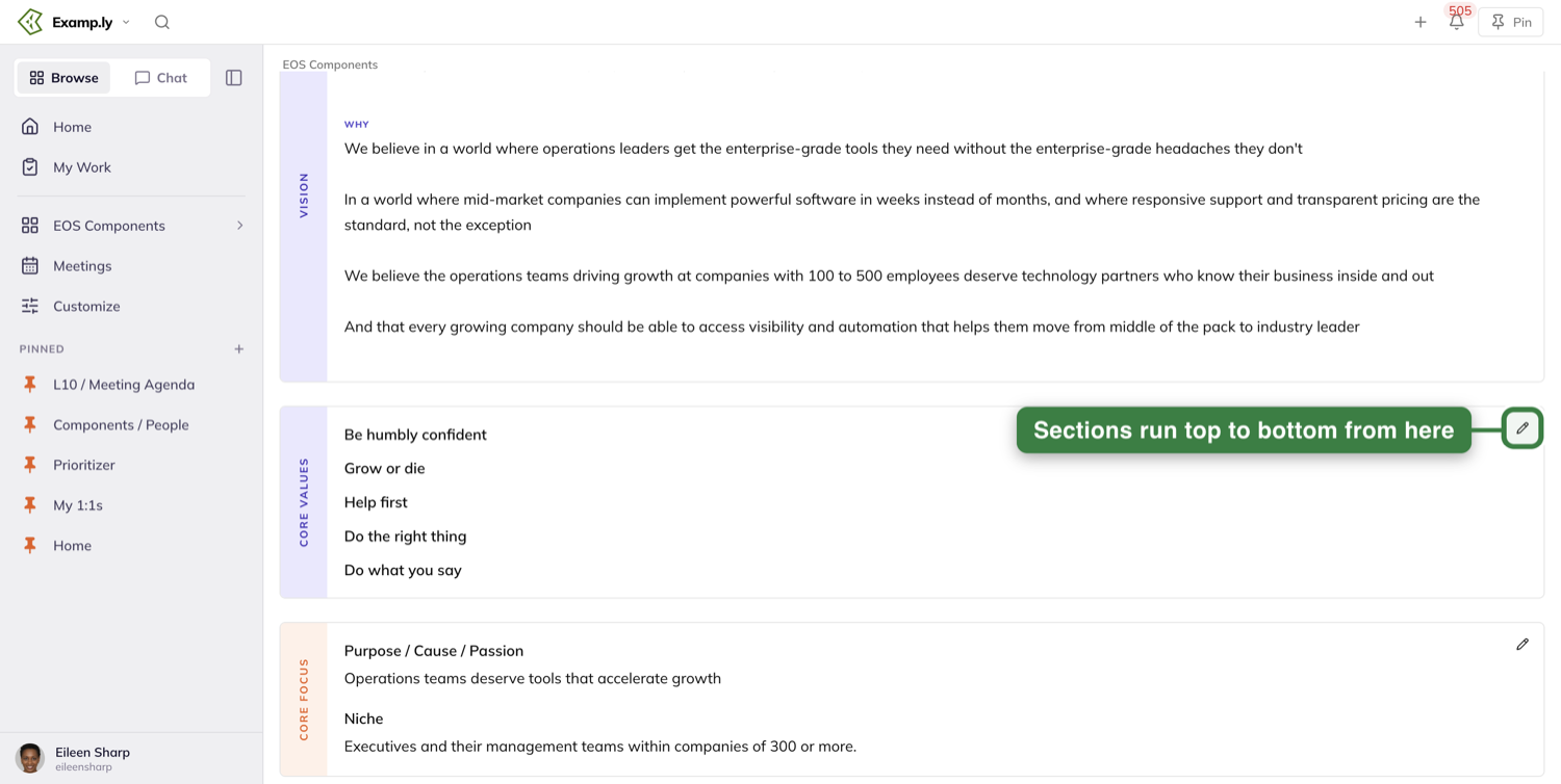
What is on the screen
The sections run down the page in this order: Core Values, Core Focus, BHAG, Marketing, then Plans.
The marketing section is labelled Marketing on the page. Its pencil is named Edit Marketing Strategy.
Plans has its own row of tabs: 3-Year Picture, 1-Year, Q1, Q2, Q3 and Q4, plus a picker for the year.
Empty sections still show up
A section you have never filled in does not disappear. It keeps its box, its name and its edit pencil.
An empty BHAG reads "No BHAG defined yet". An empty 3-Year Picture reads "Ready for clarity!"
So a half-written V/TO shows you where to pick up, instead of hiding the gaps.
Start the interview
Where you find it depends on whether your team has any vision written yet.
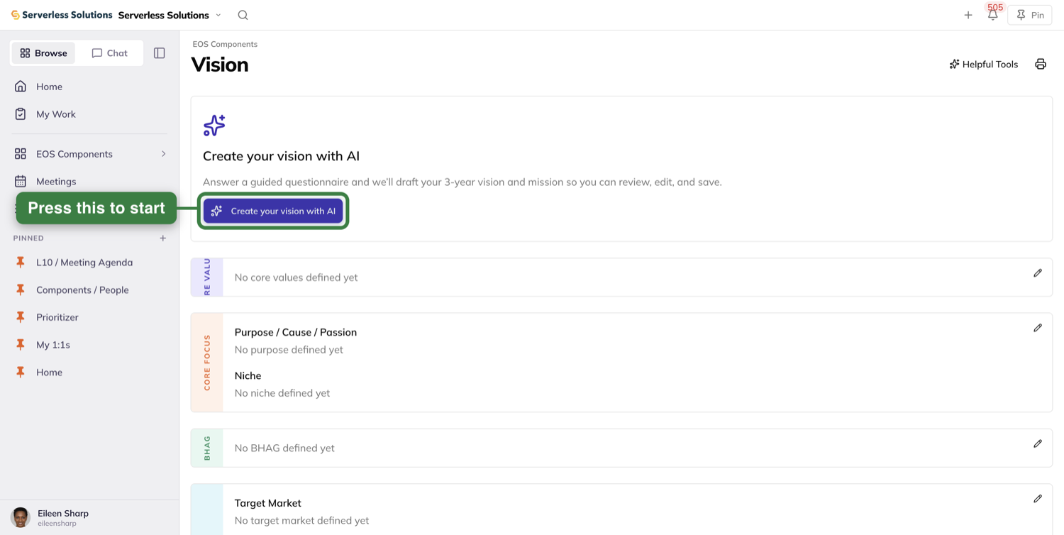
If your vision is still empty
A card sits in the body of the page headed Create your vision with AI. Under it: "Answer a guided questionnaire and we'll draft your 3-year vision and mission so you can review, edit, and save."
Press the Create your vision with AI button on that card.
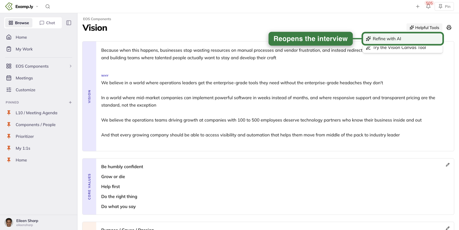
If you already have a vision written
The card is gone. Open the Helpful Tools menu at the top right of the page and pick Refine with AI.
What opens
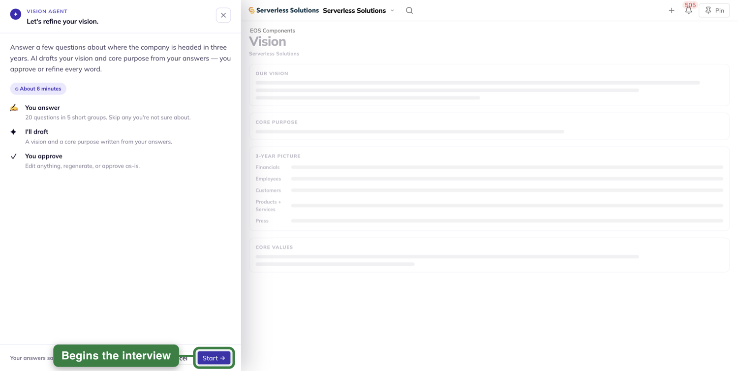
Both paths open the same thing: the Vision Agent, a tall panel down the left side of the window.
It covers your sidebar while it is open. Nothing about your sidebar changes — it is only covered, and it comes straight back when you close the panel.
The Vision page next to it dims. It is still your real page, and you will watch it fill in as you go.
What the panel tells you first
The header reads Vision Agent over the line "Let's refine your vision."
Then the plan: "Answer a few questions about where the company is headed in three years. AI drafts your vision and core purpose from your answers — you approve or refine every word."
A chip reads ◷ About 6 minutes. That clock is a character in the text, not an icon.
Under it, three cards say who does what: You answer, I'll draft, You approve.
The first card sizes the job for you: "20 questions in 5 short groups. Skip any you're not sure about."
First time through
Press Start → at the bottom. You land on the first question.
Coming back to a run you already started
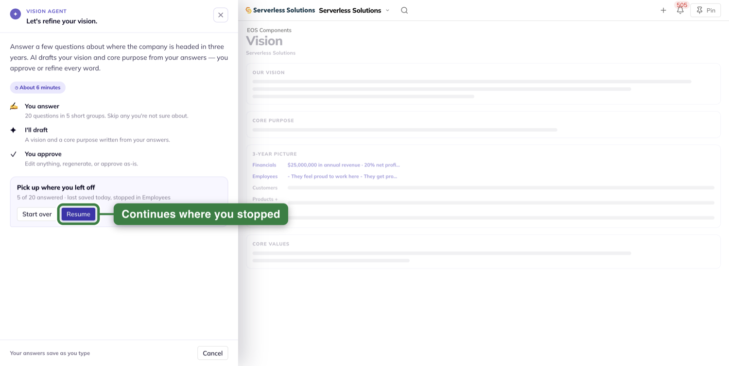
A card reads Pick up where you left off, with how many you have answered and the group you stopped in.
Press Resume to carry on where you were.
Press Start over and the card asks you first, right where it stands. Nothing is cleared until you confirm, and Keep my answers puts the card back the way it was.
Answer the questions, one at a time
There are twenty questions in five groups of four: Financials, Employees, Customers, Products + Services, then Press.
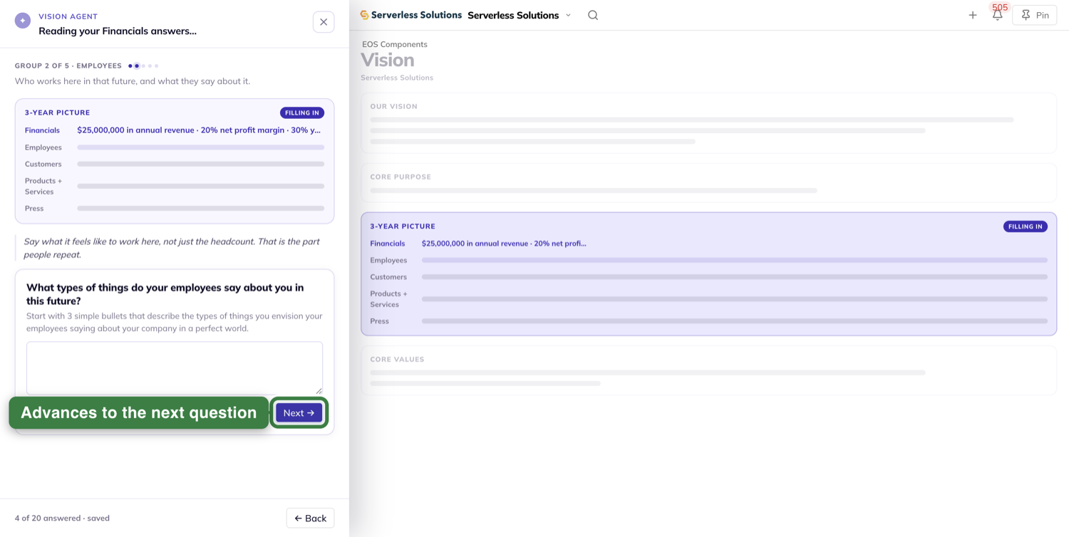
You see one question at a time. A cue above it tells you where you are, like Group 2 of 5 · Employees.
There is nothing to save
The opening screen promises it: Your answers save as you type. There is no Save button anywhere in the interview.
Once you are answering, that line becomes your count and your receipt: 5 of 20 answered · saved.
Nothing greys out or spins while a save happens. You keep typing.
Skipping is fine
Every question offers Skip this one at the left and Next → at the right.
A skip does not count as an answer, and nothing warns you about it.
Watch the page fill in
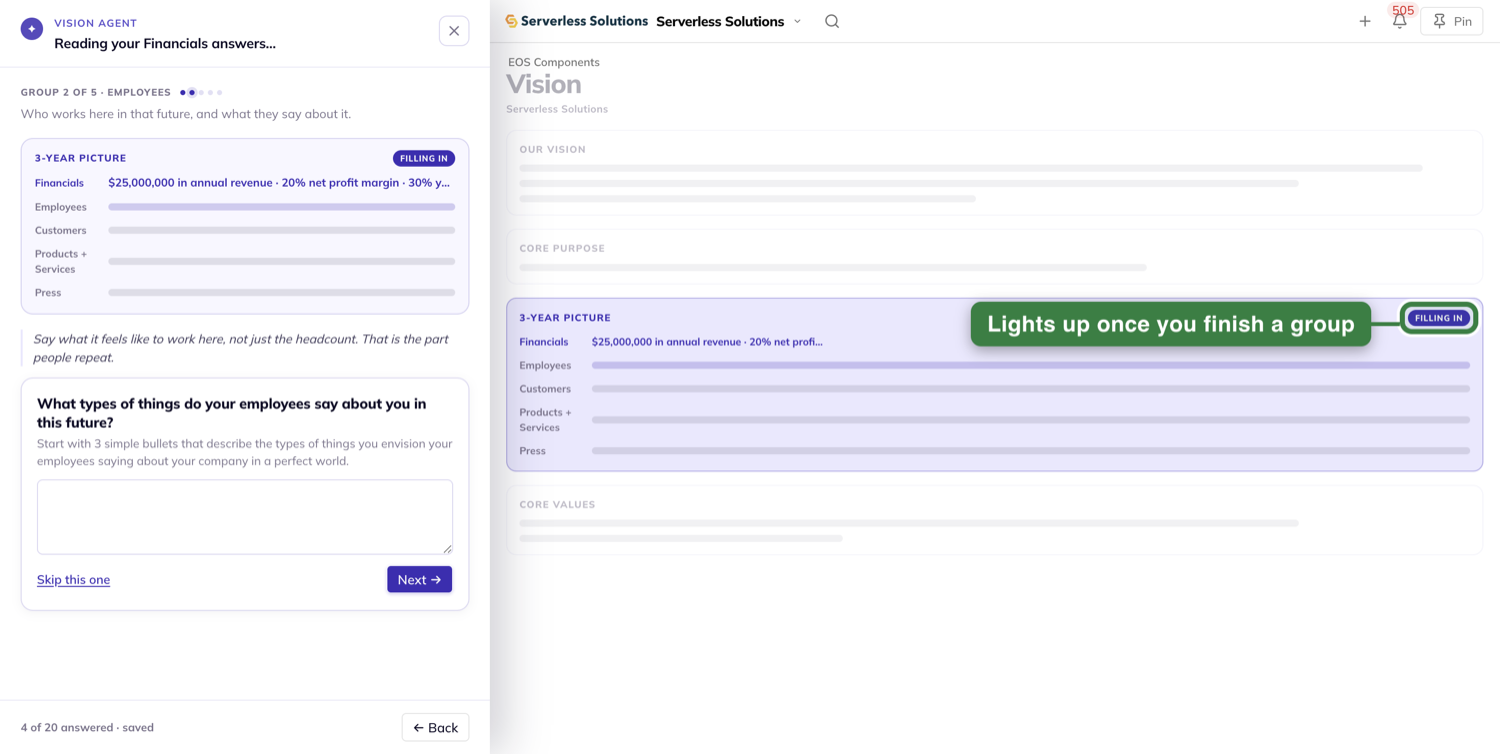
Look at the dimmed page beside the panel. The 3-Year Picture section lights up and gets a Filling in badge.
Each group adds one row there when you finish it. Answering one question inside a group adds nothing — rows fill by group.
You do not have to answer all twenty
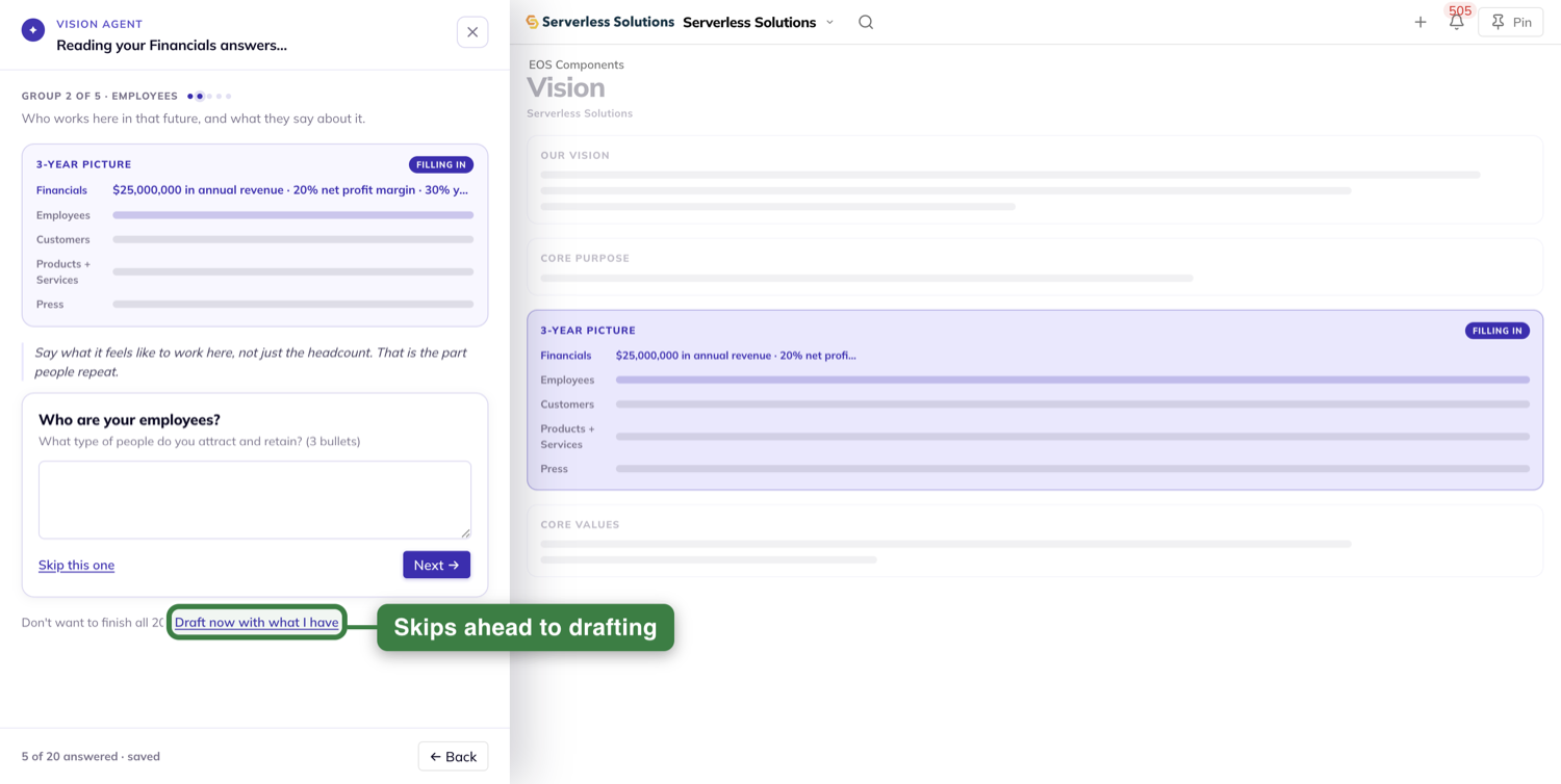
Once you have five answers, an offer appears under the question: Don't want to finish all 20? followed by Draft now with what I have.
Below five answers it is not on the screen at all. It is not there and greyed out — it is simply not there.
Pressing it goes straight to the drafting and skips the review in Step 4.
Leaving in the middle is safe
The ✕ at the top right of the panel closes it. Nothing asks you to confirm, and every answer is kept.
Come back to the Vision screen later, open the interview again, and the resume card knows exactly where you stopped.
Look over your answers before it writes
Finish the last group and the panel hands you everything you said, under the line "Done asking. Take a look."
Your answers are grouped under their group names. Each row shows the question, your answer, and a control on the right.
An answered row offers Edit. Press it and you go back to that question with your answer already in the field.
A skipped row reads "Skipped — AI will infer this from your other answers", and its control reads Answer instead.
A skip is never an error. Nothing turns red, nothing says required, and nothing stops you moving on.
At the bottom sits your count and one button: Generate my draft.
Approve the vision it drafts
Press Generate my draft.
The wait
The panel changes right away, before any draft exists. It ticks off ✓ Reading your answers, then ✓ Finding the thread, then shows Drafting your vision… still working.
The bottom reads Usually about 10 seconds.
The page lights up in the same order the panel says: 3-Year Picture badged Reading, then Our Vision badged Writing, then Core Purpose badged Queued.
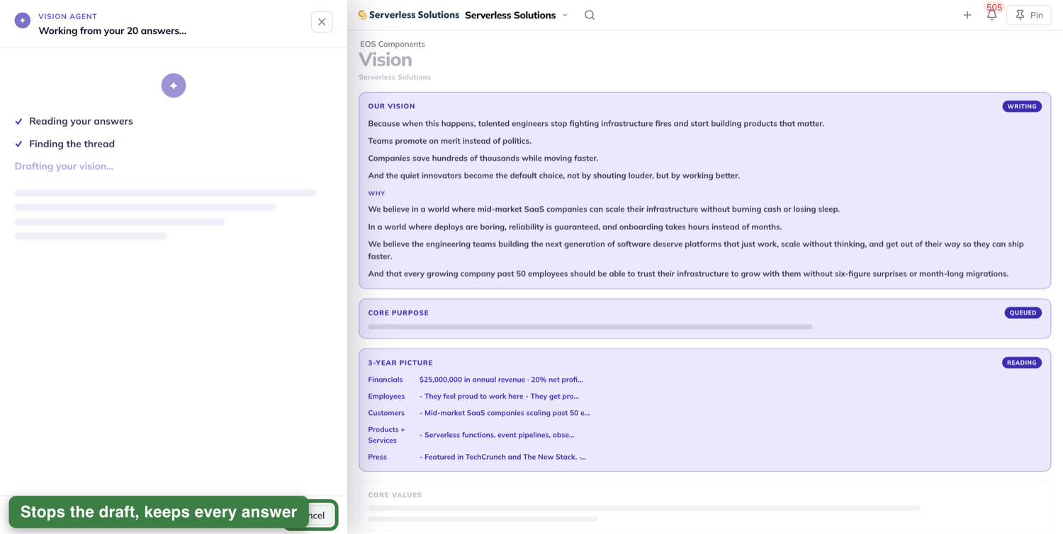
Changed your mind? Cancel stops the drafting and puts you back on the review with every answer intact. It does not close the panel — the ✕ does that.
If you took the shortcut and skipped the review, Cancel is how you get to it.
The draft
The header now reads Vision Agent · Step 2 of 3 over "Here's your draft. Change any word."
Two boxes hold the draft: Purpose and Description.
The draft itself shows up on the page, not in the panel. Our Vision lights up with a Just drafted badge, at full page width.
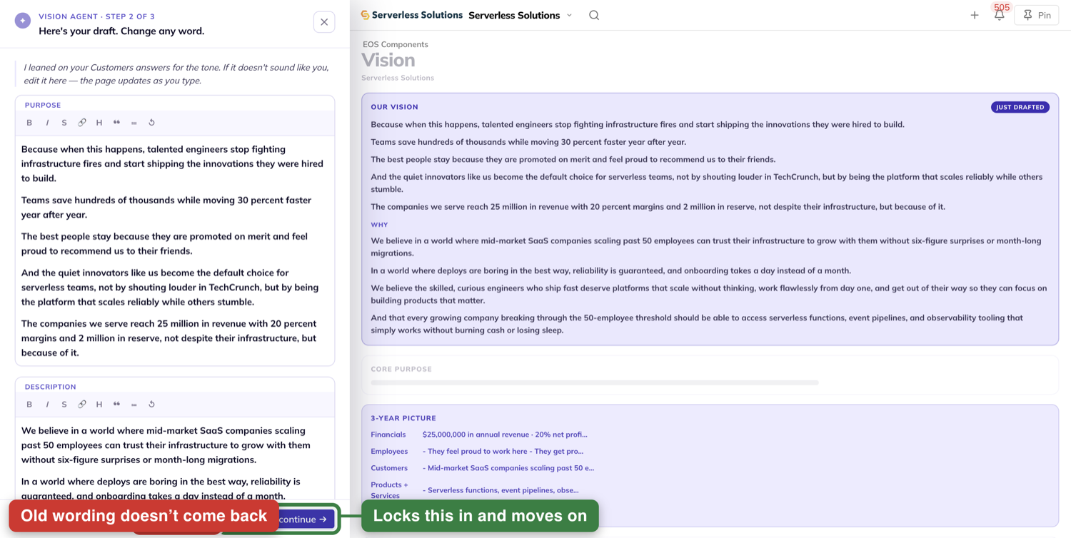
Type in either box and the page changes as you type, before anything is saved.
Don't like it at all? Regenerate writes a fresh draft from the same answers. One thing to know first: the old wording does not come back with undo.
Happy with it? Press Approve & continue →. The page marks Our Vision as Approved and the panel moves to the last step.
Approve your core purpose
The header reads Vision Agent · Step 3 of 3 over "Last one. One sentence."
There is one field. No second box, no formatting bar.
The line above it says why: "The one sentence your team can repeat from memory. Change anything you like."
Edit it, and the page's Core Purpose line follows along as you type.
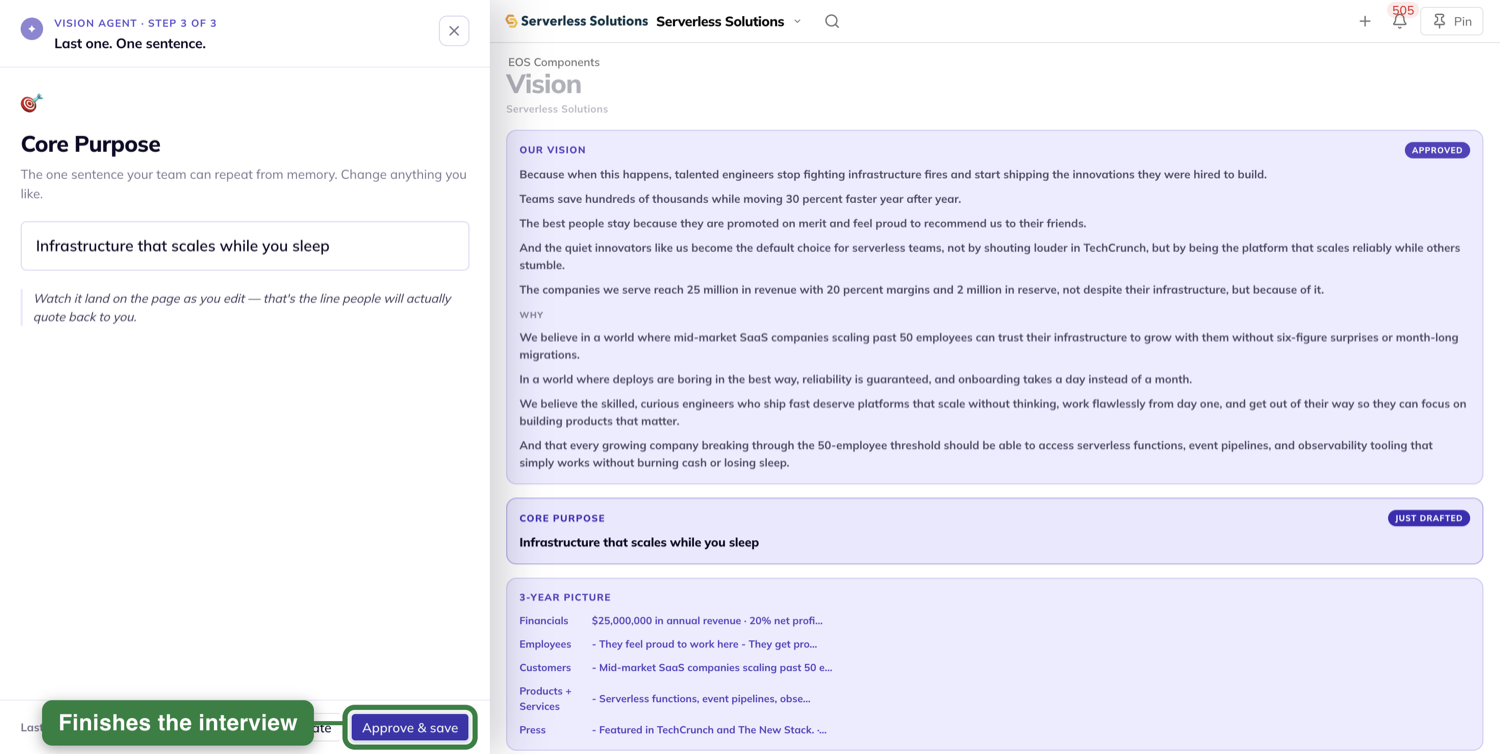
Press Approve & save. The panel closes, your sidebar comes back, and the page returns to full brightness.
Where what you approved lands
Everything the interview wrote is saved on your Vision page.
Your core purpose sits under Core Focus, on the Purpose / Cause / Passion line.
No message tells you it saved
That is on purpose. Nothing pops up, and there is no "Saved" text anywhere.
The sections the interview just wrote carry a brief highlight instead, and that highlight is your confirmation. It fades on its own.
Sections that did not change carry no highlight, so what is new is easy to spot.
Filling in the rest of the V/TO by hand
The interview writes two things: your vision and your core purpose. You write the rest yourself, section by section.
The pencil
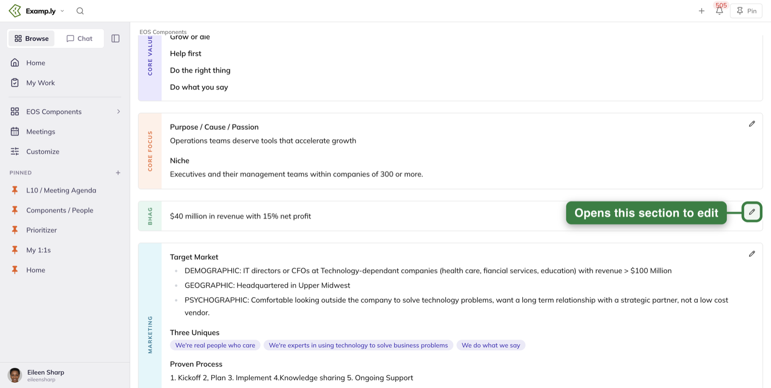
Each section box carries a small pencil in its top-right corner. Its name tells you what it opens — Edit Core Values, Edit Core Focus, Edit BHAG, Edit Marketing Strategy.
Plans works a little differently. Its pencil sits inside the tab you are on, in the row of chips: Edit 3-Year Picture on the 3-Year Picture tab, Edit Q3 on the Q3 tab, and so on for each one.
The drawer
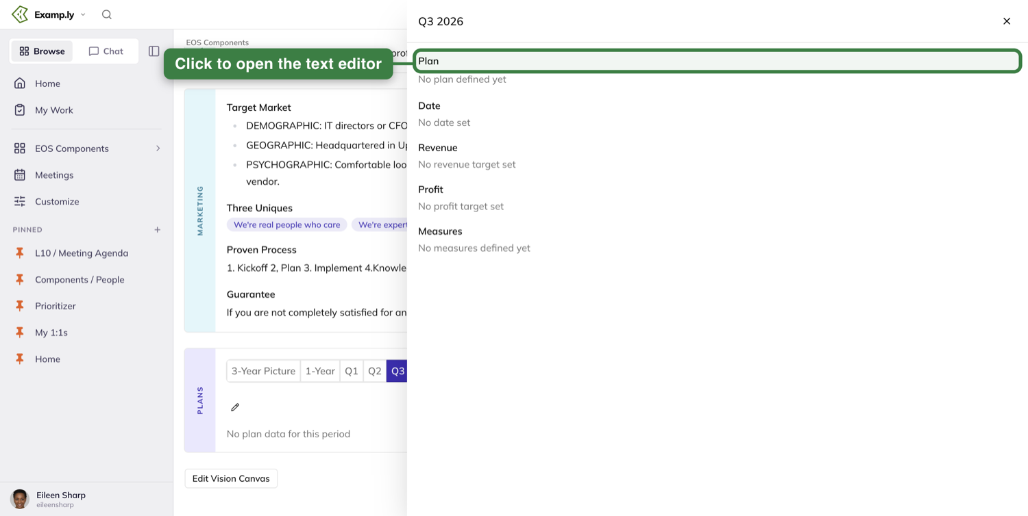
The pencil opens a drawer for that section. On a quarter it is titled with the quarter and the year, and it holds five fields: Plan, Date, Revenue, Profit and Measures.
The text editor for the plan opens only after you click the Plan field.
Saving
Two ways: click Save, or press ⌘ + Enter (Ctrl + Enter on Windows).
Either way, your new text appears on the page right away and the editor closes at the same moment. The save finishes behind you.
Every text box in Vision saves the same way — a full-size Save button, never a checkbox.
Typing your three-year numbers once: the Vision Canvas
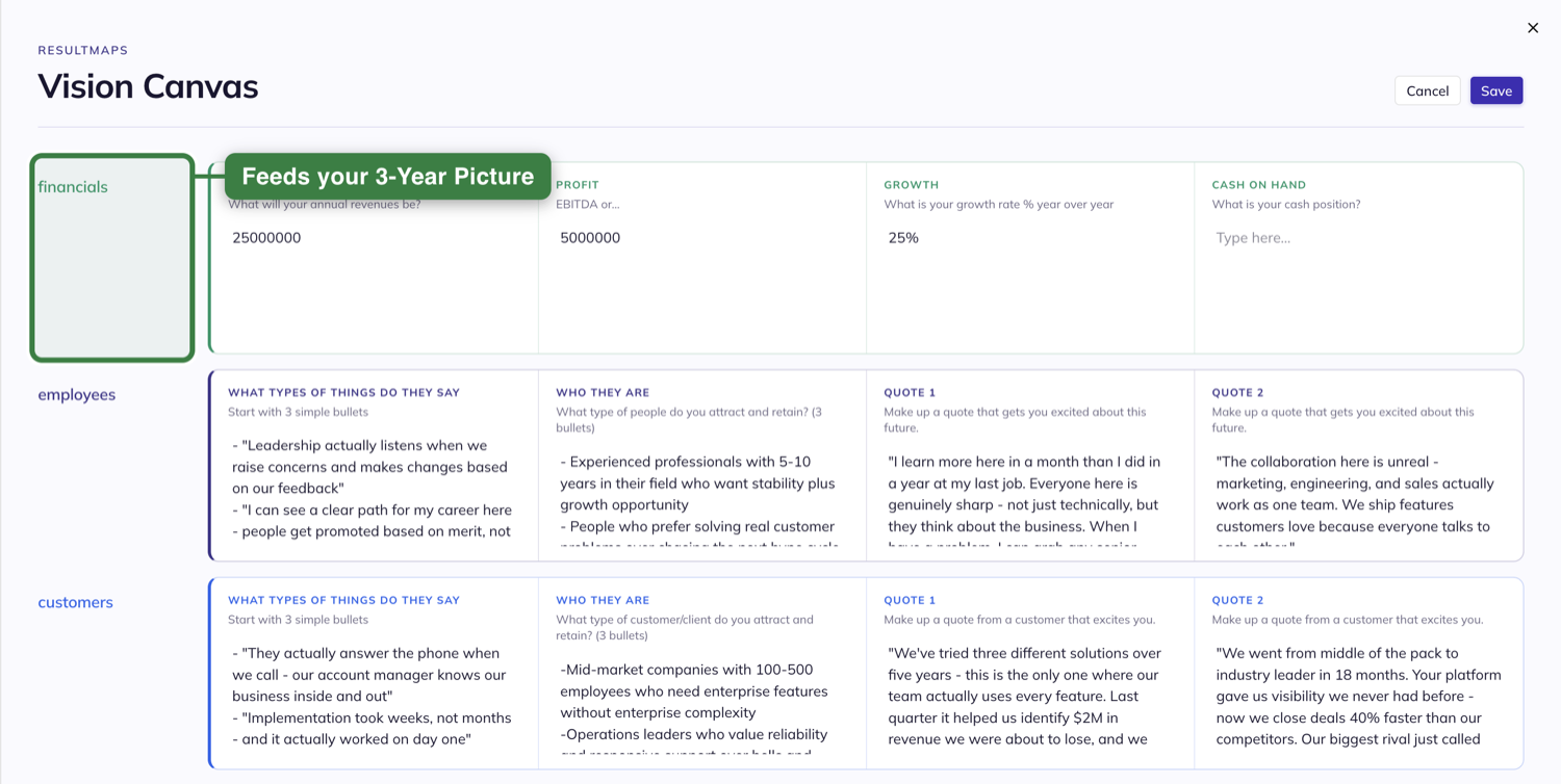
The other tool on this screen is a worksheet, not an AI. It is a grid of five rows — financials, employees, customers, products + services, press — with four boxes in each row.
They are the same twenty questions the interview asks, laid out so you can fill them in yourself.
Two ways in
Under the 3-Year Picture there is a button. It reads Use the AI Vision Canvas before you have one, Edit Vision Canvas once you do, and View Vision Canvas if you can read the vision but not change it.
The Helpful Tools menu carries it too, as Try the Vision Canvas Tool — or View Vision Canvas for someone who can only read.
The part worth knowing
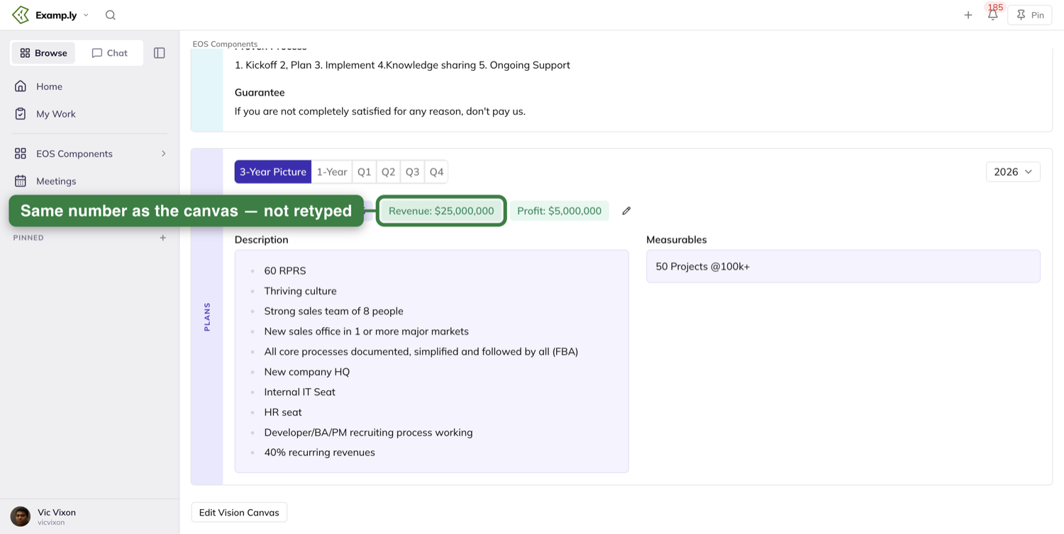
The revenue and the profit you put in the financials row show up in your 3-Year Picture once you save. You type those numbers once, not twice.
Save and Cancel
Type in any cell, then press Save.
Cancel closes the canvas and throws away what you typed. Open it again and you get the last thing you saved.
Someone who cannot change the vision can still open the canvas and read every cell. They just cannot type in it.
Reading what the AI wrote, later
The way back in is the button under Plans: Use the AI Vision Canvas before a canvas is saved, then Edit Vision Canvas once one exists — or View Vision Canvas if you can read the vision but not change it. It opens what the AI wrote — the vision, the mission and the why.
Nothing empty or made up is ever shown as if it were real output.
Who can change the vision, and who can only read it
Three kinds of people change it: whoever holds your Visionary seat, whoever holds your Integrator seat, and team admins of the team that owns the vision.
Three ways to be a team admin
Two of them do not show up in the team's member list, which surprises people.
You created the team. Or you hold an editor role on the parent team. Or you hold a contributor role on this team's own list.
Any one of those makes you an admin here, even with no membership row on the team at all.
What everyone else sees
They read the whole V/TO and change none of it. No pencils anywhere, and no Refine with AI.
They do keep the Helpful Tools menu. It holds one item: View Vision Canvas.
The button under Plans reads View Vision Canvas as well. Both open the canvas to read, never to type in.
Nothing is greyed out and nothing is locked. A control you cannot use is simply not on the screen — there is no lock icon, no tooltip and no "ask an admin" hint.
If your team's vision comes from a parent team
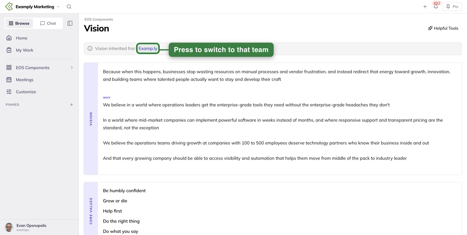
A banner sits at the top of the screen reading Vision inherited from and then the parent team's name.
That name is a button. Press it and you switch to that team.
Nobody edits an inherited vision from here — not even an admin of this team. No pencils, and no Refine with AI.
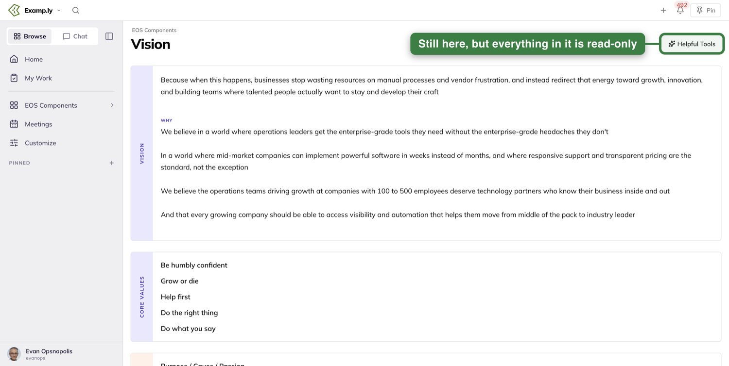
The Helpful Tools menu stays on the page, and what it opens is read-only — the same view a plain member gets.
To change it, switch to the team that owns it and edit it there.
Where your Core Values turn up outside this screen
Your Core Values follow you into Reviews.
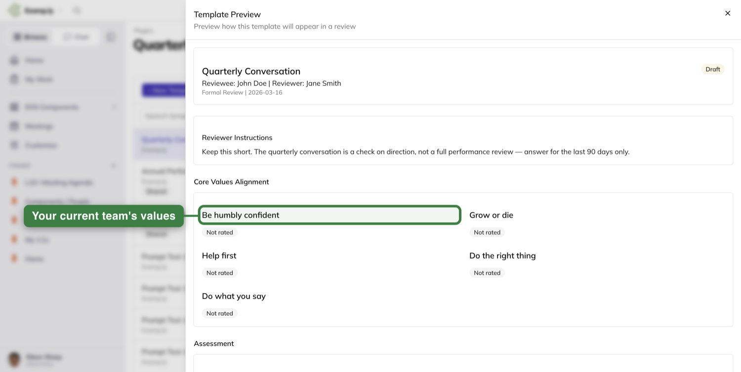
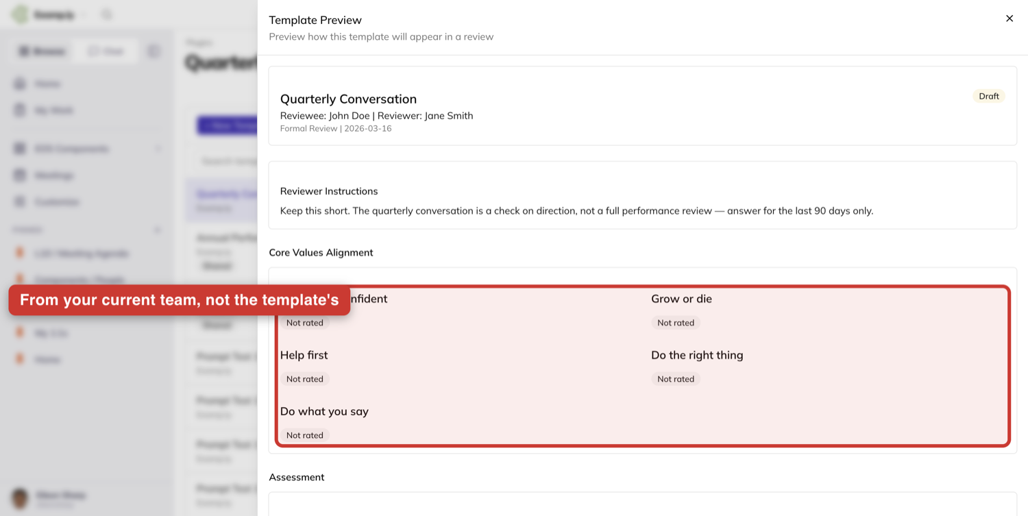
Open a review template and press Preview Template. The Core Values Alignment section lists the core values of the team you are currently switched to.
That is your current team — not the organization the template came from. Preview a template shared from somewhere else and you still see your own team's values.
If your current team has no core values yet, the section holds a loading placeholder for a few seconds, then tells you no core values are set for this team.
Was this helpful?
Add People to Your Team
You add people to your team from the team’s own Members tab. Someone who already has a ResultKit account joins the moment you pick them; someone who doesn’t gets an emailed invitation and sets up their account from it.
In this article
- Before you begin: who can add people?
- Getting to your team’s Members tab
- 1Add someone who is already in your organization
- 2Invite someone who isn’t in ResultKit yet
- 3Track the invitation while you wait
- 4What your teammate does
- If the invitation expires
- Sending the same welcome to everyone you invite
Both start the same way — you open the Add member picker and type. What you type decides which of the two happens: a name finds people your organization already knows, and an email address that matches nobody offers to invite them.
This article walks through both, what you see while an invitation is outstanding, what your teammate meets at the other end, and how to put your own words at the top of the email they get.
Before you begin: who can add people?
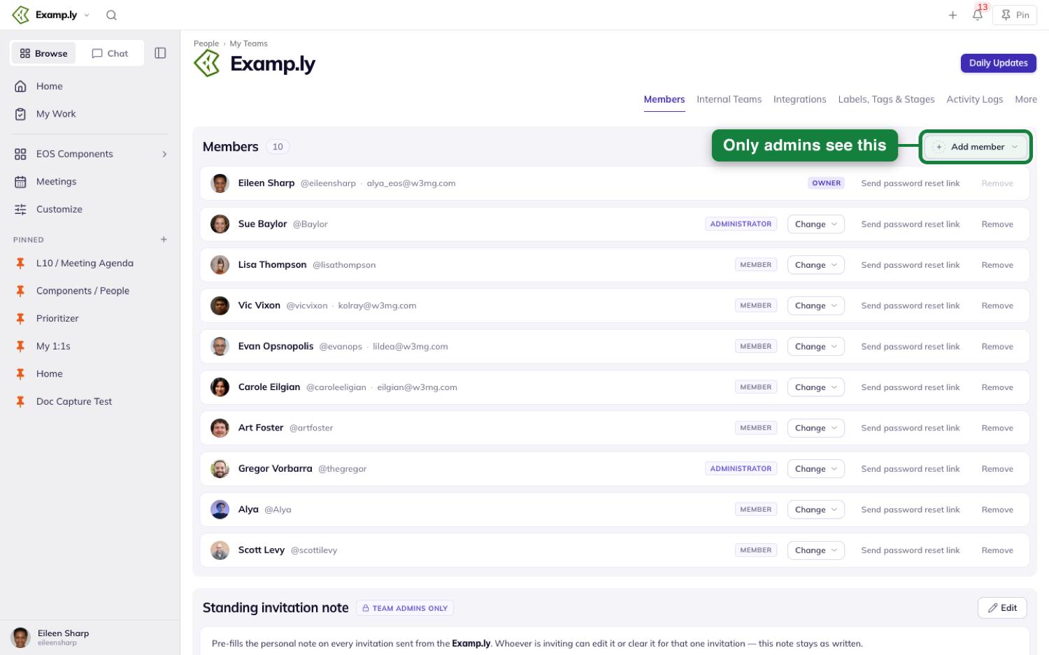
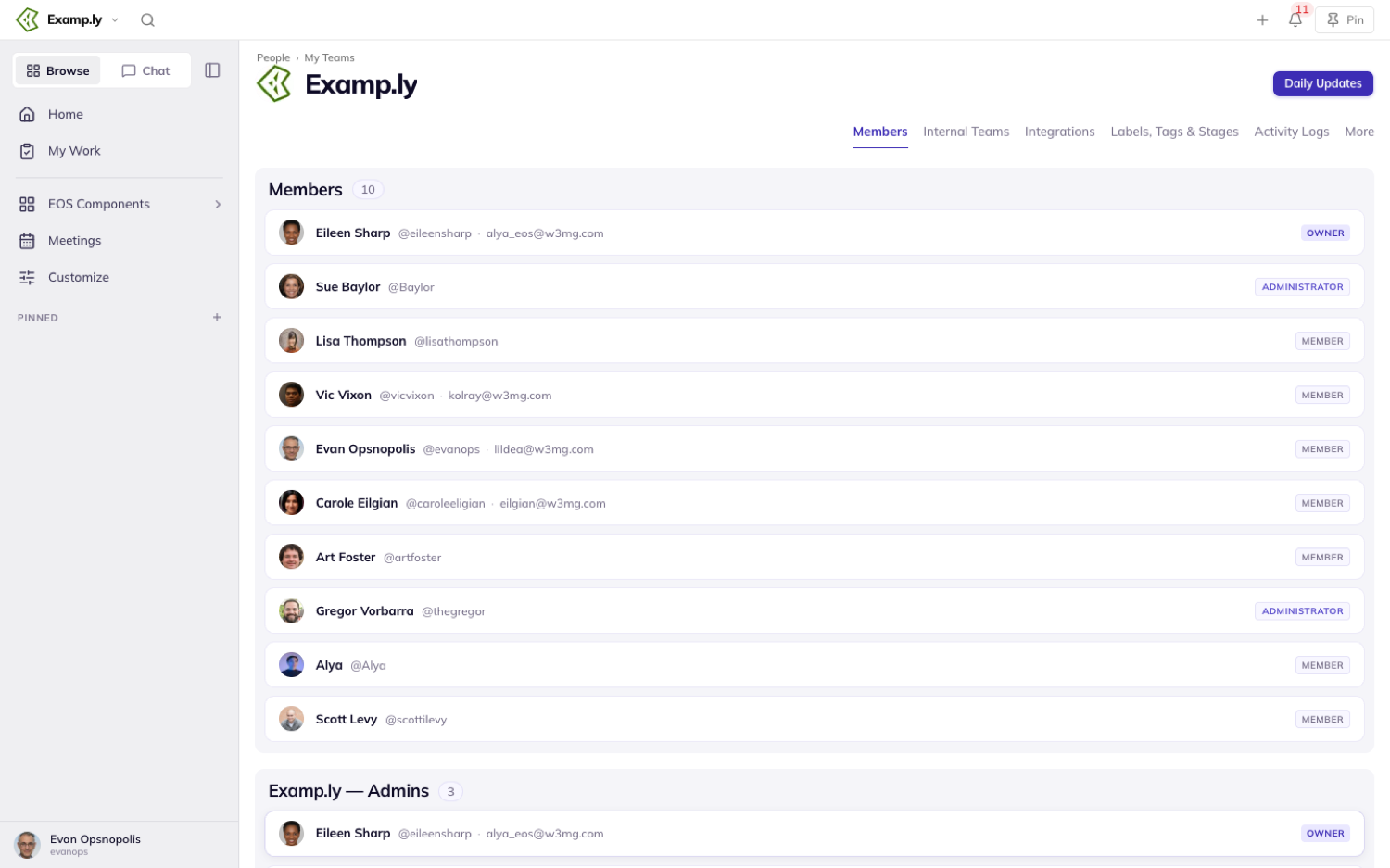
Adding and inviting are limited to team administrators. If you’re on the team without admin rights you can see everyone on it, but there is no Add member control on the tab — it isn’t greyed out, it simply isn’t there. The controls for changing and removing people are gone too, and so is the whole standing-note section further down.
The sections only administrators can act on are marked for you: a Team admins only pill sits on the ones your members can’t see, and an Organization admins only pill on the organization-wide ones.
Getting to your team’s Members tab
Every team has its own page, and its Members tab is where you add people.
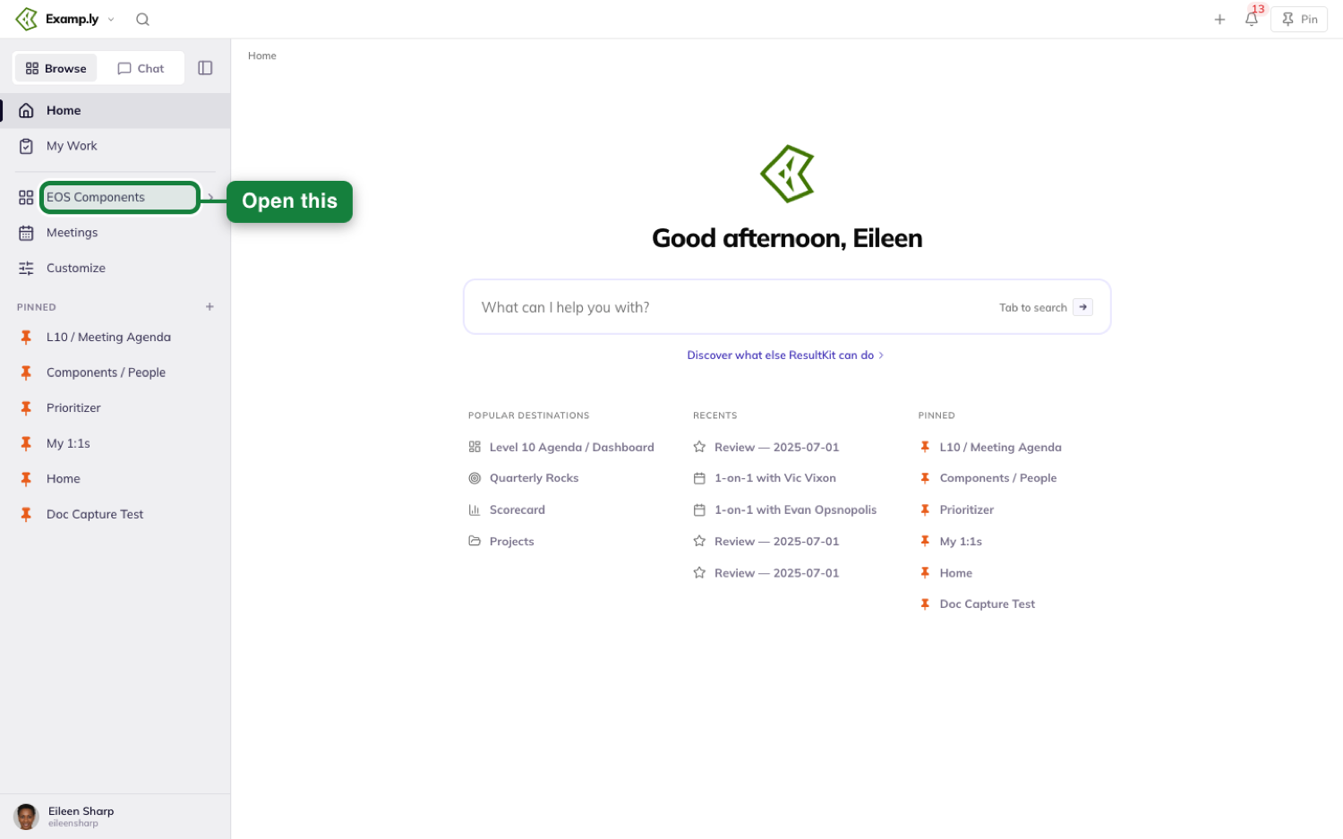
Open EOS Components in the sidebar.
Choose People, then press the My Teams tile.
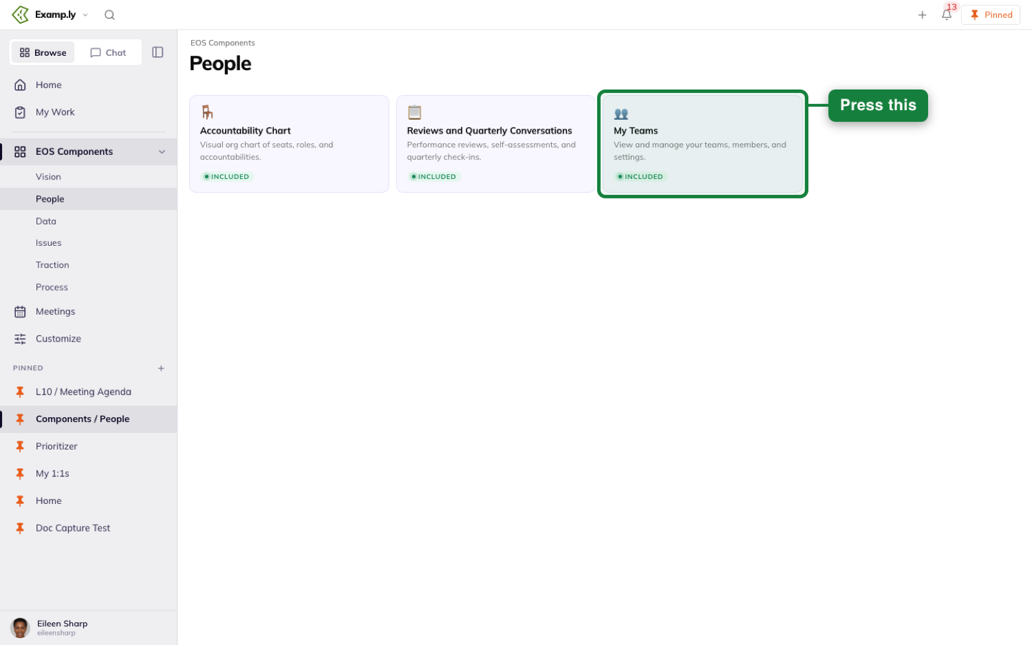
My Teams shows the teams you belong to. Pick yours, and its page opens on the Members tab.
Add someone who is already in your organization
Open your team, go to the Members tab, and press Add member.
The picker opens on a search box reading “Search people”, with one line of guidance under it: “Search by name, or enter an email address to invite someone new.” Both paths live in this one control from the start — you never have to fail a search to find the invite option.
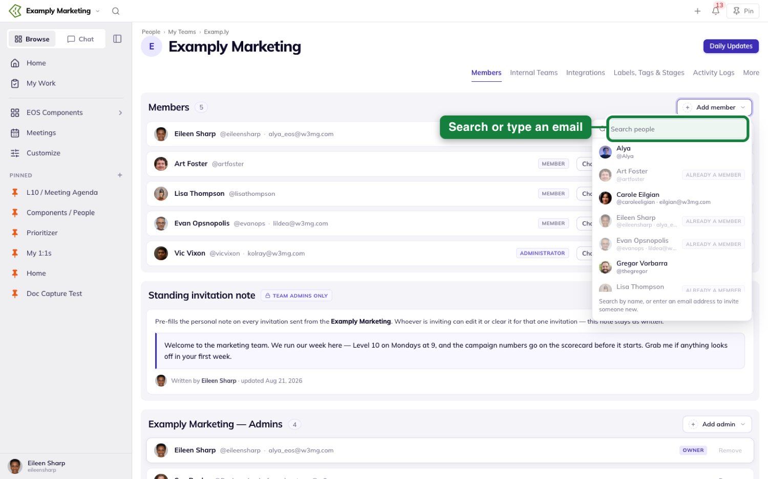
It opens with everyone your organization already knows listed, so on a small team you often don’t have to type at all. Pick a person and they join straight away — no invitation and no waiting, because they already have an account.
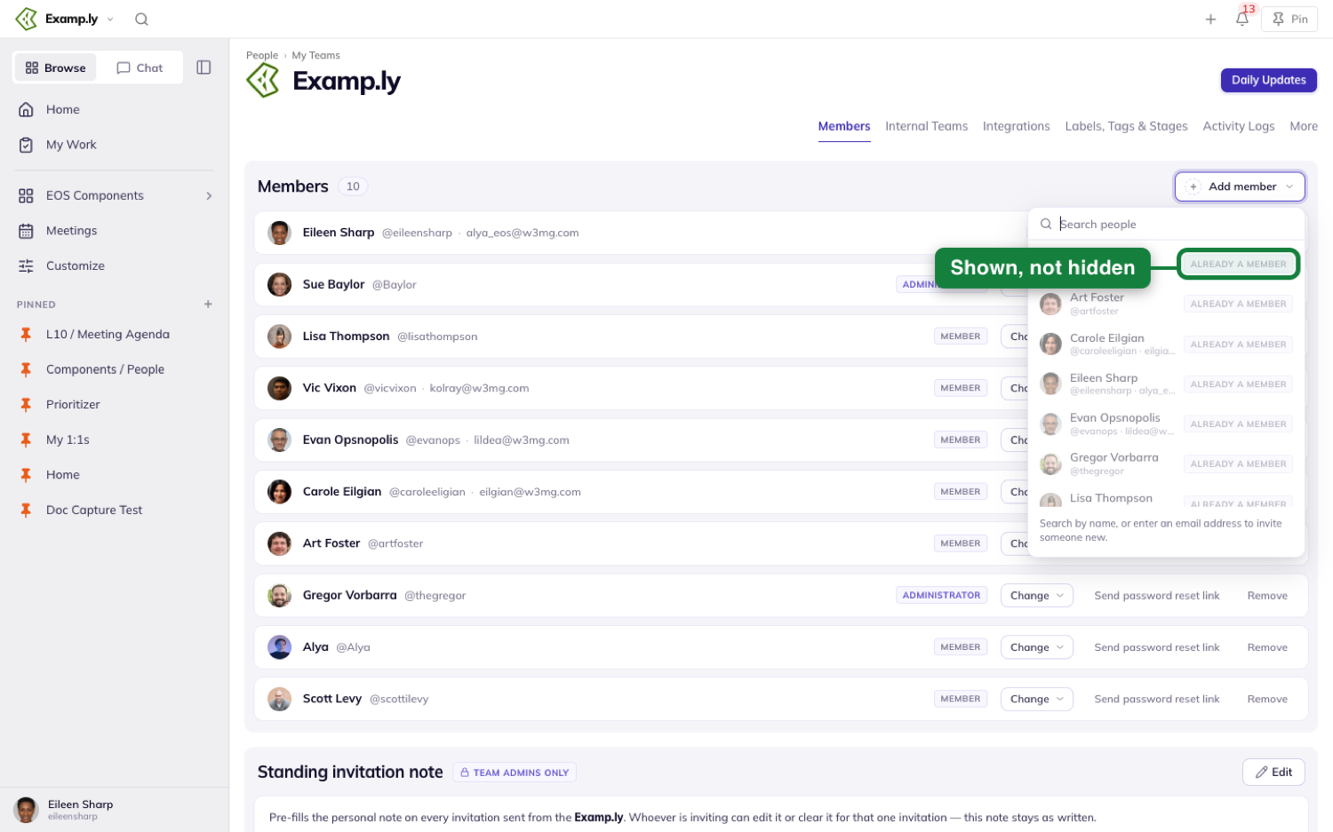
Anyone already on this team stays in the list, marked Already a member and not selectable, so you can see they’re there instead of wondering why your search turned up nothing. On a team that already holds everyone in your organization — often the top-level one — every row reads that way, and inviting a new address is the only thing the picker can do for you.
Invite someone who isn’t in ResultKit yet
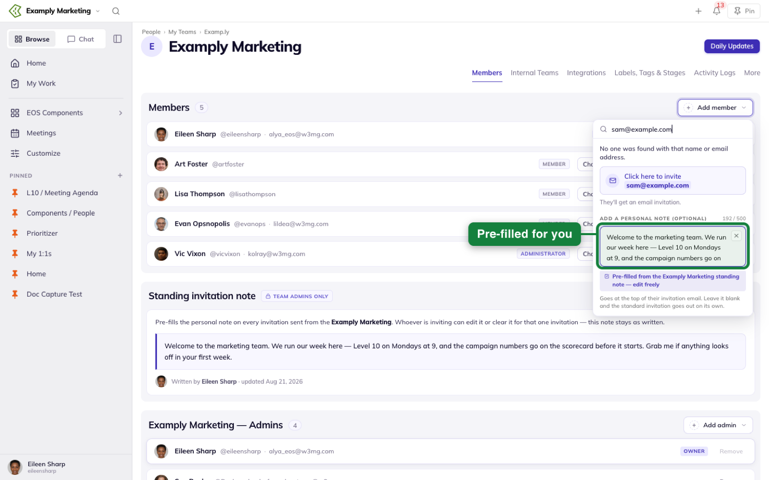
Type their email address instead. When nothing matches, the picker says “No one was found with that name or email address.” and offers a button reading Click here to invite with the address you typed set inside it.
Underneath it, one line says what happens next: “They’ll get an email invitation.” The invitation is for the team whose tab you’re on, so if that isn’t the team you meant, switch teams before you send rather than after.
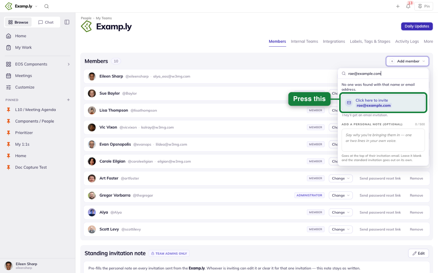
Beneath that sits Add a personal note (optional), a box that prompts “Say why you’re bringing them in — one or two lines in your own voice.” Whatever you write goes at the top of their invitation email. Leave it blank and the standard invitation goes out on its own. A counter beside the label tracks the 500 characters you have to play with.
The note is worth the fifteen seconds. It is the difference between an invitation that explains itself and one that lands cold.
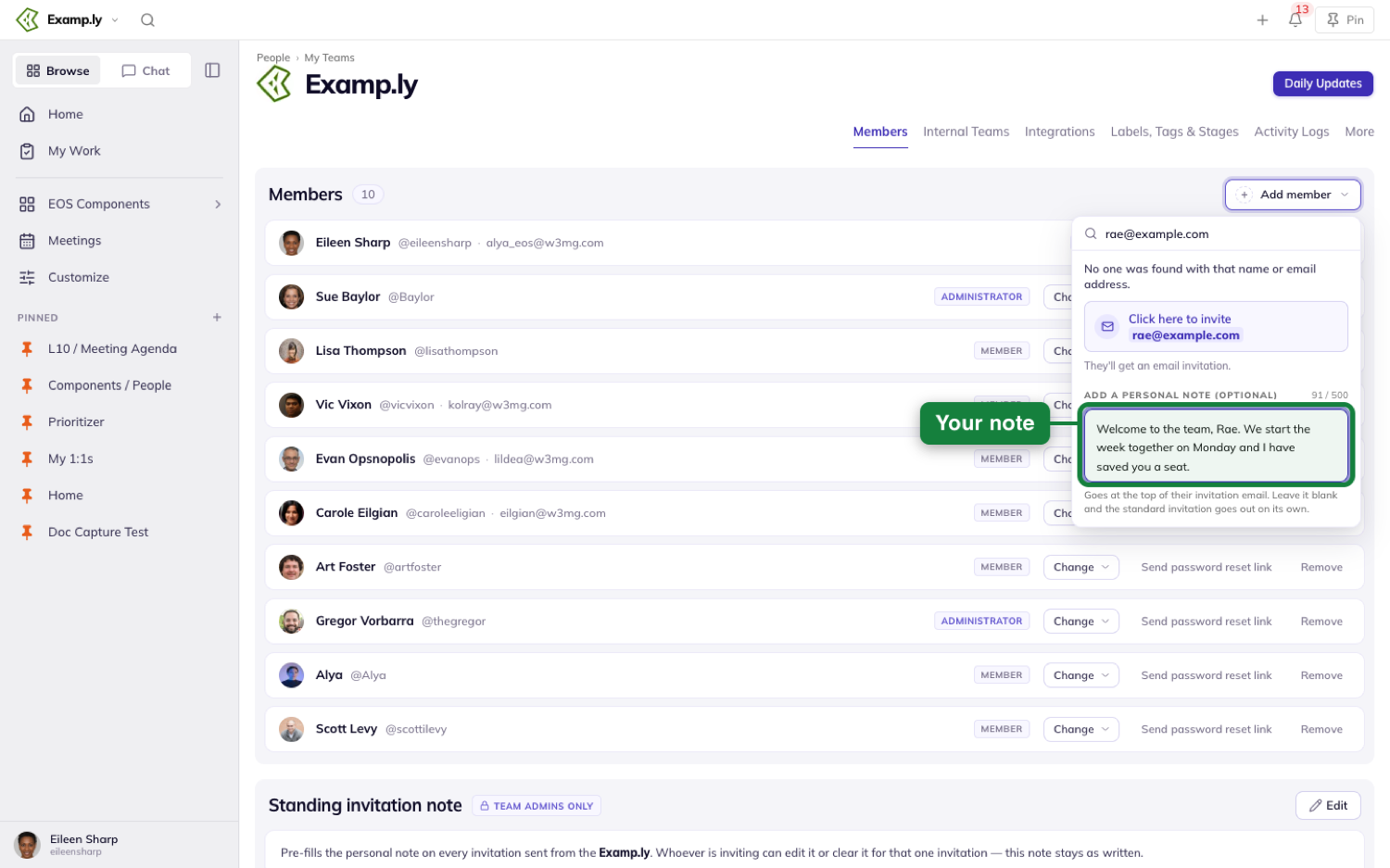
Press the invite button and the person appears on the team as a pending tile at once, without waiting on the server — so the tab always shows what you just did.
Track the invitation while you wait
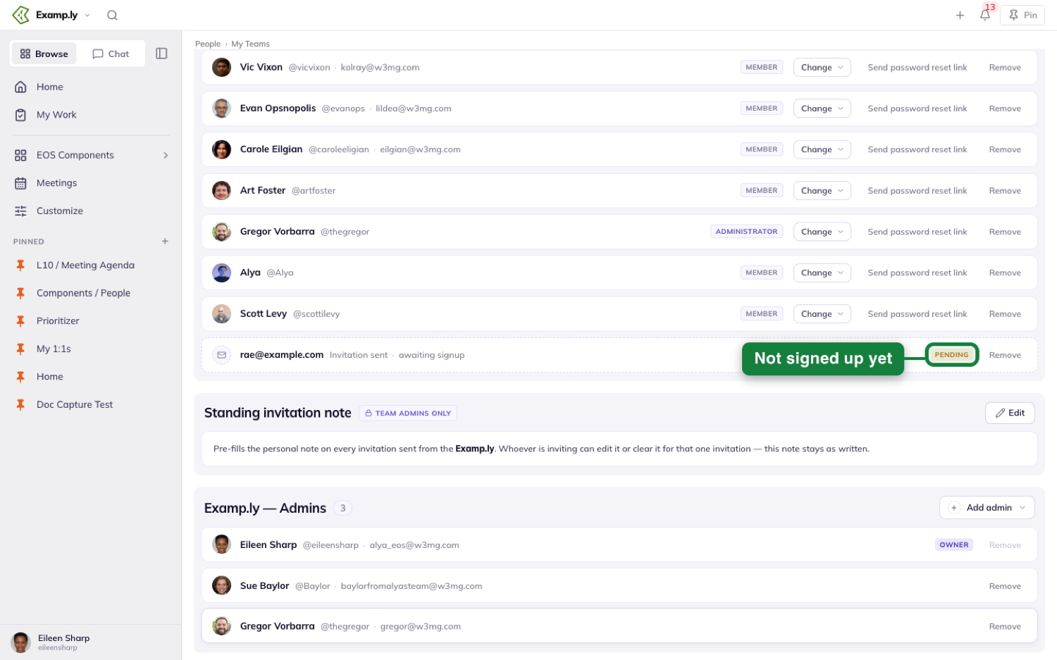
An invitation nobody has accepted yet shows as a dashed tile: an envelope where the avatar goes, the email address where the name goes, the line “Invitation sent · awaiting signup”, and a Pending chip.
There is no name and no @login on it, because there isn’t one yet. The section’s count pill includes the tile, so the number on the tab counts the people you’re waiting on as well as the people who have joined.
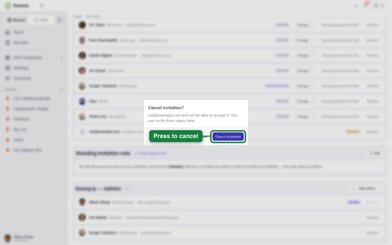
Changed your mind, or mistyped the address? Remove on the tile cancels the invitation. Once cancelled it cannot be accepted — the link stops working rather than quietly letting someone in later.
The same tile also carries Resend Invite, which sends the link again without changing anything else about the invitation.
What your teammate does
They get one email, headed by whatever note you wrote, above the standard invitation text and a single Accept invitation button.
That button opens one screen showing who invited them and which team they’re joining, with their email already filled in and locked — the link is what proves the address is theirs, so there is no separate “confirm your email” step to sit through.
They set a name and a password, or use Continue with Google or Continue with Microsoft, and they’re in. That is the whole thing: one email, one screen.
If they’d rather sign in with Google or Microsoft, it has to be the same address you invited. Picking a different account is refused with a message naming the provider they picked, and no account is created.
If the invitation expires
Invitations are good for 14 days. After that the link still opens, but it shows an expired screen in place of the form: who invited them, which team, when it was sent, and when it ran out.
They press Request a new invitation and a fresh link is emailed to the same address. You’re notified that they asked, so a lapsed invitation doesn’t just go quiet.
Sending the same welcome to everyone you invite
Below the members list sits Standing invitation note — a note that pre-fills the personal-note box for every invitation sent from this team, so you aren’t retyping the same welcome.
When the box has been pre-filled it says so underneath and tells you to edit freely. Editing it there changes that one invitation only, never the standing note itself.
Further down the same tab, an Organization standing note section does the same job for everyone joining anywhere in the organization. The team’s own note wins wherever both exist, and the organization’s is what fills the box on teams that haven’t written one.
Was this helpful?
Accountability Chart
You want your people to lead and get the right stuff done. And you want to build a high-performing team that grows and scales your company, easily and without stress. Mixed signals and conflicting priorities muddy the waters of accountability and prevent people from taking ownership of results. ResultKit lets you work your EOS Accountability Chart from any AI and any view, creating clarity for yourself and everyone on your team, including your AI. Your whole company draws as one chart, every seat, its roles and who holds it, kept current for people and AI alike. That means people know what they own, bring issues forward, and drive results without you having to push.
In this article
- Before you begin: who can change the chart
- 1Open your Accountability Chart
- 2Read the chart
- 3Narrow the chart to one leader's branch
- 4Choose how much of the chart to show
- 5Open a seat and define what it is accountable for
- 6Rename a seat where you read it
- 7Give a seat to someone
- 8Add a seat under any seat you can edit
- 9Move a seat
- 10Archive a seat, and what it takes to bring it back
- 11Print the chart
- 12Ask the assistant to set up a chart
- What is saved behind you when you reorganize
- Who can change the chart, and who can only read it
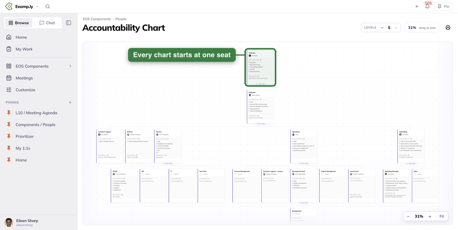
Your whole company draws as one Accountability Chart. It starts at one seat at the top and runs down through every team, so there is one chart for the organization rather than one per team.
A seat is a role, not a person. It carries the things that role is accountable for, and it holds whoever sits in it today — or reads Vacant when nobody does.
This article opens the chart, reads it, and narrows it to one leader's branch. Then it defines a seat, renames one, gives one to someone, and adds, moves and archives one. It ends with printing, what is saved behind you, and who can change what.
Before you begin: who can change the chart
Everyone on the team reads the whole chart. What you can change depends on where you sit in it.
You can edit a seat if you are a team admin, if you own that seat, or if you own any seat above it.
That last one is the part people miss. Owning the Operations seat lets you edit every seat reporting up to it, without being an admin of anything.
Two things sit outside that rule. Printing is open to anyone who can see the chart. Bringing an archived seat back is team admin only.
Open your Accountability Chart
In the sidebar, open EOS Components and pick the People tab.
People is a set of tiles, not the chart itself. Choose the Accountability Chart tile and the chart opens on its own page.
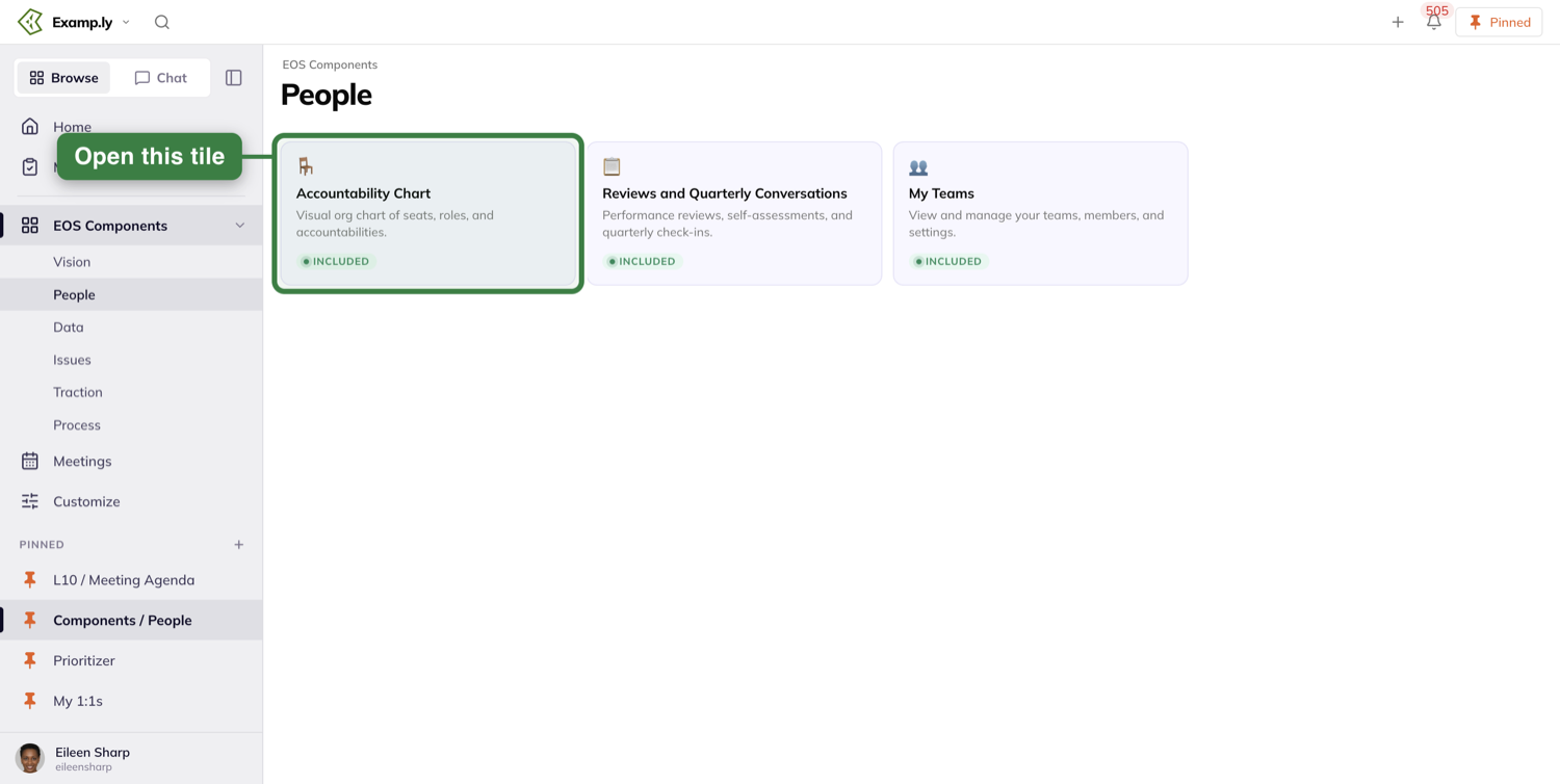
The page heading reads Accountability Chart. On a team that is not running EOS it reads Ownership Chart instead.
Read the chart
One seat sits at the top. In EOS that is your Visionary.
Everything else hangs off the seat it reports to, and those lines cross team boundaries. A seat on your Operations team can report to a seat on the root team, and the chart draws it that way.
You get the same chart whichever team you are currently switched to. Switching teams changes your team context, never the chart in front of you.
What a seat card shows
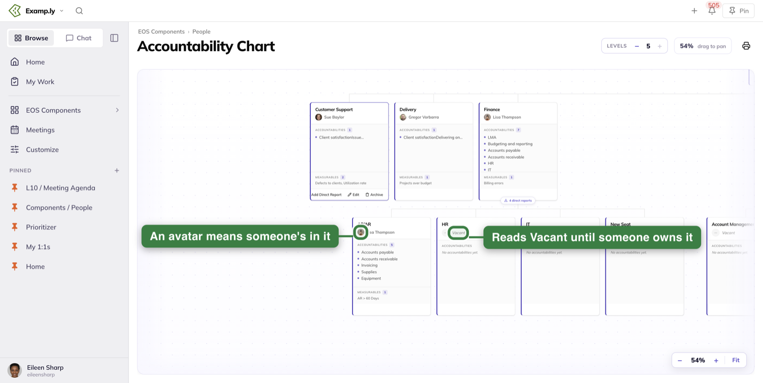
Each card carries the seat's name, the things it is accountable for, and the person who holds it with their avatar.
A seat nobody holds reads Vacant. That is a real state, not a gap — a vacant seat is a role you have defined and not yet filled.
Someone else's change arrives on its own
If a colleague gives someone a seat while you have the chart open, that seat updates in front of you.
You do not reload, and the chart does not blank out and redraw.
Narrow the chart to one leader's branch
A chart big enough to be true is too big to read at once. So you narrow it.
A seat with people reporting to it carries a small chip along its bottom edge counting them — 5 direct reports, or 1 direct report when there is only one.
A seat with nobody reporting to it carries no chip at all. Not a zero, not a greyed one — nothing.
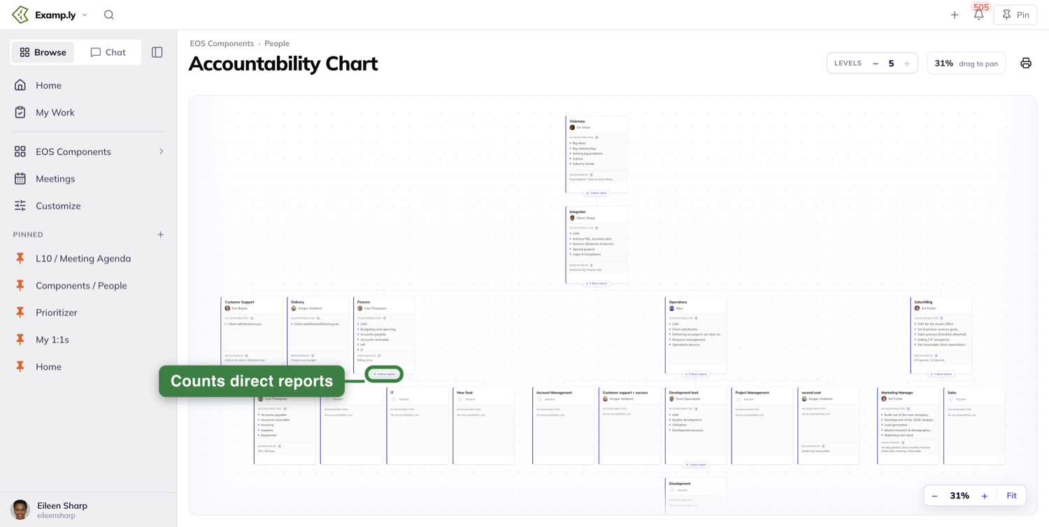
Focusing
Click the chip and the chart redraws around that seat. It becomes the top card, and everything outside its branch leaves the canvas.
Double-clicking the card does the same thing. A single click does not — that opens the seat.
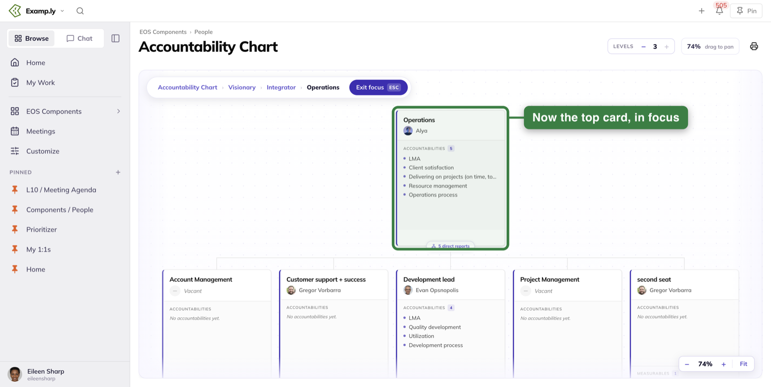
Finding your way back
A bar appears at the top left naming the path you took, starting at Accountability Chart and ending at the seat you are in.
Every name before the last one is clickable. Click one and you re-focus there, part way back up.
The seat you are in is the last name in the bar, and it does nothing when clicked.
At the right of the same bar sits Exit focus, carrying an ESC badge. Press it, or press Esc, and the whole company comes back.
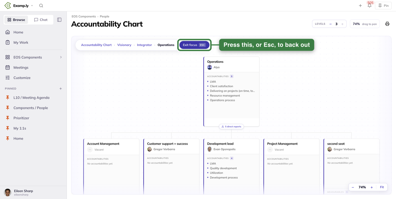
Choose how much of the chart to show
The page header carries a Levels control. It reads how many levels deep the chart is showing.
Step it down and the deepest row leaves the canvas. Step it up and the row comes back.
It stops at both ends. At the chart's full depth the up button greys out, and at one level the down button greys out.
Focusing resets it. Narrow to a branch and Levels re-reads that branch's own depth, not the number you had set.
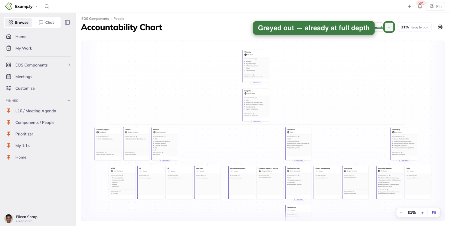
Zooming and moving around
The canvas carries a zoom cluster at its bottom right: minus, the current percentage, plus, and Fit.
Zoom runs from 10% to 300%. Pinching on a trackpad does the same thing, and the percentage moves as you pinch.
Fit resizes the chart to the width of the canvas. It shrinks as far across as it needs to, and never zooms past 100%.
Scrolling over the canvas moves the chart rather than zooming it. Dragging the empty background between the cards moves it too, which is what the header's drag to pan readout is telling you.
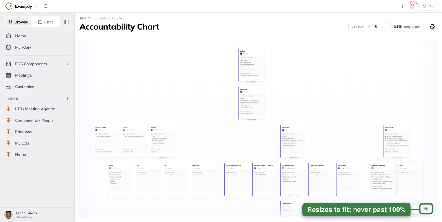
Your place is kept
Zoom in on a seat, open it, then close it again. The chart is exactly where you left it.
That holds whether you changed anything or not, and whether you closed the panel or pressed Esc.
Open a seat and define what it is accountable for
Click a seat card to open it. The sheet has three tabs: Seat definition, Process and Notes.
It opens on a coaching line: Define the seat, not the person. Under it, the advice to aim for three to five specific accountabilities you would hand to the next person who sits there.
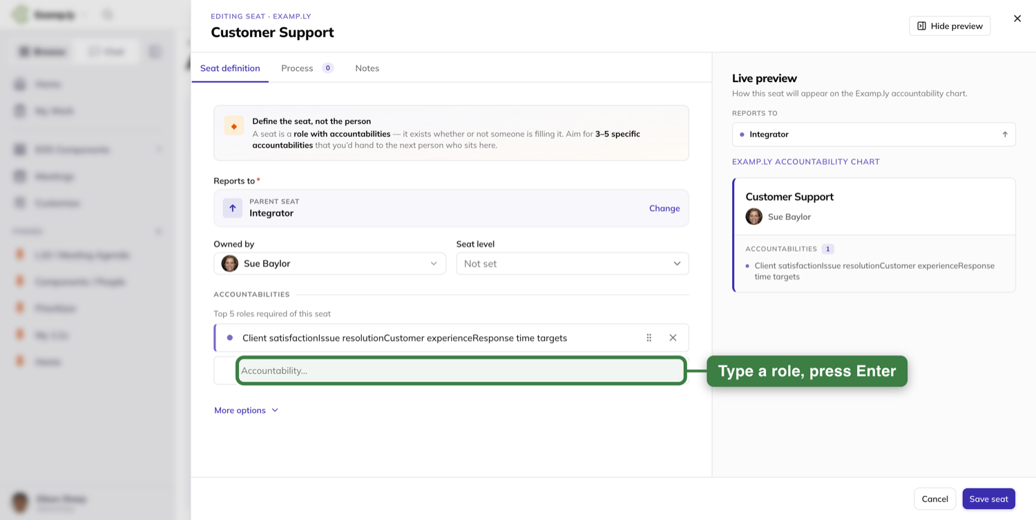
The five roles list
The section is headed ACCOUNTABILITIES, over the line Top 5 roles required of this seat. Under the rows sits an empty box reading Accountability….
Type into it and press Enter. The role lands in the list at once and the sheet stays open.
The cursor drops into a fresh empty box underneath, so you can type the next one without touching the mouse.
Pressing Enter on an empty box adds nothing. No blank row, and the sheet stays where it is.
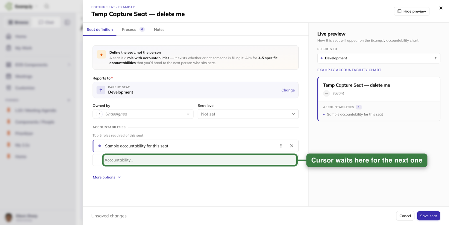
Putting them in order
Drag a row by its grip and drop it where you want it. The new order is saved as it lands.
The grip also opens a small menu carrying Move up and Move down, which do the same thing one row at a time.
The panel beside it
The right half of the sheet is a Live preview, headed with a line about how this seat will appear on the chart.
It shows the card as you are building it, so you watch a role land on the card as you commit it.
Hide preview at the top folds it away when you want the room.
Files a seat carries
The Process tab holds the process and playbook documents for that seat, and its count sits on the tab.
Those files are what the Process/Playbook Index prints in Step 11.
Rename a seat where you read it
The seat's name at the top of the sheet is the field. Click the words and type over them.
Press Enter and the sheet closes, with the new name already on the card in the chart. The save finishes behind you.
Click away instead and the name commits in place, on a sheet that stays open with your other edits untouched.
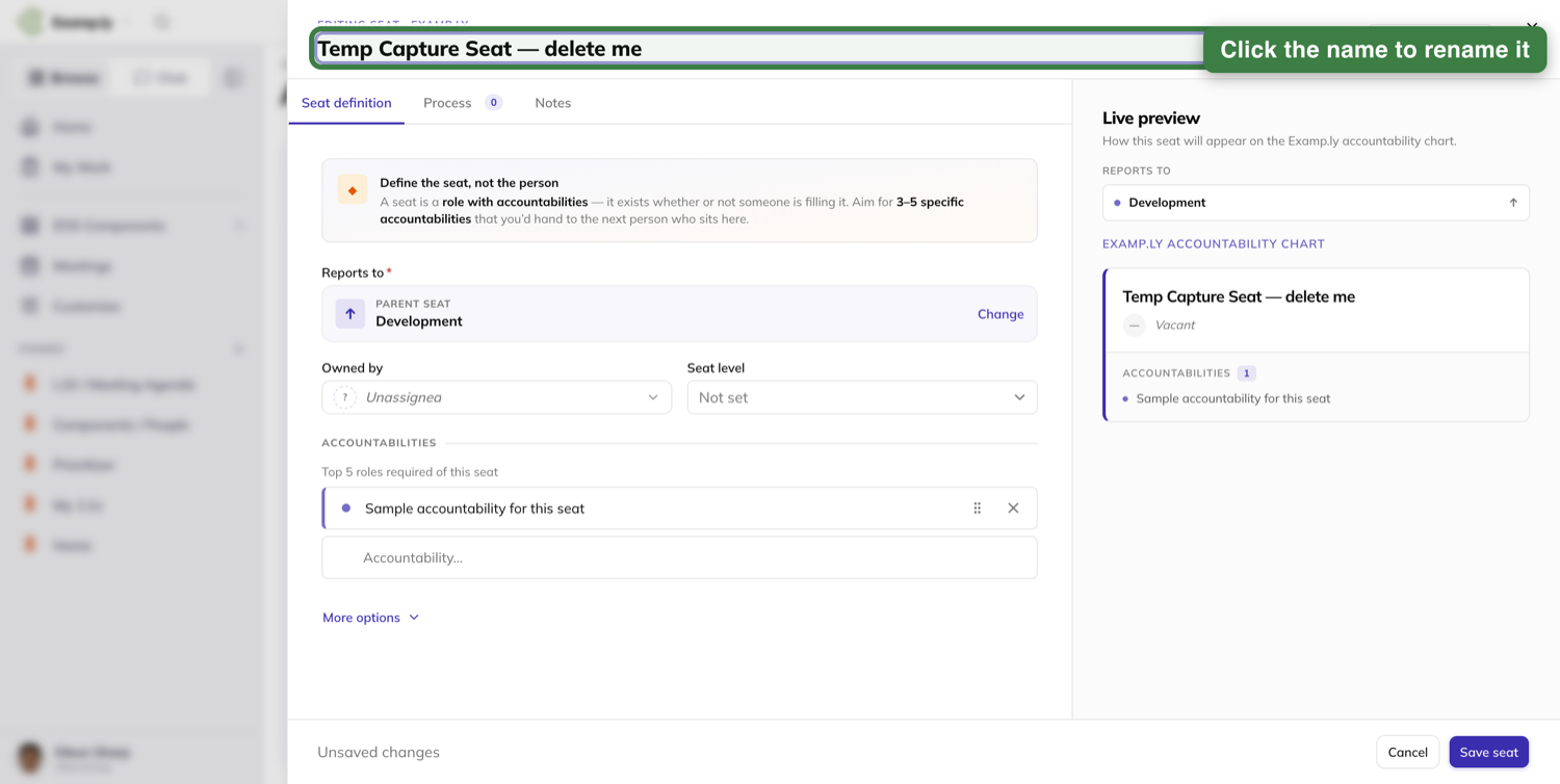
If you cannot edit that seat, none of this is on your screen. The name is plain text — nothing to click, and nothing hinting there is.
Give a seat to someone
Open the seat and use the Owned by picker.
It offers everyone in your organization — the root team and every team beneath it. Not just the team you happen to be switched to.
That is the point of it. The right person for a seat often sits on a different team, and you can still pick them.
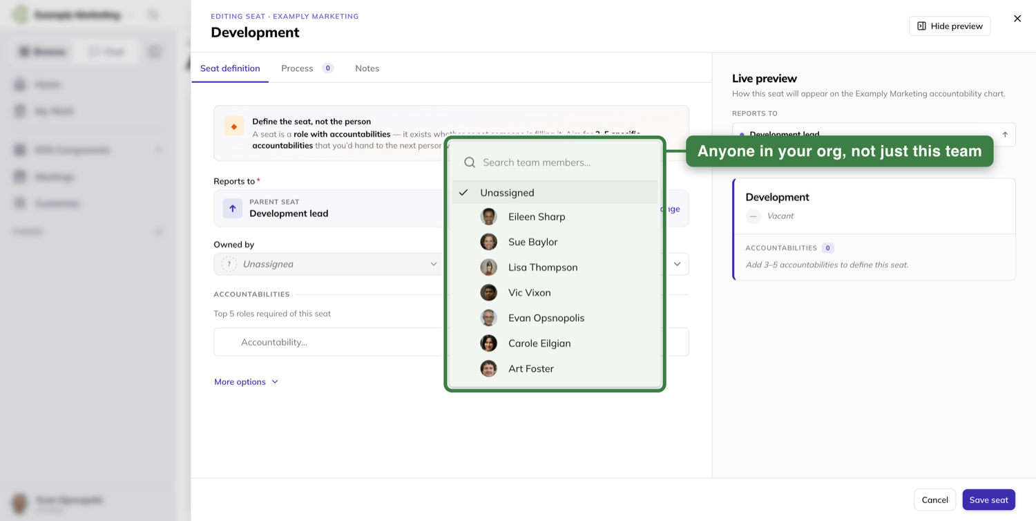
Click their row, or type a few letters and press Enter on the highlighted one. Either way the field and the seat card show them straight away.
Someone who cannot edit the seat sees its owner as plain text, with no picker to open.
Add a seat under any seat you can edit
Every seat you can edit carries an add-seat control. Use it and a blank new-seat form opens.
The form already knows which seat the new one reports to, so you never pick the parent yourself.
It is blank every time. A seat you created a moment ago leaves nothing behind in the next form.
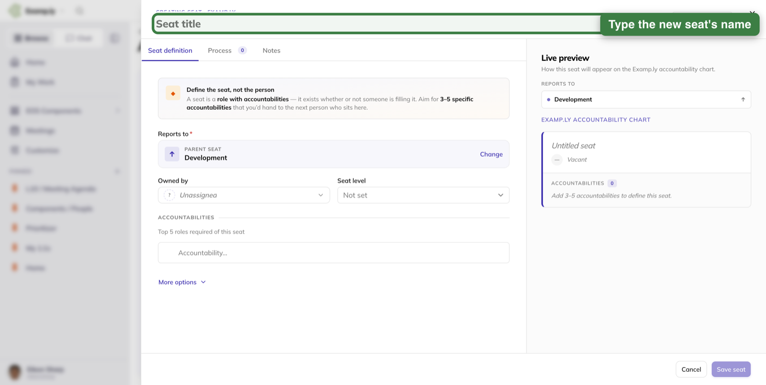
Which team the new seat belongs to
The new seat belongs to its parent's team, not to whichever team you were switched to when you made it.
Your own team context does not change either. You stay where you were.
It appears even if it is deeper than what you were showing
Add a seat one level below the depth on screen and Levels steps up by itself to take the new level in.
The seat can still land below what is on screen. Pan down if you do not see it straight away.
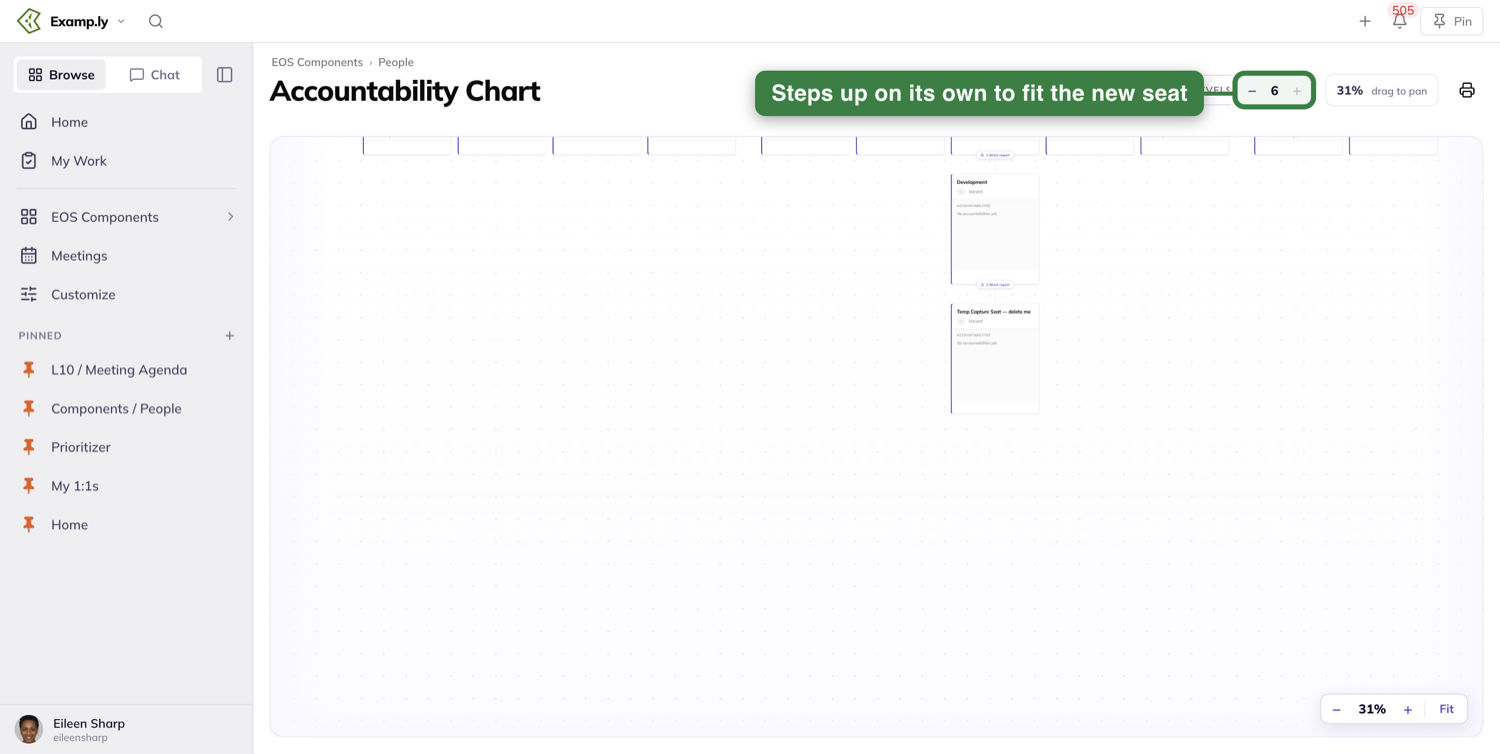
Only one seat can sit at the top
A team already holding a top seat will not take a second one, and says so.
Move a seat
Open the seat you want to move. Under Reports to sits its parent seat, with a Change link at the right.
Press Change, pick the seat you want above it, then press Save seat.
The chart redraws with the seat in its new place immediately, and it is still there after a reload.
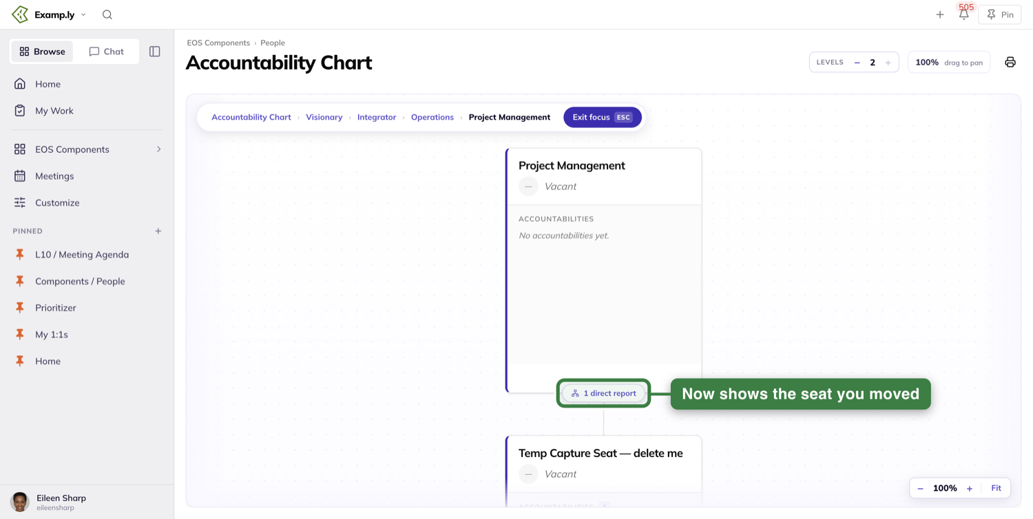
Where a seat can and cannot go
Anywhere inside your organization is fine, including onto a seat that belongs to a different team.
Across organizations is not, and the move is refused with a message saying so.
The one seat at the top of the chart cannot be given a parent. That refusal is what keeps the chart to a single top.
A seat that has somehow been left stranded at the top alongside it can be given a parent the same way, which is how you fix one.
Archive a seat, and what it takes to bring it back
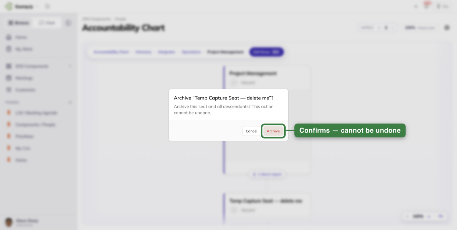
Choose Archive on the seat. The confirmation names it — Archive "QA Lead"? — and asks "Archive this seat and all descendants? This action cannot be undone."
Confirm and the seat leaves the chart at once, with the save finishing behind you.
It takes the reporting line with it
Archiving a seat archives everything reporting to it as well, in one go.
Archive a Finance seat with four seats under it and all five leave the chart together.
The seat at the very top of the chart cannot be archived at all.
Bringing one back is a team admin job
Restoring an archived seat is the one seat action that needs team admin rather than seat edit rights.
Someone who owns a seat can archive the seats beneath it and cannot bring them back.
A restore covers the one seat it names. Anything archived below it stays archived.
Print the chart
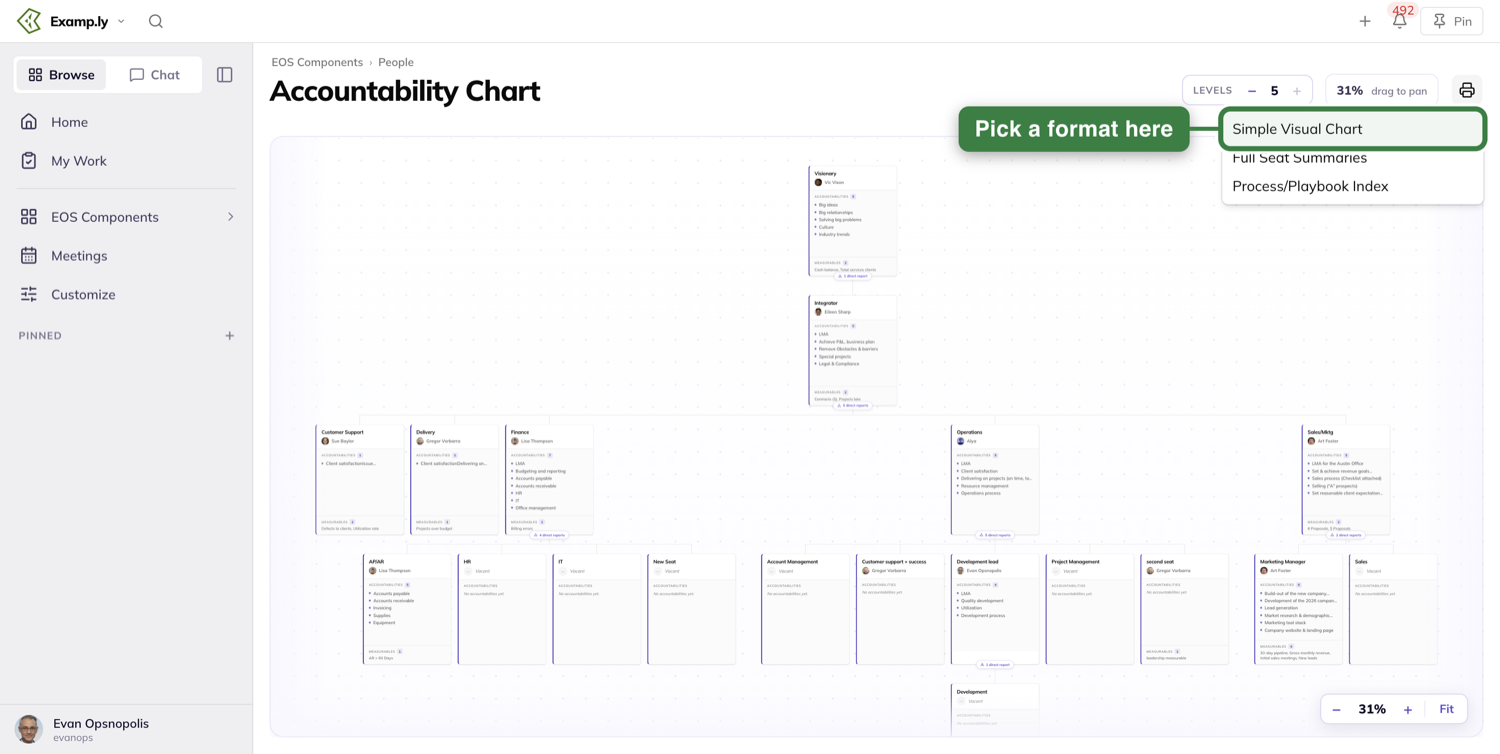
The Print control sits in the page header, after the Levels stepper.
Anyone who can see the chart can print it. There is no admin gate on it.
It opens a menu of three: Simple Visual Chart, Full Seat Summaries and Process/Playbook Index.
The visual chart asks how much you want
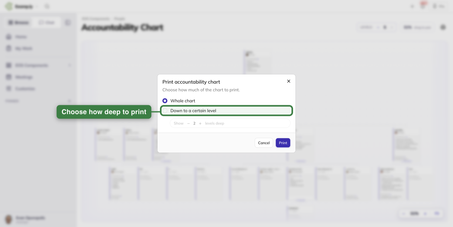
Choose Simple Visual Chart and a prompt opens headed Print accountability chart, over "Choose how much of the chart to print."
Whole chart is already selected, so pressing Print without touching anything takes all of it.
Pick Down to a certain level instead and a levels deep stepper appears beside it. It will not go past the depth your chart actually has.
What comes out
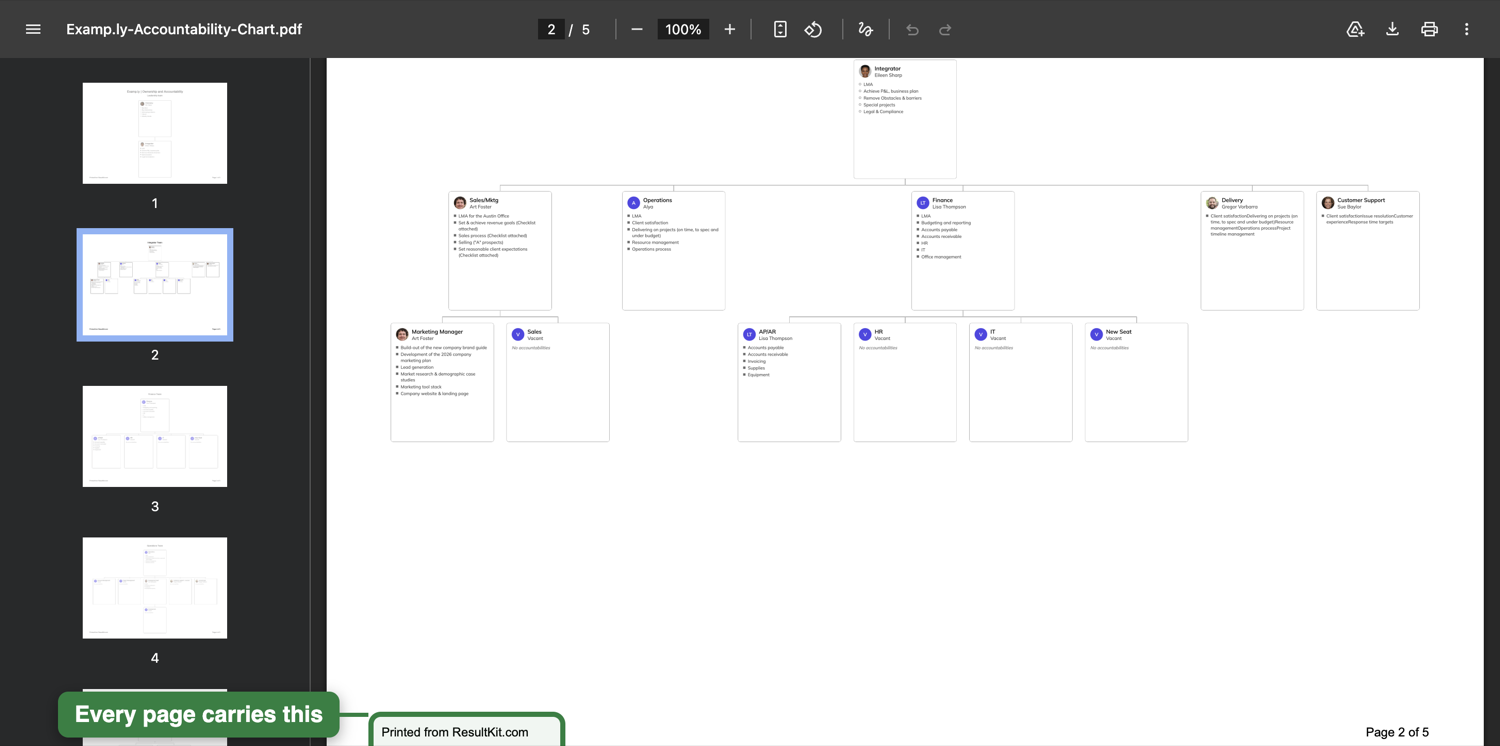
You get a PDF download rather than a print dialog.
It breaks up one branch section to a page, with a title page in front. Examp.ly's whole chart comes out as five pages.
Every page carries Printed from ResultKit.com at the left and Page 1 of 5 at the right.
The other two download straight away
Full Seat Summaries gives you a page per seat — nineteen of them for Examp.ly — carrying its title, its owner, what it reports to, the seats reporting to it, and its accountabilities, measurables, process documents and rocks.
Process/Playbook Index gives you a page per seat listing that seat's process documents as links you can click.
Neither asks how much you want, and neither carries the printed-from line. That belongs to the visual chart.
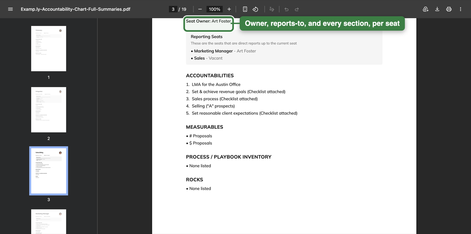
What the file is called
The name leads with your organization, never with a team — for example Examp.ly-Accountability-Chart-Full-Summaries.pdf.
All three files follow that pattern, and the chart word changes to match a team that is not running EOS.
Ask the assistant to set up a chart
A team with no chart yet does not have to start from an empty canvas.
Ask the assistant to set up the accountability chart, naming the team you want it for. Name the team — it does not assume the one you are looking at.
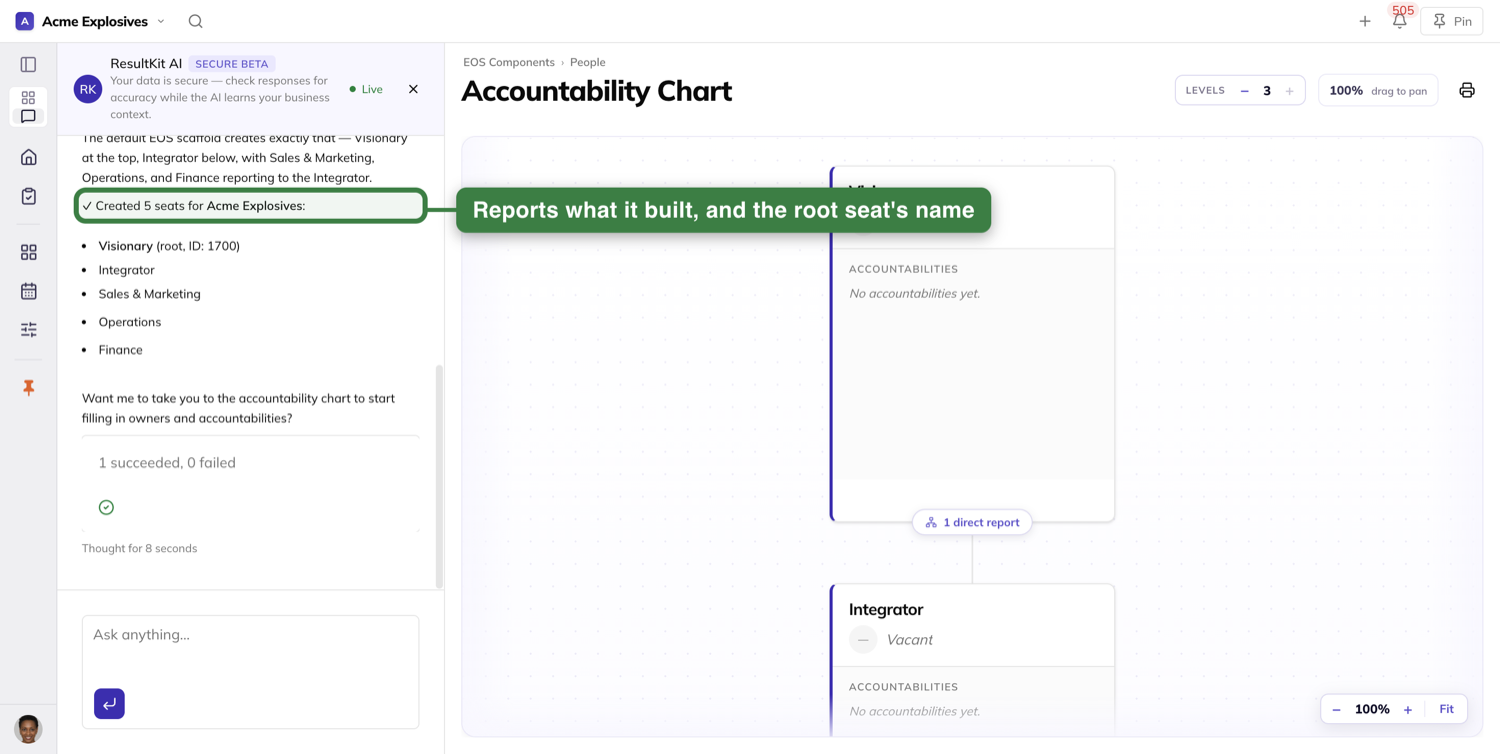
It creates a starter set of seats and reports what it made: how many, and the name of the seat at the top.
On the EOS team in the picture below that reads five seats created, with Visionary at the top.
Ask on a team that already has a chart and it does not build a second one. It talks you through adding seats by hand instead.
Asking for a single seat
Ask the assistant for one new seat and it offers you a choice before it creates anything.
You can create it now with a name and a parent, or define the whole seat card first — the function, five roles and the level.
What is saved behind you when you reorganize
Every structural change to the chart saves a copy of the chart as it stood first.
That covers editing a seat, moving one and archiving one. You do not ask for it, and nothing interrupts you while it happens.
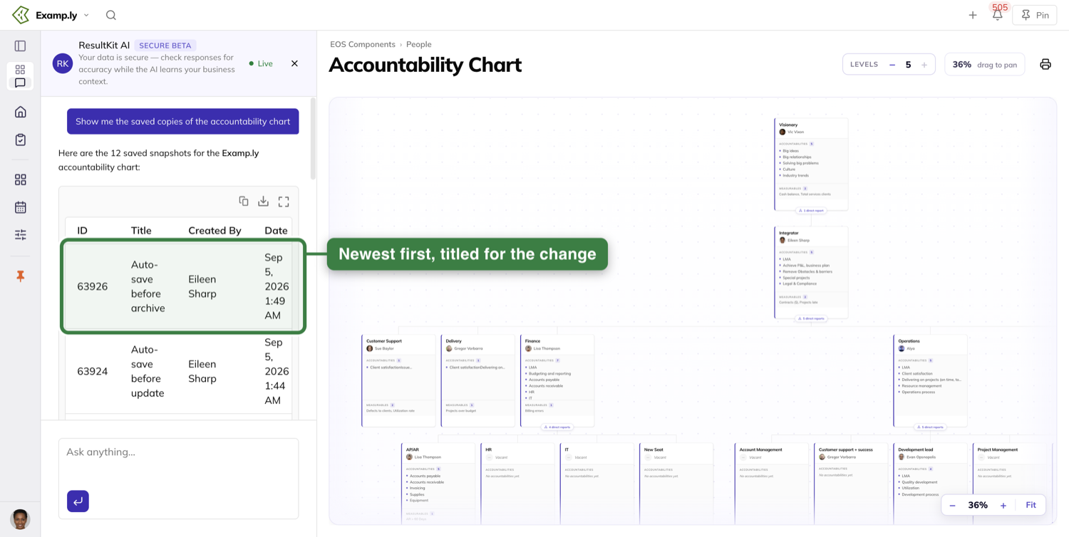
There is no list of those copies on the chart itself. To see them, ask the assistant for the chart's saved copies.
It answers with them newest first. Each one is titled for the change it came before — Auto-save before update, before move, before archive — with who saved it and when.
Who can change the chart, and who can only read it
Team admins can edit every seat on the chart.
A seat owner can edit their own seat and every seat reporting up to it, with no admin role anywhere.
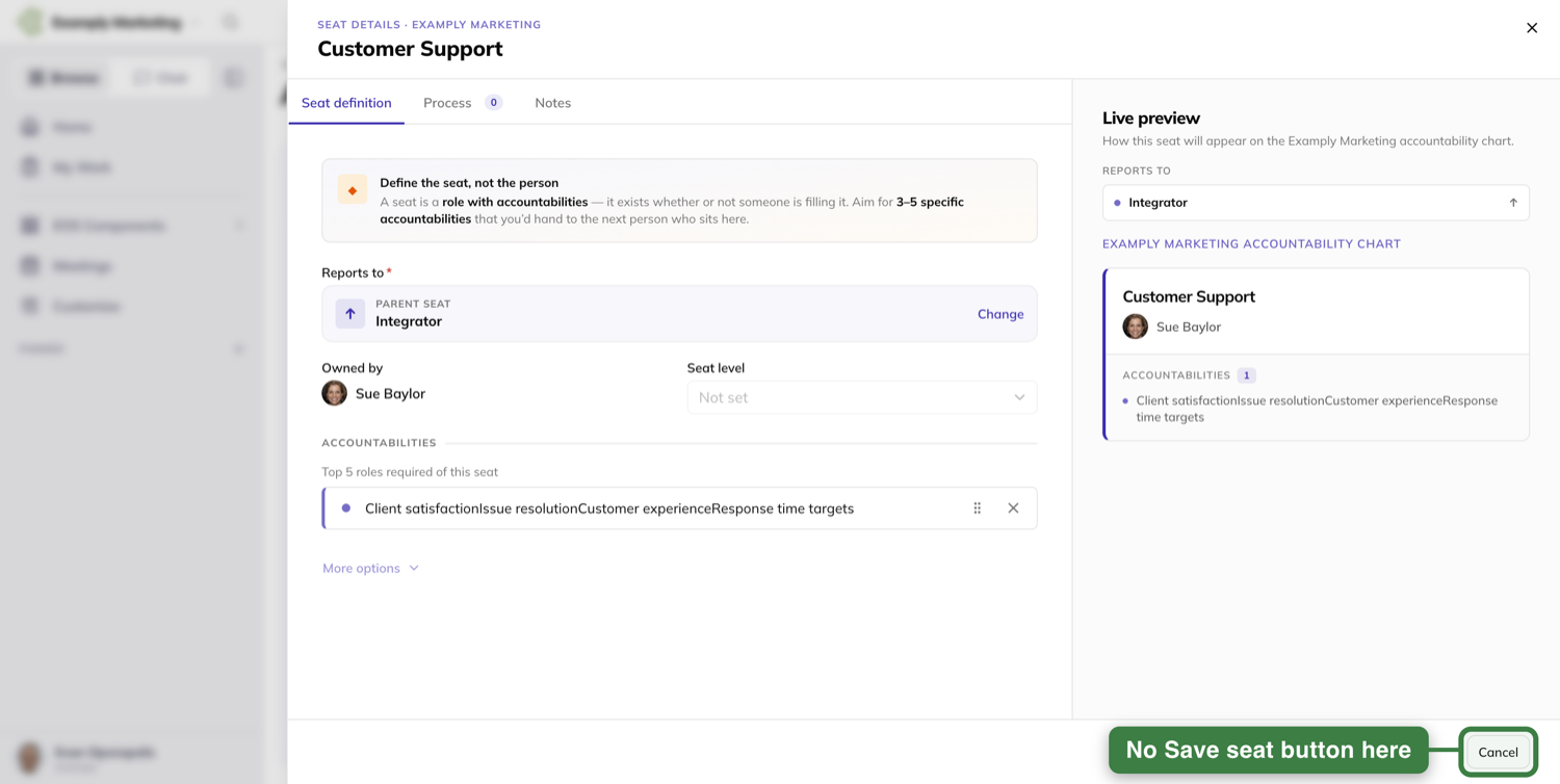
Everyone else reads. A seat they cannot edit opens headed SEAT DETAILS rather than EDITING SEAT.
The title is plain text, and so is the owner — there is no picker to open on it.
There is no empty Accountability… box to add a role, and the footer carries Cancel alone. No Save seat means nothing you do there can be written.
Two things cut across that. Printing is open to everyone who can see the chart, and restoring an archived seat needs team admin however many seats you own.
Was this helpful?
Formal Reviews
In ResultKit, you can run a formal review or quarterly conversation with anyone in your part of the accountability chart - your direct reports and the people under them. Reach a shared, honest read on how someone is doing, and leave a record of it both people can stand behind.
In this article
Both people answer the same set of prompts - the person being reviewed writes their side, the manager writes theirs - and once both are in, ResultKit sets the two sets of answers next to each other so you can talk about the gaps.
In this article, we’ll walk you through the whole thing end to end: opening reviews up to the right people, building the questions, starting one, writing it, closing it, and printing the record.
Before you begin: who is allowed to run reviews?
Reviews are gated at the team level. Someone has to be named a reviews administrator before any of this is open to them.
To set these permissions, open the team page, go to the Members tab, and scroll down to find the Reviews Administrators section.
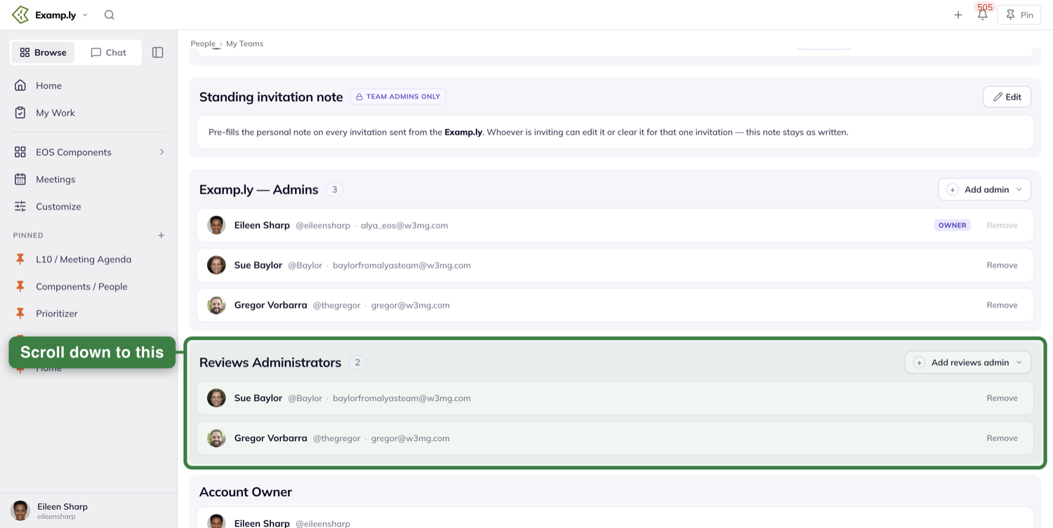
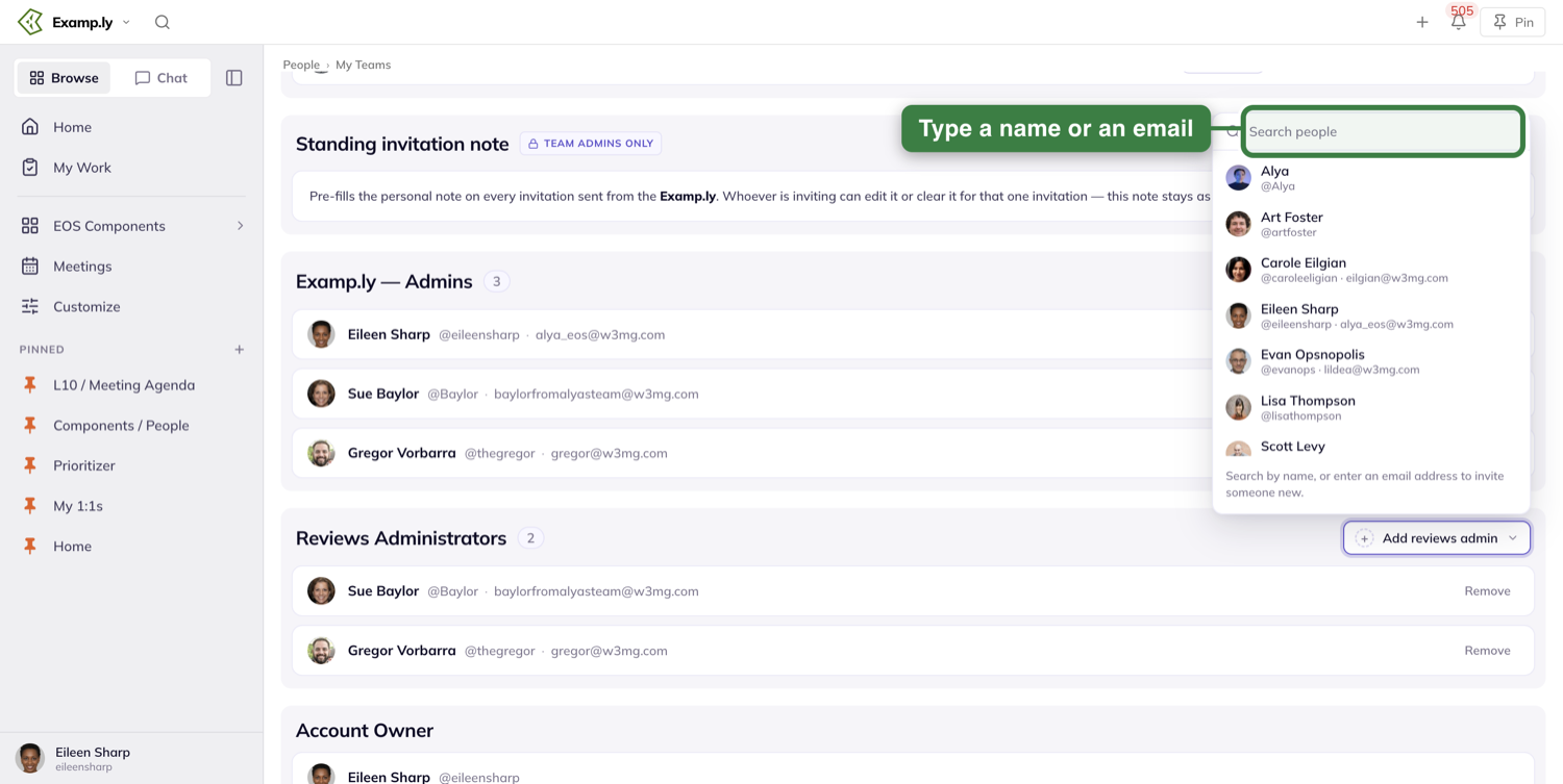
Press Add reviews admin, then Search people to pick someone already in the org - or type an email address to invite someone who isn’t.
Build a template
Everything a review asks comes from its template.
To create your first template, open Quarterly Conversations and Reviews - the screen this article calls Reviews for short - and go to the Templates tab.
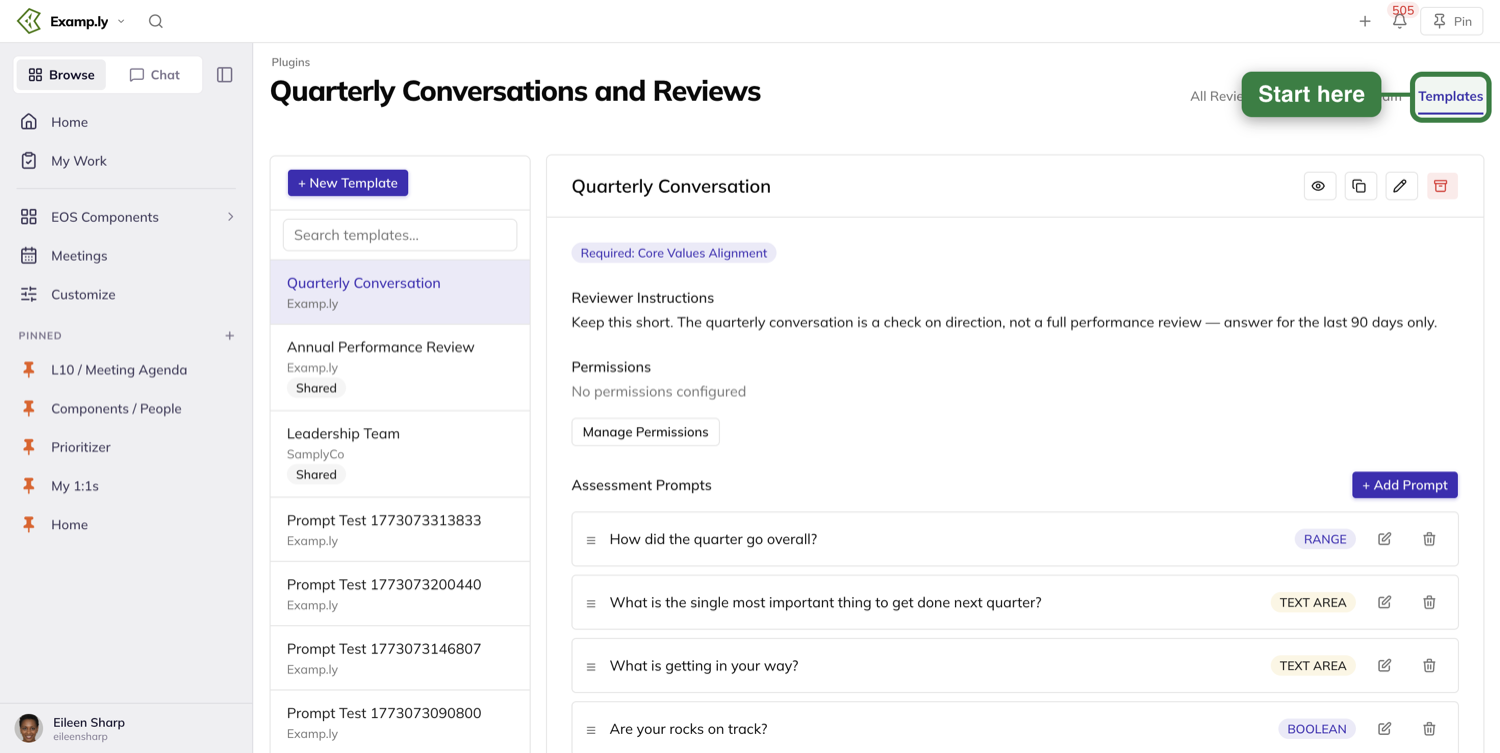
Create New Template asks for a Template Name, Reviewer Instructions - the notes the reviewer reads while they’re writing - and Organization Sharing.
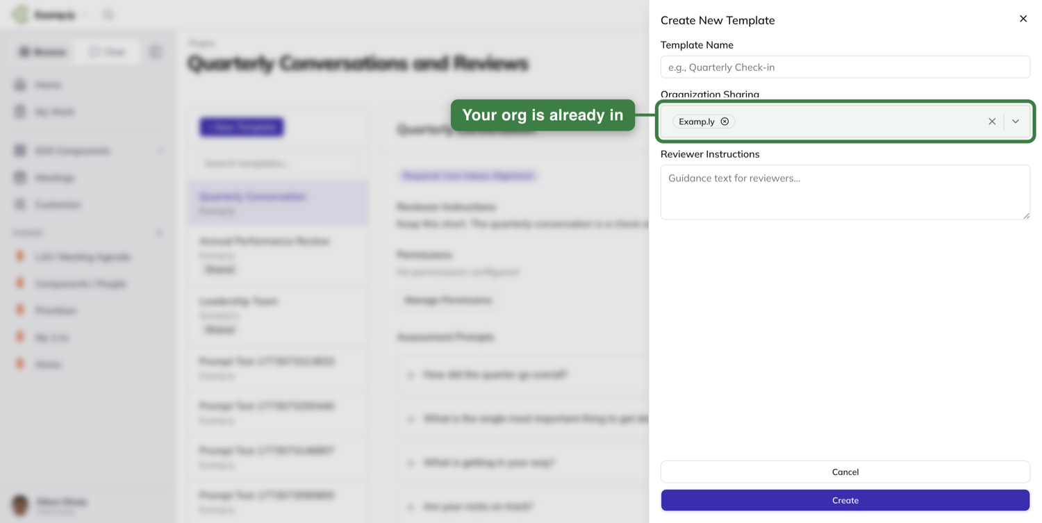
Open the template to add your prompts.
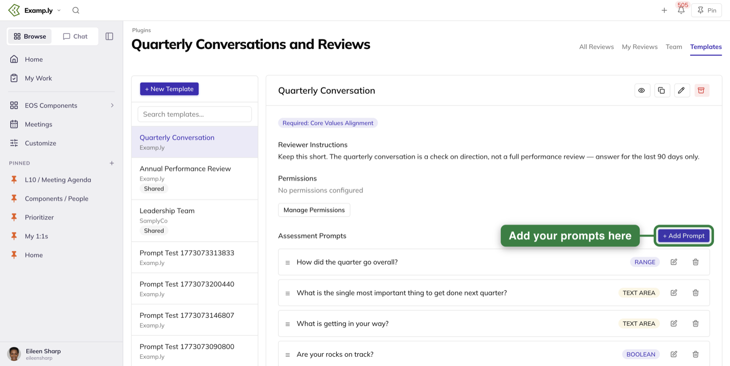
Drag them to reorder, edit or delete them in place. Core Values Alignment is always there and can’t be removed.
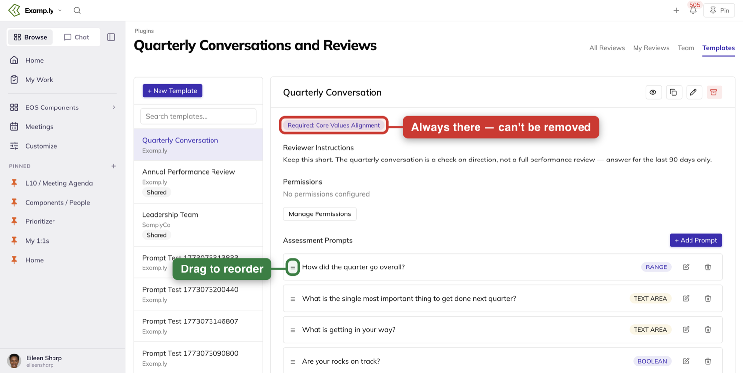
The four icon controls on a template are, left to right, Preview Template, Copy Template, Edit Template, and Archive Template. Archive is the red bin, and it is one-way - there is no archived-template list and nothing to restore from, so treat it as delete.
One thing to know before you preview: Preview Template opens the Template Preview drawer, and the core values it lists belong to whatever team you’re currently switched into — not the org the template was built in.
Decide who can use it
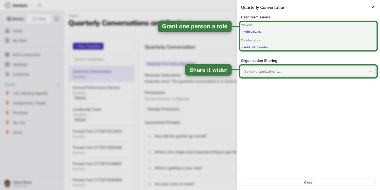
The template’s permissions drawer grants roles one person at a time: + Add viewer… under Viewers for someone who should read it, + Add collaborator… under Collaborators for someone who should be able to change it. Select organizations… is separate from both, and shares the template wider.
Start the review
In Reviews, press + New Review. If that button isn’t there, you’re not allowed to create reviews here.
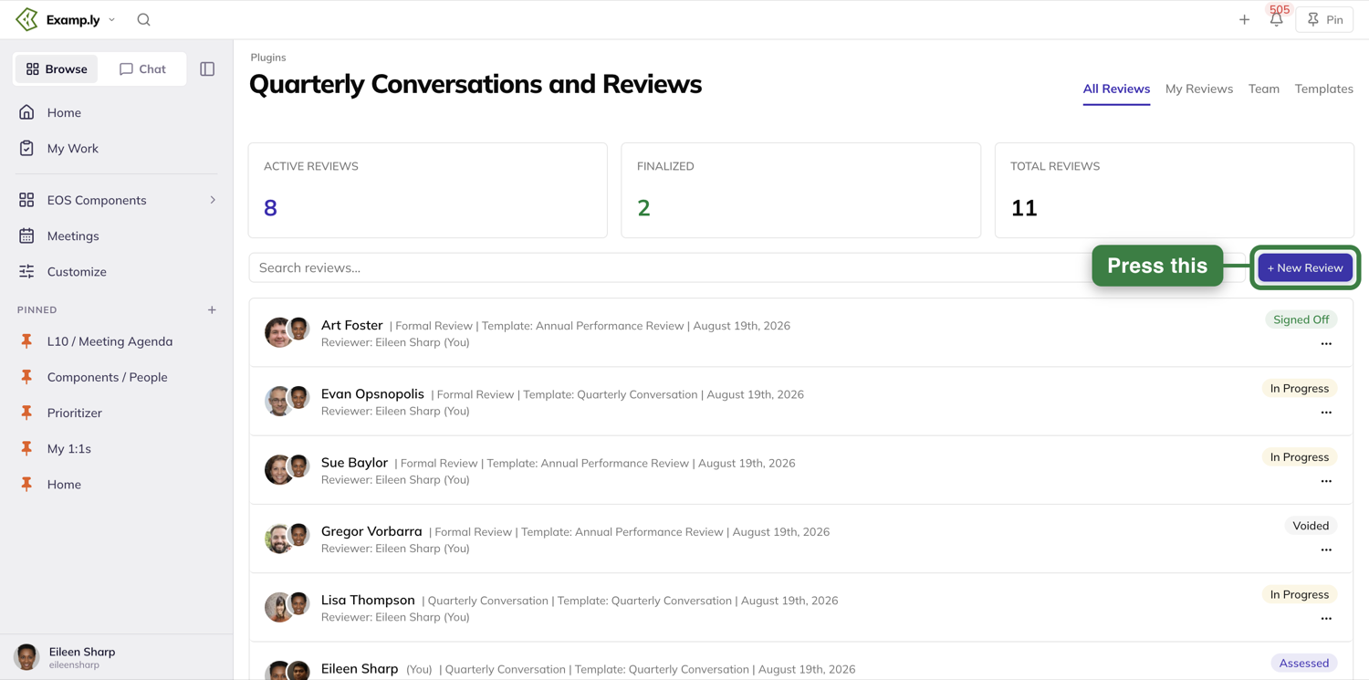
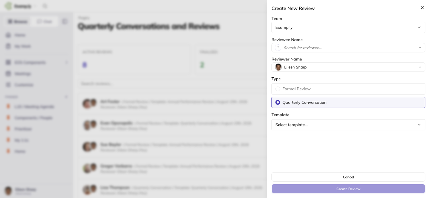
The sheet asks for five things: Reviewee Name, Reviewer Name, Template, Type, and Team.
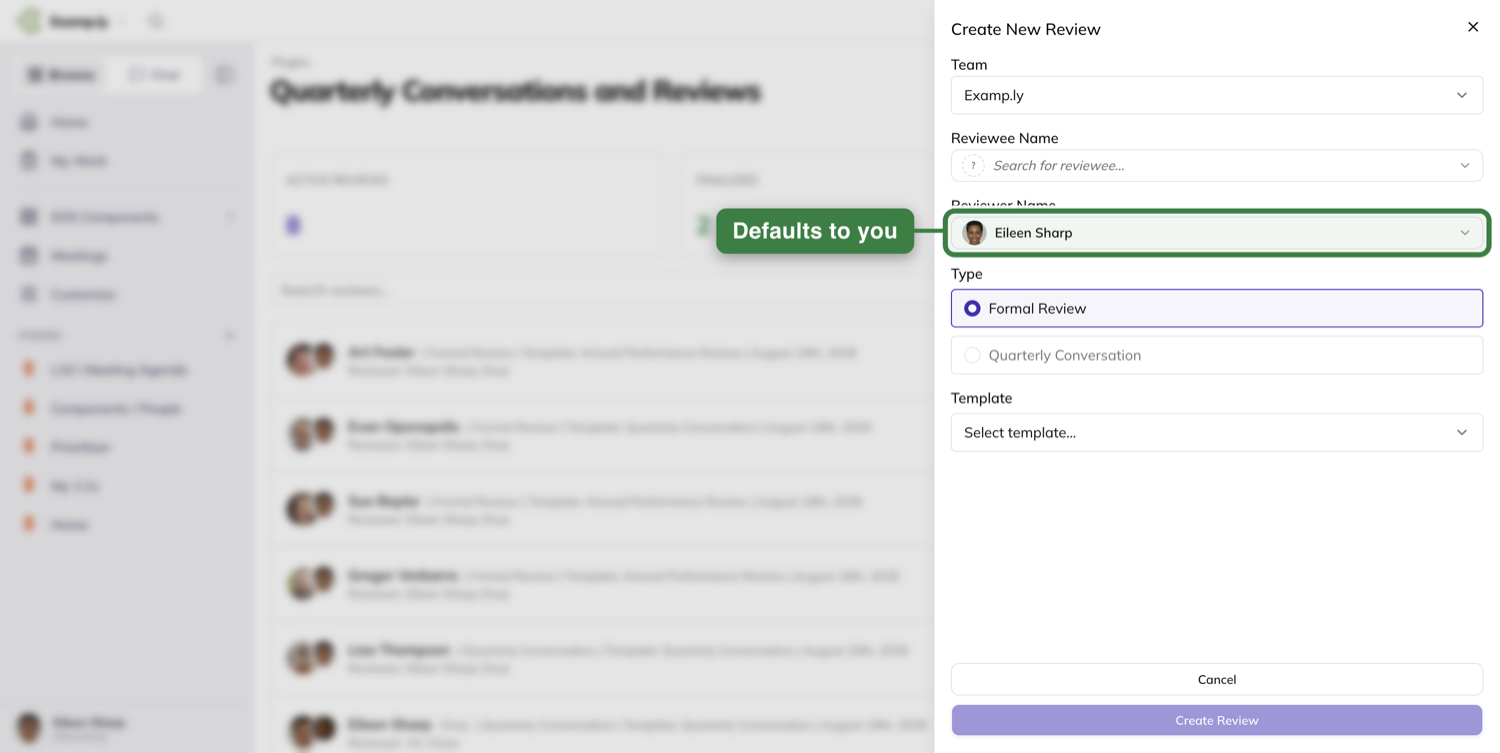
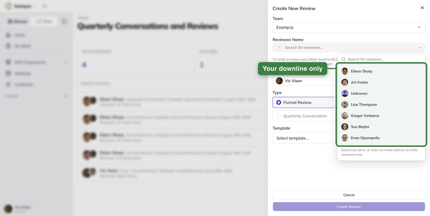
The reviewee list only holds people below you on the accountability chart - your direct reports and the people under them, never your peers.
If that list comes up short or empty, the sheet says why instead of leaving you staring at a blank box.
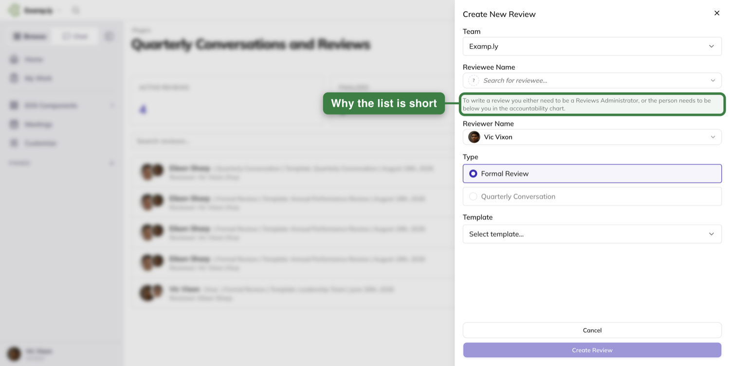
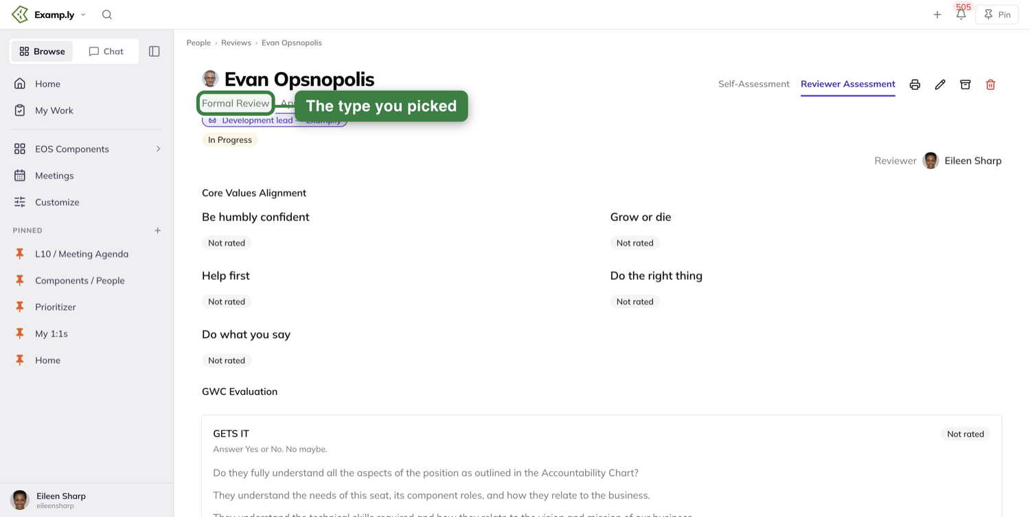
Type is worth a second look: it’s set here, on the review itself, and doesn’t come from the template.
Formal Review and Quarterly Conversation are the two choices, and either can come from any template — the template’s own name, even “Quarterly Conversation,” never decides which one you get.
Write your side
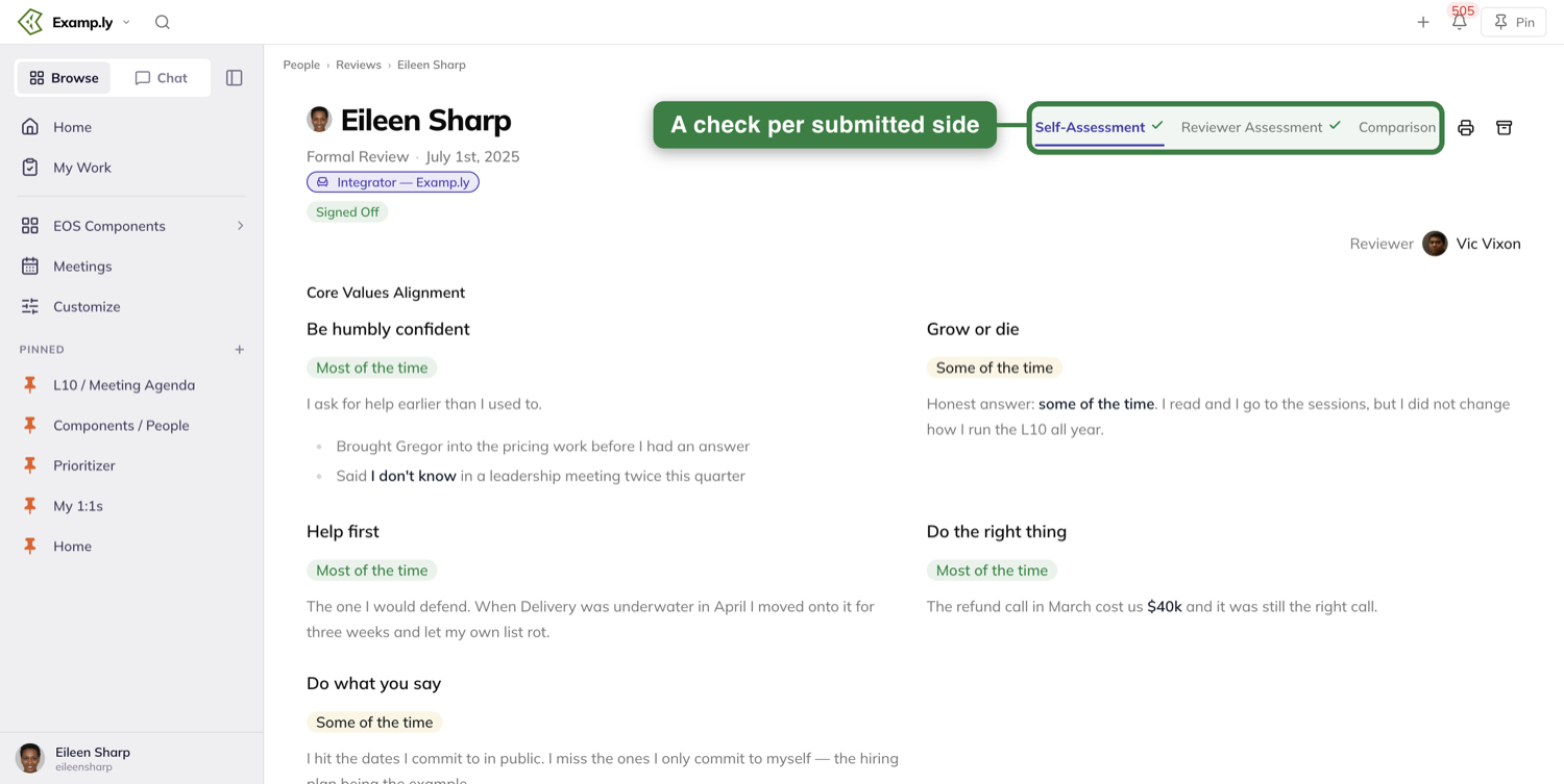
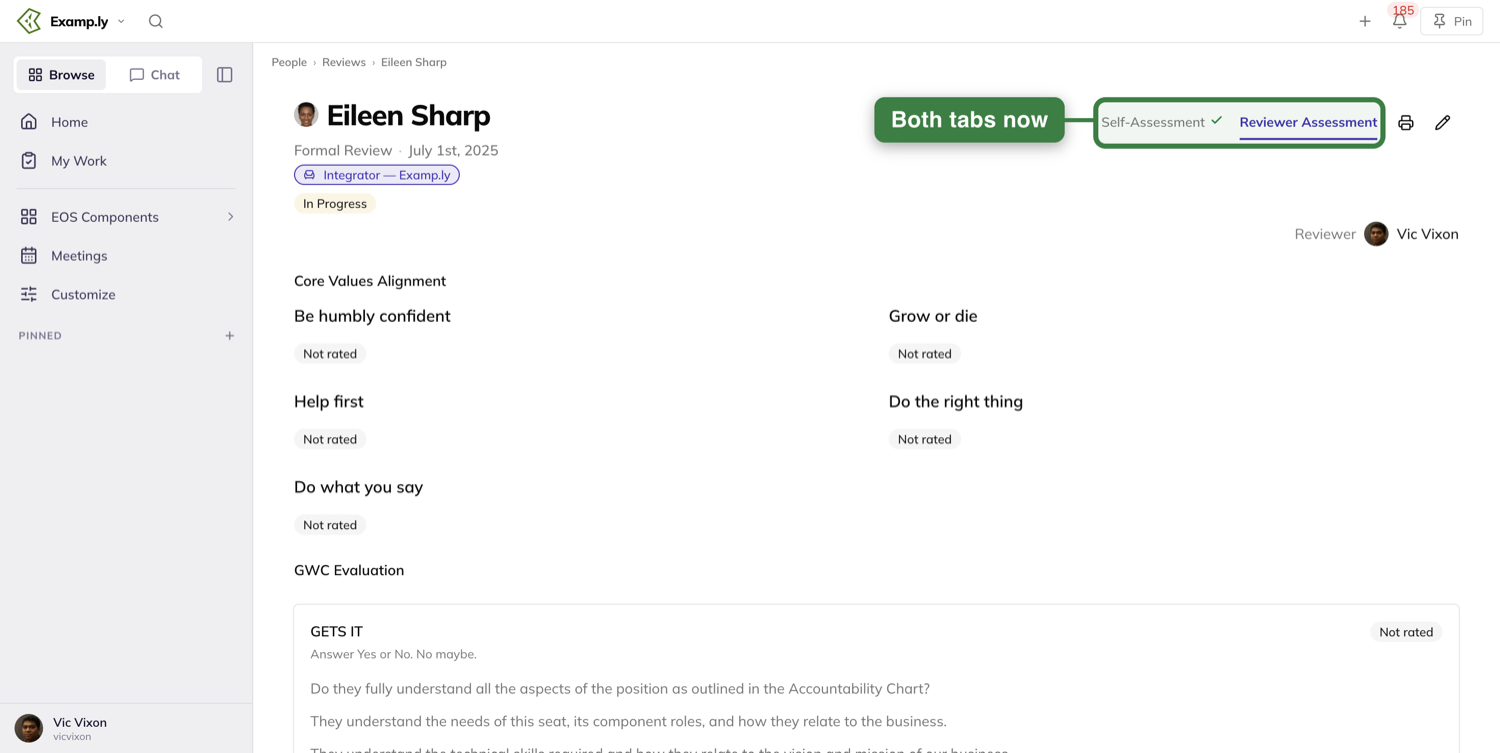
The review opens with up to three tabs: Self-Assessment, Reviewer Assessment, and Comparison.
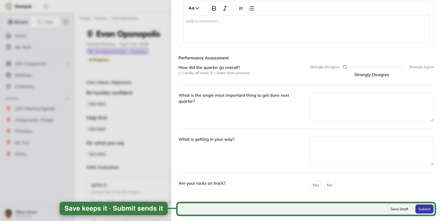
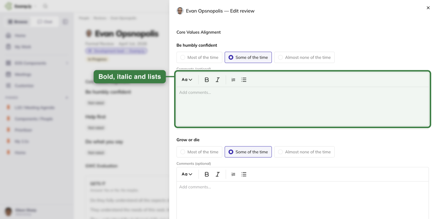
Each assessment holds the template’s prompts, the Core Values Alignment ratings with a comment box under each value, and the GWC Evaluation. Both end in Save Draft and Submit.
The reviewee always sees their own tab. The reviewer’s view of it opens once the reviewee submits — so in practice the reviewee goes first.
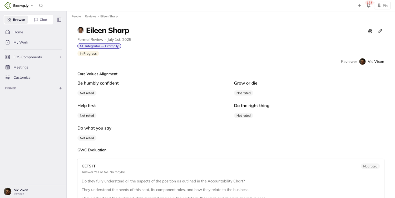
The pencil (Edit review) opens a drawer that saves as you type: it reads Saving…, Saved, Unsaved Changes, or Save failed — will retry, and the form holds its position under your cursor while it does.
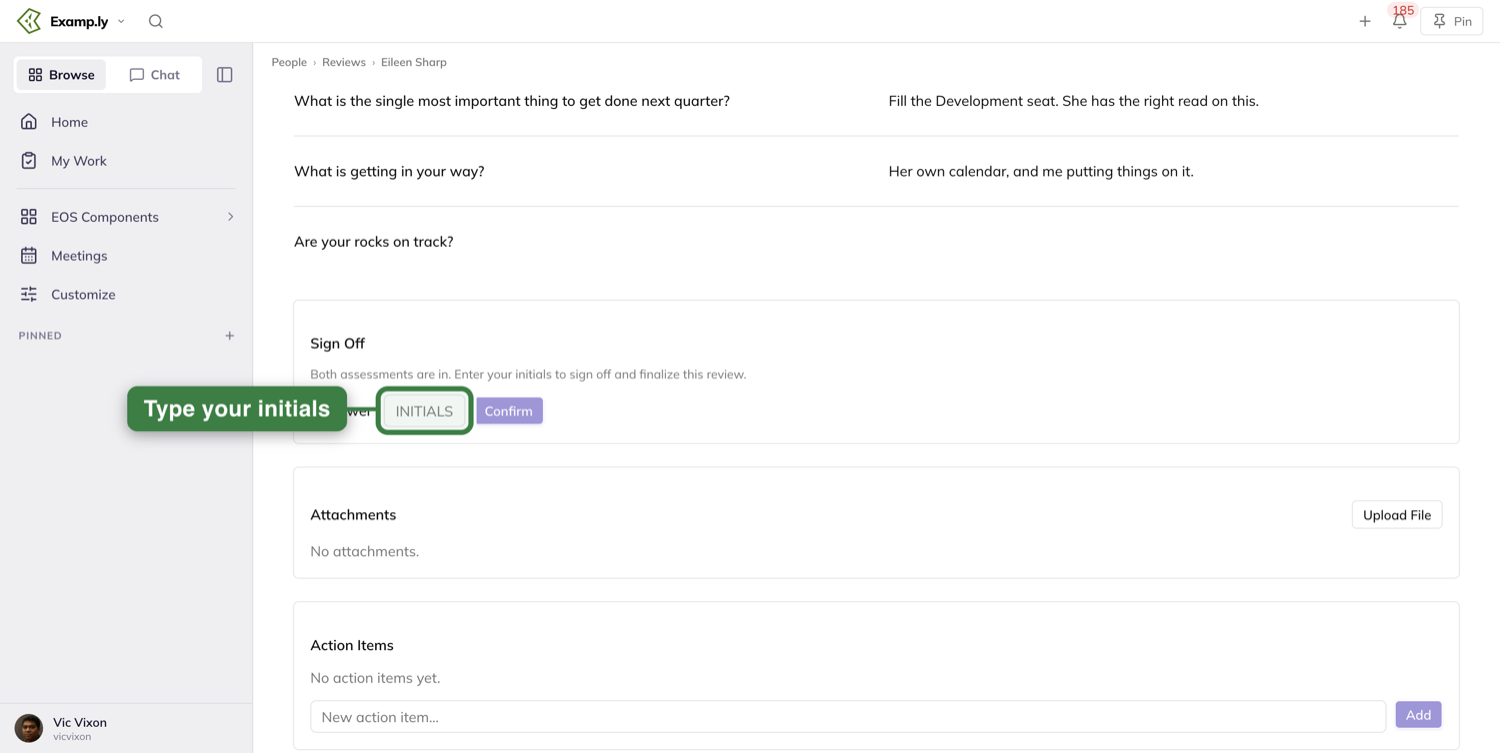
Below the assessments sit three more panels. The reviewee’s seat accountabilities are listed so whoever is writing can see what the role actually asks for. Attachments takes supporting files through Upload File. Action Items is where the conversation turns into work - type into New action item… and press Add.
Close it out
The reviewer submits their assessment, and normally that’s that. If the reviewee never filled in their side, you’re not stuck. A dialog asks: “The reviewee has not completed their portion. Do you want to finalize it without them completing a self-review?”
Yes closes it. The other button — “No, save my changes but don’t mark the review closed” — keeps everything you wrote without finishing anything, which is the one to press if you’re still waiting on them.
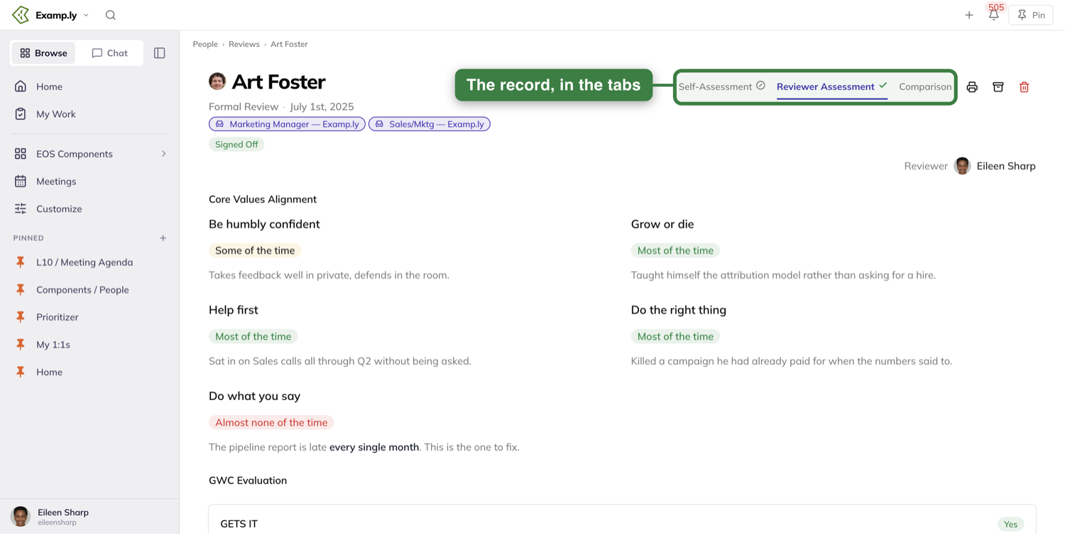
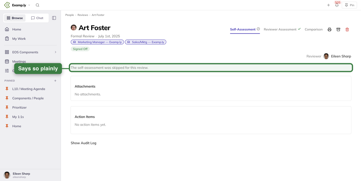
Sign-off captures Initials: the Sign Off card reads “Both assessments are in. Enter your initials to sign off and finalize this review.” On the skip path above there is no initials field - that dialog has only its two buttons - so ResultKit fills them in from your name on your behalf. Once it’s signed off, the tabs carry the record themselves: a green check where a side was submitted and a struck circle where it was skipped. The tab keeps its name - open the skipped one and the panel says The self-assessment was skipped for this review. Nothing about it is hidden.
Read it back and print it
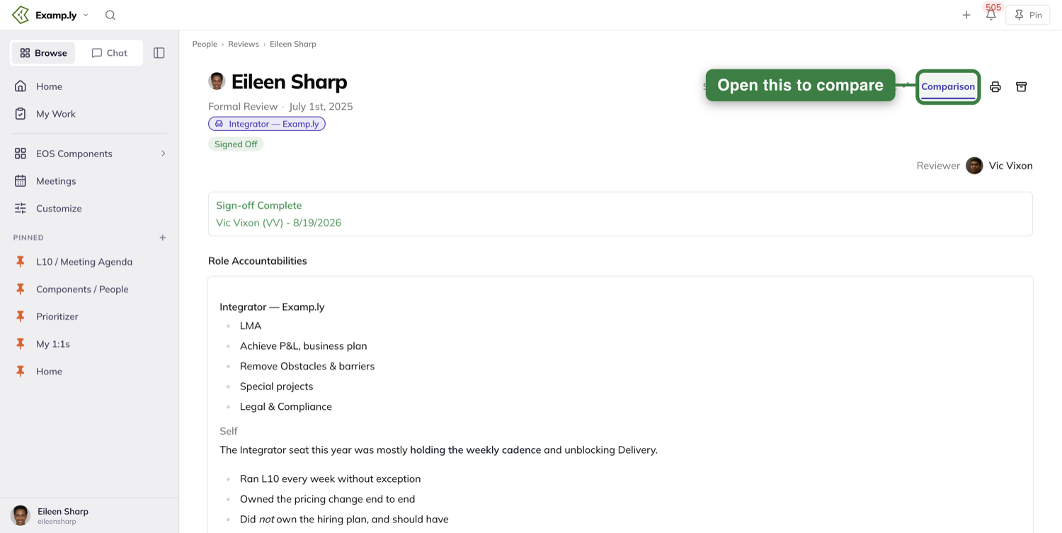
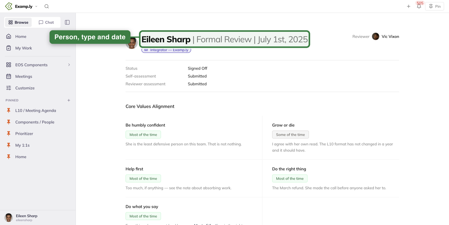
Once the review is signed off, both sets of answers will show up side by side, in the words each person actually wrote, with bullets and bold intact.
The printer icon (Print review) opens a print-ready copy of the review and starts printing on its own. The PDF is named for the person, the review type, and the date, and long reviews print in full rather than getting cut off at one page.
After it’s closed: what can still change
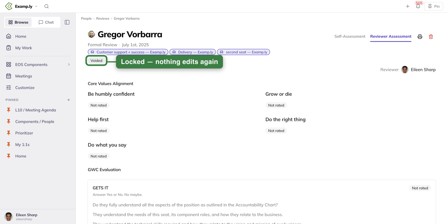
Three states lock a review: Signed Off, Voided and Archived. Once a review is in any of them, nothing on it can be edited again. Before that, whoever created it can delete it as long as the reviewee hasn’t responded yet, and the owner can archive any review that hasn’t been voided.
There are five statuses in all, and a row’s badge never reads anything else: In Progress while it is being written, Assessed once both sides have submitted but nobody has signed off yet, then Signed Off, Voided or Archived. Finalized is not one of them - it is the label on the dashboard’s middle count card, which counts the reviews that are Signed Off.
Quarterly Conversations
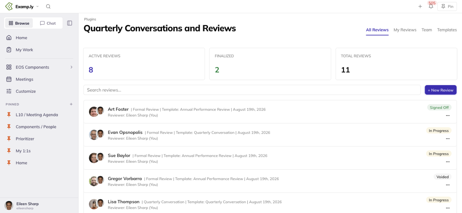
Quarterly Conversations work exactly the same way. Pick Quarterly Conversation instead of Formal Review when you create one, and every step after that is identical — writing, closing, printing.
Wherever a review is listed, its row shows its own type, never the template it was built from. Two reviews built from the same template can show up as one Formal Review and one Quarterly Conversation.
Who can open a review
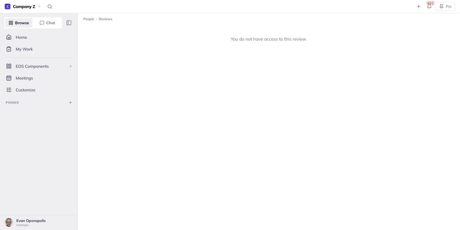
Five roles, and only five: the reviewer, the reviewee, whoever created it, the reviewee’s direct manager, and review administrators. A peer gets nothing, and neither does a skip-level manager - being two rungs up the chart is not one of the five. Creating the review is, though: set one up for someone further down than your own direct reports and you keep your own access to it as its creator. Being a team admin buys nothing on its own. The print page lets in and turns away exactly the same people the review page does.
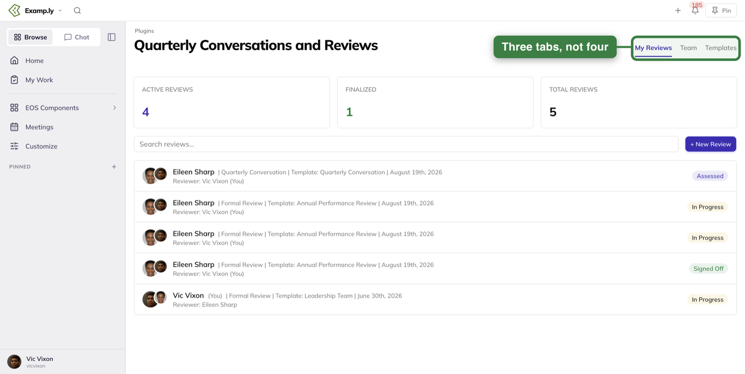
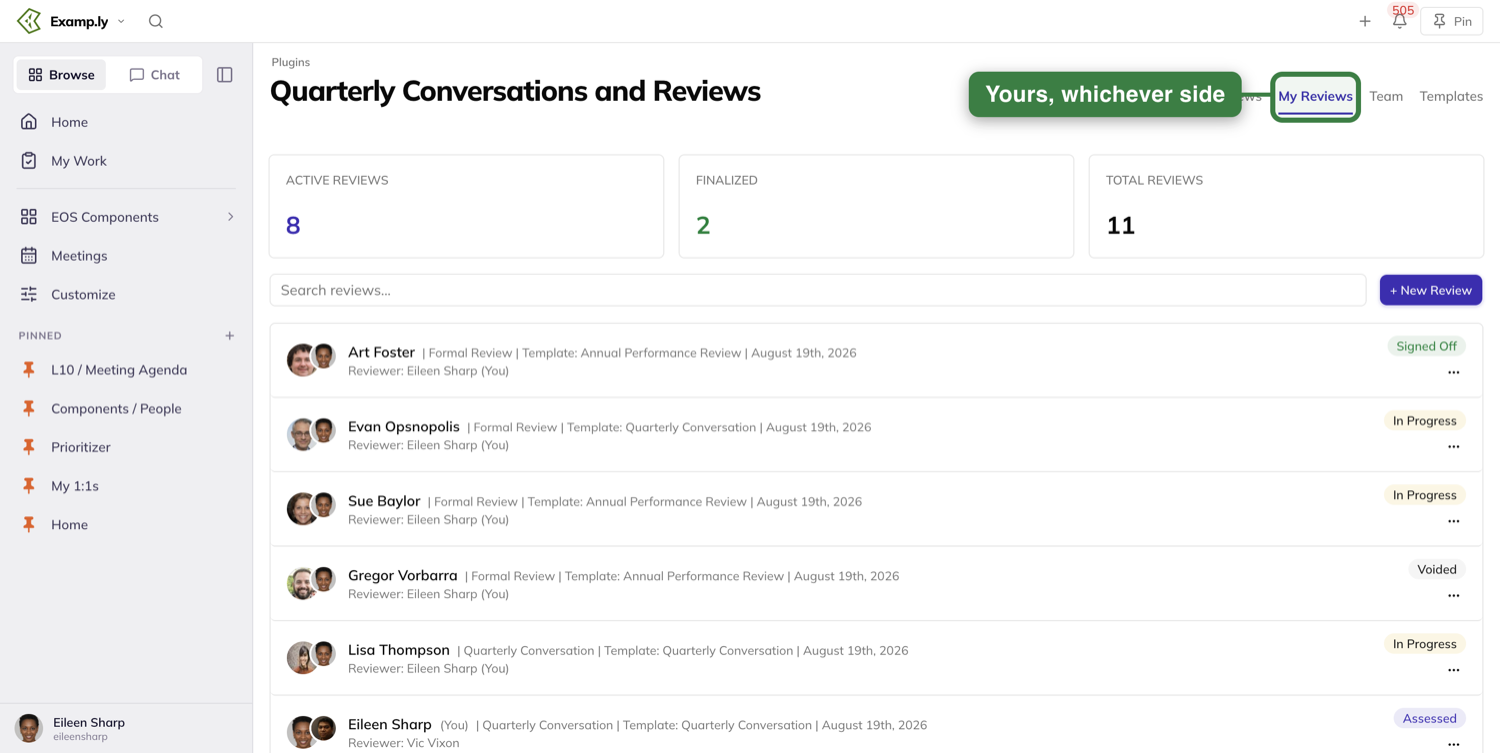
To find reviews, the dashboard offers My Reviews, Team and Templates, with Active Reviews, Finalized and Total Reviews counts above them. Review administrators get a fourth tab, All Reviews, which leads the strip and covers the whole organization; if you are not an administrator it is not there at all, not even greyed out. My Reviews means yours, whoever you are.
Was this helpful?
Sign-up and Social Sign-in — Signing In and Creating Your Account
Type whatever you remember into one field — your login name or your email.
In this article
- 1Sign in with your login name or email
- 2Read a refusal for what it actually says
- 3Land back where you were headed
- 4Start an organization with your email
- 5Confirm your email with the code
- 6Start an organization with Google instead
- 7Sign in with Google or Slack
- 8Sign in with Microsoft
- If your account predates today's sign-in screen
- When a provider window doesn't finish
A correct password signs you in either way. Nothing on the screen suggests you used the "wrong" one.
A refusal always names the real reason. You can also skip the password step entirely with Google or Slack.
This article covers signing in, starting a new organization, and using a provider instead of a password. Resetting a forgotten password is its own article.
Sign in with your login name or email
On the sign-in screen, type your login name or your email into the one identifier field. Case doesn't matter either way.
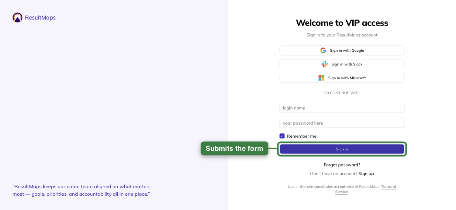
Type your password and press Sign in, or press Enter.
The button reads "Signing in..." while it works, and won't take a second click.
Read a refusal for what it actually says
A wrong password and an identifier nobody uses get the identical answer: "The login name or password is incorrect."
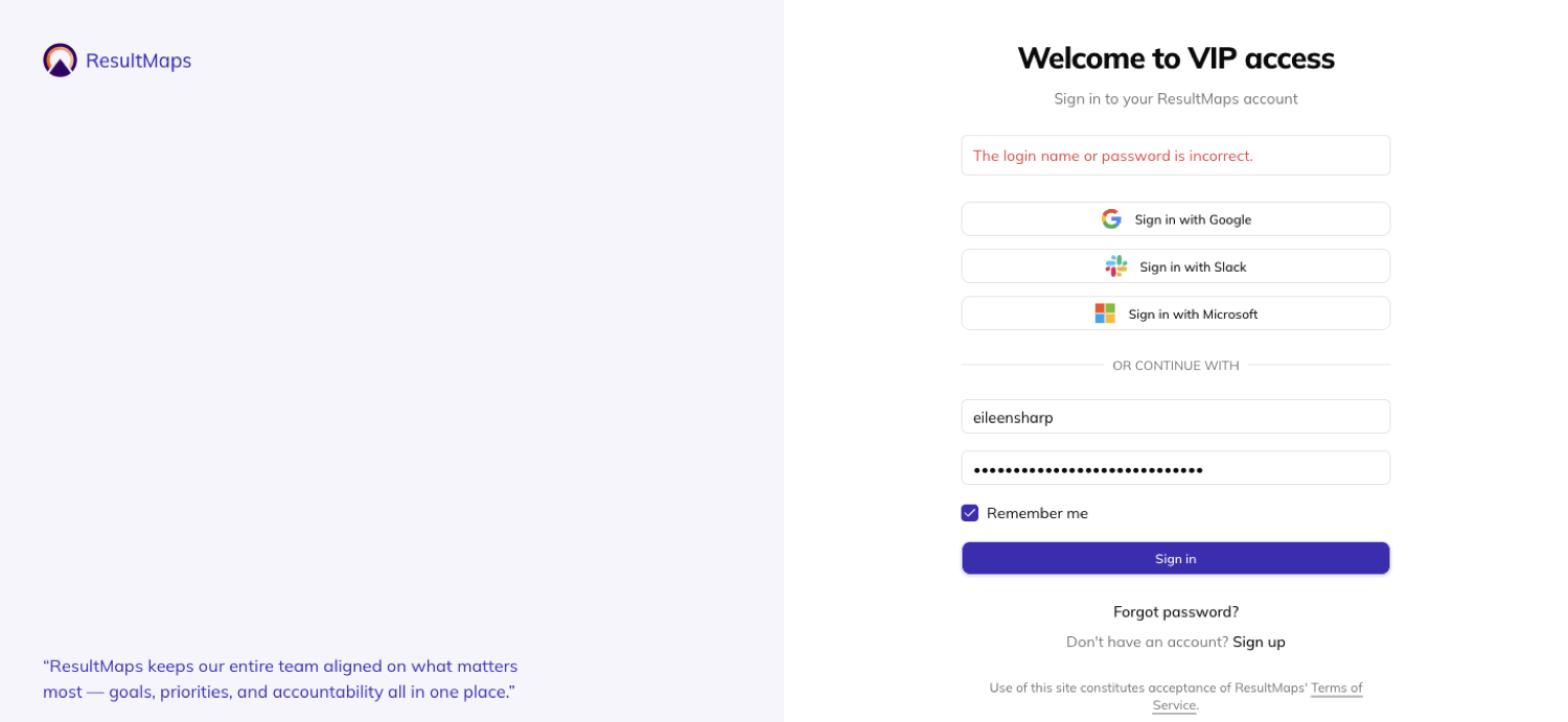
Other refusals name something more specific. An outage says sign-in is temporarily unavailable, never that your password is wrong.
An unconfirmed email says so directly: "Confirm your email address to continue."
Several failed attempts in a row get a wait message, not a lockout notice.
Land back where you were headed
Follow a link to a specific page while signed out, and you land on the sign-in screen with that destination held.
Sign in, and you arrive at the page you were originally headed to — never a home screen you have to navigate from all over again.
Start an organization with your email
Open the signup screen to create a brand-new organization.
As you type your name, the preview on the left fills in your seat.
Type an organization name, and the preview's title and top row fill in too — before anything is saved.
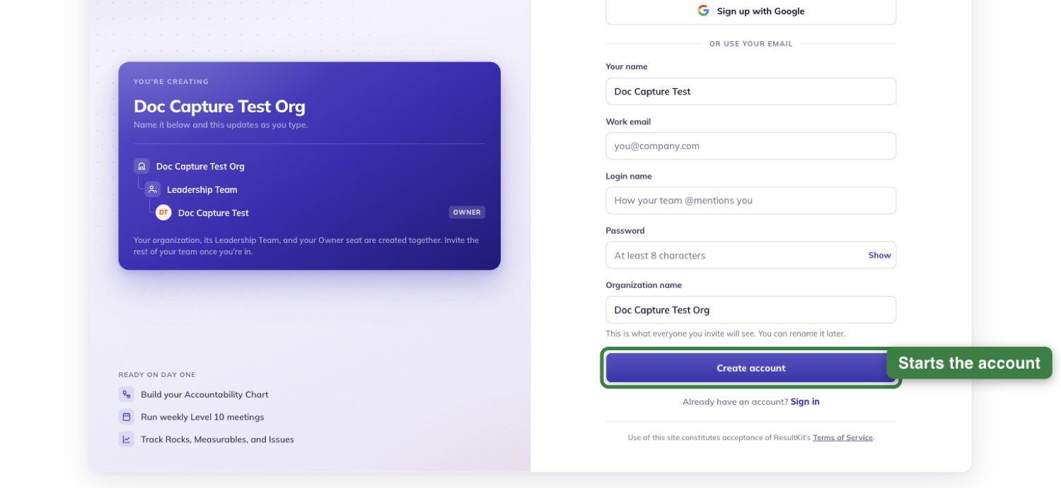
Five fields are asked for: your name, your work email, a login name, a password of at least 8 characters, and your organization's name.
Click Create account or press Enter in the last field. The button reads "Creating {your organization}…" while it works.
Confirm your email with the code
Submitting doesn't sign you in right away — it sends a 6-digit code to the email you gave.
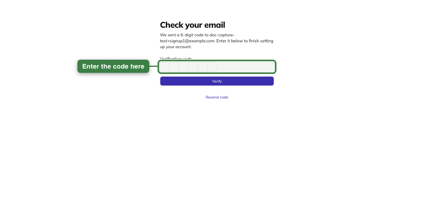
Enter the code, and your organization, its Leadership Team, and your Owner seat are created together in that one act.
Leave the screen before entering it, and nothing has been created at all.
Start an organization with Google instead
Click Sign up with Google and pick your account in the chooser that opens.
Whatever you'd already typed in the organization-name field carries over rather than being lost.
The organization-name step is the only thing left: one required field, never pre-filled on your behalf.
Submitting it creates your organization, your Leadership Team, and your Owner seat together.
Sign in with Google or Slack
Click Sign in with Google or Sign in with Slack above the password fields.
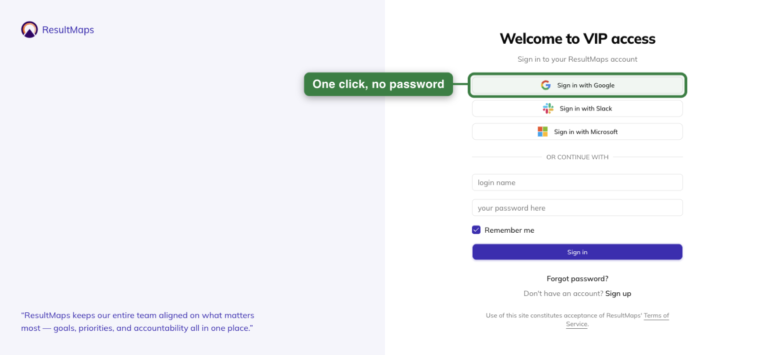
Approving the provider signs you into the same account you already have — never a second, duplicate one.
You're never asked for your ResultKit password this way, and nothing about your teams changes.
Sign in with Microsoft
Click Sign in with Microsoft and it routes you silently, with no "work or personal?" question ever asked.
It sends you to your organization's connection if you've typed a matching work address. Otherwise it uses the connection you last used on that device, or the personal-account connection.
A customer organization's own work accounts only work with Microsoft once that organization has been set up for it.
Until then, its people use Google, a password, or a personal Microsoft account instead.
If your account predates today's sign-in screen
Your password still works even if it wouldn't pass today's rules.
If you type your email instead of your login name, the platform resolves it and retries for you — invisibly, on your first sign-in.
When a provider window doesn't finish
Closing Google's or Slack's window without approving isn't treated as a failure.
You land back on the sign-in screen exactly as you left it, with nothing said about it.
If Slack isn't available on your deployment, the screen tells you plainly and your password fields stay usable.
A callback that doesn't match what you started is refused the same way, with no cause named.
Was this helpful?
Sign-up and Social Sign-in — Two-Factor Authentication and Staying Signed In
Your account can ask for more than a password. Turn on two-factor authentication in your own security settings, and every password sign-in after that needs a code too.
In this article
Everything about how long you stay signed in, and what signing out actually clears, is controlled from the same handful of places.
This article covers turning two-factor authentication on and off, what the code challenge looks like, and what "Remember me" and signing out do and don't leave behind.
Turn on two-factor authentication
Open Security settings, under Settings. Two-factor authentication starts off, with a control to turn it on.
Click it to begin setup.
Know there's no way back if you lose your device
There's no recovery path if you lose the device your authenticator app is on. There are no backup codes, and no administrator can clear your second factor for you.
Losing that device locks you out of your account. Turn this on knowing that going in.
Scan the code or enter it manually
Setup shows a scannable code for your authenticator app, and a manual-entry key if you'd rather type it in.
Enter the code your app generates to finish. Get it wrong, and two-factor authentication stays off — nothing is half turned on.
Answer the code challenge at sign-in
From then on, a password alone doesn't get you in. The code challenge replaces the sign-in fields on the same screen, before any session exists.
Enter the wrong code too many times and you're rate-limited and told to wait. You're never locked out for good over a mistyped code.
Sign in with Google or Microsoft instead, and you skip the challenge entirely. The provider handles your second factor, and your security settings say so.
Turn it off
Turn two-factor authentication off the same way you turned it on, in Security settings. Password sign-ins stop asking for a code right away.
Choose whether to be remembered
Remember me sits on the sign-in screen, checked by default. It decides whether your session outlives closing the browser.
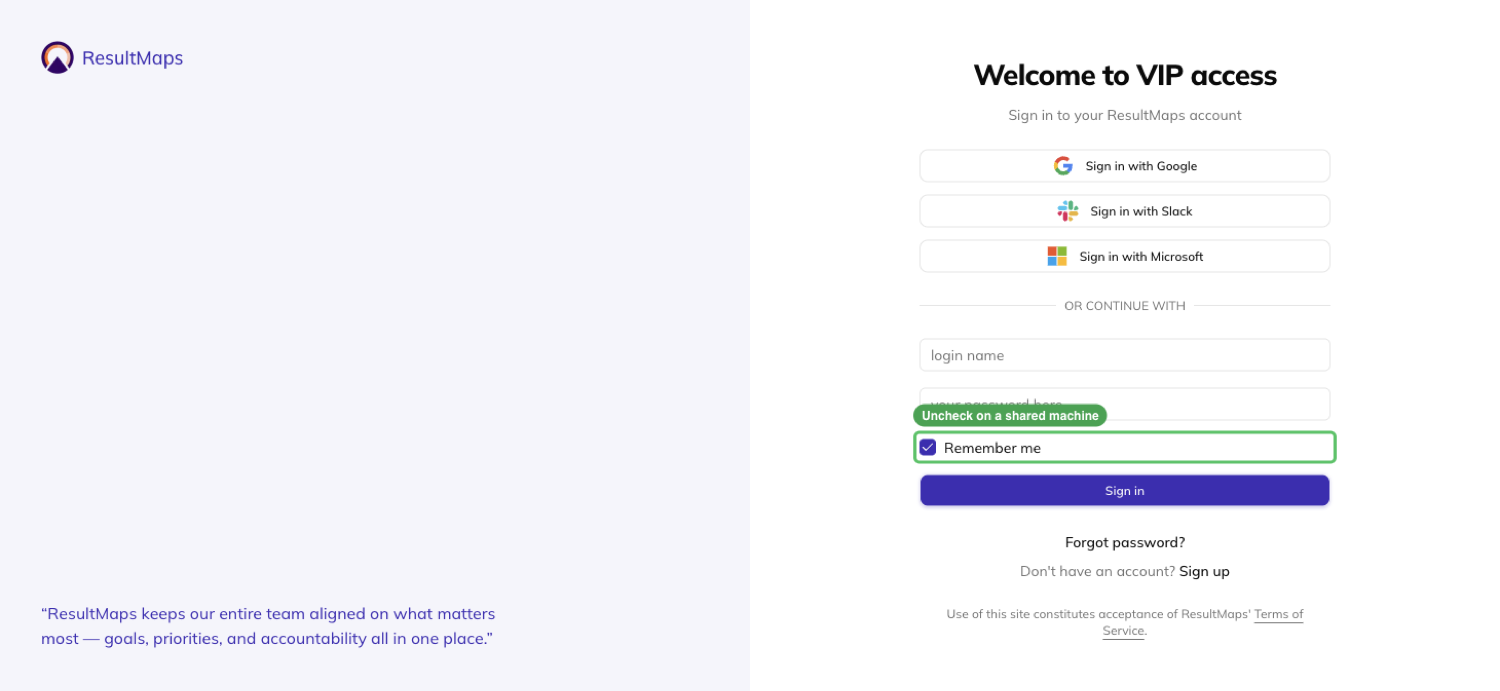
Uncheck it on a machine that isn't yours. The choice holds even if you finish signing in through a provider instead of typing a password.
Sign out
Open the account menu and choose Sign Out. It takes effect at once, with no confirmation to click through.
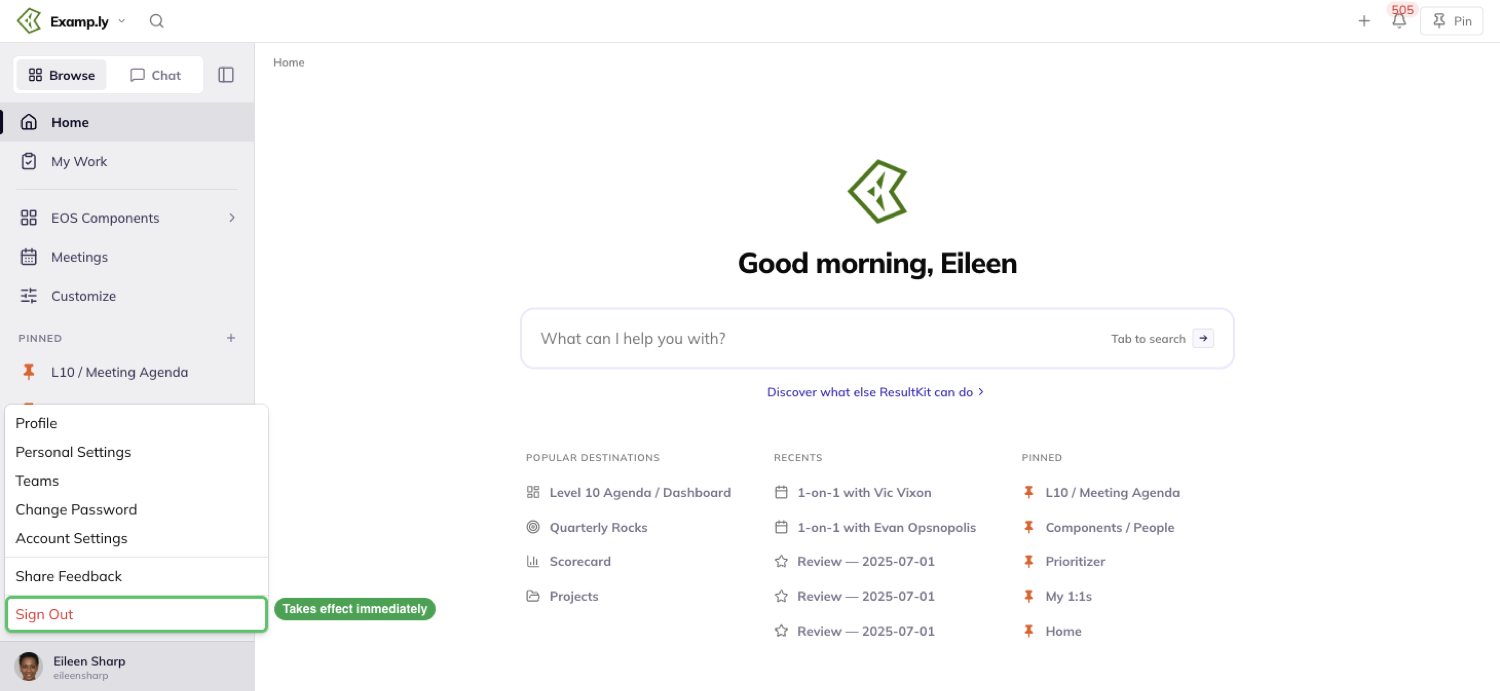
Signing out ends your session both in ResultKit and on the identity platform underneath it.
What "Remember me" and signing out actually clear
Signing out only affects the browser you did it in. Sign out on your laptop and your phone stays signed in — nothing asks it for a password.
It also clears what the next person at that machine could see. Nobody who signs in after you inherits your chat history — a conversation only ever belongs to the person who owns it.
Was this helpful?
Password Reset
Getting back into a locked-out account starts with one field. Type your login name or your email — whichever one you actually remember — and you'll see the same message every time, whether or not that account exists.
In this article
A 6-digit code lands in your inbox, and you use it once to set a new password.
This article walks the reset itself, then covers the one thing a team admin can do to help someone else back in.
Ask for a reset
From the sign-in screen, click Forgot password? to reach the Reset password screen.
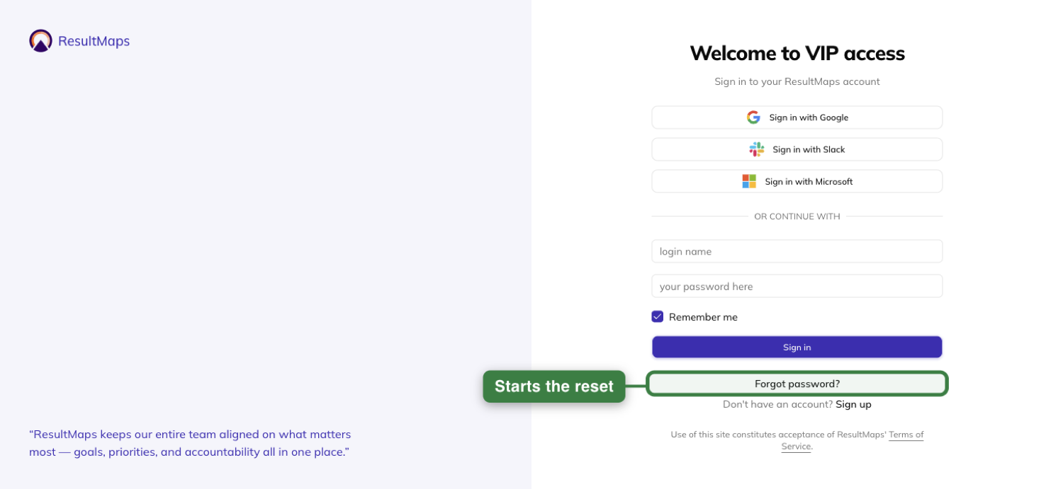
Type either your login name or your email into the one field. Press Enter or click Send code — both do the same thing.
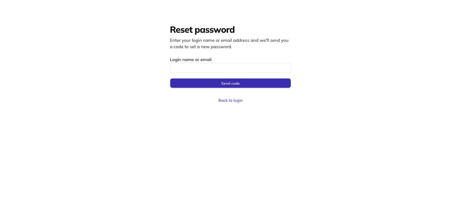
The message "If that account exists, we've sent a 6-digit code to its email address. Enter it below." appears at once, before anything is actually sent.
That message and the screen it sends you to next are identical whether or not the account is real. Nothing on screen ever says which.
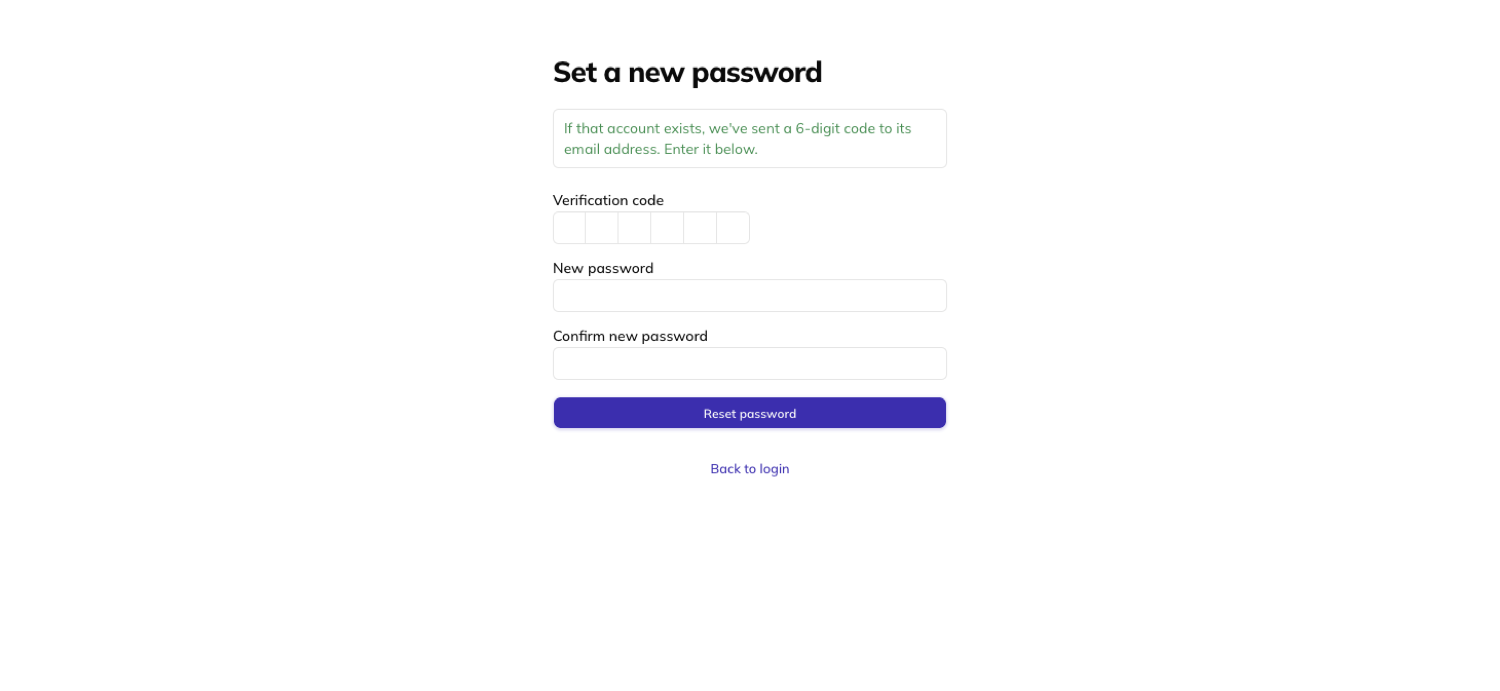
Enter the code and set a new password
You land on the Set a new password screen, with fields for Verification code, New password, and Confirm new password.
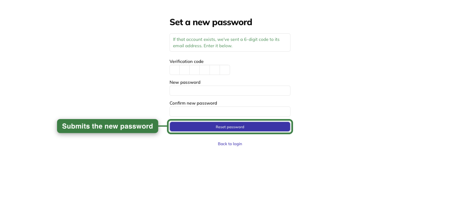
Enter the 6-digit code from the email, type your new password into both fields, and press Enter or click Reset password.
You land on the sign-in screen with the reset acknowledged. Sign in with either your login name or your email — whichever one you used to request the code, or the other one; both still work.
If the code doesn't work
A code that's wrong gets "That code isn't right." — you stay on the screen to try again.
A code you've already used once gets "That code has expired. Request a new one." A code is only good for one reset.
Your original password still works if a second attempt with the same code gets refused — the refusal changes nothing.
Submitting six requests in fifteen minutes gets a rate-limit message instead. Even that message says nothing about whether any account exists.
Sending a reset from the Members tab
If a teammate is stuck, a team admin can send them the same reset email without leaving the team's Members tab, using the Send password reset link control on their row.
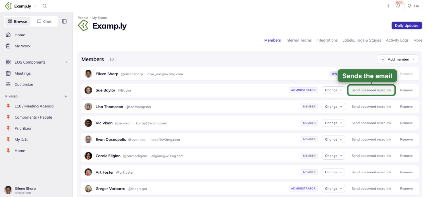
Using it shows "Password reset email sent to {email}." at once, and the row underneath — name, identity line, role chip, role and removal controls — stays exactly as it was.
The admin never sees or chooses a password. The email that goes out is the identical one the self-serve request sends.
Only someone who can manage the team sees Send password reset link — on any row, including their own. A plain member sees no reset control anywhere on the tab.
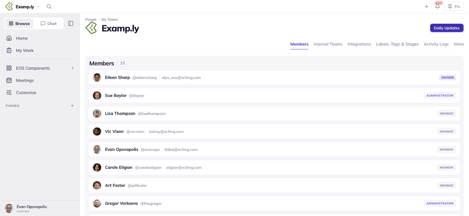
An account that never finished signing up recovers exactly the same way, through either route — nobody has to know or explain that it was never confirmed.
Was this helpful?
Rocks & Milestones
You want laser focus on what drives your company forward. It's easy to get lost in busy work that checks someone's boxes but doesn't get results. Busywork (work about work) dilutes and buries what should be driving growth. ResultKit makes it easy to find and keep your focus. You get context integrity across productivity tools built to help your brain and AI work together. Context flows through your business operating system and into any AI you use. Every project, issue, to-do and meeting action connects to the priority (Rock) it advances, so drift shows up instantly instead of hiding until it's too late. That means you, your AI and your team focus on the right things, follow through and get results.
In this article
- 1Open the team's Rocks board
- 2Set a Rock under the goal it advances
- 3Break the Rock into milestones
- 4Read the board week to week
- 5Flip a Rock On Track or Off Track
- 6See what the Rock ladders up to
- 7Report milestone progress in the weekly prep
- 8Close the quarter
- Who can own a Rock
- Where a child team's Rocks come from
Rocks are the few things your team must finish this quarter. Each one sits under the one-year goal it advances.
You set them on Traction and split each into milestones.
This article walks one quarter end to end — opening the board, setting Rocks, reading them weekly, and closing out.
Open the team's Rocks board
In the left sidebar, open EOS Components and choose Traction.
The page opens on the Rocks sub-tab. Its siblings are Personal Rocks and Meeting Pulse.
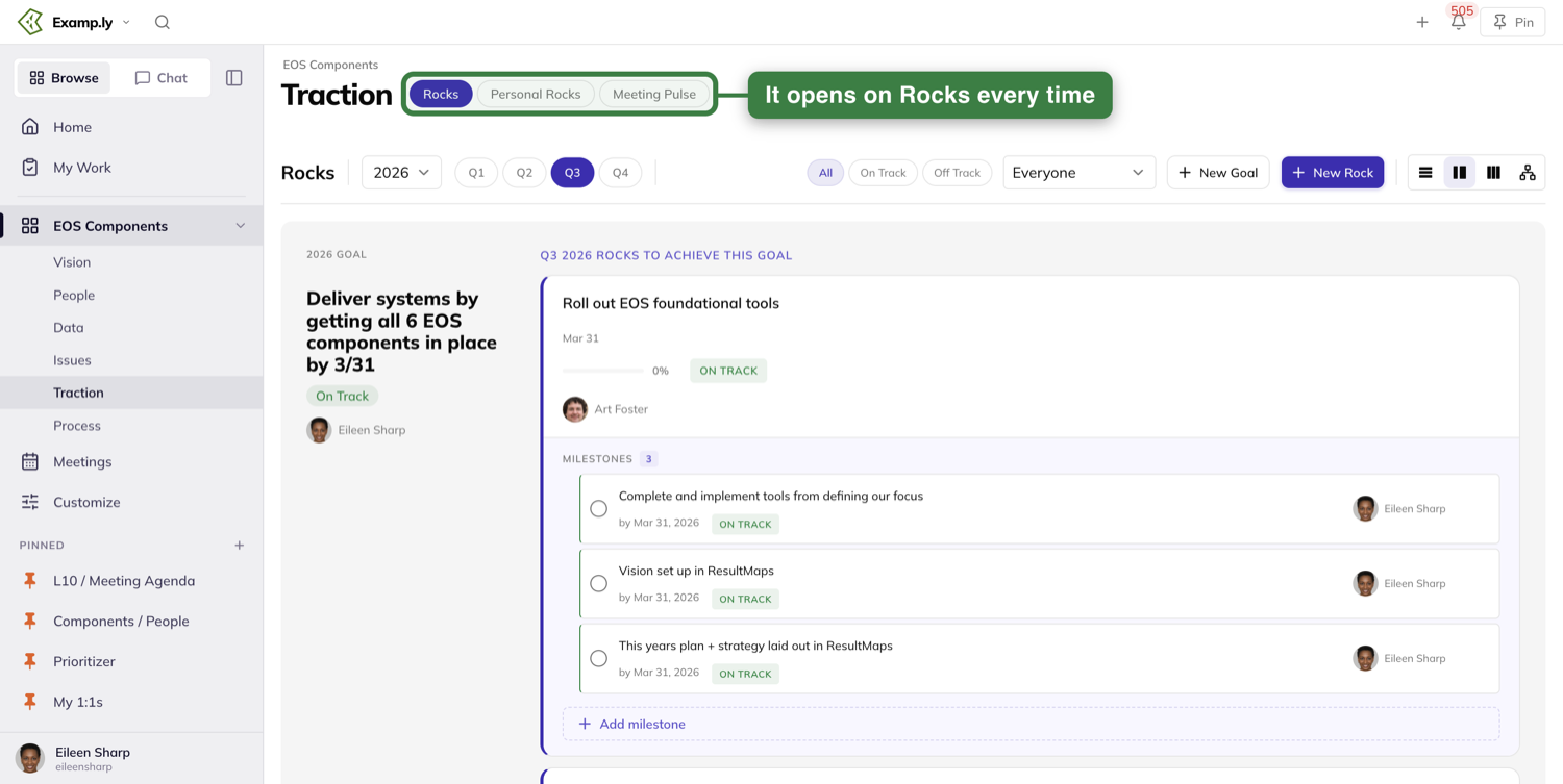
It opens there every visit. Traction never remembers which sub-tab you left on.
Personal Rocks are a separate thing with their own guide. Everything below is the team's board.
Set a Rock under the goal it advances
Press + New Rock in the toolbar. Every goal group also carries its own Add Rock button.
Starting from the goal's own button fills the goal in for you.
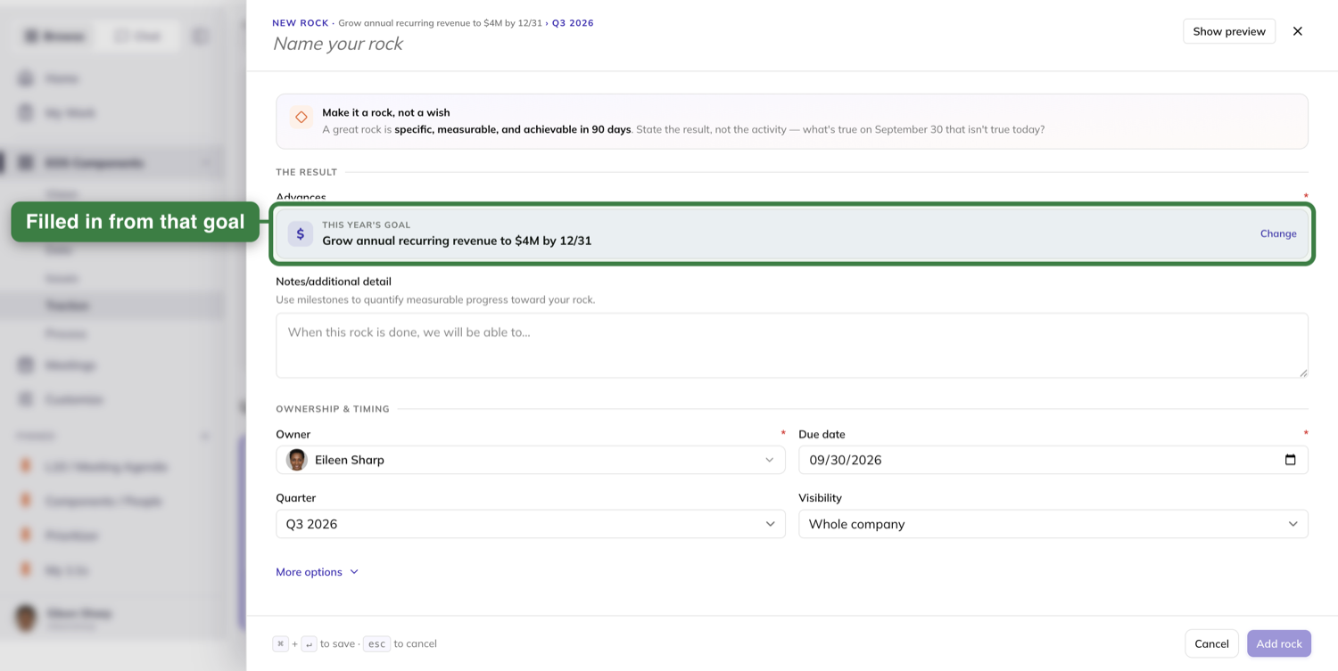
The drawer's title line is the name field. Its placeholder reads "Name your rock".
Below it, Advances names the Rock's one-year goal.
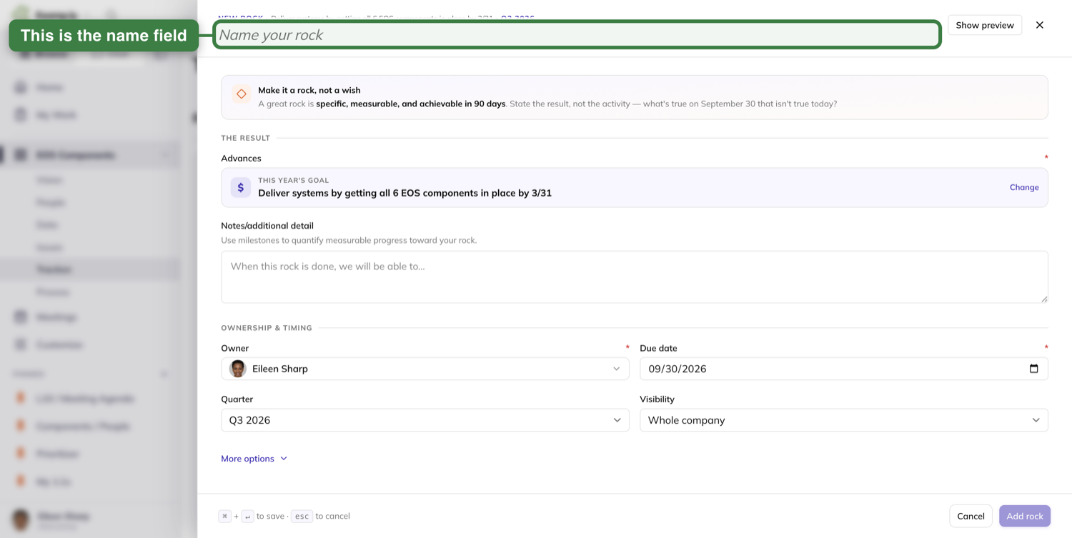
The tip card reads "Make it a rock, not a wish" and names this quarter's last day.
It always names the quarter containing today, even when you are viewing a different quarter.
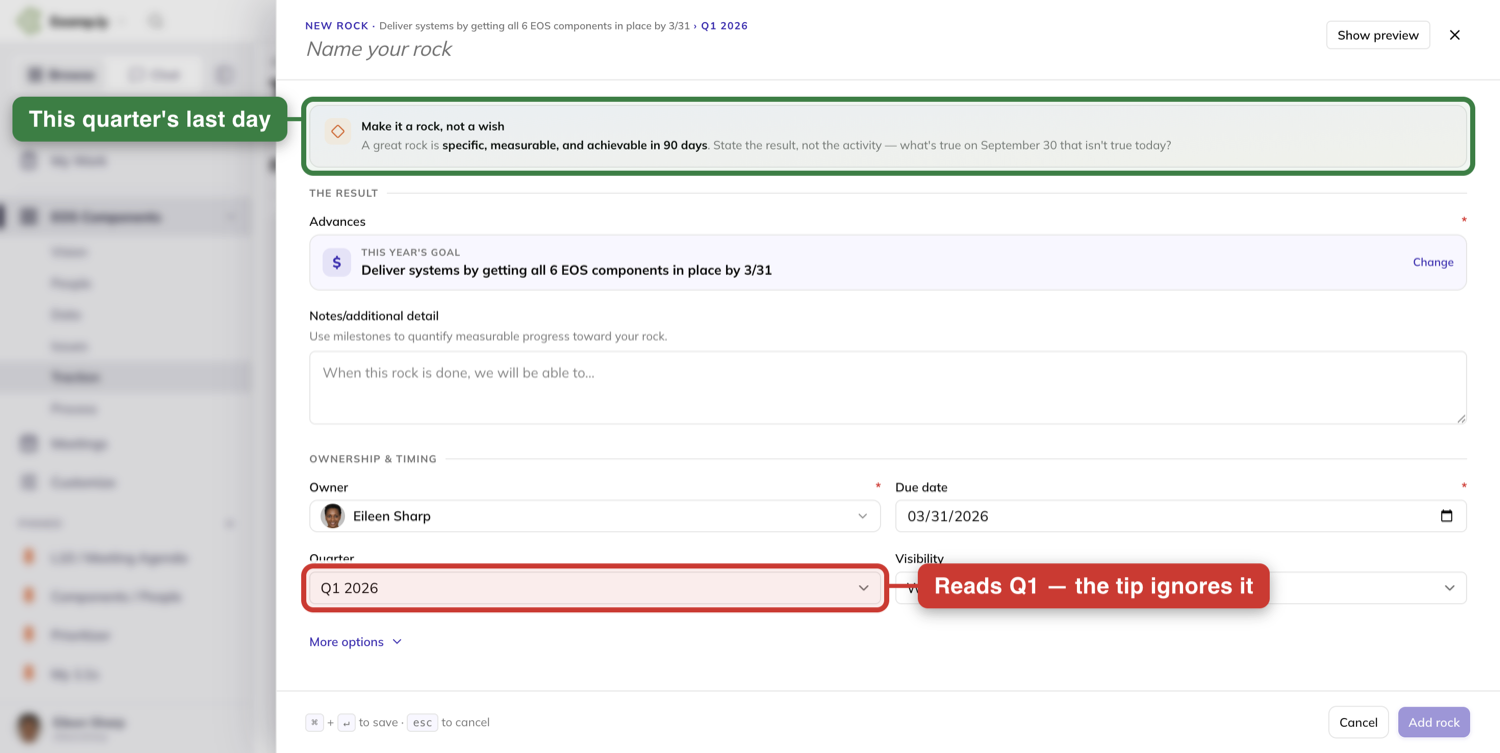
Press Add rock. The tile appears under its goal before the save finishes.
Break the Rock into milestones
Open the Rock from its tile and go to the Milestones tab.
Type the milestone's name and a target date, then press Add milestone.
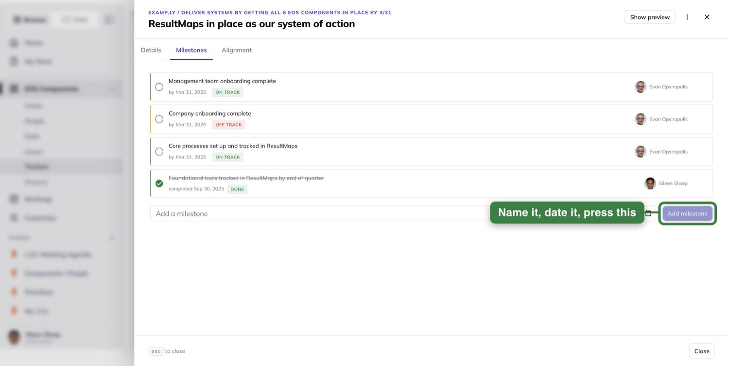
The row appears the instant you press it, and the save runs behind you.
Nothing pops up to confirm it. The milestone simply appears.
The board behind the sheet already carries it, with no refresh.
Read the board week to week
Each one-year goal heads its own group. The eyebrow above the name reads 2026 GOAL.
Between the goal and its Rocks sits the label Q3 2026 ROCKS TO ACHIEVE THIS GOAL.
Every Rock shows its name, its due date, a progress bar, a status badge and its owner.
Its milestones list beneath it. Done ones are checked and struck through.
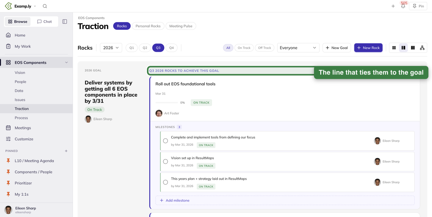
The All, On Track and Off Track pills narrow the board. The goal headers stay put either way.
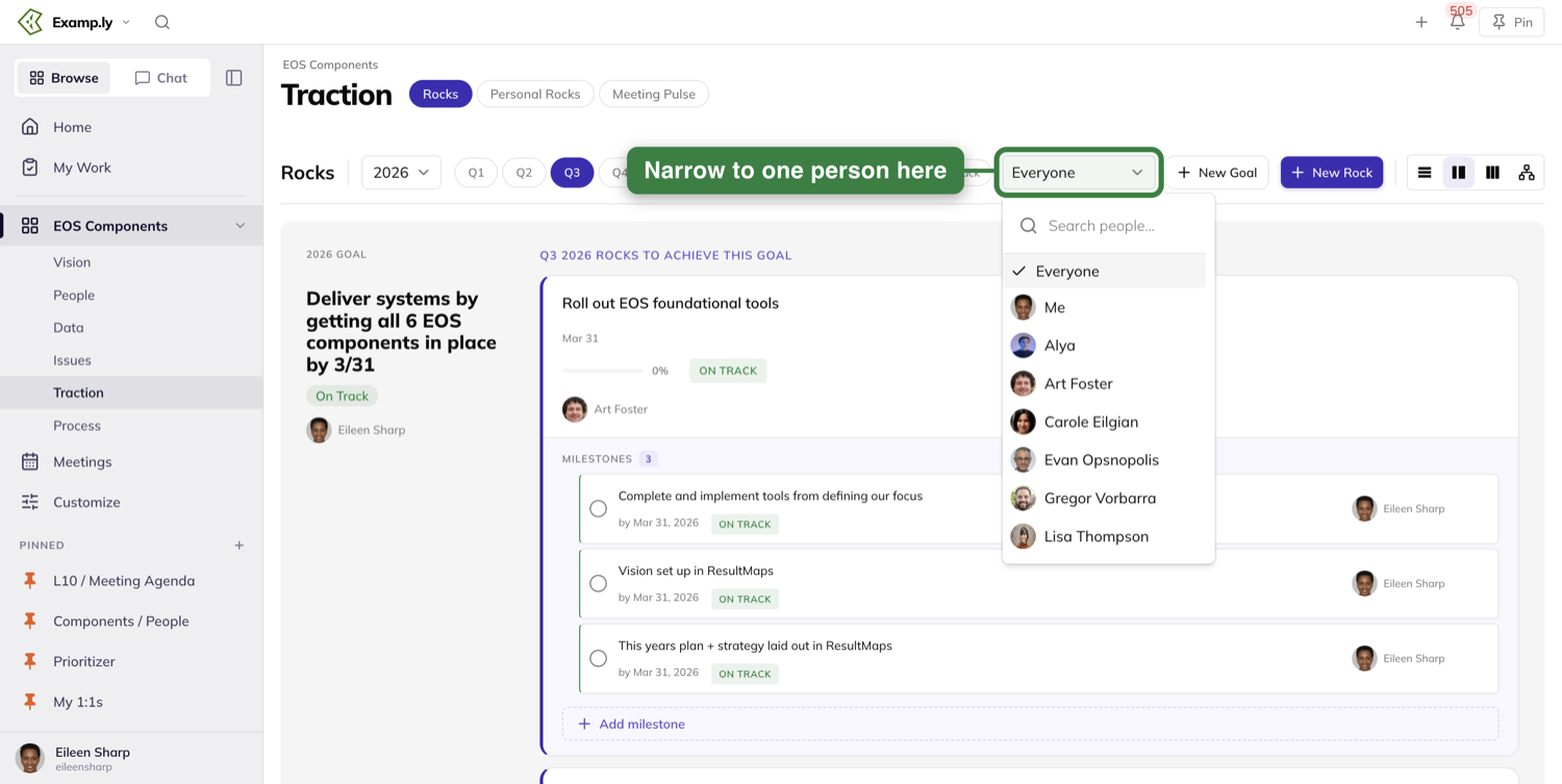
The people filter reads Everyone until you pick someone. It lists everyone on the team, with a Me row at the top.
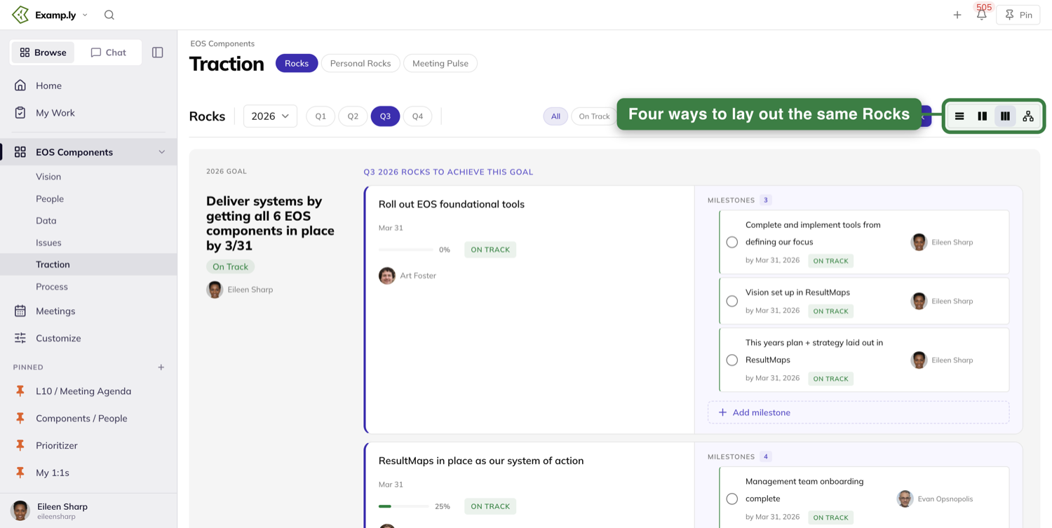
The switcher on the right re-lays the same Rocks four ways, Mindmap view included.
Flip a Rock On Track or Off Track
Click a Rock's status badge. Its tooltip reads "Click to flip status".
The badge flips at once and the save follows. No toast appears.
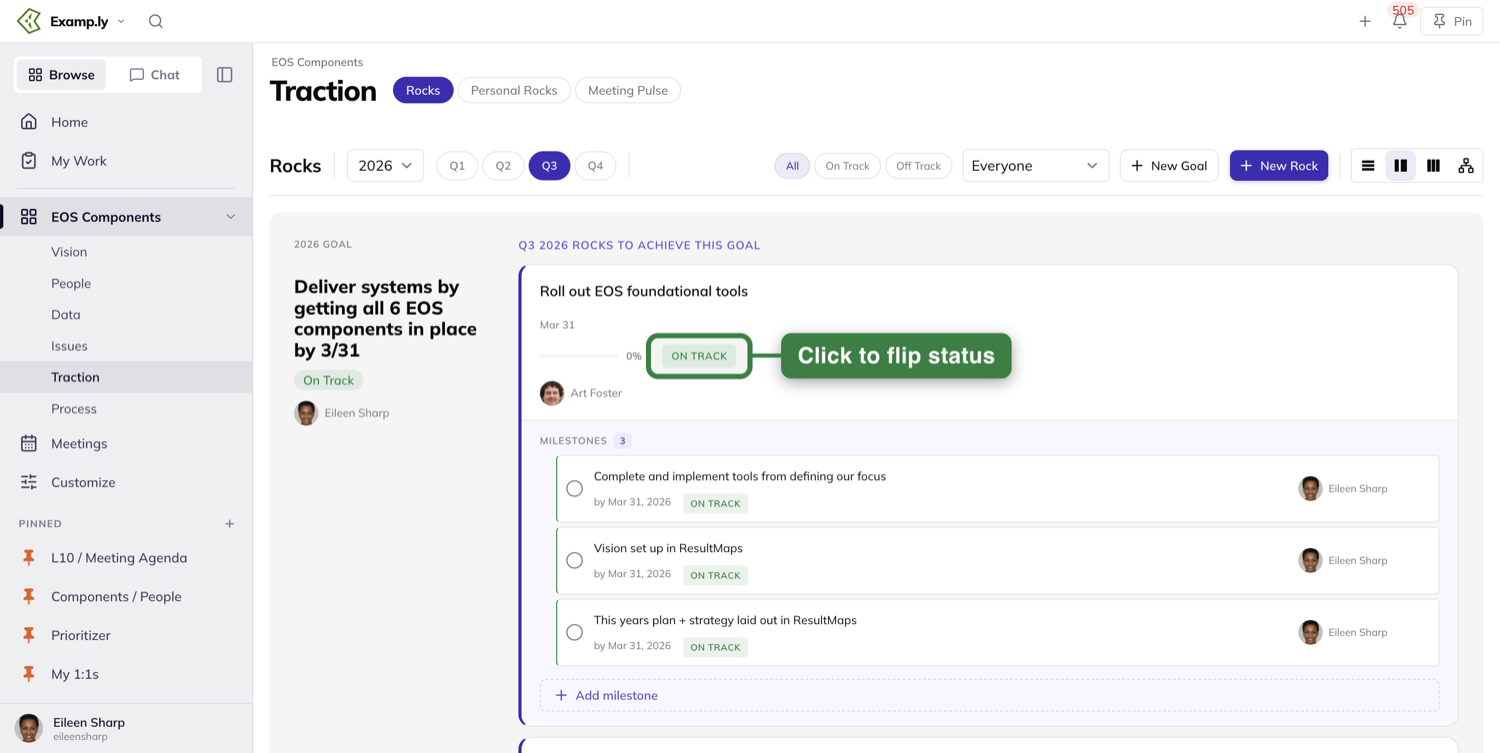
There are only two answers — On Track and Off Track, with no third state.
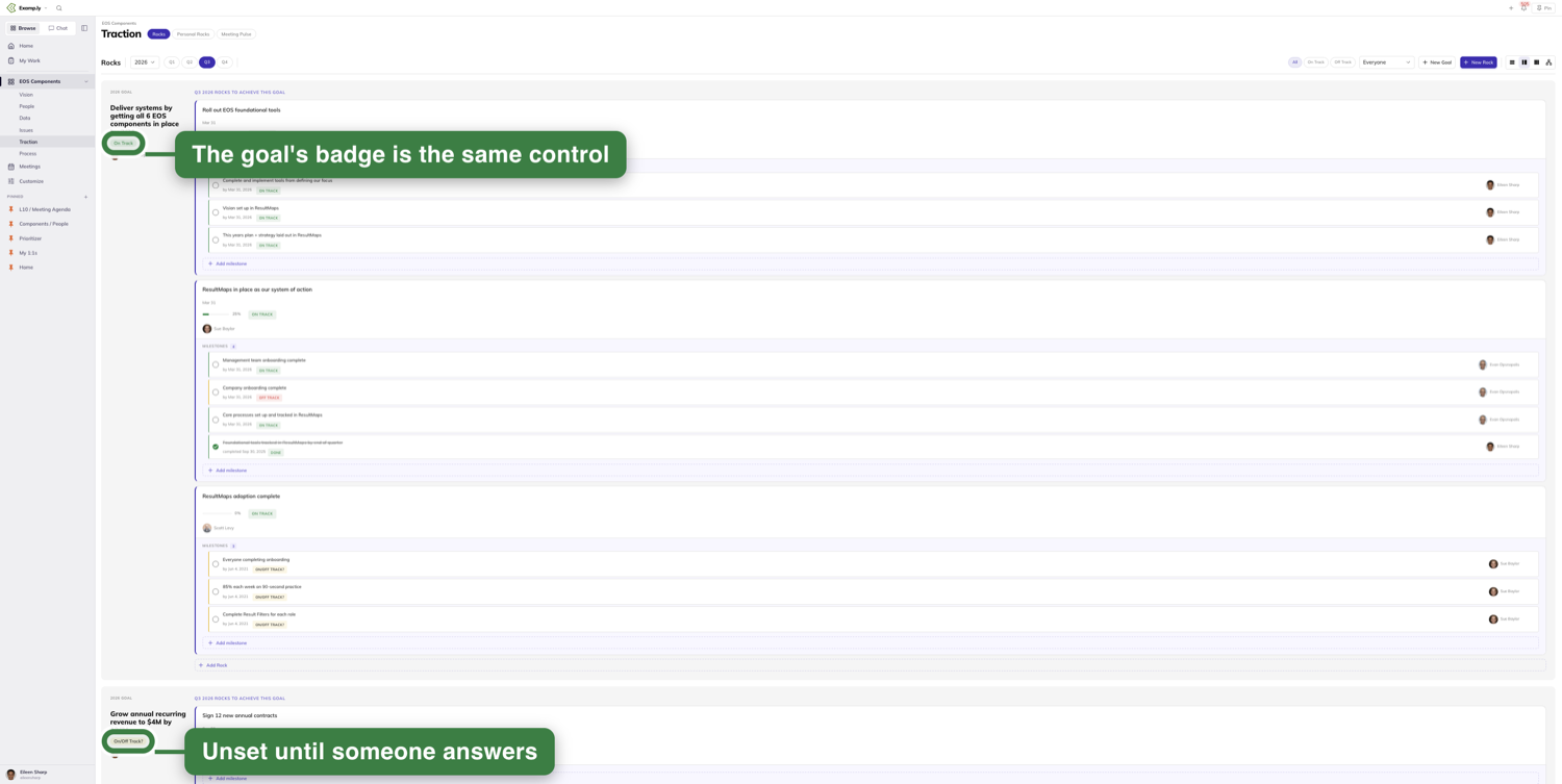
A Rock nobody has checked in on reads On/Off Track? until someone does.
Each one-year goal's badge is the same control. Clicking it sets the goal, exactly as a Rock's badge does.
The keyboard works too. Move focus to the badge and press Enter.
See what the Rock ladders up to
Open the Rock and choose its Alignment tab.
The tab draws the line. ADVANCES · 1-YEAR GOAL above, THIS ROCK — wearing a YOU ARE HERE pill — in the middle, its milestones below.
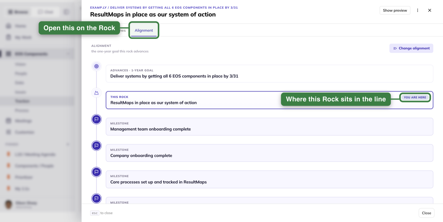
Nothing else is on it — no project, no measurable, no list of surfaces.
To re-point the Rock, press Change alignment. The picker offers the team's one-year goals and nothing else.
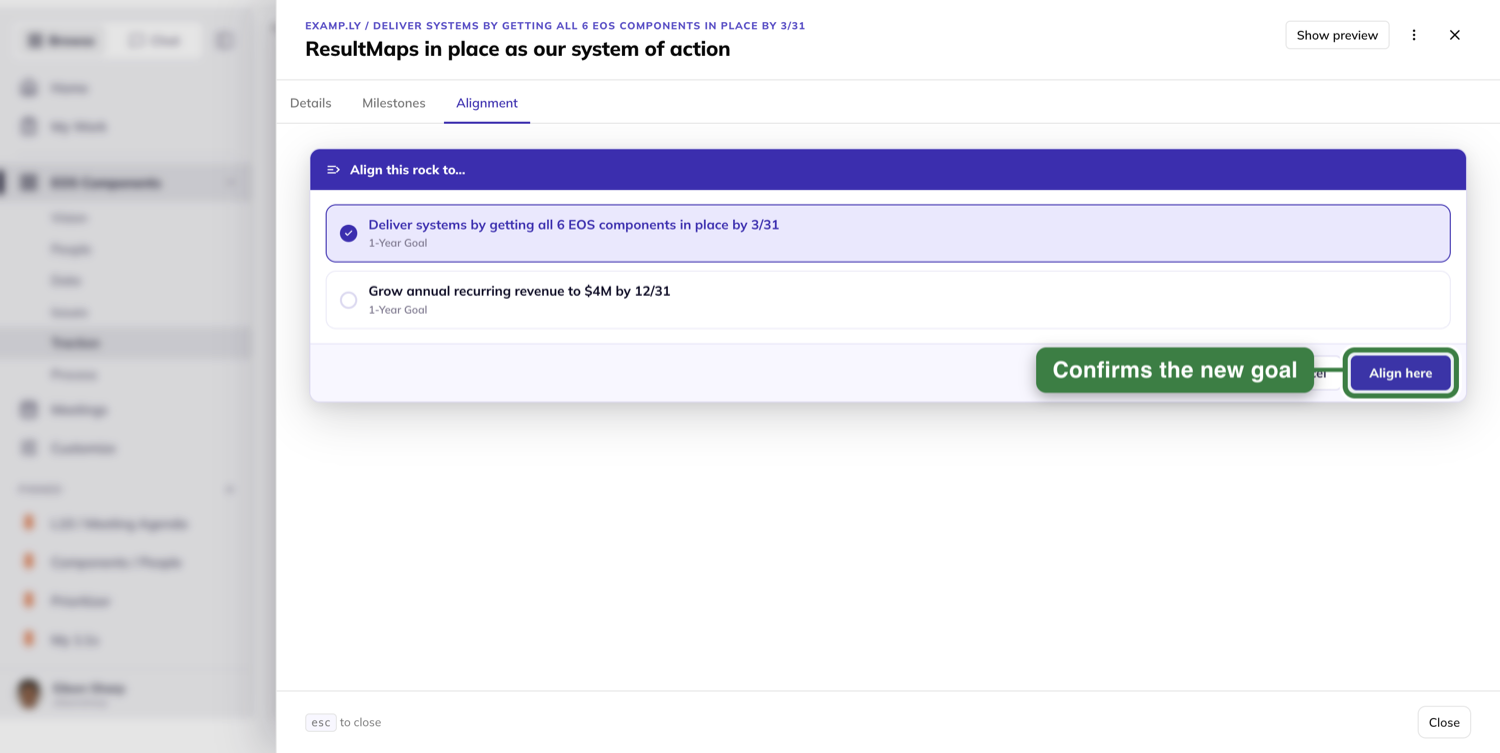
Pick one and confirm. The Rock moves under its new goal on the board behind you, with no refresh.
The tab behaves the same way when you open the Rock from the Level 10.
Report milestone progress in the weekly prep
Each week, the Milestones section of your 3-Step Prep lists the milestones you own.
Each sits under its Rock and the year goal above it, and reads Milestone · due end of quarter.
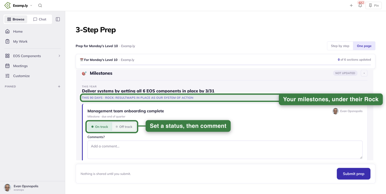
Set a status and leave a comment.
A #hashtag in that comment creates a linked action tied to the milestone, due end of week.
Own no milestone this week? The section shows an empty state and you move on.
Submitting carries what you entered into the Level 10's Rock review.
Close the quarter
Open the Quarterly and its Review Prior Quarterly Rocks section.
A Rock reads differently here. Its badge is REALIZED / ACHIEVED or NOT (YET) ACHIEVED.
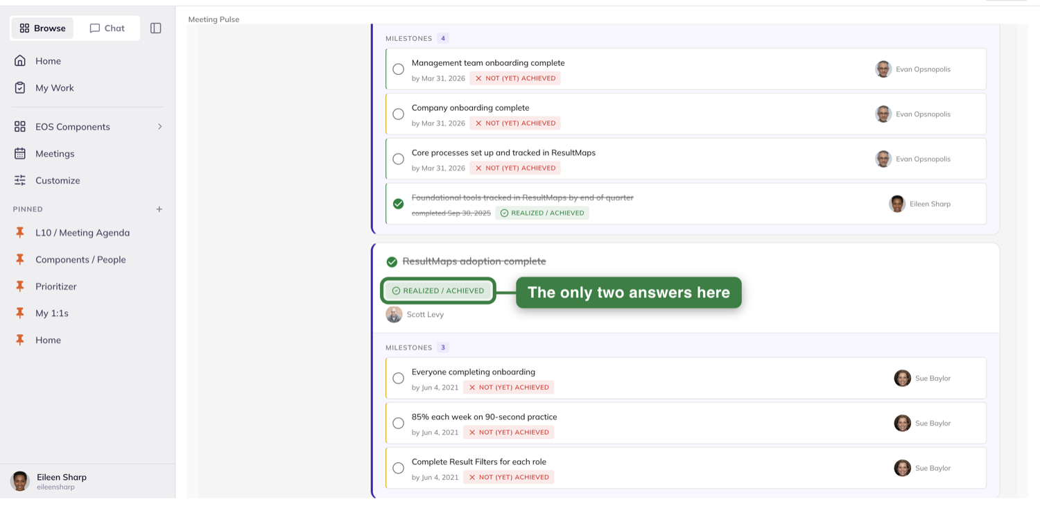
A realized Rock is checked and struck through. A Rock's badge here never reads On Track or Off Track.
With edit rights you set either state in the moment. Without them you can read it but not change it.
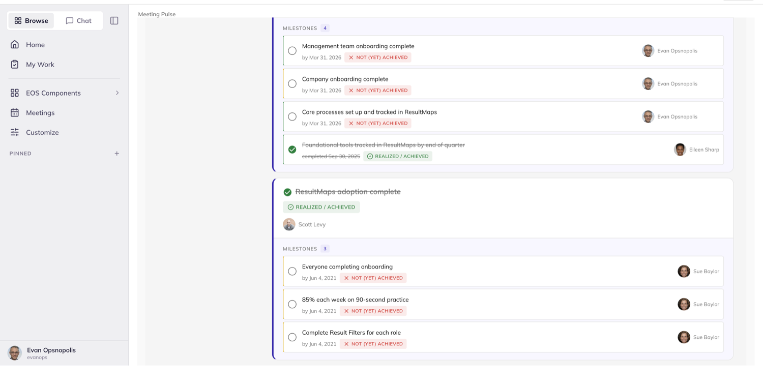
Every Rock still unfinished offers a Carry forward checkbox. A realized Rock is shown as done and offers none.
Select the ones still worth pursuing and confirm — the button counts your pick, reading Carry 2 Rocks into Q3 2026.
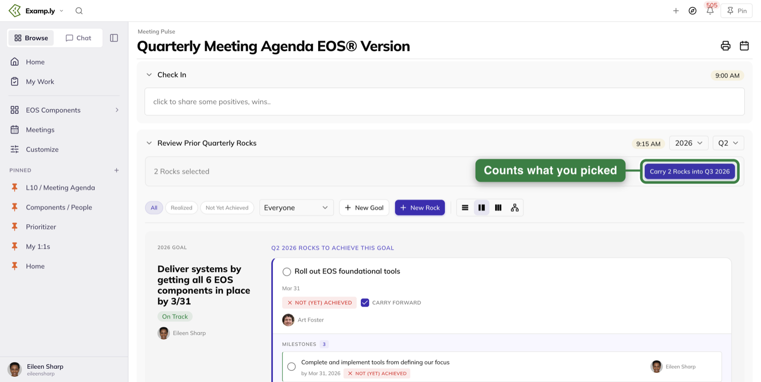
Each carried Rock is copied into the next quarter under the same owner. The originals stay in the closed quarter.
Who can own a Rock
The owner picker offers everyone in the organization, not only the team you are on.
Someone on a sub-team can own a Rock on the root team's board.
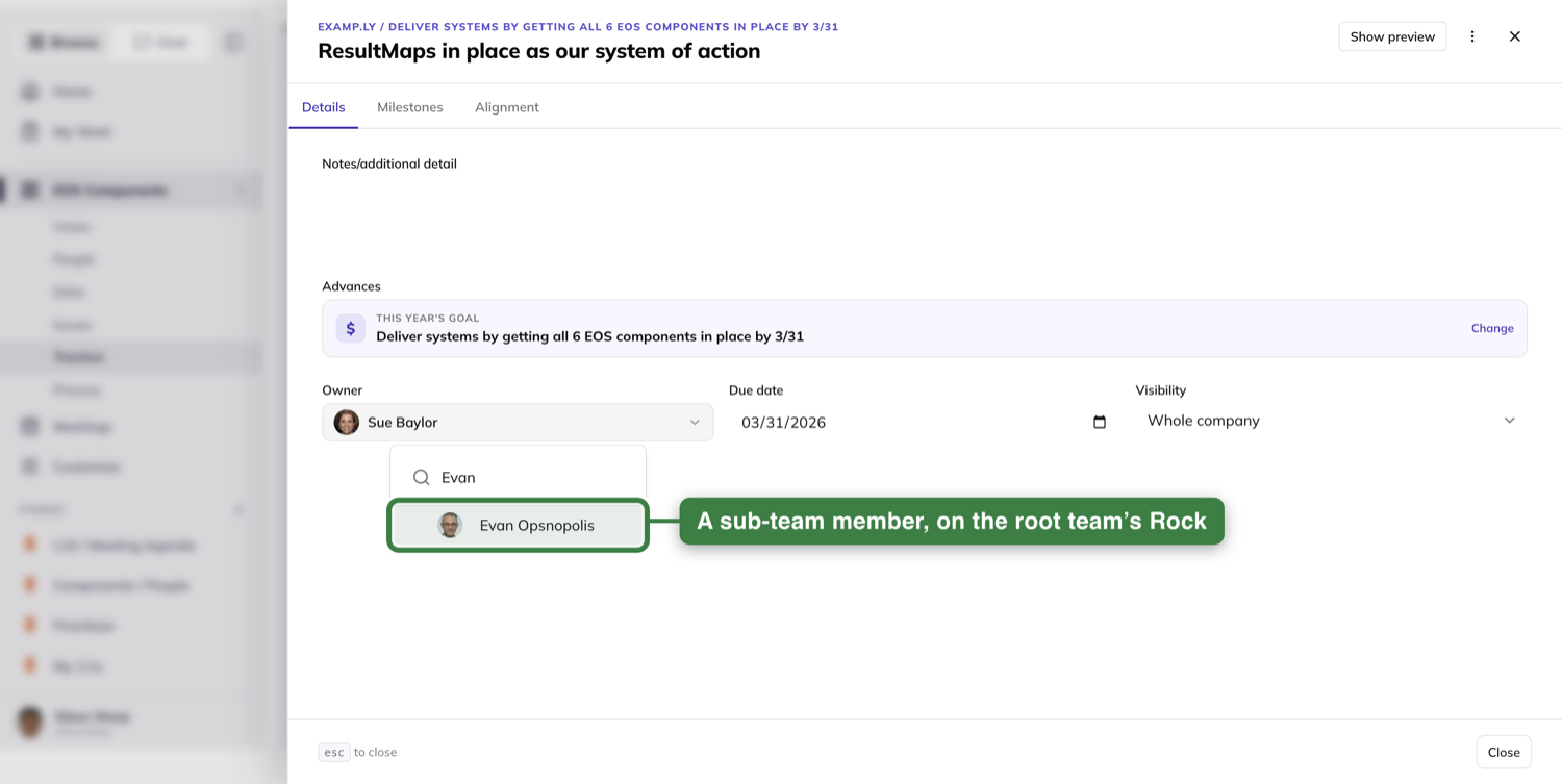
One-year goals work the same way.
Where a child team's Rocks come from
The root team's Framework card carries the row Enable cascading Rocks + Goals. You reach it on the team's More tab.
Switch it on and the root team's Rocks and goals cascade down.
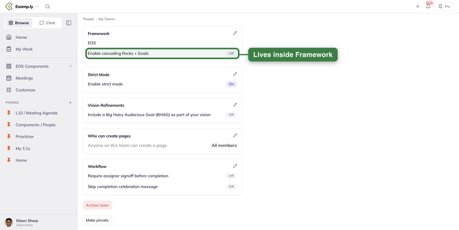
A child team that is not cascading gets an Inheritance card instead, carrying Inherit rocks from.
Point that at a parent team and this team reads the parent's Rocks.
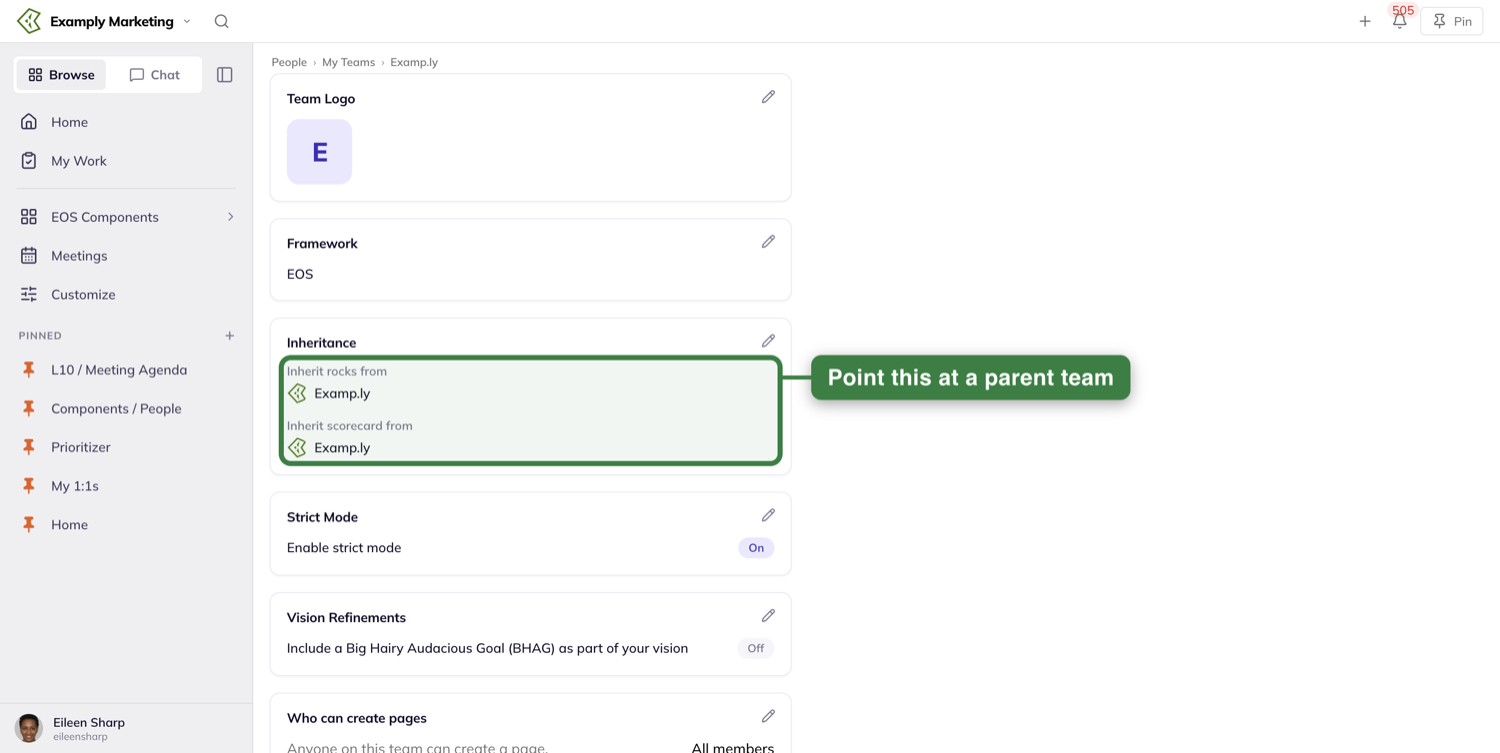
The two never appear together. A child team has no cascading row, and a cascading team has no Inheritance card.
Each card saves on its own Save. Changing a control writes nothing until you press it.
Was this helpful?
Personal Rocks
A personal rock is a rock you set for yourself. It works the same way a company rock does — one quarter, one clear result — but it never lands on the team's board unless you put it there. The certification you're chasing, the habit you keep meaning to protect, the reading you never get to: those are personal rocks.
In this article
Every personal rock starts private. Nobody sees it but you, and it stays that way until you decide otherwise — rock by rock, either your team or one particular person. That's the whole point of keeping them separate from the company board: you get to work on something in the open with your manager without putting it in front of everyone, or keep it entirely to yourself.
In this article we'll set one up, keep it honest week to week, find it again alongside the team's rocks, choose who can see it, and see what a teammate sees of yours.
Open your Rocks tab
Personal rocks live in your Personal Planner, on the Rocks tab — it sits between Quadrants and Sequencer.
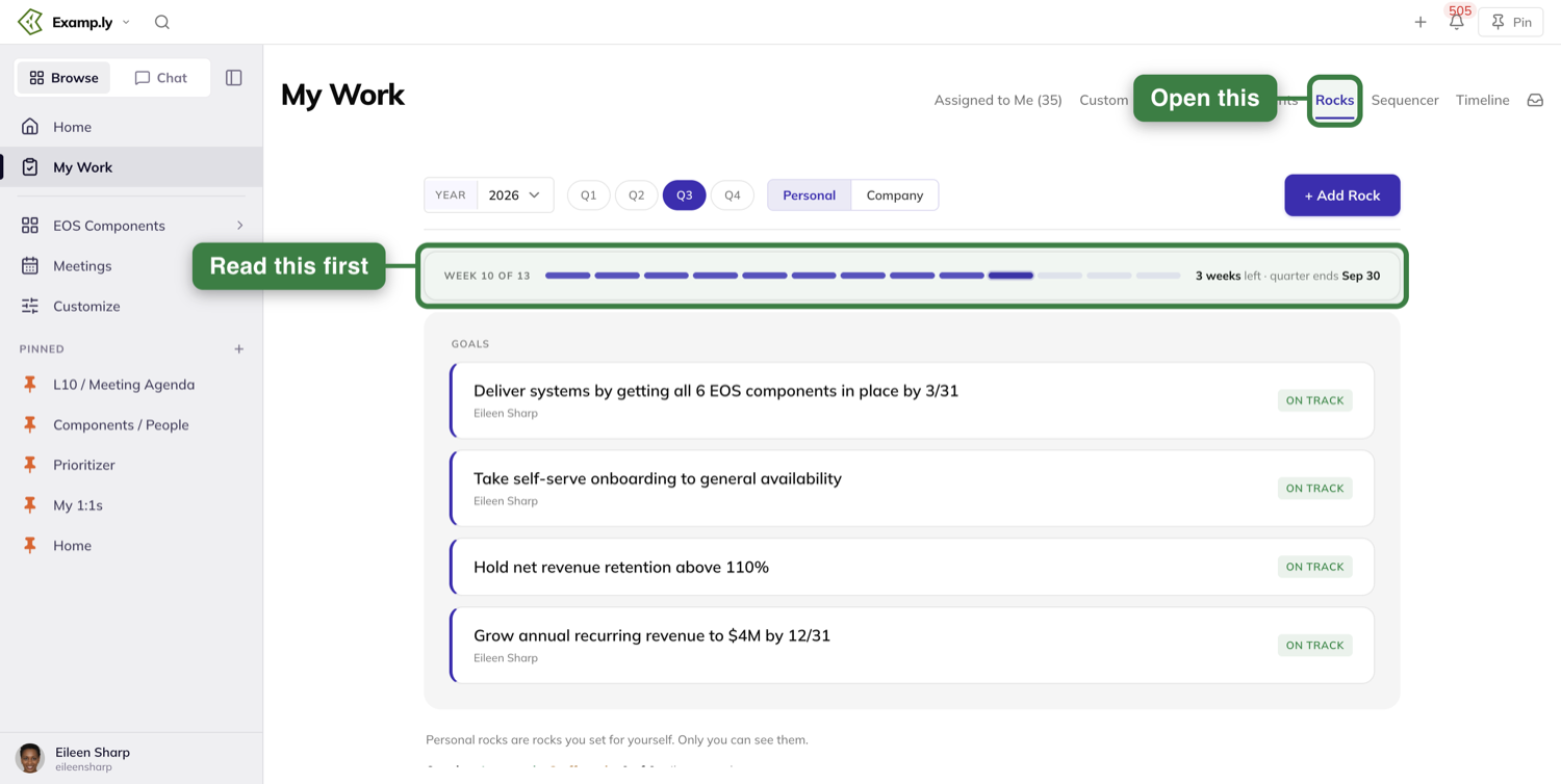
The tab opens on Personal, with a Personal | Company toggle sitting just after the quarter pills. Personal is the rocks you set for yourself; Company is the team rocks you happen to own, grouped by the team each one belongs to.
The strip below the toolbar is the one thing worth reading before you write anything down. It counts the quarter in weeks — WEEK 8 OF 13, "5 weeks left · quarter ends Sep 30" — which is a useful reality check when you're about to promise yourself something.
Set the rock
Press + Add Rock. The drawer opens headed NEW PERSONAL ROCK with the quarter beside it, so you always know which quarter you're writing into.
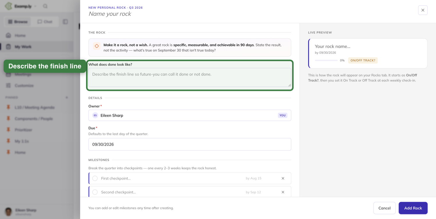
The callout at the top is doing real work: "Make it a rock, not a wish. A great rock is specific, measurable, and achievable in 90 days. State the result, not the activity — what's true on September 30 that isn't true today?" If you can't answer that last question about the thing you're typing, you have an activity rather than a rock.
What does done look like? is where you settle it. The prompt asks you to "describe the finish line so future-you can call it done or not done", and future-you is the one who'll be grateful — the wording you choose here is what you'll be arguing with in week twelve.
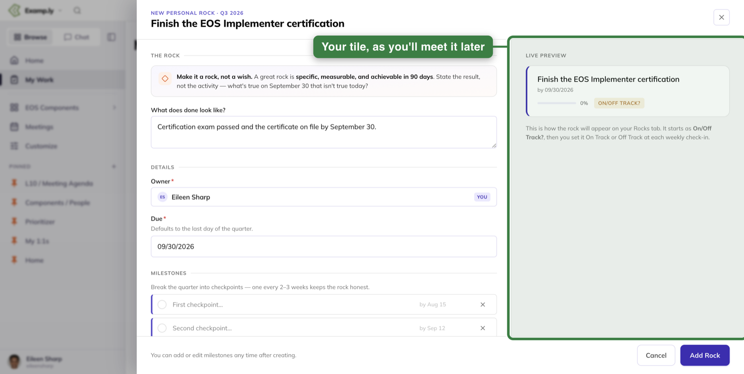
Owner is you and Due defaults to the last day of the quarter.
Below that, Milestones is optional — "Break the quarter into checkpoints — one every 2–3 weeks keeps the rock honest." Two blank checkpoint rows are waiting, each with its own due date already guessed at partway through the quarter. Name them or skip them; the note under the section says so plainly: "You can add or edit milestones any time after creating."
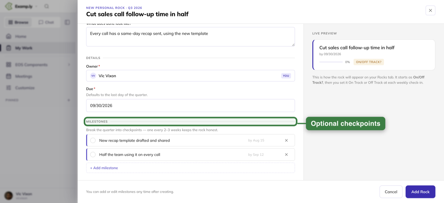
The panel on the right builds your tile as you type and tells you what happens next: the rock starts as On/Off Track?, and you set it On Track or Off Track at each weekly check-in.
Press Add Rock and it appears on the Personal side.
Answer the question every week
A new rock arrives wearing an amber ON/OFF TRACK? badge. That badge is a question, and answering it is the only upkeep a personal rock asks of you.
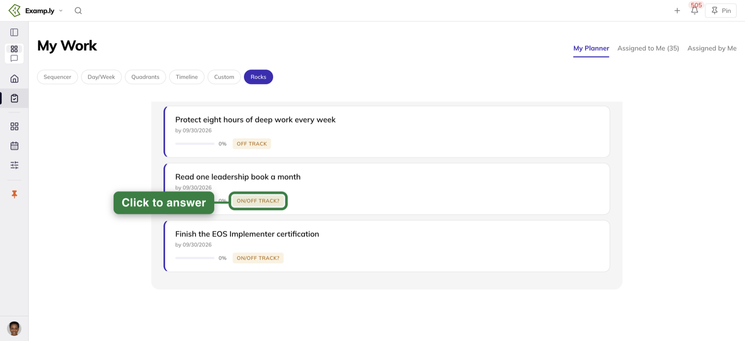
Click it and it reads ON TRACK. Click it again and it reads OFF TRACK. There is no third answer and no half-measure, which is the point — a rock you're privately unsure about is off track.
Off Track isn't a failure state. It's the flag that gets the rock talked about while there's still quarter left to do something about it.
Find it alongside the team's rocks
Your personal rocks also have a home on Traction, under the Personal Rocks tab — it sits beside Rocks and Meeting Pulse.
The heading says what you're looking at: "Rocks teammates have made visible to the team, plus rocks you assigned." Rocks are grouped by person, your own group first and tagged YOU, and each tile carries a line saying why you can see it — Your rock, on the ones you set.
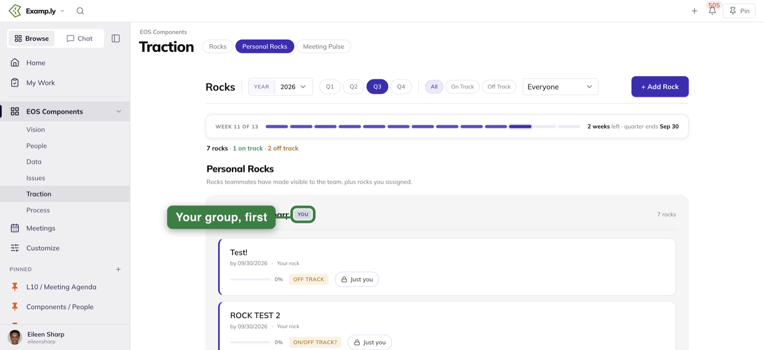
This tab is also where the status badge is at its most useful, because you're seeing your own rocks in the same view as everyone else's.
Decide who can see it
On Traction, next to the status badge sits a small chip that names, in plain words, who can currently see the rock. On a new rock it reads Just you.
Click the chip and the WHO CAN SEE THIS ROCK panel opens in place, offering three answers.
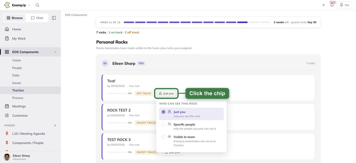
Just you is where every rock starts — "only you see this rock".
Specific people — "only the people you pick can see it" — opens a PEOPLE YOU PICKED list with an + Add person button and a search box over your teammates. This is the one to reach for when a rock is really between you and your manager.
Visible to team puts the rock in front of your teammates on Traction. Choosing it opens a TEAMS list with a search box, Entire organization at the top, and your teams beneath it.
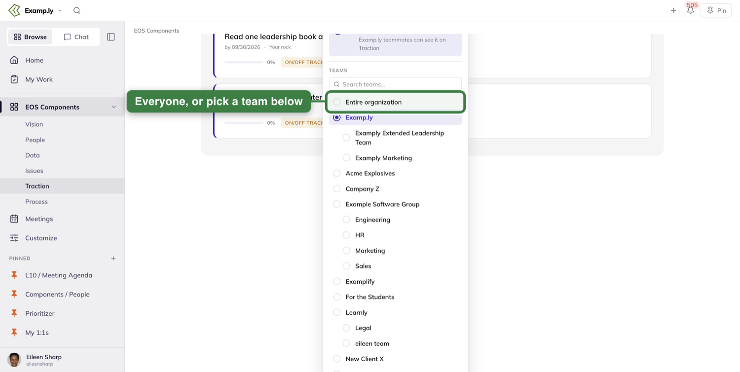
The chip updates the moment you choose, so the tile always tells the truth about itself.
What your teammates see — and what they don't
A rock you've shared shows up in a group under your name on their Personal Rocks tab, the same way theirs show up under yours.
They can read it. They cannot answer for it — the status badge on someone else's personal rock has no flip in it, so only you set your own status.
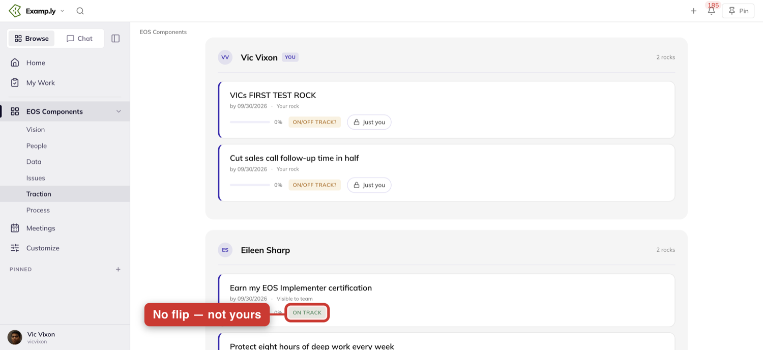
A rock left on Just you appears for nobody. Not your manager, not a team admin. If you've never touched the chip, nobody has ever seen that rock.
Where the Add Rock button behaves differently
The + Add Rock button on your Rocks tab always makes a personal rock, which is why the drawer never asks you to choose.
Open the same drawer from Traction and it gains a Scope field with Company and Personal — because that's a screen where you might reasonably mean either. If you ever end up with a rock on the wrong side, that field is the reason.
Was this helpful?
My Work
You want confidence that the most important things are moving forward with impact every day. At today's pace, it becomes impossible because data piles up fast in your brain and in your tools. When that happens, the loudest thing wins by default. An AI on its own doesn't know your business and your vision well enough to make the right call for you.
In this article
We fix that by giving you and your AI an easy way to build up and keep that context as you go. That means your vision, your goals, your business, what's happening this quarter, this week, and today, and what everyone is asking of you and what you're asking of them. Because ResultKit runs on EOS, EOS awareness is baked in. That awareness is baked into eight specific tools that help you and your AI prioritize and discern across your projects, work and personal, and keep track of what's happening in your business.
What that means is you've got confidence that you're seeing the right things at the right time, are able to take the right action, and solve problems before they've ever even come up.
My Work is your personal command center — for you and your AI chief of staff. Log, organize and track your priorities as you execute.
It is the one place in ResultKit that's yours alone. Nobody else on your team sees it, and nothing here asks who's allowed to look.
It holds one pile of work: what you put there yourself, what you own, and what's been handed to you from anywhere in ResultKit. Switching tabs never changes what's in that pile. It only changes how it's arranged.
Six ways to look at your work
On the Personal Planner tab, a row of buttons — Sequencer, Day/Week, Quadrants, Timeline, Custom and Rocks — shows the same pile, sorted a different way. You don't need all six — most people settle into one or two and leave the rest for when a specific job calls for them.
- Custom — file items under categories you invent yourself, and filter by label.
- Sequencer — put your work in one ordered line, top to bottom.
- Day/Week — see what's due today, this week, next week, and later.
- Quadrants — sort by how urgent something is against how important it is.
- Rocks — see your quarter's goals and their milestones.
- Timeline — lay your work out by when it's due, across ALL of your projects and work streams.
Beyond your own plan
- Inbox (Assigned to Me) — everything someone else has assigned to you.
- Outbox (Assigned by Me) — everything you have assigned to someone else.
- Team — what else is open on your team.
How you decide what to do
Your Personal Planner is the list you build for yourself, what you have decided to do. The Inbox, Timeline and the Compass dock are inputs to that decision: what other people have put on you, what is coming due, and what you can pull from your context. You read the inputs and pull what you commit to onto your Personal Planner.
The same wherever you are
A few things behave identically no matter which tab you're on.
Opening an item. Click any card and a panel opens over the page — nothing you type needs a Save button, it's already saved. See opening and editing, comments and steps, and where your work appears.
Labels. Color-coded, whether they're yours, your team's, or a project's. See creating and applying labels and sharing a label across teams.
Pulling work in from anywhere. One dock lets you drag work in from anywhere else in ResultKit and drop it straight onto your plan. See the Compass Dock.
Was this helpful?
Custom
The Custom view is your own board, on your own terms. You name the columns, and you decide which To-Do goes where — there's no fixed status list to fight with.
In this article
- 1Open the Custom view and see your labels
- 2Filter by clicking a label on a card
- 3Filter from the trigger instead
- 4Combine labels with ANY or ALL
- 5Clear the filter
- 6Add a To-Do into a column
- 7Adding while a filter is on
- 8Mark a To-Do done
- 9Hide or show finished work
- What the filter never touches
- Making your first label
Every card can carry labels. Click one, or open the filter at the top, and the board narrows to just that work. Checking something off happens the instant you click it, before the save even finishes.
This walkthrough covers filtering by label, adding a new To-Do while a filter is on, marking work done, and hiding finished work.
Open the Custom view and see your labels
Open My Work from the sidebar. On the Personal Planner tab, press Custom in the row of view buttons. Your columns show your own categories, with a Not categorized column on the left for anything you haven't sorted yet. Any labels on a card sit in a row of colored chips beneath it.
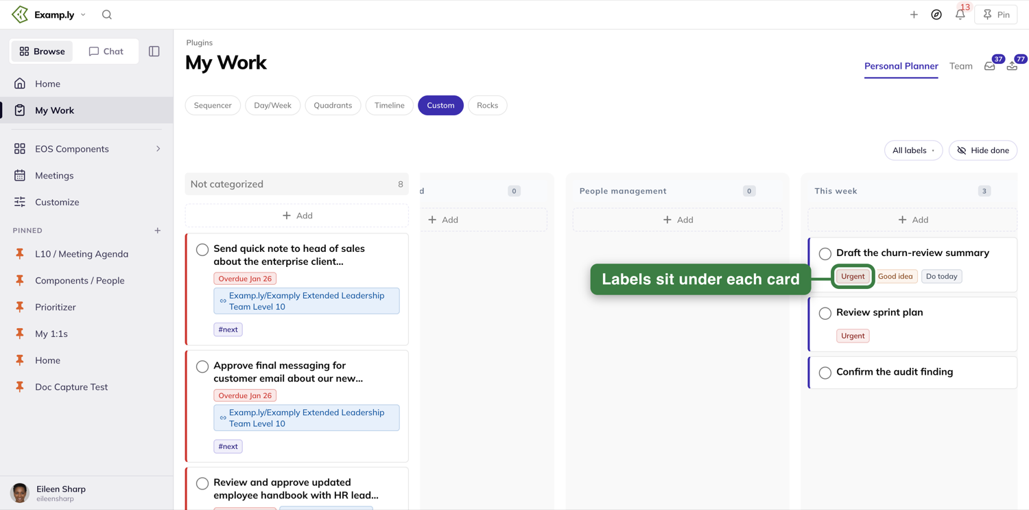
A card can carry more labels than fit. When it does, the extra ones collapse into a plain gray +1 chip.
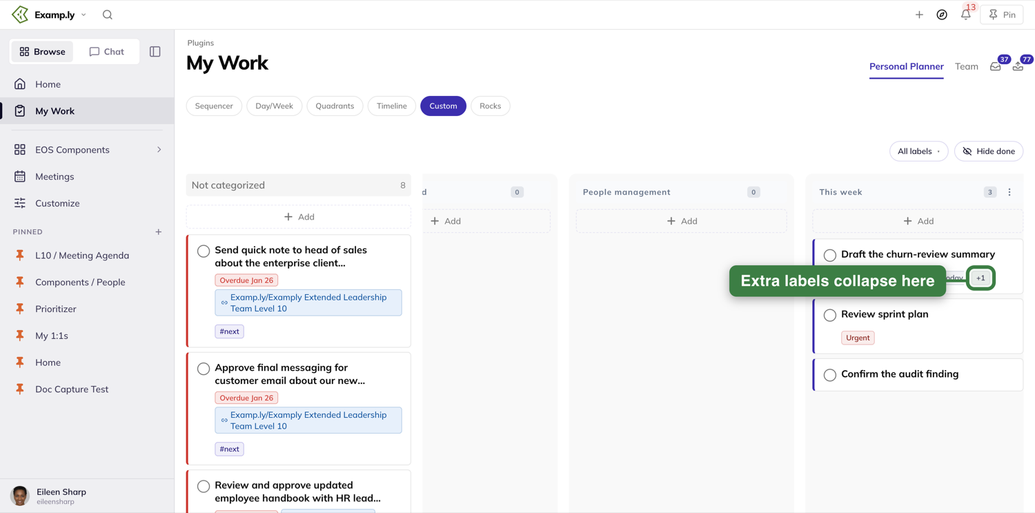
Filter by clicking a label on a card
Click any label chip on a card. That chip turns solid, and the board narrows to only the To-Dos wearing that label. Click the same chip again to bring everything back.
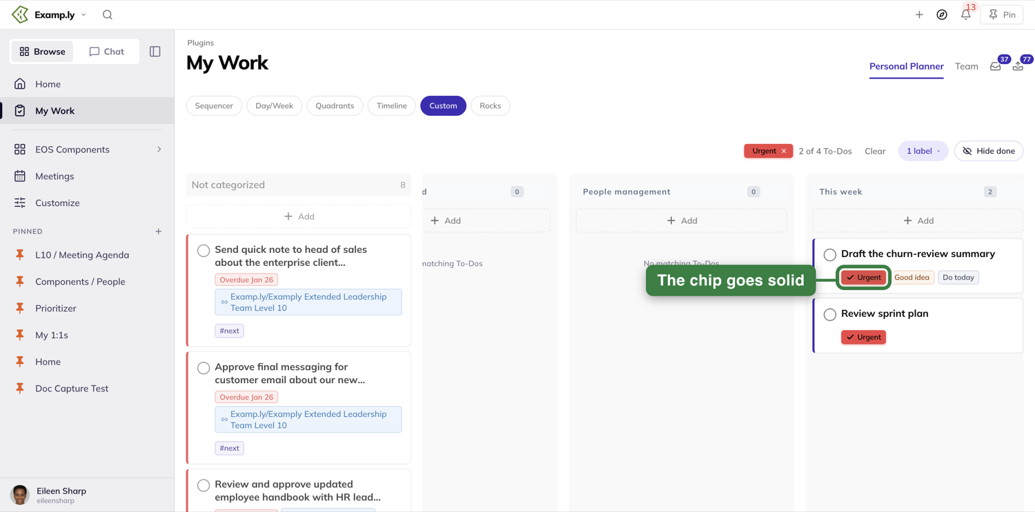
Filter from the trigger instead
You don't need a card in front of you to start a filter. Press All labels at the top right of the board.
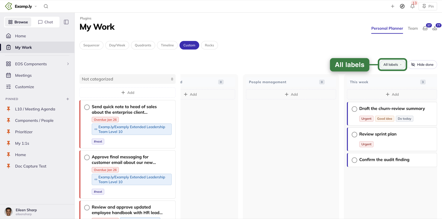
A popover lists each label with its color and how many To-Dos carry it, board-wide. Type to narrow the list, or click a label's row. The board updates as soon as you do — there's no separate step to apply it.
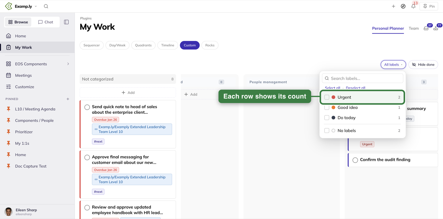
Combine labels with ANY or ALL
Pick a second label, and an ANY / ALL switch appears beside your selections. ANY shows work carrying either label; ALL narrows to only the To-Dos wearing both.
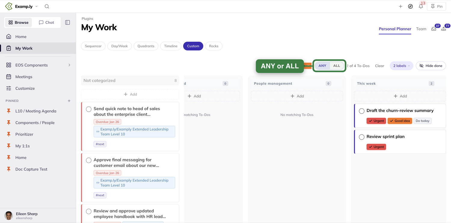
Clear the filter
A Clear button sits next to your selections any time a filter is on. Press it to bring every To-Do back at once.
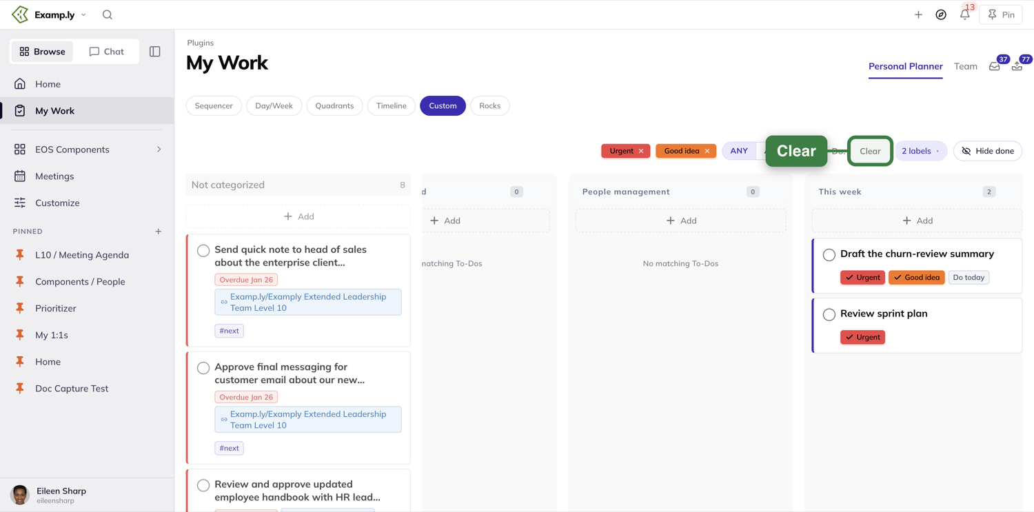
Add a To-Do into a column
Press Add at the top of any column.
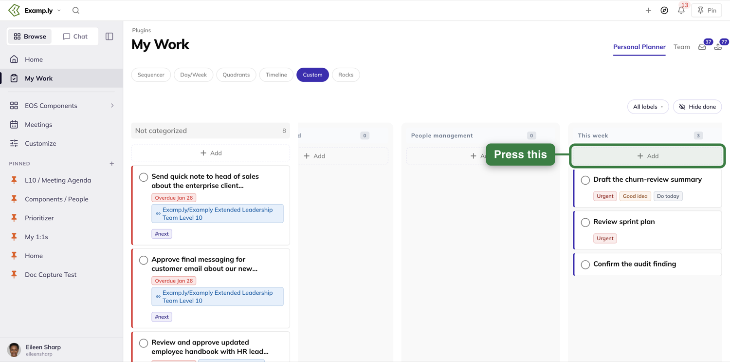
It opens the same Add window you'll see across the rest of the app, not a cramped inline box. Its Add to line is already set to the column you clicked — here, Personal Planner · This week.
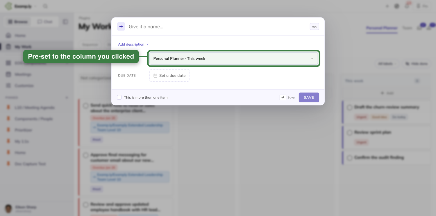
Type a name and press Enter or Save. The new To-Do appears in that column right away, before the save to the server has even finished.
Adding while a filter is on
If a label filter is active when you add a To-Do, the new one inherits every selected label automatically. You'll see them as removable chips in the window's Labels row before you save.
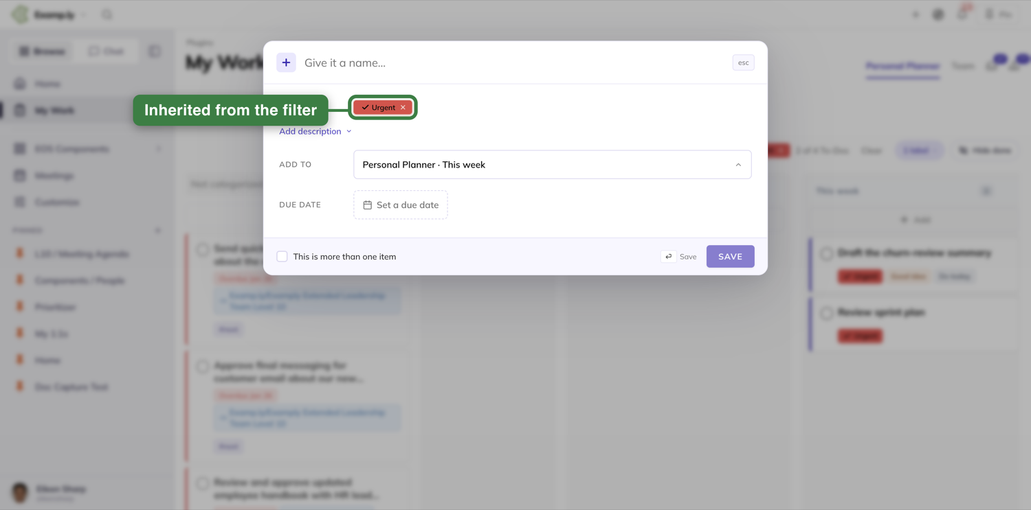
Don't want a label? Click its × to take it off before saving. The To-Do still saves — it just won't show up under the current filter. When that happens, the column shows a short amber notice so it's never a mystery why a card you just added isn't there.
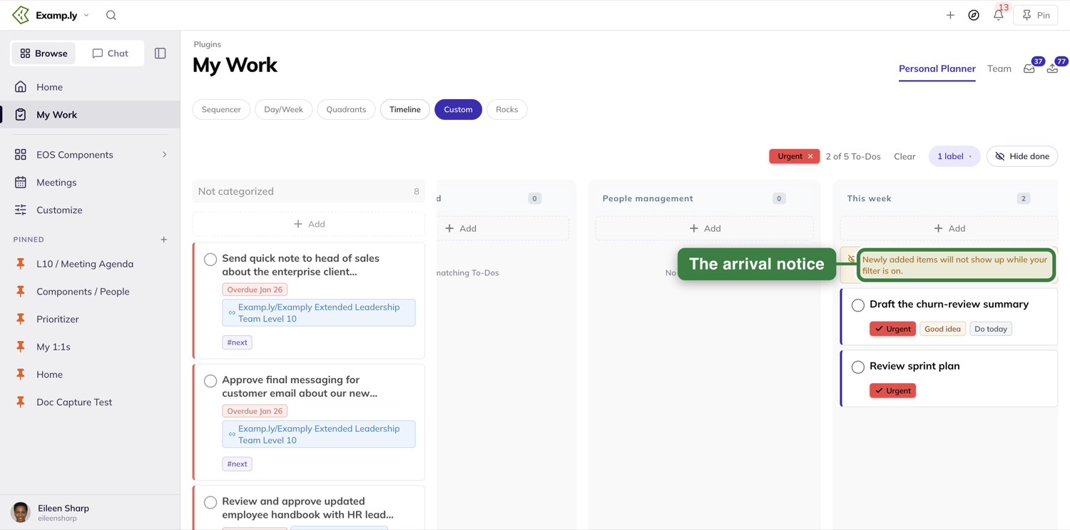
Mark a To-Do done
Click the circle on any card. It fills in and the name strikes through immediately, with a Done date under it. The save to the server happens after, in the background.
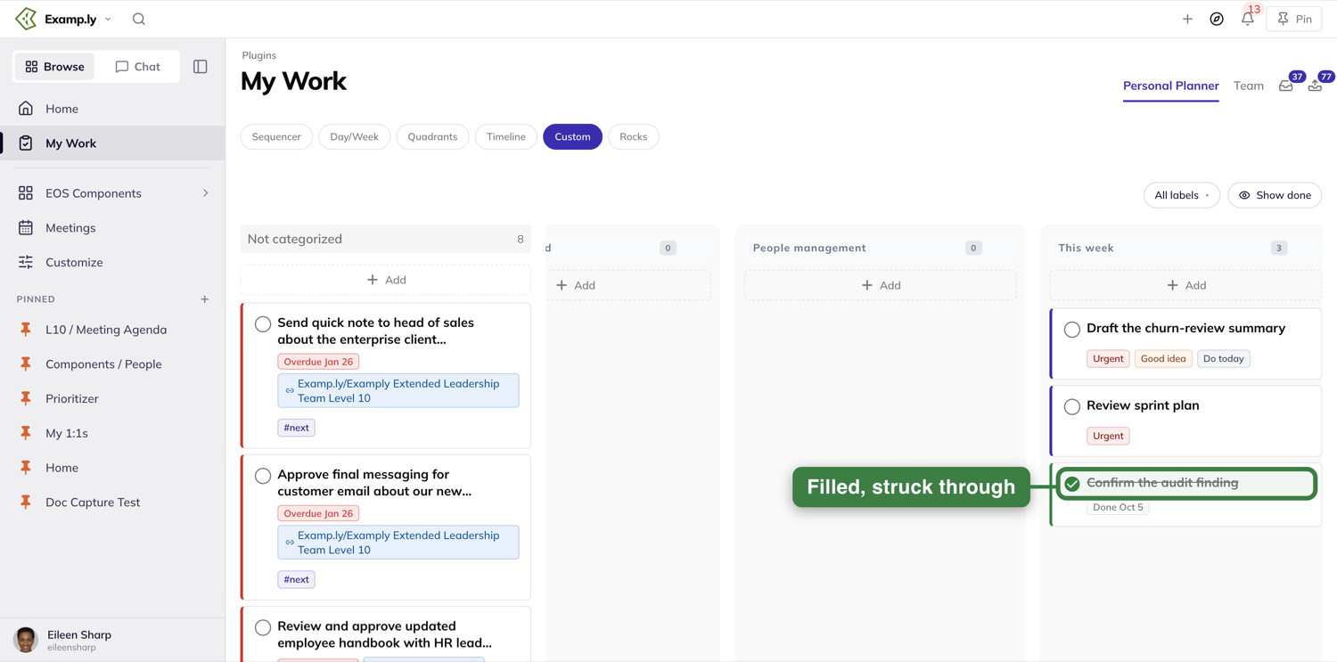
Cards in the Not categorized column respond the same way.
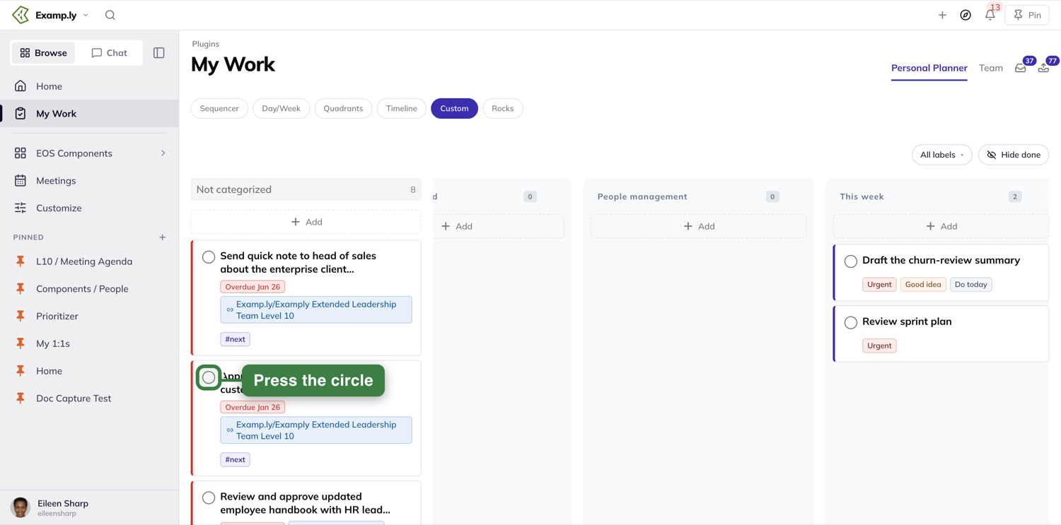
Hide or show finished work
The button beside All labels controls whether finished To-Dos stay on the board. It names the setting the board is in now: Hide done means finished cards are tucked away, and pressing it switches to Show done and brings them back, struck through, in their columns. Press it again to tuck them away.
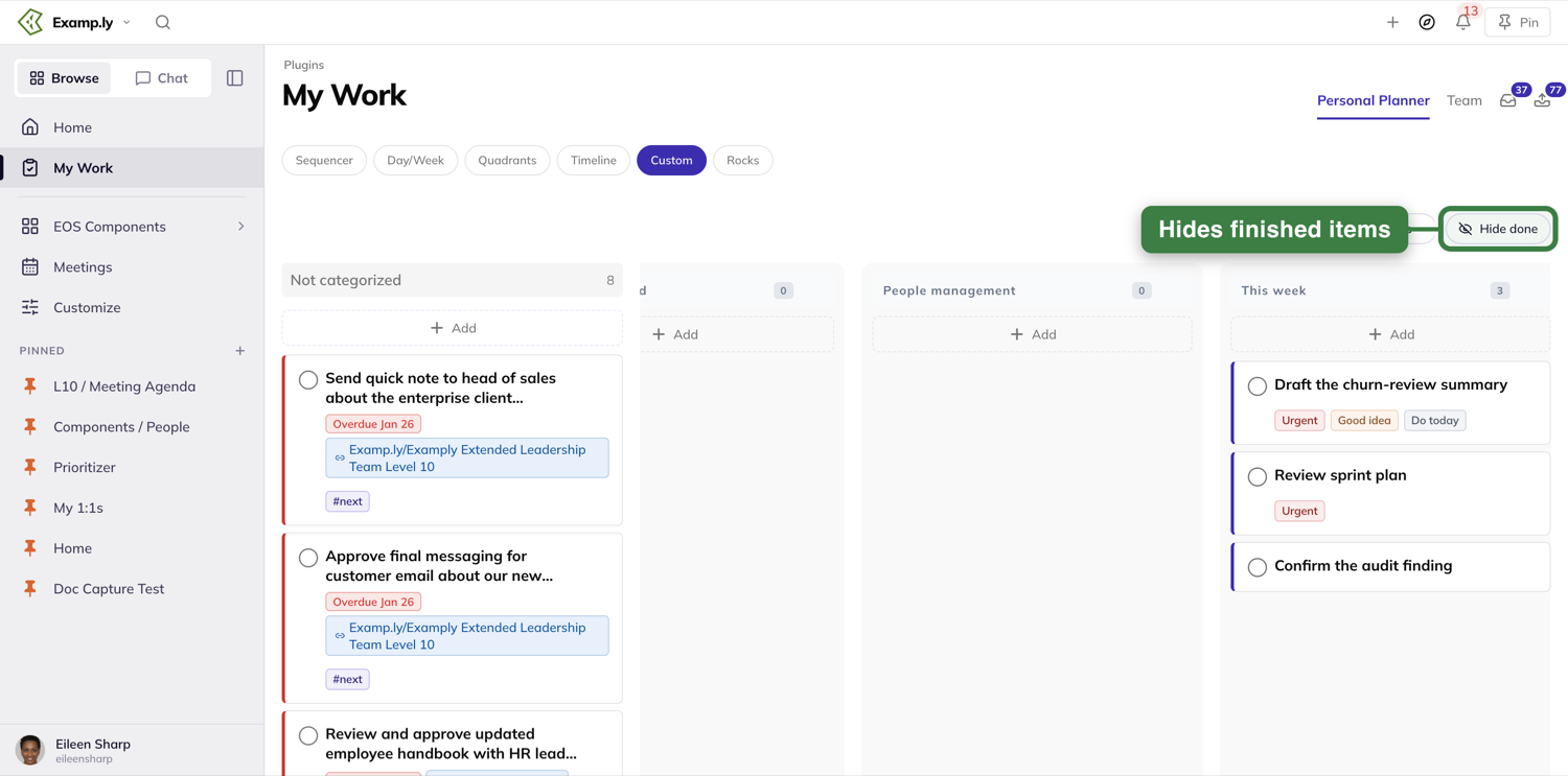
What the filter never touches
The Not categorized column dims slightly while a filter is on, but it never filters itself — everything in it stays visible. An emptied column stays on the board too, reading No matching To-Dos rather than disappearing.
Making your first label
If nothing on your board has a label yet, All labels still opens — it invites you to make one instead of showing an empty list, using the same picker the item sheet uses. This step isn't pictured here: doing it for real would have meant clearing every real label off a working account, which isn't something this walkthrough does to get one screenshot. The behavior is confirmed in the underlying spec and code, just not photographed.
Was this helpful?
Sequencer
The Sequencer is one ordered list — everything you're working on, top to bottom. It's the view you land on by default.
In this article
Two things keep that order trustworthy. A label filter narrows the list to what you're looking for, without deleting anything. A drag across priority groups gets refused, not silently reshuffled.
This walkthrough covers filtering by label, what happens when you reorder, and how an applied label shows up right away.
Before you begin: finding the Sequencer
Open My Work from the sidebar. The Personal Planner tab opens on the Sequencer, the first of the view buttons under the tabs.
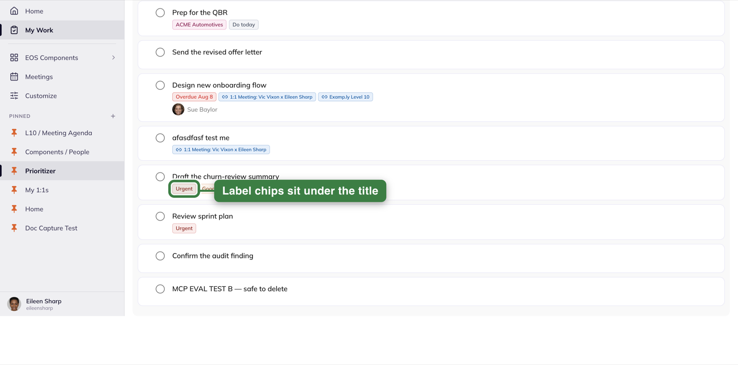
Filter the list by label
Press All labels, at the right end of the toolbar above the list. A popover opens with a search field, Select all and Deselect all, every label with a count of the To-Dos wearing it, and a No labels row.
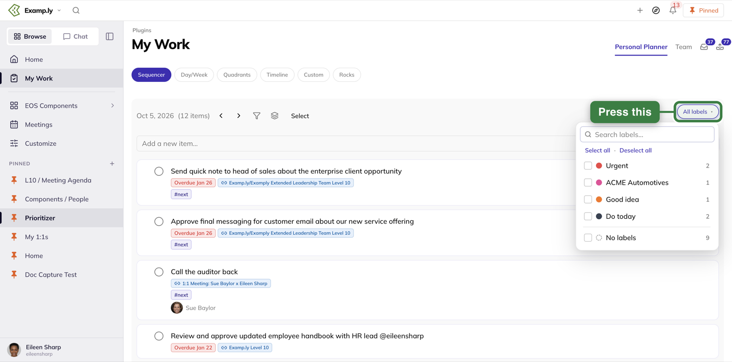
Tick a label and the list narrows at once. The toolbar shows each selected label as a chip, a count such as 2 of 12 To-Dos, and a Clear button.
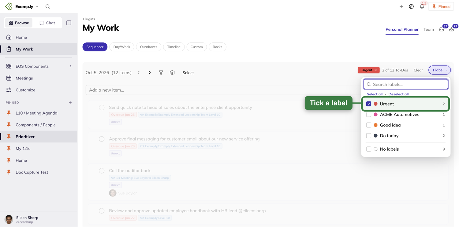
Tick a second label and an ANY / ALL switch appears. ANY keeps To-Dos with either label; ALL keeps only those with both.
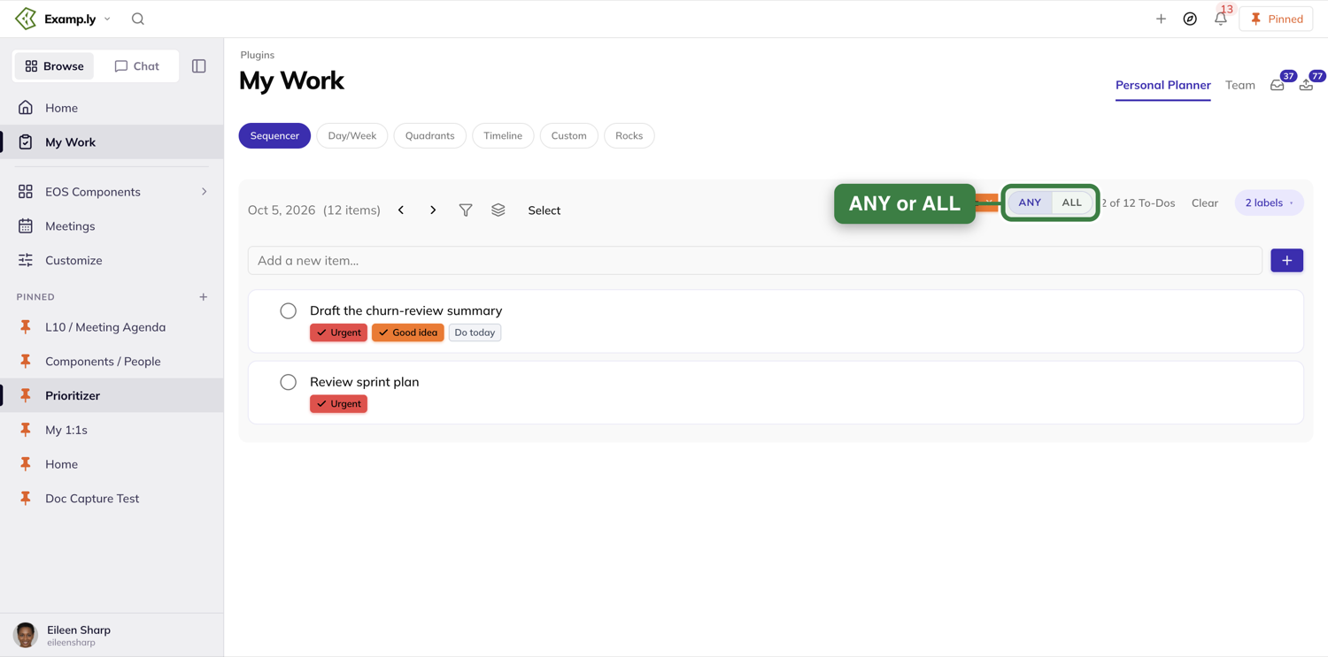
Clear drops every label filter in one press.
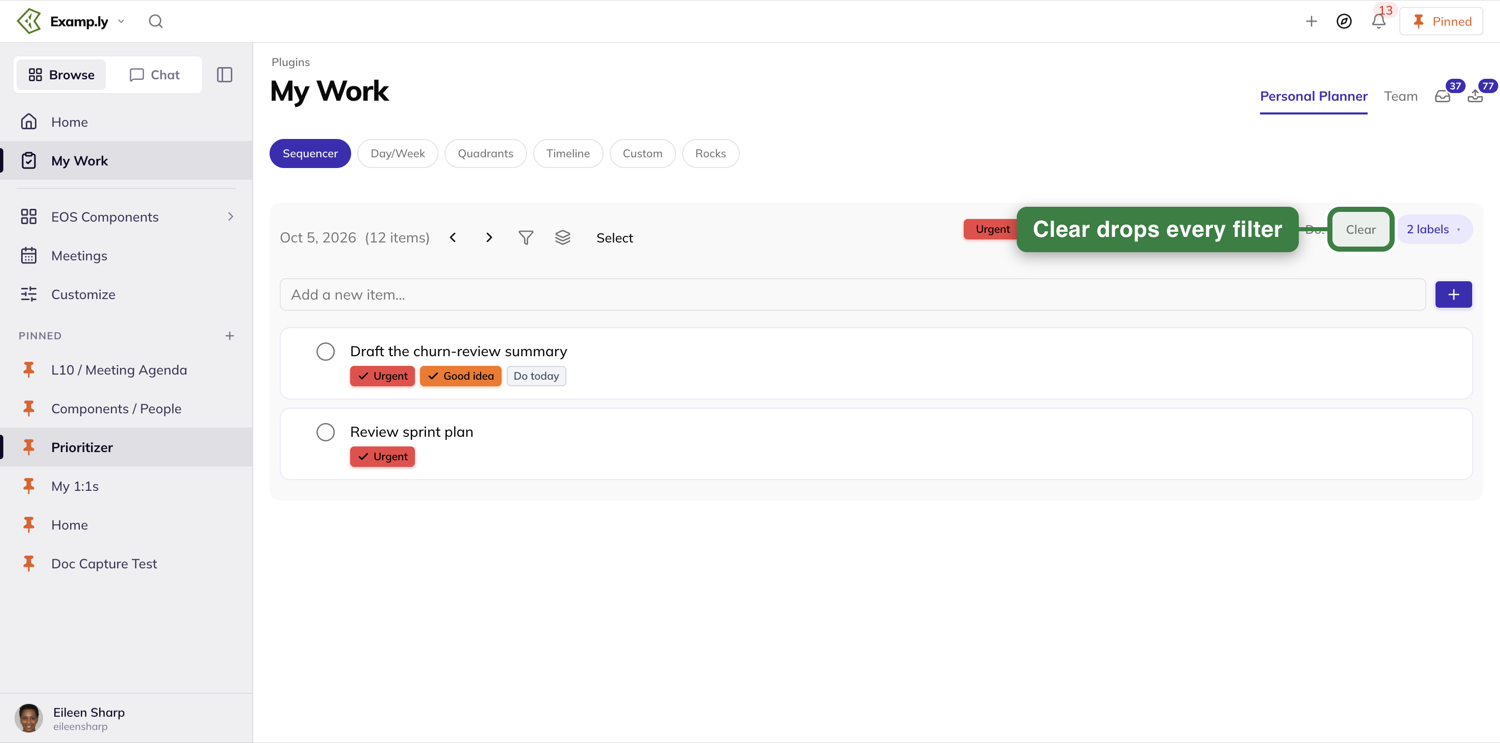
You can also start a filter from a To-Do's own chip: click it and the chip goes solid to show it's active.
Reorder the list
Drag a To-Do within its own priority group and the list reorders live. No confirmation needed.
Drag it across a priority group — a #next To-Do dropped among To-Dos that don't carry the tag, for instance — and the move is refused. A message appears at the bottom of the screen explaining that ResultMaps prioritizes cards on the tags you add, with a link to more on prioritization tags. Nothing moves.
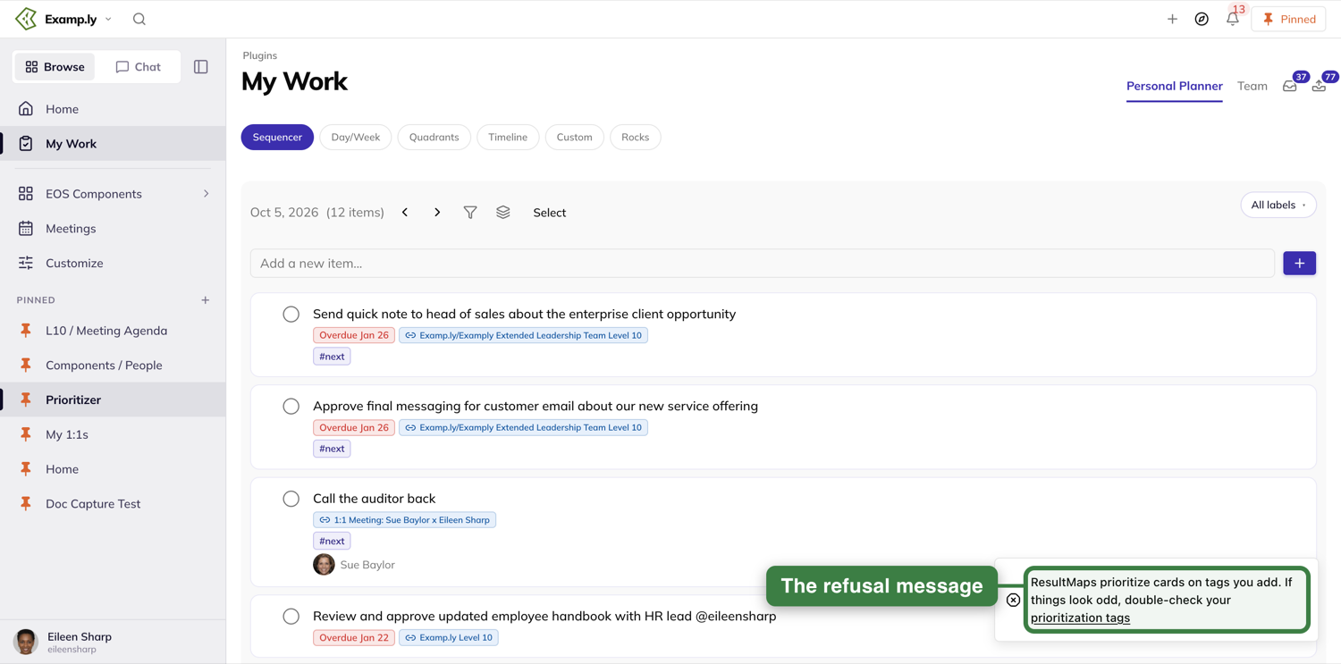
Apply a label and watch it stick
Open a To-Do and, on its Details tab, press +Label.
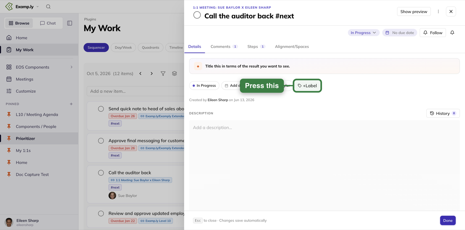
The picker lists your Personal labels first, then your team's. Tick one.
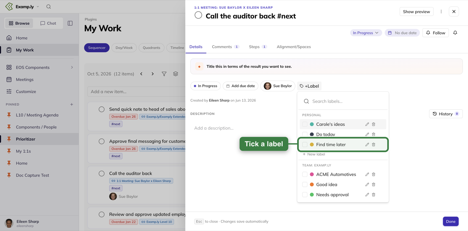
Close the To-Do and the chip is already on its row in the list. You don't wait on the save, and it won't flicker while it settles.
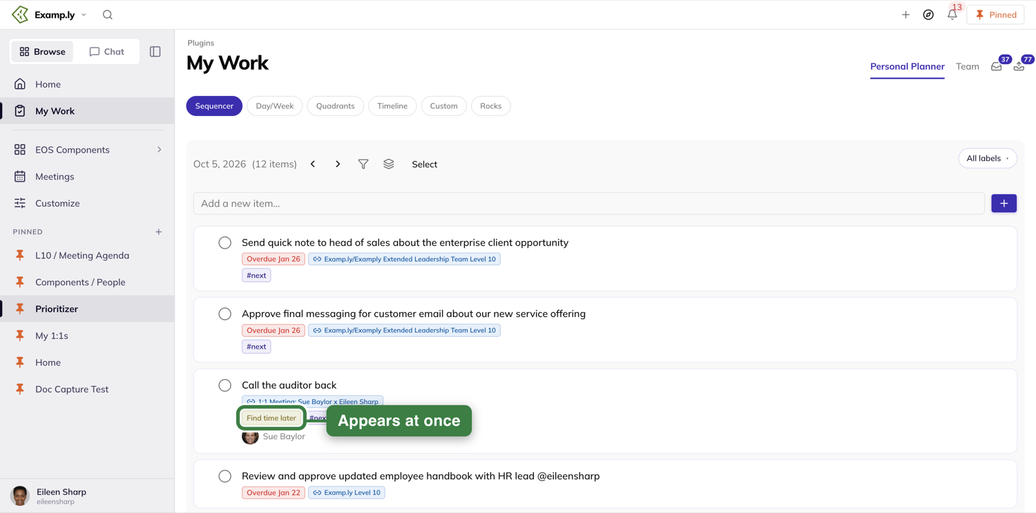
Also on this toolbar
The arrows beside the date step through other days' lists. The funnel icon sets what to show — everything, only your "Musts," or hide done and snoozed items — and the layers icon regroups the list by priority, result, due date, creator or quadrant. Select lets you pick several To-Dos for a bulk action.
Bringing work in from elsewhere
The Compass dock is available here, as on the other views. Press the compass in the top bar to open it, then drag anything from elsewhere in ResultKit onto your list.
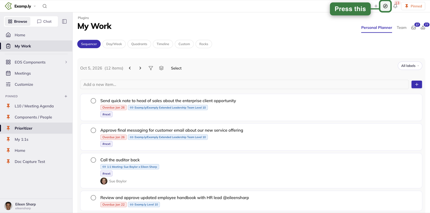
Was this helpful?
Day/Week
Day/Week lays your work out by when it's due — Today, This Week, Next Week, Later — in four matching columns. Mark something done and it disappears the instant you click; bring it back with one switch. Adding new work opens the same window every column in ResultKit now uses.
In this article
This walkthrough covers the Show completed switch, adding a To-Do into a time column, and what happens when you drag something in from elsewhere in ResultKit.
Open the Day/Week view
Open My Work from the sidebar. On the Personal Planner tab, press Day/Week in the row of view buttons. Your work is laid out in four gray columns — Today, This Week, Next Week, Later — each with its own header and a count at the top.
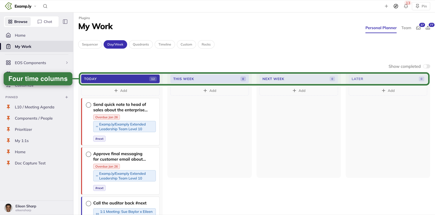
Mark a To-Do done
Click the circle on any card. It fills in and the item leaves the column immediately — the save to the server happens after, in the background.
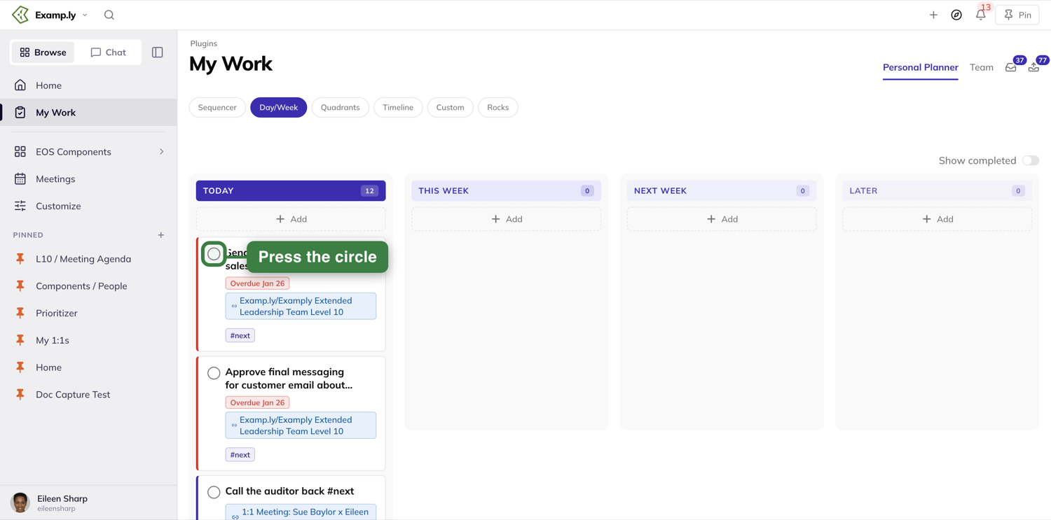
Show completed is off by default
With Show completed off, a finished item stays off the board — whether you just checked it off this second or it was completed yesterday. Nothing you've finished clutters the view.
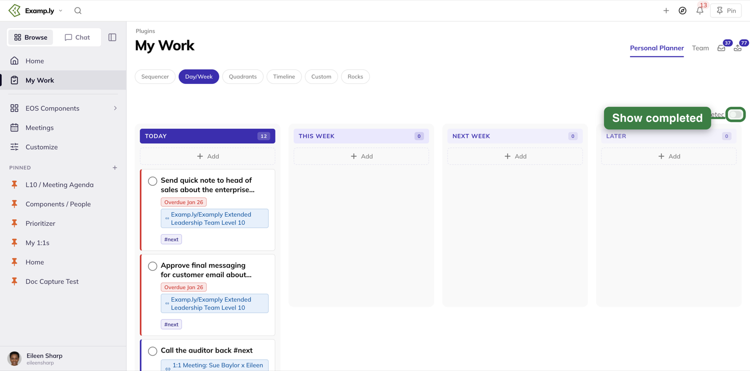
Turn Show completed on to see everything you've finished
Flip the switch on, and every completed item reappears at once — including one you finished a moment ago in this same session — right alongside your open items, struck through with the date it was done.
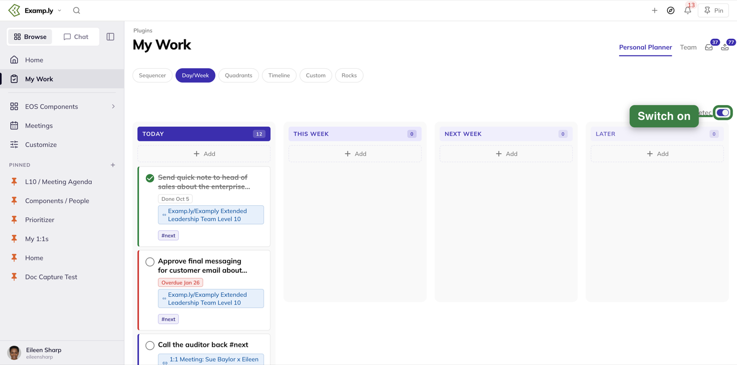
Add a To-Do into a column
Press Add directly beneath a column's header.
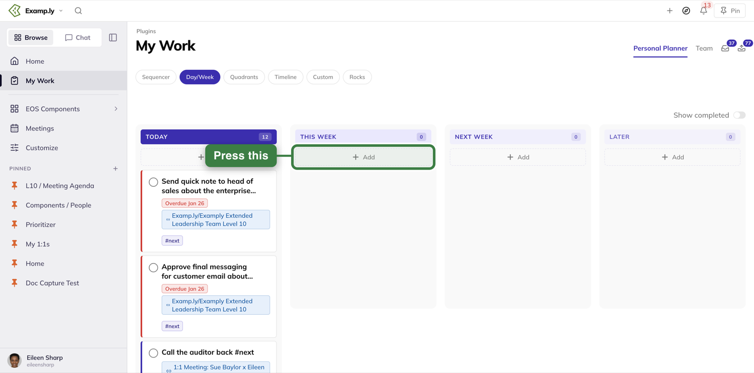
It opens the same Add window used across the rest of the app — not a cramped inline box. Its Add to line is already set to the column you clicked, so the new entry lands there.
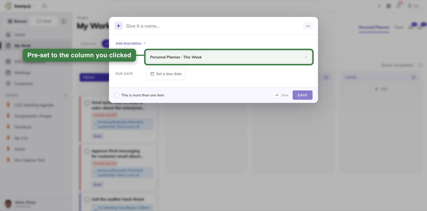
Assign someone while you add it
Type @ and a teammate's name right in the entry before saving, then pick the person from the list that opens. The new To-Do lands already assigned to them.
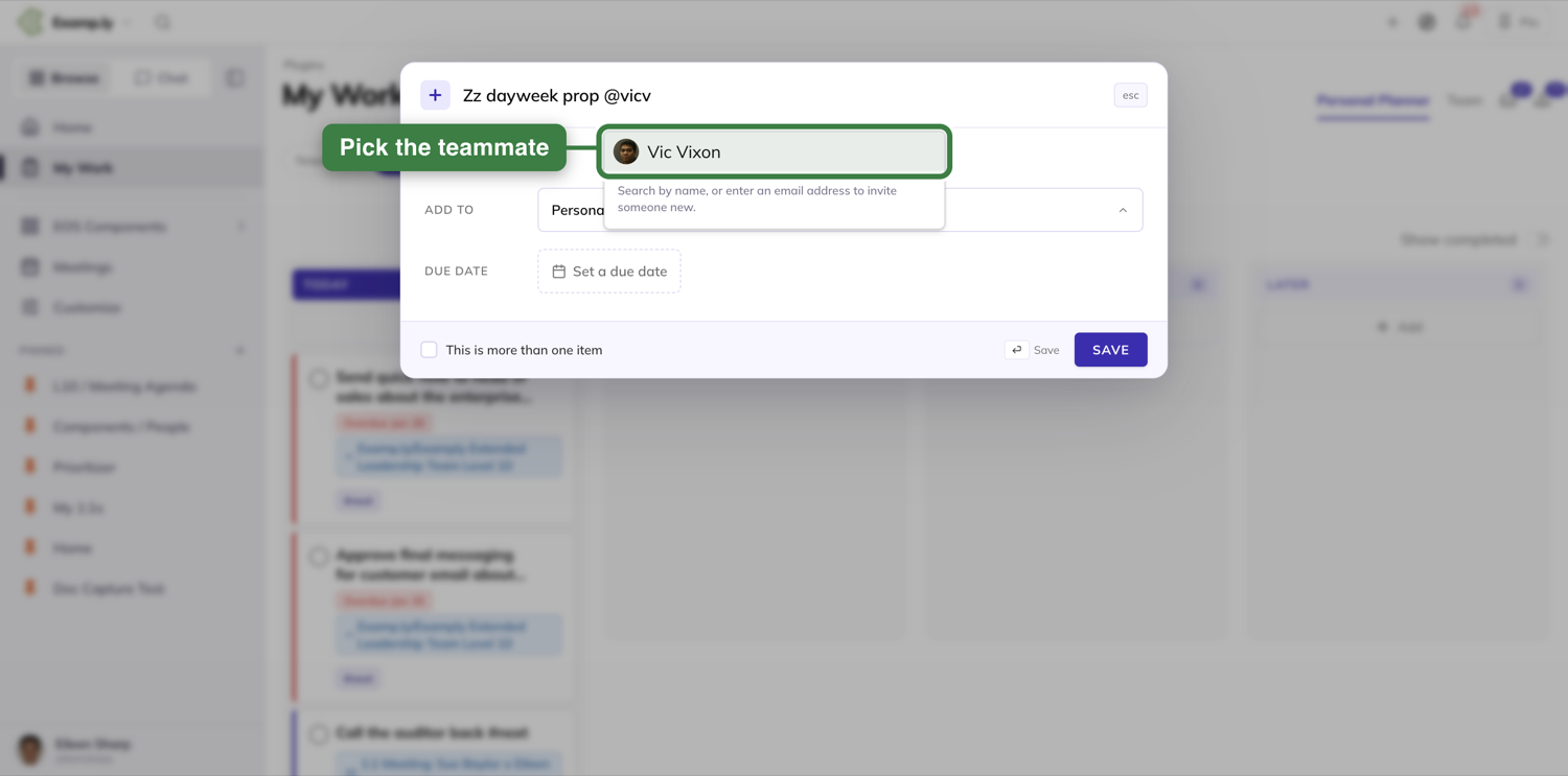
Save it — it appears before the server answers
Press Enter or Save. Either way, the new To-Do appears in its column right away — indistinguishable from a card that's been there for weeks — with the person you picked shown beneath it.
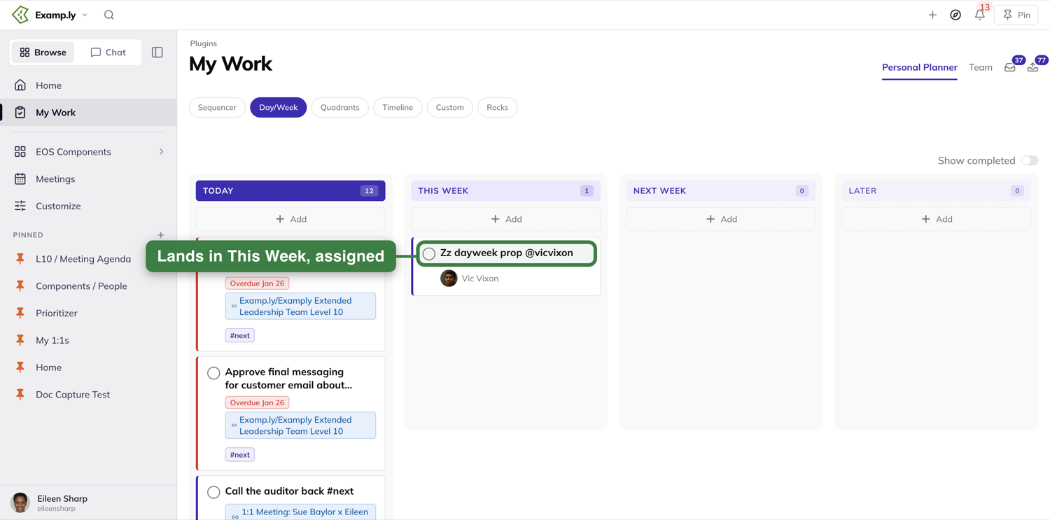
Drag something in from anywhere in ResultKit
Open the Compass dock and drag any item onto a Day/Week column. It settles into whichever time bucket you dropped it on — Today, This Week, Next Week, or Later.
Was this helpful?
Quadrants
Quadrants sorts your work by urgency against importance instead of by date — four boxes, plus a "Not categorized" list on the side for anything you haven't sorted yet. Every card in that list is readable the moment the view loads. Drag anything in — from the Compass dock, or between boxes — and you'll see exactly where it's about to land before you let go.
In this article
This walkthrough covers reading the Not categorized list, dropping a Compass-dock item into a quadrant, and the drag feedback that shows you where a card is headed.
Open the Quadrants view
Open My Work from the sidebar. On the Personal Planner tab, press Quadrants in the row of view buttons. You'll see a Not categorized list down the left side for anything you haven't sorted yet, and the four boxes beside it: Urgent | Important, Not urgent | Important, Urgent | Not important, and Not urgent | Not important. Urgent | Important sits top left of the boxes and Not urgent | Important top right, with the two "not important" boxes beneath them.
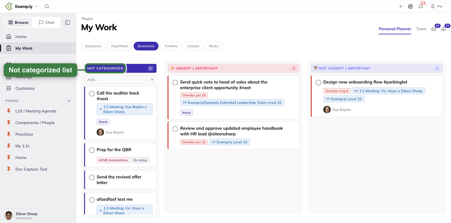
Every card in Not categorized is readable right away
Nothing in the Not categorized list waits on a drag to show its content — every card's title and controls are there the instant the view finishes loading, no matter how many you have waiting to be sorted.
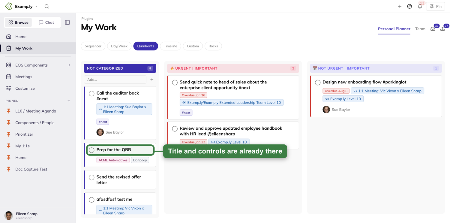
Drag a card from the Compass dock into a quadrant
Press the compass in the top bar to open the dock, and pick up an item by its grip handle. As you drag it over a quadrant, that whole box lights up with a ring and a "Drop into" tag telling you exactly where it will land if you let go.
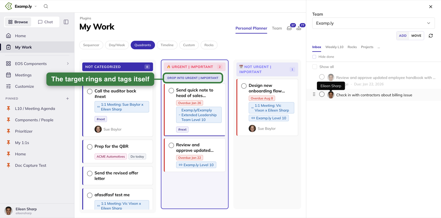
Release it — it lands, sorted, right away
Let go, and the card appears in that quadrant immediately — on your plan, categorized, and still there the next time you load the page.
Move a card between quadrants
Pick up any card already on the board and drag it toward a different quadrant. Its old spot shows a dashed "Moving…" placeholder, and the quadrant under your pointer rings itself the same way a dock drag does.
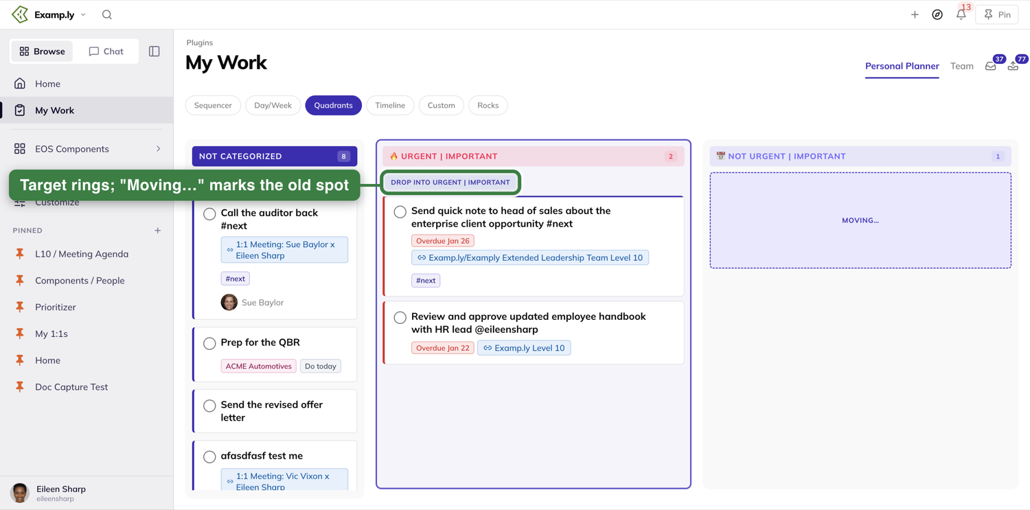
Reorder a card within its own quadrant
Drag a card up or down inside the same quadrant it's already in. That quadrant still rings itself the same way, so you always know it's about to accept the drop.
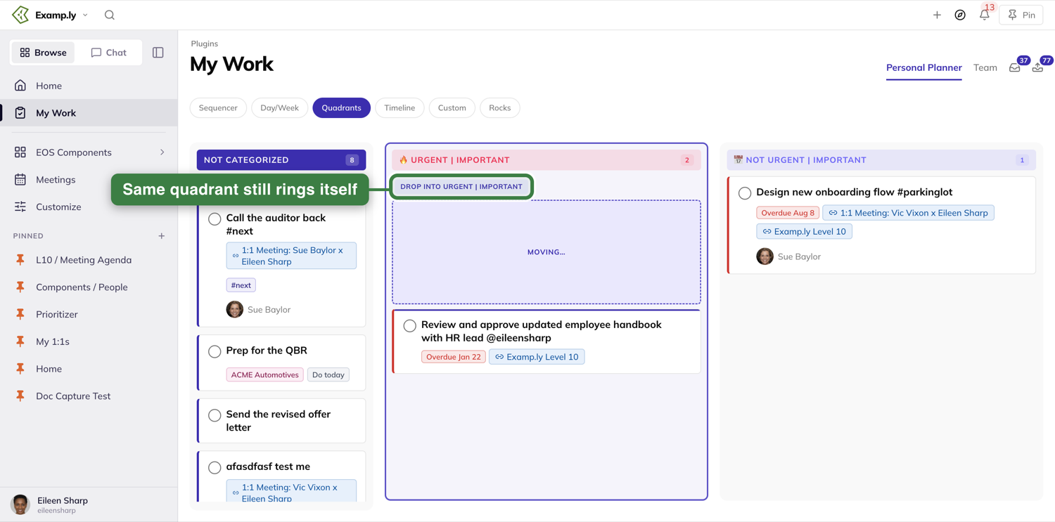
Was this helpful?
Rocks
The Rocks view is where your quarter's goals live alongside your day-to-day work. It opens on your own personal rocks, with your goals above them when you own or are assigned any — one click over to a Company side shows every company rock you own, grouped by team. Flip a status and it updates instantly.
In this article
This walkthrough covers reading the Personal side, switching to Company, adding a new personal rock, and checking in on a rock's status.
Open the Rocks view
Open My Work from the sidebar. On the Personal Planner tab, press Rocks, the last of the view buttons. You'll land on the Personal side by default, with a quarter runway strip showing which week you're in.
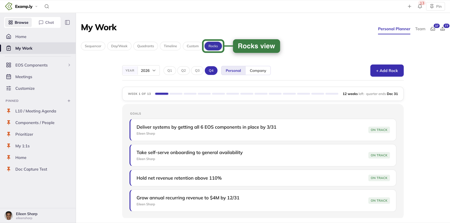
If you own a goal or have a goal assigned to you, it shows in a Goals strip above your rocks, each with its status.
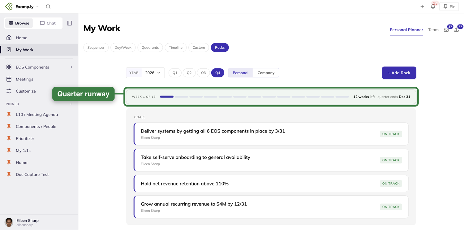
When you haven't set a rock yet
Below the goals, the Personal side holds the rocks you set for yourself — only you can see them. If you haven't set one for the quarter, it invites you to: a short note on what a good rock looks like and a Set your first rock button.
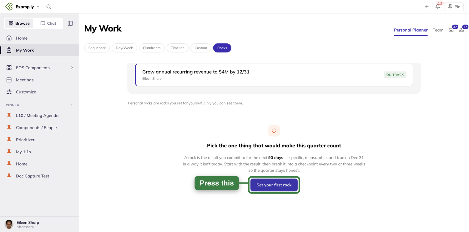
Switch to your company rocks
Press Company in the toggle next to the quarter buttons. Nothing else on the page moves — the swap just shows the other half of what you own.
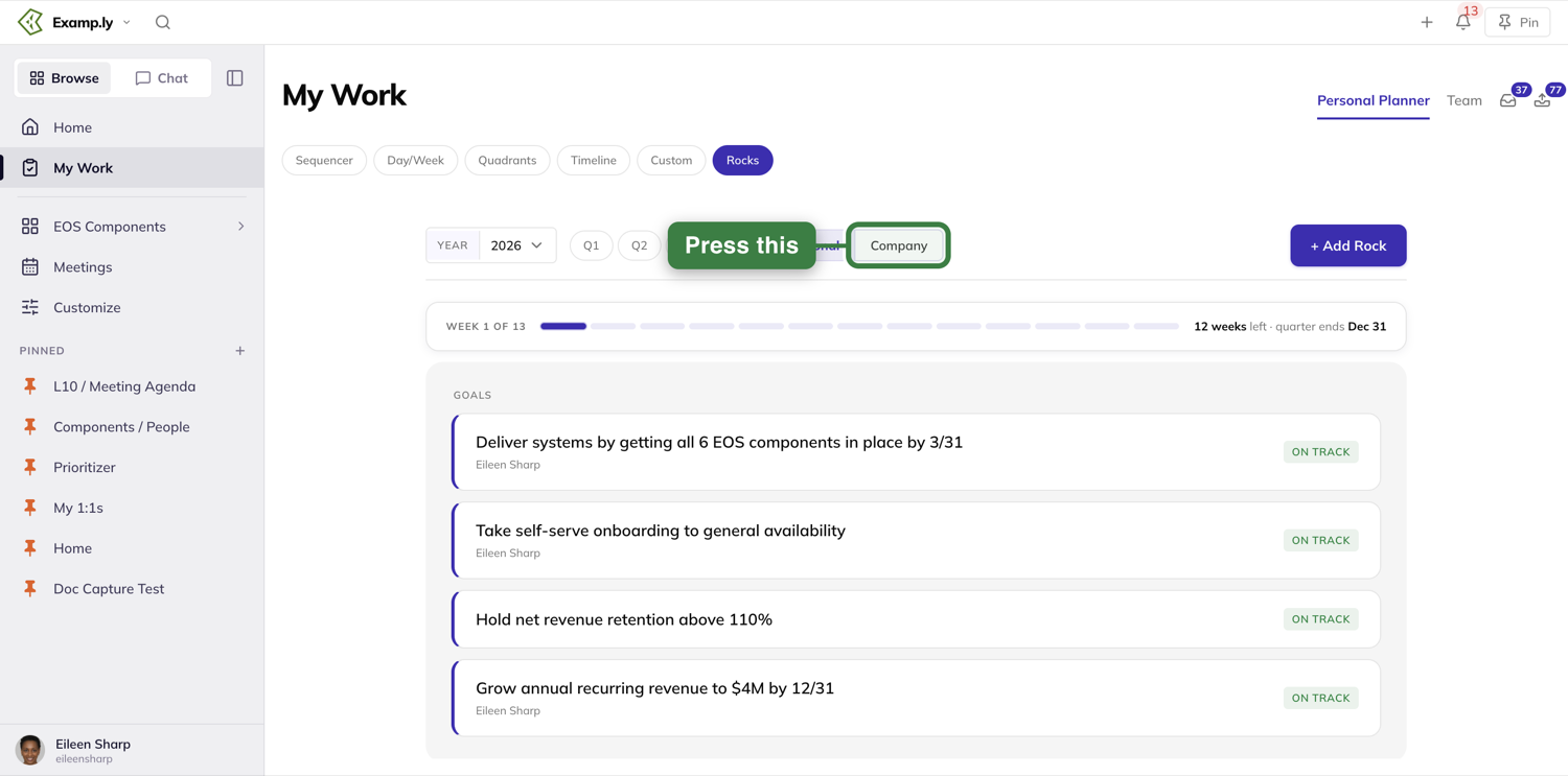
If you don't own any company rocks, the Company side says so plainly
When you own a company rock, it shows up here grouped by organization and team — one group per team where you own something. If you own none for the quarter, the side just says so, in a plain line rather than the coaching tone the Personal side uses. A note above it links to the full company view.
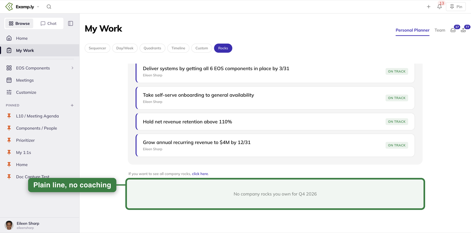
Add a personal rock
Press + Add Rock (or Set your first rock). It always creates a personal rock, whichever side of the toggle you're on.
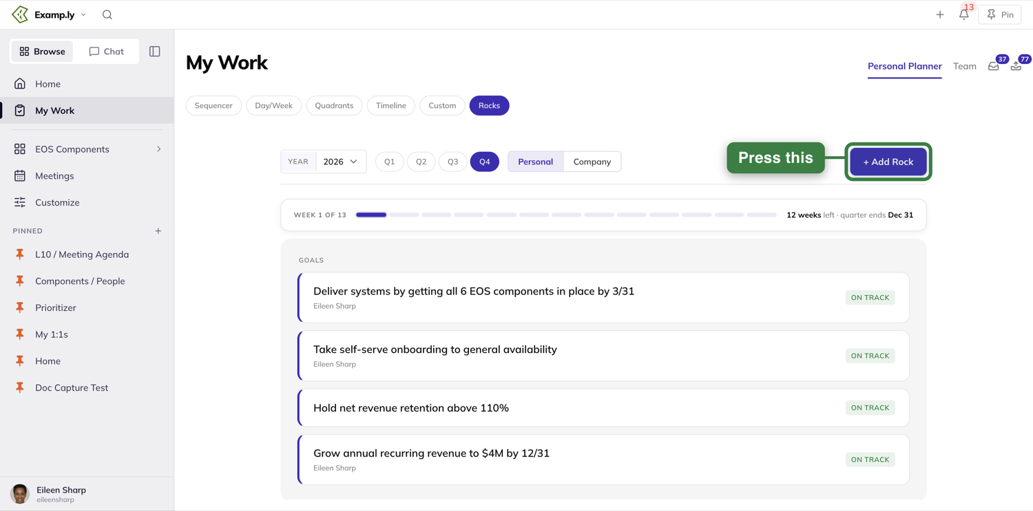
A panel opens. Type the result you're committing to as the rock's name, and describe what done looks like in the box below it. The owner is you, and the due date defaults to the last day of the quarter. Watch the live preview on the right update as you type — a new rock starts with the amber On/Off Track? badge, since you haven't checked in on it yet.
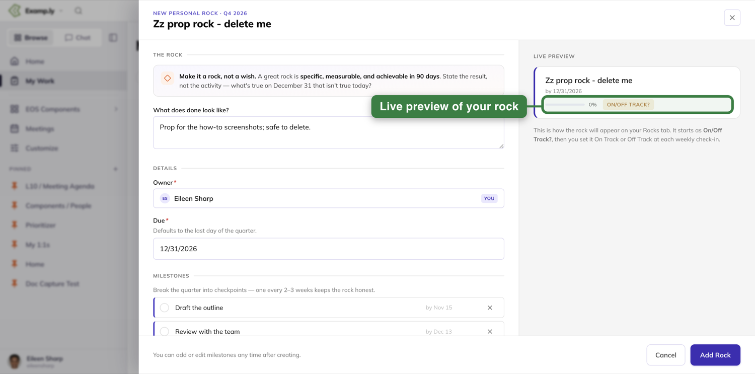
Your new rock appears at once
Press Add Rock and the panel closes — your new rock is already on the Personal side, in a group for the quarter's rocks, before the save confirms. If you started from the Company side, the view returns to Personal first, so the new rock is never created somewhere you can't see it.
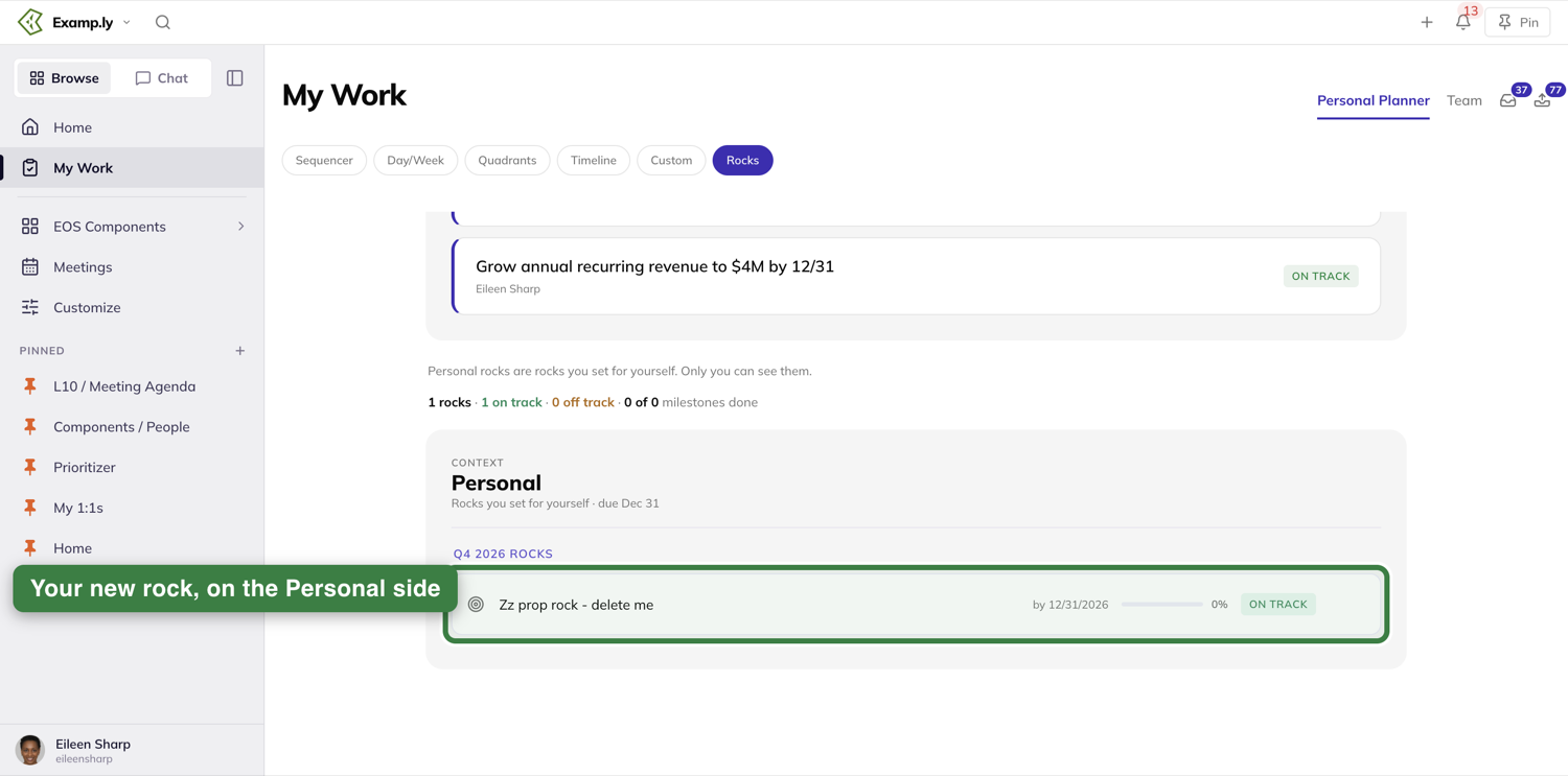
Flip a rock's status at your weekly check-in
Press a rock's status badge to flip it between On Track and Off Track. It flips immediately, and the summary line above — "1 rocks · 0 on track · 1 off track" — updates with it, before the save even finishes.
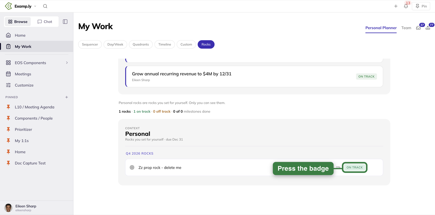
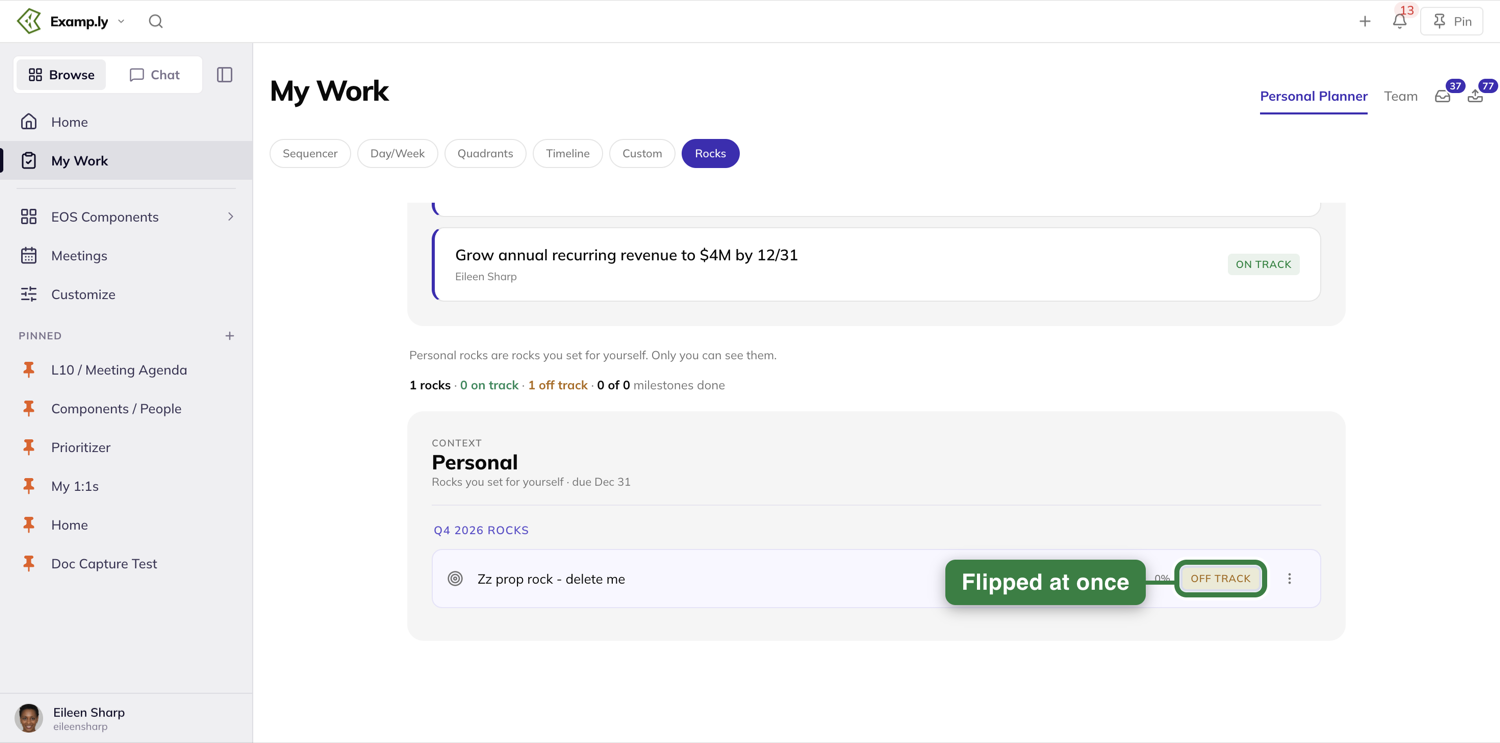
Was this helpful?
Timeline
The Timeline view lays your work out by due date — this week, next week, and everything after — so you can see what's coming without scanning a list and doing the date math yourself. Anything already overdue gets its own section at the top.
In this article
1. Open the Timeline view
Open My Work from the sidebar. On the Personal Planner tab, press Timeline in the row of view buttons. Your items load grouped into weekly sections, with anything already past due collected under Overdue at the top. Press a section's header to fold it away.
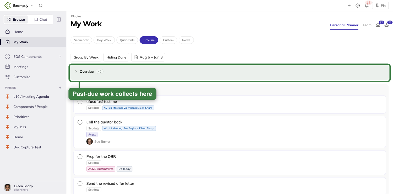
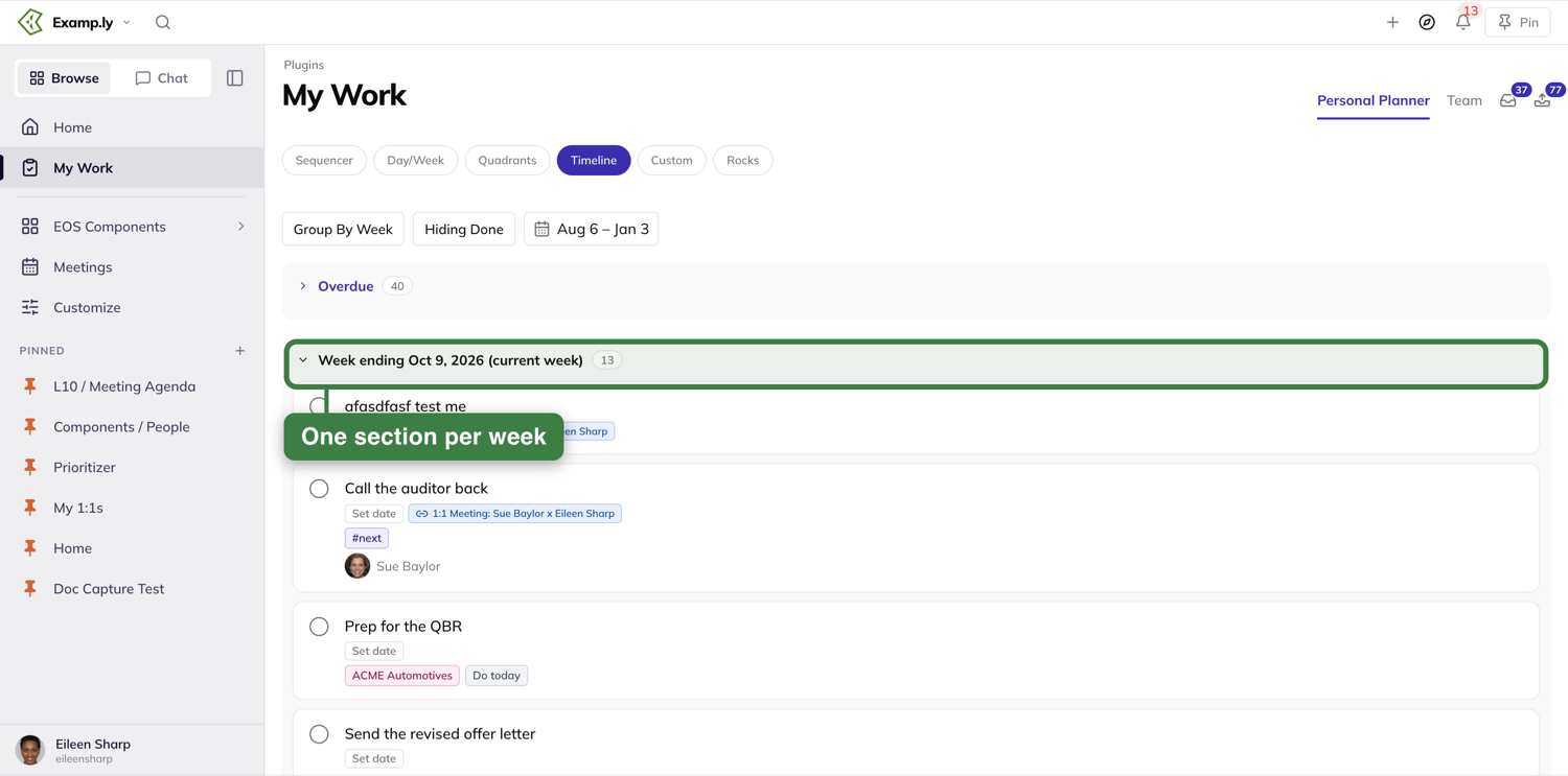
2. Switch between weekly and monthly grouping
The first button above the list names how the view is grouped right now: it reads Group By Week. Press it to switch to months. Nothing reloads — the same items you're already looking at re-sort into month sections instead, and the button now reads Group By Month.
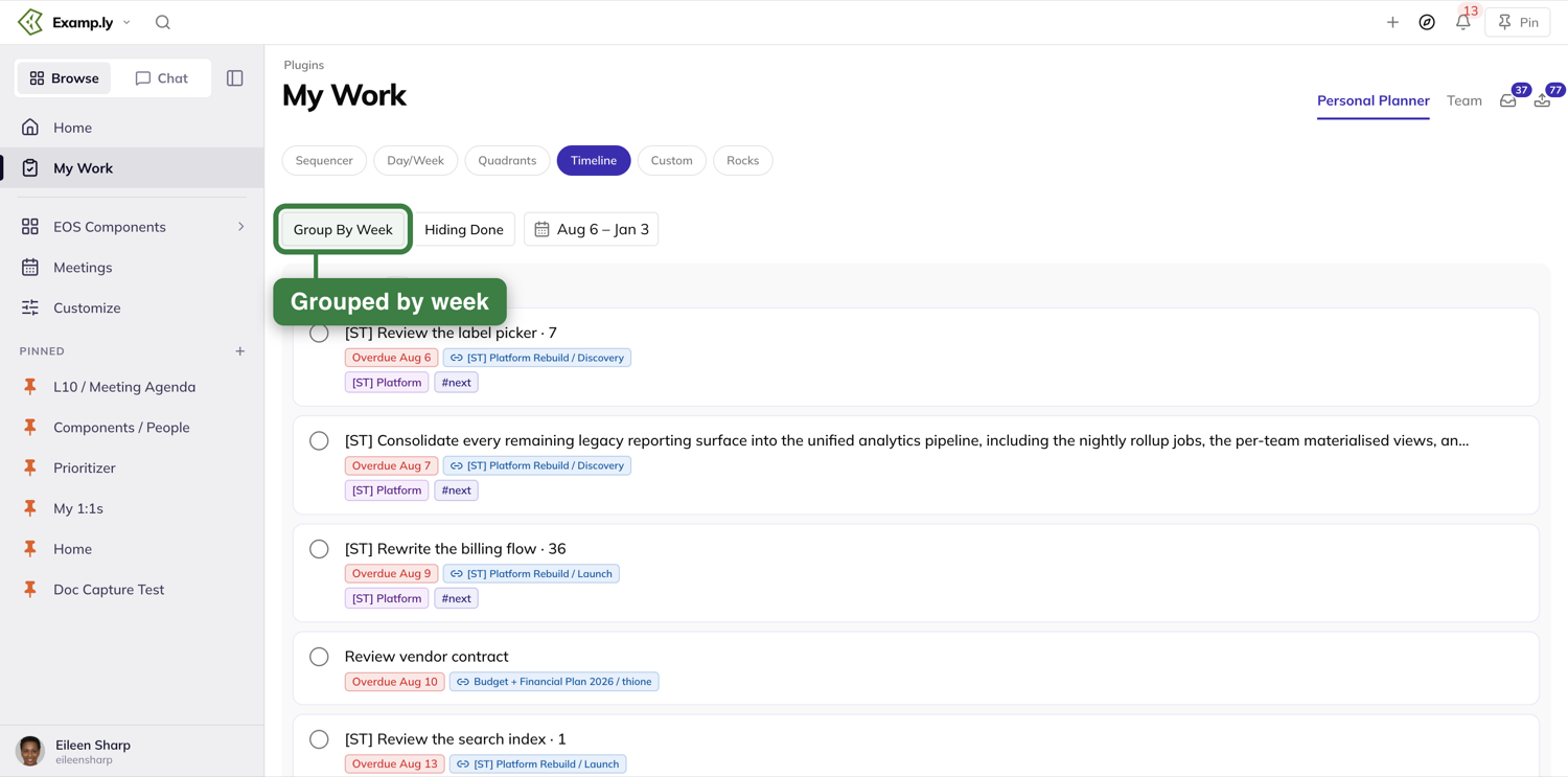
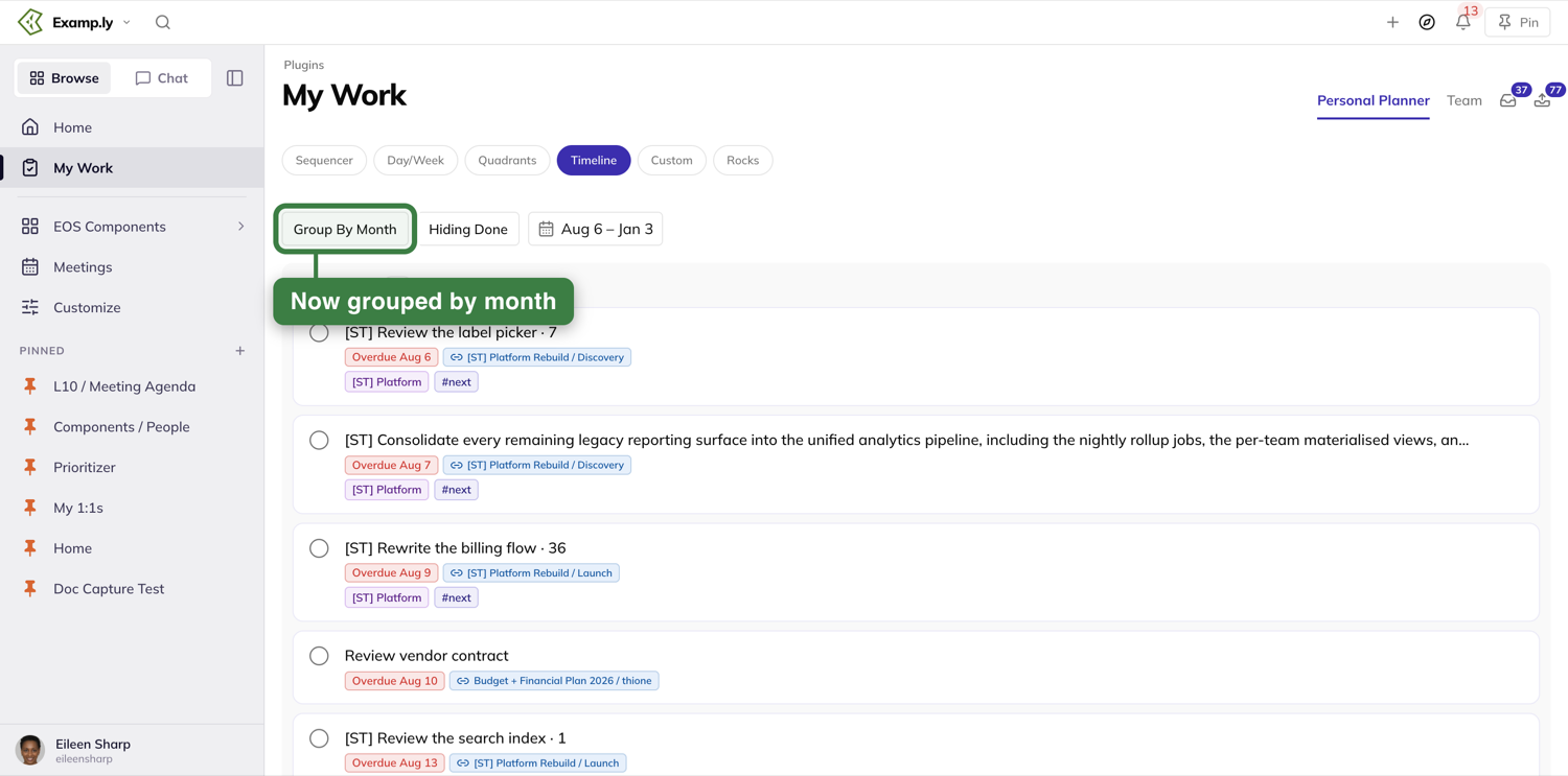
3. Show what you've already finished
Completed items are hidden by default, and the second button says so: Hiding Done. Press it to switch to Showing Done when you want to see everything that was due in a given stretch, not just what's still open.
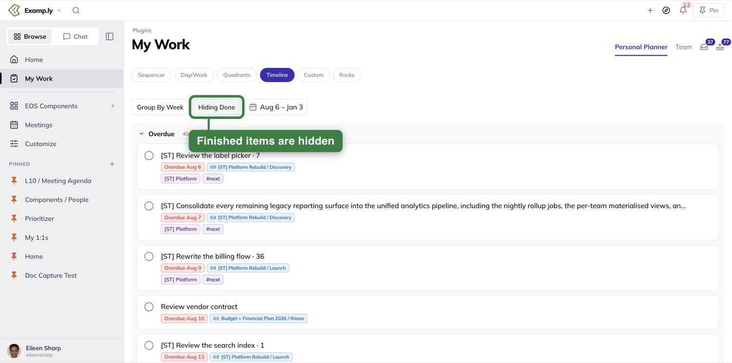
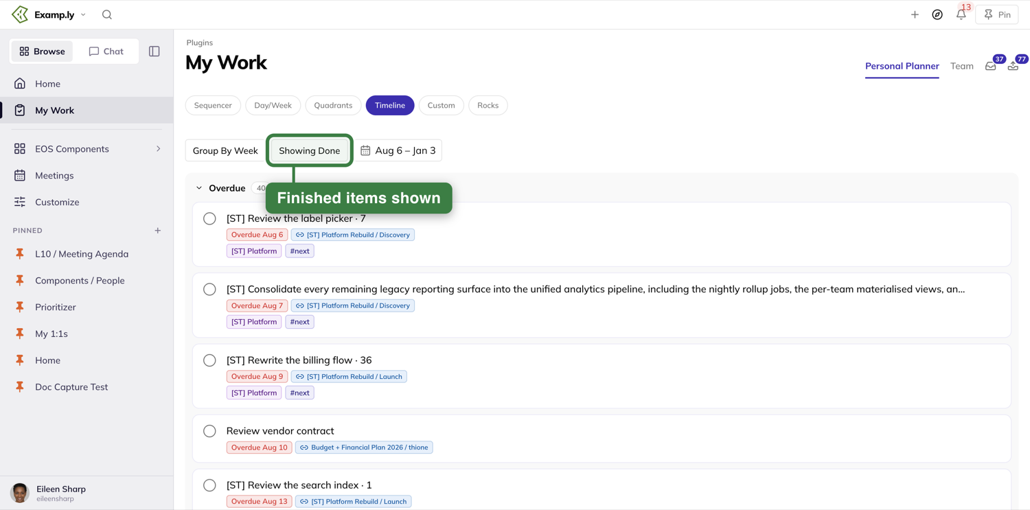
4. Look further out
The default window covers several months — at the moment, Aug 6 to Jan 3 — and you can widen or narrow it any time. Press the date range to open a calendar with ready-made ranges such as last week, month to date and year to date.
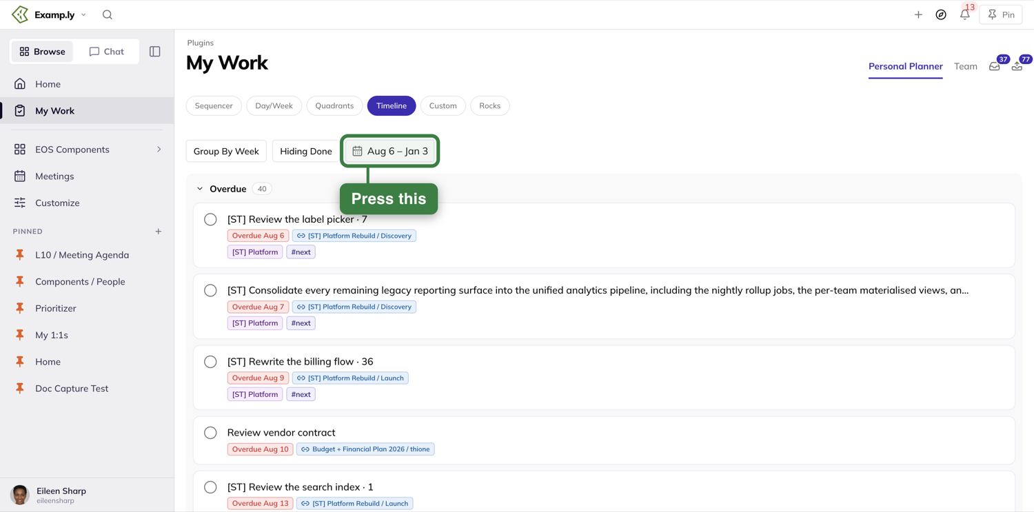
5. Every week gets its own section, even an empty one
A week or month with nothing due in it still shows up in its place, reading No items — it isn't skipped, which would make an empty stretch look like a gap in your data instead of a genuinely quiet week.
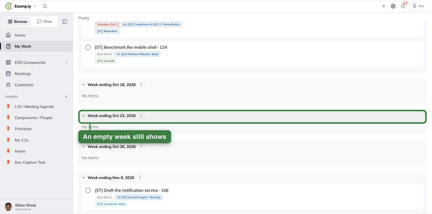
6. Use a tile's own menu
Point at a tile and a menu button appears at its right edge. The menu carries the actions the rest of your planner uses: open details, rename, tag it as a MUST-DO, apply a template or checklist, set a recurrence, allow team access, add it to your calendar, or archive it. There's no "remove from planner" here, since Timeline isn't a list you're curating — it's just showing you what's due.
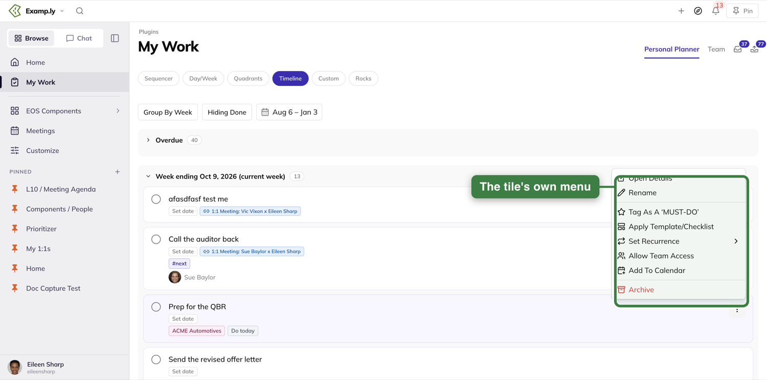
7. Move a tile's due date right from its pill
Press the date on any tile — or Set date if it has none — to open a calendar and reschedule it. The change saves in the background and the tile moves to its new section right away. The calendar also has a Clear date button at the bottom.
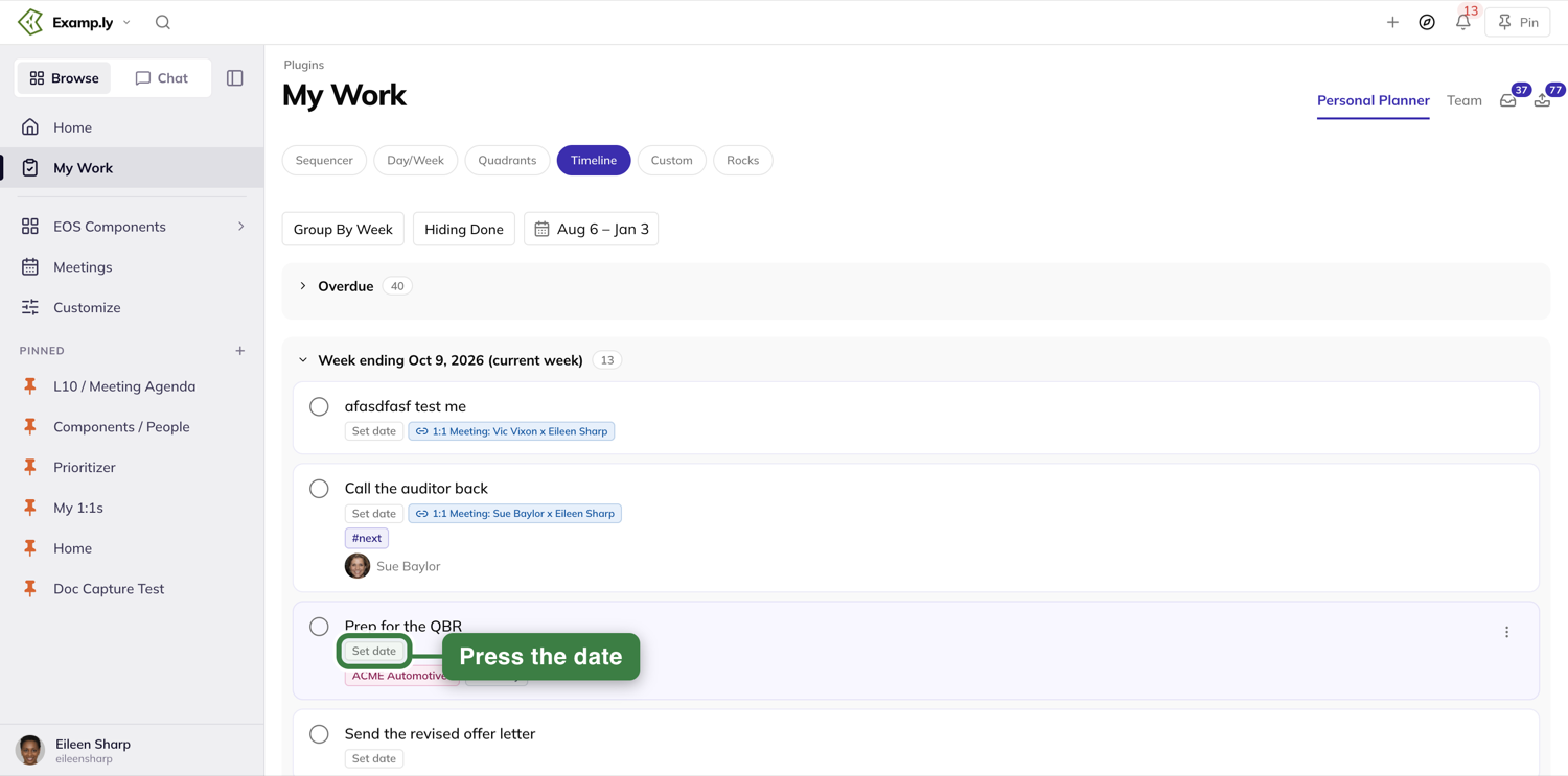
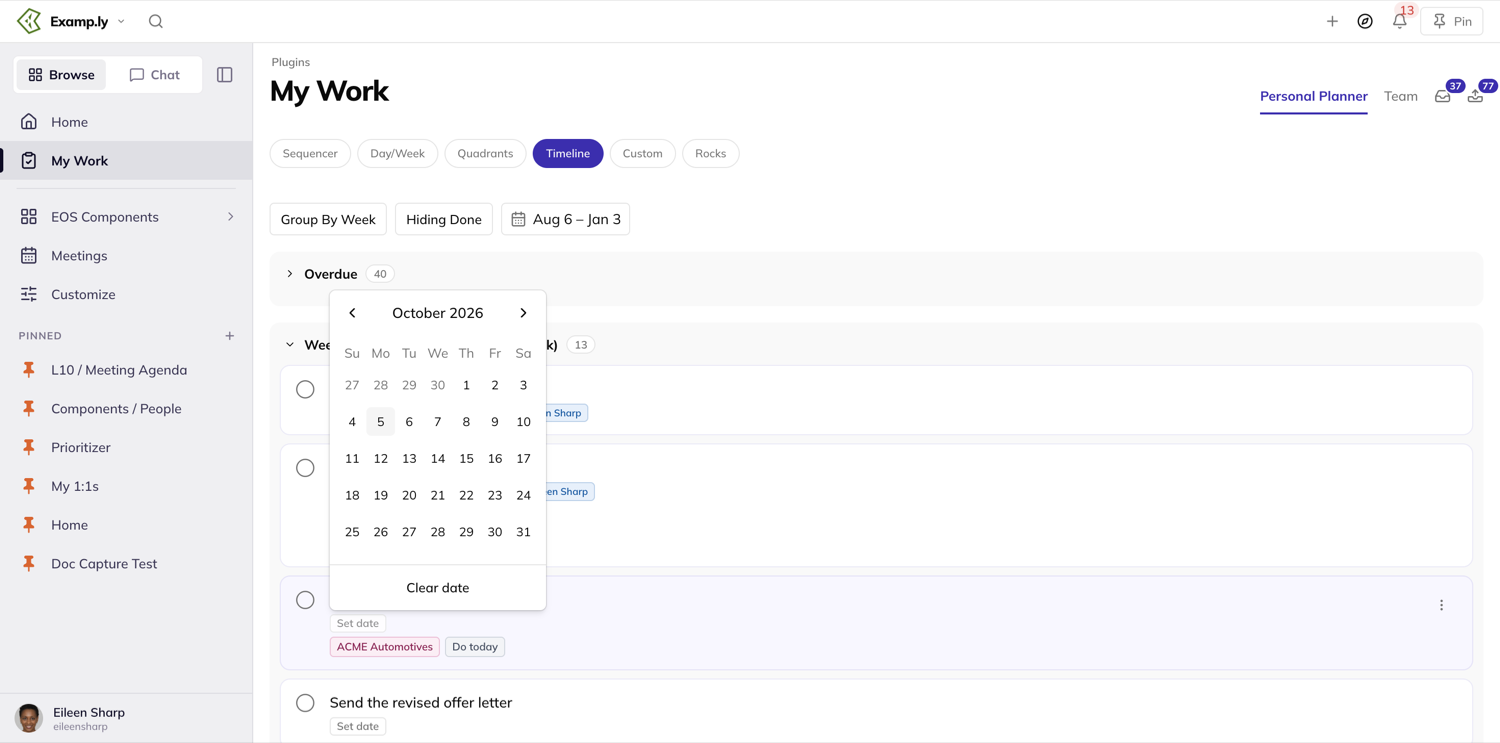
8. What the Compass dock doesn't do here
You'll see the same Compass dock button here that you do on the other views.
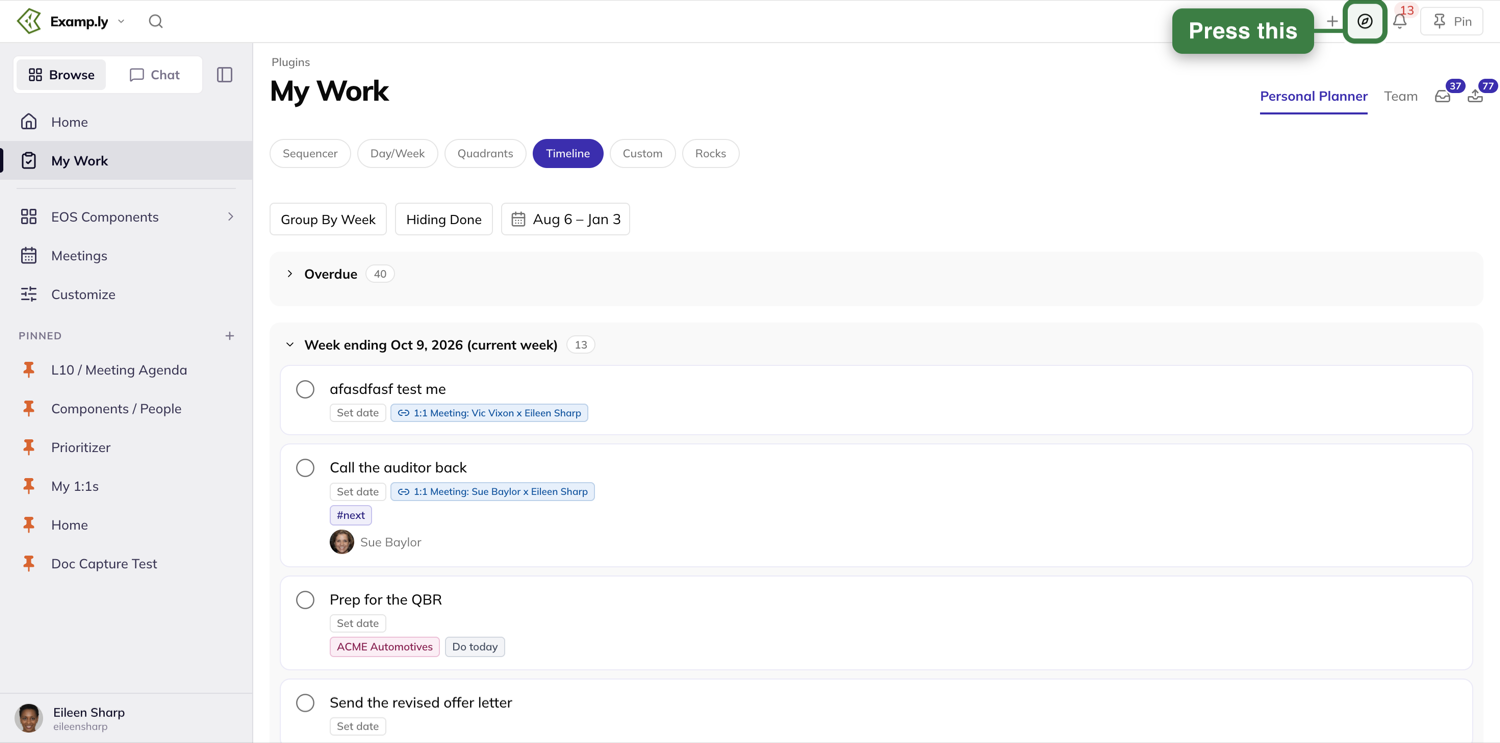
On this view, though, dragging something onto the page and dropping it doesn't do anything — worth knowing so a drag that seems to go nowhere isn't mistaken for something broken.
Was this helpful?
Outbox
The Outbox — labeled Assigned by Me in the app's own navigation — is the one list of everything you've personally asked other people to do. It shows only what you delegated to someone else, filterable by status, team, person, and whether they've even acknowledged it yet.
In this article
This walkthrough covers opening it, checking on a completed delegation, filtering to one person's work, reordering, creating a new delegation, and the shortcuts that handle a whole batch at once.
Open the Outbox
Open My Work from the sidebar and press the outbox icon at the top right of the page, beside the Inbox icon — it carries a badge with the number of delegations. You'll see only items you assigned to someone else — never your own work, never something someone else asked of you — starting with To-do and Review items only.
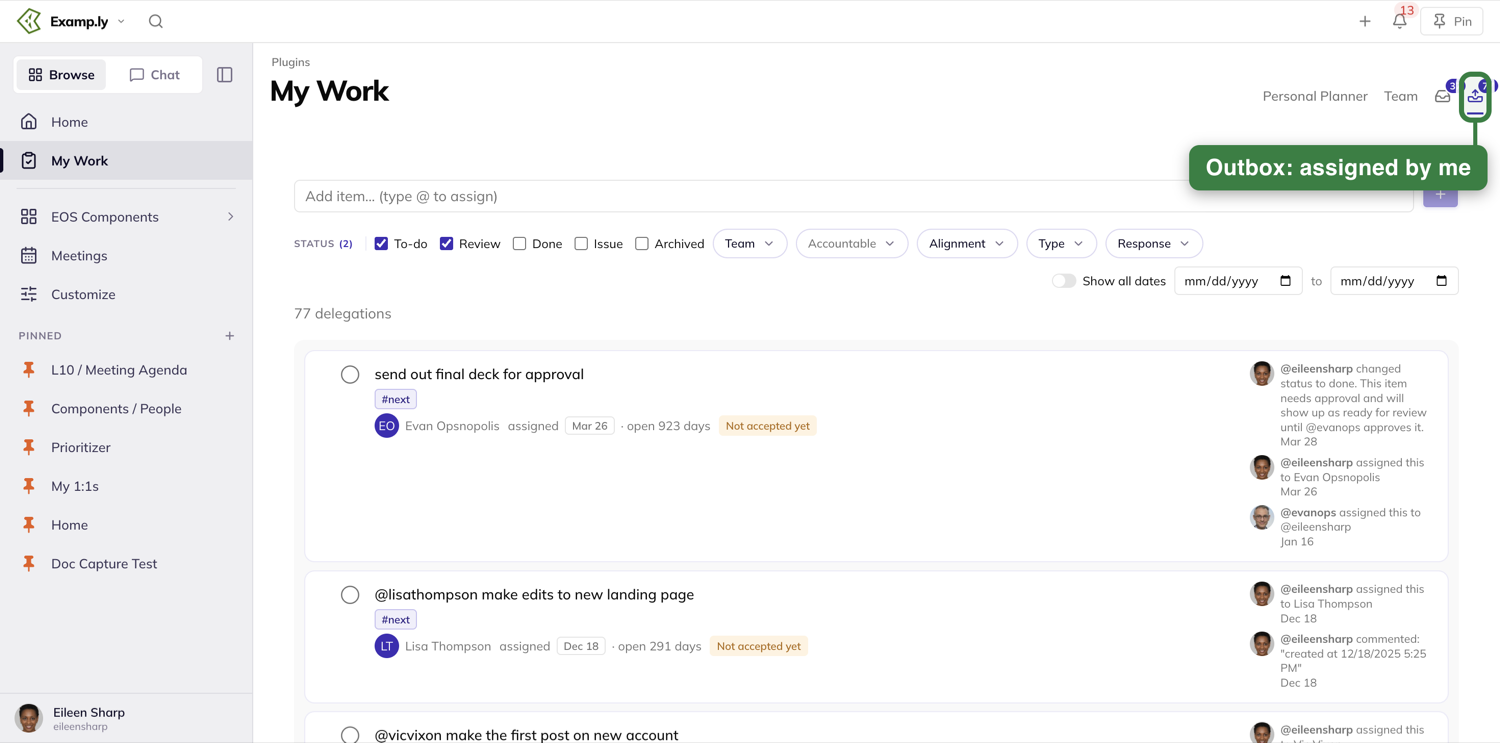
See a finished delegation by turning on Done
A completed delegation doesn't just disappear — tick the Done status filter and it's still there, so you can confirm it actually got finished.
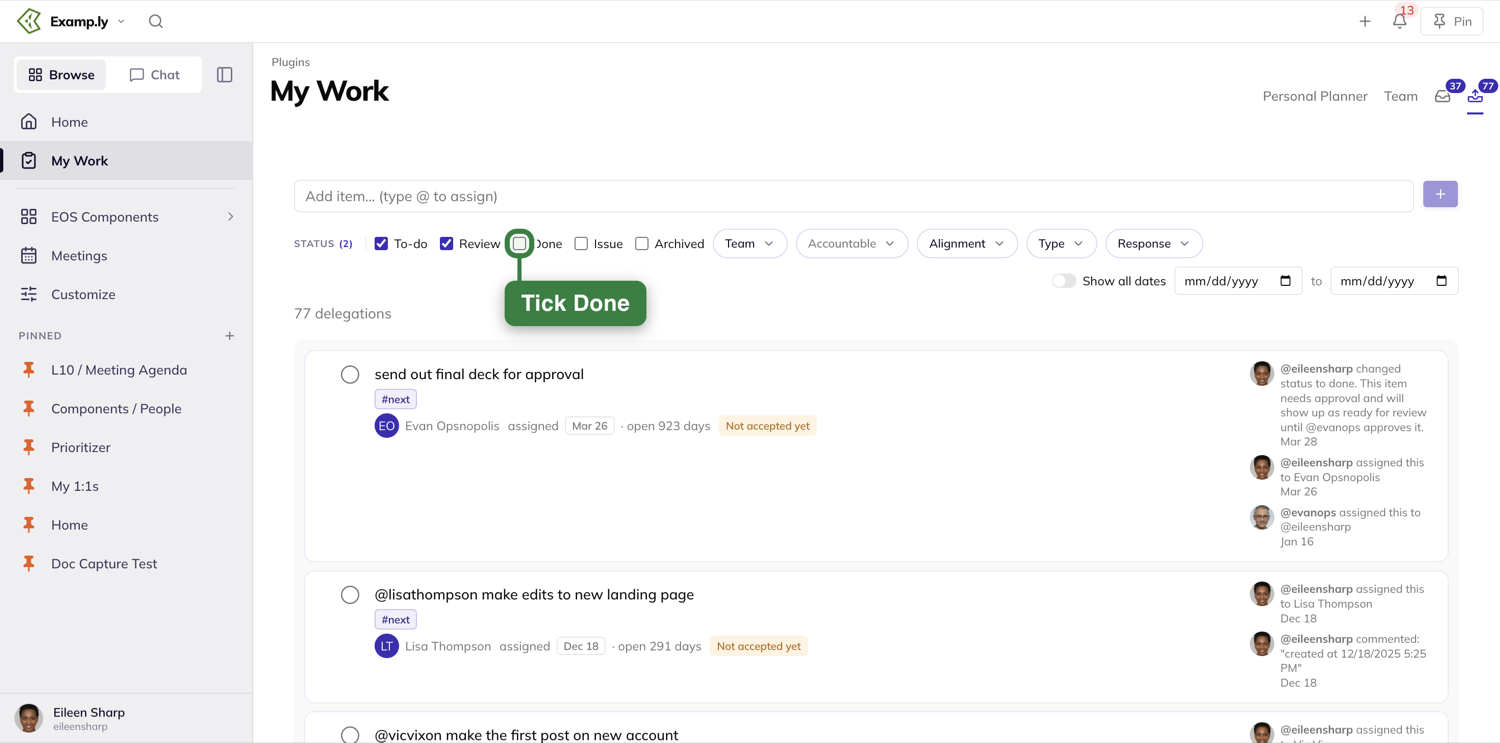
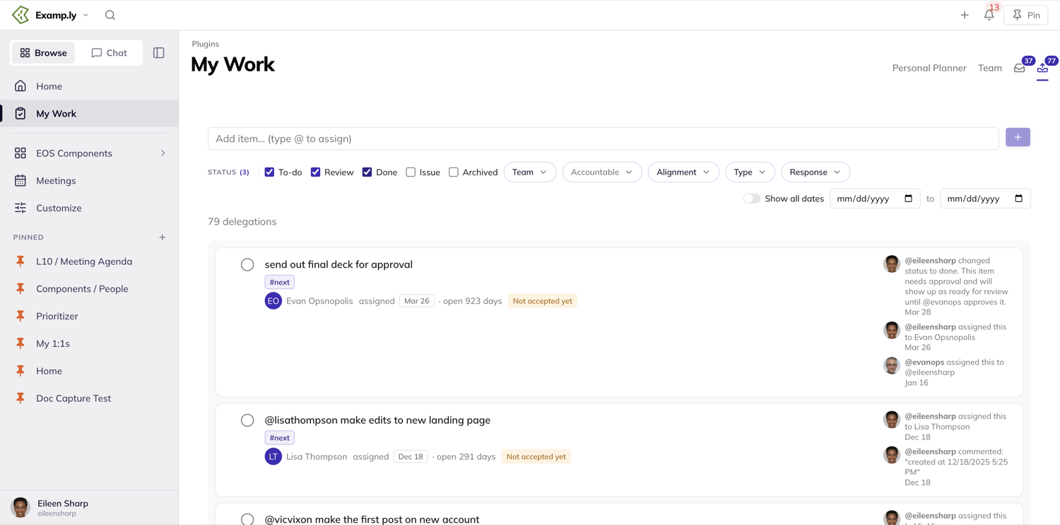
Narrow to one person's delegations
Use the Accountable filter to see only what you've asked of one specific person — type-ahead search finds them by name.
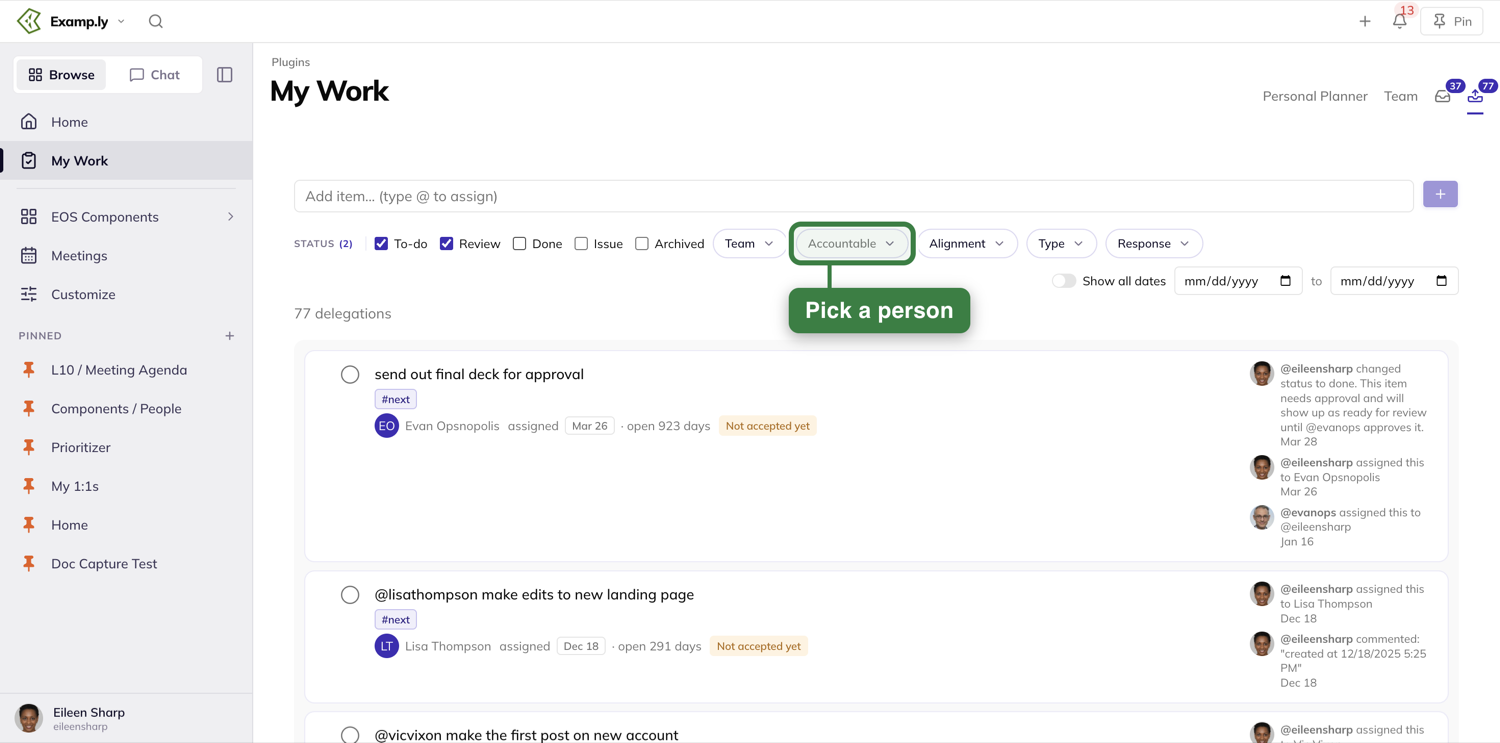
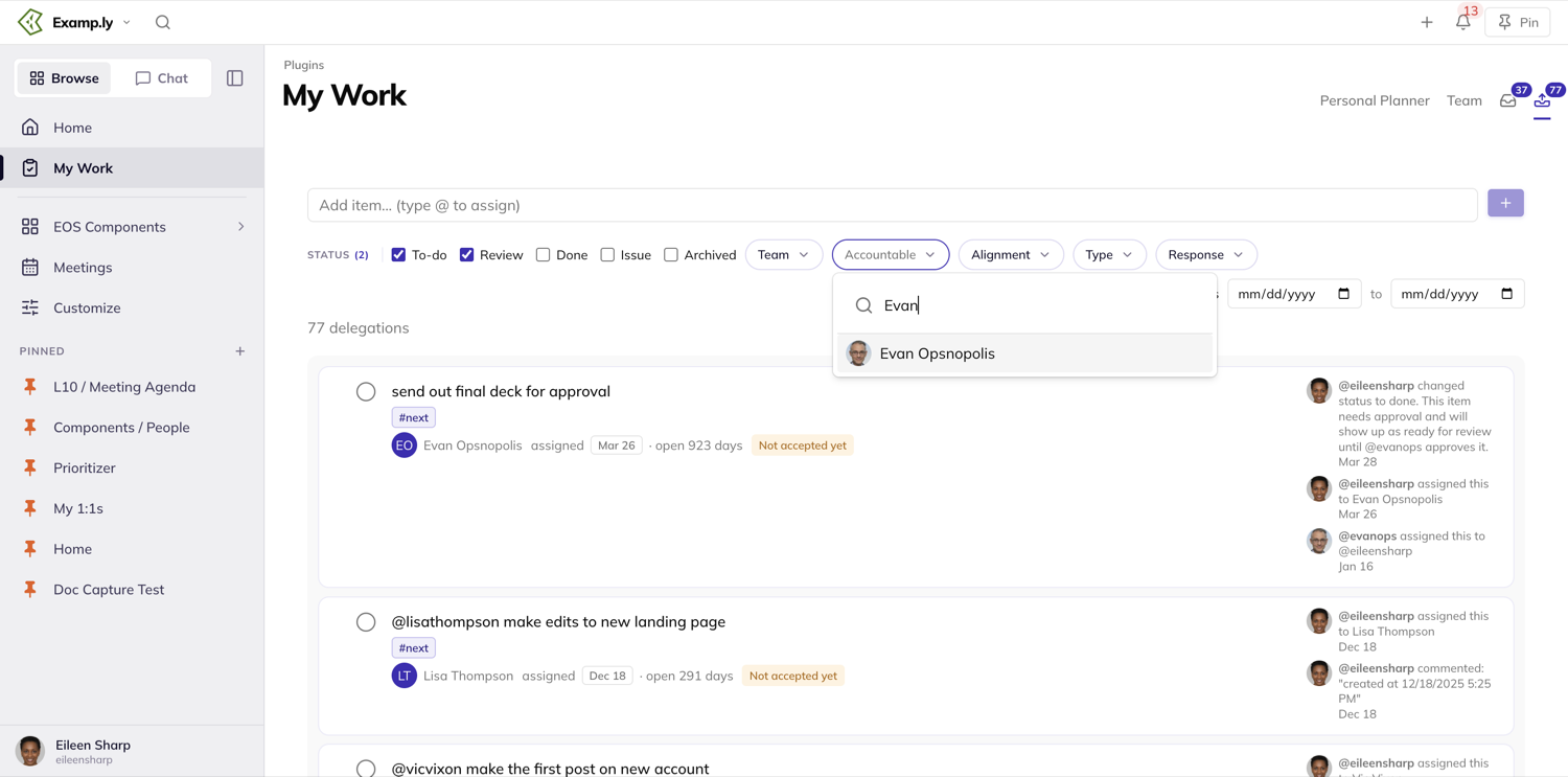
See who hasn't responded yet
The Response filter separates delegations the other person has acknowledged from ones still sitting untouched. It offers All, Not accepted yet and Accepted — choose Not accepted yet to see what needs a nudge.
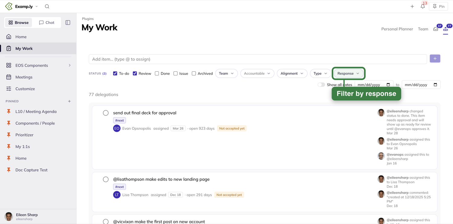
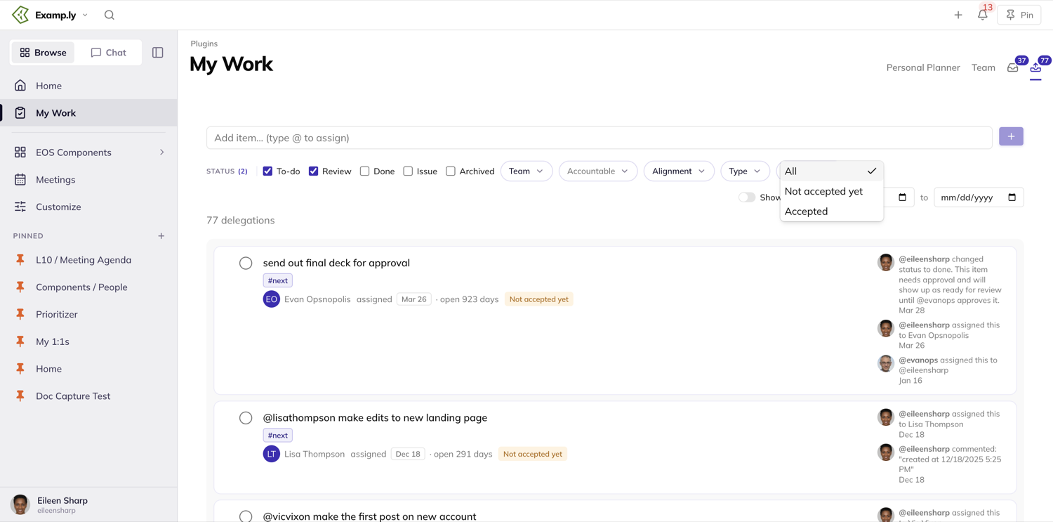
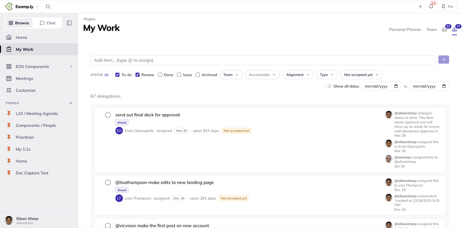
Reorder
Point at a row and its controls appear: a grip on the left to drag it, and buttons on the right to move it to the top, up or down. This reprioritizes your own list of delegations under the default Sort, which reads None (Priority); choosing Most Recently Assigned or Most Recently Updated orders the list by date instead.
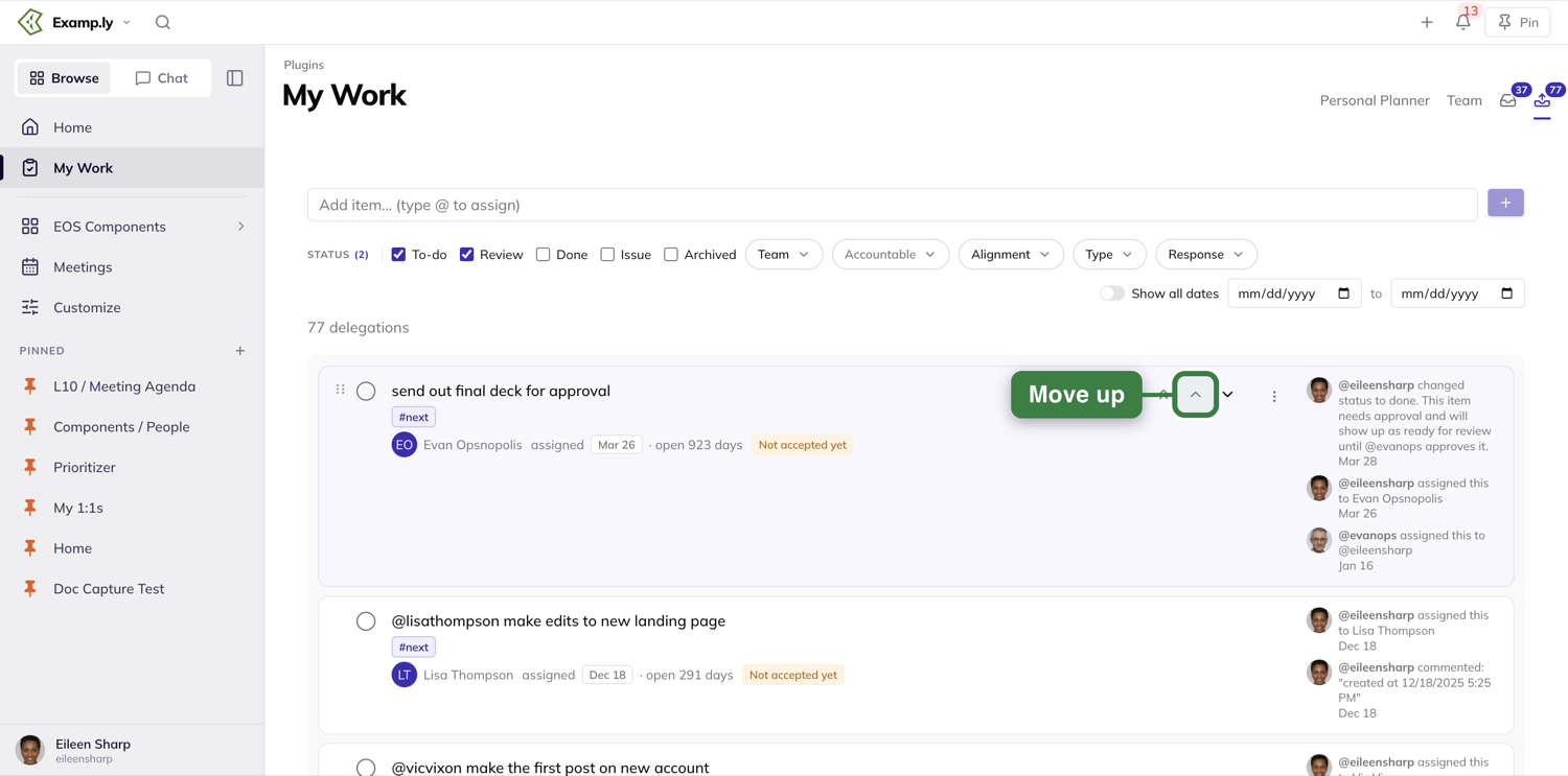
Delegate something new with an @mention
Type into the entry row at the top and @-mention the person you're asking. Pick them from the list that opens, then press Enter or the plus button.
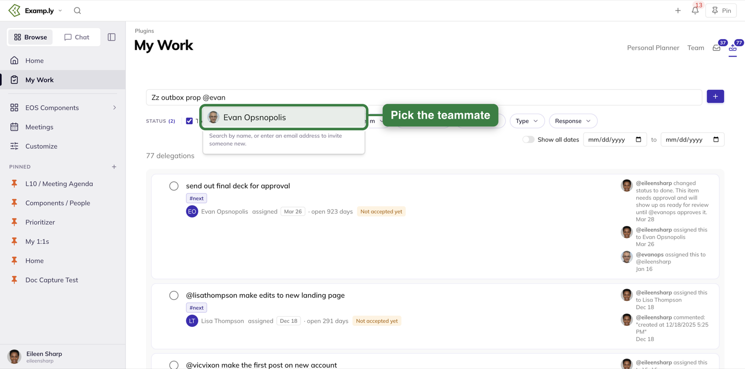
The new item appears already assigned to them, with a "Not accepted yet" tag until they respond — no separate step needed.
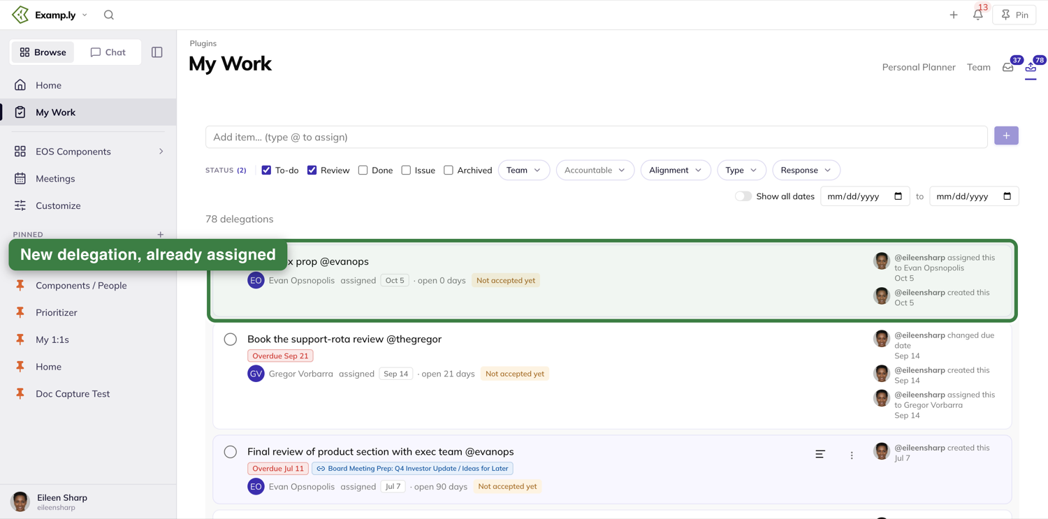
Handle a whole batch at once
At the bottom of the list, open Shortcuts. It offers Clear All #NEXT Tags, Track All Under A Team — which bulk-assigns a team to every delegation that doesn't have one yet, instead of setting it row by row — and Archive all shown.
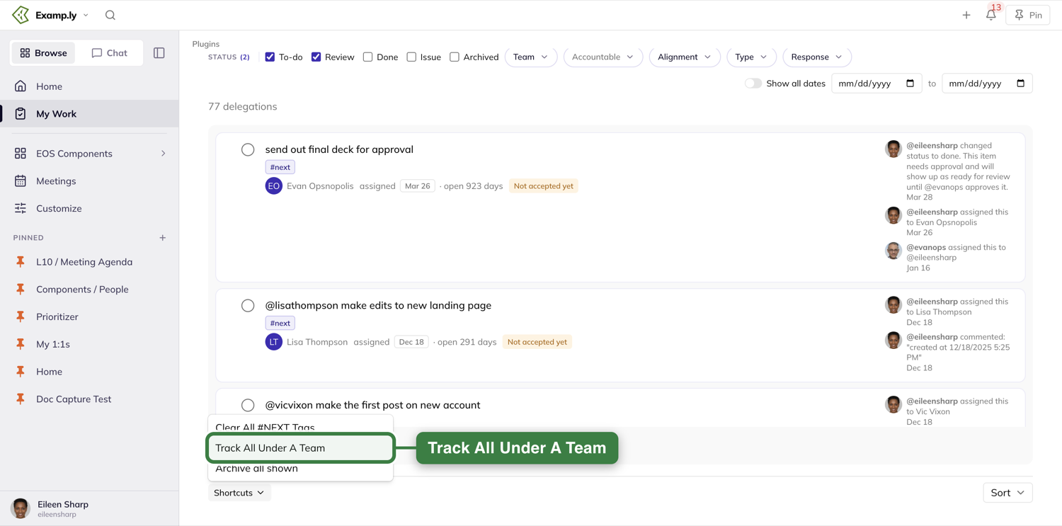
Was this helpful?
Inbox (Assigned to Me)
The Inbox — labeled Assigned to Me in the app's own navigation — is the one list of everything someone else has asked of you, from anywhere in ResultKit. It's a set of inputs to your day: you read what's been put on you, then decide what you'll commit to.
In this article
This walkthrough covers opening it, what each row offers, and narrowing the list.
Open the Inbox
Open My Work from the sidebar and press the inbox icon at the top right of the page. Its badge shows how many items are waiting. The list holds items other people assigned to you — Level 10 To-Dos, project assignments and 1:1 items — newest first, each showing who assigned it, the date, and how long it has been open.
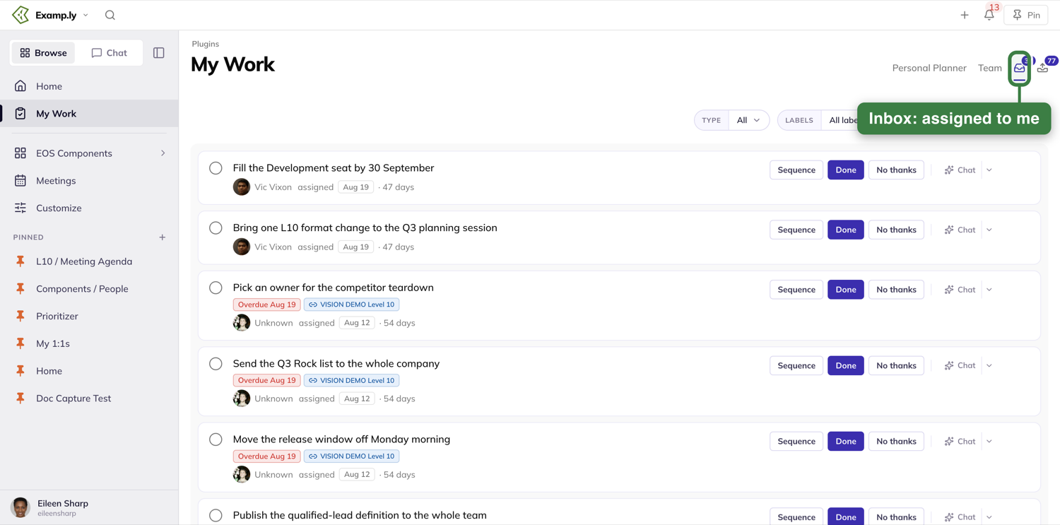
Decide what to do with a row
Each row carries three buttons: Sequence, Done and No thanks. Sequence puts the item in your own ordered list so you can plan it. Done marks it finished. No thanks declines it. A Chat button opens the AI chat about that item, and the arrow beside it opens more.
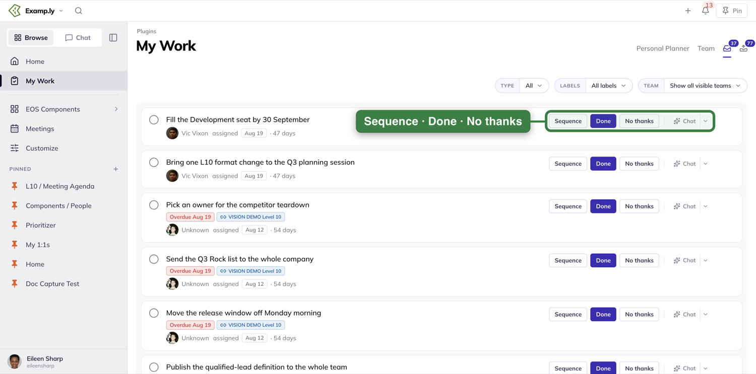
Press the item's name or its circle to open it in the item sheet, as anywhere else in ResultKit.
Narrow the list
Three filters sit above the list: Type, Labels and Team. Team defaults to Show all visible teams, which leaves out teams you've muted.
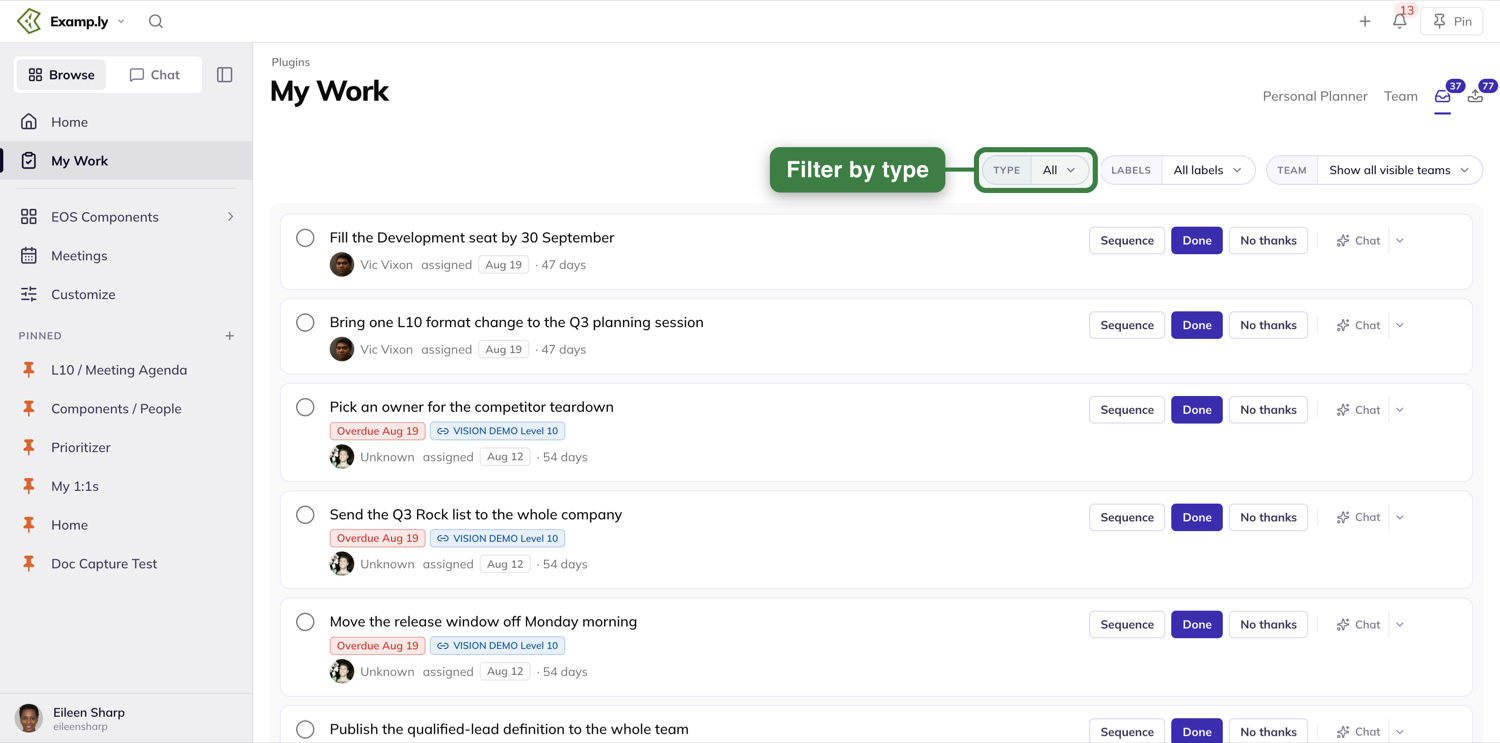
Type offers All, Level 10 To-Dos, Project assignments and 1:1s.
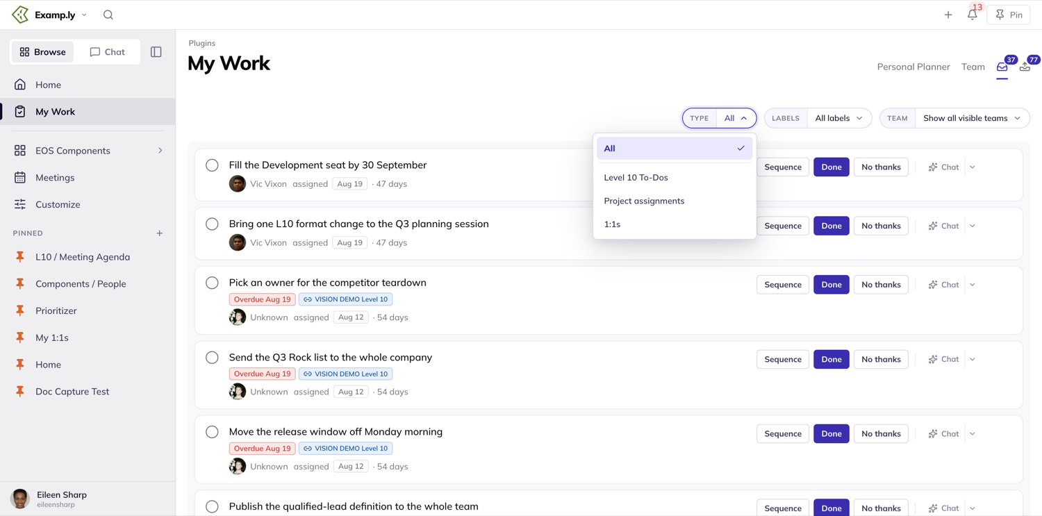
Was this helpful?
Opening and Editing in the Item Sheet
Click any item — on a Level 10 board, a project, a roadmap, or your own My Work — and it opens in one panel, right over the page you were on.
In this article
The panel stays open while you edit, and every change saves as you make it. There's no Save button anywhere: the footer says Changes save automatically.
This article walks through opening the sheet, editing its Details tab, and what happens when a teammate has the same item open.
Open an item
Click any item card, row, or title anywhere in ResultKit. A panel slides in from the right, over the page you were on. Four tabs sit across the top: Details, Comments, Steps, and Alignment/Spaces. Details opens first.
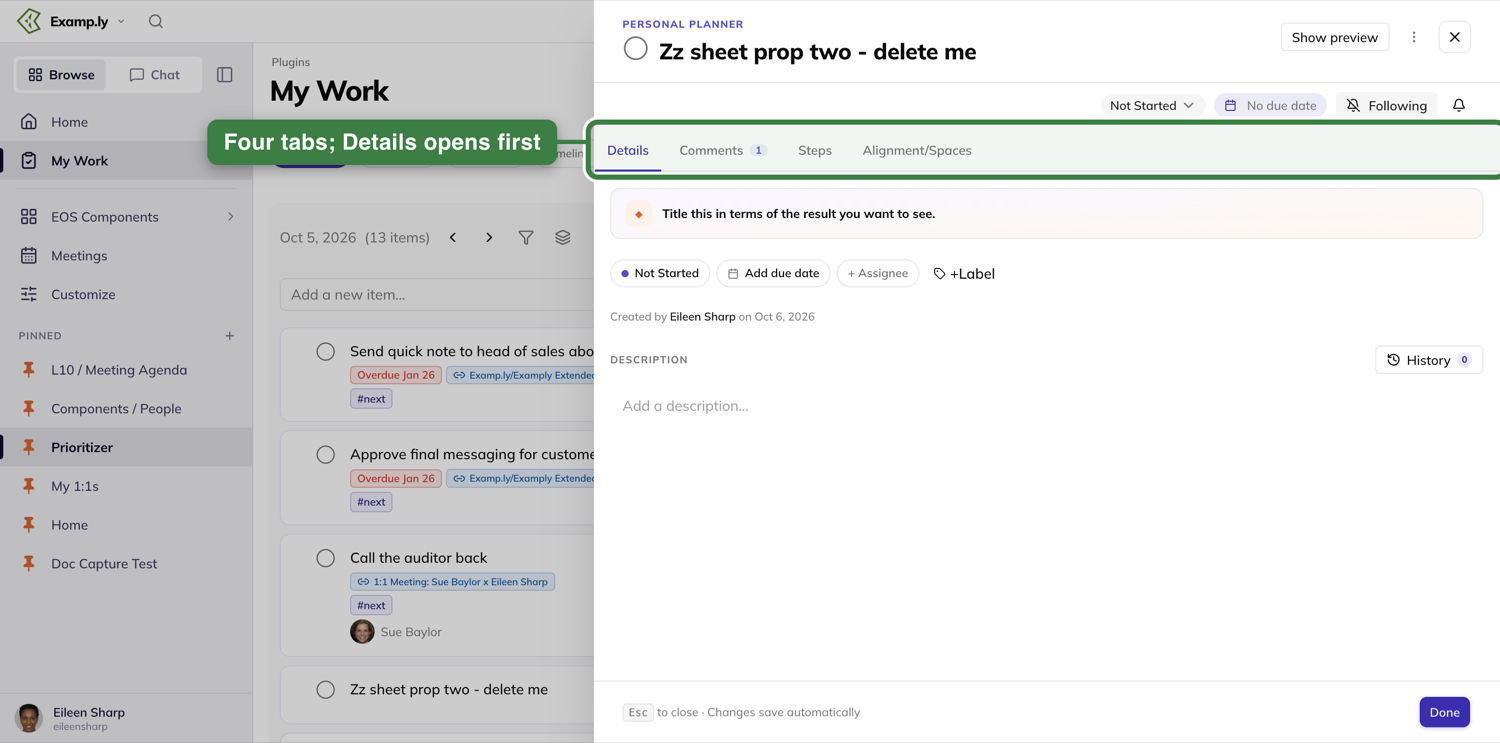
Edit the Details tab
Under the title, one row of pills: status, due date, assignee, and a label button. Click any pill to change it. The change shows at once — you don't wait for a save to finish.
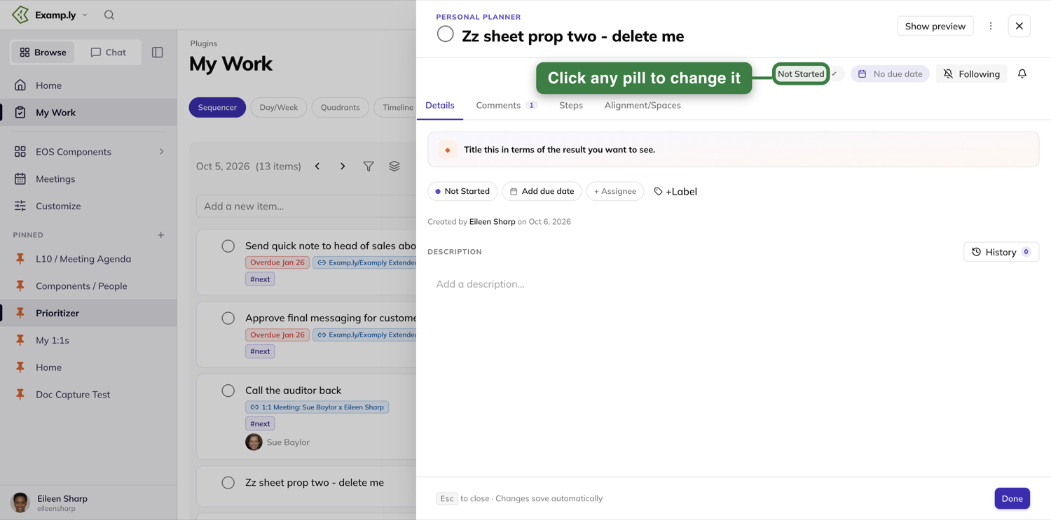
If your change gets refused, the field puts itself back to what it was before.
Add a label
Press +Label to open the label picker.
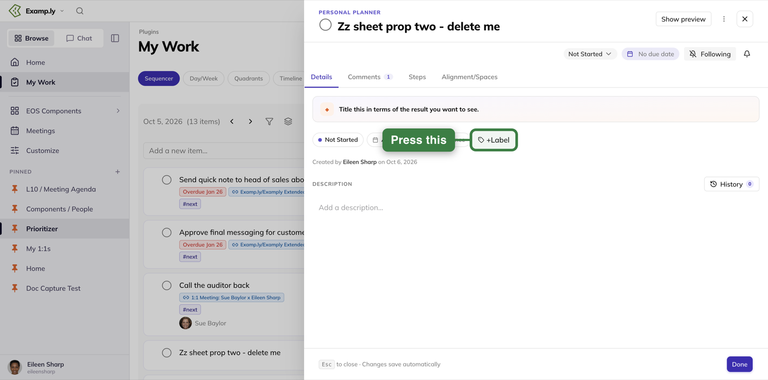
The picker lists your Personal labels first, then your team's. Tick one and it appears on the item at once, in the sheet and on the card behind it.
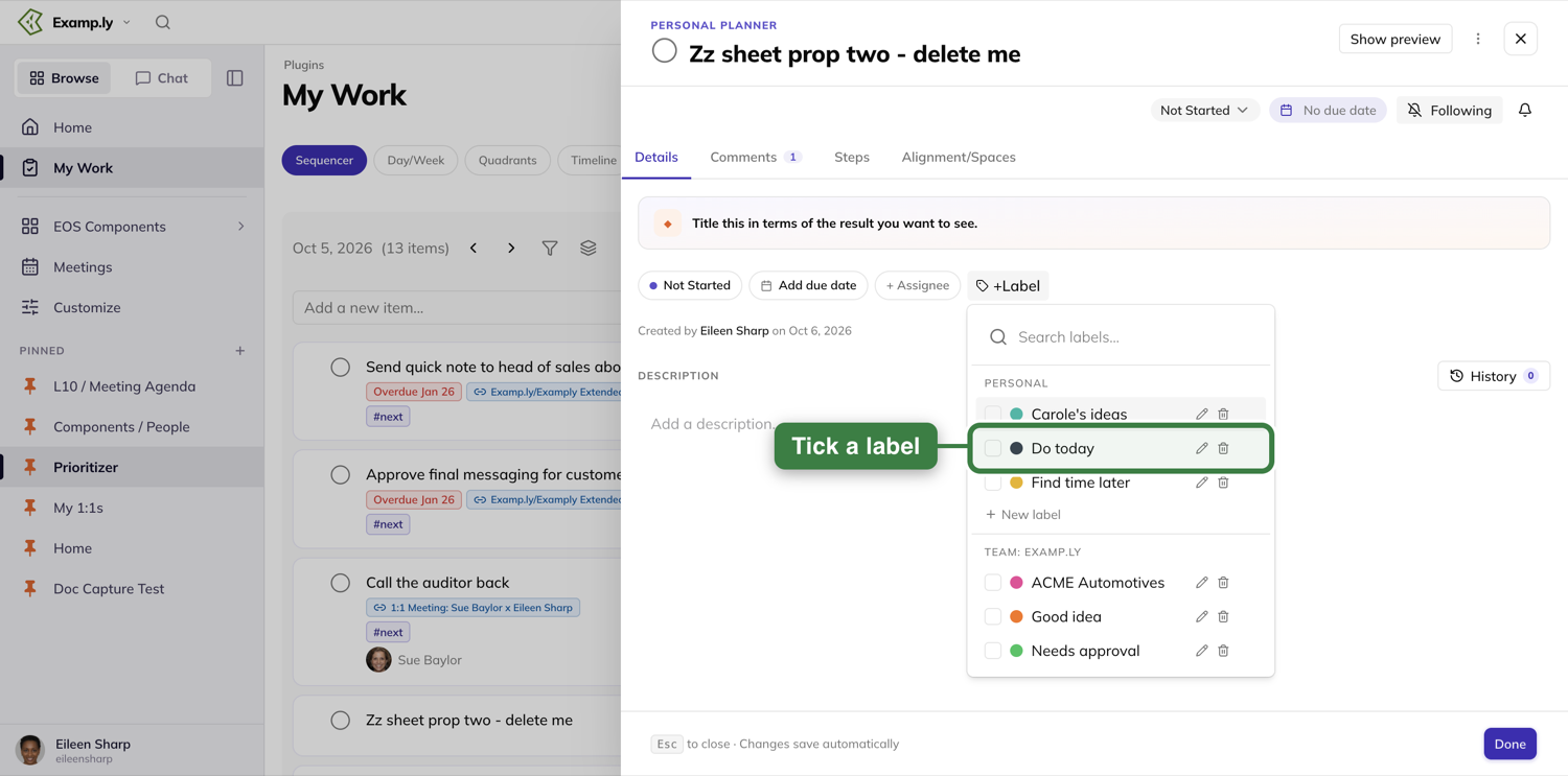
Mention or invite someone
Type @ in the item's description to bring up a picker of people across your whole organization, not just this item's team. It also finds recent meetings and other items that match.
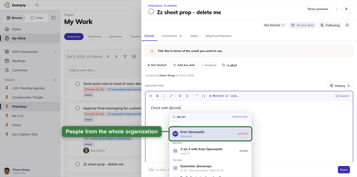
Type an email that matches nobody, and the same list offers to invite that person — even if they've never signed in before.
Format the description, and attach a file
Click into the description and a toolbar appears above it: Heading, Bold, Italic, Link, bulleted and numbered lists, Quote, Code, and Mention or link. Expand opens the description full size.
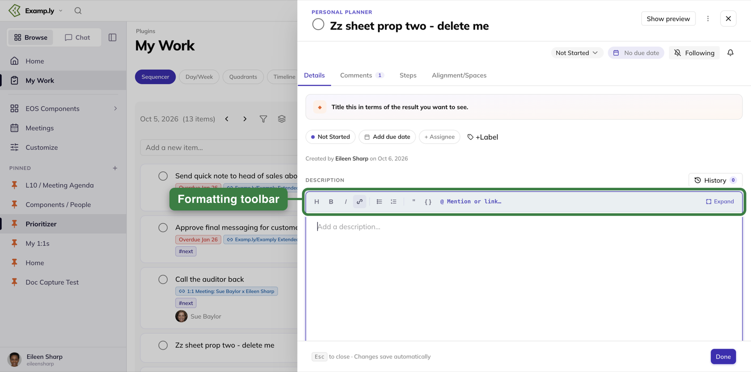
Below the description sits an Attachments section. Press Upload File to add a file from your computer, or Add Link to attach a URL. Further down, Move to a different project… files the item under a project.
Close it
Press Done, the ✕, the backdrop behind the panel, or Esc — all of them close the sheet the same way.
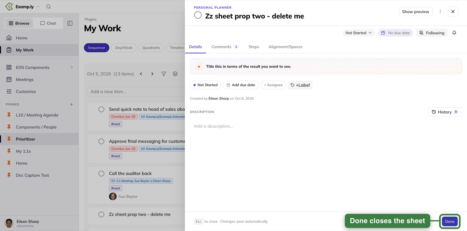
Nothing you typed is waiting to be saved. It was saved the moment you typed it.
Working on another team's item
Open an item that belongs to a different team than the one you have selected, and the sheet switches to that item's own context. The eyebrow, the assignee picker, and the labels all resolve to the item's team — not the one you started on.
What happens if someone else has it open too
If a teammate renames the item or changes its status while your panel is open, you see their change appear without refreshing. An open sheet keeps listening — it isn't a snapshot taken the moment you opened it.
Was this helpful?
Comments and Steps in the Item Sheet
The item sheet holds more than the Details tab. Comments keeps every conversation about the work attached to the work itself, and Steps breaks it into smaller pieces without opening a second panel.
In this article
Both tabs sit next to Details, at the top of the same panel you already know how to open.
This article covers reading and posting comments, then building and opening steps.
Read the comment feed
Open the Comments tab. Discussion and system events sit together under day headers, oldest first. Three buttons above the feed — All, Comments and Updates — each carry a count. Choose Comments to see just what people wrote, or Updates to see what changed.
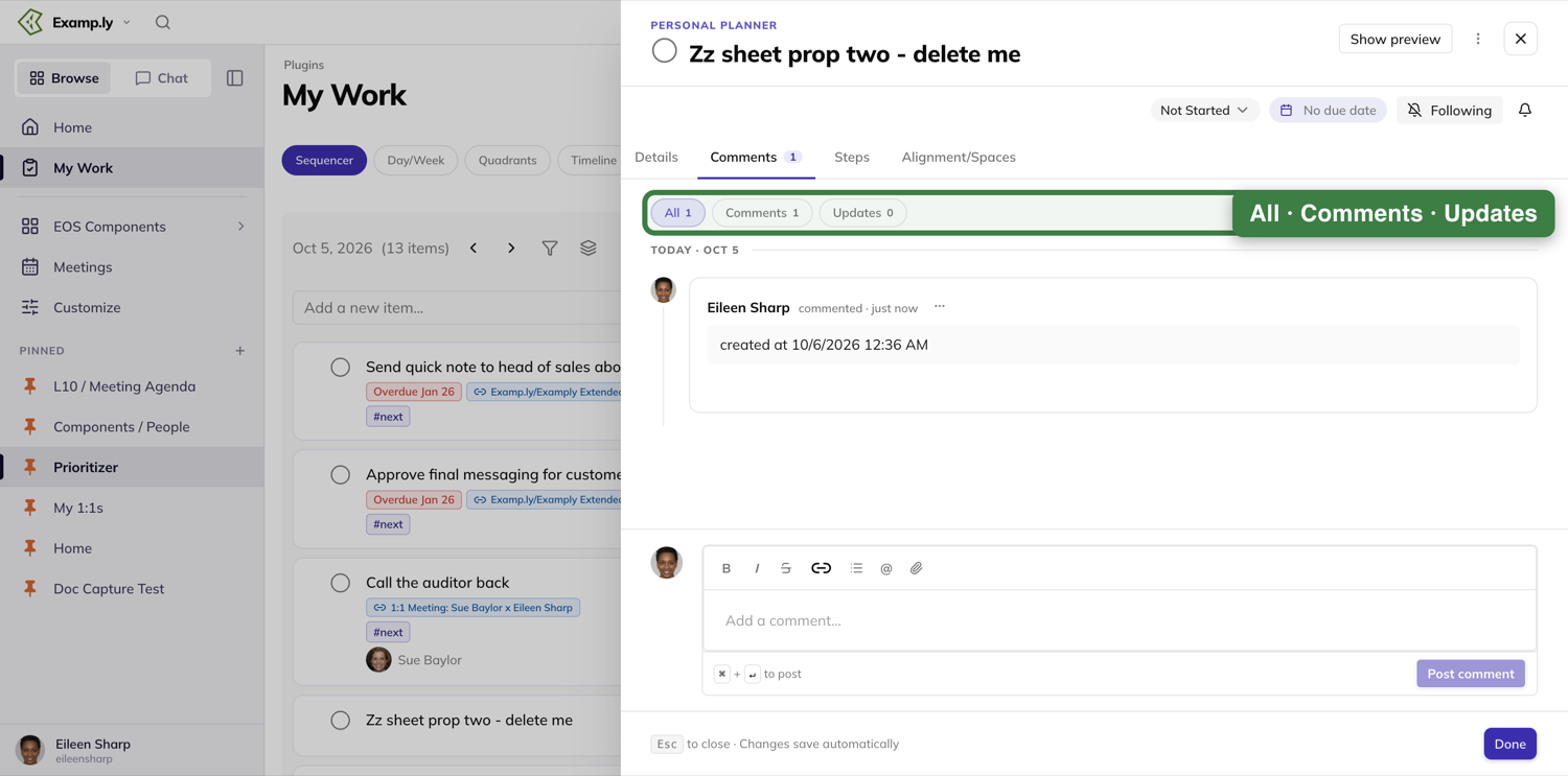
Post a comment
A composer sits at the foot of the tab, with a toolbar above it: Bold, Italic, Strikethrough, Insert link, Bulleted list, Mention, and Attach. Type your comment and press ⌘ or Ctrl with Enter to post it — or press Post comment.
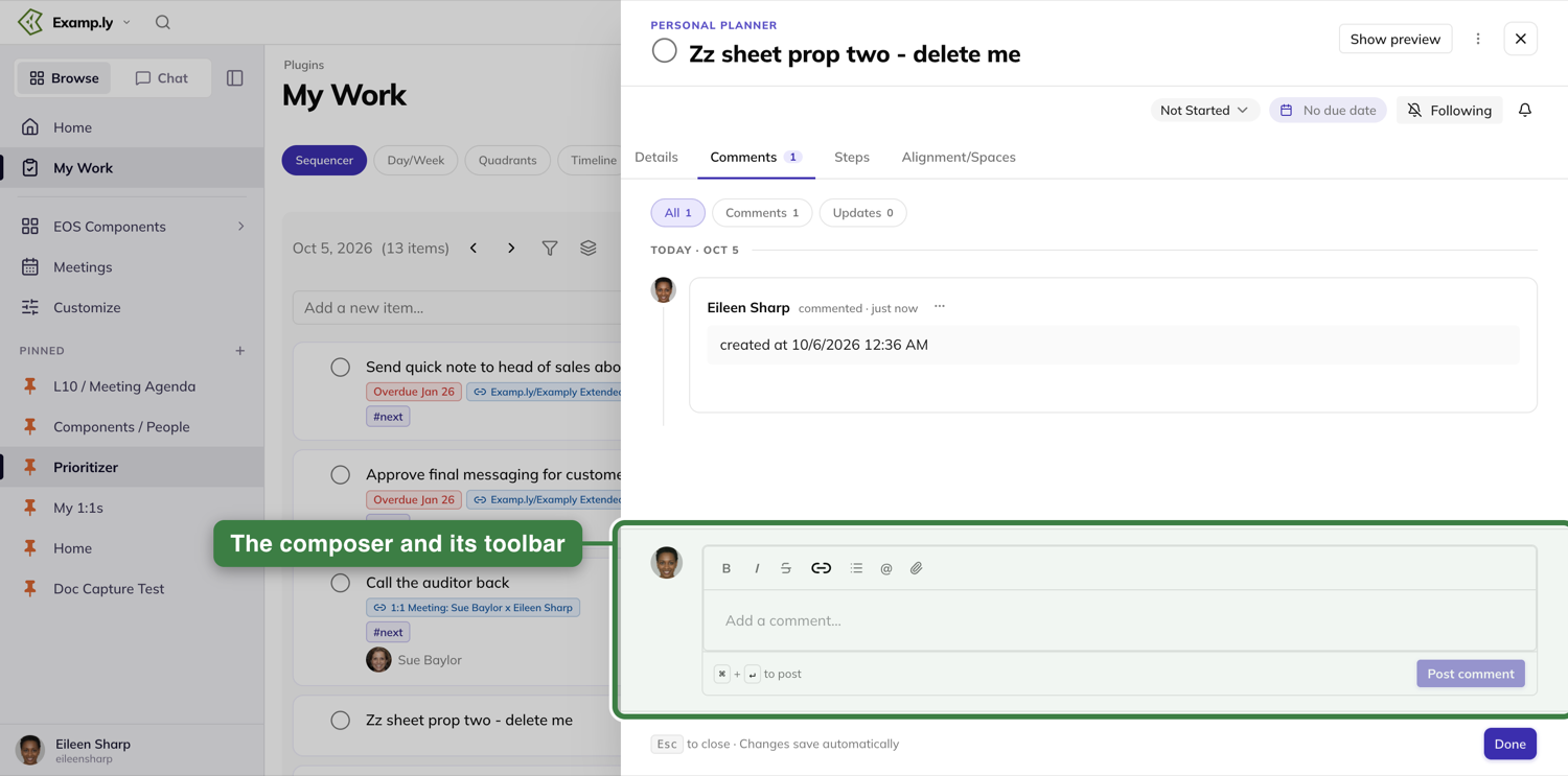
You can edit or delete your own comments from their own ⋯ menu. Nobody else's comments carry that menu for you.
Break the item into steps
Open the Steps tab. Type a step's name into the Add step… row and press Enter or Add.
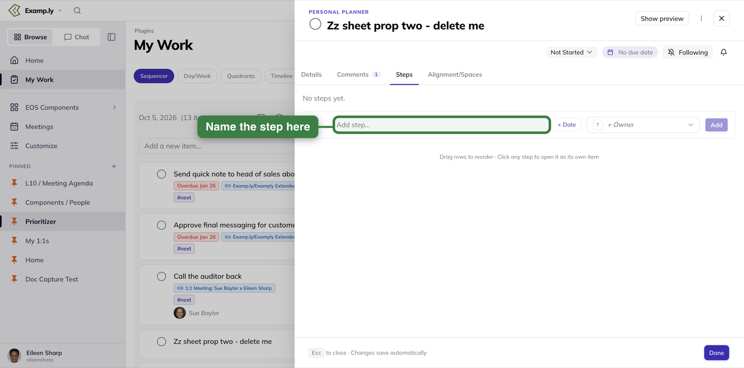
A progress bar and a line like "0 of 2 done · 2 remaining" sit above the list. Sort reorders it and Show completed brings finished steps back.
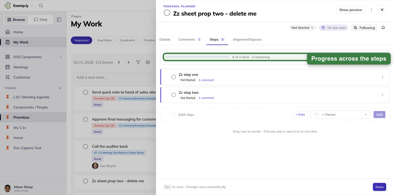
Give a step a due date and an owner from the + Date and + Owner pills in that row before you add it — a step is a real item, not a checklist line.
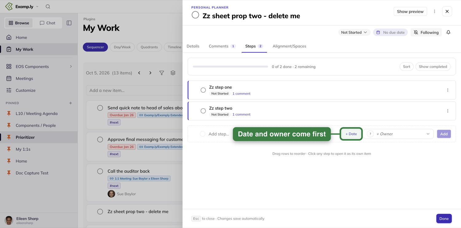
Open a step on its own
Click a step's name and it becomes the open item in the same panel, with its own Details, Comments, Steps and Alignment/Spaces tabs.
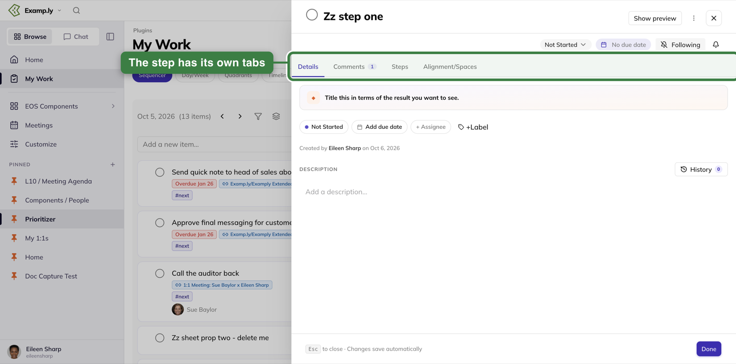
Use your browser's Back button to return to the item the step belonged to.
Was this helpful?
Alignment and Where Your Work Appears
The last tab in the item sheet, Alignment/Spaces, answers two questions about a piece of work: what it's for, and everywhere it currently lives.
In this article
Both sit in the same tab, one above the other, so you never have to leave the panel to check either.
This article covers reading and changing both.
See what the work is for, and where it lives
Open the Alignment/Spaces tab. A note at the top reminds you that you only see what you have access to. The Alignment section names what this item ladders up to — a Rock or Milestone, or the project and column it sits in. An item can also be Unaligned, and the tab says so plainly rather than showing an empty line.
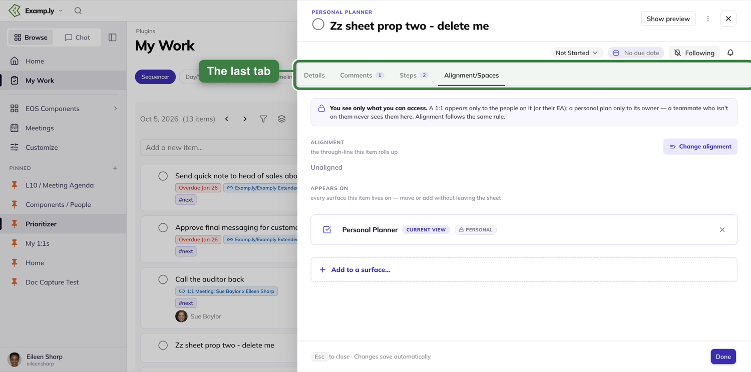
Below it sits Appears on — every place this item currently shows up, filtered to what you're allowed to see.
Realign it
Press Change alignment.
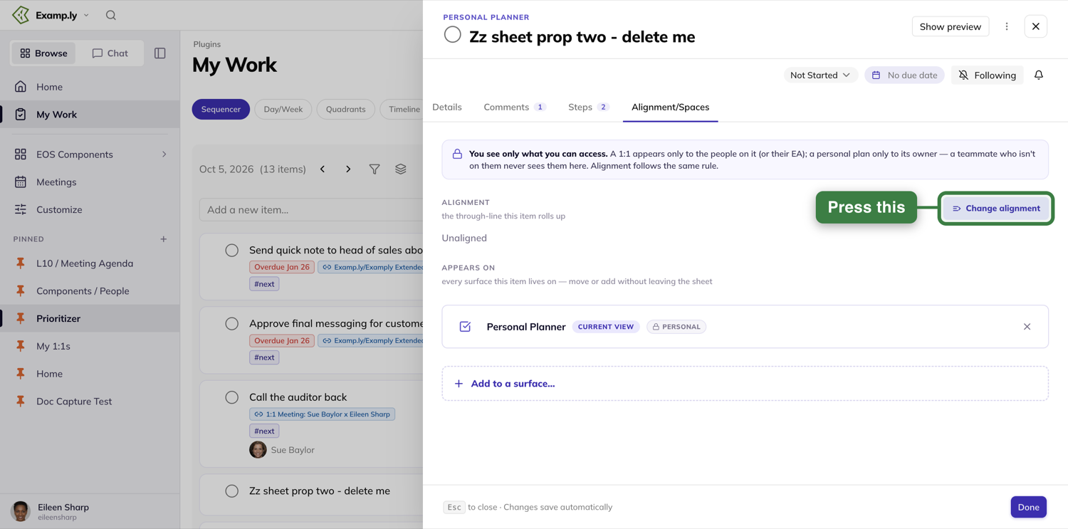
A picker opens: pick the team, then Traction, Project / Process, or Other, then the Rock or Milestone you want, and press Align here. A note at the bottom tells you that re-aligning moves the item, and its sub-items, under the new milestone.
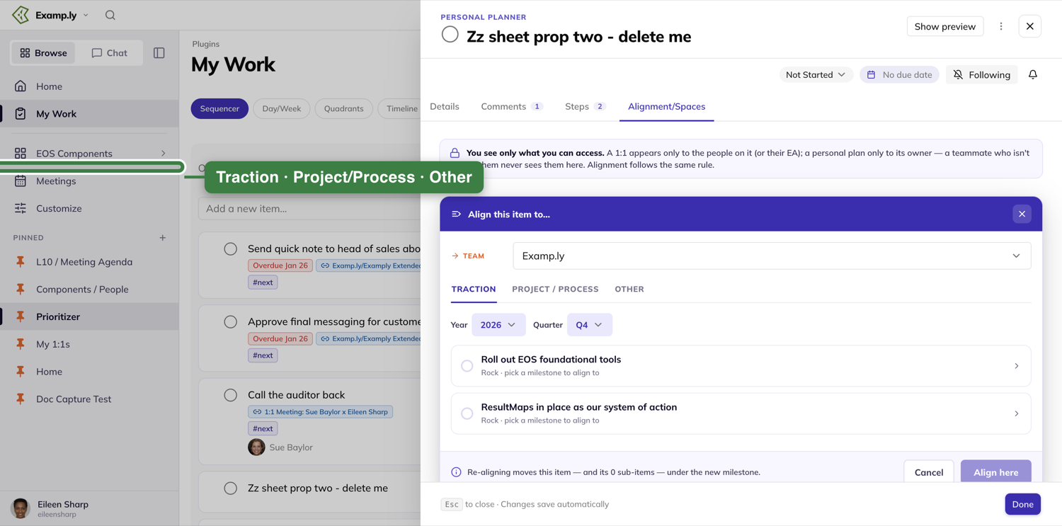
Add it to another surface
Press Add to a surface… to put the item in one more place, without taking it off any of the others.
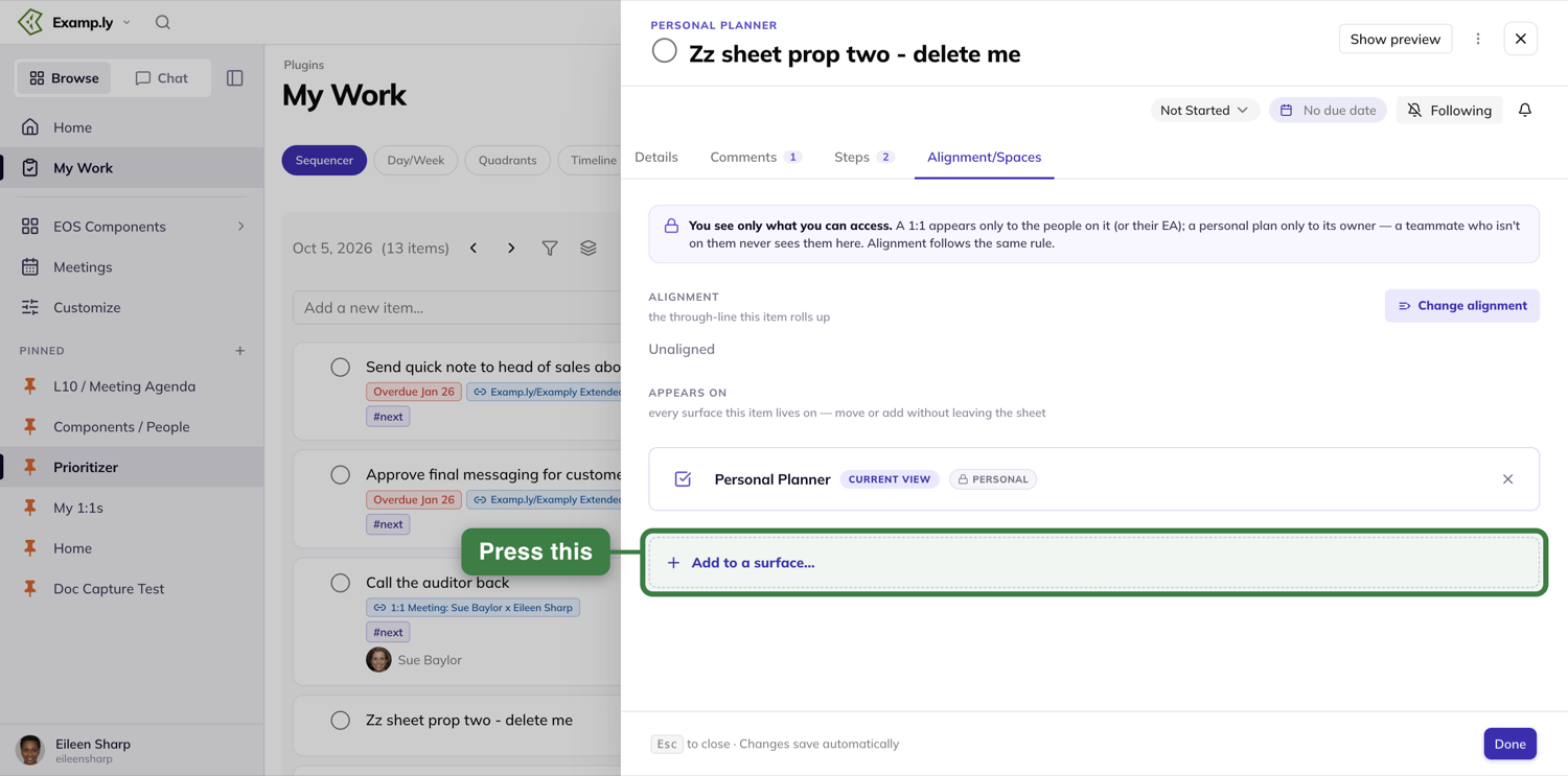
The list offers the Weekly Level 10 (To-Do, Issues or Park for later), the long-term issues list, and other surfaces: your own plan, a 1:1, a project, or a scorecard measurable. Each one asks for the next detail — a team and section, a person, a project and column.
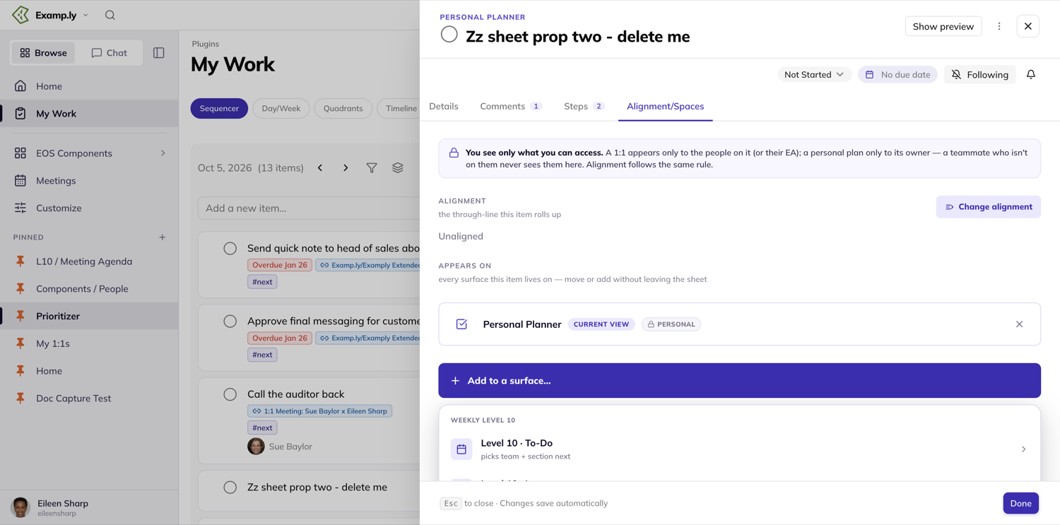
Neither adding nor removing has a save step. Each change commits the moment you confirm it.
Where you can open the item sheet from
The same panel opens the same way from My Work, a Level 10 board, a project, a roadmap, a notification, the command palette, and more than two dozen other places in ResultKit. Wherever you click an item, this is the panel that opens.
Was this helpful?
Creating and Applying Labels
Open the label picker from any item and you'll see up to three groups — Personal, Team: {your team}, and, inside a project, Project: {your project}. Every group works the same way to apply a label; they differ only in who can create, rename, or delete one.
In this article
1. Open the label picker
Press +Label on any item — from the item sheet on a My Work view, a Level 10 board, a project, or a roadmap card. (An item that already has labels shows them as chips beside a "1 label", "2 labels" button instead; it opens the same picker.)
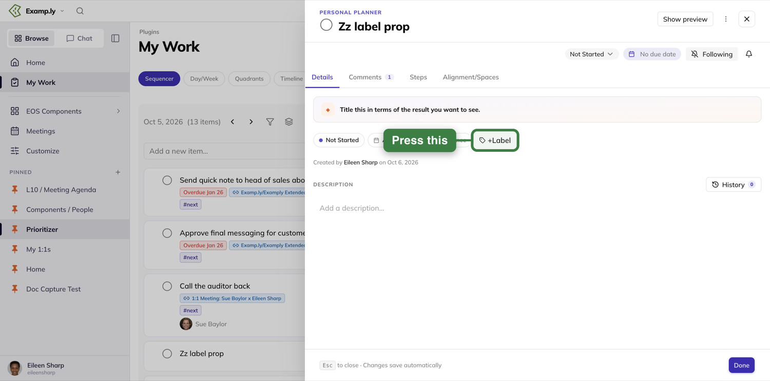
2. Create a personal label
Anyone can make a Personal label — no admin role needed, and it works even on an item you can't edit. In the Personal section, press + New label.
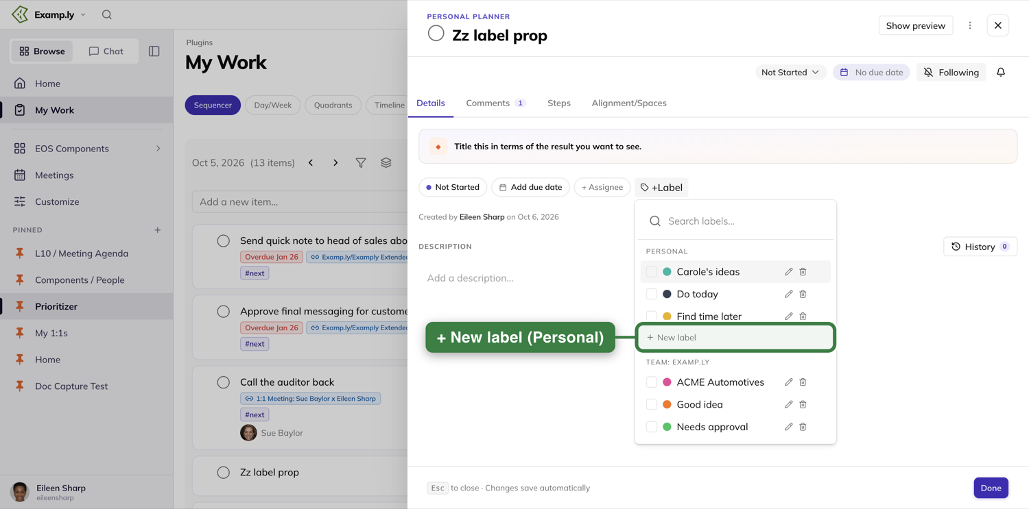
Type a name, choose a color, and press Save. The label is created and applied to the item at once.
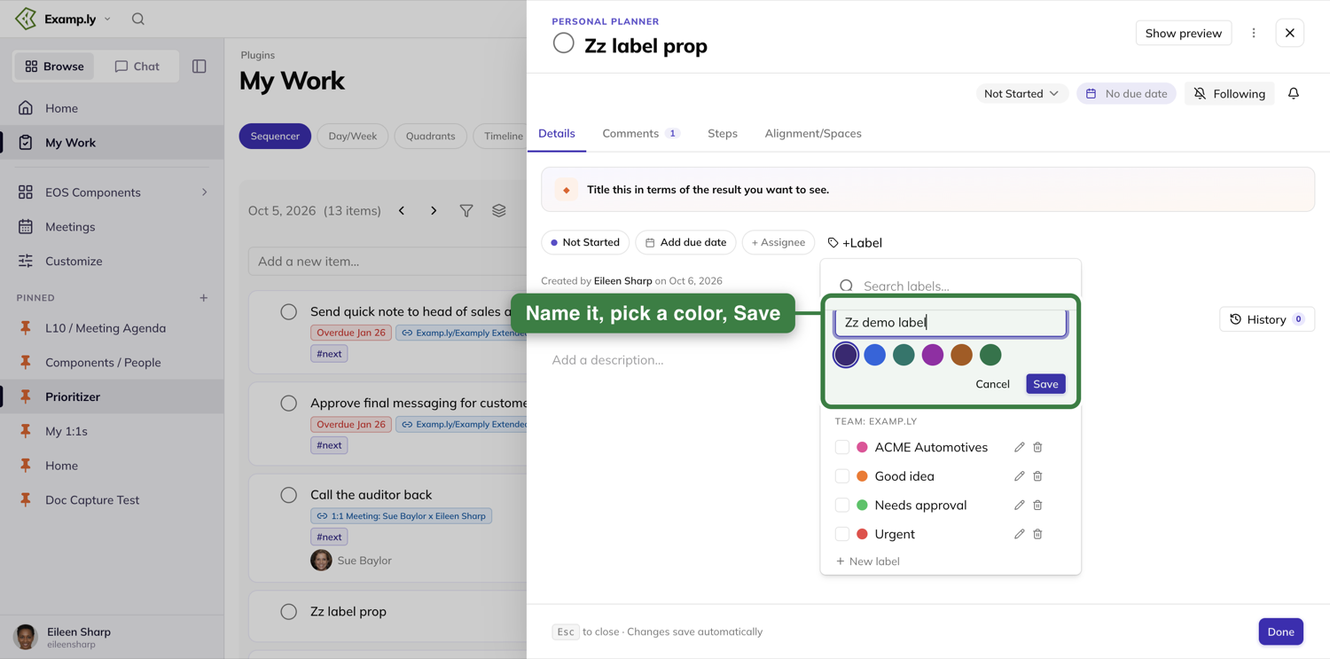
3. Create a team label — admins only
In a Team: {team name} section, only a team admin sees + New label.
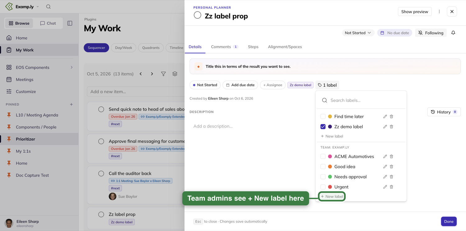
Everyone else sees the team's existing labels with no way to add one.
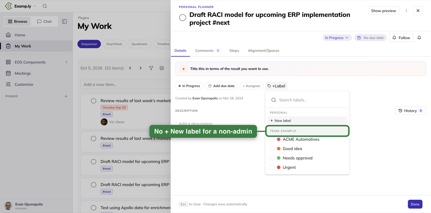
4. Apply an existing label
Tick the box next to any label — Personal, Team, or Project — to apply it. Untick it to remove it. Both happen immediately; there's no Save button anywhere in the picker.
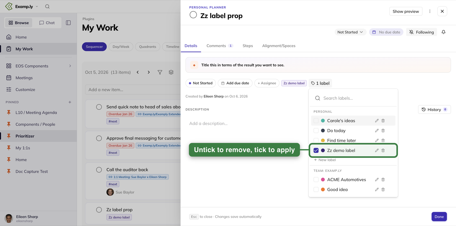
5. Rename or delete a label you own, right from the picker
Every label you can create, you can also edit from the dropdown itself. Each row has a pencil and a bin at its right — rename updates every card that already wears the label. Deleting from the picker is immediate — there's no confirmation step here, so double-check the row before you press the bin.
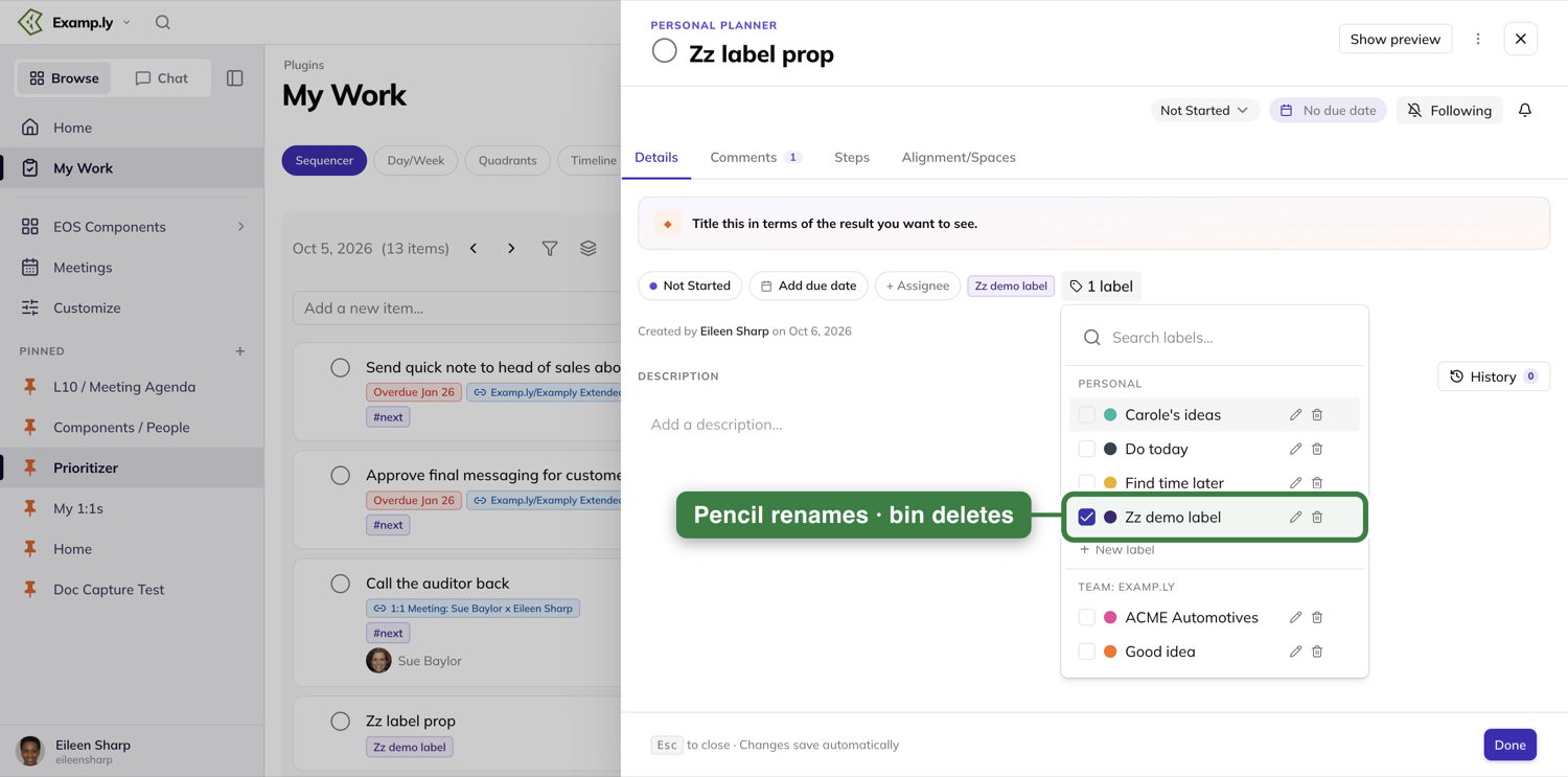
6. Manage labels outside an item — this is where deleting asks first
You don't need an item open to manage your own labels:
- Personal Settings → Labels manages your Personal labels.
- A team's Labels, Tags & Stages → Labels tab manages that team's Team labels.
- A project's item sidebar carries the same picker for Project labels, scoped to that project.
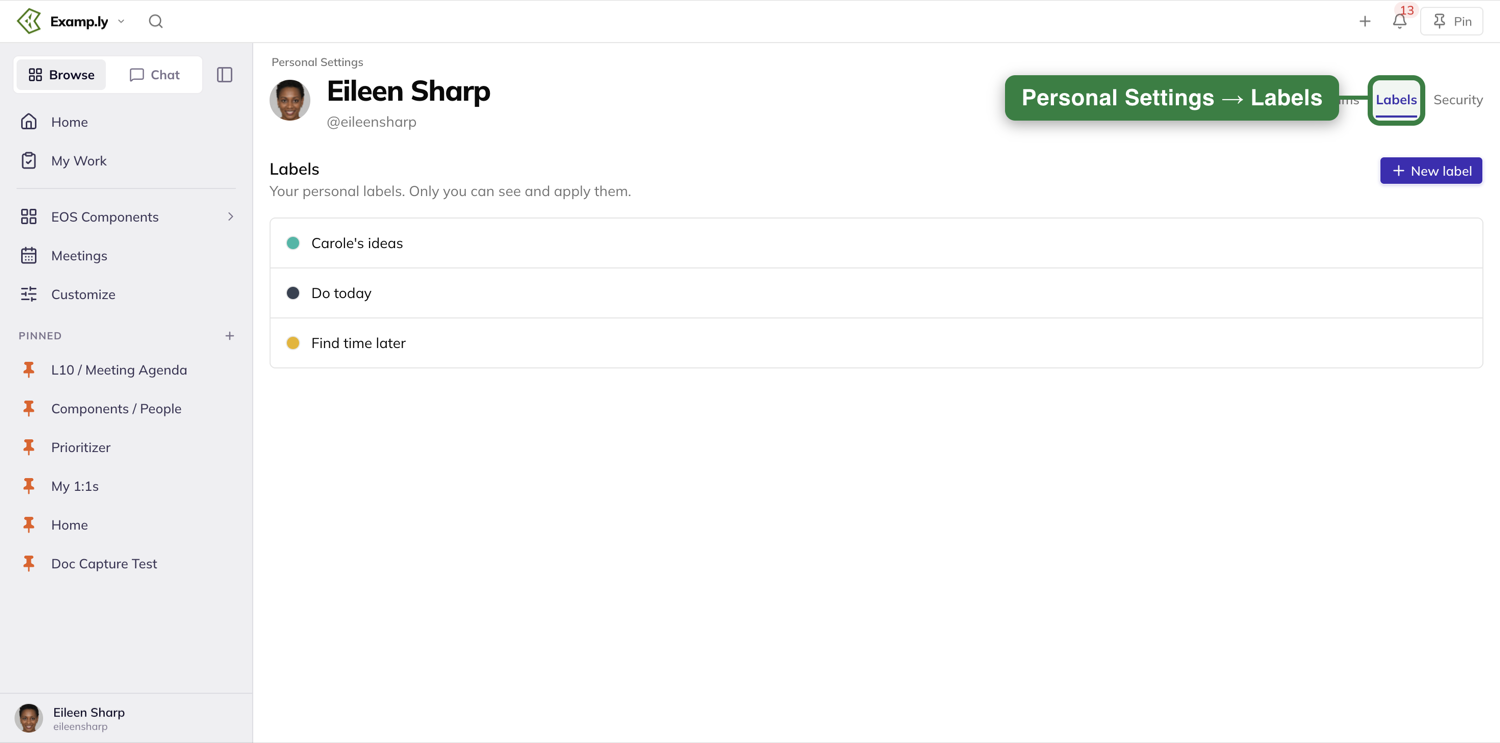
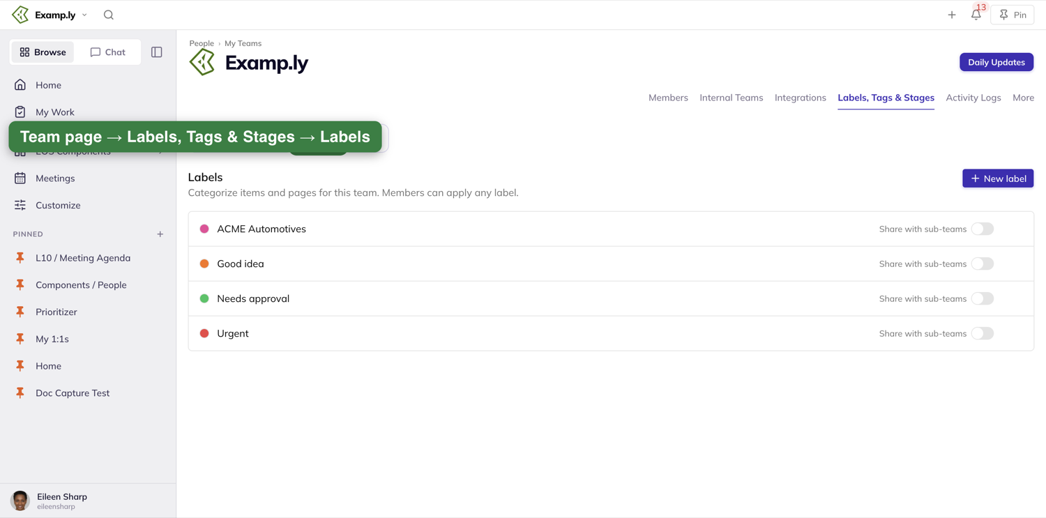
Unlike the picker, deleting from one of these management screens does confirm first.
7. What you'll never see
System (Eisenhower) priority labels never appear in any of these three sections, on any screen shown above — they're set only from the Quadrants view. And a label you make for yourself never shows up for anyone else, on any item, anywhere — Personal really does mean personal.
Was this helpful?
Sharing a Team Label Across Teams
A team admin can push one label down through every team beneath theirs, instead of remaking it on each one — from your organization's root team all the way to the bottom of its hierarchy.
In this article
1. Find the sharing toggle
Open your team's page, then Labels, Tags & Stages, then its Labels tab. Each of your team's labels has a Share with sub-teams toggle.
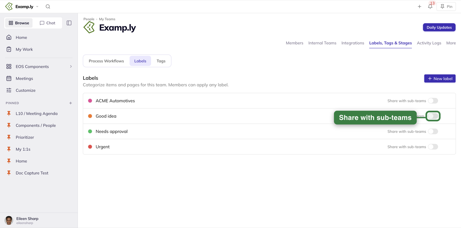
2. Turn sharing on
Switch the toggle on. It saves immediately — reload the page and it's still on.
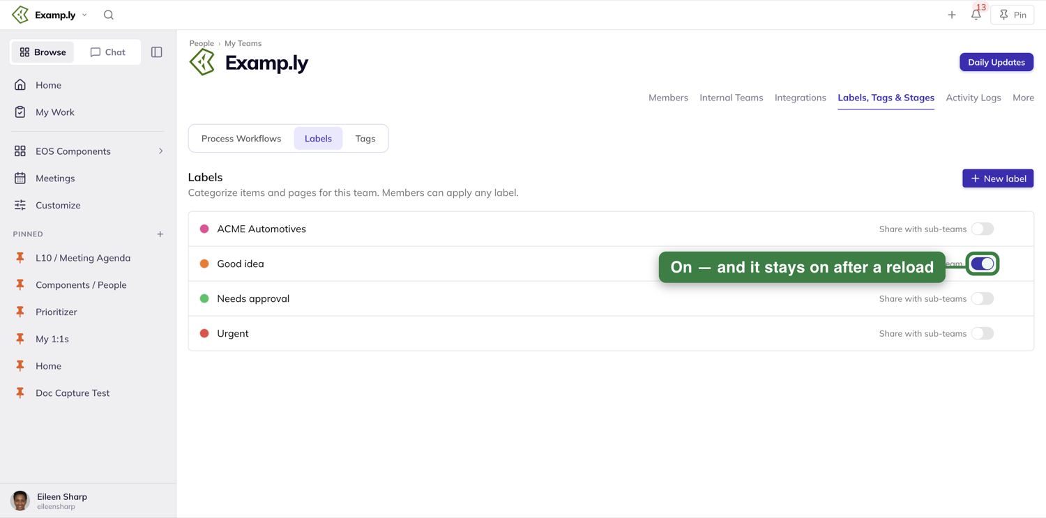
3. See it show up on a sub-team
Anyone on a team beneath yours now sees the shared label in their own item sheet's Team section, marked Inherited from the team that shared it. They can apply it like any other team label — but only the sharing team can rename, delete, or stop sharing it.
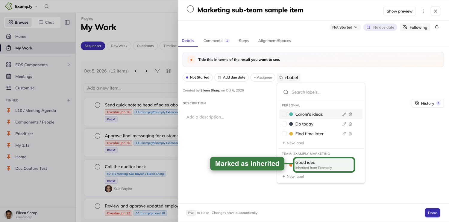
4. Sharing stays inside your organization, and only flows downward
A shared label reaches every team below yours — children, grandchildren, and deeper — but never a sibling team, never a team above yours, and never a team in a different organization. Nothing to configure here; it's just how the boundary works.
5. Turning off sharing asks first
Switching the toggle off removes the label from every sub-team's item sheet and every card that showed it. If the label is in use below your team, a confirmation spells out what will happen before anything is removed — how many items lose the label and how many roadmap lanes fall back to the "No label" lane. Press Cancel to keep sharing, or Stop sharing to go ahead.
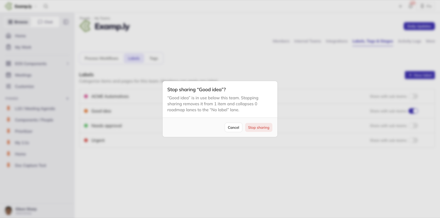
6. A shared label can become a roadmap lane
On a sub-team's swimlane roadmap, the Labels shown as lanes picker (the lane cog) reads the same team-label set — a shared label appears there too, marked as inherited, and checking it turns it into a swimlane. Not captured this time: setting up a swimlane roadmap for a sub-team was out of scope for this pass.
Was this helpful?
The Compass Dock
The Compass dock is a shared mechanism, not one screen — the shots below are captured from My Work, but everything described applies wherever the dock opens (the Level 10 board, a 1-on-1, a project view).
In this article
Opening the dock
Look for the compass icon in the top bar. It only appears on a page that actually offers the dock — if you don't see it, this screen doesn't pull in outside work.
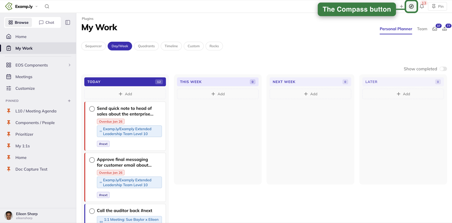
Press it, and a panel slides in from the right edge of the screen, open over whatever you were doing.
What the dock shows changes by where you opened it
On My Work, the dock shows four tabs: Inbox, Weekly L10, Rocks, and Projects. It deliberately leaves out a My Work tab (you're already there), 1:1/Work Sessions, and Long-term Issues — those only appear when the dock is opened from the Level 10 board, a 1-on-1, or a project view instead.
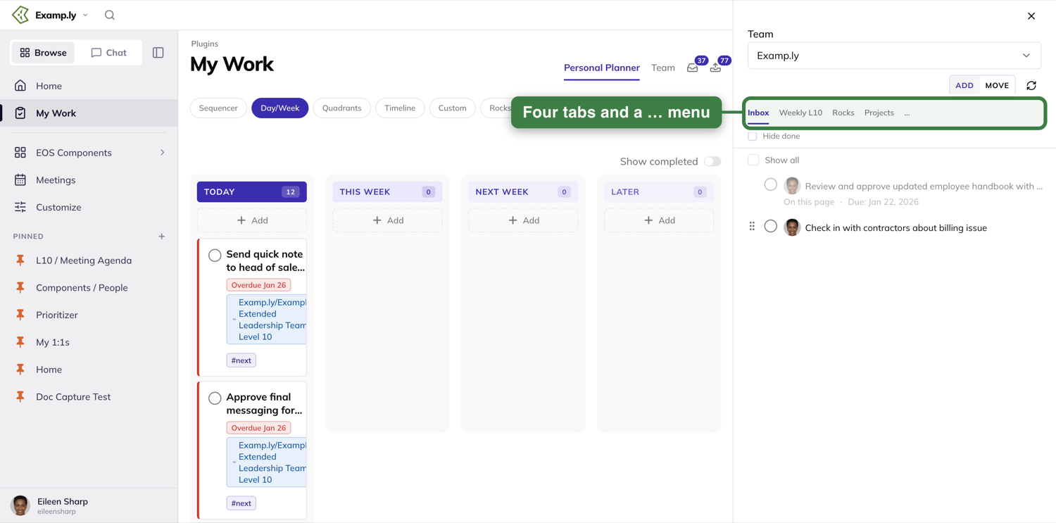
The … control at the end of the tab strip holds any further tabs.
Switching teams
A Team selector at the top of the dock lets you choose whose data the tabs show. With only one team, it still shows — there's just nothing to switch to.
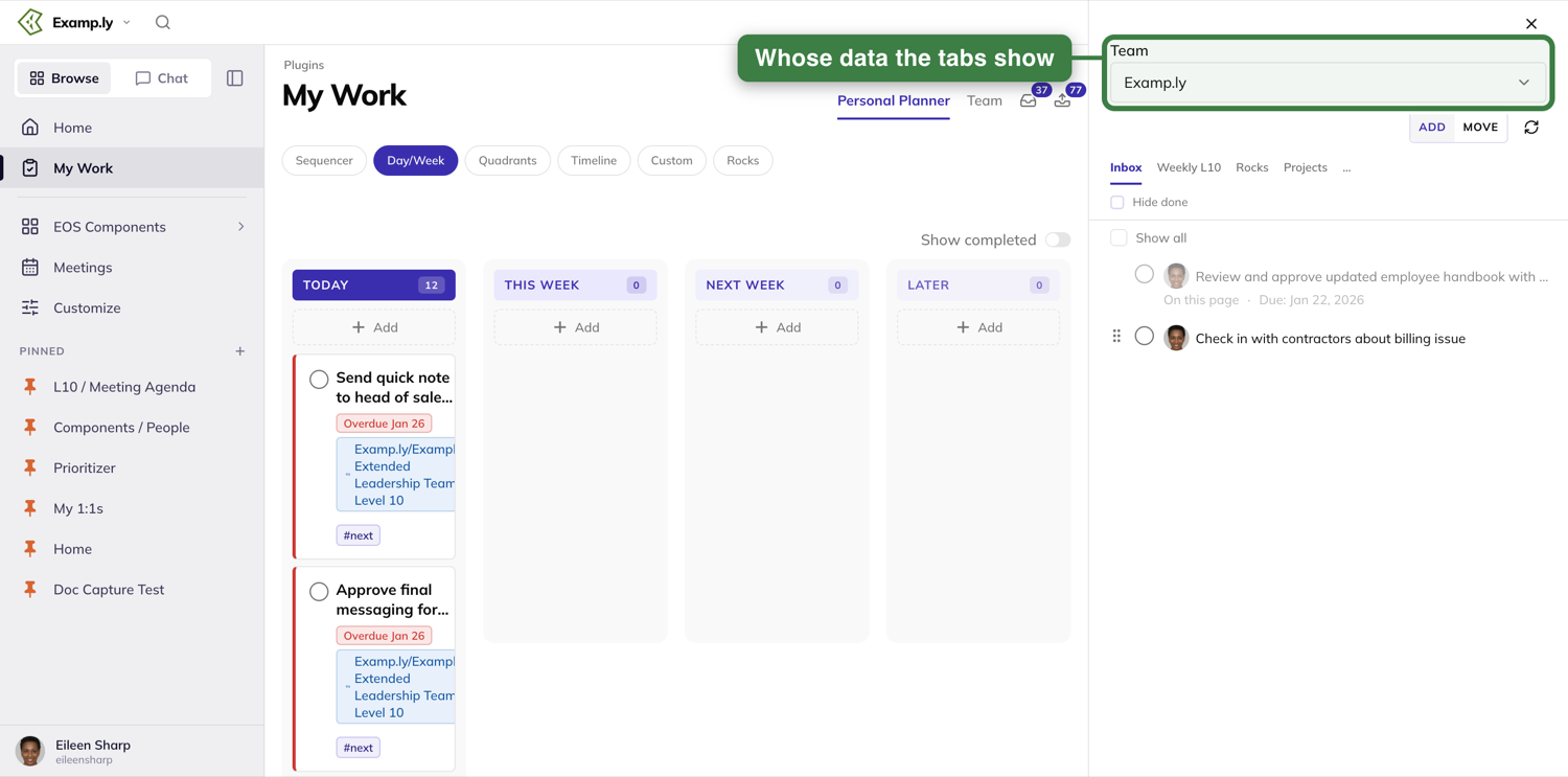
ADD or MOVE
On the tabs where it matters, a toggle lets you choose what a drop does. ADD (the default) drops a copy into the new place and leaves the original where it was. MOVE removes it from its original context instead. Rocks has no such choice; nothing about the dock lets you move a Rock out of being a Rock. The circular-arrow button beside the toggle refreshes the list.
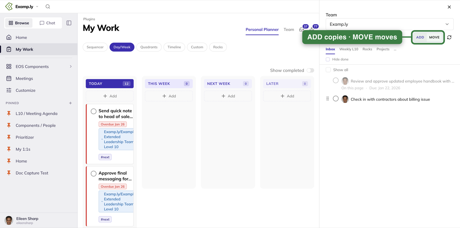
The Projects tab: drilling into one project
The Projects tab starts with a list of your team's projects, each with a count. A Hide done box hides finished work.
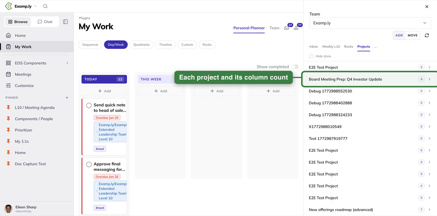
Press one, and the dock shows that project's columns as a row of chips with live counts — All, plus one per column — filtering the list below to whichever chip you pick.
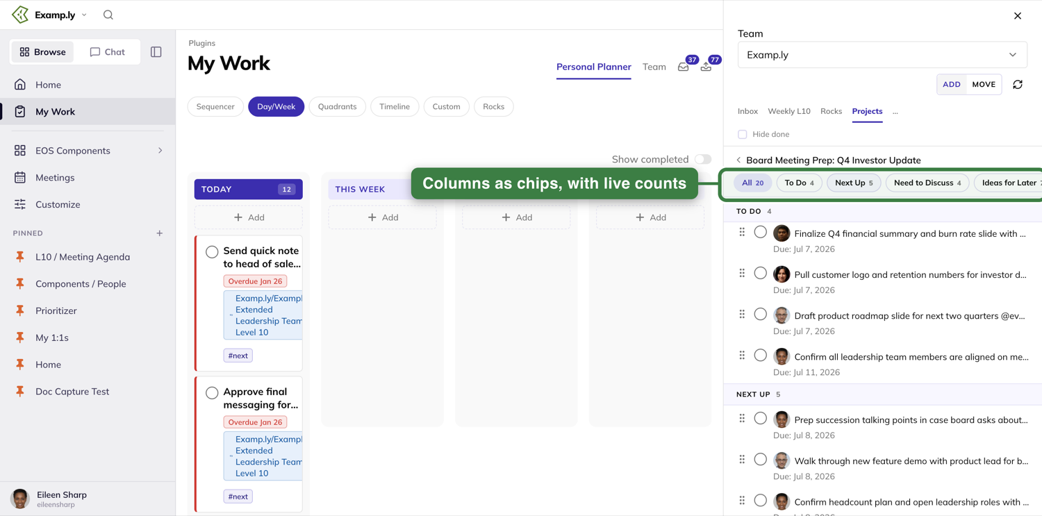
Drag a card from the page onto a column header, or into the list while a chip is selected, and it lands in that column with no extra prompt — the chip and the group header both update their counts immediately. Drop it onto a project row instead (before drilling in), and you get a column-picker prompt, since the dock doesn't know which column you meant.
What the dock never does
Nothing you do inside the Compass dock is specific to My Work — the same panel, tabs, and drag behavior show up on the Level 10 board, a 1-on-1, and every project view, just configured with a different tab set. Long-term Issues, in particular, never appears on My Work; it's a team-scoped list, reached only from the Level 10 board, a 1-on-1, or a project's own views.
Was this helpful?
The Team Tab
The Team tab answers a question the other views can't: what else is open on my team? It shows your team's open work in one list, without the To Do / Doing / Done columns you'd see on a board.
In this article
This walkthrough covers opening it and the four controls that decide what the list shows.
Open the Team tab
Open My Work from the sidebar and press Team, beside Personal Planner. A line above the list says how many items are open on the team you're looking at — for example "18 open on Examp.ly".
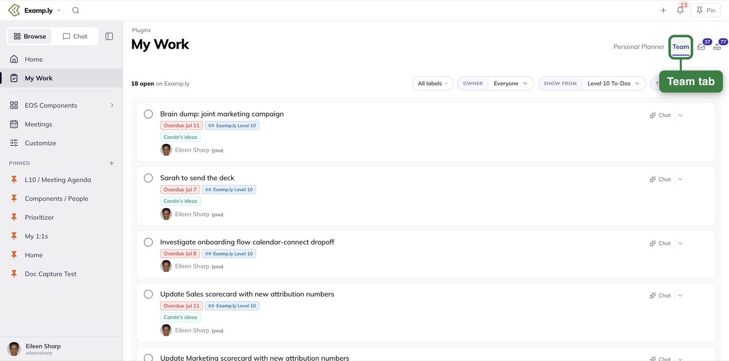
Anything you create is assigned to you until you choose to assign it to someone else, so it shows under your name here.
Choose whose work to see
Owner defaults to Everyone. Open it to pick one teammate; each name shows how many open items they have, and you're marked "you".
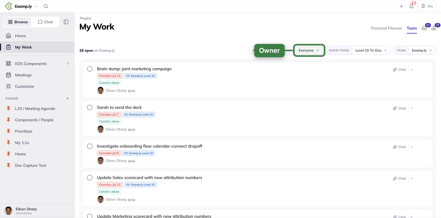
Choose what kind of work to show
Show from defaults to Level 10 To-Dos. Its choices are All, Level 10 To-Dos, Level 10 Issues, 1:1 To-Dos and 1:1 Issues; a tick marks the one in use.
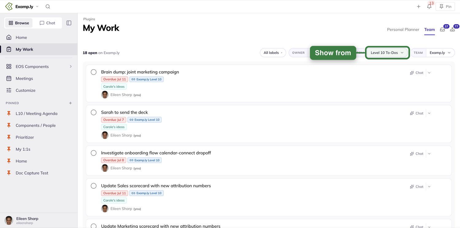
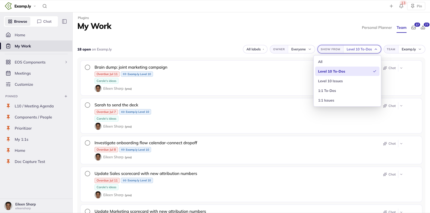
Choose the team
Team defaults to the team you're working in. Open it to look at another team's work, or choose Show all visible teams, which leaves out teams you've muted.
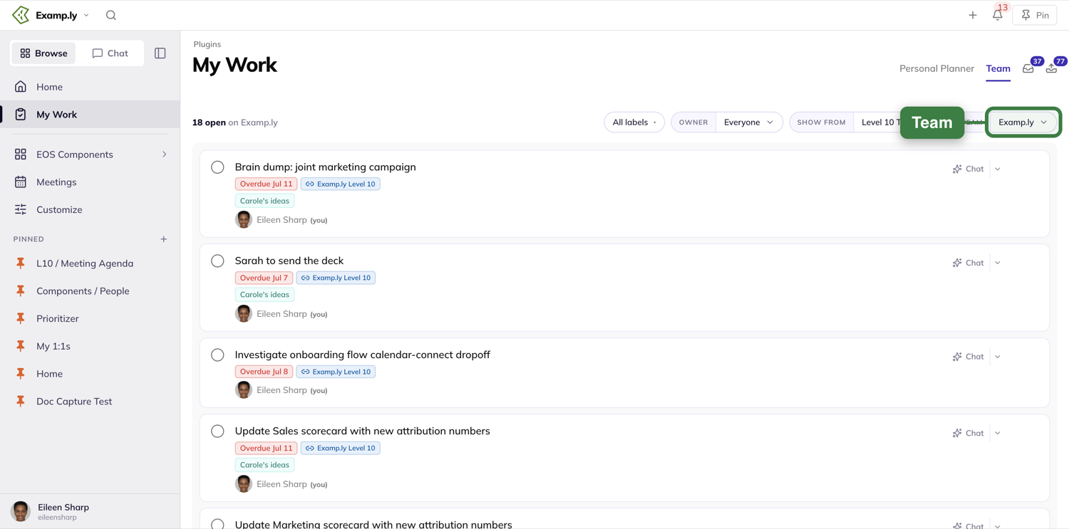
Filter by label
The All labels control at the left of the row works the same way as on the Sequencer and Custom views — tick a label and the list narrows to it.
Was this helpful?
Swimlane Roadmaps — Finding, Sharing, and Managing Roadmaps
A swimlane roadmap lays real projects and work out in rows. Every card on it is the actual item — move it and the item's date moves too.
In this article
The Swimlane Roadmaps tab is where every saved roadmap lives. That includes roadmaps that belong to your team, another team, or another organization you're part of.
A three-pill control decides how far that list reaches. Opening a roadmap can even switch which team you're working in.
This article covers finding a roadmap, sharing a link to one, renaming or deleting it, and starting a new one. It ends with who can edit a roadmap once it's open.
Find your team's roadmaps
Open the Swimlane Roadmaps tab on the Projects plugin page. The scope control above the list opens on This team.
It lists only your current team's saved roadmaps, with a count showing how many.
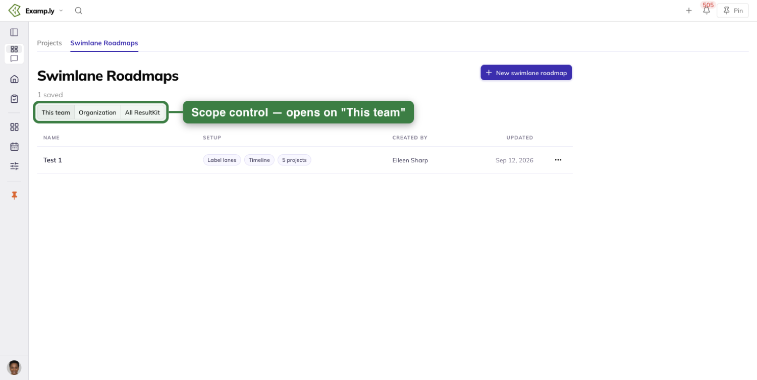
Widen the list to see other teams
Click Organization to see every roadmap you can view across your organization. Click All ResultKit to reach across every organization you belong to.
The list clears at once, and three skeleton rows show while the wider list loads.
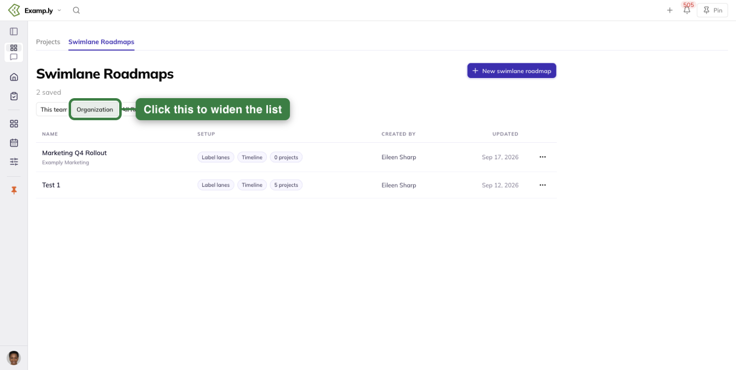
Other teams' roadmaps carry a label so you know whose they are. A same-organization team's roadmap shows just that team's name.
A roadmap from another organization shows both the organization and the team together. A root team shows only the organization's name, and your own team's roadmaps stay unlabeled.
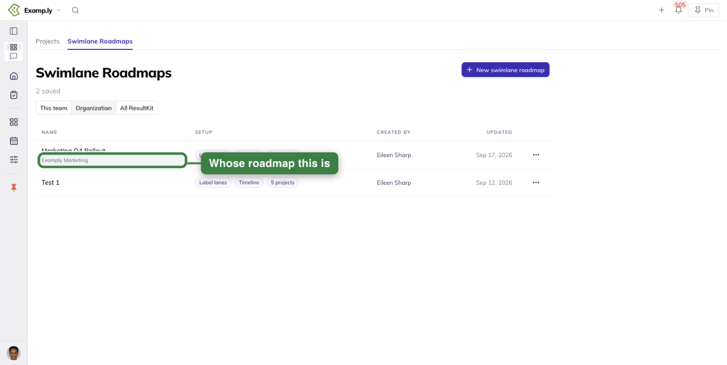
The count above the list always matches what that scope lists. Widening it never surfaces a roadmap you couldn't already view.
Open a roadmap on another team
Click a roadmap's title to open it.
If it belongs to a different team than your current one, the global Switch team selector changes to that team. Everything you open next follows it.
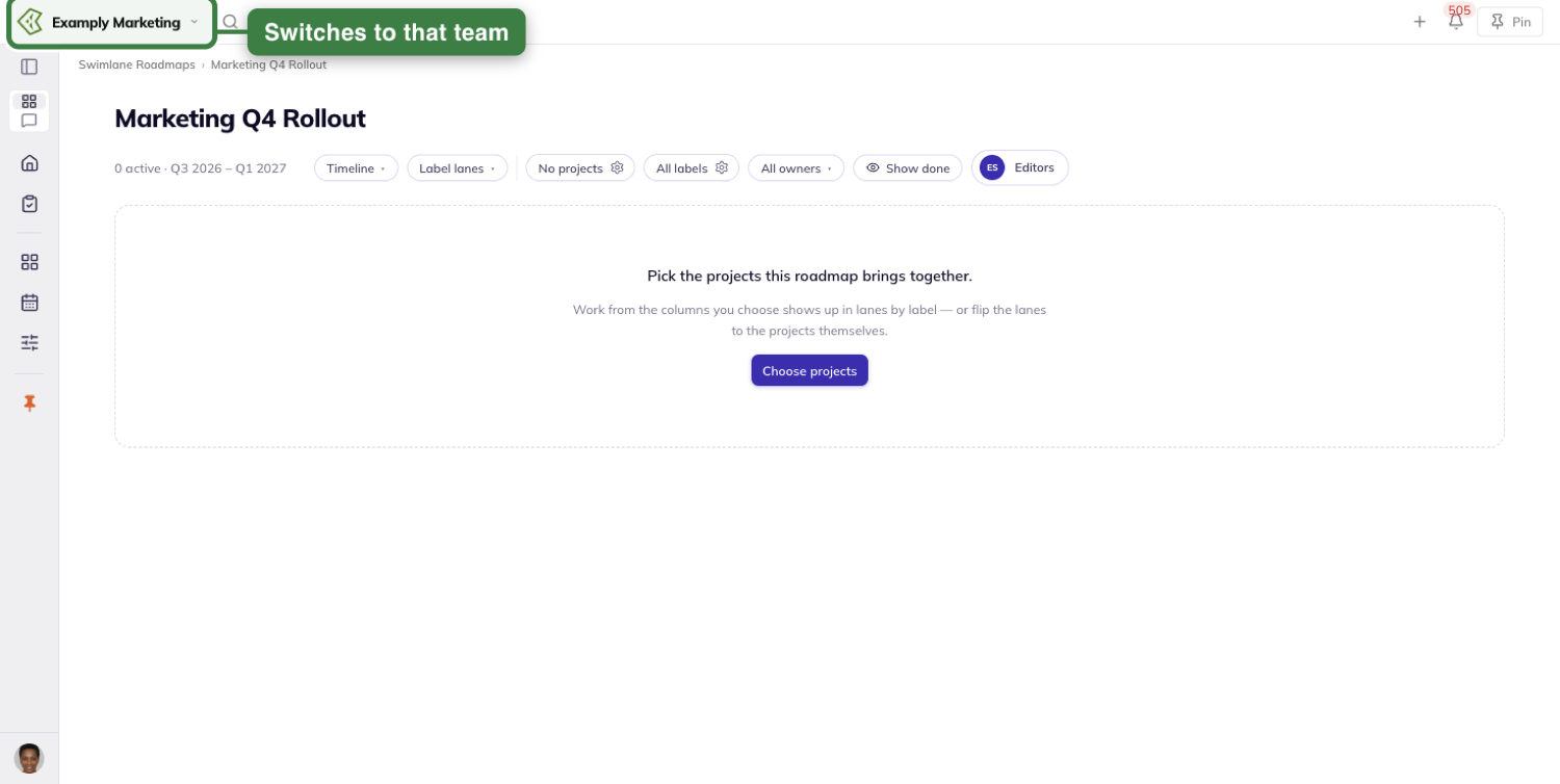
Opening a roadmap that already belongs to your current team changes nothing about the selector.
The Swimlane Roadmaps breadcrumb takes you back to the list with your scope selection intact. The selector stays on whichever team the roadmap switched you to — it doesn't silently switch back.
Share a roadmap with a direct link
Paste a roadmap's link directly into your browser. It opens the same way clicking its title would.
If you can view that roadmap's team, the Switch team selector switches to it. The roadmap then loads in full.
If you can't view that roadmap's team, the page reads "This roadmap could not be loaded." with a Back to Swimlane Roadmaps button.
No title, lanes, or work render — not even for a link from another organization entirely. The selector stays exactly where it was.
Rename or delete a roadmap
Every roadmap row carries a small actions menu with Rename and Delete.
Only the roadmap's creator or an admin of its team sees that menu. A root-team admin sees it on every team's roadmap beneath them, because admin rights inherit down.
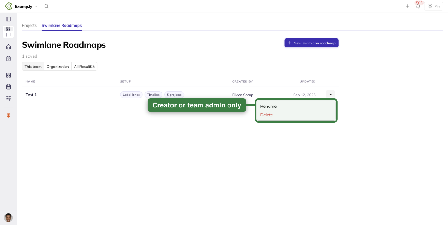
Anyone else viewing the same row has no menu there at all — not a greyed-out one.
They can still open the roadmap. Only managing it is withheld.
Clicking Delete opens a confirm dialog naming the exact roadmap.
It warns that the roadmap will be removed for the whole team. It also reassures you that the projects and work it shows are untouched.
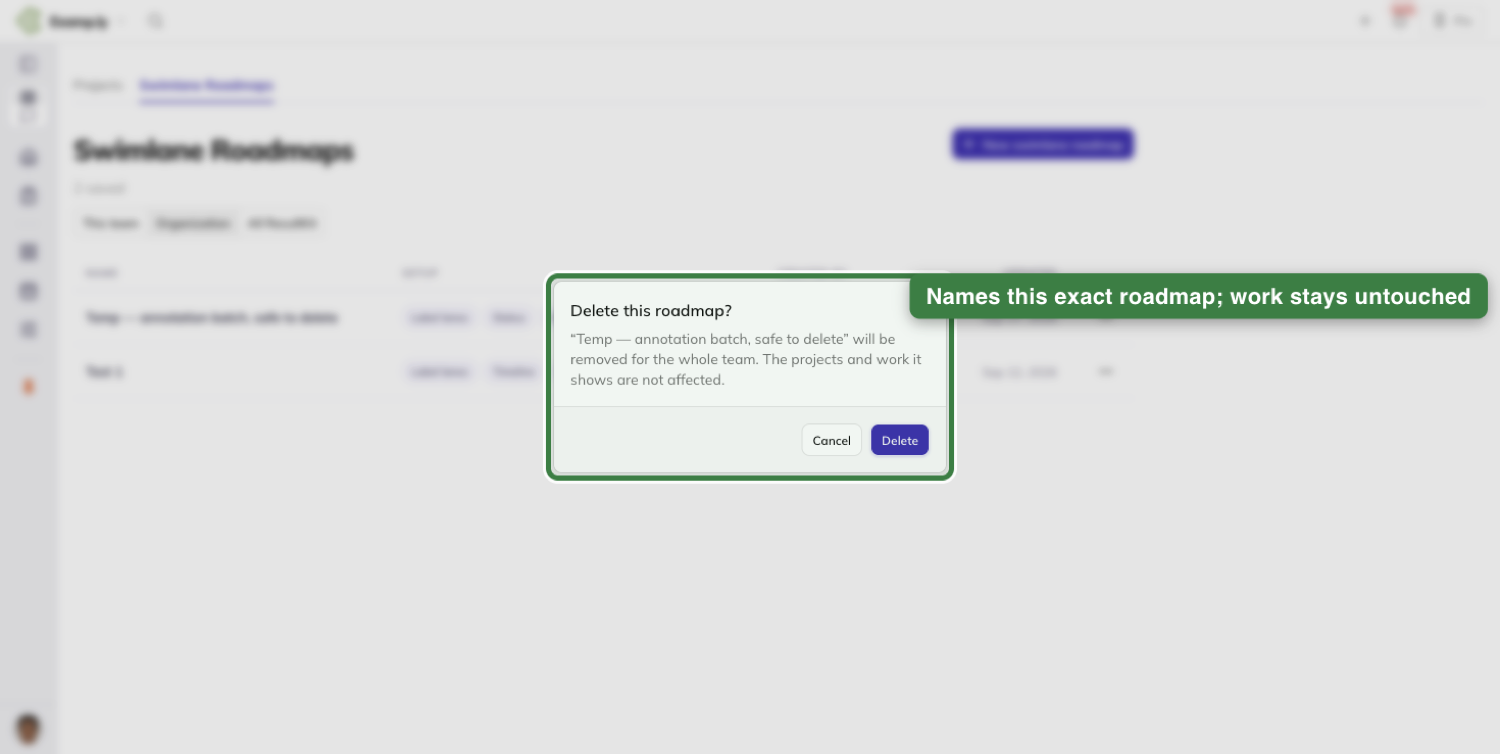
Start a new roadmap
Click New swimlane roadmap to start one.
It's always created in your current team, no matter which scope pill the list happens to be showing.
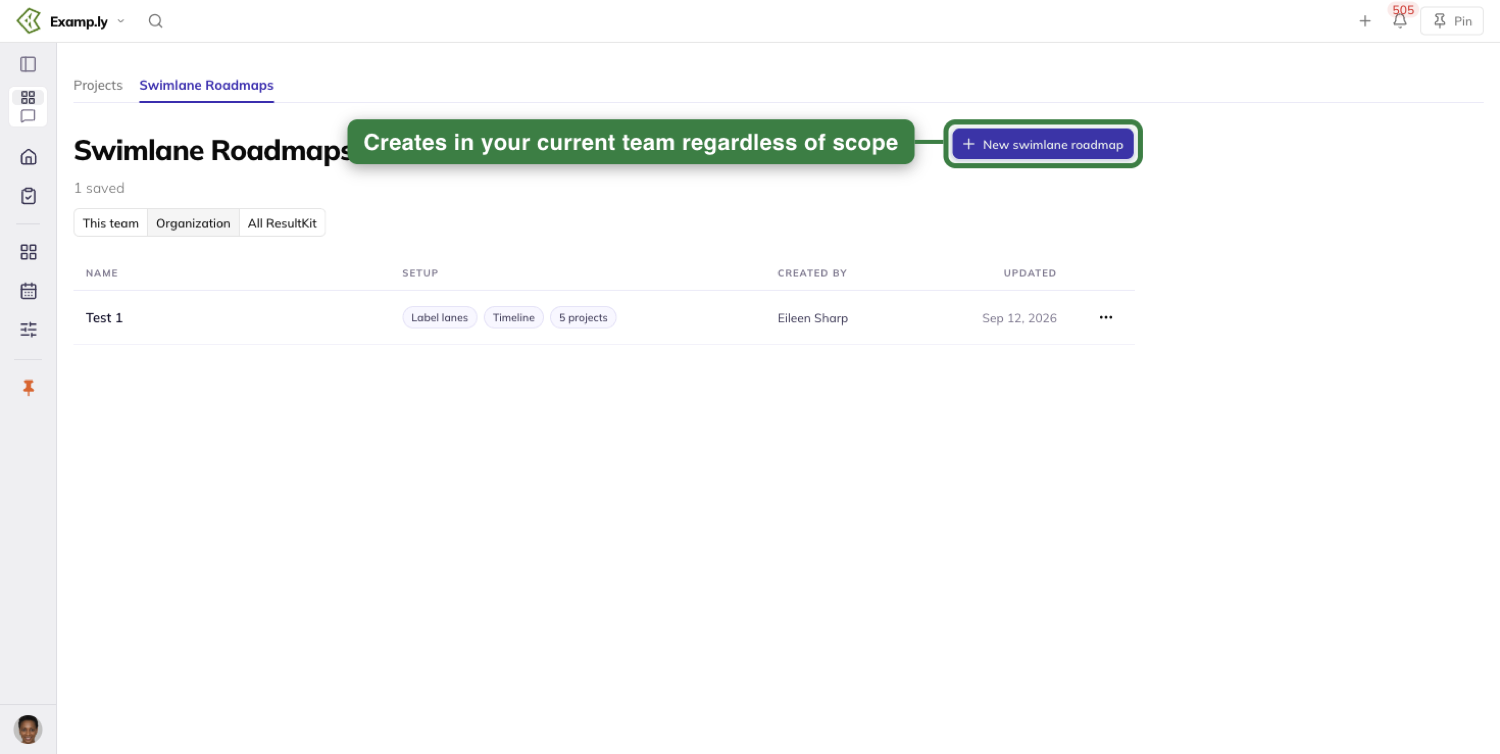
If your team has no saved roadmaps yet, the list shows an empty state instead. Its Create the first roadmap button does the same thing.
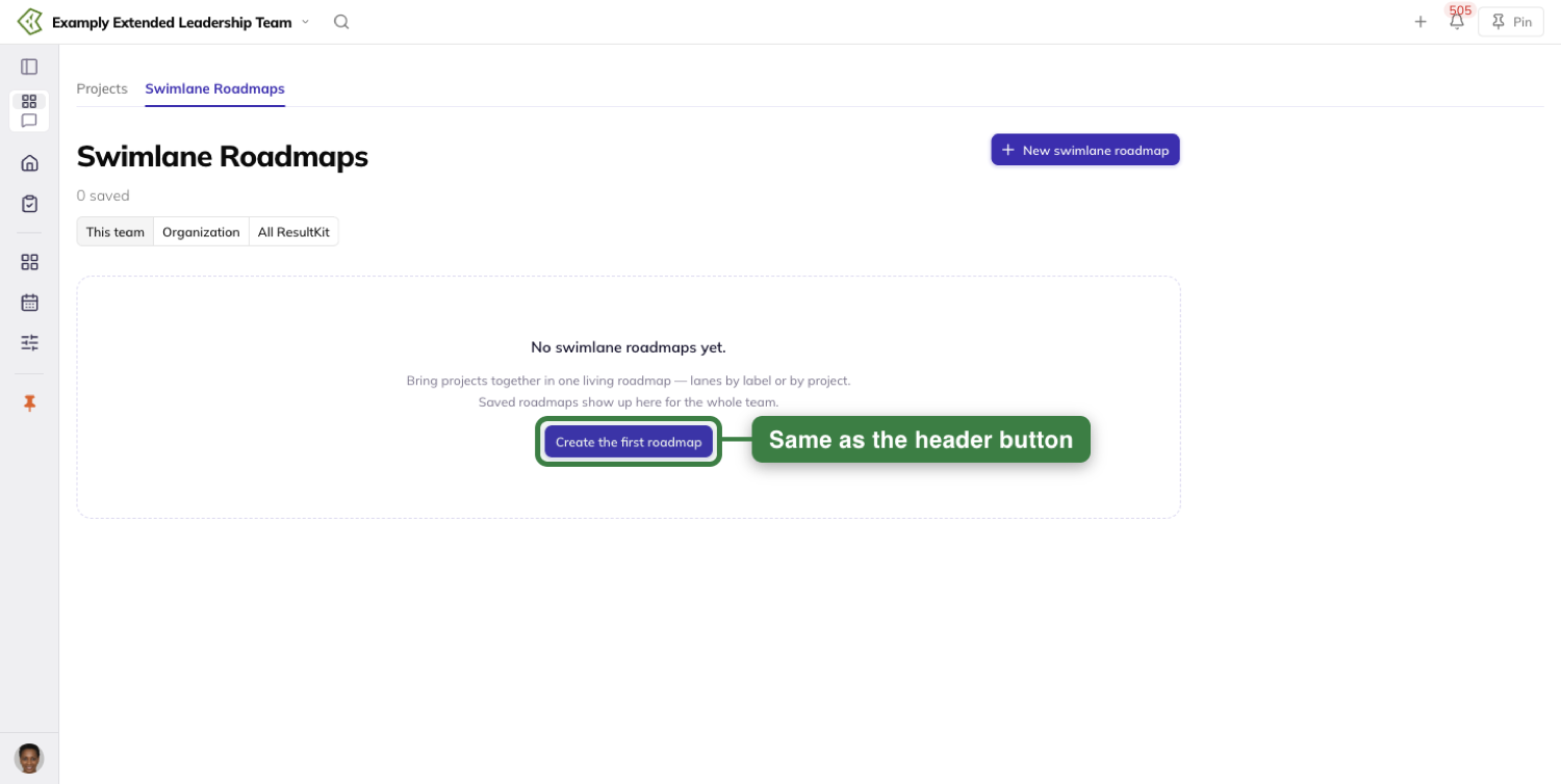
Once you're building a roadmap, there's no scope control on the page at all — scope only ever filters the list.
The Swimlane Roadmaps breadcrumb is the only way back. It returns you to the list with your scope choice exactly as you left it.
Choose how the roadmap displays
Switch between Timeline, Status, and Calendar from one control on the roadmap itself.
Each roadmap remembers your choice the next time you open it. That choice is yours alone.
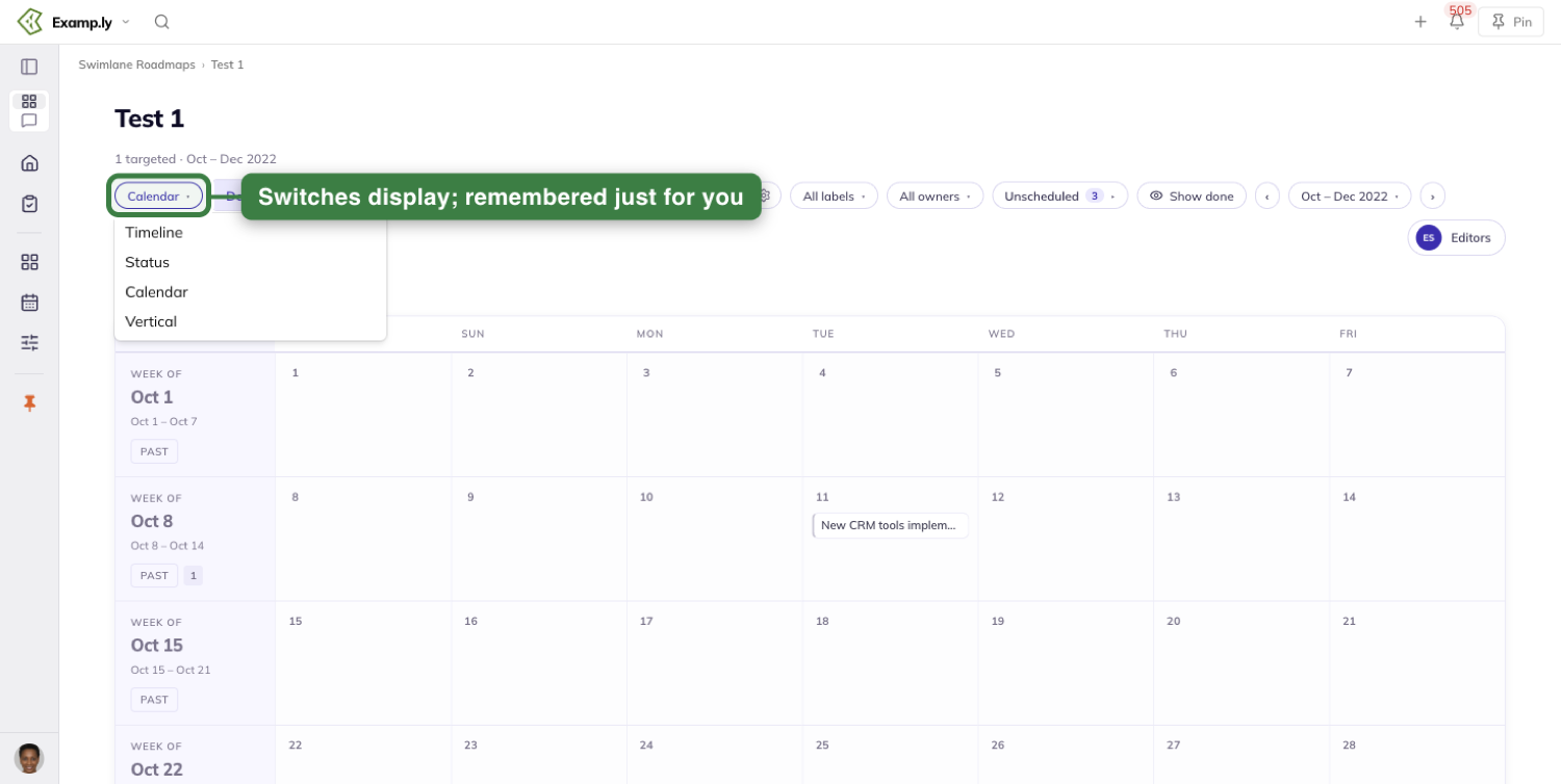
Status needs a process workflow chosen first. Until then it shows a plain message instead of columns.
A team admin sees a path to pick one — the workflow cog if the team already has one, or a Create a process workflow button if it doesn't.
Anyone else just sees the same message, with no button.
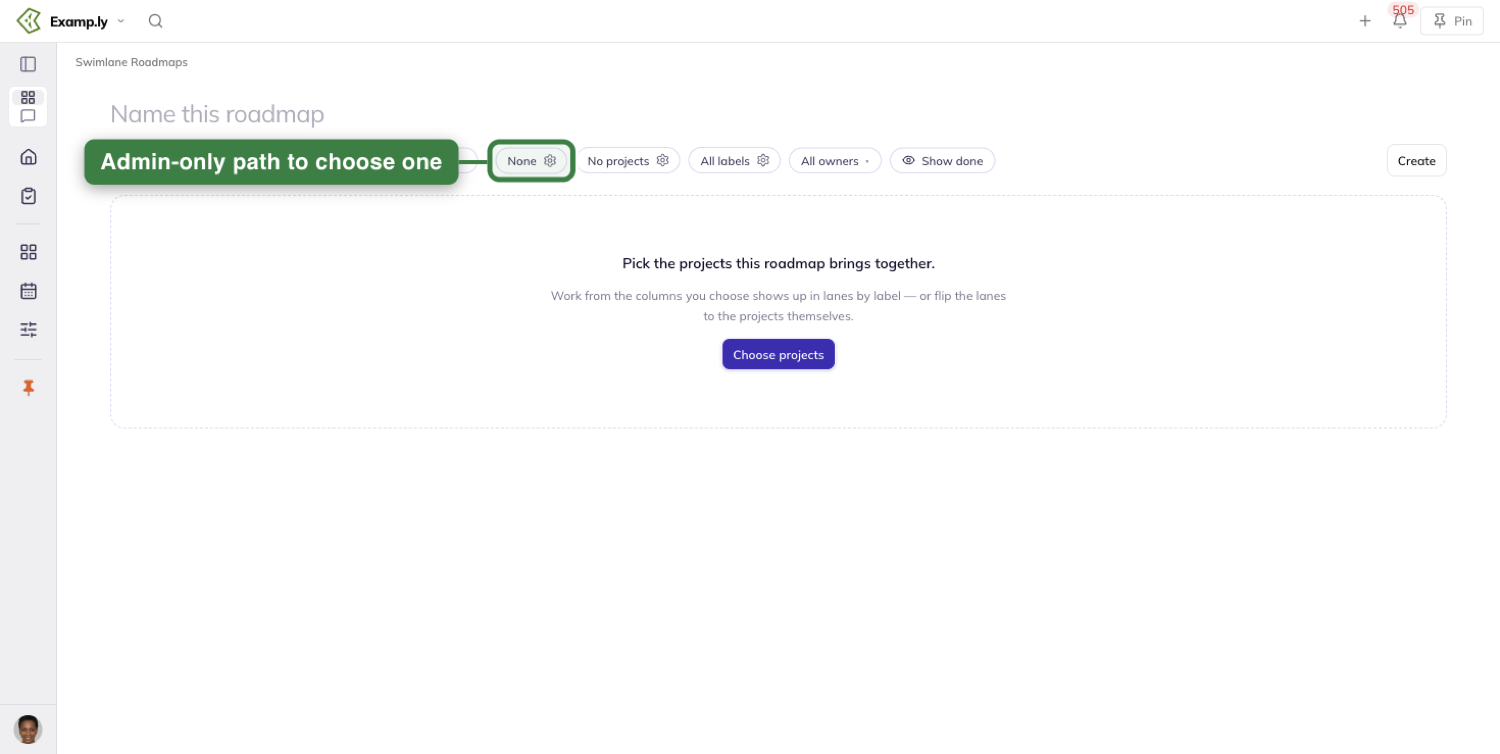
On both Timeline and Status, the column headers stay pinned at the top as you scroll.
A long list of swimlanes never leaves you guessing which column you're looking at.
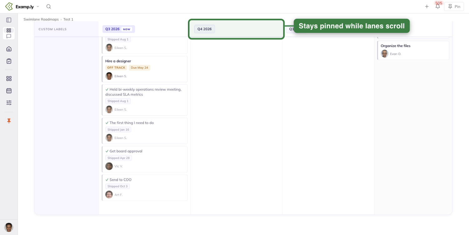
Who can edit a roadmap
A team admin always has the full editing surface on that team's roadmaps.
That means renaming, dragging cards, the toolbar's cogs, deleting, and the editor list — without needing to be added anywhere.
Anyone else needs a grant on the roadmap's own editor list.
That grant works regardless of team: someone on a different team entirely edits fully once they're on the list.
Losing their team membership later doesn't take the grant away.
A team member with no grant and no admin standing sees the same board read-only.
Cards, lanes, and item details are all visible. There's no drag handle, no add control, and no cogs anywhere.
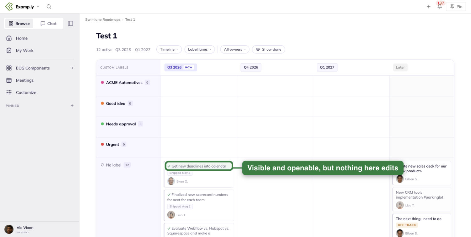
Any editor, not just an admin, can add or remove other editors from that list.
Removing someone drops their editing surface at once, with no reload needed. They're back to the same read-only board everyone else without a grant sees.
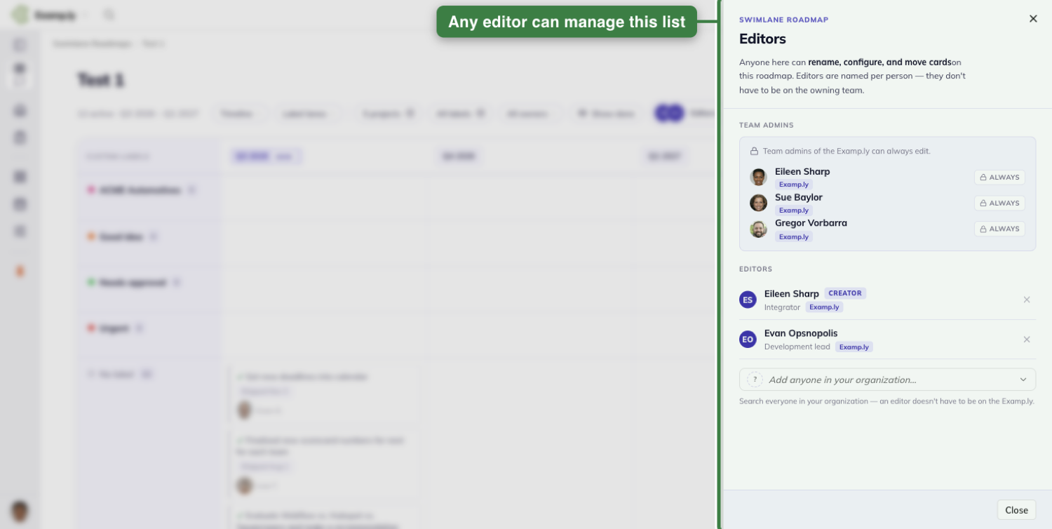
Creating a roadmap puts you on its editor list automatically, even if you're not your team's admin.
That seeded grant, not being the creator, is what keeps your access if anything about your team membership changes later.
How lanes are ordered and colored
When a roadmap's lanes are labels rather than projects, they appear top to bottom in the same order your team's labels are already ordered in. That's true on both Timeline and Status.
Each lane also picks up its label's own color. A lane reads at a glance as the same label you'd recognize anywhere else in ResultKit.
The No label lane keeps its plain, muted look no matter what.
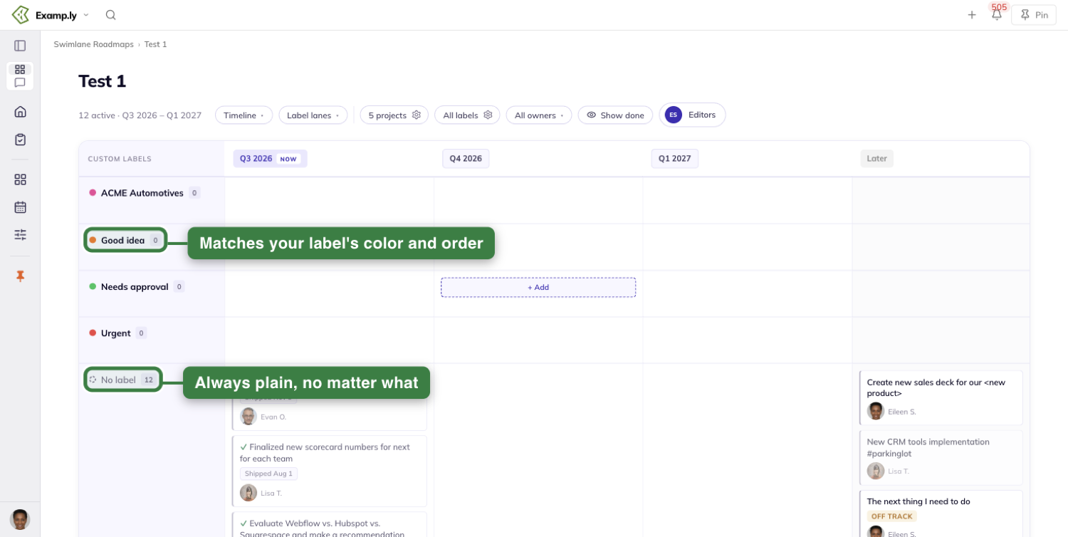
Was this helpful?
Swimlane Roadmaps — The Vertical View
Vertical turns your roadmap's lanes and stages on their side. Instead of lanes running as rows with a stage's cards inside each one, every stage becomes its own column, holding one card per lane.
In this article
It reads the exact same work the Status view reads — nothing is added or dropped, only regrouped — and it sits as a fourth choice next to Timeline, Status, and Calendar.
This article covers switching to Vertical, reading its columns and cards, filtering and searching the board, and what happens when work underneath it changes.
Switch to Vertical
Click Vertical in the view toggle, alongside Timeline, Status, and Calendar. It's a plain fourth entry — no badge, no "new" marker.
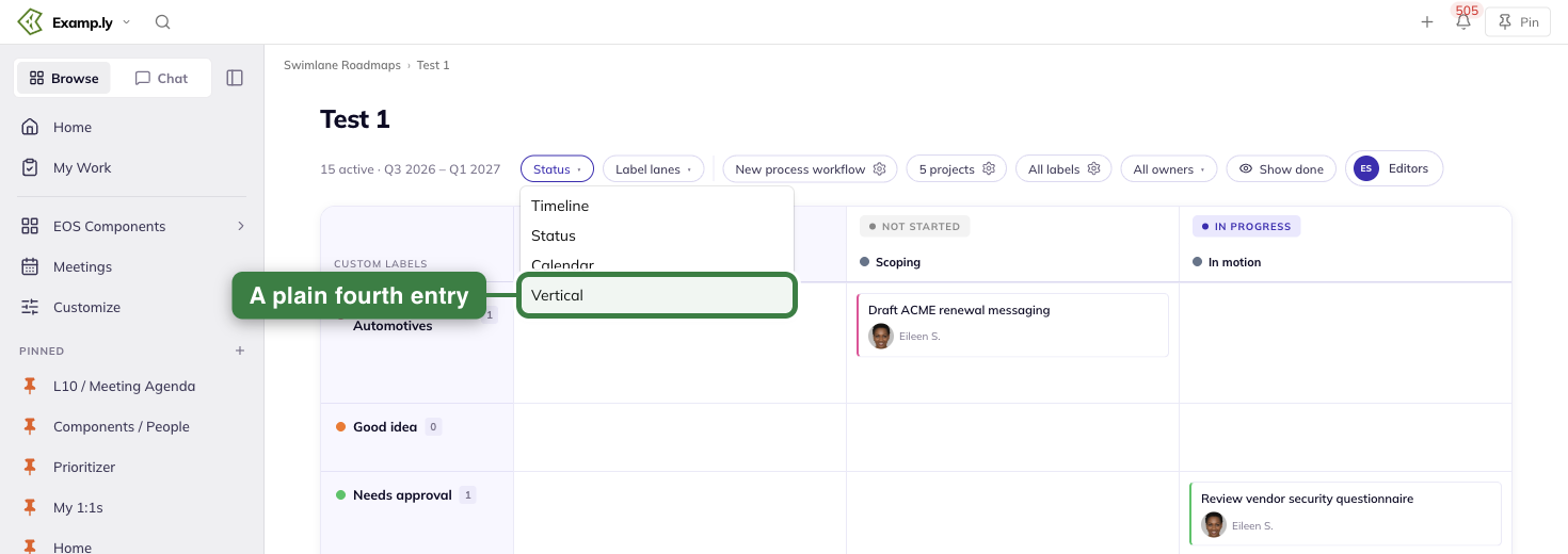
The board reshapes at once. The lane-rows grid becomes stage columns side by side, in your process workflow's own order.
Every item stays exactly where it was — same stage, same lane. Switching views only rearranges the work; it never changes it.
Your choice is personal. Reopening the roadmap later puts you back on Vertical, but it changes nothing about the view anyone else sees.
A direct link to the roadmap opens on Vertical only if that's the view you last chose there. Anyone who has never chosen a view lands on the roadmap's own saved default instead.
Read the board
Stages run left to right in your workflow's own order. There's no lane row anywhere — lanes live inside each stage column instead.
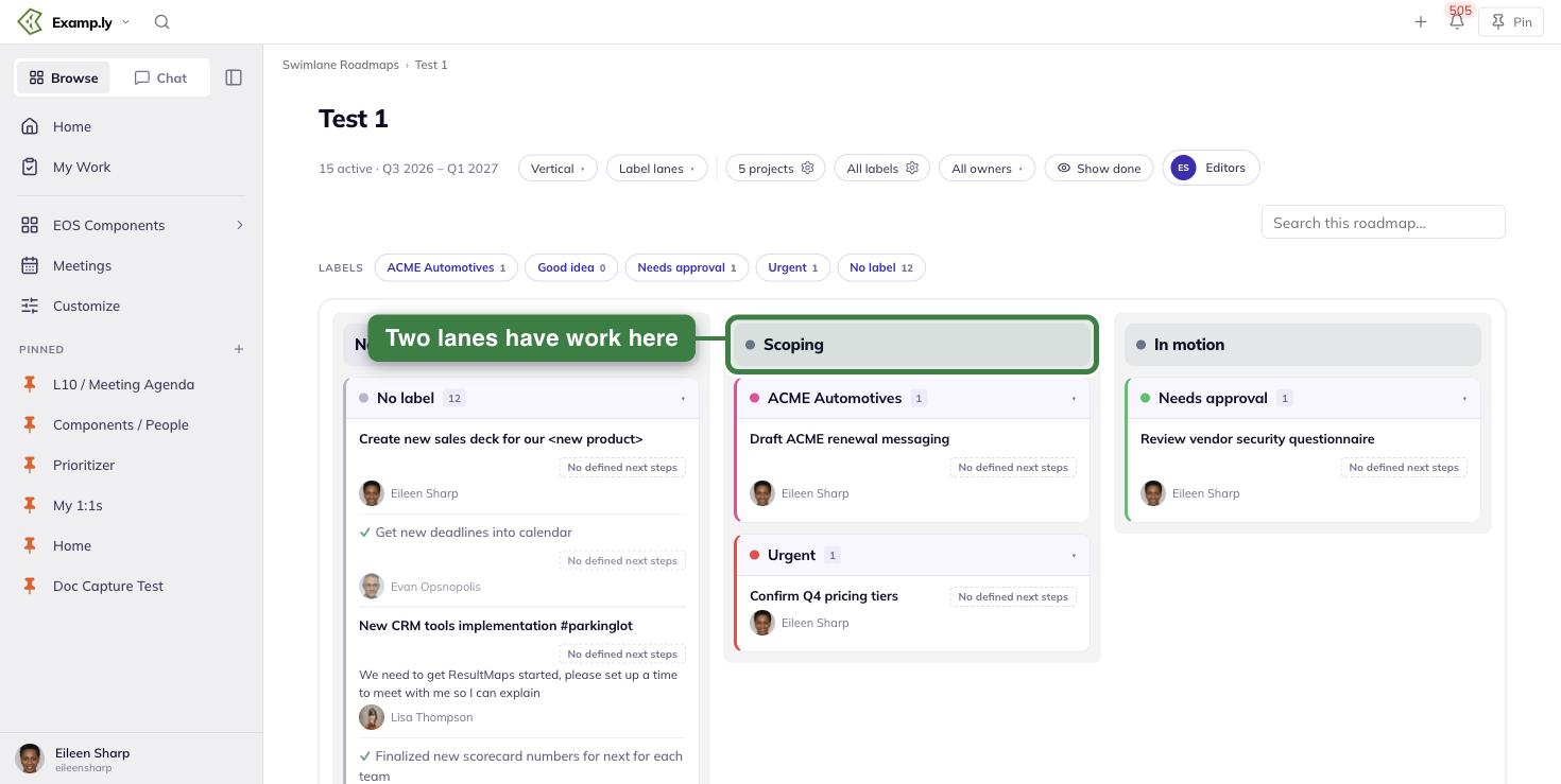
Inside a column, a lane's card stacks in your team's label order. A lane with nothing in that stage simply has no card there — not an empty one.
Each lane card's header shows the label's colour dot, its name, and a count. That count is only for this one stage, never the lane's total across the board.
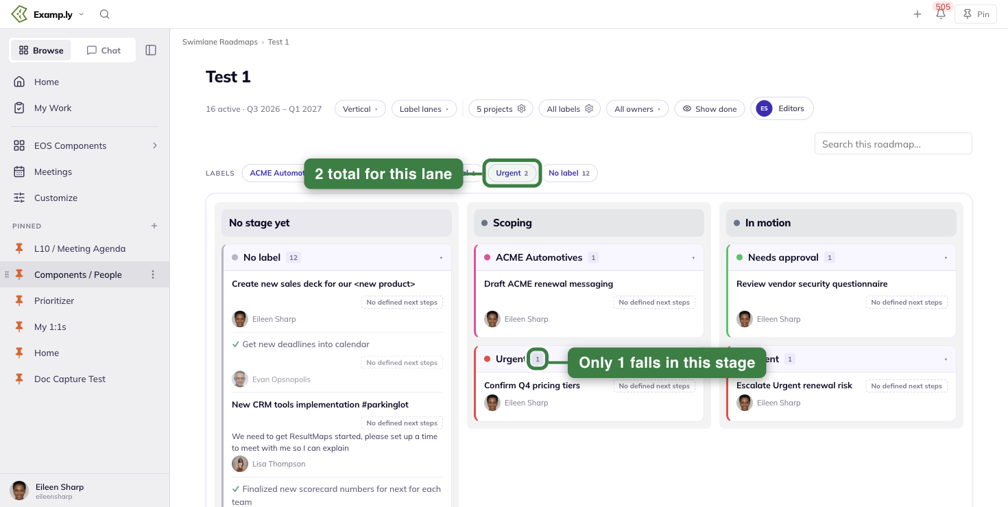
Stage headers show just a name — no count, on a full column or an empty one. They stay pinned at the top as you scroll.
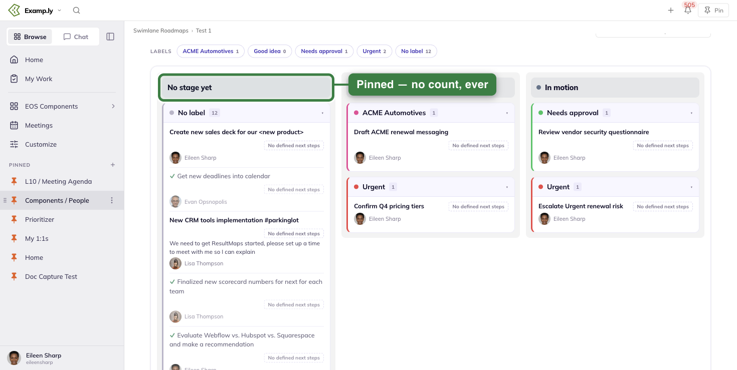
A long column never leaves you guessing which stage you're in.
Work with no stage yet gets its own column, first, before the others — exactly like it does on Status. If nothing is unplaced, that column simply isn't there.
Read a row
Every row shows an item's name as a link, its status words, and its one-line description right on the row's face. You never have to open anything just to read it.
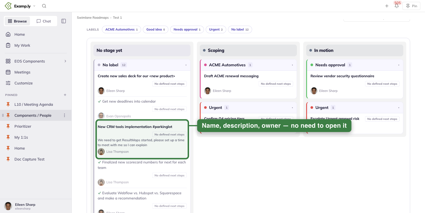
An assigned item shows its owner's initials avatar next to their name. An unassigned one shows neither.
An item with no status words reads "No defined next steps" instead, drawn as an outline so it reads as an absence, not a state.
Click an item's link and it opens in a new tab, leaving the board exactly where you left it.
Click the item's name instead, and its standard detail sheet opens over the board.
Collapse a lane card
Click a lane card's header to fold it shut. Its rows disappear and the header alone remains, still showing its count.
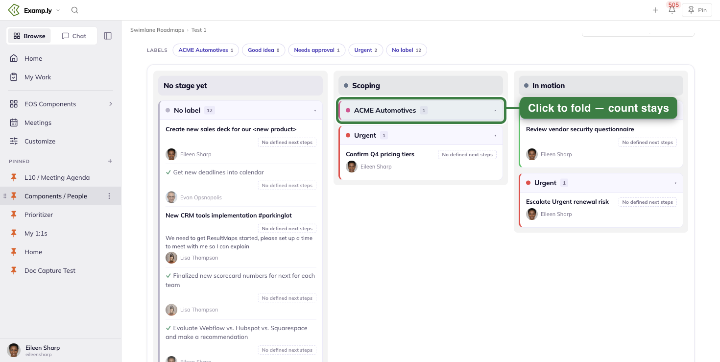
Click the header again to bring the rows back.
Collapsing is per card, not per lane — the same label's card in another stage column stays exactly as you left it.
Filter by label
Above the board, a rail of pills carries each label's total count across the whole roadmap. Click one to filter the entire board down to that lane.
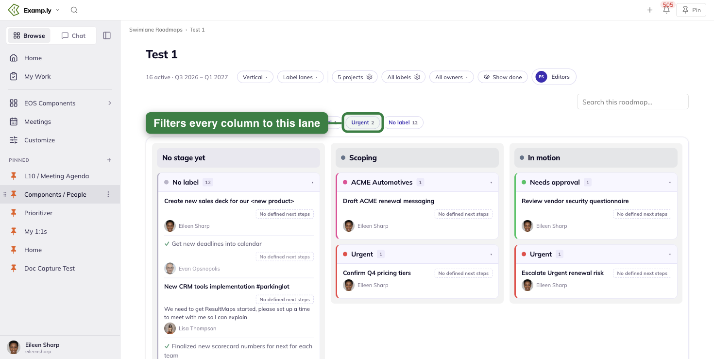
Filtering to a label expands any of its cards you'd collapsed. A stage with nothing in the chosen label still keeps its column and header, empty.
Click the same pill again to clear the filter.
This filter is the roadmap's own — the same one Timeline, Status, and Calendar use. Choosing a label here changes what those views show too, and it's remembered the next time anyone opens the roadmap.
Search the board
Type into "Search this roadmap…" and rows that don't match disappear as you type — by name, description, link, or status words.
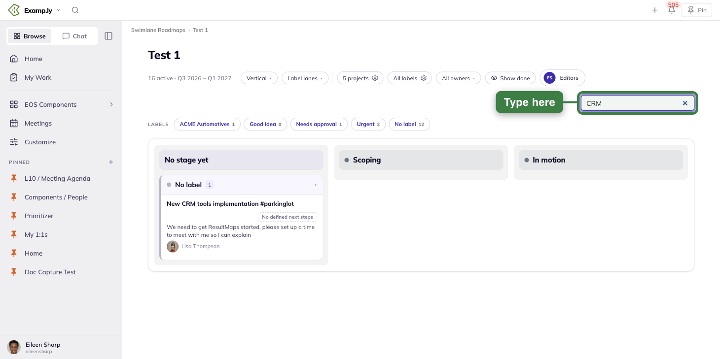
Matching ignores letter case and stray spaces around what you type.
A lane card left with nothing to show disappears along with its rows, though its stage column and header stay put.
Clear the field and every row and card comes back, each in whatever expanded or collapsed state it held before.
Search and the label filter work together — narrowing by label first, then searching, only ever narrows further.
Hide done work or narrow by owner
Turn on Hide done and every finished row leaves the board at once, along with any lane card left holding nothing else.
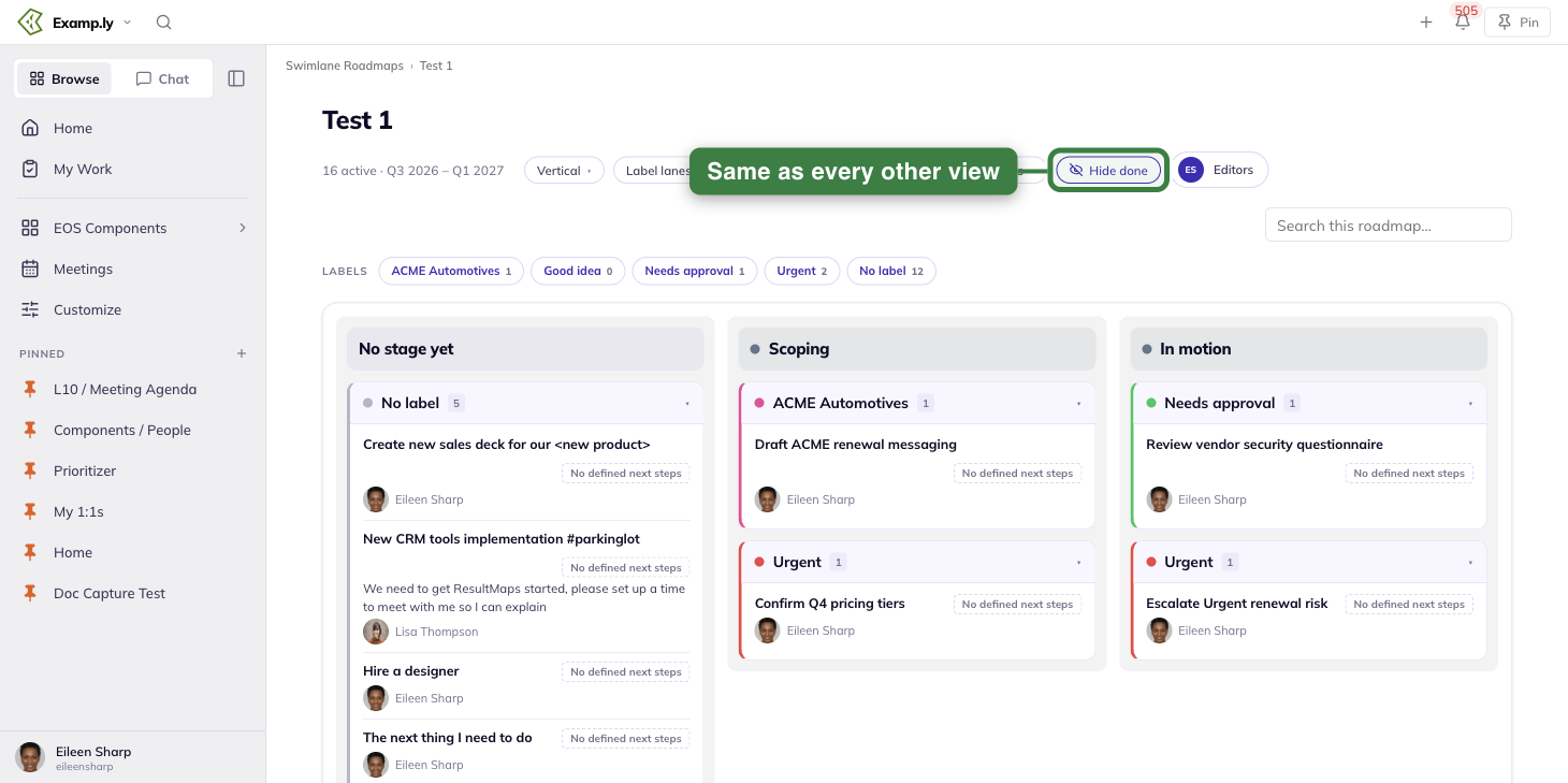
That choice survives a reload, exactly as it does on the roadmap's other views.
Pick a name in the owner filter and the board narrows to their rows only, clearing any lane card that has none left.
Unlike the label filter, the owner filter isn't saved — it resets the next time you open the roadmap.
What repaints itself
Vertical stays live while you work. Reassign an item, mark it done, or archive it from its detail sheet, and the row behind updates immediately — no reload needed.
An archived item disappears from its lane card at once, and from every other view of the roadmap too.
If that was the card's last row, the whole card goes with it.
Who can see and edit Vertical
Reading Vertical is open to anyone who can already view the roadmap — the same board, the same counts, the same colours everyone else sees.
Editing is not. Only a team admin or someone named on the roadmap's editor list gets any edit affordance here.
There isn't an edit control on Vertical that doesn't already exist on the roadmap's other views.
When no process workflow is chosen
Vertical is built from your process workflow's stages, so it needs one chosen — exactly like Status. Until then it shows that same empty state instead of a board.
A team admin sees a way to pick a workflow from there. Anyone else just sees the plain message.
Printing Vertical
Printing strips away the search field, the label rail, and every other reading control, leaving just the roadmap's title and its stage columns.
Each stage prints full-width, one after another down the page.
No lane card or row ever splits across a page break.
Was this helpful?
Swimlane Roadmaps — Working the Roadmap
Once work is on a swimlane roadmap, you can move it by dragging it. You can also add new work straight from the grid.
In this article
- 1Drag a card to reschedule it on the Timeline
- 2Retime work on the Calendar's Day grid
- 3Retime work on the Agenda
- 4Retime work on the Spans lane
- 5Retime work on the Deadlines lane
- 6Give an undated item its first date from the Unscheduled tray
- 7Add work with + Add
- 8See what your addition writes back
- 9Add more than one item at a time
- 10Reach + Add on a touch device
- What this feature can't do
- Archiving an item
- Hiding done work
- When a card repaints itself
- Choosing who owns an item
Drop a card on a new date and the item's own date changes with it. There's no separate save step.
Every cell an editor can write to carries its own + Add. The cell you clicked supplies the row and column facts for whatever you create there.
This article covers dragging work to reschedule it, and adding new work from a cell.
It ends with what happens to an item over its life on the roadmap: archiving it, hiding it once it's done, and reassigning it.
Drag a card to reschedule it on the Timeline
Drag a card to a new quarter on the Timeline. A confirmation dialog opens before anything saves.
Confirm it, and the card moves to that quarter. The item's own due date changes with it.
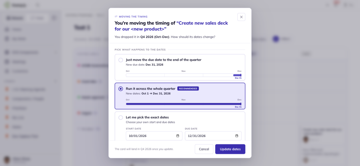
Retime work on the Calendar's Day grid
On the Day grid, drag a chip to another day and drop it.
If the drop is unambiguous, it writes immediately. No dialog appears at all.
Dropping on a day at or before the item's own start works differently. Nothing saves yet.
A small chooser opens instead, asking whether to shift the whole run or keep the start where it is.
Drop a chip back on the day it started from and nothing changes. No write happens either way.
Retime work on the Agenda
The Agenda groups work into week bands. A drag here only tells the app which week, never which day.
Drop a row on a week band and a chooser opens, asking which day that week. Nothing saves until you pick one.
Pick a day and the row moves there, in that band's date order.
Cancel instead, and the row returns to where it started. Nothing is written.
Retime work on the Spans lane
On Spans, dragging the middle of a bar moves its whole run — start and due date together.
The bar's length stays exactly the same.
Dragging one end of the bar changes only that end. The other end never moves.
An end can never cross past the opposite one.
Retime work on the Deadlines lane
On Deadlines, drag a flag to a new day and it writes immediately — the same single-write rule as the Day grid.
A flag landing on a Friday renders in flip mode. Its name moves to the left of the dot, so it still fits inside the week row.
Give an undated item its first date from the Unscheduled tray
Every item with no date sits in the Unscheduled tray. It's a pill in the Calendar toolbar showing how many are waiting.
Click the pill and a panel docks on the left, showing those items as chips.
Drag one out onto a day and a chooser asks whether that day should be its due date or its start date.
The tray stays docked as you scroll. It never accepts a dated item dragged back into it — it only gives dates out.
Add work with + Add
Every cell an admin can edit shows a small + Add button on hover. Without admin rights, no cell shows it anywhere.
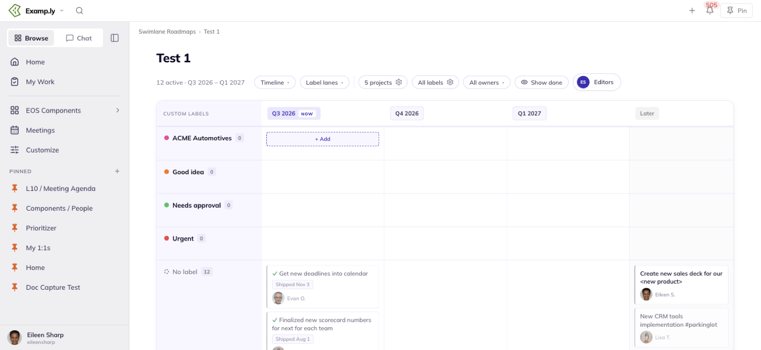
Click it and a form opens, asking only what the cell couldn't already tell it.
If rows are labels, it asks which project. If rows are projects, the project is already fixed — it never asks.
The choices offered are always limited to what's actually on this page. A project or column that isn't part of the roadmap never appears, however you search.
See what your addition writes back
On the Timeline, the quarter column you clicked becomes the card's due date — its last day, specifically.
The trailing Later column leaves the card undated instead.
On Status, the workflow stage you clicked is written in the same request that creates the card. It opens already sitting in that stage.
On the Calendar's Day grid and Deadlines lanes, the day you clicked becomes the due date directly.
On the Agenda, a short "which day that week" question comes first, since a week band alone isn't a date.
Whatever you add appears in its cell right away, before the server confirms.
If the save fails, it quietly disappears again. No error banner, no toast.
Add more than one item at a time
Open the form's multi-add mode from any cell and type more than one line.
Each line becomes its own card, carrying that cell's project, column, and date.
These cards don't paint immediately the way a single add does. They show up the next time the page loads.
Reach + Add on a touch device
On a laptop or tablet with no hover, every cell's + Add is visible at rest. You can see it before touching anything.
On a mouse, nothing changes. The button still only appears when you hover the cell.
What this feature can't do
You can't add work to a project that isn't on this page. You can't file it in a column the page doesn't show, either.
No search box reaches around either limit.
You also can't save an item with no column at all.
If a project has zero columns, the form says so plainly, and Save stays off until you pick one that has some.
Archiving an item
Open an item's detail sheet and its header menu offers Archive, right alongside Save As Template and Apply Template.
You need edit rights on the item to see it there.
Archiving takes the item off every view and every lane at once — Timeline, Status, all four Calendar lanes, and the Unscheduled tray if it was undated.
The change survives a reload.
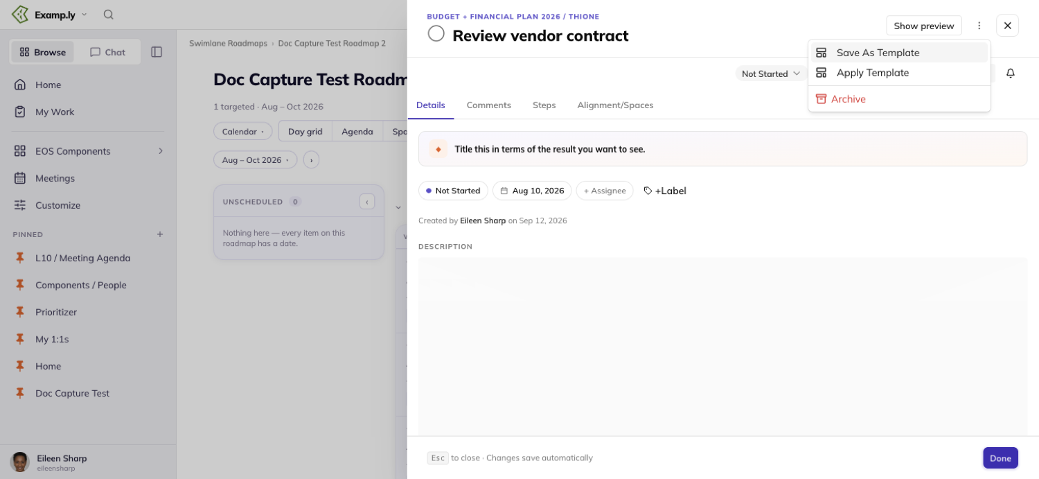
Hiding done work
A Hide done filter is available on every view. Turn it on and finished work disappears from the board at once.
The choice is remembered in your browser. It even carries over to a roadmap you haven't opened yet.
It works the same whether you're an admin or not.
When a card repaints itself
Reassign an item from its detail sheet and the card behind it updates immediately, before the save finishes.
You never see a stale name next to a new avatar, or the reverse.
The Day grid, Spans, and Deadlines lanes don't draw an assignee at all — no avatar on their chips, bars, or flags. The reassignment still applies; you just see it elsewhere.
Choosing who owns an item
The assignee picker on any roadmap item lists your whole current organization. It isn't limited to people on that item's own project or team.
That list looks the same no matter which item you open it from, even across items from different projects.
Was this helpful?
Swimlane Roadmaps — The Calendar
A roadmap's Calendar puts real dates under the work, not just quarters. It reads the same cards four ways — Day grid, Agenda, Spans, and Deadlines.
In this article
- 1Open the Calendar
- 2Read the month scaffold
- 3Change the date range
- 4Filter to a label or an owner
- 5Work the Day grid
- 6Work the Agenda
- 7Work the Spans lane
- 8Work the Deadlines lane
- 9Collapse a month
- 10Hide weekends
- 11Schedule an unscheduled card
- Frozen column headers
- What dims behind an open item sheet
Every month renders as a stack of Saturday-through-Friday week rows. It opens on the current workweek, with done work showing.
This article covers reading the Calendar, its range, and its filters. It also covers each of the four sub-views, plus the settings — collapsed months, hidden weekends, an unscheduled tray — that are yours alone on each roadmap.
Open the Calendar
Choose Calendar in the view toggle, next to Timeline and Status.
The quarter board is replaced by month sections, each a stack of full-width week rows.
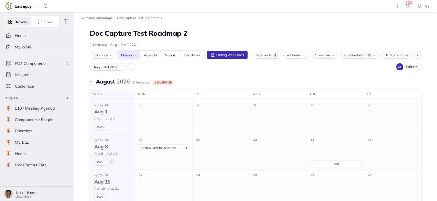
A sub-view toggle appears beside it, reading Day grid · Agenda · Spans · Deadlines. Day grid is active first.
Viewing the Calendar isn't limited to admins. Anyone on the team sees the same months, week rows, and cards.
Which view and sub-view you land on is remembered for you alone. It never changes what a teammate sees opening the same roadmap.
Read the month scaffold
Each month's header names how many cards are targeted inside it — "0 targeted" for an empty month, or a real count for a busy one.
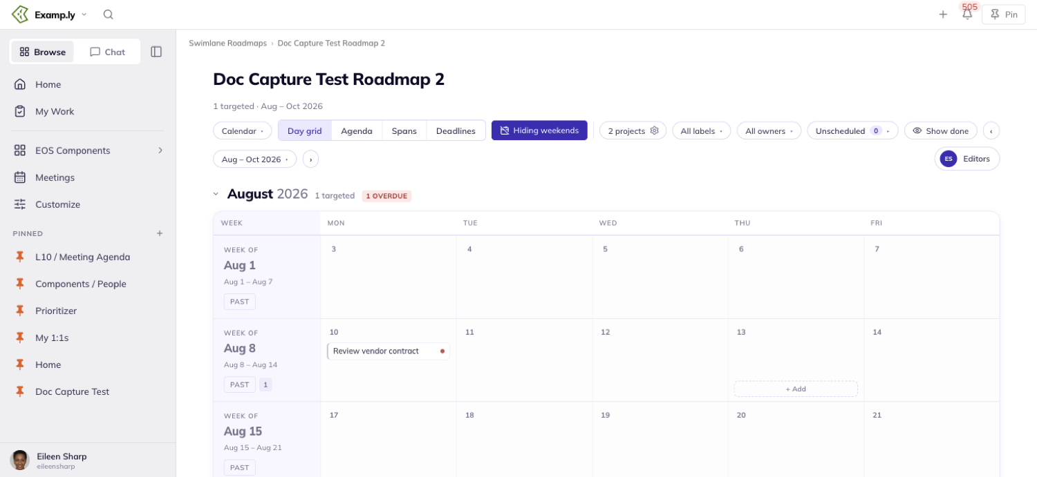
A month with trouble in it flags that too: a red count for anything overdue, an amber count for anything off track.
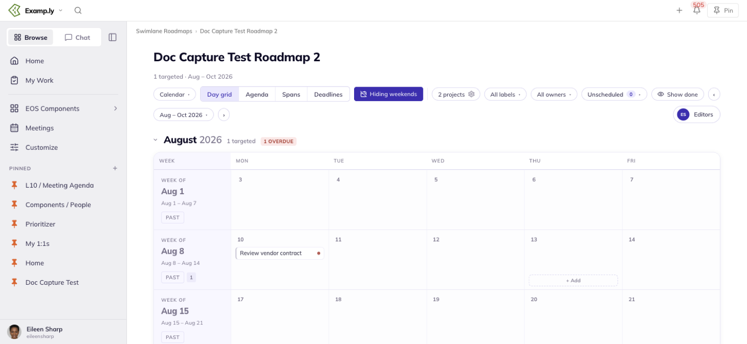
Each week gets its own full-width row, labeled by its starting date. Its day columns run Saturday through Friday.
The current week carries a "This week" chip. Today's own date is filled in the brand color and marked "Today" — no other day is marked that way.
A week with nothing targeted in it still gets its full row. Empty weeks are visible gaps, not collapsed away.
Days that spill into a neighboring month render dimmed. A card targeted on one of those days shows there too, without counting toward that neighboring month's total.
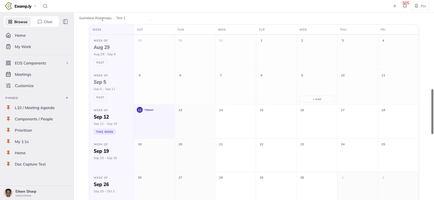
A card sits on its target date, full stop.
Even once it's overdue, the Calendar never slides it forward the way Timeline rolls overdue work into the current quarter.
A done card moves to the day it actually shipped, marked with a green checkmark and dimmed styling.
Change the date range
Click the range pill in the toolbar to open a menu of six ranges: This month, Rolling 3 months, This quarter, Rest of year, All scheduled, and Custom range….
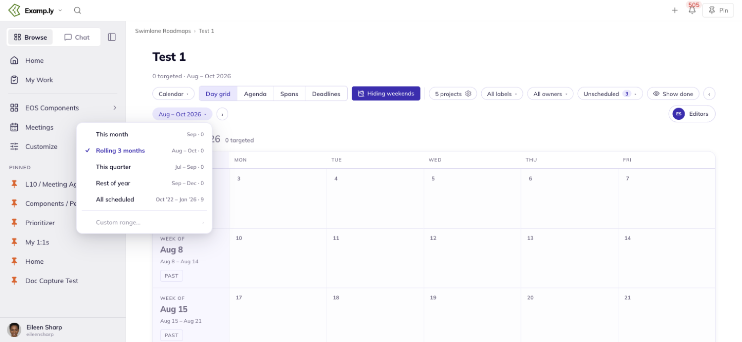
Each of the first five rows shows its own concrete months and how many cards fall inside it — the same counting rule the month headers use.
A checkmark marks whichever range you're currently on.
Stepping the window with the toolbar's arrows leaves no row checked — the pill's own months are now the only truth.
All scheduled fits the window to the work itself — from the month of the earliest targeted card through the month of the latest, empty months included.
Your range choice is yours alone. A teammate who's never touched it still opens the roadmap on its saved default, whatever range you last picked for yourself.
Filter to a label or an owner
Choose a label from the labels filter to see only that label's cards. Every week's count updates to match what's actually visible.
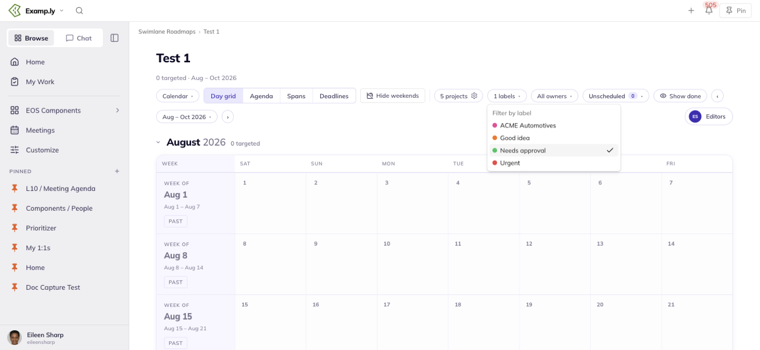
The label filter and the sub-view you're on are saved with the roadmap.
The owner filter is not — it resets to All owners each time you come back.
Switching between Day grid, Agenda, Spans, and Deadlines never drops a filter you've set. The same cards, range, and label stay in place across every one.
Work the Day grid
A card renders as a one-line chip in its label's color, truncated with an ellipsis if the day column is too narrow.
Overdue work carries a red dot on its chip. Off-track work carries an amber one.
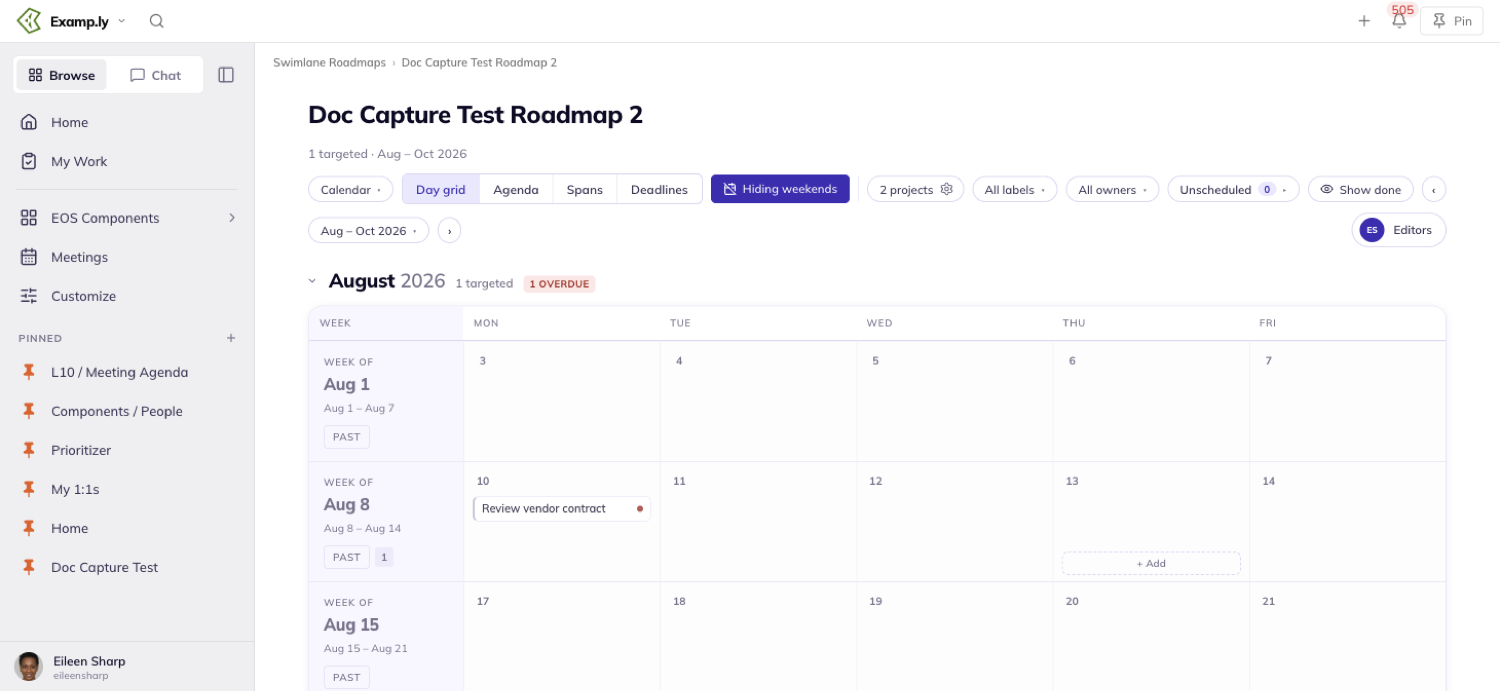
Hover an empty day and a team admin sees a dashed "+ Add" affordance appear inside it. A team member without admin rights sees no such affordance there.
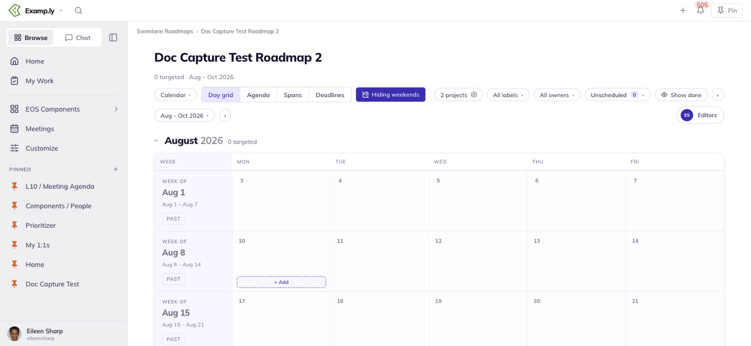
Clicking + Add opens the same Add From Anywhere modal the swimlane board uses, locked to this roadmap's projects. The new card lands on the day you clicked.
Click any chip to open its item detail sheet, with the Calendar still visible behind it.
Changing its target date there moves the chip at once, with no page reload.
Work the Agenda
Each week lists its cards as one-line rows, in date order, led by a day-and-date badge.
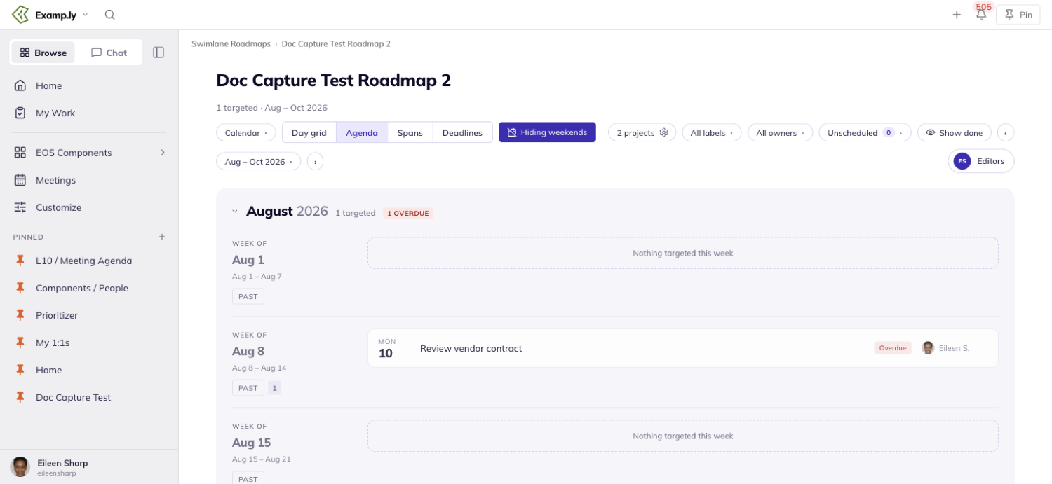
A row carries its label chip and its owner's avatar and name.
Today's row is highlighted in the brand color with a "Today" chip. An overdue row carries a red "Overdue" chip.
A shipped card shows a green checkmark, its name struck through, and a "Shipped" chip naming the date.
Every date badge carries its true weekday, even across a month boundary. No two sub-views ever print a different weekday for the same date.
Click a row to open its item detail sheet, exactly as a Day grid chip does.
Work the Spans lane
A card with both a start and a target date renders as a bar in its label's color, ending in a solid target tick.
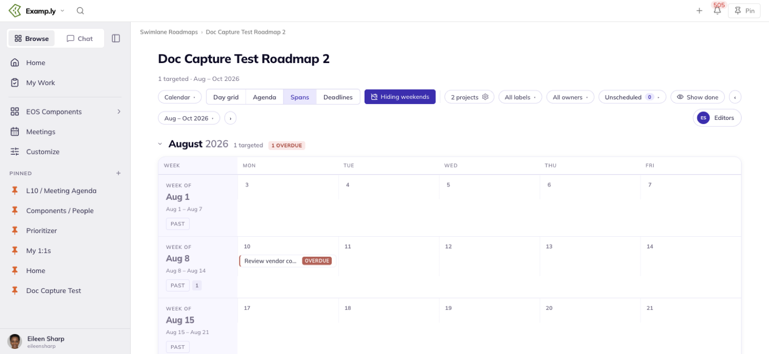
A card with no start date renders as a single-day pin instead of a bar.
A bar that crosses a week boundary appears in both rows, capped and continued with a small arrow where it crosses.
An overdue bar turns red in every week it touches. A done bar turns green with a checkmark before its name.
A dashed line marks today, running through only the current week's row.
Click a bar to open its item detail sheet, from either week it appears in.
Work the Deadlines lane
A card appears exactly once here, as a flag dot on its target date.
Even a card that runs for over a week shows nothing on the days leading up to it.
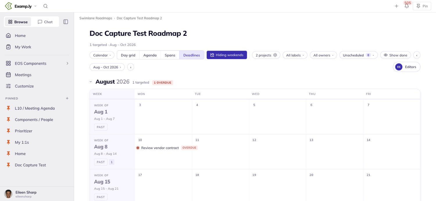
The flag wears its label's color.
A deadline landing on a Friday keeps its name to the left of the dot, so the whole entry stays inside its week.
Overdue and off-track flags carry the same red "Overdue" and amber "Off track" chips the other sub-views use.
Click a flag to open its item detail sheet.
Collapse a month
Click a month's headline to collapse it. Its week rows disappear, but the headline stays — name, count, and any overdue or off-track flags included.
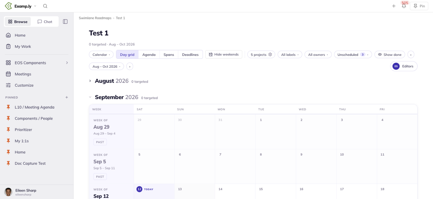
Expanding it again shows exactly the cards it held before.
A collapsed month stays collapsed the next time you open that roadmap, across all four sub-views.
It's yours alone, and it doesn't follow you to a different roadmap.
Anyone can collapse a month, admin or not. Doing so only changes what that one person sees.
The Unscheduled tray is never affected by collapsing — it keeps showing every card in it regardless.
Hide weekends
Turn on Hide weekends in the Calendar toolbar and Saturday and Sunday drop out of every week row, on every sub-view.
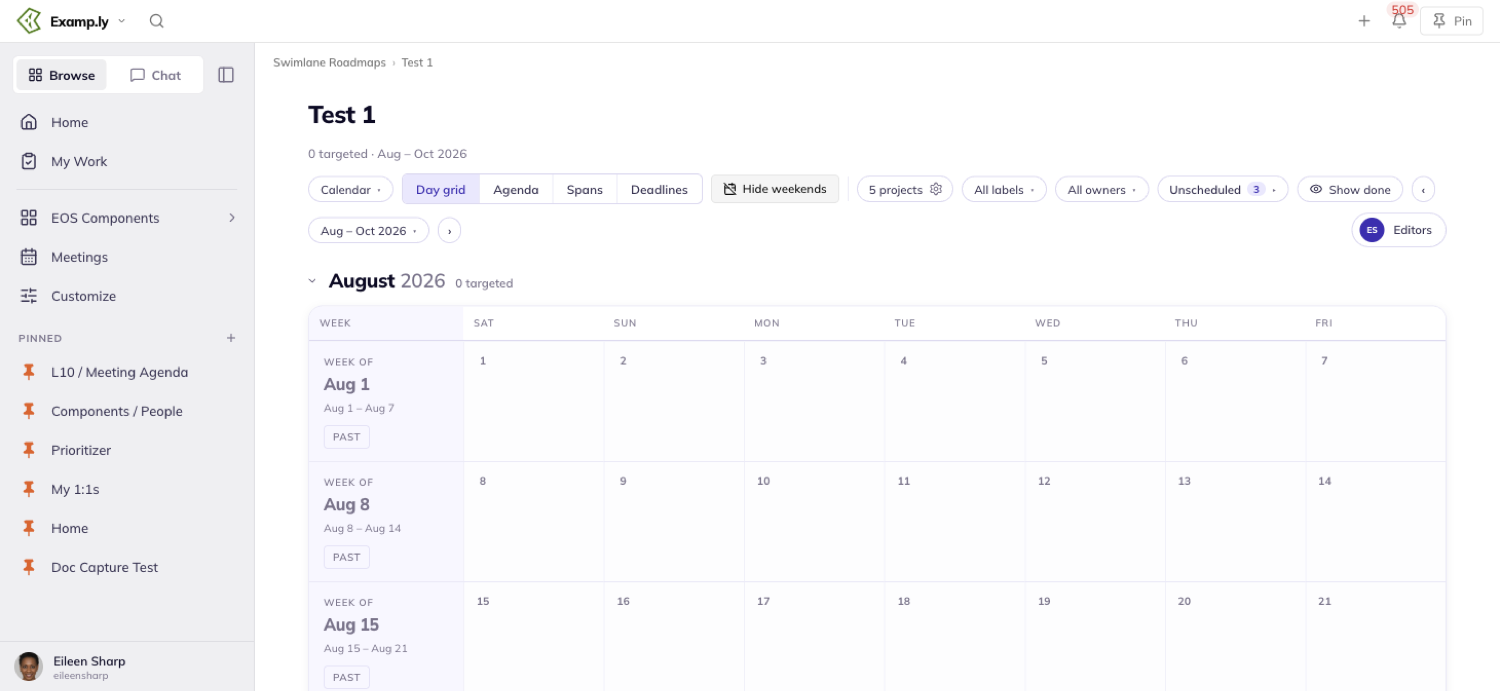
A card dated on a hidden day isn't lost. Its week carries a marker naming how many items fall on hidden days, and activating it reveals them.
A bar that crosses a hidden weekend still draws as one continuous bar, with no gap where the weekend used to be.
You can't drop a card onto a hidden day either — dragging one over the gap where Saturday and Sunday used to be shows no drop target.
The setting is per person and per roadmap. It survives you leaving and coming back.
It doesn't reach a teammate, and it doesn't follow you to a different roadmap.
On a fresh visit to any roadmap, weekends start hidden by default. The toolbar control reads "Hiding weekends" in deep purple to say so.
Schedule an unscheduled card
A card with no target date at all doesn't disappear. It lives in the collapsed Unscheduled pill in the toolbar, showing a count.
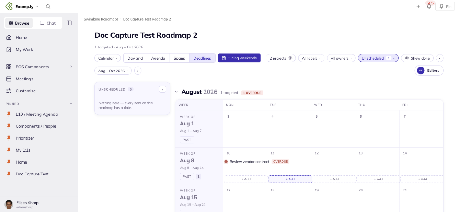
Expand the pill and a tray docks along the calendar's left edge, listing each undated card as a chip in its label's color.
The tray holds its place across Day grid, Agenda, Spans, and Deadlines. It stays on screen while you scroll the dated grid underneath it.
Undated cards are never counted in any month or week. Changing the date range never touches the tray — undated work is range-independent.
Frozen column headers
On every sub-view, the row of column headers stays pinned at the top as you scroll. The week rows and their cards scroll beneath it.
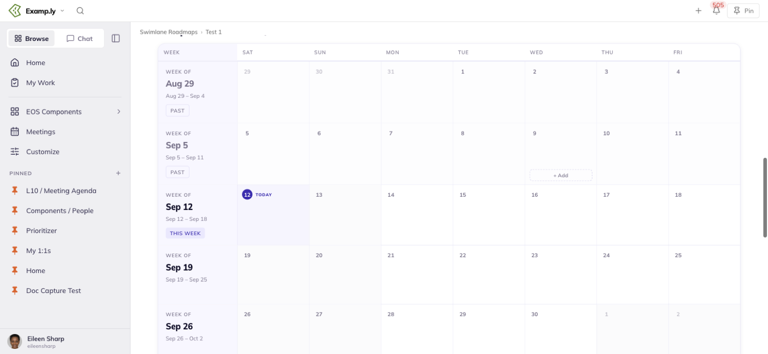
That holds for Day grid's day columns, and for the date columns in Spans and Deadlines alike.
You're never guessing which column is which partway down a long roadmap.
What dims behind an open item sheet
Opening any card's item detail sheet — from a chip, a bar, or a flag — dims the whole Calendar behind it at once, before the sheet even finishes loading.
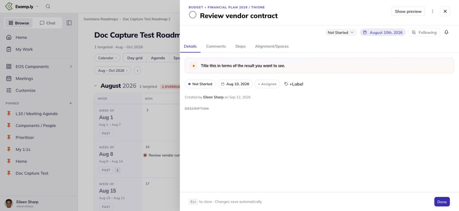
Week labels and day-column headers dim exactly as much as the cards do. Nothing behind the sheet stays bright, including the Unscheduled tray when it's open.
Closing the sheet brings the Calendar back to full brightness all at once, with no lingering dim or late brightening.
Was this helpful?
Scorecard
You want to see whether you're actually winning, and trust your team to move things forward on their own. Teams stay busy but growth is stuck, and leaders get pulled back into assembling and maintaining data to see what's happening. The numbers that do exist tell you what already happened, not what's driving the business. ResultKit makes it easy to find the few numbers that matter. Each has one owner, fills itself in from the system that already has it, and flows live through your meetings, 1-on-1s and any AI you use. That means what gets measured gets managed, and because the numbers flow through to every other tool in the ResultKit toolbelt, you get the right results faster without hovering.
In this article
- Before you begin: who can do what
- 1Open your Scorecard
- 2Record this week's number
- 3Add a Measurable and set it up
- 4Let a number fill itself in
- 5Roll several numbers into one
- 6Check a number's history
- 7Manage the account's Connections
- 8Review the Scorecard in your Level 10
- 9Prep before the meeting
- 10Track personal Measurables in a 1-on-1
- 11Point a team at another team's Scorecard
- 12Ask the AI
- Who can record, and who can read
- Where else these numbers show up
Your team's weekly numbers live on one Scorecard: each one typed by the person who owns it, or filled in automatically from the system that already has it. Every number reads as on track or off track against its target, and the same rows turn up in your Level 10, your 1-on-1s, your weekly prep and your quarterly review.
The mechanics are simple. A Measurable is a row, a week is a column, and a number belongs to the week it was entered into — typed by hand, pulled from a source you connect, or added up from other Measurables on your team or someone else's.
This article walks through opening your Scorecard, recording this week's number, adding and setting up a Measurable, connecting one so it fills itself in, rolling several into one, reading a number's history, managing the account's connections, and working the same rows inside your Level 10, your weekly prep and your 1-on-1s.
Before you begin: who can do what
Reading the Scorecard is open to any member of the team. Every member sees the Measurables, their targets and their weekly values — including on a private team.
Recording a number needs standing on that row: you have to be the Measurable's owner, its assignee, or a team admin. Creating a Measurable and archiving one are team admin jobs.
One thing that catches people out: being an account admin and being a team admin are different things. You can own a Measurable, connect it to a source and record into it every week without administering the account at all.
Open your Scorecard
Your Scorecard is the team's Data view. Rows are your Measurables, columns are weeks, and the left of the grid stays pinned as you scroll sideways — the Measurable, Owner and Target columns never slide out of sight.
The bar above the grid controls what you are looking at. Three pills switch the period between Weekly, Monthly and Quarterly. A Year picker sits beside them. An owner picker reading All owners narrows the grid to one person's rows, and the Active only pill hides Measurables that have been archived.
Three more controls sit on the right of that bar if you are a team admin: Set Targets, a settings menu that switches the grid between expanded and compact and turns the notes column on, and a button that downloads the Scorecard as a CSV.
When the page loads, the grid scrolls itself so the current period's column is on screen — whichever way round your weeks are ordered. You should not have to hunt for this week.
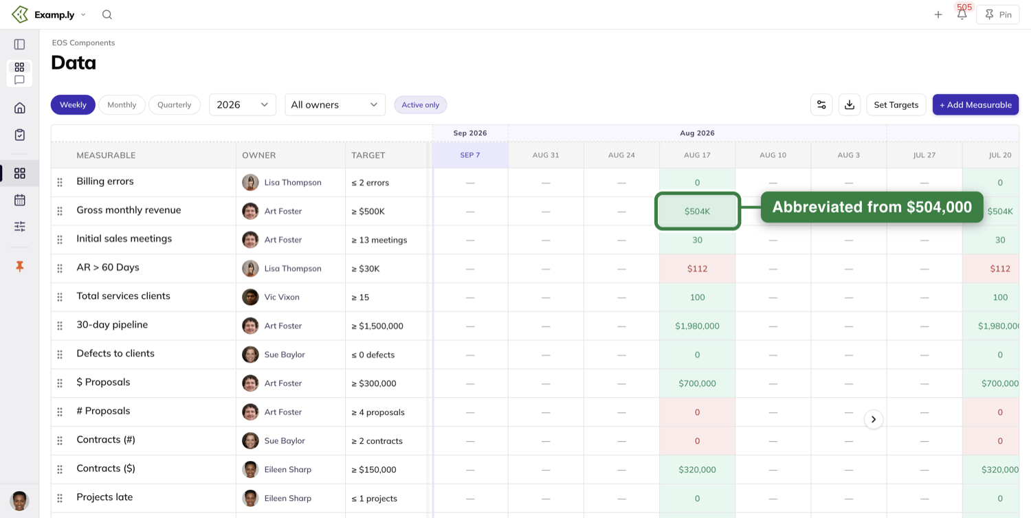
Switch to Monthly or Quarterly and read the cells carefully, because this is the part people get wrong. A month cell is not the month's weeks added together — it shows one representative week from that month. A Measurable whose May weeks read 55, 45, 47 and 30 shows 55 for May, not 177. Quarterly works the same way.
There is a second thing happening in those views. The on-track and off-track colouring is judged against your weekly target scaled up to the period — roughly four and a third weeks for a month, thirteen for a quarter — while the Target column goes on displaying the weekly figure. So the same number can show green in Weekly and red in Monthly against what looks like the same target. The colour is comparing against more than the column says.
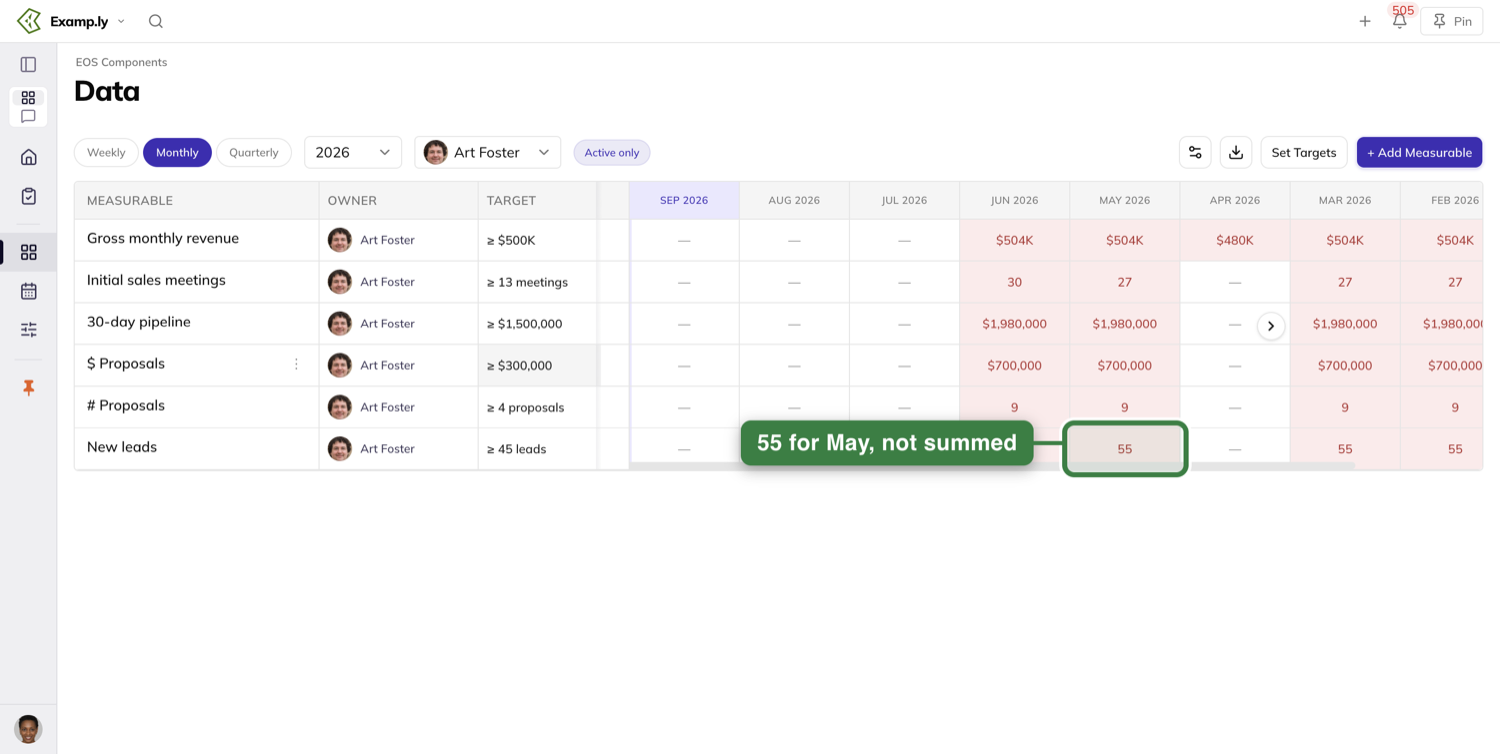
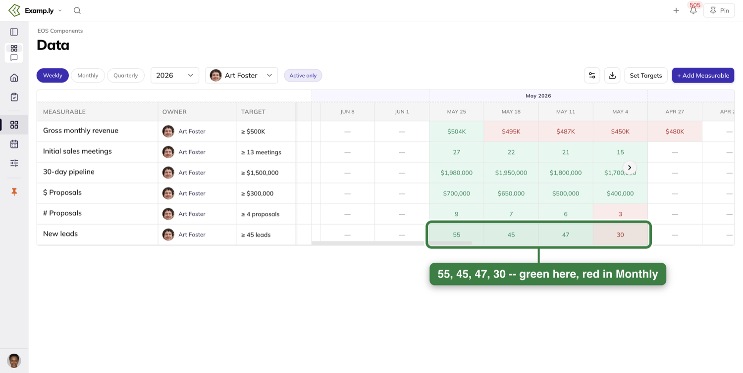
Once any Measurable on the card is connected to a source, a legend appears beneath the grid explaining the marks: On track, Off track, N/C for "no value delivered this week", a dot for "Edited after sync", and the reminder that "All cells editable — click a week to type over a synced value". A card with nothing connected shows no legend, because it has no marks to explain.
Record this week's number
Click the current week's cell on your row, type the number, and press Enter — or just click somewhere else, which commits it the same way. The number paints in the cell immediately, before the server has confirmed anything, and the save finishes in the background. Refresh the page and it is still there.
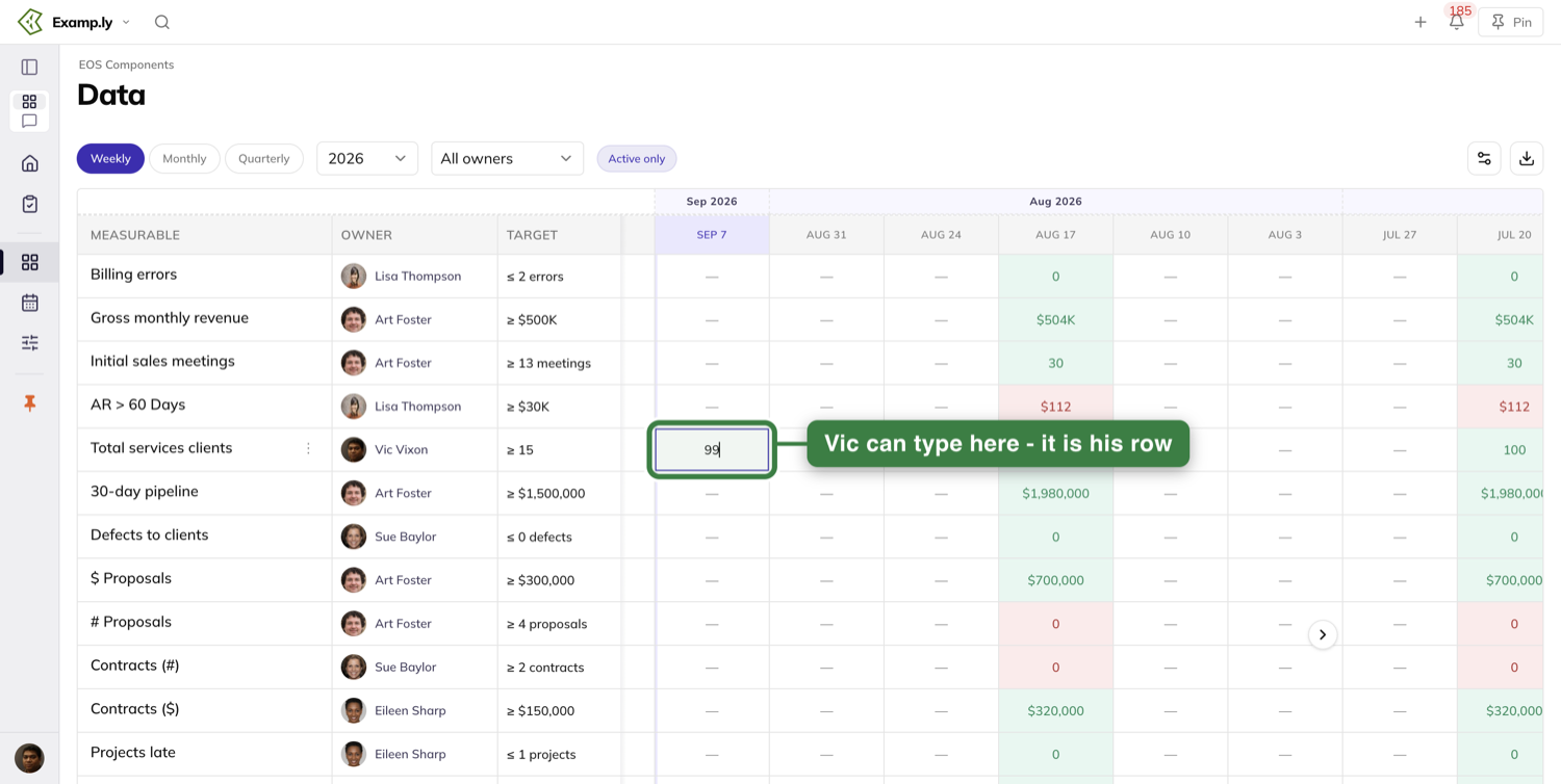
Here is the behavior worth knowing about: a number stays in the week you entered it into. If you record Sunday afternoon and come back Monday morning, after the Scorecard's current week has rolled over, your number is still sitting in last week's column — unchanged, not zeroed, not carried forward. The new current week's cell is simply empty, which means "not entered yet" and reads differently from the number you recorded.
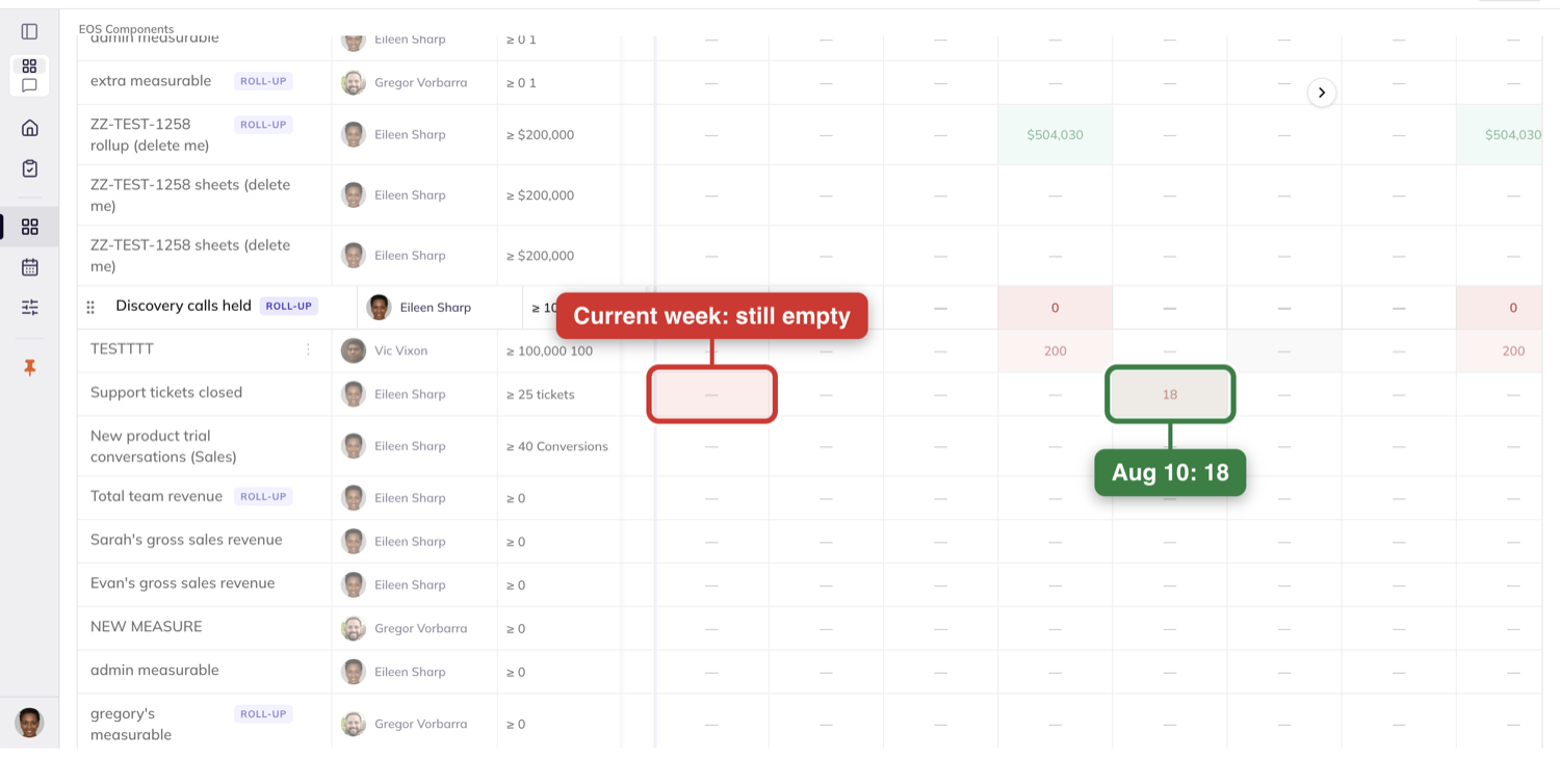
An empty week reads as a dash once the Measurable has a target. Before a target is set, the same empty cells render a question mark instead — so a row full of question marks usually means nobody has set the target, not that nobody has recorded anything.
Past weeks work exactly like the current one. Click any earlier week's cell, type, commit, and it persists — no week behaves differently from its neighbours.
A cell you are not allowed to edit simply does not respond. Clicking it does nothing: no message, no error, no explanation. If a cell will not open for typing, you are not the owner, not the assignee and not a team admin on that row.
You do not have to refresh to see other people's work. When a teammate records a value in their own session, the number appears in your grid on its own, and nothing else on the page flickers or reloads.
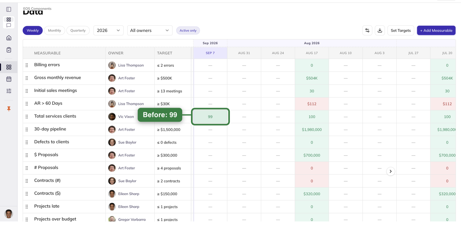
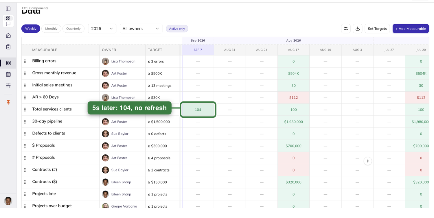
Add a Measurable and set it up
Team admins get a + Add Measurable button above the grid. It opens the same sheet you get when you open an existing Measurable — one edit surface, in create mode. Name it in the header, where the field prompts "Give it a name…".
The sheet's Settings tab is where the definition lives. Target is the number to hit. Unit takes a symbol like "$, %, #". Direction is Higher is better or Lower is better, which decides which side of the target counts as on track. Target Period offers Weekly, Monthly, Quarterly and Yearly. Aggregation — Sum, Last or Average — decides how weeks combine when the grid is read by a longer period. Owner searches your team members.
Display is the small one that changes how the row reads all year. Leave it on Show Full Numbers and 1,500,000 shows as $1,500,000. Switch it to Abbreviate Numbers and the same value shows as $1.5M. It is set per Measurable, so a revenue row can abbreviate while a defect count does not.
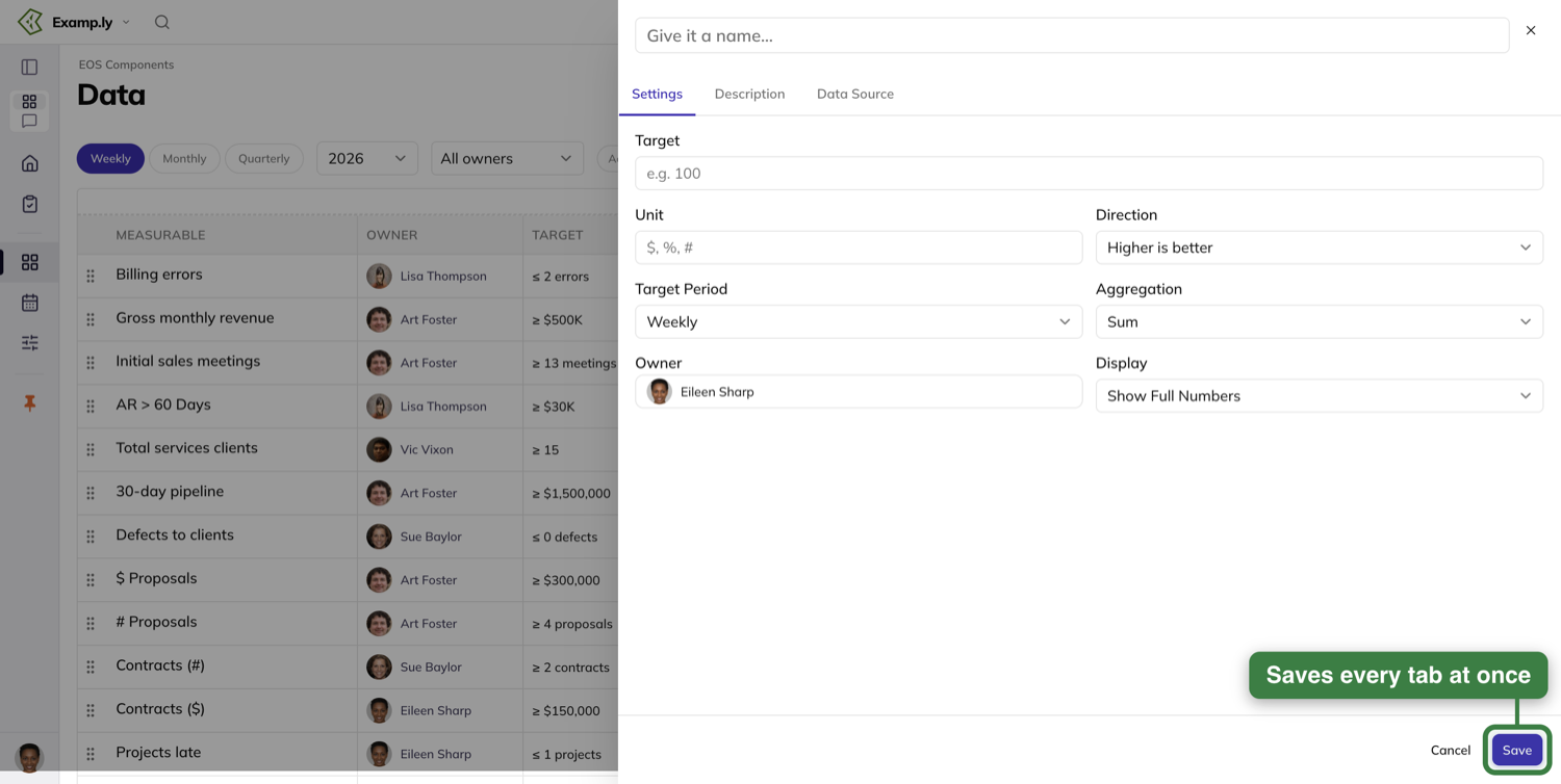
The Description tab holds one box for context — the prompt reads "Optional description". There is no per-tab save: one Save in the sheet's footer commits everything you changed on every tab, and Cancel sits beside it.
Back on the grid you can change a target without opening the sheet at all. Click the Target cell, type, and press Enter or click away. A Measurable with no target yet shows + Set target to anyone who can edit it, and a plain dash to everyone else.
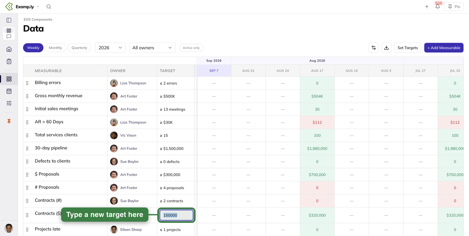
Each row carries a ⋮ menu that appears when you hover it. A team admin gets Edit and Archive, plus Move up and Move down for reordering.
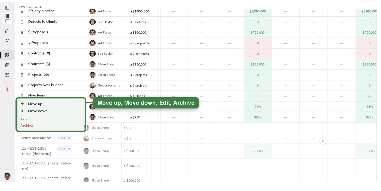
The two reorder items are fussier than the rest: they appear only in Weekly view with no owner filter applied. Narrow the grid to one person, or switch to Monthly, and Move up and Move down quietly disappear from the menu, leaving Edit and Archive. Clear the filter and go back to Weekly to get them back.
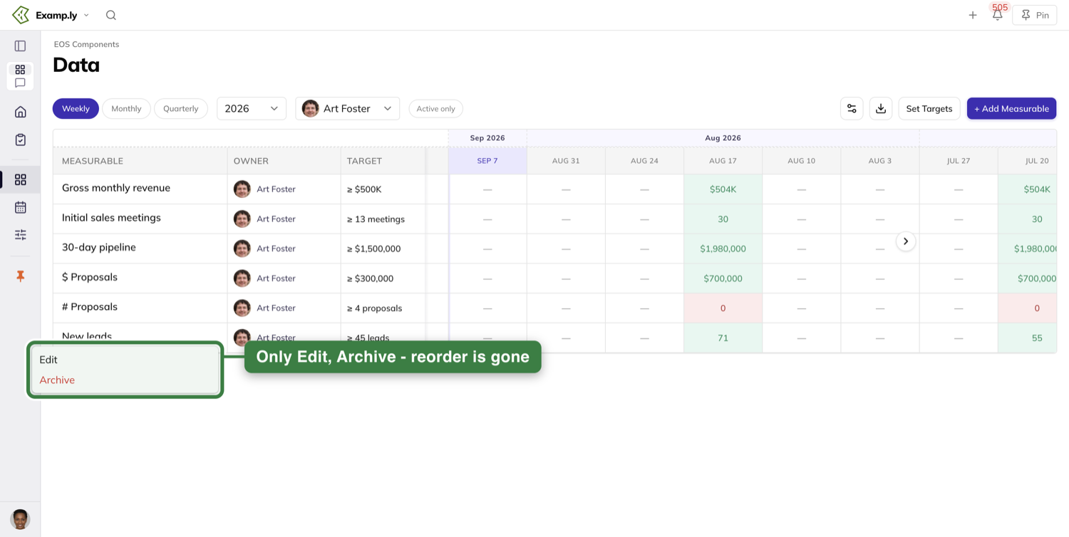
Archiving asks first, and the confirmation tells you the row is only hidden: "will be hidden from the scorecard. You can view it again using 'Show Archived'." Turn the Active only pill off to bring archived rows back into view — their menu swaps Archive for Restore.
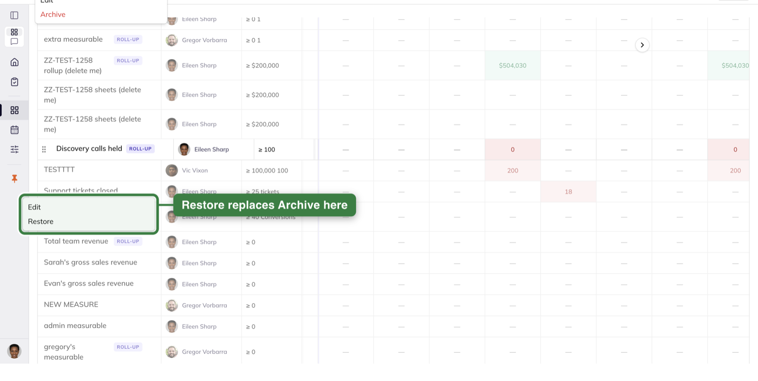
A member who is not a team admin — even the Measurable's own owner — opens that menu to find nothing in it, which is worth knowing before you go looking for a control that is not there for you.
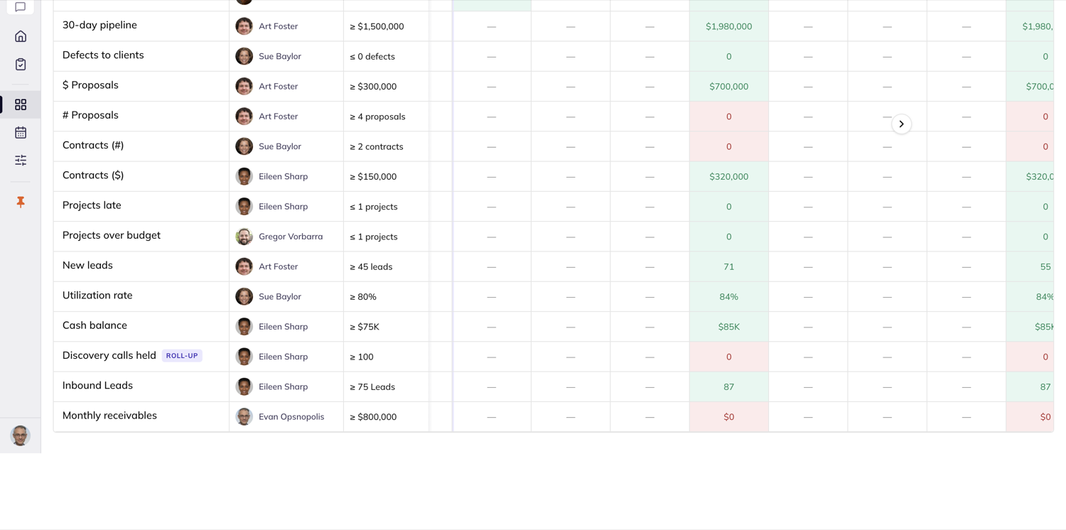
Let a number fill itself in
If a system somewhere already knows this number, stop retyping it. Open the Measurable and go to the Data Source tab. A card at the top of the tab says "This Measurable can fill itself in" and explains the deal: each week's value lands in the matching week on the Scorecard, cells stay editable, and every change — synced or typed — is logged.
The Data Source picker offers four choices: Manual, Google Sheets, Other API and Roll-up.
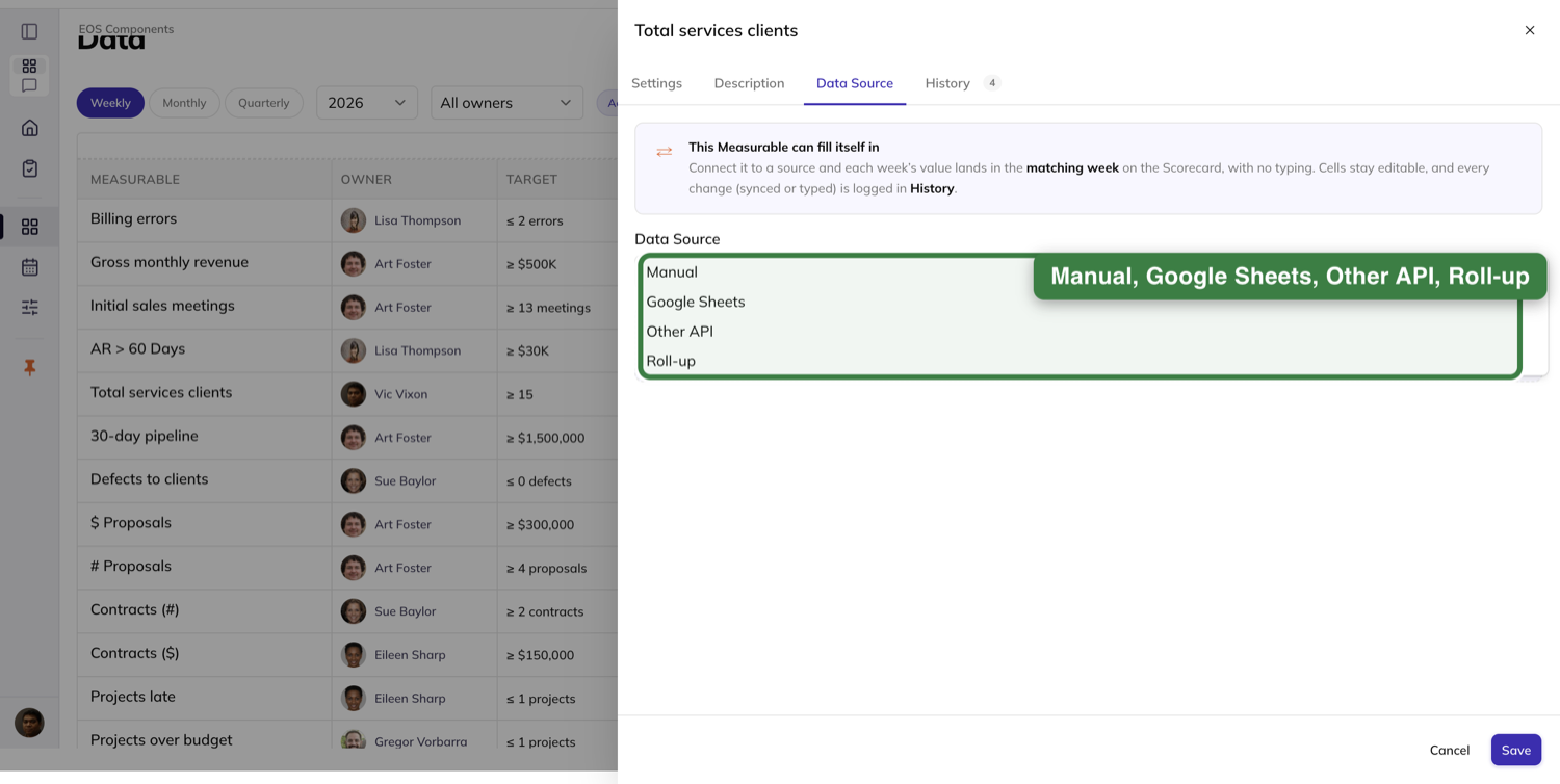
Choose Other API and the connected configuration appears beneath. If your account already has saved connections, they are listed — pick one and you are asked for no credential at all, because the saved connection carries its own.
If there is nothing saved, or you would rather not wait on an admin, type the endpoint and an API key straight into the fields on this tab and press Connect — Enter in the key field does the same thing. The key masks itself as you type. You do not need to be an account admin, you are never told to go somewhere else, and this works from wherever you opened the sheet, including from inside a running Level 10 or a 1-on-1.
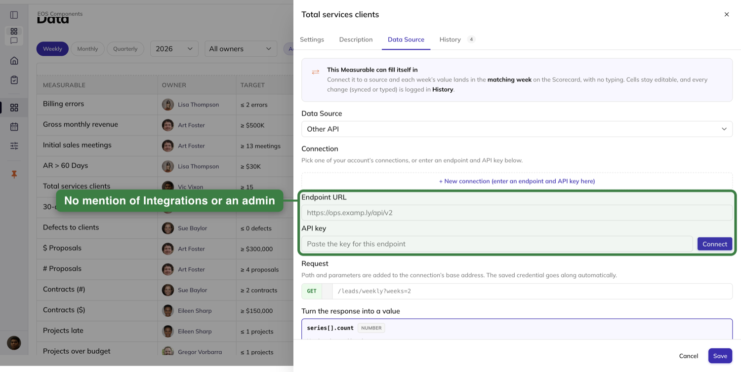
Next, tell the Scorecard which part of the response is the number. Under Turn the response into a value the tab lists the fields it found and you click the one that holds the value. Note the field tagged Sets the week — that is the date the Scorecard reads to decide which week each value lands in, which is why a connected Measurable fills the right column rather than always the current one. If a week gets more than one value settles the tie, with Latest (keep the most recent), Sum (add them up), Count (how many entries) and Average (the mean of them).
Press ▸ Test data source before you commit to anything. The button paints its own feedback first, then shows the number it actually fetched and the week it would land in. Nothing has touched your Scorecard yet — the hint beside the button says so plainly: "Runs the request with the saved credential. Nothing is written to the Scorecard until you save."
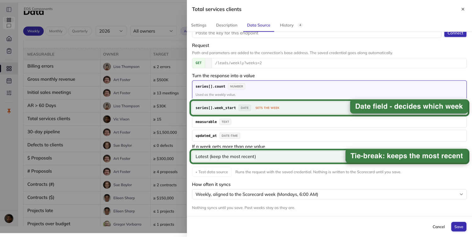
Set How often it syncs — Weekly, aligned to the Scorecard week (Mondays, 6:00 AM), Every weekday morning, or Only when refreshed by hand — and press Save. Two things happen. The row grows a chip naming the connection with its last-synced time beside it, and every past week keeps exactly the value it already held. Connecting a Measurable changes nothing retroactively.
From then on the number arrives on its own. The week's cell fills with the fetched value and nobody typed it.
When a pull fails and its retries are exhausted, the Scorecard says so instead of inventing a number. The week reads N/C — not last week's figure, not a substitute — and the row's chip turns amber with needs attention and a Reconnect link ready to click. Every past week keeps the value it already had.
A synced number is not the last word. Click the cell and type over it: the cell takes the edit, a small dot appears in its corner marking it as edited after the sync, and hovering it names who changed it. The change is filed as an Override, so nobody has to guess later whether the number came from the source or from a person.
To go back to typing, set Data Source to Manual. The connected configuration disappears, the row's chip goes with it, and every value you ever synced or typed is still sitting in its own week. As the tab puts it: "Manual entry: Each week, the owner (or anyone who can edit this Scorecard row) types the number straight into the week's cell. You can switch back to a connected source anytime; nothing is lost."
Google Sheets works a little differently. You pick the Google account the sheet is read with from the connections an admin has already authorized — the helper text is explicit that admins connect one once on the Integrations page and no credential is entered here. Then you paste the sheet's link into Spreadsheet and name the exact Tab and Cell the number lives in.
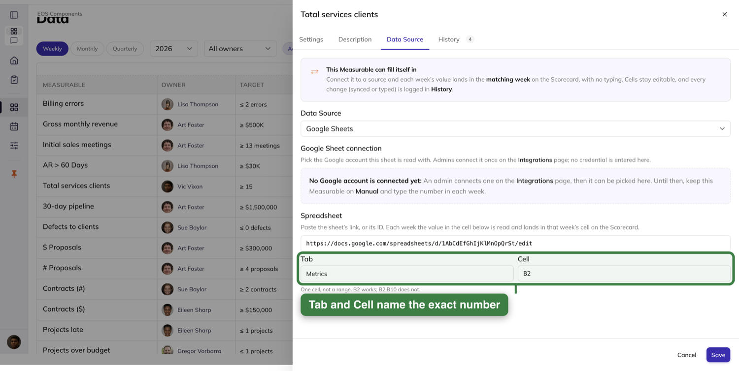
It is one cell, not a range: "One cell, not a range. B2 works; B2:B10 does not." There is no test control until you have saved, because the preview reads the saved binding rather than what is still in the fields. And as everywhere on this tab, "Nothing syncs until you save. Past weeks stay as they are."
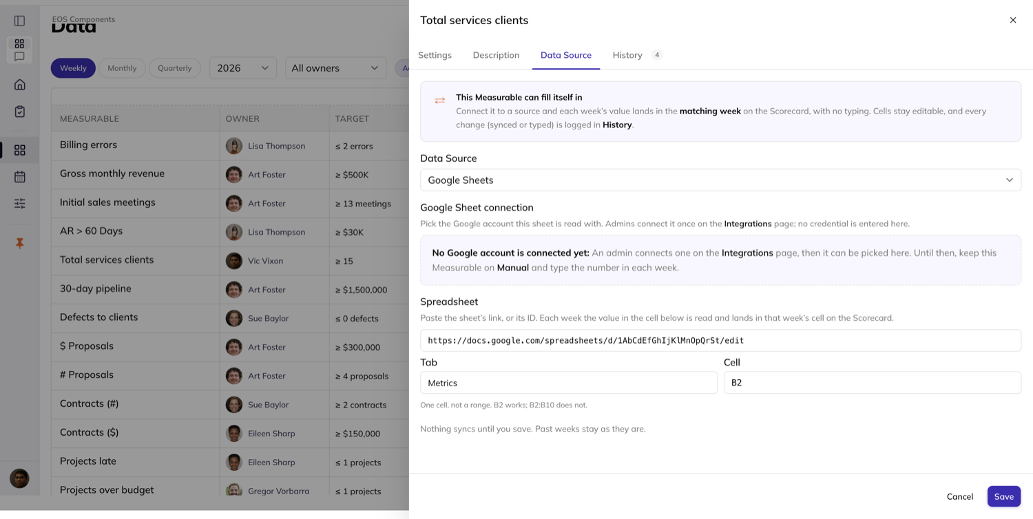
Roll several numbers into one
A Measurable can be the sum or the average of other Measurables instead of a number anyone types. On the Data Source tab, set the source to Roll-up. Roll-up Type offers Sum and Average.
Then pick the parts under Measures to Roll Up. A Team picker lets you browse any team you have access to, and the list you build can mix them — a component that lives on a different team is shown back to you with that team's name beside it, so you can tell where each piece came from without going to look.
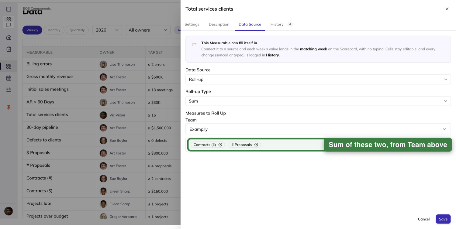
Press Save and the sheet closes onto a row that has already changed: it carries a Roll-up badge beside its name and its current-week cell shows the total, with no refresh. After that it keeps itself current — record a value on any component, on any team, and the roll-up recalculates the moment the component commits.
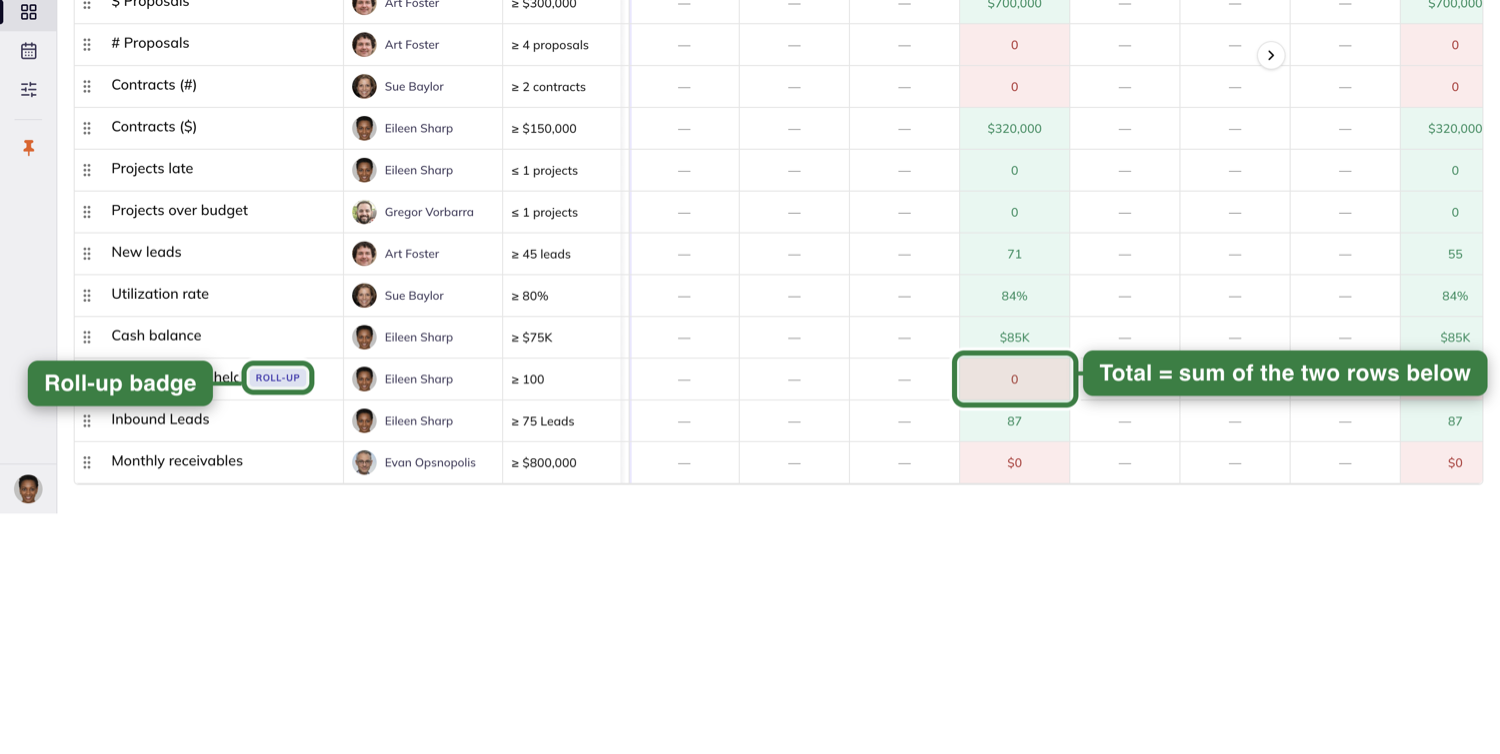
Open a roll-up's Settings tab and you get a Component Measures block at the foot of the tab listing every part by name with its current-week value, and a Make changes link that takes you straight back to Data Source to edit the composition. A Measurable that is not a roll-up shows no such block at all.
One consequence to expect: a roll-up's cells do not take typing. Clicking a week on a roll-up row does not open it for editing, because its values are calculated from its parts. Connected and manual rows stay editable; roll-up rows do not.
Check a number's history
Every Measurable keeps its own record of what happened to it. Open the Measurable and choose the History tab — its label carries a badge with the number of entries waiting inside.
The feed is grouped by day, newest first, and it logs more than values. A sync shows as the source itself doing it, named and timestamped, with the week it filled. A hand edit over a synced value carries an Override tag and shows the old and new numbers as a pair. A change to the target shows the same way, with the person's avatar. Connecting a source and disconnecting one are both logged. And a failed pull sits in the feed highlighted amber, saying the week was left N/C and carrying a Reconnect action right on the entry, so you can fix it from where you found out about it.
Four filter pills narrow the feed: All, Values, Settings and Connection, each showing its own count. Pick one and the entries that do not belong disappear, along with any day that has nothing left in it.
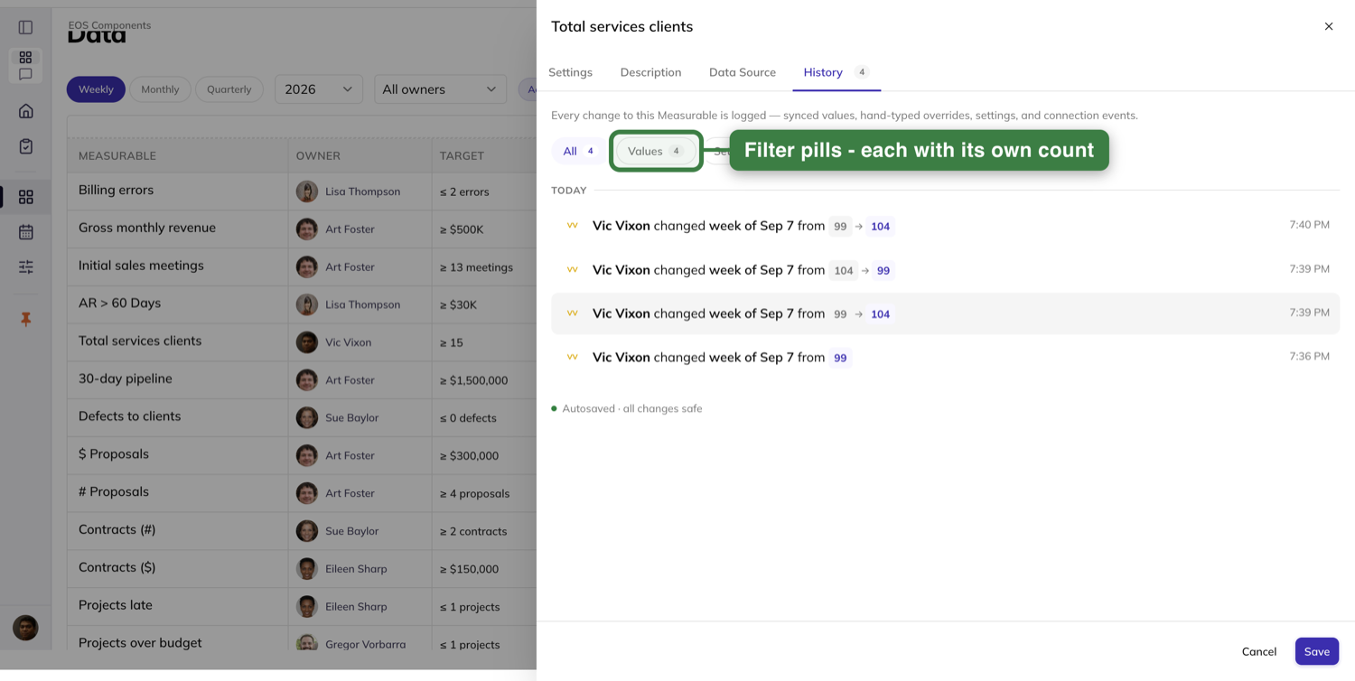
You do not need to reload to keep up. If someone else overrides a value while you have the feed open, the new row arrives in it on its own.
Manage the account's Connections
Credentials that more than one Measurable should share are created once, on the Integrations page, in the Connections section. The section is marked Admins only and carries a count of how many connections the account holds.
Press New connection and a panel asks for three things: a Name, a Base address and an API key. Save it and the key is shown to you in full exactly once, under a warning you should take literally — "Shown once — save it now. It won't be shown again." From then on the card shows it masked, and there is no way to read it back.
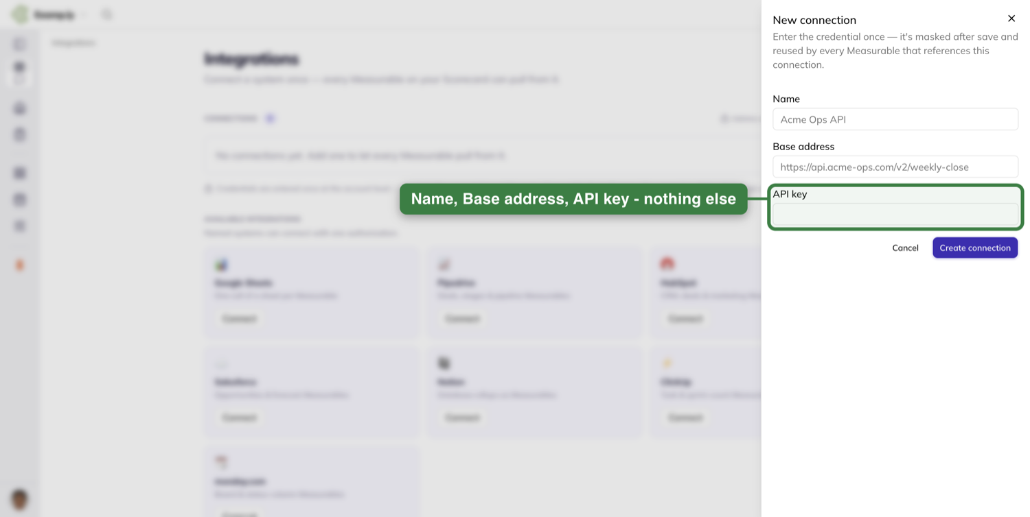
Each card carries what you need to trust it: Connected or Needs attention, when it last synced, who added it and when, and Used by a count of Measurables. Test paints its own feedback first and then flashes "✓ 200 OK" when the connection answers.
A connection whose authorization has lapsed says so instead of failing quietly. The card turns amber, reads Needs attention, and states the consequence in plain terms — the token expired, and Measurables on this connection show N/C until it is reconnected — with Reconnect as the card's main action.
Disconnect asks before it does anything, and it names every Measurable it would break: "These Measurables will stop syncing and show N/C until you reconnect:" followed by the list. Nothing is disconnected until you confirm.
A member who is not an admin sees the same list read-only — names, types, statuses and used-by counts, without New connection, Test, Disconnect or Reconnect. That gate belongs to this page alone. On a Measurable they can edit, they can still enter an endpoint and key inline and connect it themselves, exactly as Step 4 describes.
Beneath the connections sits Available integrations, a tile per named system — "Named systems can connect with one authorization." A tile whose system you have already connected says so, so you are not left wondering whether you did it twice.
Review the Scorecard in your Level 10
The weekly meeting does not get its own copy of the numbers. The Level 10's Agenda has a Scorecard section showing the same rows you just left — the same values, the same source chips, the same last-synced times. If a number is missing, record it right there in the meeting; the cells behave exactly as they do on the Data view, Enter and click-away both.
The control that matters here is a filter by person. Pick someone and the grid narrows to their rows immediately — no reload, no spinner, no skeleton — and the picker shows who you chose. Choose All owners to bring everyone back. It works from the keyboard too: open it, arrow to a name, press Enter. Pick someone who owns nothing on this Scorecard and you get an empty section with the picker still sitting there, so you can undo the choice from where you made it.
What the meeting's Scorecard deliberately leaves out is the rest of the filter bar: there is no year picker, no period toggle and no archived switch. The grid stays on the current year's weeks so everyone in the room is reading the same thing.
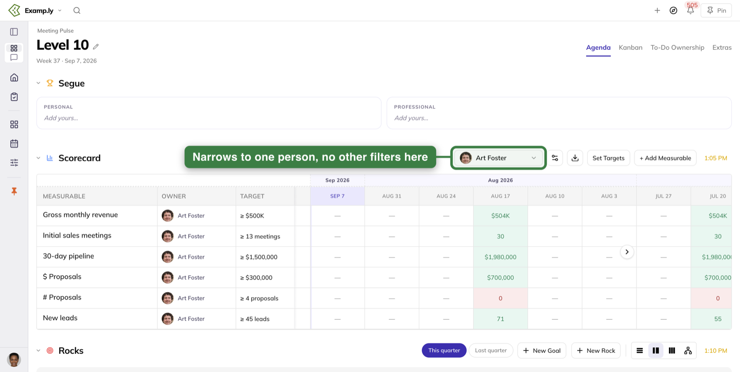
The Measure edit sheet opens from here too, with everything it has anywhere else — including the Data Source tab, so a Measurable can be connected mid-meeting without anybody leaving the meeting.
Prep before the meeting
The weekly 3-Step Prep is where you fill in your numbers before the room needs them. It opens by asking "How do you want to prep?" — Step by step walks you through one section at a time, and All on one page puts everything on one scroll. Whichever you pick you get the same sections, and you can switch between them.
The Measurables step shows only your own rows — the help text says so: "Enter this week's number for the Measurables you own. Only your own Scorecard rows show here." Each row gives you three columns: Target and Last week to read, and This week to type into.
Two small buttons sit on each row. + headline attaches a headline to that number, and + issue raises an issue about it — the tooltip nudges you when the number is short, asking whether you are missing the target or worried about the period ahead.
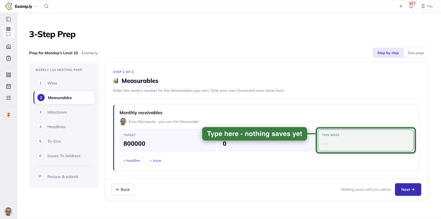
This is the one place where typing a number does not save it. Enter does nothing here and neither does clicking away — nothing is written until you press Submit prep at the end, which sends the whole prep at once. The footer says as much while you work: "Nothing saves until you submit".
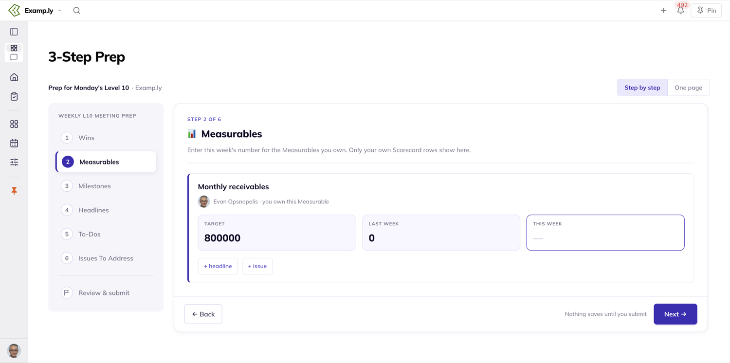
If you own no Measurables, the section is not there at all — it is skipped, not shown empty. And what you do type lands where it is needed: the prep's Measurables feed the Scorecard review in that week's Level 10.
Track personal Measurables in a 1-on-1
A 1-on-1 has its own Measurables section, for the numbers that belong to one person rather than the team's card.
The + button in the section header creates one, using the same sheet you already know. Watch the Owner field: it defaults to you, so creating a Measurable for the person you are meeting with means switching Owner to them. Do that and it appears in their Measurables — on their screen as well as yours — with them as owner, and they can record into it and edit it themselves.
Recording is quicker here than on the grid. Click the card's big number, the value opens ready to overwrite, and Enter commits it. Type something that is not a number and the card tells you so: "Enter a number". Clicking the card's name opens the full edit sheet.
To pull existing team Measurables onto the 1-on-1, use the gear menu's Choose Measurables. The dialog is titled Select Team Measurables:, lists a team's Measurables with their owners as checkboxes — the ones already on this 1-on-1 come up pre-checked — and commits with Save.
Each card carries a 13 WKS graph with Last wk beneath it. Read that chart as a shape, not a calendar. It plots the last thirteen values that were actually recorded, spaced evenly across the card, so the line runs the full width whether those thirteen readings came from thirteen consecutive weeks or from eight months of patchy recording. Nothing is invented to fill a week nobody recorded — but nothing marks the gap either, so the horizontal distance between two points is a position in the sequence, not elapsed time.
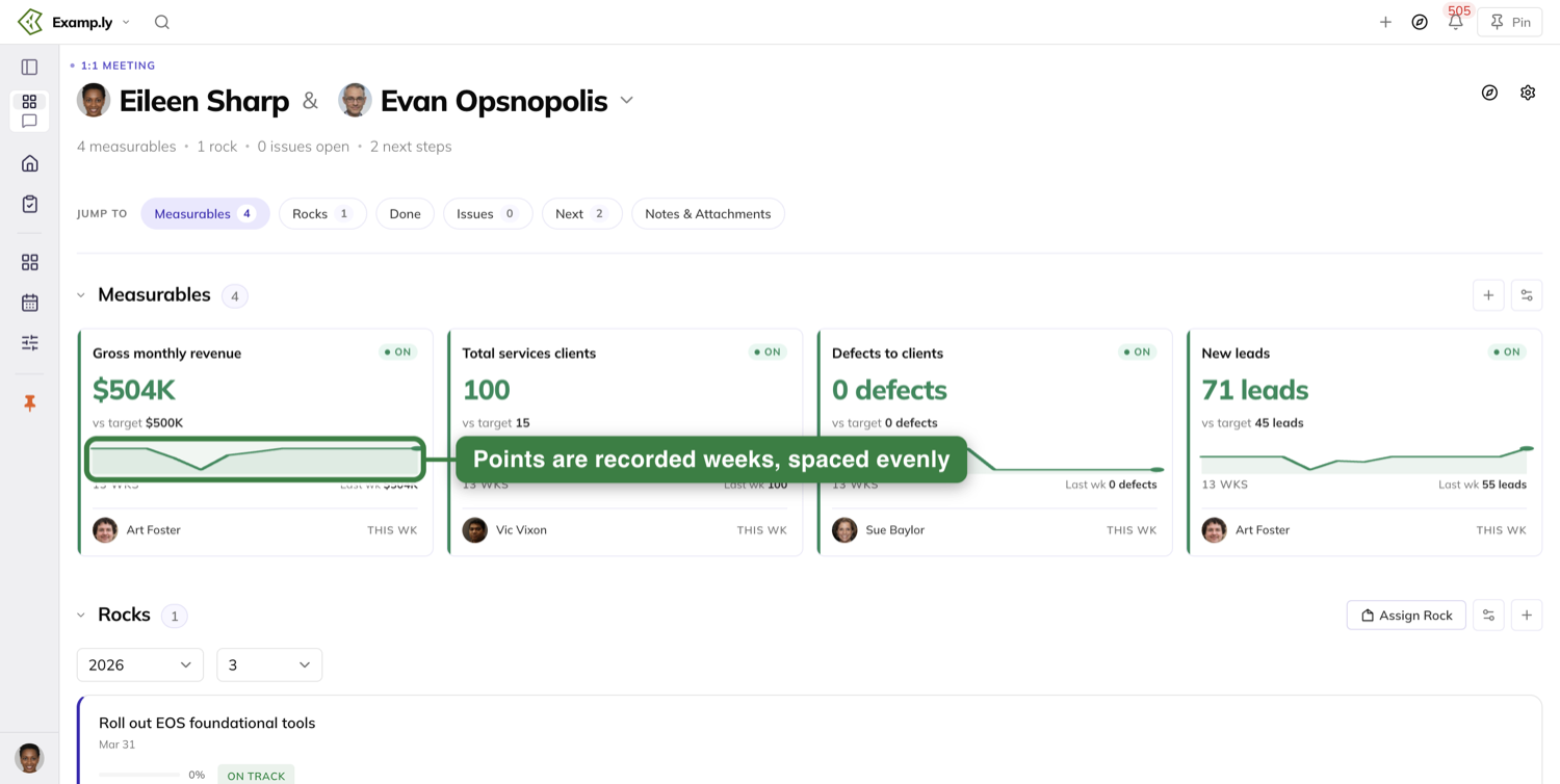
Point a team at another team's Scorecard
A team that should read another team's numbers rather than keep its own is pointed at them from the team's page. Open the team, go to its More tab, and press the pencil on the Inheritance card. Team admins get the pencil; everyone else reads the card as it stands.
Set Inherit scorecard from to the team whose Scorecard this one should show, then press Save. Nothing is written at the moment you change the picker — Save commits it and nothing else does. Cancel puts the card back to the values it had, and the team's Scorecard source is untouched.
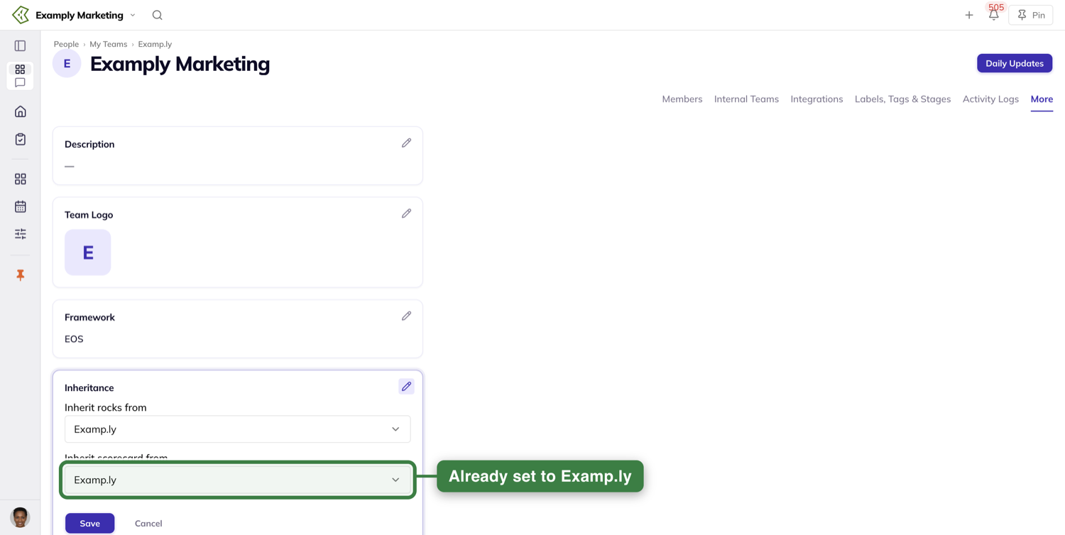
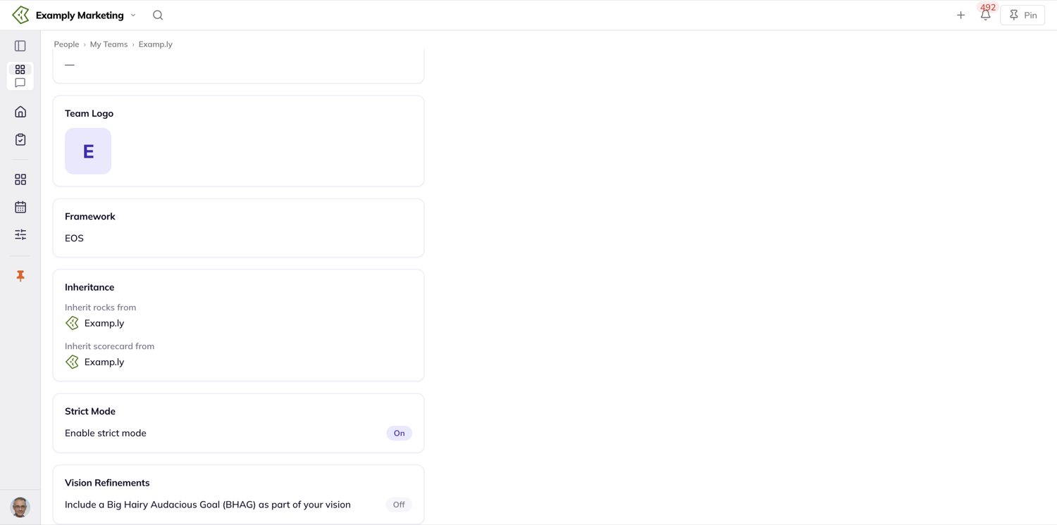
After that, the inheriting team's Data view opens with a banner naming the team it reads from, and the parent's rows show read-only. The + Add Measurable button is not offered on an inheriting Scorecard, because the Measurables belong to the other team.
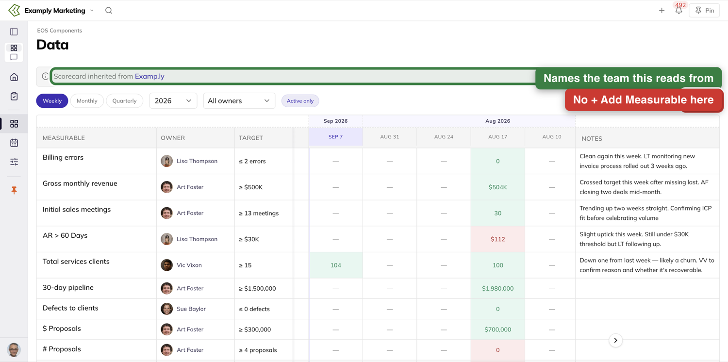
Ownership travels with the Measurable, not with the screen. If you own a Measurable, you can record into it from whichever team's Scorecard you are looking at it on, and its edit sheet opens editable for you there — the same rights you have on the team that owns it.
Ask the AI
If you would rather ask than look, the sidebar's Chat tab opens the assistant — Cmd+J opens and closes it too. Ask what a Measurable reads this week and you get the number the cell shows. It makes no distinction between a value that synced in and a value someone typed: both are just this week's number.
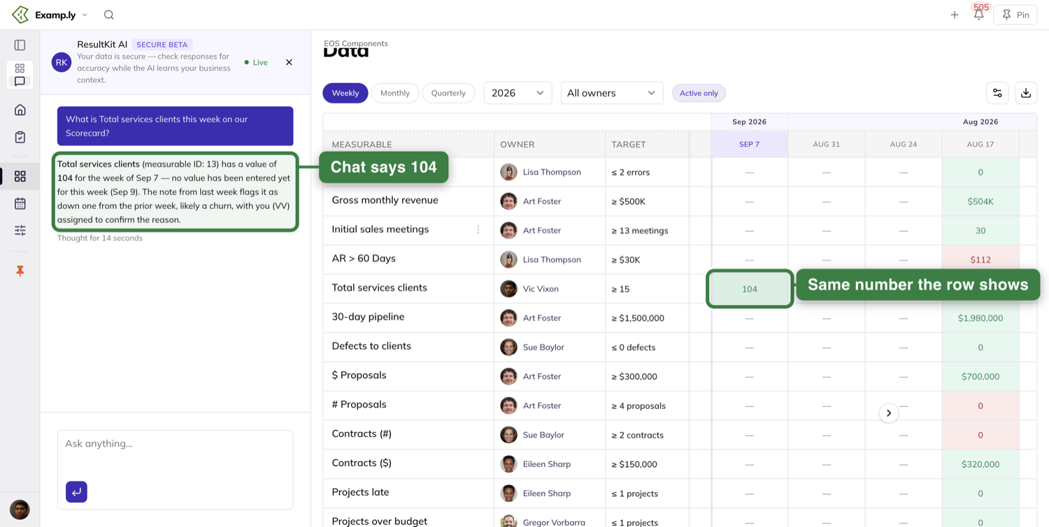
Who can record, and who can read
Recording a value takes standing on that particular row: the Measurable's owner, its assignee, or a team admin. Being one of those is enough on its own — an owner does not also need admin rights, and the right holds wherever the row appears, including on a team that inherits it.
Reading is open to the whole team. Every member sees the Measurables, their targets and their weekly values, private teams included.
The edit sheet enforces exactly what the grid does. A Measurable you cannot type into on the grid opens without edit affordances: the name does not become editable, the Settings fields do not take input, and there is no way to save a value through it. There is no back door.
Connections are the one place where account admin matters, and only on the Integrations page. Creating, testing, disconnecting and reconnecting account connections are admin jobs. Connecting a Measurable you can edit is yours — endpoint, key, Connect, on its own Data Source tab.
Where else these numbers show up
The Quarterly Business Review has a Scorecard section of its own, and the figures drawn from a Measurable update on it as values are recorded — including while someone else is doing the recording in their own session.
Was this helpful?
FAQ: Personal Measurables vs. the Team Scorecard
This comes up frequently now that we've got personal Measurables out: when should I use a personal measurable, versus putting one on the team scorecard?
I'll use a basketball team as an example.
If I wanted to know how the game was going, I'd look at the scoreboard. The score, what period it is, how much time is left, how many fouls. Those are indicators that get put on the team scoreboard, and they give me a sense of how the game is going. I can use that to make decisions about my conversations with the team.
In business it's the same way. Your scorecard for your business or for your team is the set of information that lets you see how the team is really progressing, and whether you're moving in the direction you want to move.
At the same time, if you want to manage performance, you may give individuals numbers to think about.
Using the same basketball analogy: some players do better when they get to a certain spot on the court. You may challenge that individual to get to that spot a certain number of times in a game and take their shot. That's not something that goes on the scoreboard you use to see how the team is doing.
So — shots taken from the paint for Scott. The paint is the colored area in basketball; if you don't know basketball, just go with me. I want to see at least ten shots per half, because we believe that will elevate his scoring, and that in turn is going to find its way up to our team scoreboard.
That lets me, as a leader or a manager, manage individual performance — instead of the indicators we need for how the overall team is doing.
There are also times where it might not be appropriate to share certain information with the team. You may be trying to manage some aspect of performance that doesn't need to bother everybody else.
Personal stat lines can be indicators and proxies of the kind of team success you're creating. But they're not the team scoreboard.
So when it's a personal measurable, the place to put it in ResultKit is in your one-on-one meeting with that individual.
Here's how to get there.
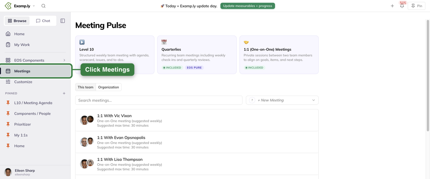
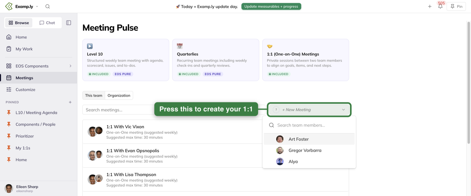
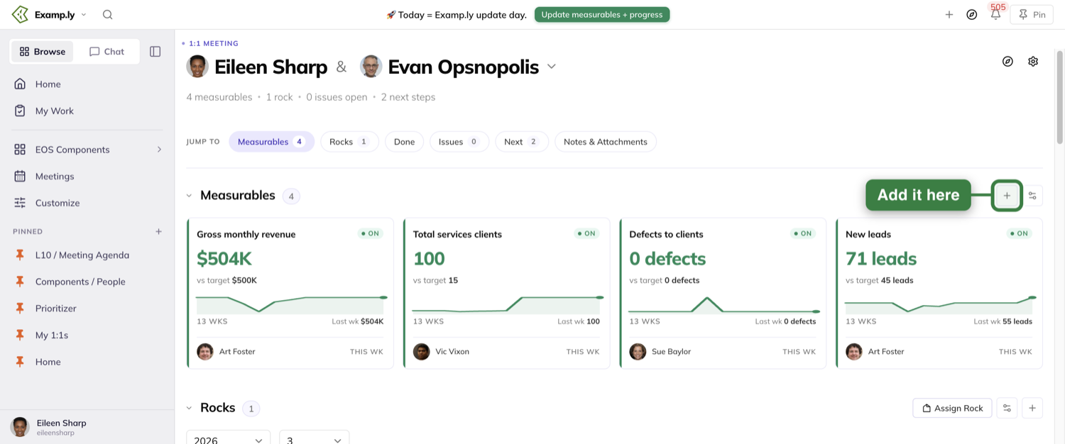
Was this helpful?
Level 10 Meeting
You want your weekly meetings to drive the right results. That means the right data and issues are surfaced, decisions are made and become results. Typically, a decision made in the meeting may become a to-do, but that to-do gets stuck. It has to flow through different systems and manual hand-offs, becoming a cascade of work about work as it's retyped into wherever the daily work actually lives. Or it stays buried in a siloed meeting system. We fix that by letting you raise an issue and turn it straight into a fully owned to-do that can also live in a project, on a 1:1, on your personal work plan, and in any other context for you, your AI, your team and your business. It's available wherever the work is done. What that means is what comes up in the room becomes results, owned and visible wherever the work is done, never lost, retyped, or quietly dropped.
In this article
- Before you begin: you have to be a member of the team
- Two kinds of people in the meeting
- 1Open your team's Level 10
- The four tabs
- Opening the meeting from a link
- 2Prepare before the meeting
- Pick how you want to prep
- The six sections
- Nothing saves until you submit
- What each status does
- 3Work the agenda in order
- The Segue opens the meeting
- Changing the section times
- 4Post your headlines
- Give it a category
- Add images, files and links
- The seven-day life
- Managing a headline
- Bringing an old headline back
- 5Read the scorecard
- Filtering to one person
- Entering this week's number
- When the week rolls over
- 6Review the rocks
- Opening a rock
- 7Work the to-dos and issues
- Moving a row between sections
- 8Turn an issue into a to-do
- The form that opens
- What creating it does
- Afterwards
- 9Rate the meeting
- Entering a score
- Whose row you can enter
- The Kanban board
- Moving cards
- Where a card came from
- Park For Later
- The To-Do Ownership tab
- What this tab filters by
- The chip this tab keeps
- Opening an item
- Assigning from the sheet
- Steps
- Where else the item lives
- Moving an item to another team's Level 10
- Aligning it to work
- Flagging an issue long-term
- Sending work somewhere else: the Compass dock
- Projects and long-term issues
- A drop that does not work
- The Extras tab
- The score over time
- Files and links
- Everyone in the meeting sees the same board
- Who can do what
Your team's whole weekly meeting runs on one screen, in order, from the agenda at the top. Everyone in the meeting watches the same board change as it happens — a number entered, a card moved, a headline posted.
Raise an issue and it becomes an owned to-do without leaving the page. That item stays the same record everywhere it shows up next — your planner, your 1:1, wherever it lands.
This article walks the meeting from before it starts to the score at the end, then covers the other three tabs, the item sheet, and who can do what.
Before you begin: you have to be a member of the team
Membership is the only door into a team's Level 10. Nothing else opens it.
Administering a team you do not belong to does not let you in. Neither does being a global admin, and neither does owning the account.
Follow a link to a team you are not on and the page reads "You do not have access to this team." You see no team name, no rocks, no to-dos, no issues and no scorecard.
Two kinds of people in the meeting
Most of the meeting works the same for everyone. A few things are the meeting admin's alone.
The meeting admin is a team admin of the team. They enter any attendee's meeting score, reorder rows on the Agenda and the Kanban board, and set each agenda section's time.
Everyone else is an attendee. They add headlines, update the measurables they own, complete their to-dos, and enter their own meeting score.
Open your team's Level 10
Go to Meetings. The Level 10 is the first of three tiles, marked with a green Included pill and an EOS Pure pill beside it.
Quarterlies sits second and 1:1 (One-on-One) Meetings last. Only the first two are marked EOS Pure.
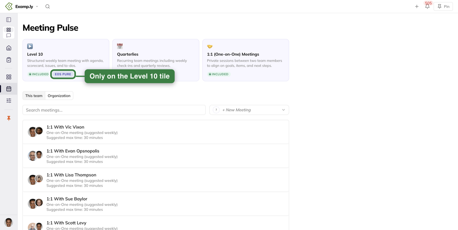
The four tabs
The Level 10 page carries four tabs: Agenda, Kanban, To-Do Ownership and Extras.
The Agenda is where the meeting is run. The other three are ways of looking at the same work, and at the meeting's own record.
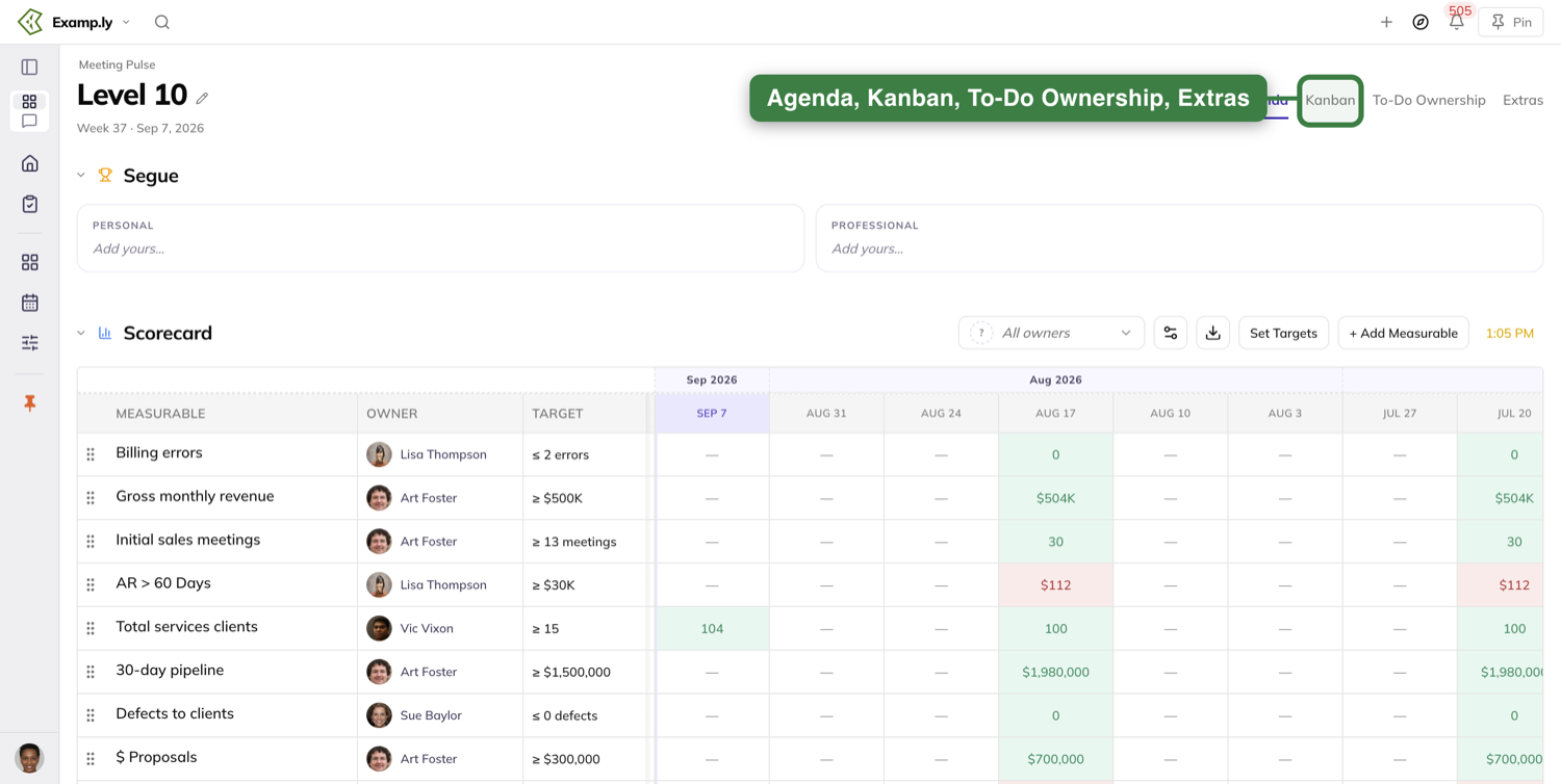
Opening the meeting from a link
A direct link opens the Level 10 as the team the link names, from the first paint. Another team's agenda never flashes up first.
Opening that link switches you to that team, and you stay switched until you change teams yourself.
Switching teams while you are here updates the meeting in place. The page does not reload and the tab you are on stays selected.
Prepare before the meeting
The day before your meeting and the day of it, a banner appears on your main pages.
It reads "Tomorrow = [your team] update day." or "Today = [your team] update day." with a green Update measurables + progress button.
The day-of banner shows all day. There is no cutoff hour, and each person's "today" is their own time zone's date.
Pick how you want to prep
The first time you open 3-Step Prep, it asks "How do you want to prep?"
Two cards are selectable: Step by step, one section at a time, and All on one page, everything on one scroll.
A third card offers the prep as a conversation. It is a greyed-out stub — it is not selectable and it launches nothing.
Your choice is remembered. Next week the prep opens straight into it, and a toggle at the top switches you between the two.
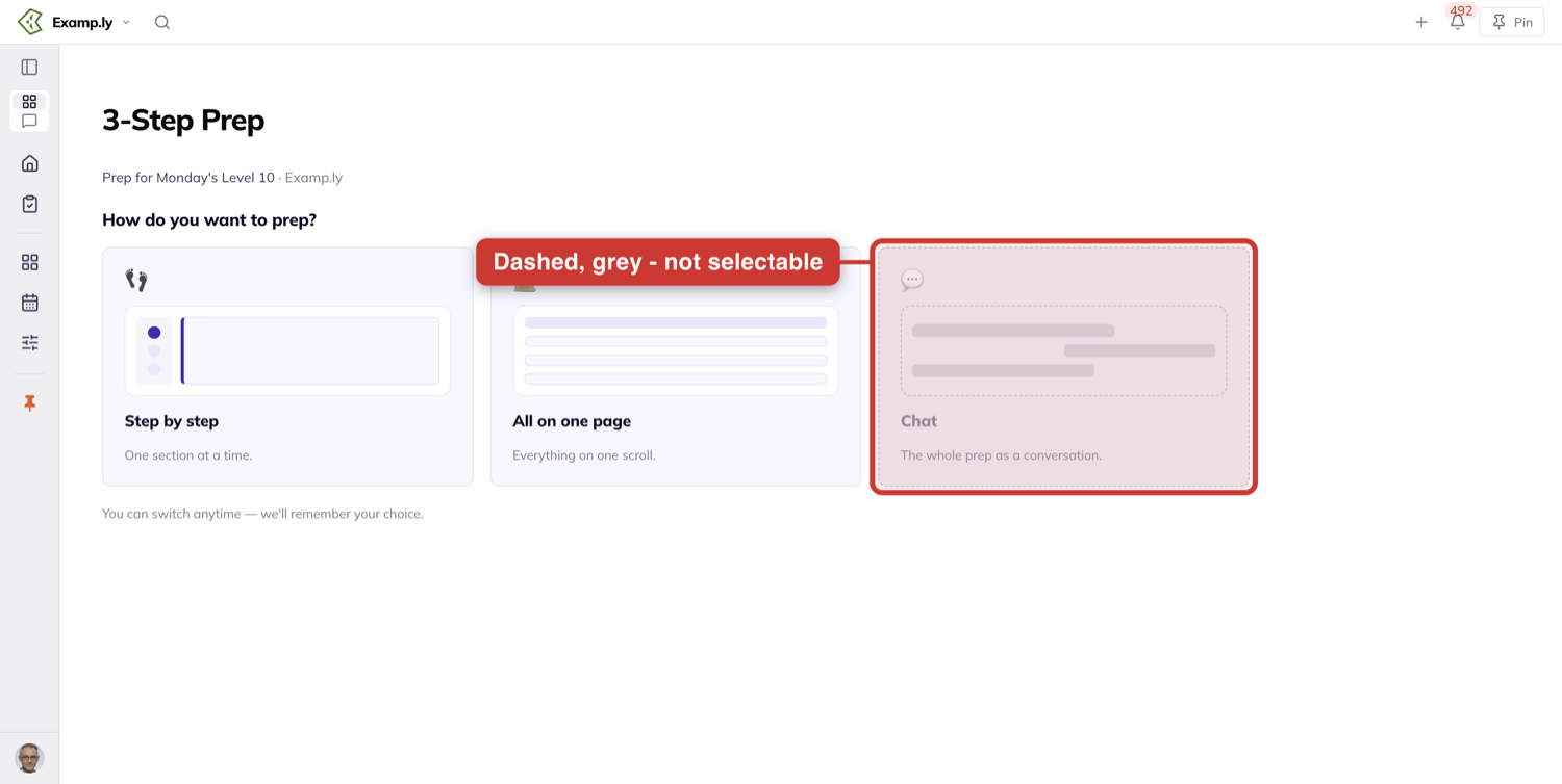
The six sections
The prep collects six sections in order: Wins, Measurables, Milestones, Headlines, To-Dos and Issues To Address.
If you own no measurable, you see five. The Measurables section is simply absent for you.
Measurables shows only your own scorecard rows, each with its target, last week's number, and a field for this week's.
To-Dos asks for a status on each of your 7-day to-dos: Done, Blocked/stuck, Extra steps needed or Not started.
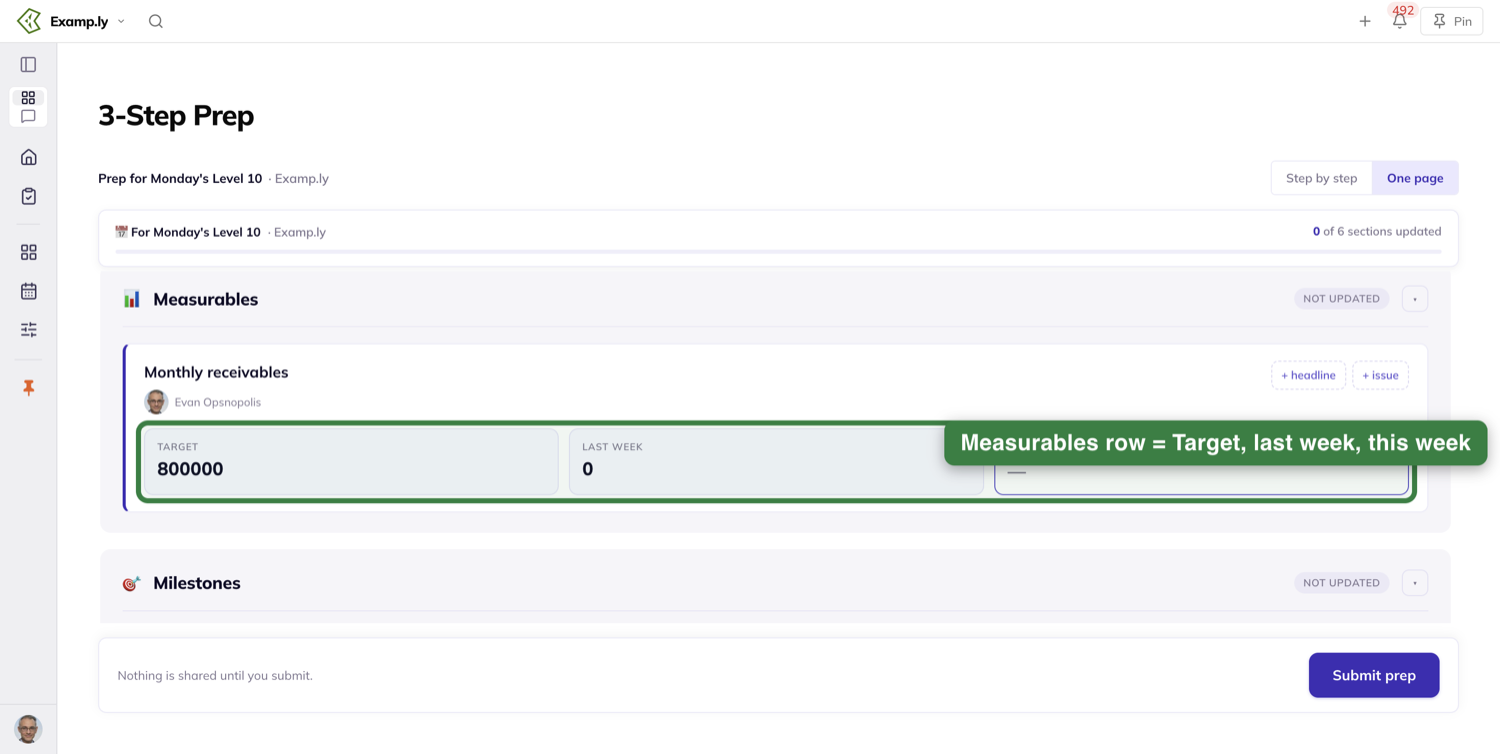
Nothing saves until you submit
This is the part people get wrong. There is no per-section save anywhere in the prep.
The stepper says so under its button: "Nothing saves until you submit". Leave before submitting and nothing is kept.
Switching between the two guided approaches is different. They share one draft, so everything you typed carries across.
One Submit prep writes it all at once, and then you see "You're ready for [day]'s Level 10."
What each status does
Done completes the to-do. Blocked/stuck raises it as an issue for the team to work in the meeting.
Extra steps needed and Not started both keep the to-do active, and each leaves an automatic comment saying which you picked.
Every prep section lands in its matching agenda section — measurables in the scorecard review, milestones in the rock review, and so on.
Work the agenda in order
The Agenda tab runs top to bottom: Segue, Scorecard, Rocks, Headlines, Done, Issues, To-Do, then Conclude.
The page header names the week you are in, like Week 35 · Aug 24, 2026.
The Segue opens the meeting
Segue is where the good news goes. It holds two columns, PERSONAL and PROFESSIONAL.
Each has an Add yours… field, so everyone puts up a win before the working sections start.
If you filled in wins during your prep, this is where they land.
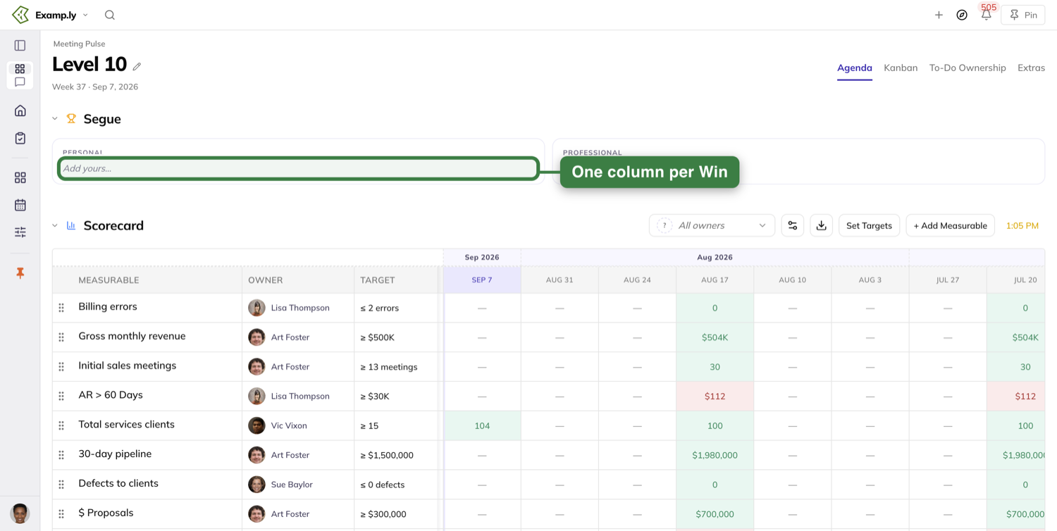
Each middle section header shows the time it starts, in your own time zone. Segue and Conclude show none.
On a team that is not running EOS, the Headlines section is skipped and the cascade runs straight through it.
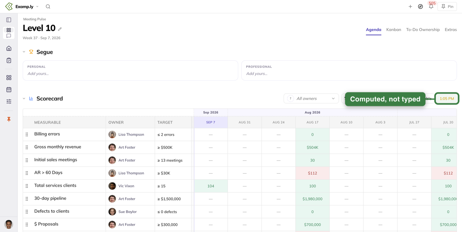
Changing the section times
If you are the meeting admin, click any section's time. Meeting Time Settings opens.
It holds the meeting's Day of Week and Start Time, then a duration for each section.
Change the start time and every section time recalculates at once. Change one section's length and only the sections after it move.
Everyone else sees the times and cannot click them.
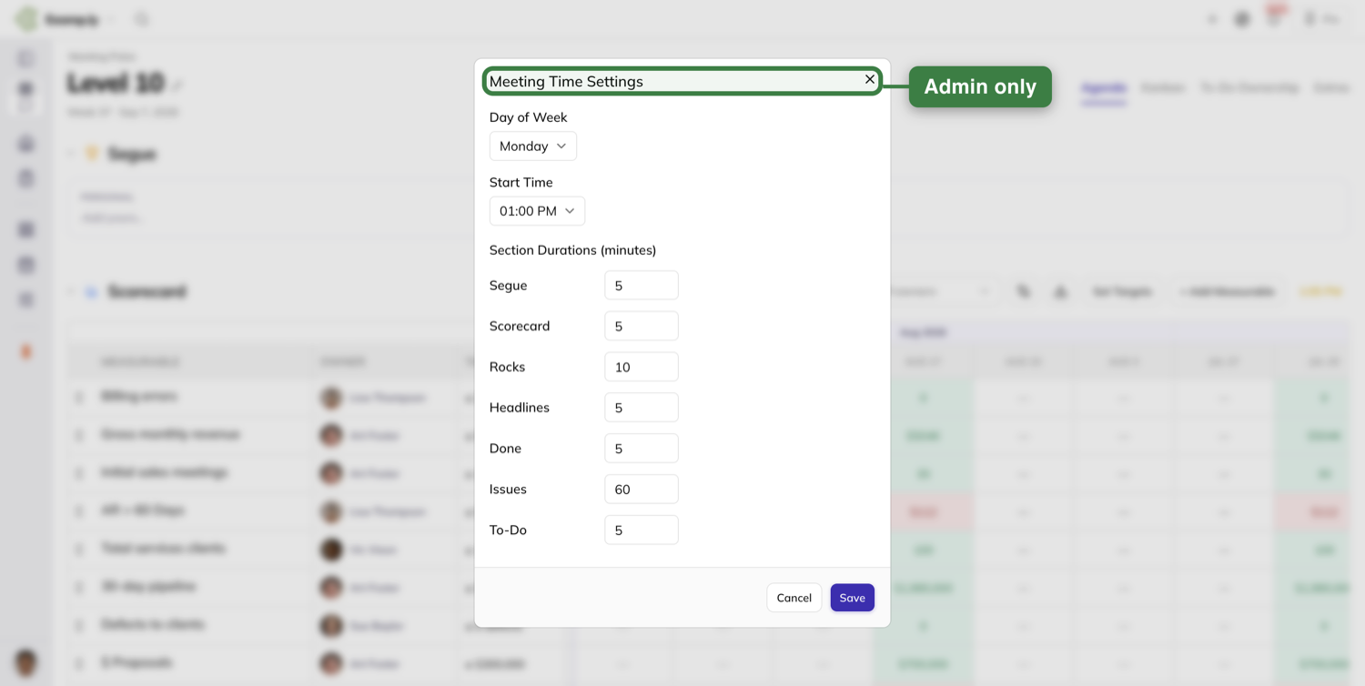
Post your headlines
A headline is a piece of team news that lives seven days, from one meeting to the next.
Type it into the compose row at the bottom of the Headlines section and press Enter, or click Add headline beside it.
New headlines are added at the bottom of the list, next to the form, and the form stays where it is.
Your own photo shows on the headline straight away — not initials, and not after a refresh.
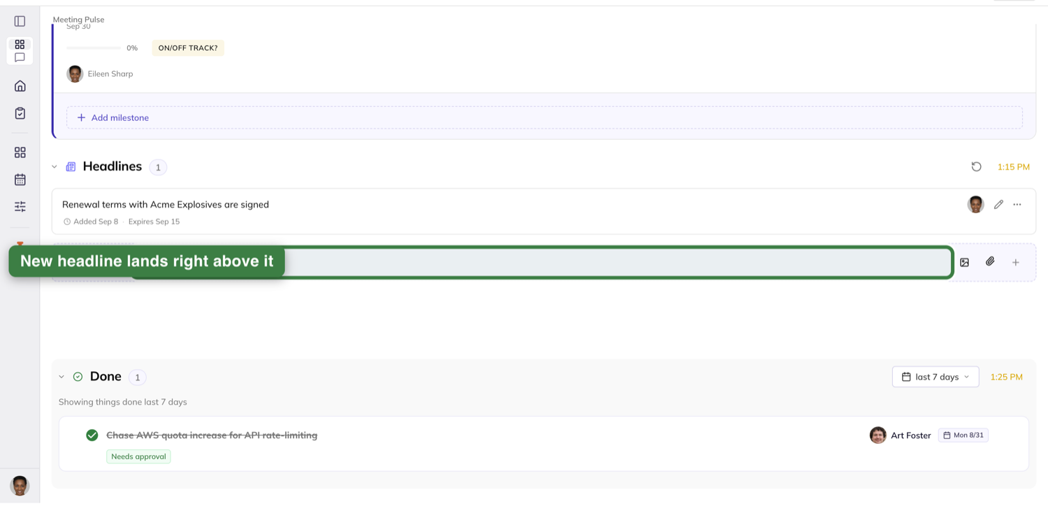
Give it a category
Every headline can be filed under one category, picked from a fixed list. There is no free typing.
SIX KEY COMPONENTS · EOS comes first — Vision, People / Employees, Data, Issues, Process, Traction — then GENERAL, holding Customer and Other.
The category you choose shows as a badge on the headline.
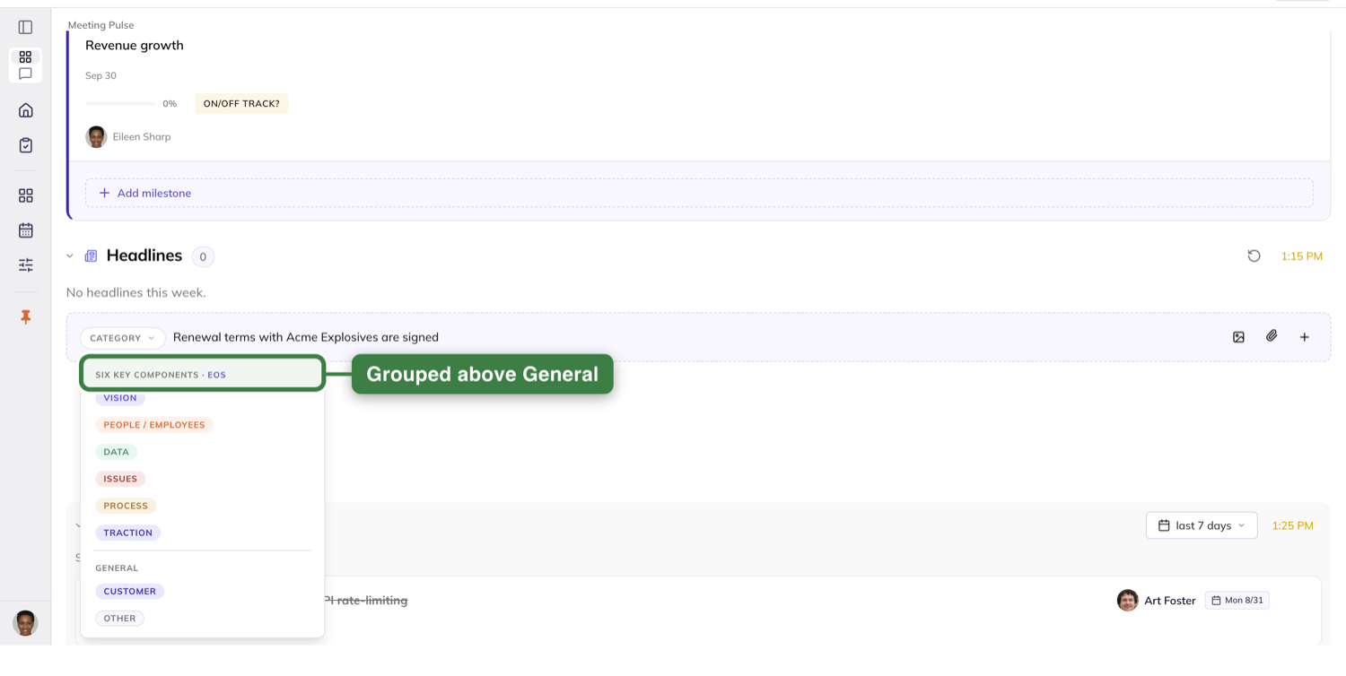
Add images, files and links
Add images with Add image. On the compose row you can also paste one or drag one in.
Several images collapse to a single thumbnail with a +N count over it. One image carries no count.
Click the thumbnail and the image opens full size. Arrow keys and the Next and Previous controls move through the set, and it does not wrap around at either end.
Files and links go on through Attach a file or link. They show as chips under the headline text, a file chip carrying its name and size.
A file has to be 4.5 MB or smaller and of an allowed type. Click a file chip to download it; click a link chip and it opens in a new tab.
The seven-day life
Each headline row shows when it was added and when it expires, like "Added Jun 9 · Expires Jun 23". One expiring soon is emphasised.
A new headline expires seven days out. Add one on meeting day and it is still there at next week's meeting.
It is visible through the whole of its expiry date, in your own time zone, and drops off afterwards.
Managing a headline
Open the headline's More menu to Edit it, Extend its expiry, or Expire it now.
Expiring takes it off the active list immediately, and it stays off after a reload.
Nothing is ever deleted. The menu says so itself: "Expire now drops the headline from the active list but keeps it in history. Nothing is permanently removed."
A team admin can edit and manage another member's headline. Anyone else sees the files and links read-only, with no add or remove controls.
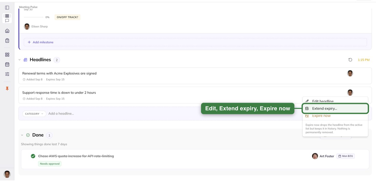
Bringing an old headline back
View your headline history, the rewind icon at the far right of the Headlines section, opens your own headlines.
It shows your five most recent first, and loads older ones as you scroll. It holds only headlines you created.
Bring back is the only thing the history offers. It pushes the expiry out fourteen days and the headline returns to the active list.
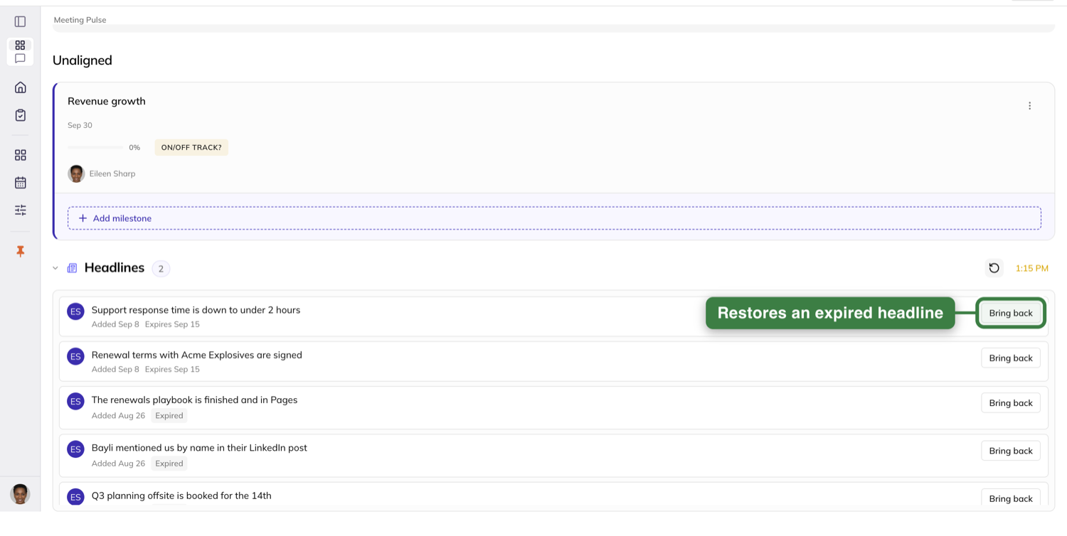
Read the scorecard
The Scorecard section shows the team's measurables for the week, exactly as they read on the Data screen.
A measurable fed by an integration carries its source chip and its last-synced line here too. A roll-up carries its Roll-up badge.
Every row shows its owner's avatar and name — their photo, or their initials if they have none.
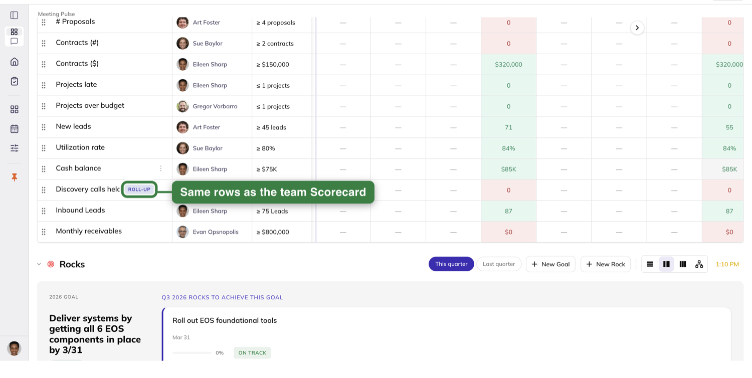
Filtering to one person
The section has a filter-by-person control, and it opens showing every owner.
Pick a person and only their rows stay. There is no reload and no spinner.
Pick someone who owns nothing and you get an empty section — the control stays put, showing their name, so you can clear it.
All owners brings everyone back. That control is the section's only filter: no quarter picker, no period toggle, no status filter.
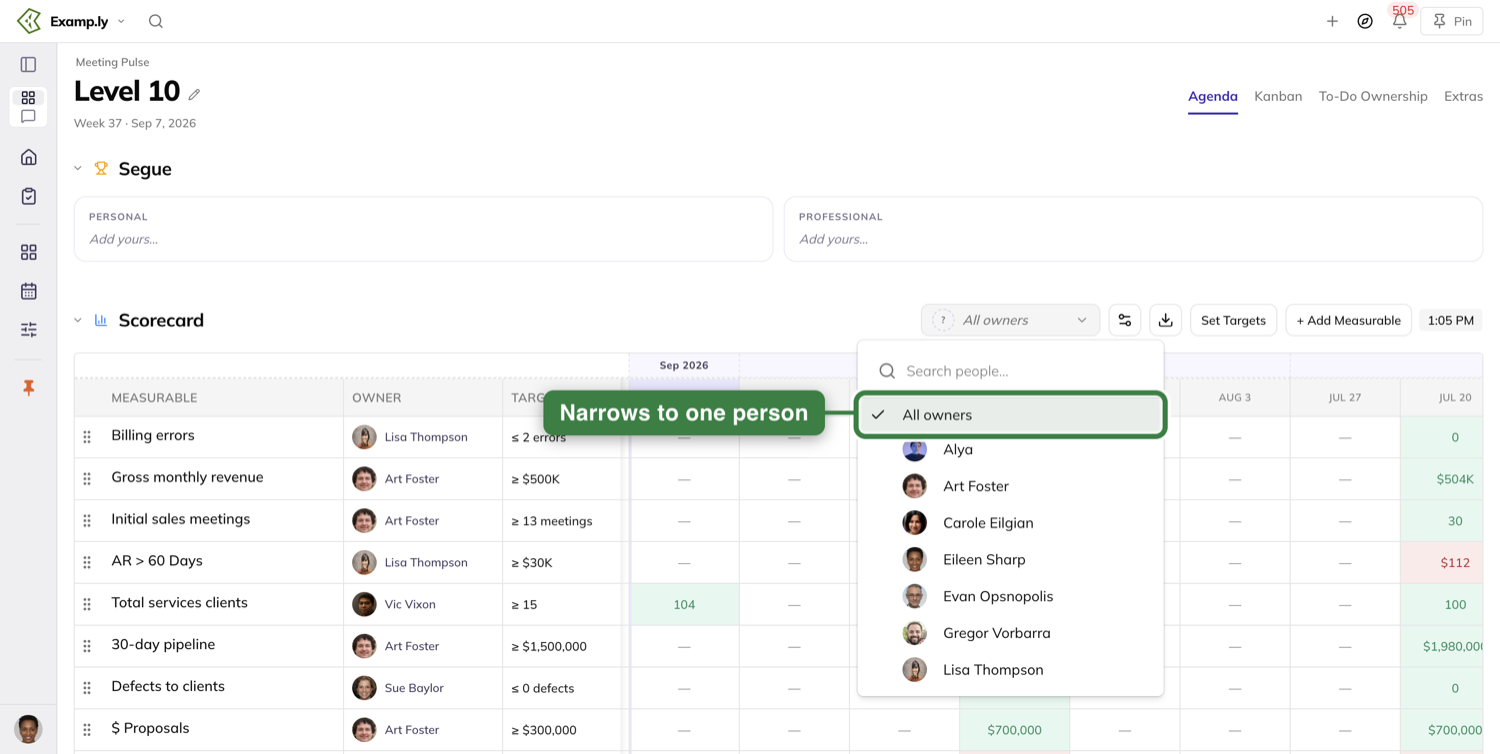
Entering this week's number
Click the current week's cell, type the number, and press Enter or click away. Either commits it.
The cell shows your number at once and the save finishes behind you.
You do not have to be an admin. If you own the measurable, you can record its value.
Type into a measure that feeds a roll-up and the roll-up row recalculates in the same instant.
When the week rolls over
A number you entered stays in the column of the week you entered it into. The rollover does not move it.
The new week's cell is simply empty — not yet entered, which is different from a recorded zero.
Review the rocks
The Rock Review section opens on this quarter's rocks.
Its header carries two pills: This quarter and Last quarter. Click Last quarter and the list repaints immediately.
The subtitle then reads that last quarter is showing and names it, and this quarter's rocks are gone from the list.
Your choice is remembered — when you leave and come back, and in a fresh session too. Switching back is remembered the same way.
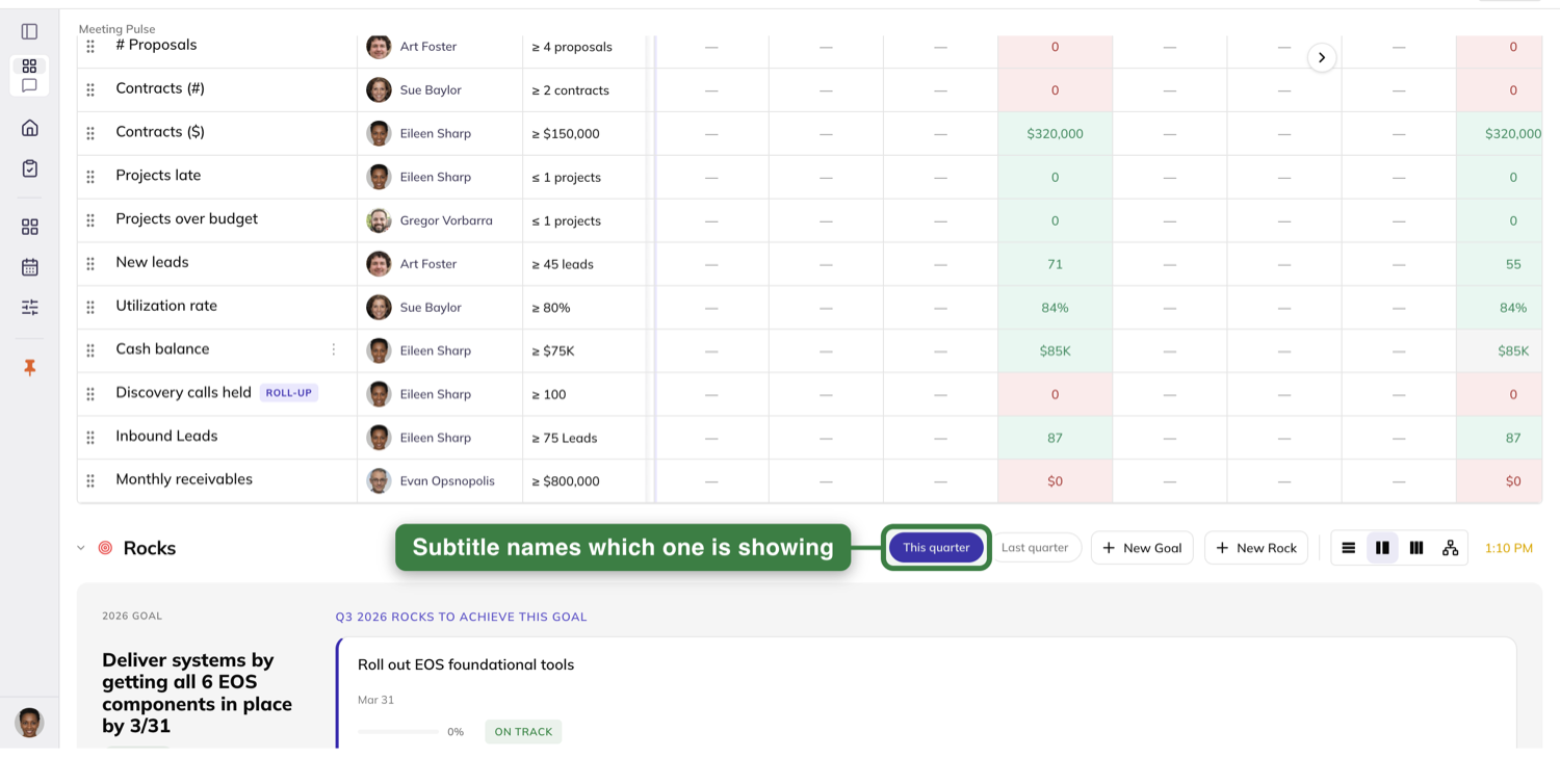
Opening a rock
Click a rock to open its detail sheet. It behaves exactly as it does on the Traction screen.
Its Alignment tab offers the same Change alignment flow, picking from your team's one-year goals.
Work the to-dos and issues
The Agenda's To-Do, Issues and Done sections are the meeting's working list.
Add a to-do by typing into the section's Add to-do… field and pressing Enter. The card appears before the save finishes.
That inline field has no due date control on it.
Mark something done from its completion circle and it moves into Done in the same paint, with no reload.
Done keeps a range control of its own, set to last 7 days.
An issue keeps its Issues marker even while it sits in the Issues section — the marker says what it is, not where it is.
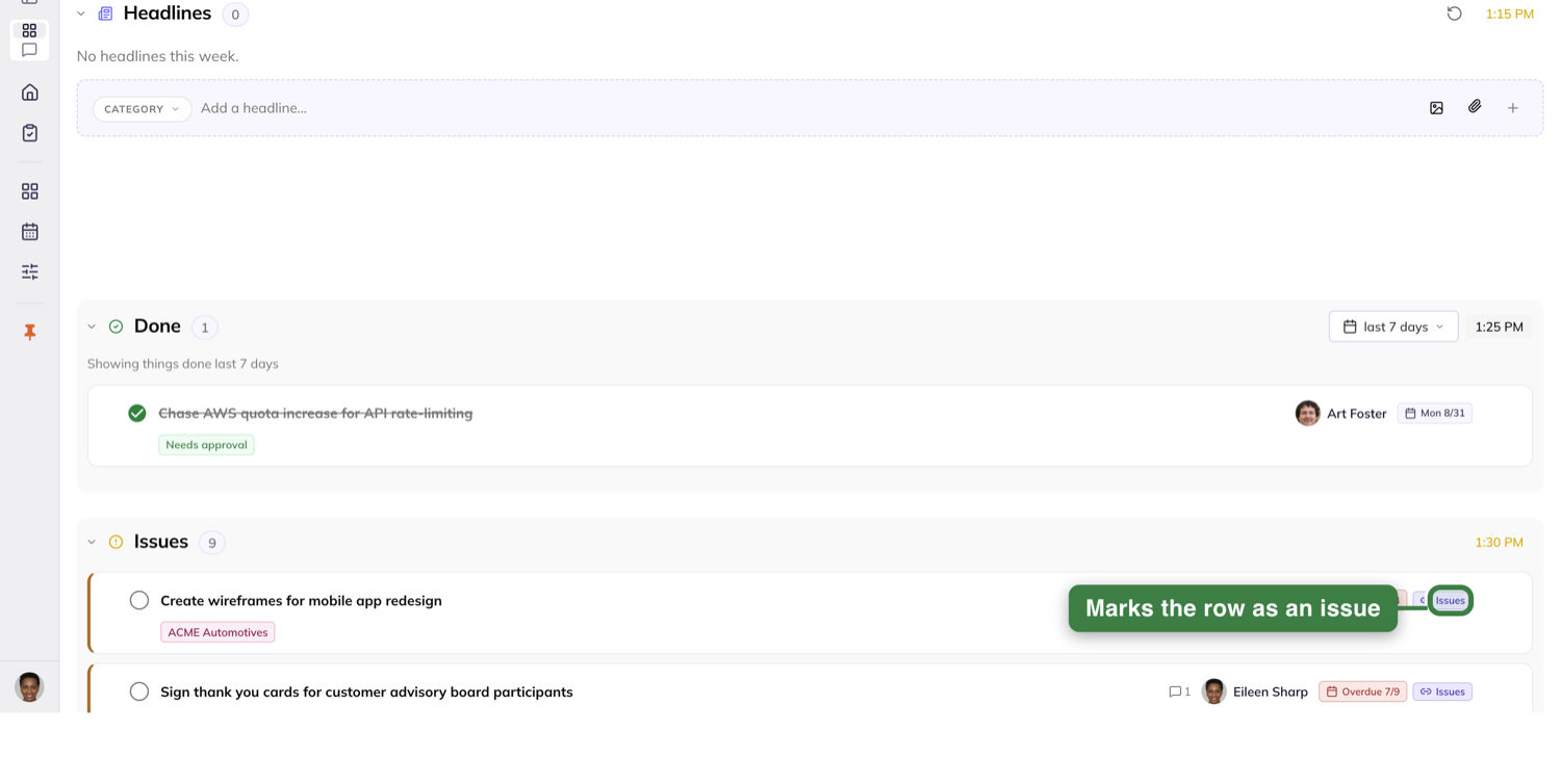
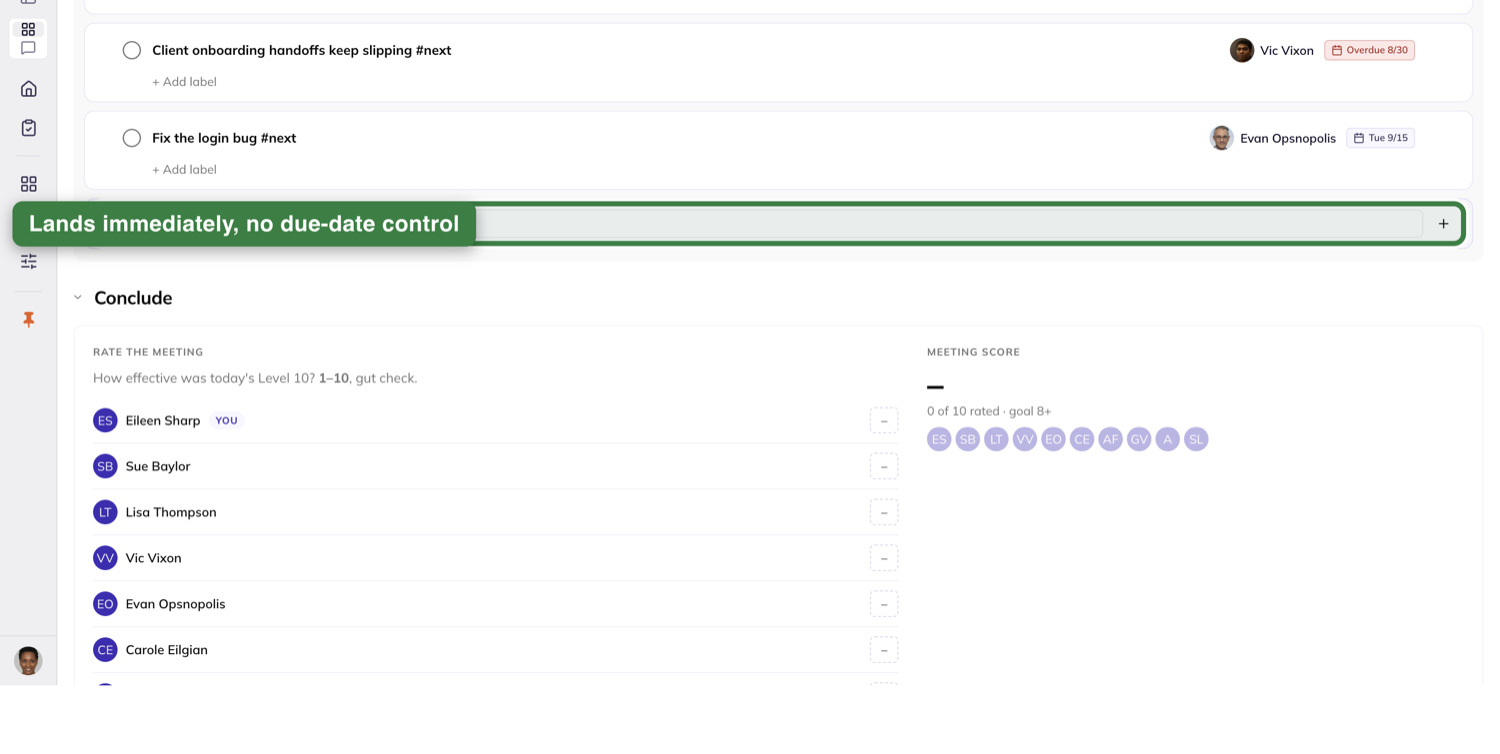
Moving a row between sections
Pick a row up and drag it. It lifts and follows your cursor, tilted slightly, and the spot it left shows a dashed placeholder marked "Moving…"
The section you are over rings itself and shows a floating tag reading "Drop into" and that section's name.
Release, and the row is in the new section straight away. The move finishes in the background.
Turn an issue into a to-do
This is how an issue gets solved rather than re-discussed. Open the issue from the Issues list.
Above its details sits a tip card: "Issues get solved when they turn into To-Dos — create one to resolve this Issue."
It carries one button, Create To-Do to resolve this issue.
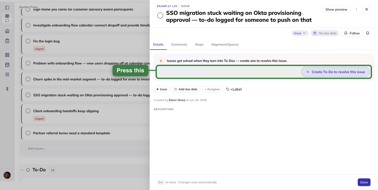
The form that opens
The form opens in place, in the same slot the tip card had. The sheet does not navigate and no dialog opens over it.
Its label reads New To-Do — Resolves this Issue. The title is prefilled with the issue's title and you can type over it.
The description starts empty, asking "What will we do to resolve this?" The issue's own description is not copied in.
Two pills show what it inherits: the due date, and the destination — your Level 10's To-Do section. Owner is not pre-filled as a pill; it is a separate + Assignee control alongside them.
The due date is seven days from today, shown as readable text. It is not the issue's due date, and it is never left blank.
There is no status control. A new to-do is always Not started, so there is nothing to pick.
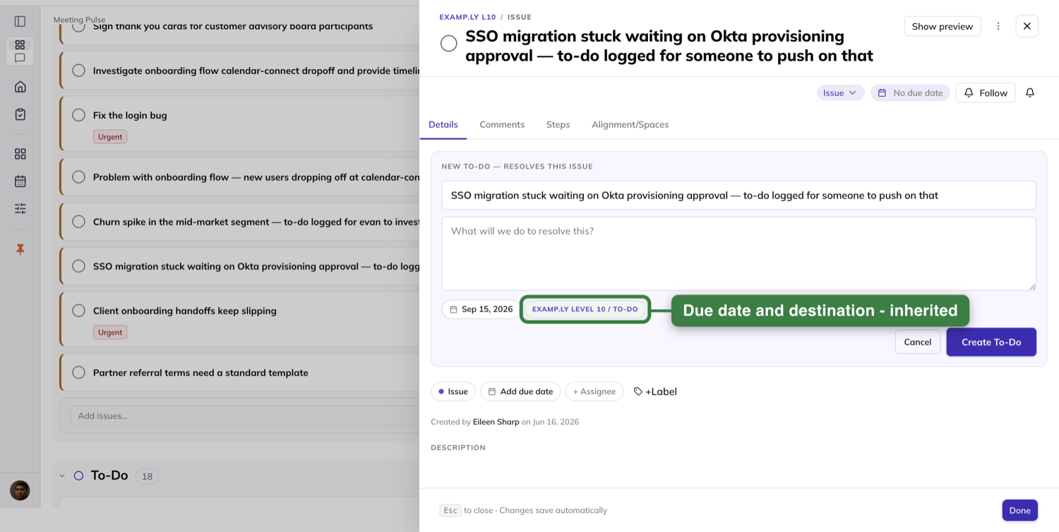
What creating it does
Click Create To-Do — or press Enter in the title field, which does the same thing.
The button reads "Creating To-Do…" while it works, and a second click on it does nothing.
Then a green check confirms the to-do landed in your Level 10 and is also shown under Steps on this issue. An Undo sits at its right.
The Steps count on the tab strip ticks up by one, and the compact to-do card appears below the confirmation.
The to-do is in the agenda's To-Do section in the same instant. The issue stays in Issues — it does not become a second row there.
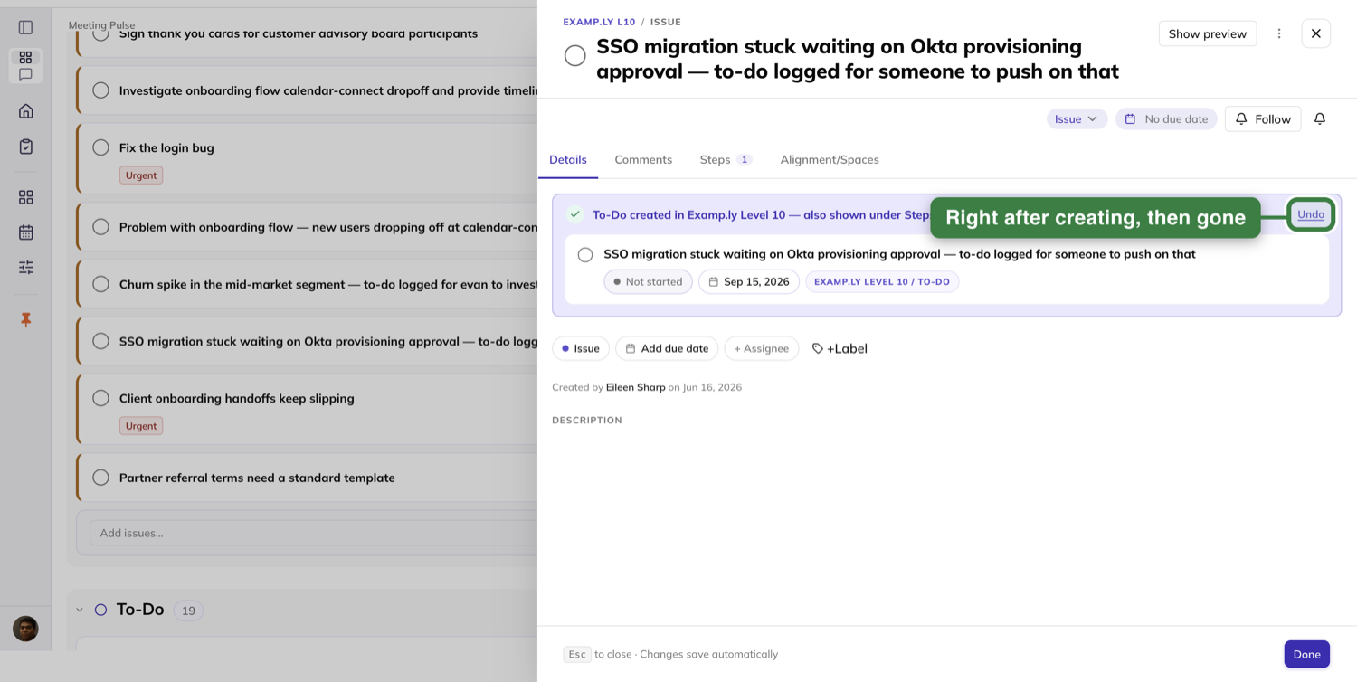
Afterwards
Reopen the issue tomorrow, or next week, and the resolving to-do card is still in that slot.
The tip card does not come back. Anyone who can see the issue sees the same card, and it names the to-do's owner, not the viewer.
Undo removes it everywhere at once — from the agenda's To-Do list, from the issue's Steps, and from the link between them.
Rate the meeting
The agenda ends at Conclude, and Conclude is a roll call.
A Rate the meeting block asks "How effective was today's Level 10? 1–10, gut check."
It lists every attendee with their avatar and an empty – placeholder. A YOU badge marks your own row.
Beside it a Meeting score block reads the average and how many have rated, against a goal of 8.
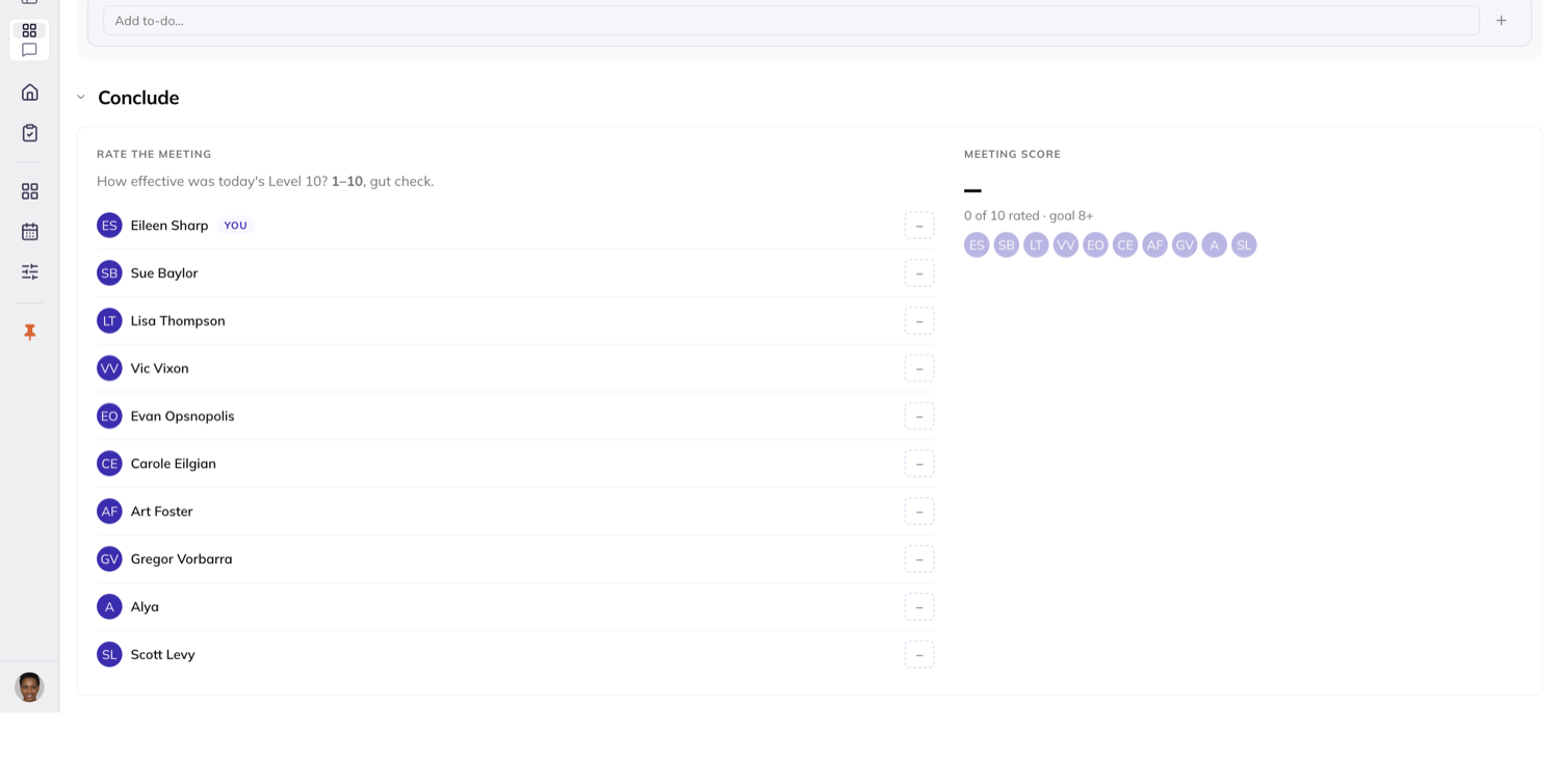
Entering a score
Click the placeholder on a row and the score options open. Pick a number and the row paints it immediately.
An 8 or above gets the on-goal treatment; below 8 is visibly below goal. The average and the count update as you go.
Clicking the X on the open options closes them and leaves the row at –. Nothing is recorded, and you can open them again.
An attendee who has not rated yet shows dimmed among the avatars in the Meeting score block.
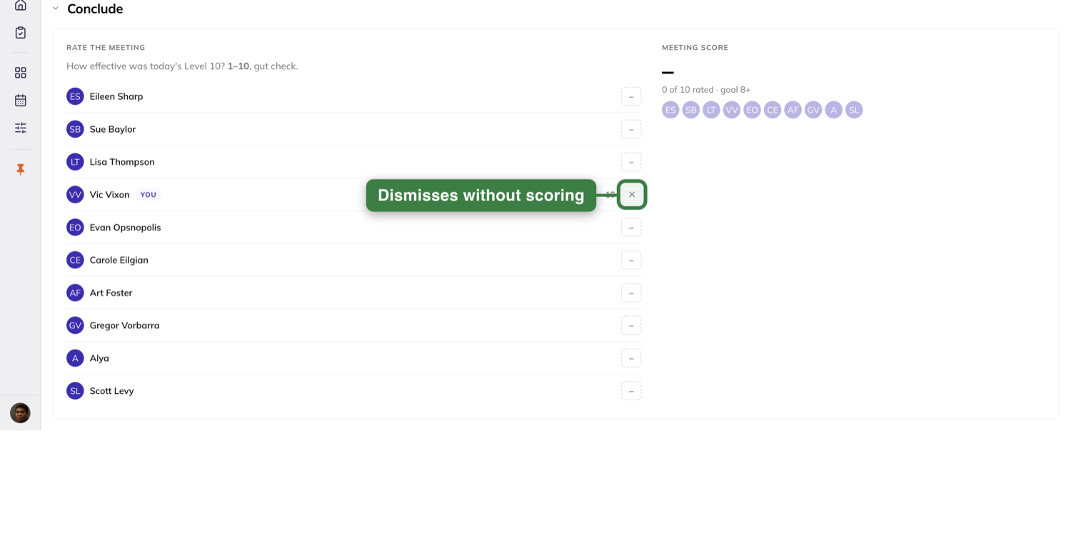
Whose row you can enter
The meeting admin can enter, and change, a score on any attendee's row.
Everyone else can enter their own. Other people's rows show their scores read-only, with no entry control at all.
Either can overwrite the other, and the last entry made is the one that stands.
Scores persist. Leave the page and come back and every score and the average read exactly as entered.
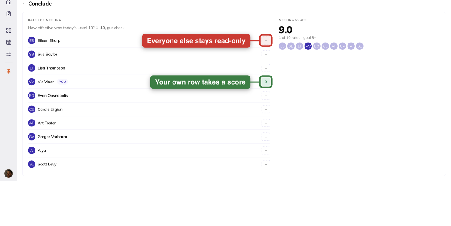
The Kanban board
The Kanban tab is the same work as a board, in four columns: To-Do, Done, Issues and Park For Later.
Every column is the same width, none scrolls sideways, and each scrolls its own contents while its header stays put.
Add straight into a column with its + Add control. A to-do added there keeps the due date you gave it, without a refresh.
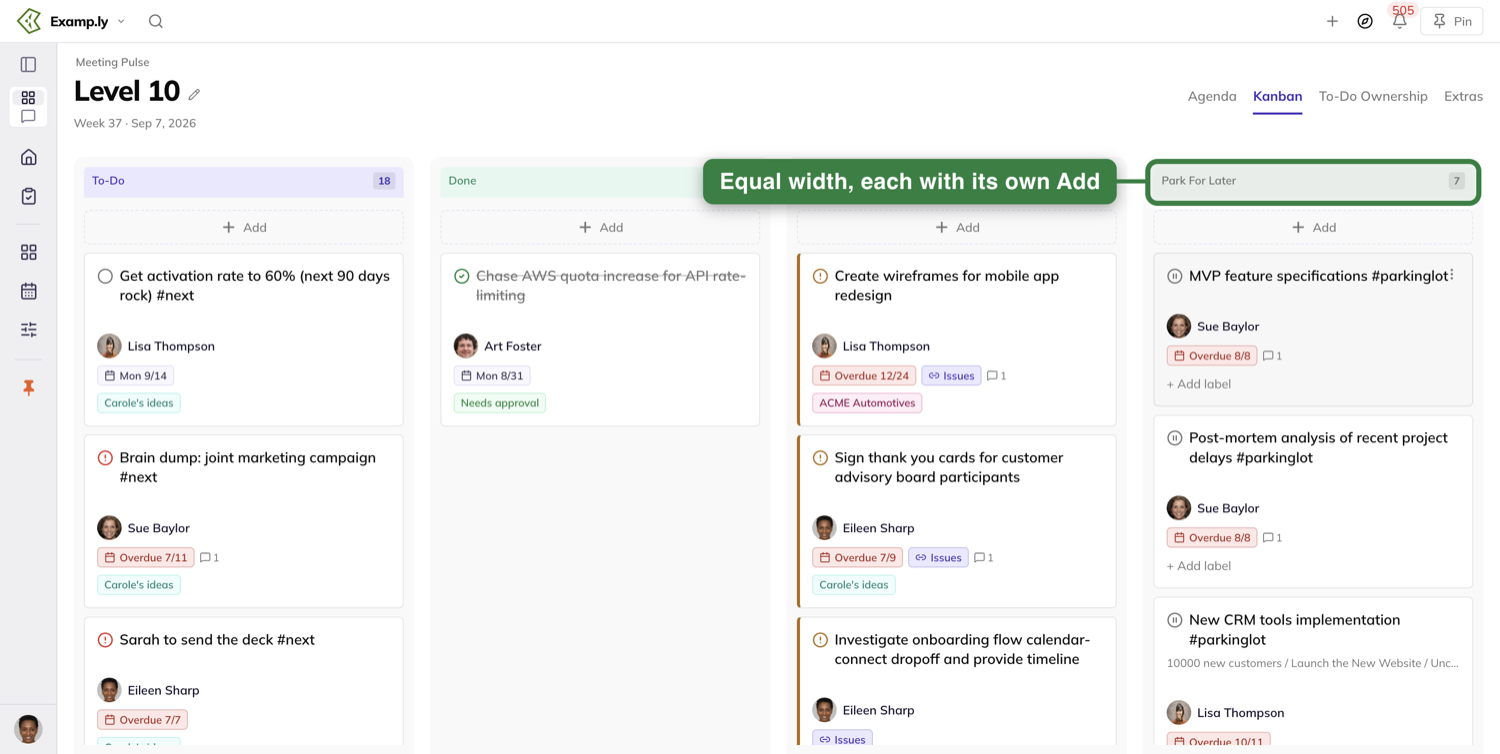
Moving cards
Dragging a card uses the same vocabulary as the agenda — the tilted preview, the "Moving…" placeholder, the ringed column and its "Drop into" tag.
Reordering inside a column rings that column too, and is the meeting admin's to do. For anyone else the card snaps back.
A non-admin dropping a card into a column lands it at the bottom, with a message saying so and to ask a team admin to prioritise it.
If a move fails, the card returns to where it came from and an error says so.
Where a card came from
A card that came from a project column carries a chip naming the project and the column, like Website Redesign / Backlog.
It is never the bare column name. Two projects' backlogs stay distinguishable on the board.
The meeting's own name is not repeated on the Agenda or Kanban cards. You are already on it.
Park For Later
The fourth column holds what the team has deliberately set aside.
Past a hundred cards it shows the first hundred with a Load more at the bottom, which disappears once everything is loaded.
The To-Do Ownership tab
This is the same set of items, grouped by the person who owns them, one column each.
Every item on the Kanban board is here, except those whose only owner has left the team.
Changes cross straight over. Add, move or delete on Kanban and this tab shows it without a reload, and the other way round.
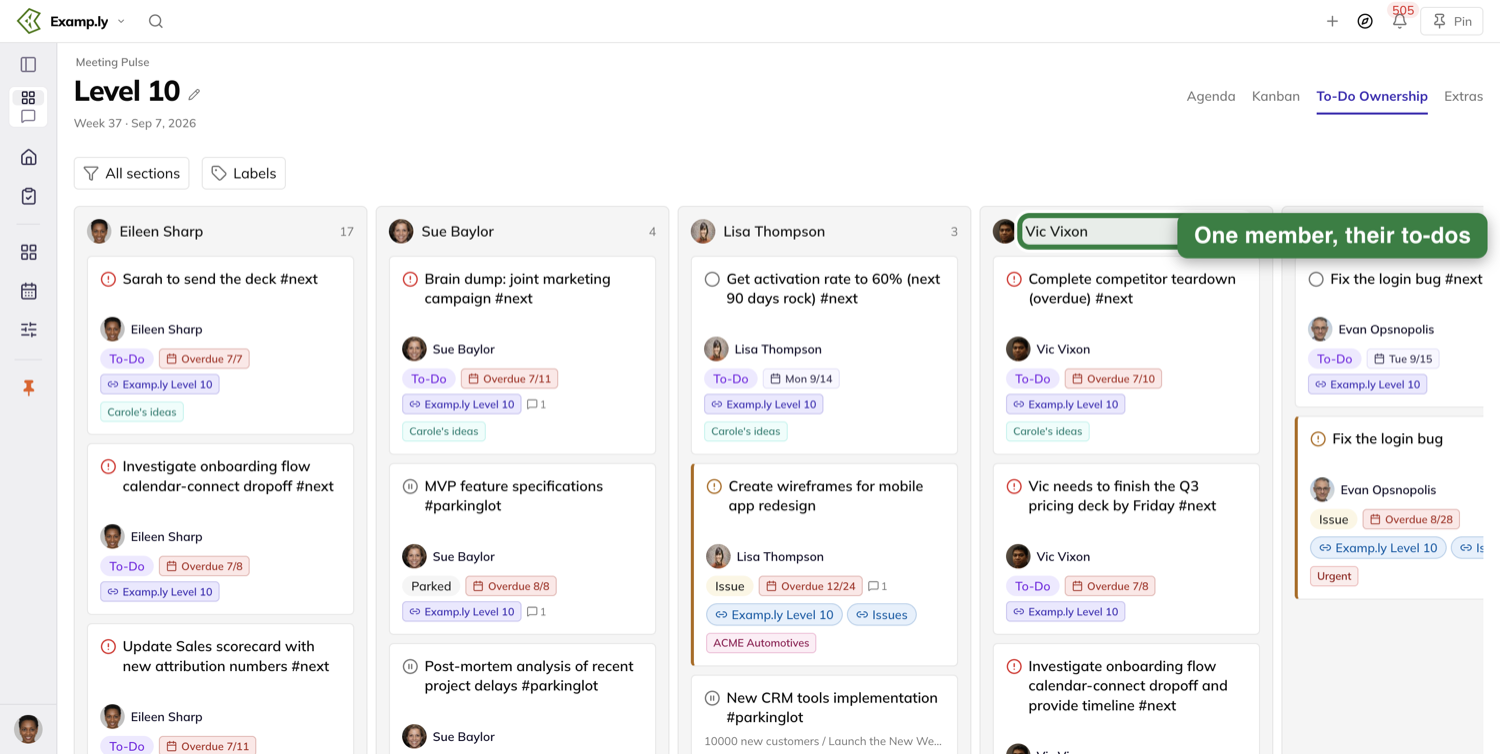
What this tab filters by
The filter bar starts with two controls: a sections multi-select reading All sections, and a Labels picker.
Deselect Issues in the sections control and blocked items drop out of every column.
The Labels picker has a search box. Type to narrow the list, pick a label, and only items carrying it stay.
Filter anything and two things change: the sections control relabels to a count, like 3 sections, and a Reset appears beside it.
Reset restores the defaults and everything reappears.
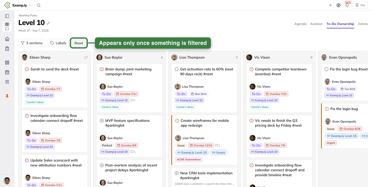
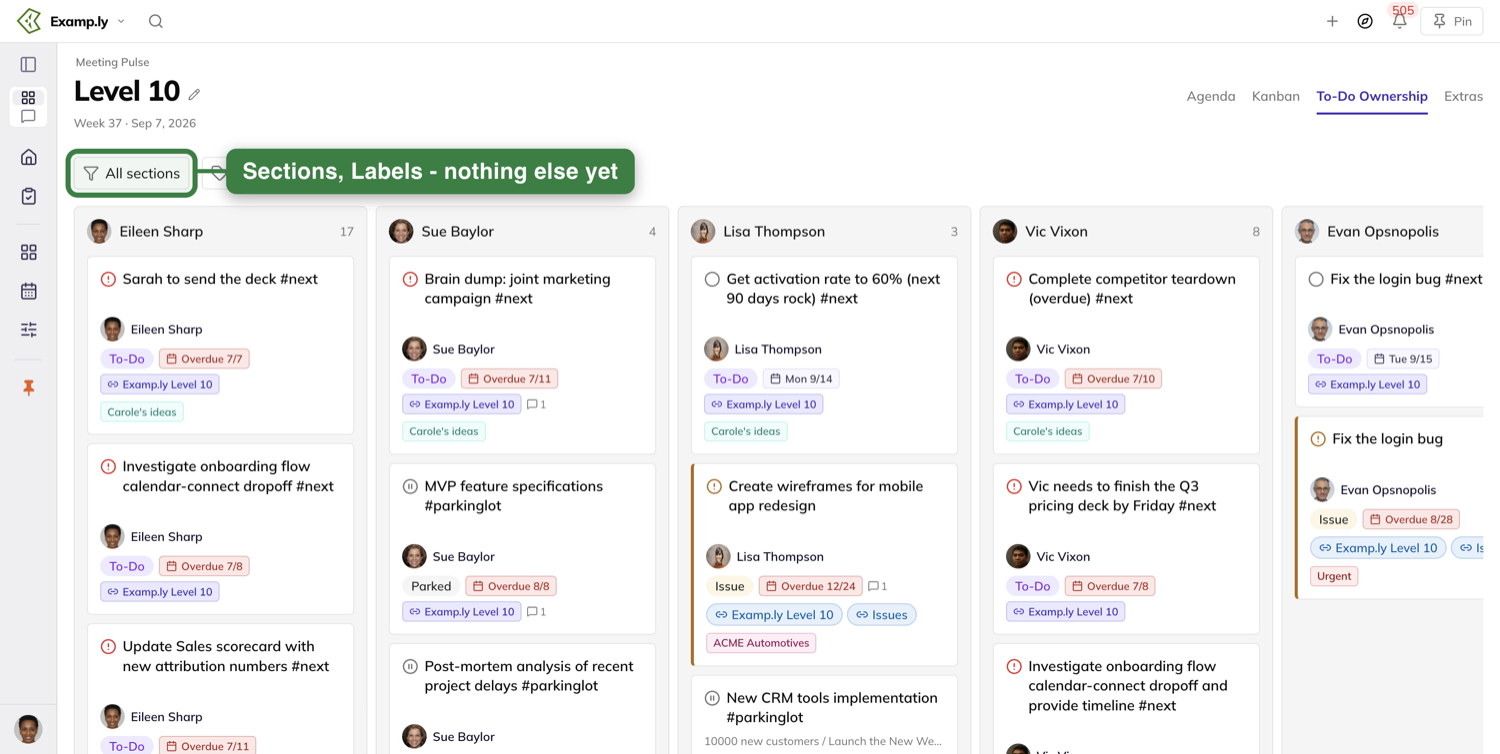
The chip this tab keeps
This is the one tab on the Level 10 that shows the meeting's own chip on a card.
It has to. Grouping by owner hides which section an item is in, so the card carries its section and the meeting alongside its other contexts.
Opening an item
Click any row, on any tab, and the item sheet opens over the page.
Its eyebrow names where the item lives — the meeting in short form, then the section.
Close it with the X, with Done, with Escape, or by clicking the dimmed backdrop. It goes at once and the tab behind it takes your very next click.
The sheet says as much along its foot: "Esc to close · Changes save automatically".
You come back to the tab you opened it from.
Assigning from the sheet
Type @ in the item's name field and the team's people list appears under your caret.
Keep typing to narrow it. Click a name or press Enter, and the sheet shows that person as the assignee immediately.
The @name stays in the item's name. It is not stripped out when the item saves.
Mentioning someone in a comment emails them — naming you, the item, and what you wrote. Nobody else on the team is emailed.
Steps
The Steps tab lists the item's steps. Click one and the sheet moves to it on the first click.
It shows that step's own details, not the parent's. If a step really has been deleted, the sheet says so.
Where else the item lives
The Alignment/Spaces tab has an Appears on section, one row per place the item lives.
The surface you are looking from is listed too, tagged Current view, even though its chip is hidden on the card itself.
Each row is named the way that surface's chip is named — your Level 10 row reads as the Level 10, never as the bare team name.
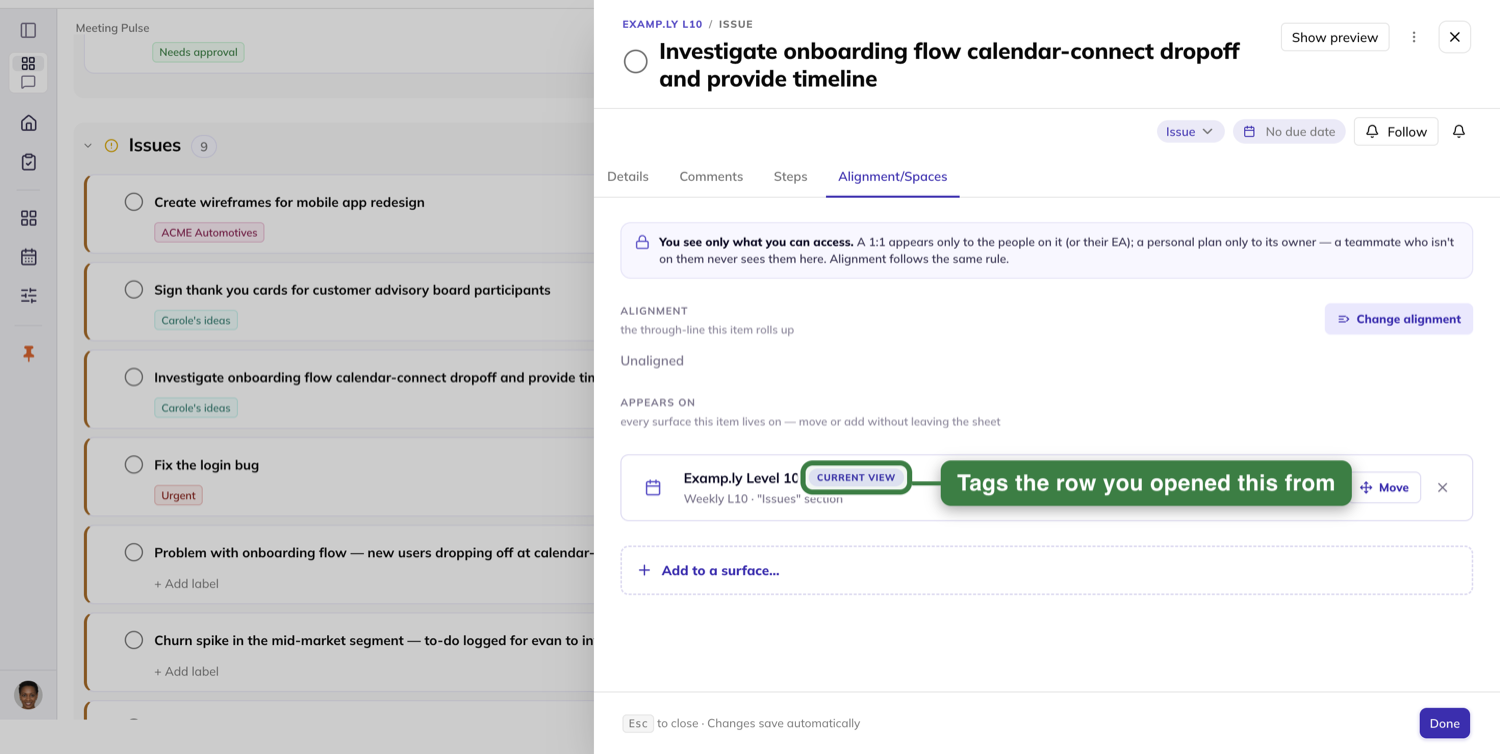
Moving an item to another team's Level 10
The Level 10 row carries a Move control. An item can be on only one team's Level 10, so choosing another replaces this one.
The team picker lists your own team first with its sub-teams under it, then every other organization A to Z. Every option is a team name.
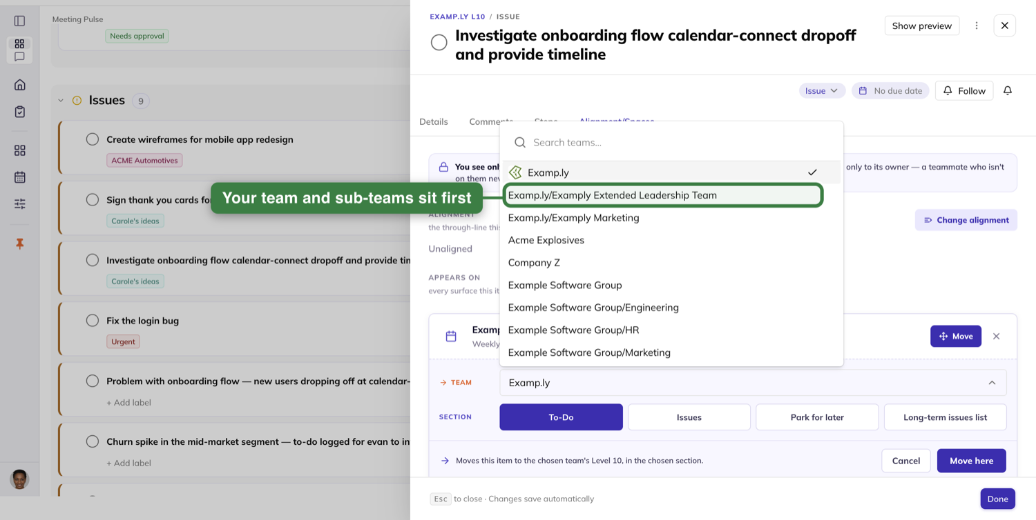
Pick a team, then a section — To-Do, Issues, Park for later or the Long-term issues list.
Confirm with Move here and the item leaves this meeting immediately — from the agenda, the board and the ownership tab, with no refresh.
Cancel and the row is exactly as it was.
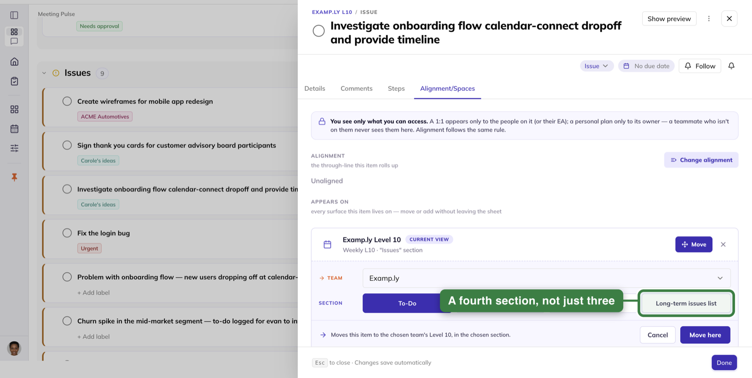
Aligning it to work
Change alignment puts the item under a project column, or a milestone.
The tab shows the new placement at once, and the row or card on the page behind picks up the project chip in the same instant.
The placement survives a reload and reopening the item.
Flagging an issue long-term
Flag an issue long-term on this tab and it leaves the Issues section immediately, while the sheet stays open.
Change it back to short-term and it returns. It is never listed in both places at once.
Sending work somewhere else: the Compass dock
The dock opens beside the Level 10 and takes cards dragged onto it from either the Agenda or the Kanban board.
Drop onto Personal Planner and the item goes on today's day plan, with a message confirming it.
Drop onto Weekly L10, a 1:1 section, or a rock's milestone, and each confirms in the same way.
Drop anywhere on the Rocks tab that is not a milestone and it aligns nothing, and tells you to drop onto a specific milestone.
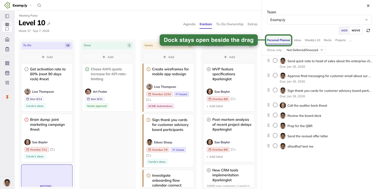
Projects and long-term issues
Dropping onto a project column adds the item there and says nothing. A move that works is quiet; only a refused one raises a message.
Dropping onto Long-term Issues flags the item for the team and the list refreshes to show it.
Drop something already on that list and no second copy is added — a brief message tells you it is already there.
The dock's Inbox is a source only. Nothing dropped onto it is accepted or saved.
A drop that does not work
A failed drop leaves the item exactly where it was, in its original column, with its status untouched.
It is never quietly marked complete, and it is still there after a reload.
You choose deliberately between adding an item to a project and moving it there, and what happens matches what you chose.
The Extras tab
Extras holds the meeting's record over time, and the material the team keeps beside it.
Its Meeting Score section carries the same roll call Conclude does. A score entered in either place shows in the other.
Rating from here does not cost you your place in the agenda — going back returns you to the section you left.
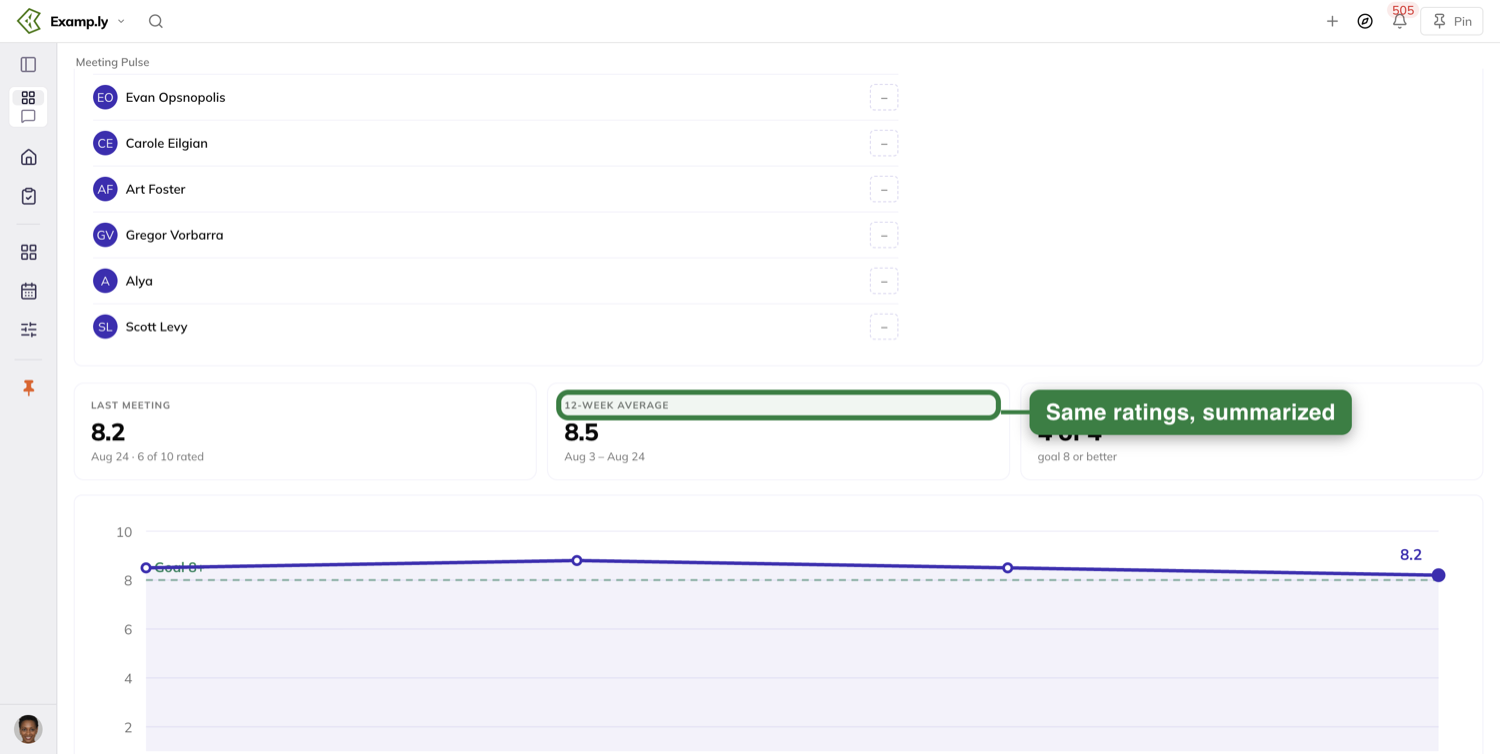
The score over time
Three tiles read the last meeting's average, the twelve-week average, and how many meetings met the goal of 8.
A trend line plots each week's average on a 1–10 axis, with a dashed goal line at 8 and the latest average labelled.
Below it, a grid gives one row per attendee and one column per meeting, this week's column highlighted. A team average row closes it.
Change the range and all three re-render. Before any meeting has been rated, the section says so rather than drawing an empty chart.
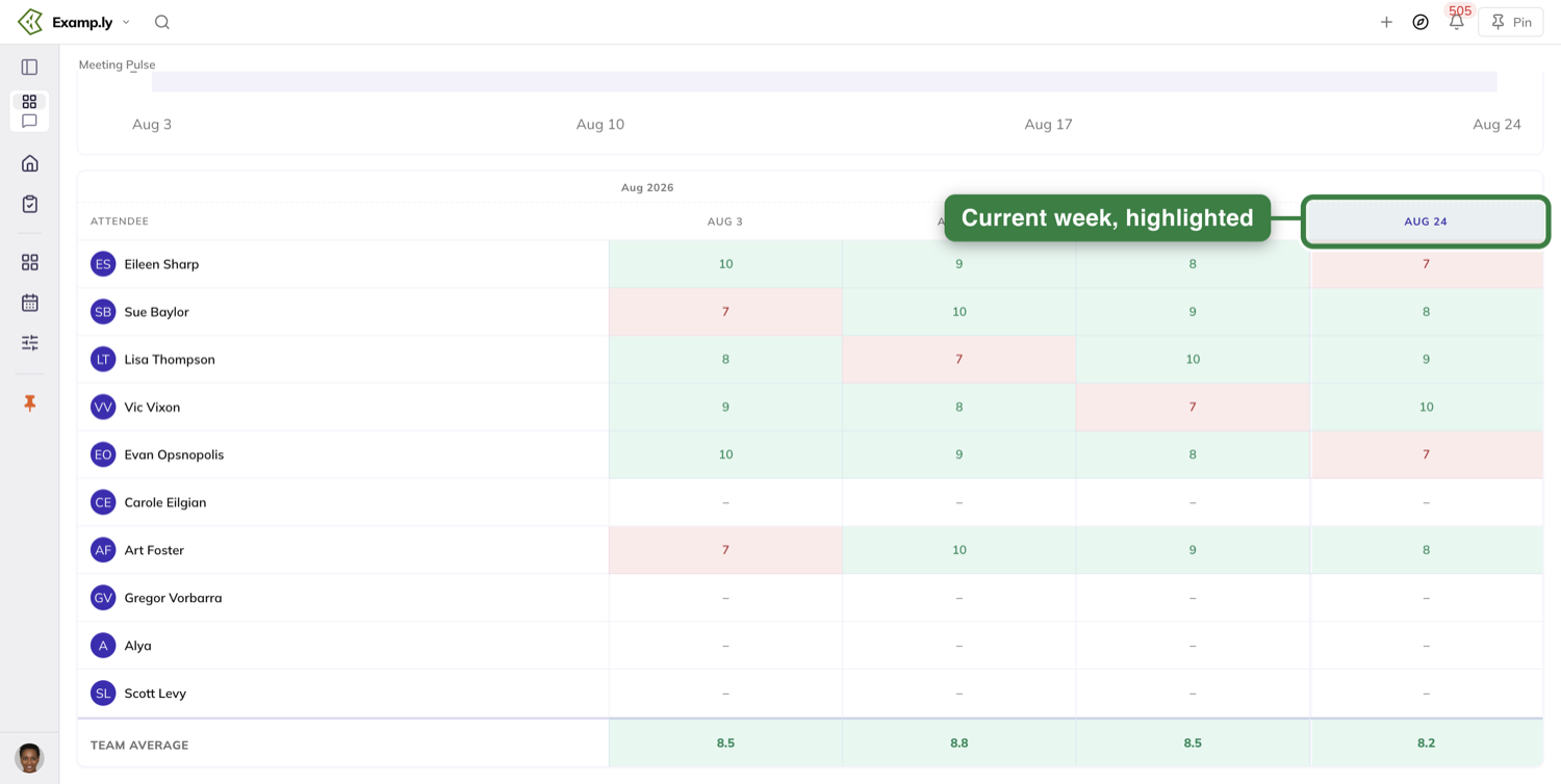
Files and links
A Related Files & Links card holds the team's documents and links. Empty, it says so rather than leaving a blank space.
Add a link from the attachment dropdown by choosing a website or app. A sheet opens on the right with Title and URL fields.
Leave off the https:// and it is added for you. Edit opens the same sheet prefilled, and Delete removes the row with no confirmation step.
Choose your computer instead and the file picker opens. The file lands in the list under its filename.
Every team member gets the edit and delete actions on every row, whoever added it.
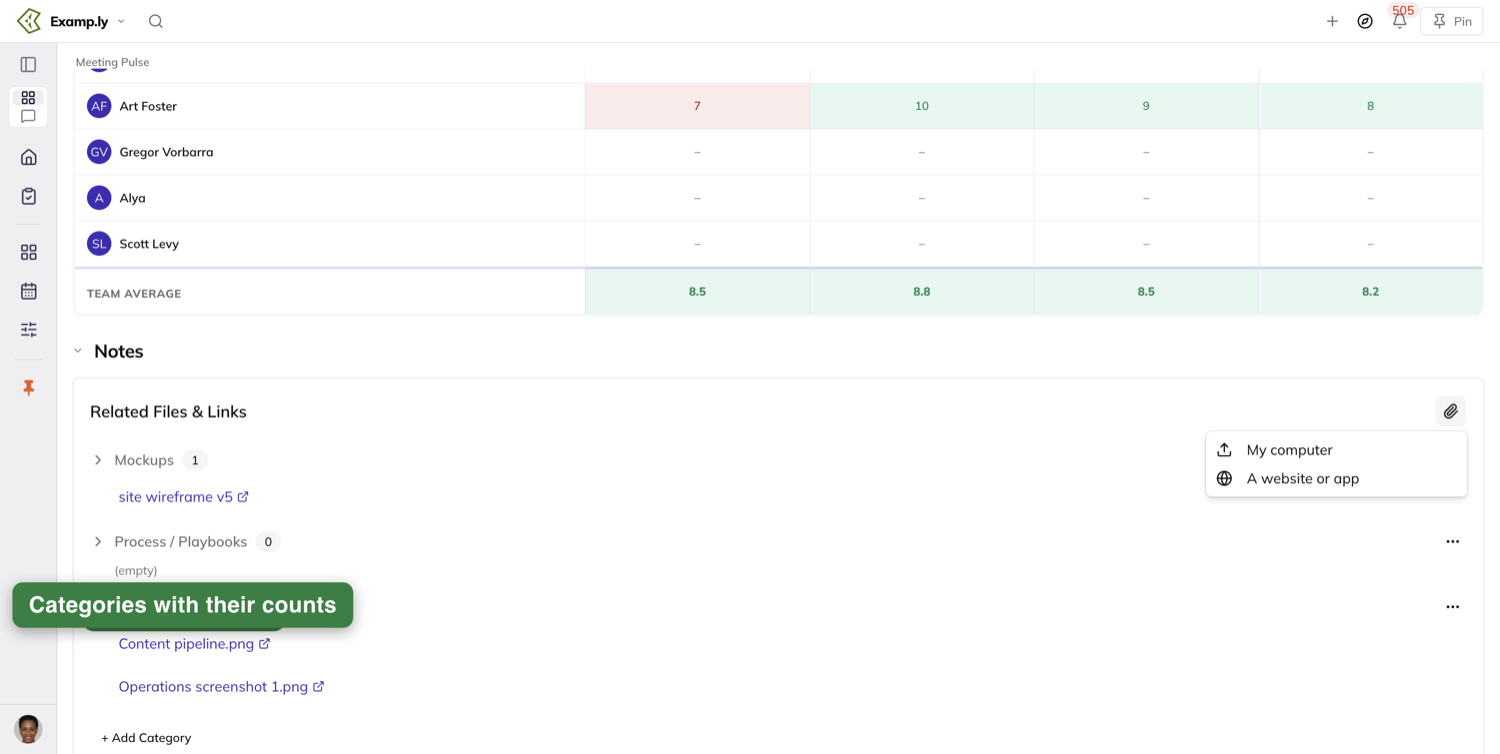
Everyone in the meeting sees the same board
What one attendee does, the others see. A to-do added mid-meeting appears on everyone's agenda without anyone refreshing.
Mark a card done and it moves to Done on the other screens, leaving the rest of the board as it was.
The page holds up for the length of a meeting. Tabs switch and rows open immediately, hours in and across reloads.
Who can do what
Only the meeting admin enters another attendee's score, reorders rows on the Agenda or the Kanban board, and edits the agenda's section times.
Everything else is open to every member: adding to-dos and headlines, marking work done, filtering the scorecard, and recording the measurables they own.
Anyone on the team can add a card to a Kanban column. A non-admin's card lands at the bottom rather than where it was dropped.
Was this helpful?
Issues
You want the obstacles to growth surfaced and solved fast, not stuck in someone's head, and not sitting on an agenda or moving through old systems that slow everything down to a crawl. Typically issues are hidden, or surfaced in fuzzy, emotional terms and talked to death. In other cases they are logged in an old-model software tool, where they go through high-friction workflows and slow down execution. ResultKit fixes that by letting you surface issues without losing flow, and then keeping you and your AI in flow with tools to identify, discuss and solve them. One click or one prompt turns a solved issue into a fully owned to-do that lives on your weekly meeting, in a project, on a 1:1, or on your personal work plan, available wherever the work is done, for you, your AI and your team. What that means is issues are solved for good, obstacles to growth are removed, and you get the right things done faster.
In this article
- Before you begin: who can do what
- 1Open the team's Issues list and read it
- 2Add an issue to the list
- 3Raise issues while you prep for the meeting
- 4Raise an issue during the meeting
- 5Send something to the long-term list from wherever you are
- 6Turn a discussed issue into a to-do
- 7Move an issue between this week and the long term
- 8Complete an issue from its row
- 9Ask the assistant what is being done
- Who can do what on the Issues list
- Where else your issues show up
Everything getting in your team's way lives on one list. It is the team's Issues list, opened from EOS Components by picking the Issues tab. You rarely have to go there to add to it: an issue can be raised from a meeting, a prep, a 1-on-1 or a project without leaving the screen you are on.
An issue is an item the team has flagged as stuck. Every team keeps two sets: the ones it carries for the long term, and the ones this week's Level 10 works through. An issue sits on exactly one of the two at a time, and you move it across from the issue itself, not from the list.
This article walks through reading the list, adding to it, raising issues in your weekly prep and in the meeting itself, sending something to the long-term list from wherever you are, turning a discussed issue into a to-do, moving an issue between the two lists, completing one from its row, and asking the assistant what is already being done.
Before you begin: who can do what
Reading the list is open to every member of the team. Everyone sees the same rows, the same chips and the same counts.
Three things on this screen belong to team admins: the Add Issue button, dragging rows into a different order, and the archive control on a row.
A member does not see them greyed out. They are simply not on the screen.
Completing an issue is not an admin job. The completion circle sits on every row, for everyone looking at the list.
Moving an issue between the weekly list and the long-term list needs edit access on the issue itself. That move happens on the issue, not on this screen.
Open the team's Issues list and read it
Go to EOS Components and pick the Issues tab. The heading reads Issues with a count of the rows in view.
You land on the long-term list, showing open issues. The filter at the left of the bar is set to Long-term (V/TO), and the status beside it is set to Open.
That filter has three settings: Long-term (V/TO), Short-term (L10) and Both.
So the two lists a team keeps are two settings of one control, not two places on the page.
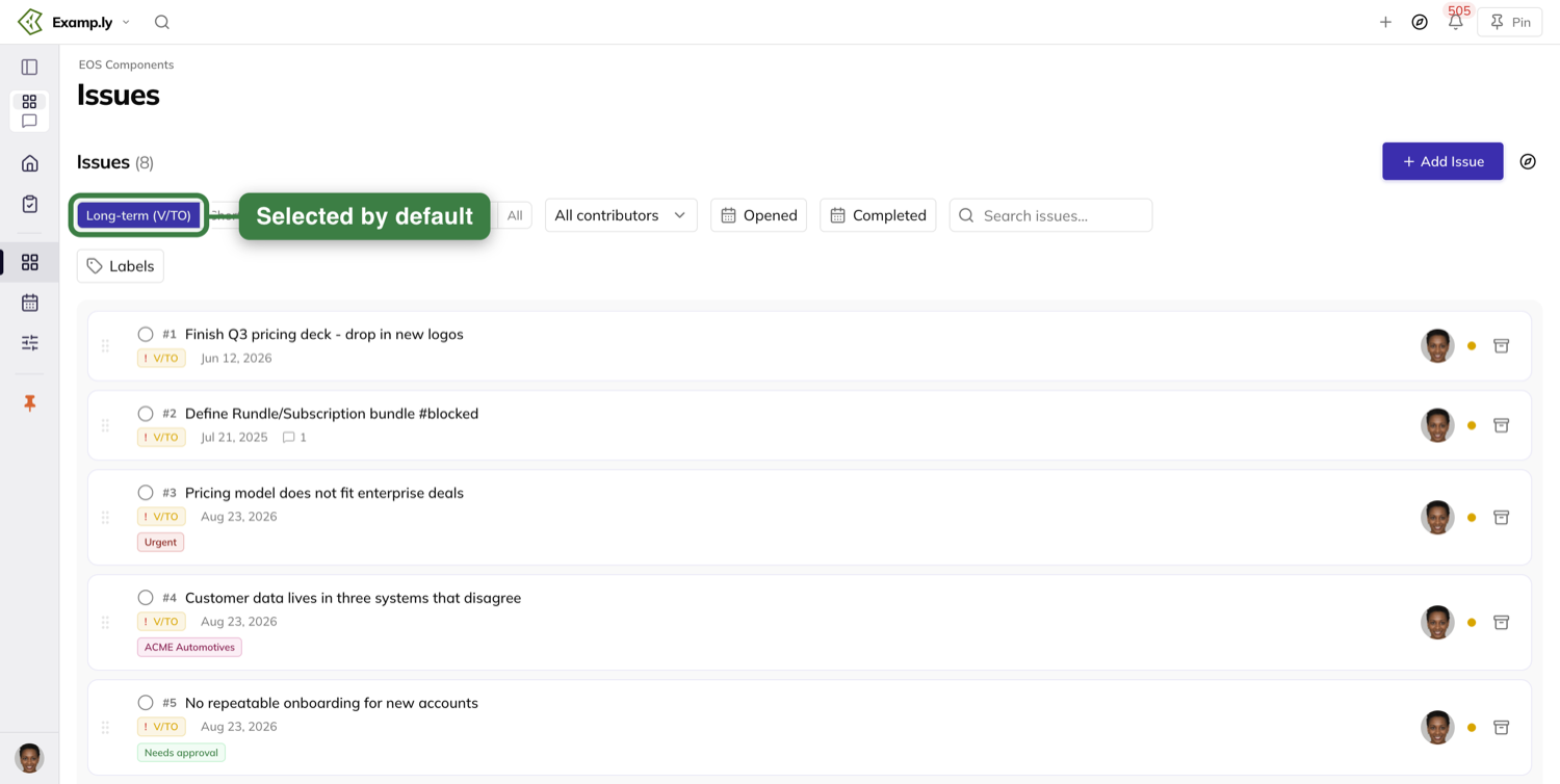
Each issue is its own card on the list's gray surface, with a gap between one card and the next.
There are no column headings above them, and nothing to sort by.
A row carries a lot in one line.
Reading across: its position number, the issue's name, a V/TO or L10 chip saying which of the two lists it is on, and the date it was opened.
Then its comment and attachment counts, if it has any, and any labels the team has put on it.
Below those sit context chips saying where it came from, and out at the right the avatar of whoever raised it and a status dot.
A team admin's row also carries a drag grip and an archive control.
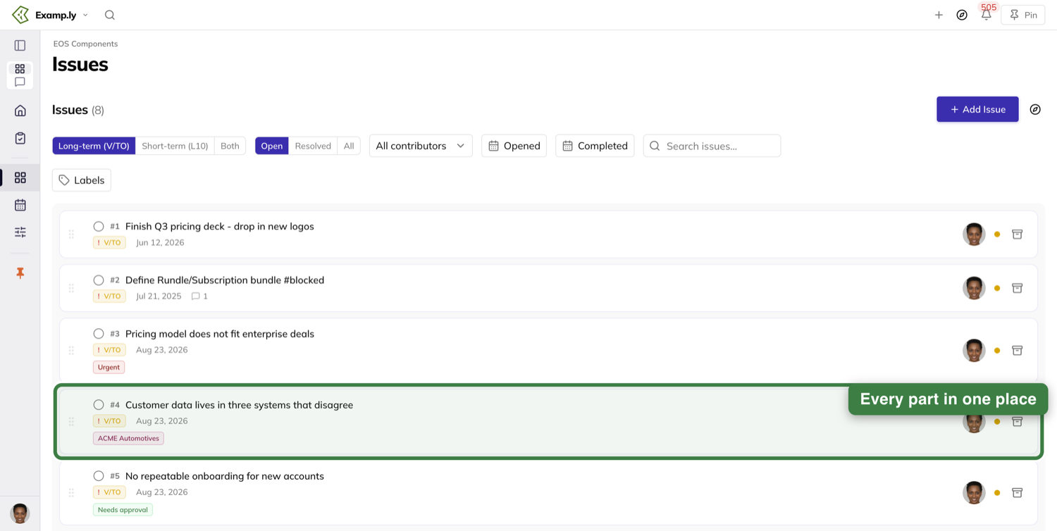
Add an issue to the list
Team admins get an Add Issue button.
It opens the same add box you get anywhere else in the product, in its usual place on the screen — not a popover, not anchored to the list.
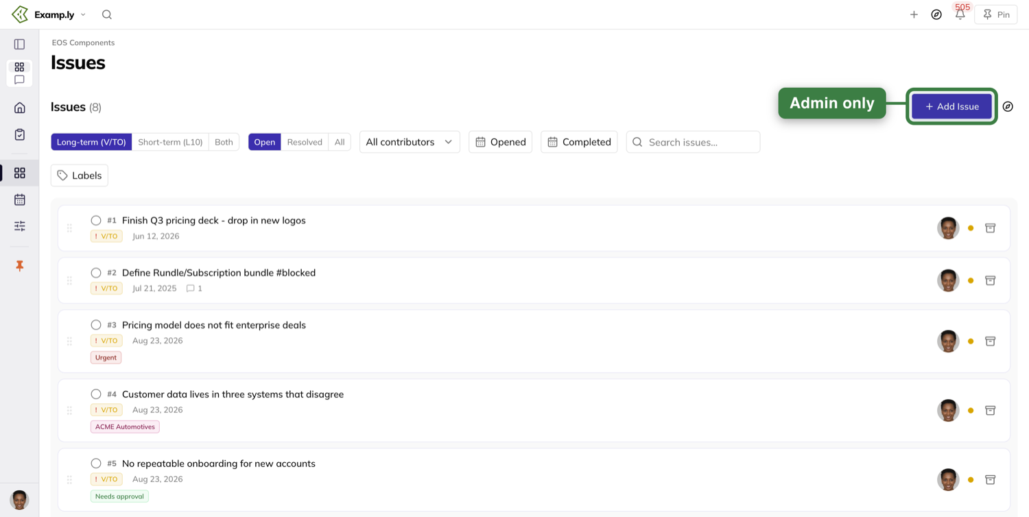
You are not asked to choose where the issue goes.
With the long-term list in view, the box opens with its destination already set to Long Term Issues for the team whose list you are on.
Type the name and save. @mention a teammate in the name and the issue is created assigned to them.
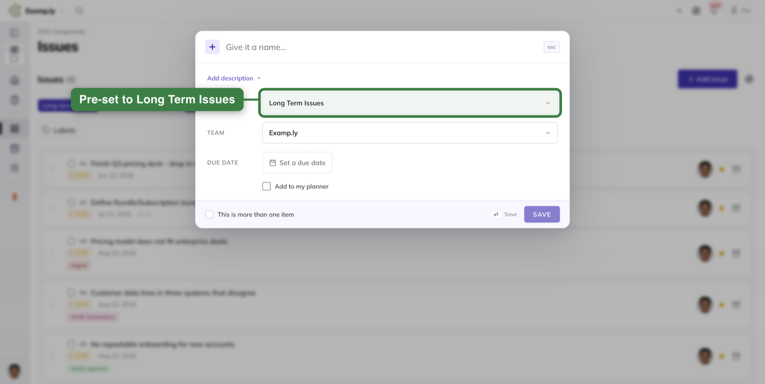
The new issue appears at the top of the list straight away, looking exactly like every other row: no spinner, no greyed-out state, no pending badge.
The save finishes in the background. If the server refuses the create, the row is taken back out of the list.
There is no second way in. This screen has no inline add box, visible or click-to-reveal.
The button is the only way to create one here, and a member who is not a team admin has no way to add on this screen at all.
Raise issues while you prep for the meeting
Most of a team's weekly issues are not typed into the Issues list.
They are typed into the prep that runs before the meeting, on the screen titled 3-Step Prep, at its Issues To Address step.
You reach it from Customize, where a 3-Step Prep tile opens it. That tile is the only link to prep in the product.
Nothing on the Level 10 itself points at it, so it is worth pinning if your team preps every week.
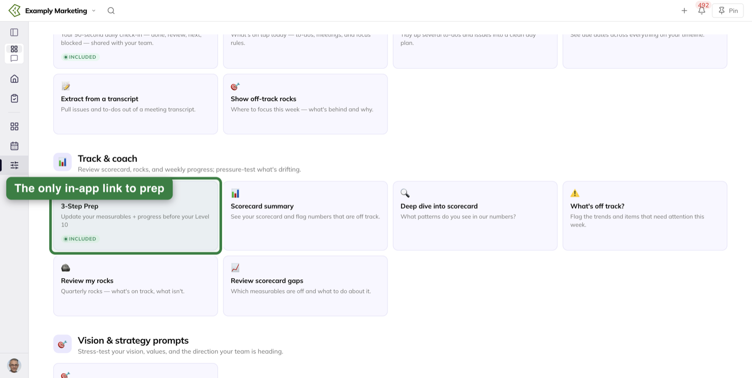
You do not need to be an admin. Anyone prepping for the meeting can put issues on the team's list this way.
The step tells you what it wants. The help reads "👈 Add any issues your team needs to address", and the field prompts "Separate your issues by hitting the 'enter' key".
Beside the field, a Current Issues: list shows what the team already has open. You are adding to a list you can see, not typing blind.
Every line you type becomes one new team issue, on the weekly list the meeting works through.
Nothing is saved until you submit the prep, which the footer says as you type.
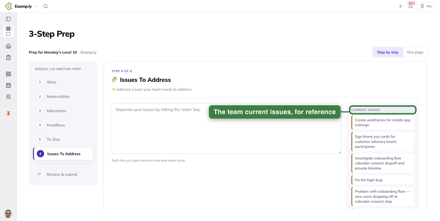
Raise an issue during the meeting
The other place issues get raised is the meeting itself, when a to-do turns out to be stuck.
You do not retype it. You move it.
On the Level 10's Agenda tab, pick up the to-do from the To-Do section and drag it into the Issues section.
While you are dragging, the Issues section rings and tints, with a floating tag reading "DROP INTO ISSUES".
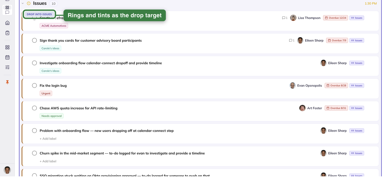
Back where the to-do came from, the To-Do section holds a dashed placeholder reading "MOVING…".
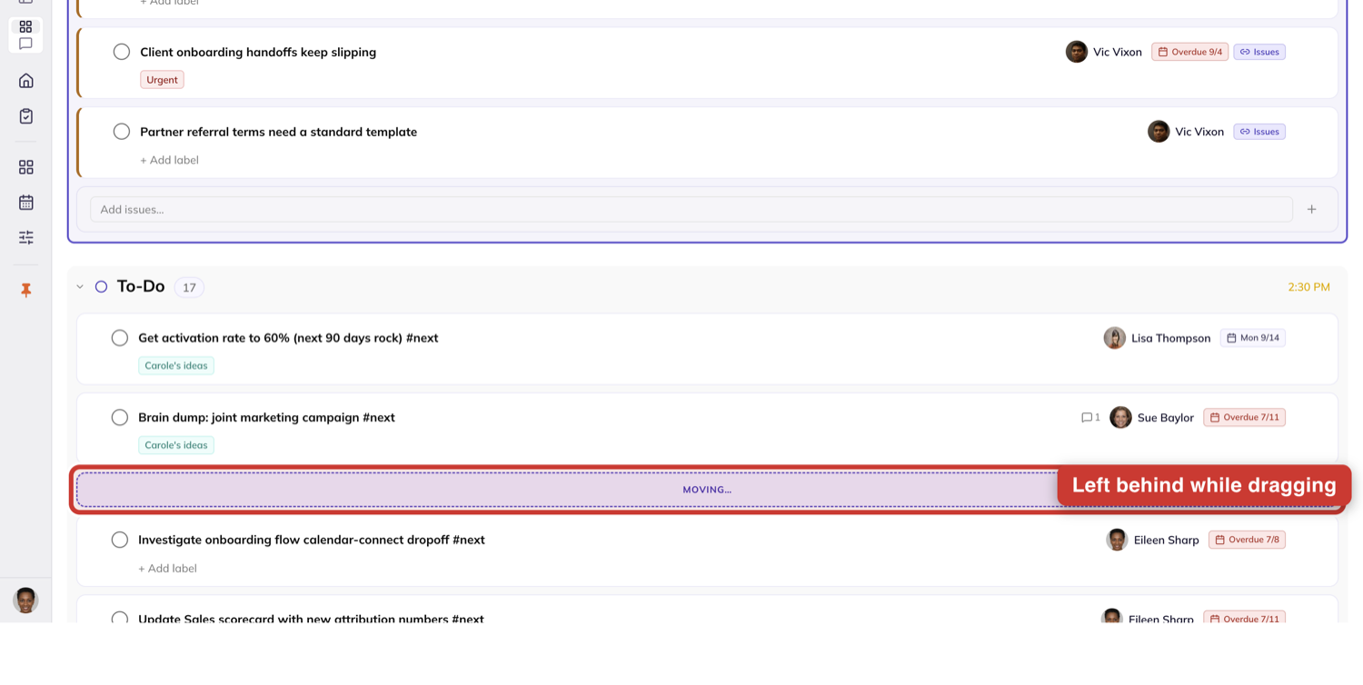
Let go and it is in Issues immediately, before the server has confirmed anything.
The move finishes in the background, and the Agenda does not reload.
Send something to the long-term list from wherever you are
Anything you are looking at, anywhere in the product, can go on the team's long-term issues list without navigating to it.
The compass dock has a Long-term Issues tab. It sits behind the … at the end of the dock's tab strip.
Open it beside whatever you are working on and drag the card onto it.
It works from the Level 10's board and from its agenda, from a 1-on-1's Issues list and its Next Steps list, and from a project's board, table and Gantt.
The dock's list belongs to a team, and the tab shows which one at the top.
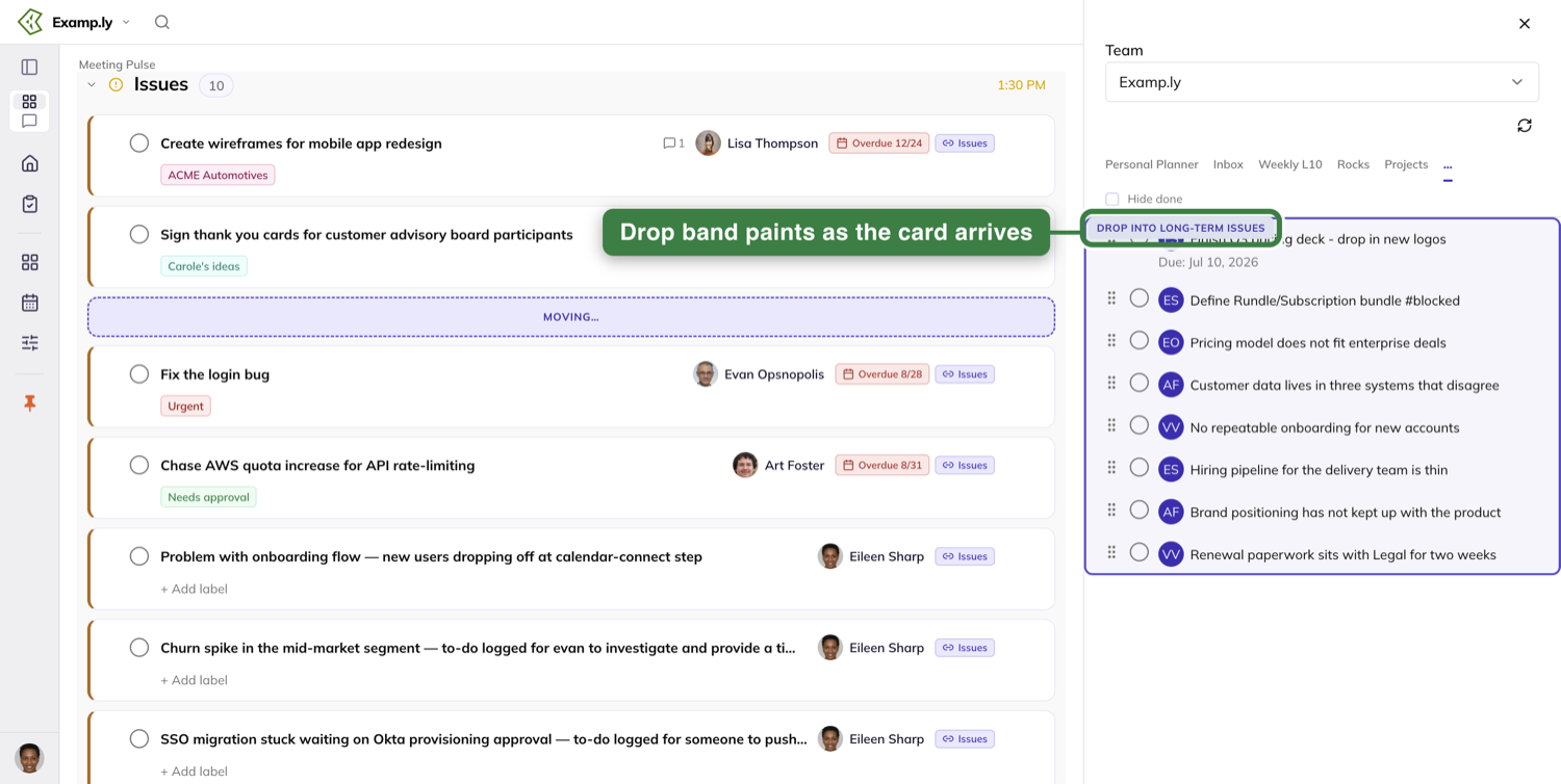
On a good drop the item appears on the list at once, before the server confirms.
The tab then refreshes behind it, so the fetched row replaces the painted one. That refresh is the only feedback there is: no success message appears.
Drop something that is already on that list and no second copy is added. A brief message tells you it is already a long-term issue.
Here is the part worth trusting. The drop moves the item and leaves the rest of it alone.
Nobody is assigned, re-assigned or notified, the due date does not move, and it is added to nobody's day plan or work session.
What does change is where it lives. A to-do you drop this way becomes an issue on the long-term list, so it leaves the team's weekly one.
On a project's Gantt it keeps its scheduled dates too.
There you must pick the item up from its row in the left-hand list, because dragging its bar on the timeline reschedules it instead.
Turn a discussed issue into a to-do
This is the step the whole feature is built around.
An issue that has been talked through is worth nothing until somebody owns a piece of work on it. So the issue asks for that work itself.
Open the issue from any list it appears on. Its sheet opens over the page.
An issue with nothing recorded against it shows a tip card, reading word for word: "Issues get solved when they turn into To-Dos — create one to resolve this Issue."
The card carries one control, a button labelled Create To-Do to resolve this issue.
You get the same prompt whichever list you opened the issue from. It is one shared sheet.
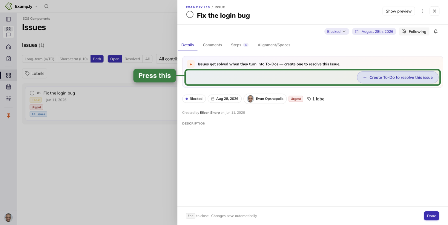
Press the button and the form opens in place, in the slot the tip card was in.
The sheet does not navigate, nothing opens over it, and the issue's own details stay where they are.
The form is labelled New To-Do — Resolves this Issue, and it already knows almost everything.
The title is filled in with the issue's own name, and you can type over it.
The description is empty and prompts "What will we do to resolve this?" The issue's description is deliberately not copied into it.
Three pills beneath carry the owner, a due date, and the destination: the team's Level 10 to-do list.
The only controls are Cancel and Create To-Do.
There is no status to choose, because a new to-do is always Not started.
The due date is worth a second look, because it is not the issue's.
It is the to-do's own creation date plus seven days — the weekly rule — shown as a readable date rather than an empty "set a due date" prompt.
The issue's own due date, up in its details, is untouched.
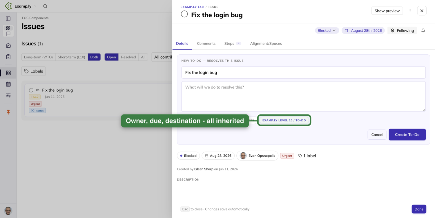
Press Create To-Do — or just press Enter in the title field, which is the same path.
The button paints its working state first, in that frame, before the server has answered anything.
It goes pressed and busy, and its label reads "Creating To-Do…". Pressing it again does nothing.
The Steps count on the tab strip ticks up by one in that same frame, before the server has answered.
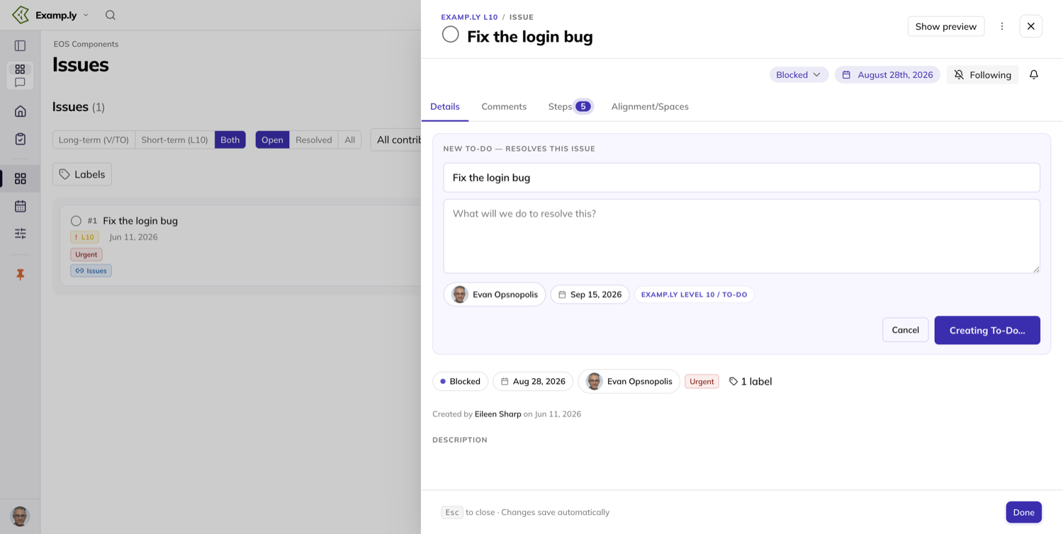
Then the form is replaced, in the same slot, by what you now have.
First a confirmation line with a green check. It names the Level 10 the to-do landed on and finishes "— also shown under Steps on this Issue."
An Undo control sits at the right of that line.
Under the line is a compact card for the to-do, carrying its completion circle, its title, and four pills: Not started, the due date, the owner, and the destination.
The prompt is gone, because the issue is not asking any more. No toast appears at any point in this.
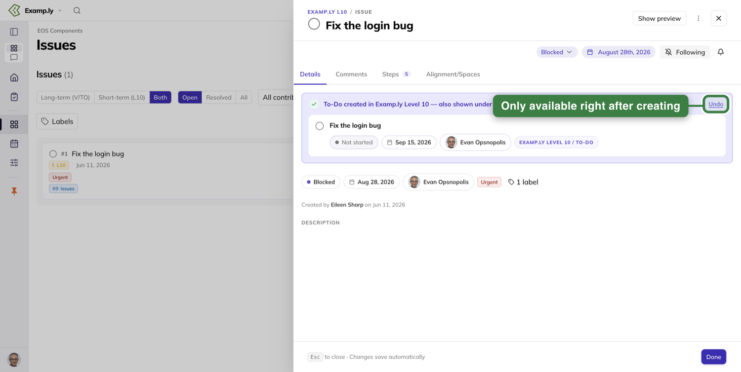
One to-do now exists in two places at once.
It is on the meeting's To-Do section, where it appeared immediately without a reload, and on the issue's own Steps tab.
It does not show up twice on the meeting. The Issues section still holds the one issue it came from.
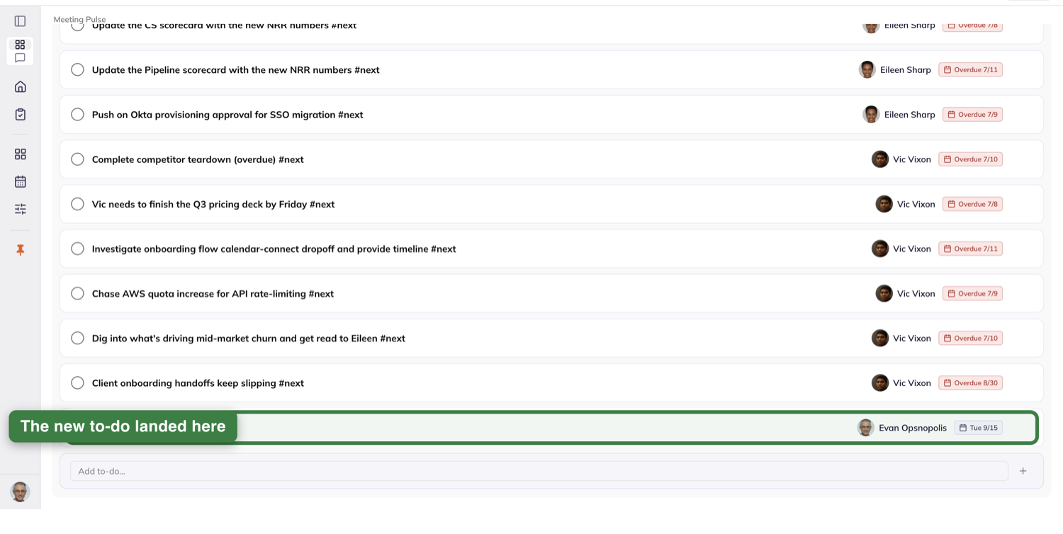
On the Steps tab it is an ordinary step row with exactly one chip on it, reading Resolves this Issue.
No heading, no divider, no separate section — a step row plus one chip.
That chip follows the recorded link and nothing else.
A step somebody typed by hand with word-for-word the issue's own title carries no chip. An issue like that still shows the tip-card prompt, whatever its steps happen to be called.
A step added afterwards does not take the chip either. It stays on the to-do's row.
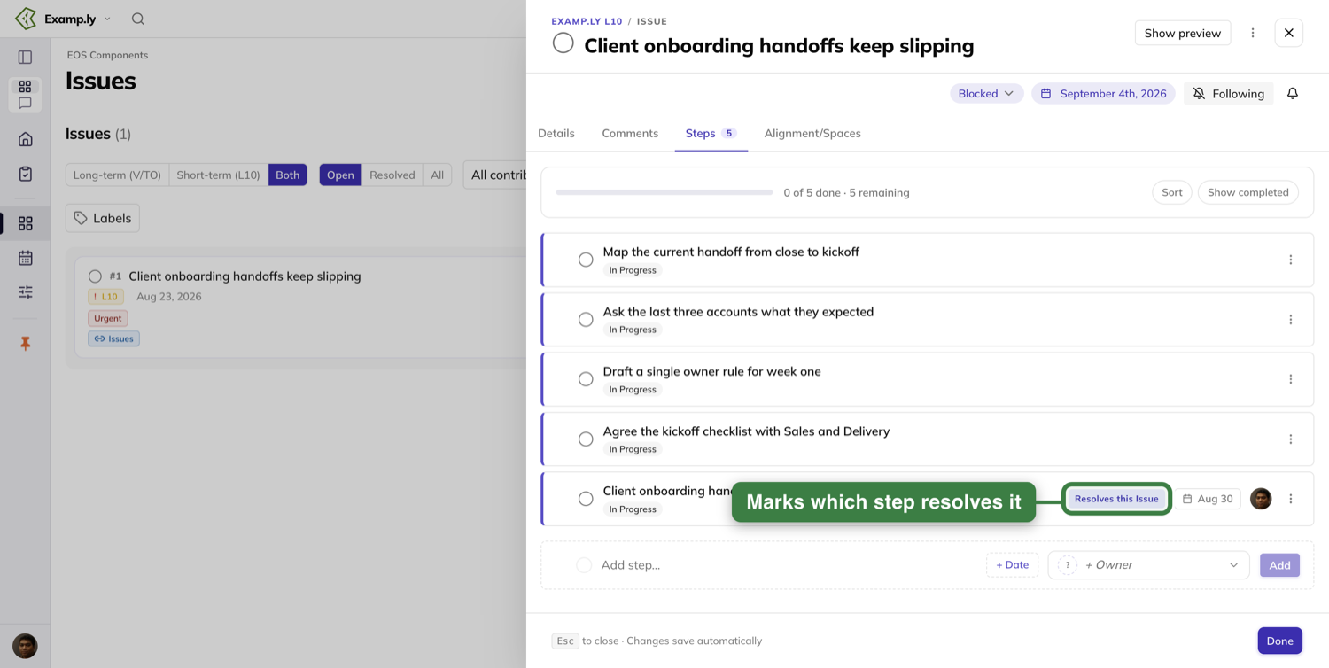
The card is permanent, and that is the point of it.
Close the sheet and reopen the issue minutes or days later, and the card is still in the same place, with the to-do's current owner, status and due date.
The prompt does not come back.
Anyone who can see the issue sees the same card. It names the to-do's owner, not whoever is looking at it.
The green confirmation line and Undo, though, belong to the moment you created it. Days later they are gone, and the card is all that is left.
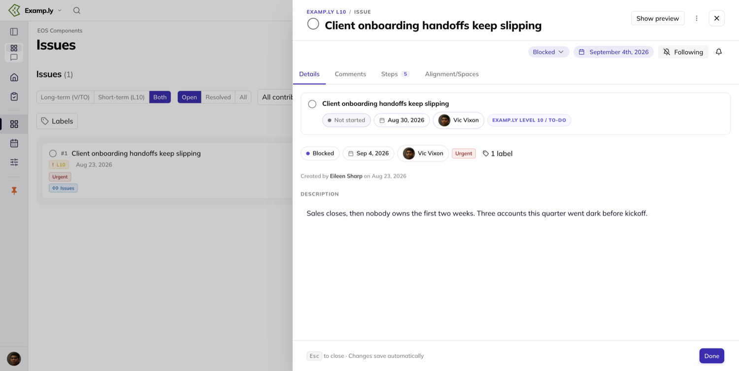
If you created it by mistake, Undo takes back all of it in one action.
The confirmation and the card disappear before the server confirms, the tip card returns with its button at its resting label, and the Steps count drops back.
The to-do is gone from the meeting's To-Do section and from Steps. Again, no toast.
Move an issue between this week and the long term
There is no control for this on the Issues list.
The move lives on the issue, on its Alignment/Spaces tab, which lists every place the issue appears.
The row titles tell you which list you are on.
A weekly issue's row is titled with the team's Level 10 and carries the sub-line "Weekly L10 · "Issues" section".
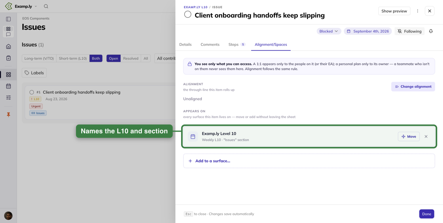
A long-term issue's row is titled with the team's long-term issues list, and nothing on that row says Level 10.
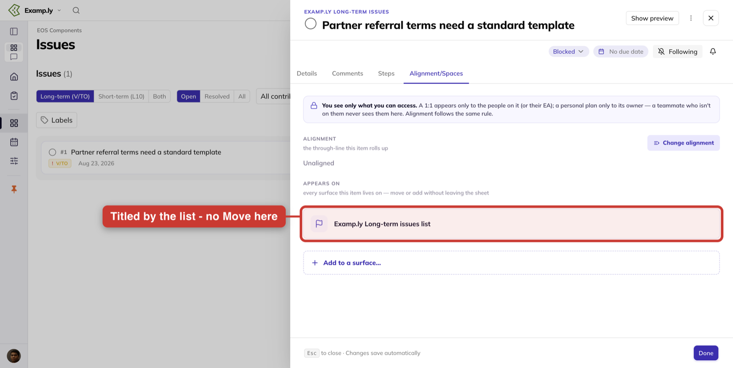
To send a weekly issue to the long-term list, press Move on that row, choose the team's long-term issues list, and press Move here.
The row retitles the moment you confirm — before the save completes, with nothing to reopen and no refresh.
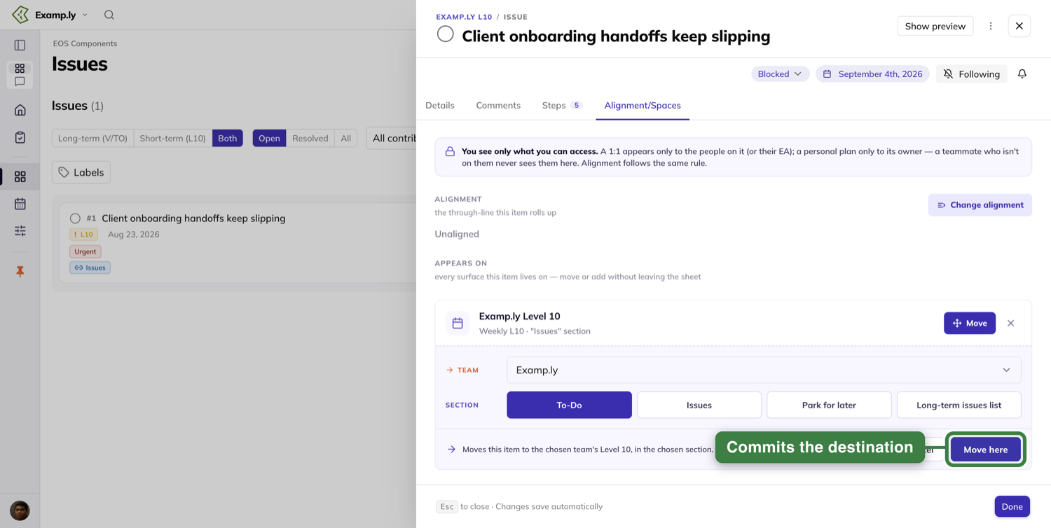
Everything asserting the old membership updates at once.
The issue leaves the Level 10's Issues section immediately while your sheet stays open, and the heading above the issue's name changes to name its new list.
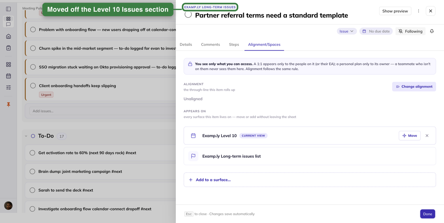
One thing to read carefully. While you are still on the Level 10, that meeting keeps a row of its own under Appears on, marked Current view.
It is naming the screen you are on, not a list the issue is still on. Open the same issue from anywhere else and only the long-term list is named.
The trip back uses a different control, and this catches people out. A long-term row carries no Move and no remove.
To put the issue back on the weekly list, use Add to a surface… and pick Level 10 · Issues for that team.
It reappears in the meeting's Issues section immediately.
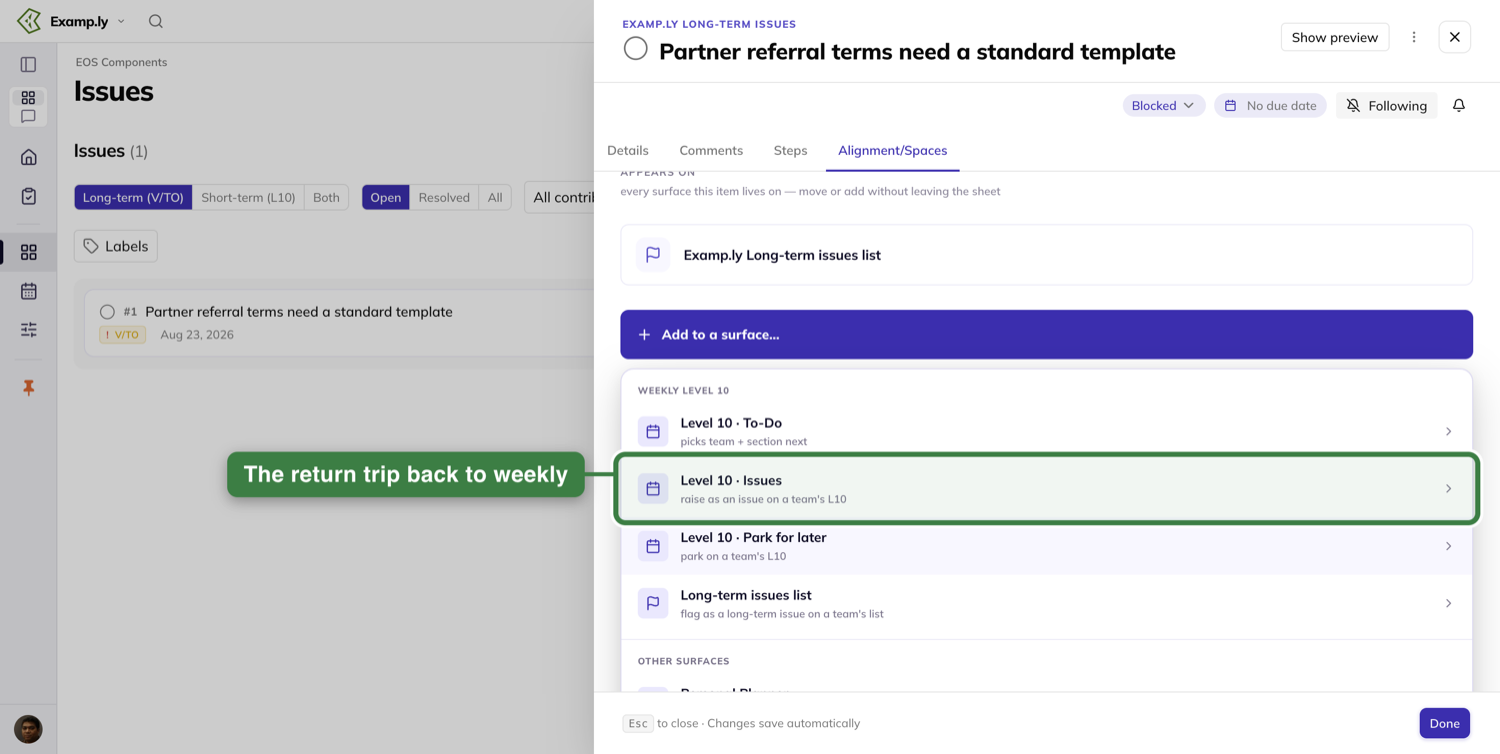
The move takes edit access on the issue. Without it, Add to a surface… is not offered to you.
The row's Move button is still shown, though, and a move you start that way is refused when it tries to save.
Complete an issue from its row
When an issue is done with, you close it from the list without opening anything.
Click the completion circle at the left of its row, or move keyboard focus to that circle and press Space.
Nothing asks you to confirm.
The issue is marked complete and its row leaves the list immediately, before the server confirms. The save finishes behind you.
Reload the page and it is still complete. One click is always enough, including on an issue you added a moment ago.
The row leaving is not the issue vanishing.
This list is the team's open issues, so a completed one is not shown on it at all. You un-complete it where done items are shown, on the issue itself.
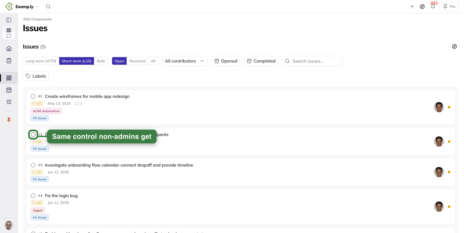
On the meeting screens it behaves the same way, with somewhere visible to land.
Mark an issue done in the Level 10's or a 1-on-1's Issues section and it moves straight out of Issues and into Done, with both counts changing.
It is still under Done after a reload, checked off and struck through there.
It does not bounce back, and it is never left struck through in the Issues section it came from.
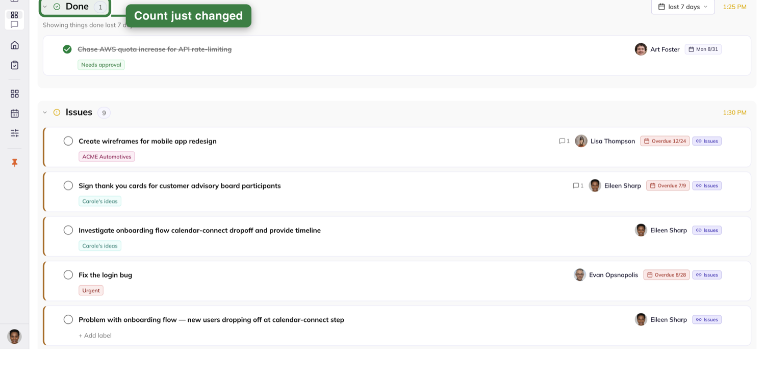
Ask the assistant what is being done
If you would rather ask than open the issue, the assistant answers from what is recorded rather than from the names of things.
Ask what is being done about an issue and it reports the to-do that carries the link, naming its owner and its due date.
Those are current values, not the ones they had when the link was made. It reads the issue's other steps out too, with their status.
If the to-do has since been deleted or archived, it reports nothing working the issue.
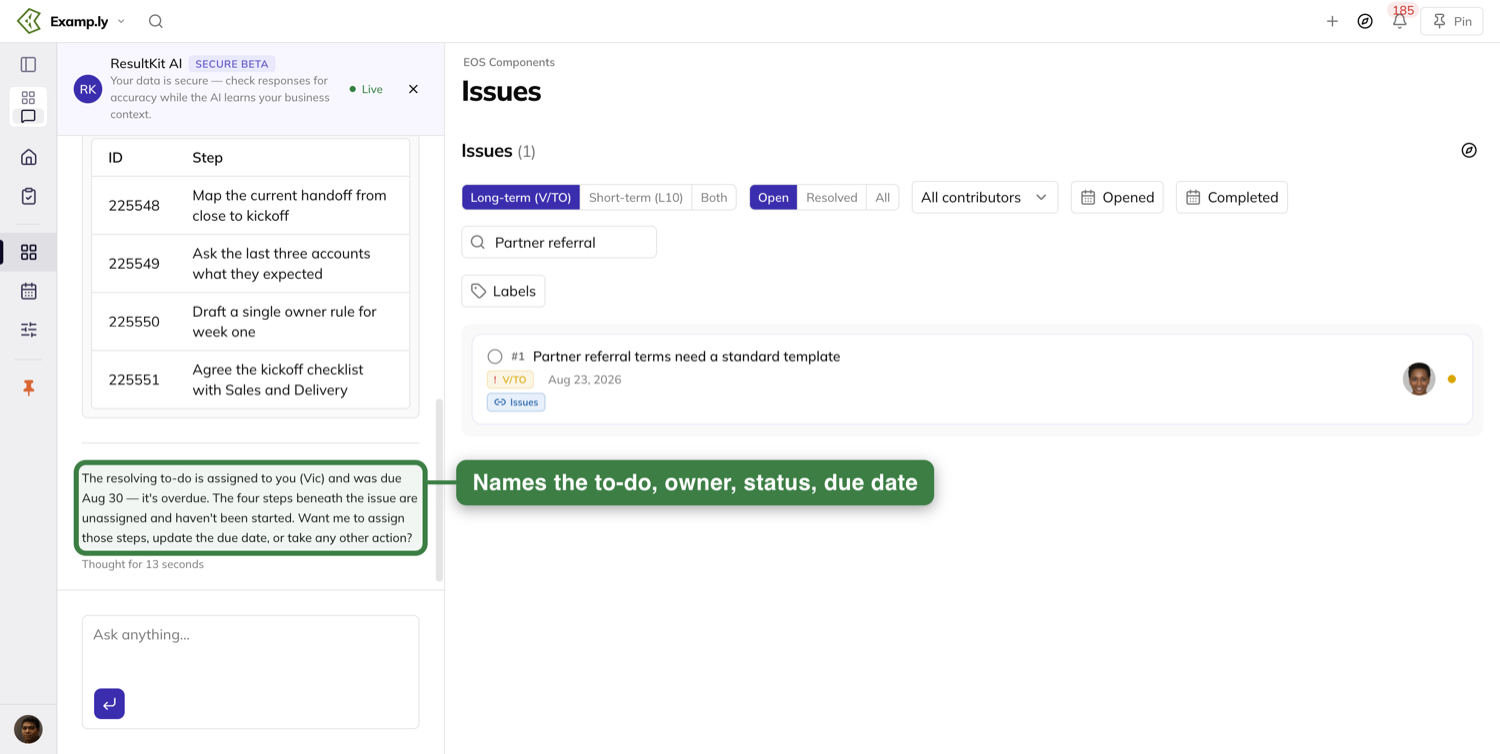
Ask about an issue nobody has started and you get told that plainly: nothing is working it yet.
That is an answer, not a gap.
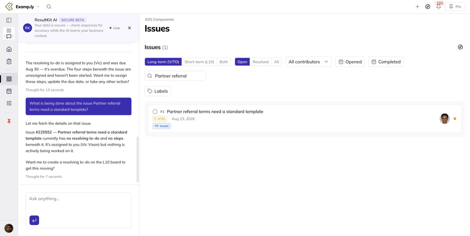
It will not guess.
A step named word for word like the issue is described as an ordinary step, not as the thing resolving it.
Asked which step resolves an issue where none carries the link, it answers that none does.
Ask it to create a to-do for an issue that already has one and it tells you one exists and names it before making a second.
Ask it to unlink a to-do but keep it, and it will tell you what that costs.
The only reversal is removing the to-do itself, and it asks before doing it.
Afterwards it reports the to-do gone from the Level 10's to-do list and from the issue's Steps.
Who can do what on the Issues list
Reading is open to every member of the team — the rows, their chips, their counts and their status.
Adding is a team admin job on this screen. So is reordering the list by dragging.
That one is fussier than it looks. The drag grips appear only on the long-term list, and only while nothing else is filtering it.
Switch to Short-term (L10) or Both, or type in the search box, and the grips go away.
The archive control on a row is a team admin's too.
None of those appear disabled to a member. They are not on the screen at all.
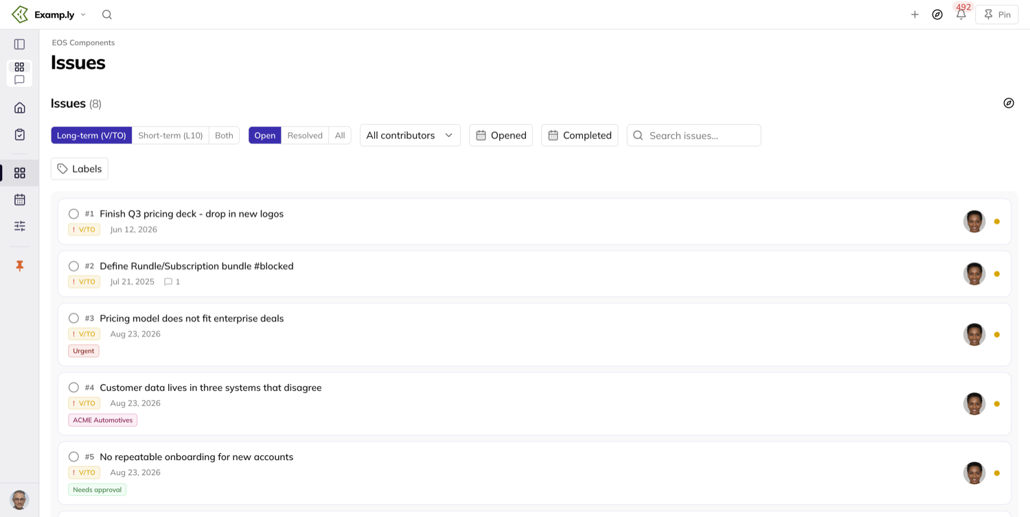
Completing is not gated that way. The completion circle is on every row for everyone reading the list.
Moving an issue between the weekly list and the long-term list takes edit access on that issue.
It is done from the issue's Alignment/Spaces tab, not from here.
Where else your issues show up
The team's Level 10 is the main one. Its Agenda tab has an Issues section, and its board has an Issues column.
Any to-do created to resolve an issue turns up under its owner on the To-Do Ownership tab.
A 1-on-1 has its own Issues section, reachable from the page's Jump to nav.
Anything on it can be dropped onto the long-term list the same way.
The Quarterly meeting screen carries an Issues section of its own.
And an issue that is on your plate turns up on your own prioritizer, alongside the rest of your day.
It carries the chips that say which meeting and which project it came from.
Was this helpful?
Archive a One-on-One
In this article
What archiving does
Archiving hides a 1:1 from your active 1-on-1s list without deleting anything. All items, notes, and history are kept, and you can unarchive it at any time.
Only the two participants in a 1:1 can archive it. Assistants cannot.
Option 1 — From the 1-on-1s list
- Go to the 1-on-1s page.
- Hover over the 1:1 you want to archive.
- Click the Archive button that appears on the card.
- Click Archive in the confirmation dialog.
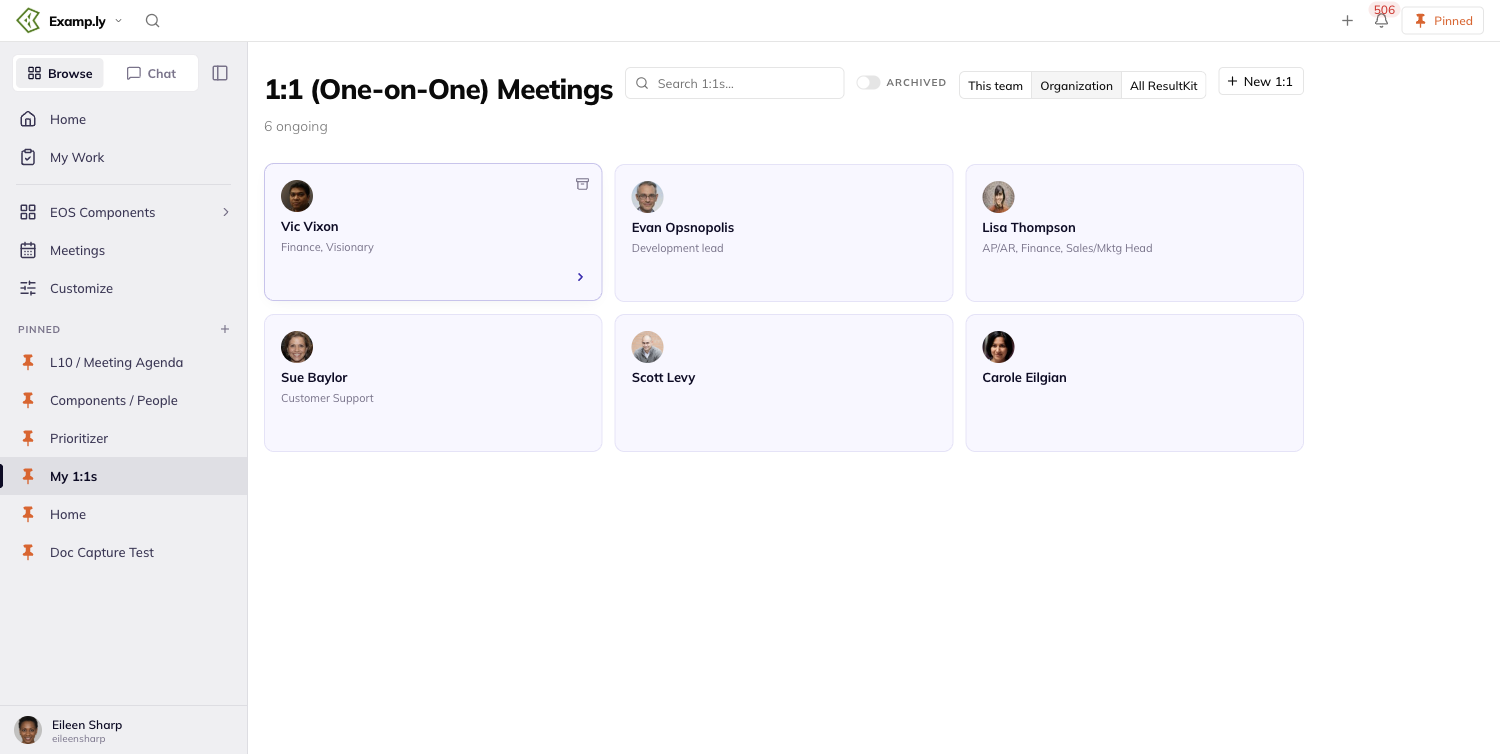
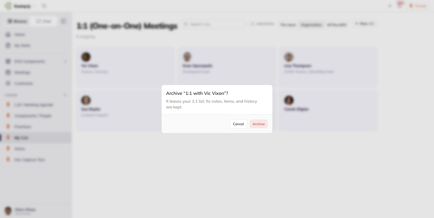
Option 2 — From inside the 1:1
- Open the 1:1.
- Click the settings menu in the header.
- Choose Archive.
- Click Archive in the confirmation dialog.
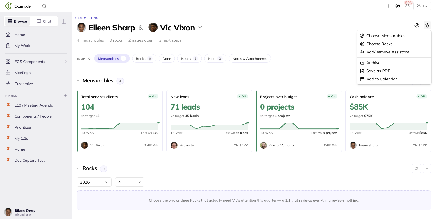
Step 4 shows the same confirmation dialog pictured in Option 1.
Viewing archived 1:1s
On the 1-on-1s list page, turn on the Archived toggle to show archived 1:1s.
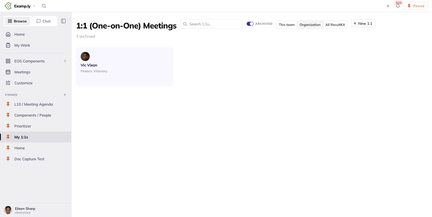
Unarchiving a 1:1
- On the 1-on-1s list page, turn on the Archived toggle.
- Open the archived 1:1.
- Open the settings menu in the header and choose Unarchive.
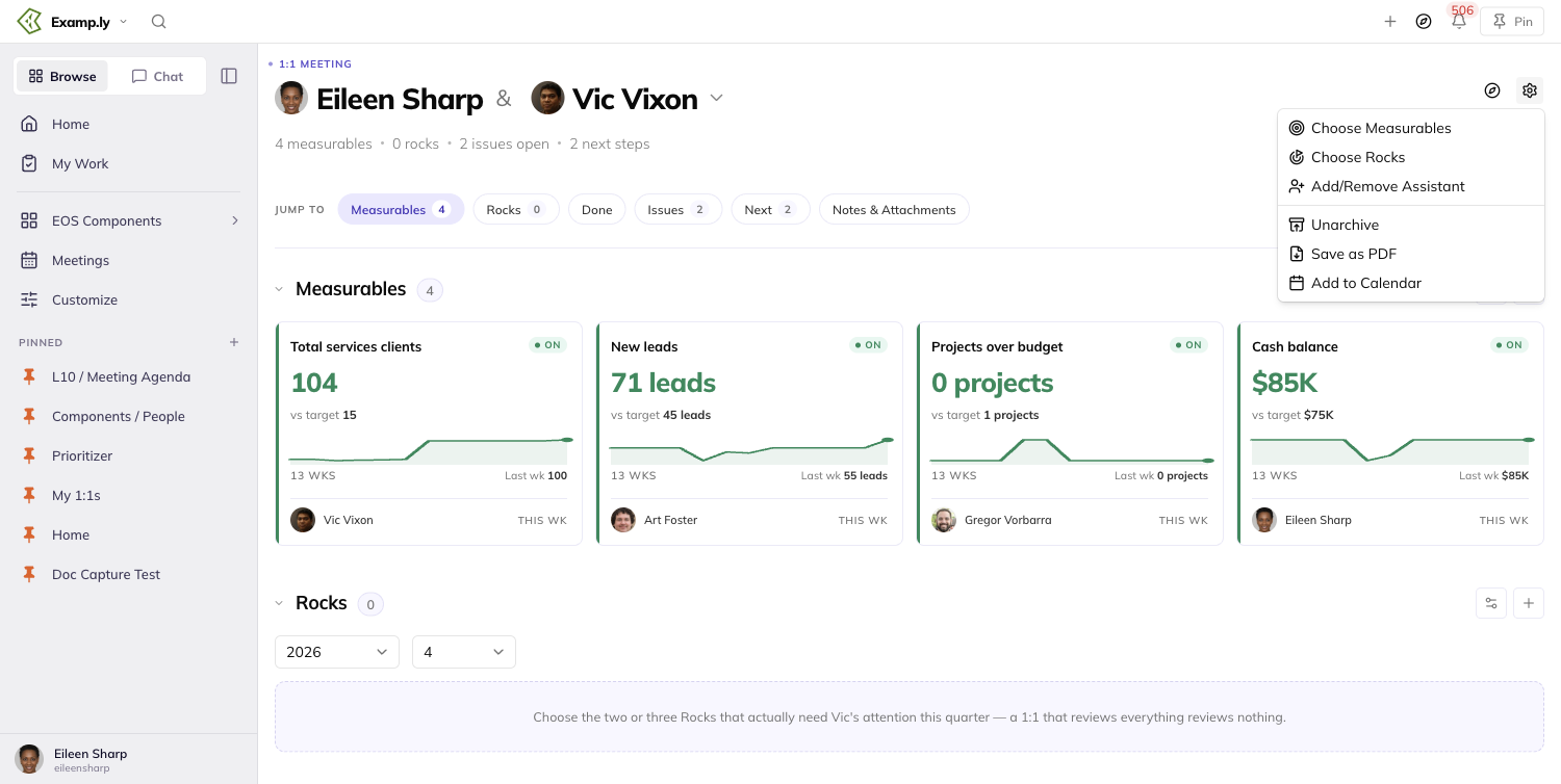
The 1:1 returns to your active list immediately.
Was this helpful?
3-Step Prep
Your team's weekly Level 10 Meeting goes better when everyone arrives with their own week already accounted for. 3-Step Prep is how you do your part: your numbers, your progress, and whatever is stuck.
In this article
The day before the meeting and on the day itself, the top bar says so, with a green button beside it. The prep it opens holds only your own things. One press of Submit prep puts each of them where the meeting will look.
This article walks from that notice to the submit: opening the prep, picking how you want to do it, filling in the six sections, submitting once, and where everything lands.
Before you begin: your team needs a meeting day
The notice runs only for a team whose meeting day has been saved. A team admin picks that day in the team's meeting settings.
Until a day is saved there is no notice, on any day of the week.
Sunday counts as a saved day, so a Sunday meeting is announced on Saturday like any other.
You do not need to be an admin to prep. What you can fill in comes down to what you own, not to any role.
Open the prep from the top bar
The day before your meeting, the top bar reads "🚀 Tomorrow = [your team] update day." Beside it sits a green button, Update measurables + progress.
The notice takes the middle of the bar, between Switch team and the icons on the right. Every other control keeps its place, and the bar does not get taller.
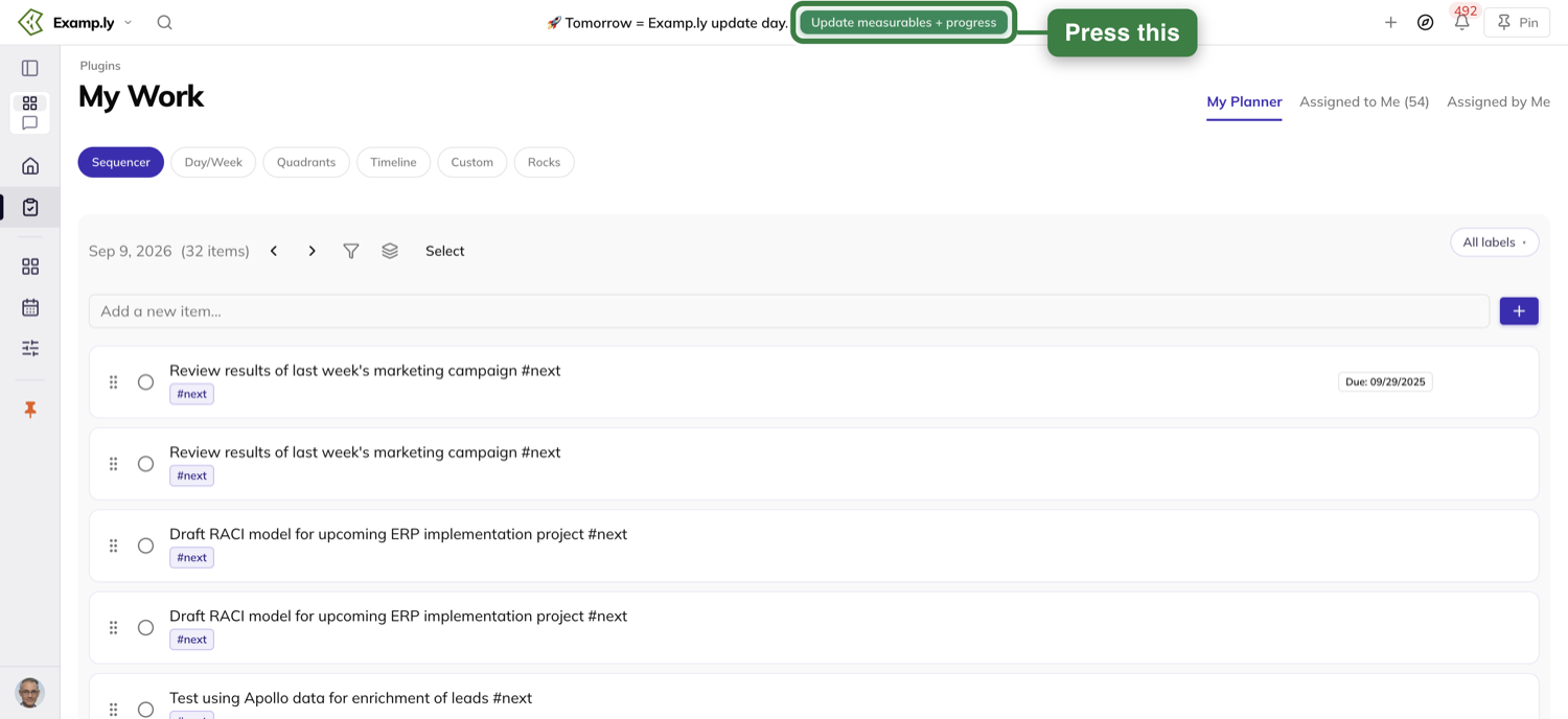
Press the button. The prep opens under the page heading 3-Step Prep, for the team the bar is showing.
The keyboard works too. Tab to the button and press Enter.
On meeting day
On the day itself the message reads "🚀 Today = [your team] update day.", with the same button beside it.
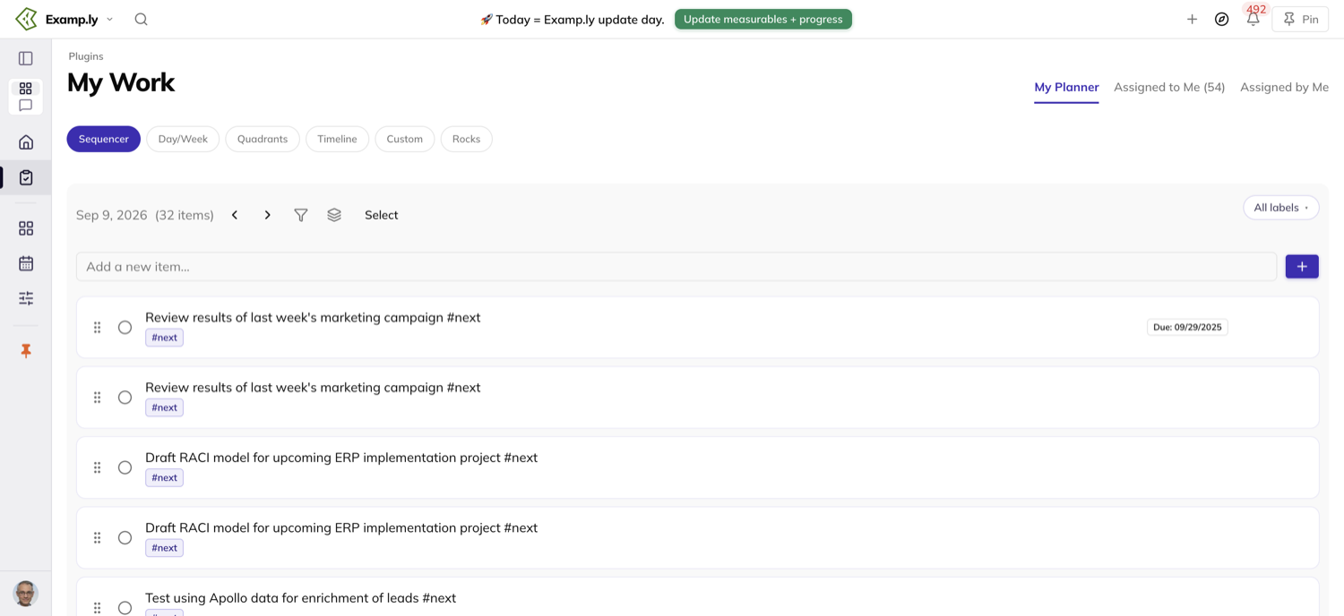
It stays until the meeting ends — its start time plus the minutes in its agenda. After that, the bar is back to normal until next week.
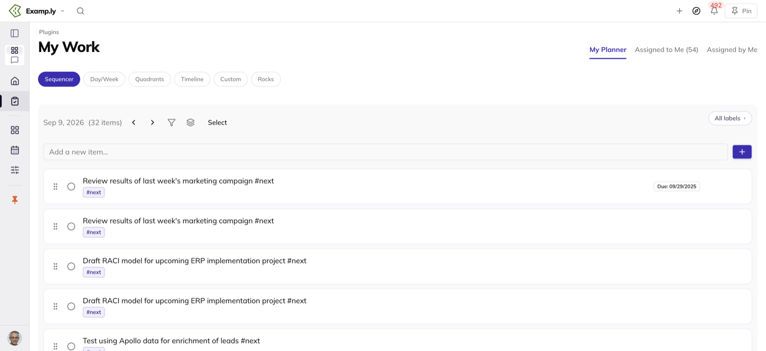
On any other day there is no notice at all. Who sees it, and when it stops, is covered at the end of this article.
Pick how you want to prep
The first time you open the prep, it asks. A line reads "Prep for [day]'s Level 10 · [your team]", and under it, "How do you want to prep?"
Two cards are yours to pick: Step by step, "One section at a time.", and All on one page, "Everything on one scroll."
A third card, Chat, is greyed out and cannot be picked. It is not available yet.
Under the cards it says "You can switch anytime — we'll remember your choice." Both halves are true.
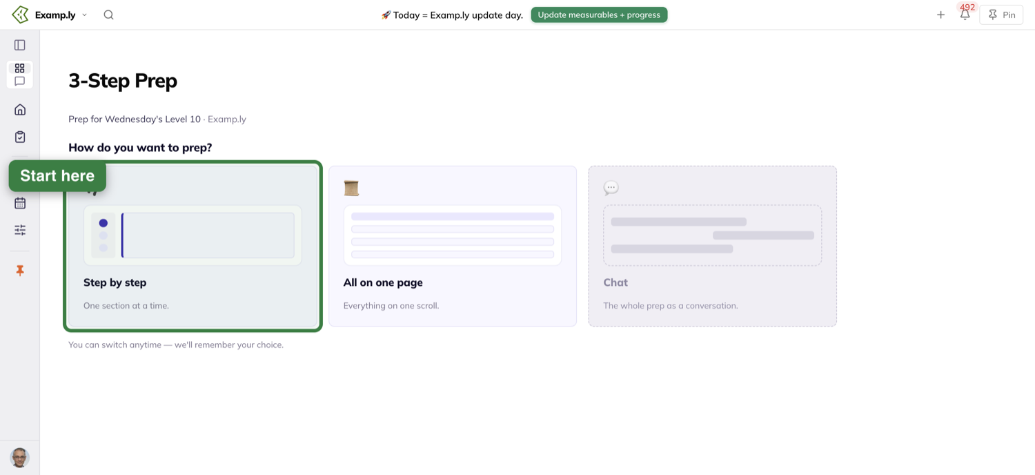
Next week it remembers
Open the prep the following week and it goes straight into the approach you picked. The chooser does not come back.
A toggle at the top of the prep, beside the context line, reads Step by step and One page. Use it to change your mind at any time.
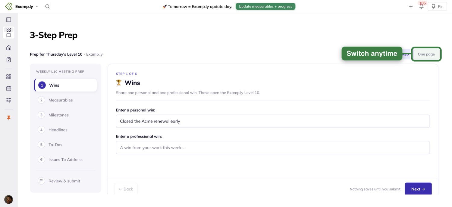
Switching mid-prep keeps everything
The two approaches are two views of one prep in progress. A win typed in one is already there in the other.
Progress carries across as well. A section you finished in one shows as finished in the other.
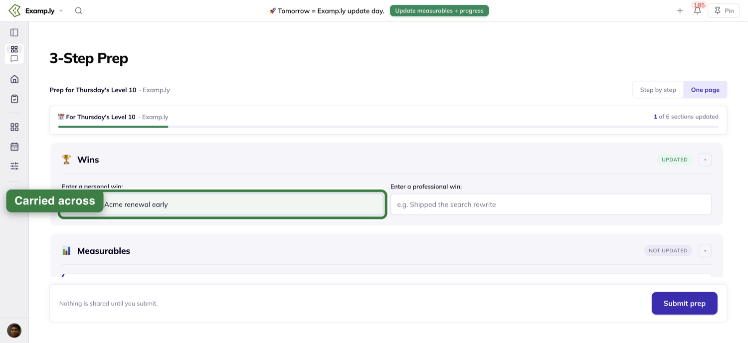
What Step by step looks like
A rail on the left, titled Weekly L10 Meeting Prep, lists the six sections and then Review & submit. You see one section at a time.
Above the section a line counts you along: Step 1 of 6, then Step 2 of 6, and so on. Each section you finish earns a checkmark on the rail.
← Back and Next → sit above the hint "Nothing saves until you submit".
Back is disabled on the first section. On the sixth, the button reads Review →.
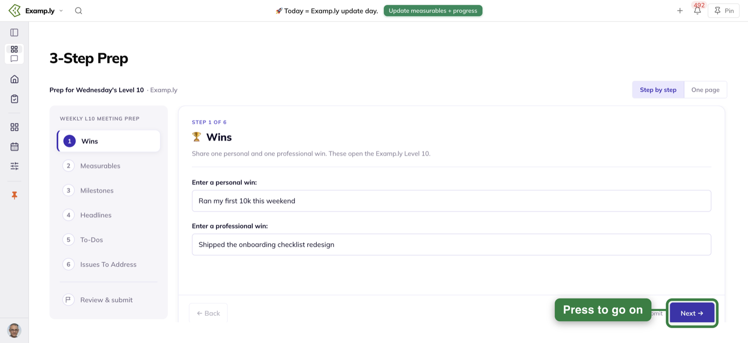
What All on one page looks like
All six sections sit on one scroll, under a header that stays put while you scroll.
The header reads "📅 For [day]'s Level 10 · [your team]" and counts "0 of 6 sections updated" over a progress bar.
Each section carries a pill that reads Not updated. Touch the section and it flips to Updated, moving the count up by one.
The submit button lives in a bar pinned to the bottom. Step 4 covers it.
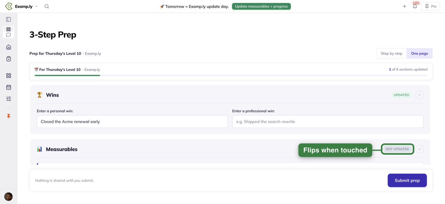
Fill in your six sections
Whichever approach you picked, the sections are the same six, in the same order: Wins, Measurables, Milestones, Headlines, To-Dos and Issues To Address.
Only your own things are in them — the measurables you own, your milestone, your to-dos. Nobody else's appear.
If you own no measurable, there is no Measurables section for you. Your prep has five.
Wins
Two fields: Enter a personal win: and Enter a professional win:.
If you already entered wins this week, they are filled in for you.
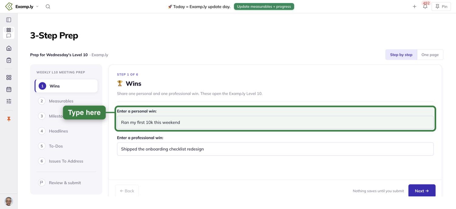
Measurables
Each scorecard row you own is listed with its Target, Last week and a This week field. Only the row's owner can fill in This week.
Each row also carries + headline and + issue.
Hover + issue and a tip reads "Not hitting the target of [target] …? Or concerned about hitting next period? Log issues with this button".
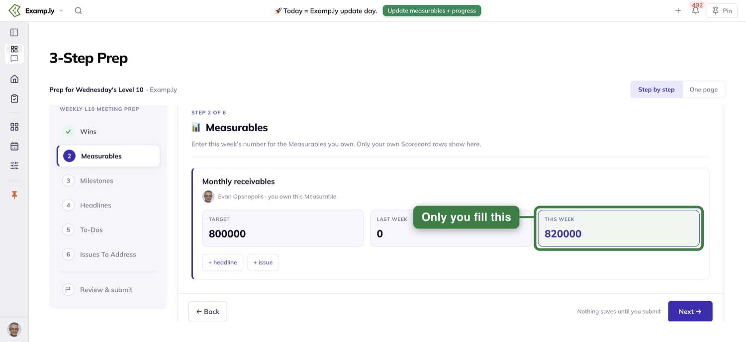
Milestones
Your milestone sits under its rock. The rock sits under the goal for the year it serves, labelled This year.
The tile reads "Milestone · due end of quarter". Pick On track or Off track — there is no third choice — and add a note in Comments? if you want.
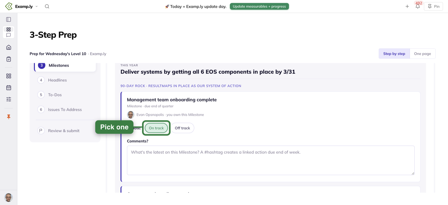
One thing to know about that comment box. A word with # in front of it becomes a new action, linked to the milestone and due at the end of the week.
The section says so itself: "A #hashtag in your comment creates a linked action due end of week."
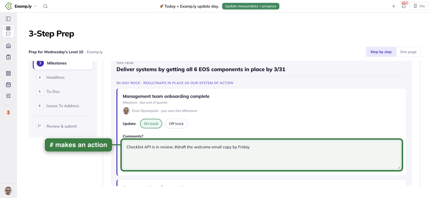
Headlines
Type each headline on its own line. The help reads "👈 Add more headlines for your Weekly L10", and the field itself says "Separate your headlines by hitting the 'enter' key".
Each line becomes one headline. Headlines expire at the next Level 10 Meeting.
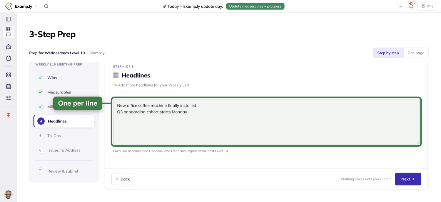
To-Dos
Each of your 7-day to-dos takes a status: Done, Blocked/stuck, Extra steps needed or Not started. A comment is optional.
What each status does happens when you submit. Step 4 covers it.
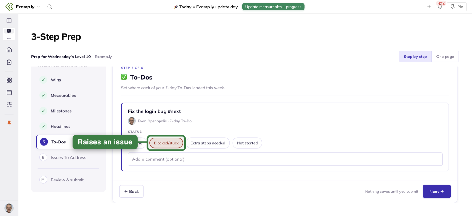
Issues To Address
The help reads "👈 Add any issues your team needs to address". A Current Issues: list shows what the team already has open.
Type new ones one per line — the field says "Separate your issues by hitting the 'enter' key". Each line becomes one new issue for the team.
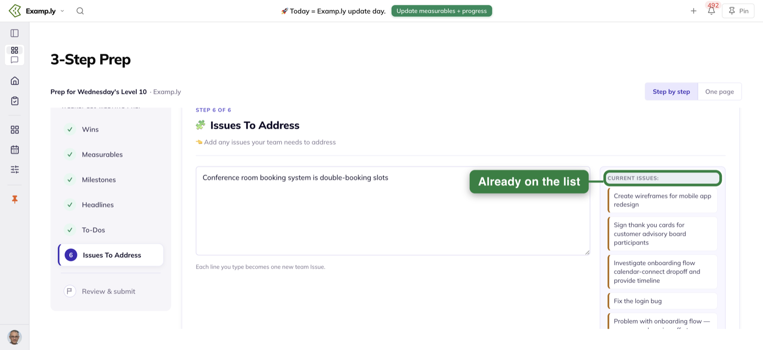
A light week
Nothing to update in a section? It shows an empty state, and you move on.
A week with no milestone and no to-dos still has wins, headlines and issues to fill in.
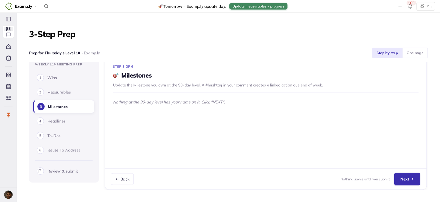
Submit once
Nothing is saved until you submit. There is no per-section save, so if you leave the prep before submitting, nothing is kept.
Switching between the two approaches is not leaving. Your entries stay.
In Step by step
The last stop on the rail is Review & submit. Its help reads "Nothing has saved yet. Give it a look, then submit — everything posts to [day]'s Level 10 at once."
Each section is summarised with an Edit link, so you can go back and change anything.
The button reads Submit prep, with the hint "This submits everything at once".
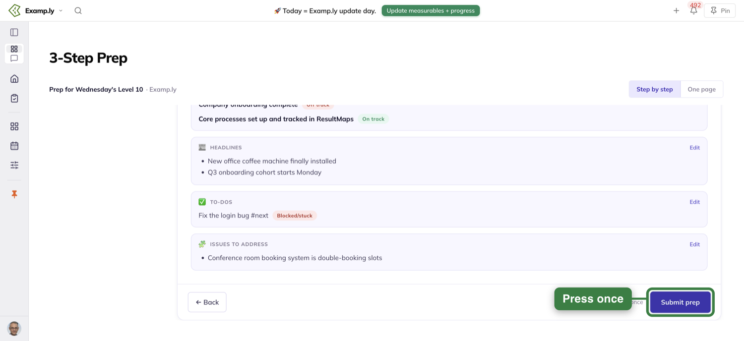
After you submit, a success screen reads "You're ready for [day]'s Level 10." and lists where each section went.
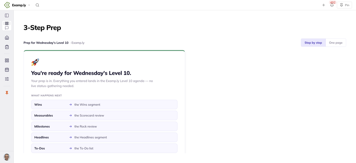
In All on one page
The bar pinned to the bottom reads "Nothing is shared until you submit." beside a single Submit prep button.
Press it and the bar confirms: "You're ready for [day]'s Level 10."
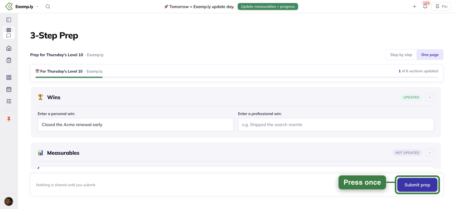
What one submit does
The button shows it is working the moment you press it, before anything has come back.
Everything posts at once: your wins, this week's number into the scorecard's history, your milestone's status and comment, each to-do's status, your headlines, your new issues, and a record that you did your prep.
You do not have to touch every section. Wins and one milestone status, with the rest left alone, is a complete prep.
A hashtag in a milestone comment becomes its linked action now, due at the end of the week.
What each to-do status does
Done completes the to-do. Blocked/stuck turns it into an issue for the team to solve at the meeting.
Extra steps needed and Not started both leave the to-do open. Each adds a comment for you: "Status marked 'more work needed'" or "Status marked 'not yet started'".
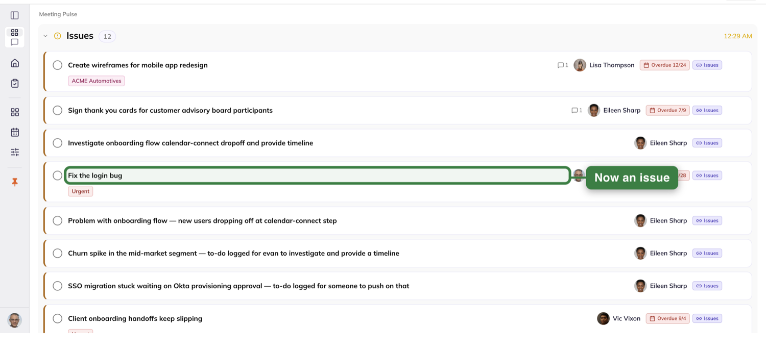
If part of it does not save
Sometimes one update fails while the rest go through. The prep tells you which one — the section, and the item by name — with a reason in plain words.
It never gives you a count of nameless failures.
What saved stays saved, and what you typed stays put. Come back and your wins are filled in, with the status you chose still selected.
Retry sends only the part that failed, so nothing that already saved is written twice.
When the retry lands, you see "You're ready for [day]'s Level 10."
Where your prep lands in the meeting
Open the team's Level 10 Meeting and each section is already in its place.
Wins go to the Wins segment, measurables to the Scorecard review, and milestones to the Rock review. Headlines land in Headlines, to-dos in the To-Do list, and issues in the Issues list.
Your part of the meeting is there before the meeting starts. So is everyone else's, once they submit.
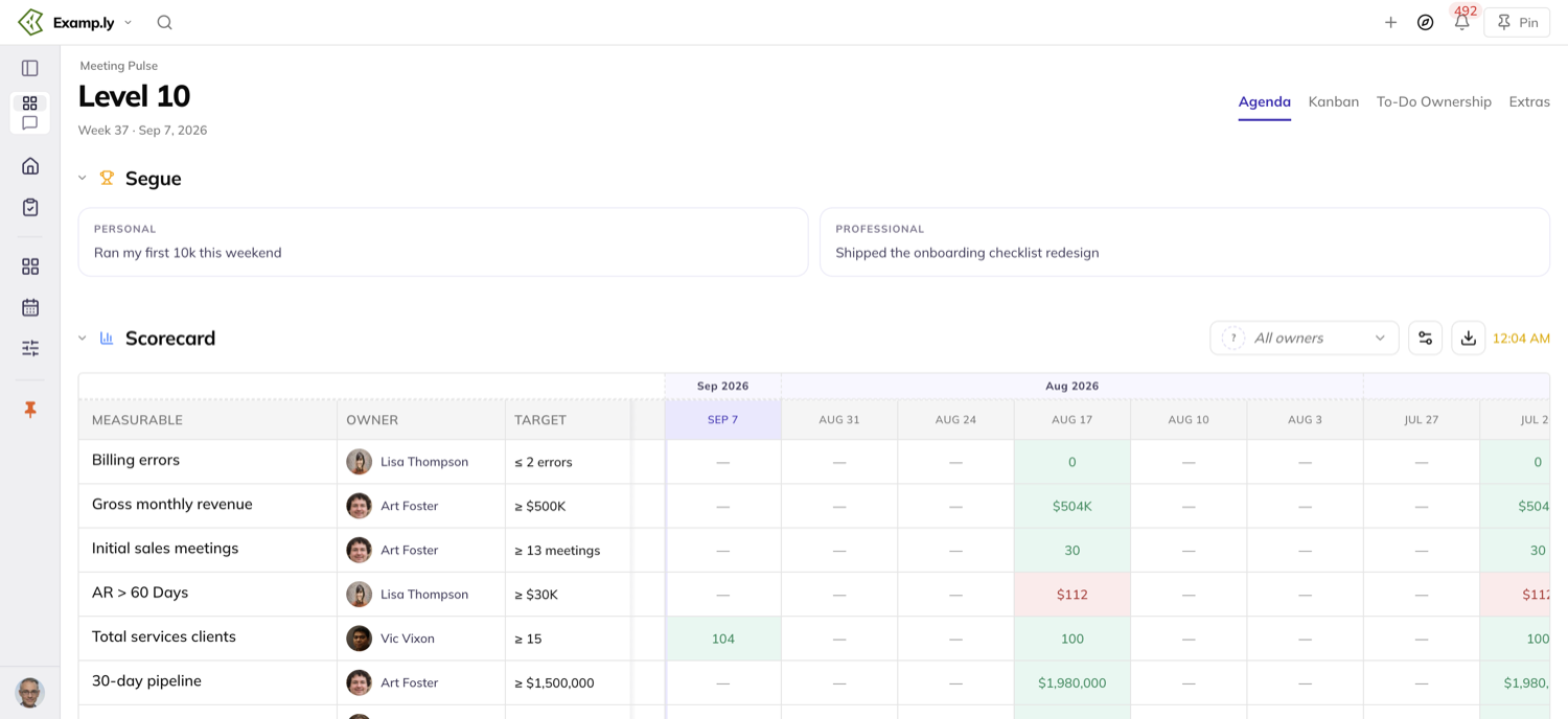
When the notice shows, and when it stops
The notice runs on two days: the day before your meeting, and meeting day until the meeting ends.
"Today" is your own calendar day, in your own time zone. A teammate several hours ahead can already see "Today" while yours still reads "Tomorrow".
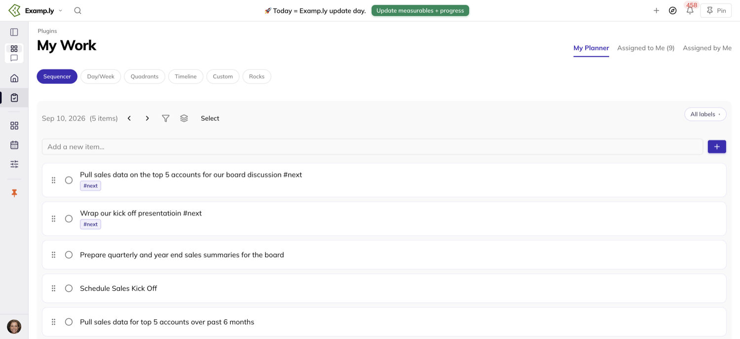
It follows the team you have selected
The notice is for the team showing in Switch team, and that team only. Switch teams and the notice switches with you.
On two teams that meet on different days, you get each team's notice while that team is selected. The green button then opens that team's prep.
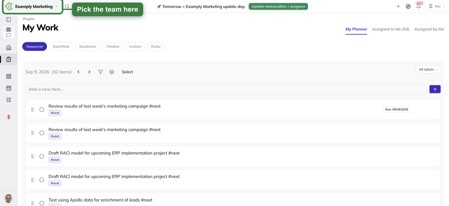
It clears the moment you submit
Submit, and the notice leaves your bar at once — before the confirmation has come back. It stays gone for the rest of the week.
That is per person. A teammate who has not submitted keeps theirs until they do, or until the meeting ends.
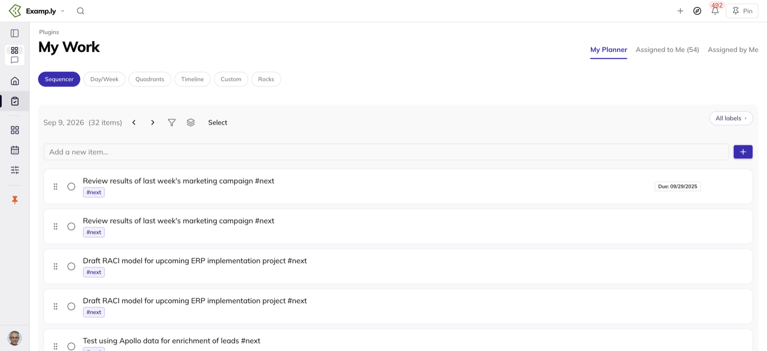
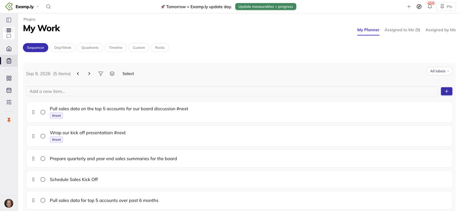
The top bar is the only place it appears
There is no prep banner inside any page — not above the page title, not in the page body, on any page.
The top bar is on every page, so that one notice is the only reminder you get inside the app.
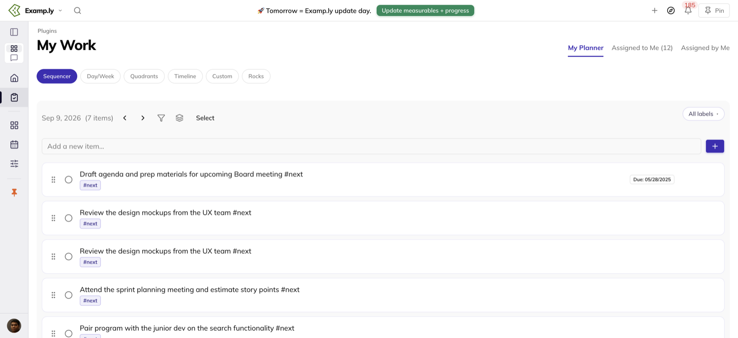
Who can prep
Every member of the team, with no admin role needed. Everyone gets the same prep.
What you can edit comes down to ownership. Only the owner of a measurable can enter its This week number, and only your own milestones and to-dos are listed.
Was this helpful?
Quarterly Meetings — The Quarterly Plan
The business plan your team came to review usually lives in another tab, while the meeting runs on without it. Now that plan reads inside the agenda itself, in the step where you revisit the vision.
In this article
A team admin fixes a wrong number right there, without leaving the page.
Next quarter's plan gets drafted in the same session, while you set the new Rocks. Click Suggest updates and your own Scorecard, Rocks, and Issues propose the lines.
This article covers reading and fixing the closing quarter's plan, drafting next quarter's plan, using AI suggestions, and reading a plan's history.
Read the closing quarter's plan
In Review V/TO™, the quarter's business plan renders below the Vision and Accountability Chart buttons.
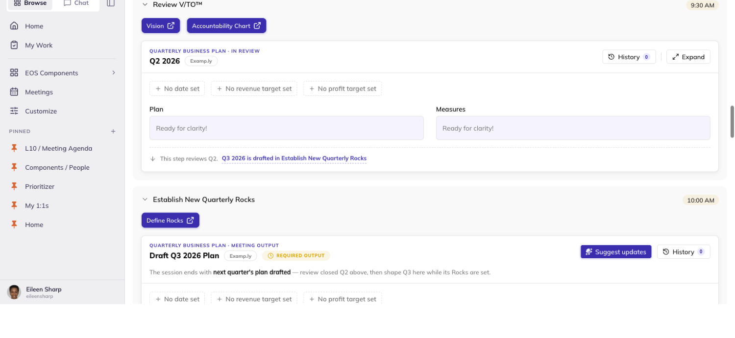
A long plan clamps and scrolls inside its own panel, so the rest of the agenda never moves — the Expand button releases the clamp.
Fix a number in place
Click any chip or box on the plan you're reviewing. A team admin can edit; everyone else only reads.
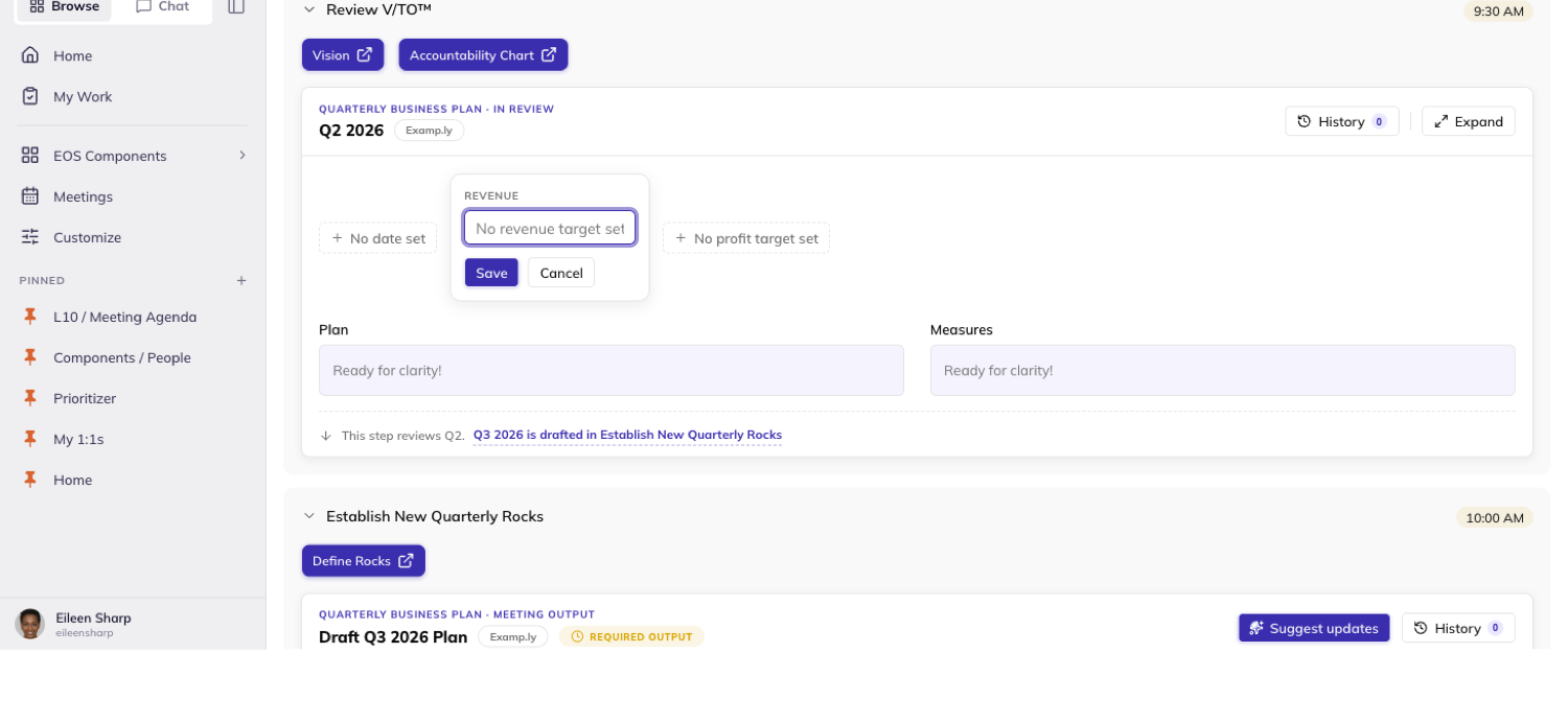
Type the new value and click Save, or press ⌘+Enter — both do the same thing.
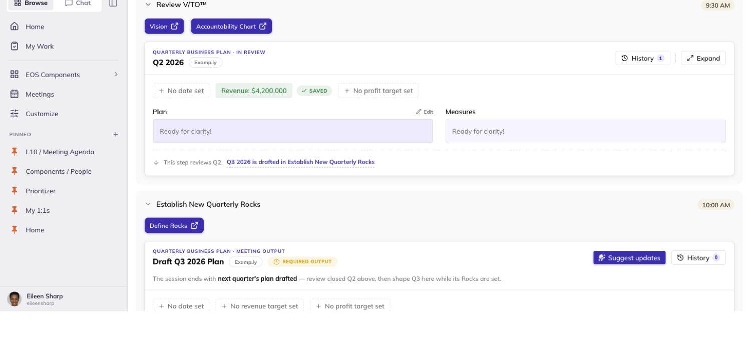
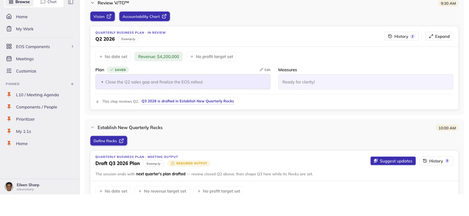
Cancel or Escape discards whatever you typed instead.
A save that changes nothing writes no history entry — the history is a list of real edits, not a list of visits.
Draft next quarter's plan
In Establish New Quarterly Rocks, a second panel carries next quarter's plan, marked Required output.
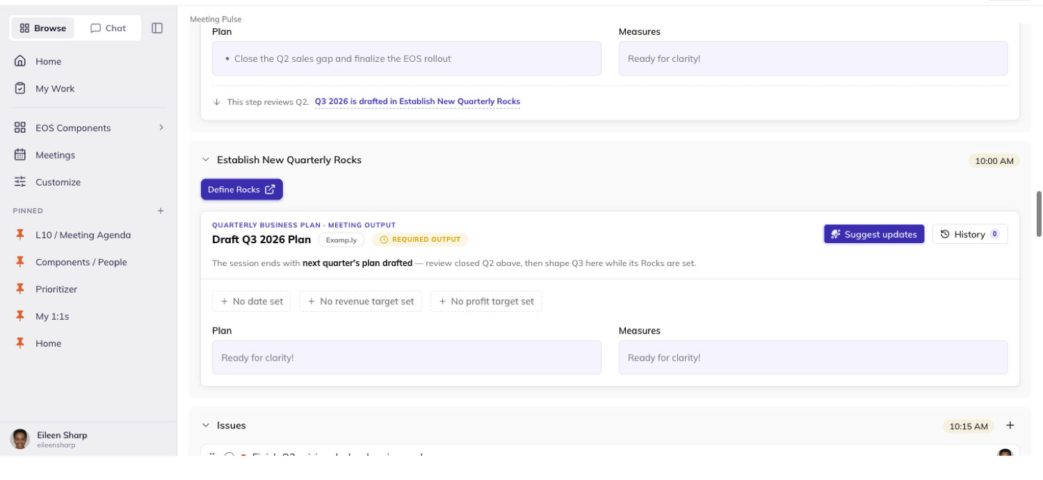
An empty Revenue or Profit field shows nothing to a non-admin. An admin sees a dashed doorway chip instead, inviting them to fill it in.
Write here the same way you edit the closing quarter's plan — click a box, type, and save.
What you write belongs to next quarter's own plan. It never touches the quarter you just reviewed.
Use Suggest updates
Click Suggest updates on the draft panel to have the app propose next quarter's plan from this quarter's own numbers.
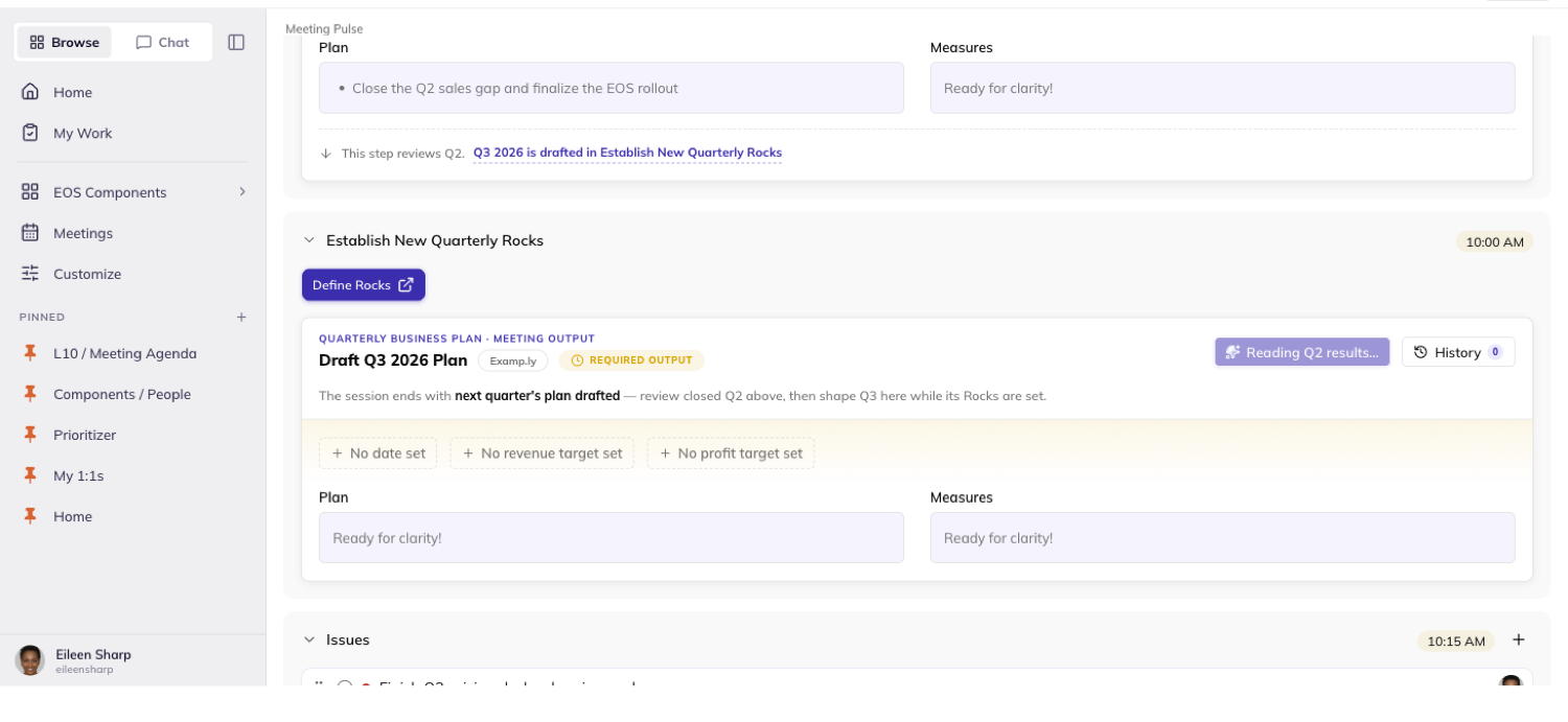
It settles into a summary bar naming how many suggestions it found, each anchored to the field it would write.
Click What I read to see exactly which sources fed the suggestions.
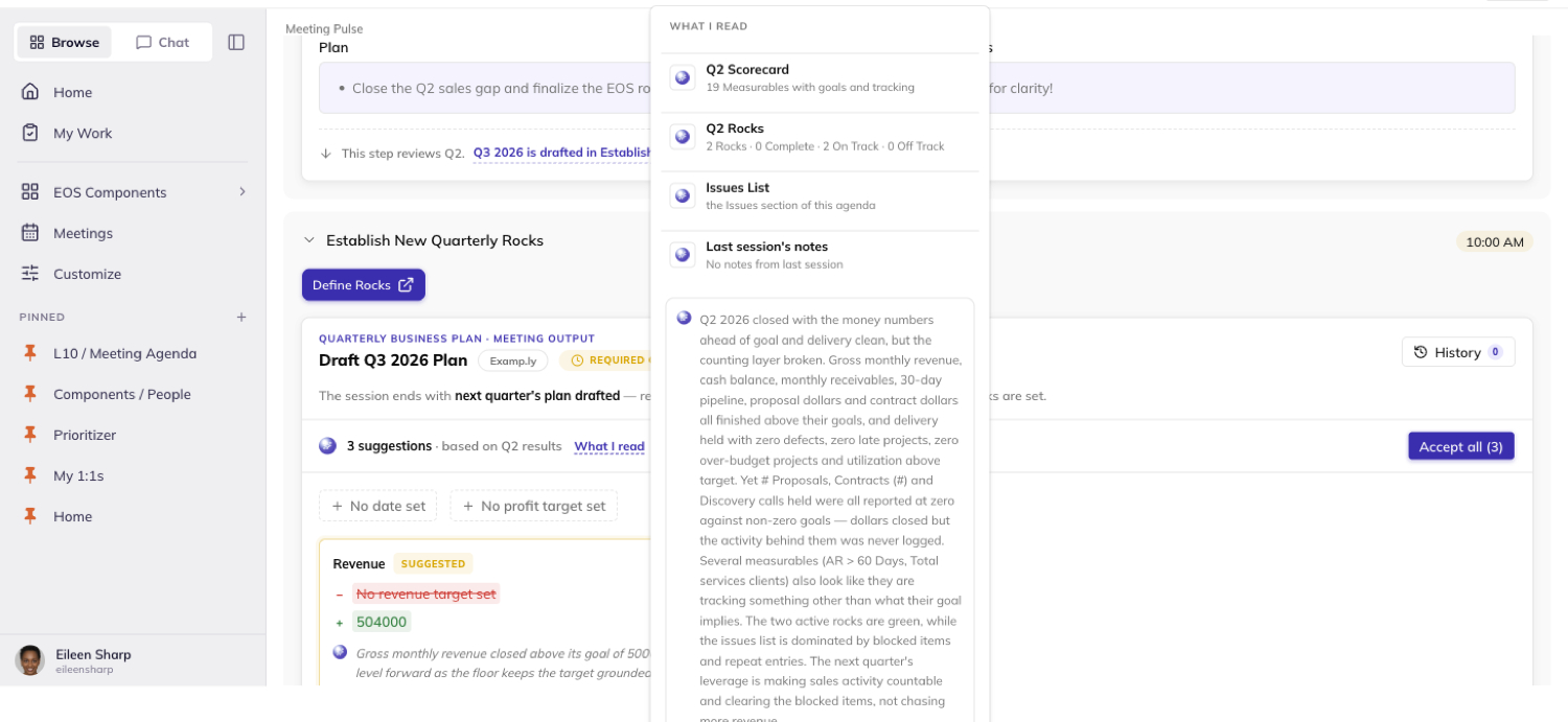
Accept a suggestion and it writes that one field. Dismiss it and nothing is written.
Accept all resolves every open suggestion at once. A field with an open suggestion can't be hand-edited until you accept or dismiss it.
Read a plan's history
Click History on either plan panel to see every saved edit and accepted suggestion, newest first.
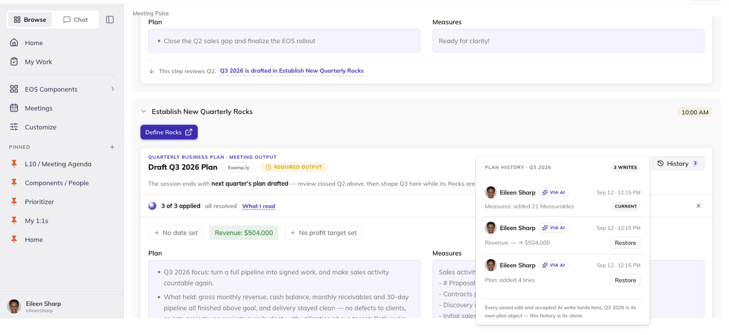
The closing quarter and next quarter keep entirely separate histories. Writing one never moves the other's count.
An admin can click Restore on an older entry to bring the plan back to that state, after confirming.
Restoring doesn't erase the writes that came after it — they stay in the list.
Reading history never writes anything. A non-admin can read the same list but has no Restore button on it.
Was this helpful?
Quarterly Meetings — Running the Quarterly Agenda
The Quarterly screen runs your quarter's planning meeting from one agenda. Issues to raise, next steps to capture, a Check In to write, and the quarter's Rocks to set all live on it.
In this article
Adding, completing, or reordering a row paints on screen before the server confirms it. Nothing you do here navigates you away from the meeting.
This article walks the agenda itself — opening an item, adding one, marking it done, reordering the list, moving to Vision or Rocks, and writing the Check In.
Open the Quarterly screen
The agenda lays out in sections — Issues, Next Steps, Check In, and the quarter's Rocks review. Each is its own gray-bordered block.
Every row inside a section is its own card. It carries a name, any context chips it holds, and an avatar for who owns it.
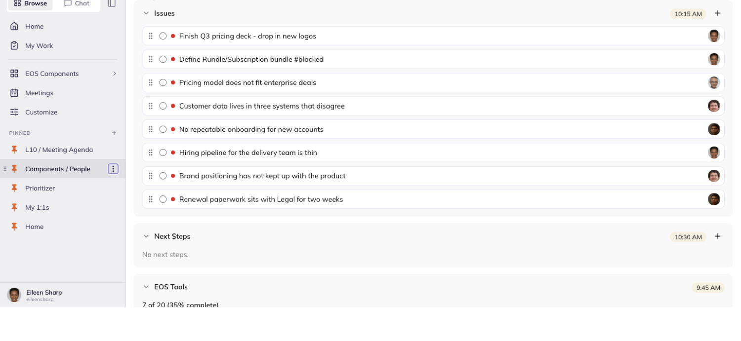
Open an item
Click an issue's or next step's name to open its item sheet. The page behind it doesn't move — no scroll jump, no reload.
Closing the sheet puts you right back where you were.
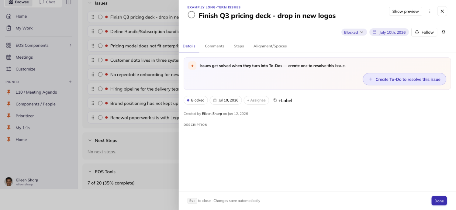
A Rock's milestone row works a little differently. The whole row opens it, not just the name.
Clicking it never opens the Rock's own drawer underneath.
Add an issue or a next step
Open a section's create form and type what you want to add. Press Enter, or click Add issue or Add next step instead.
Either way, the row appears at the top of its list before the server confirms anything.
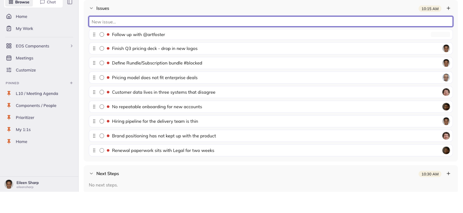
The form stays open, empty, and ready for the next one.
If a save fails, the row it painted disappears. The form stays open and empty — your typed text is never silently lost or put back for you to notice missing.
Type @ inside the form to mention a teammate. A dropdown lists the team and narrows as you keep typing.
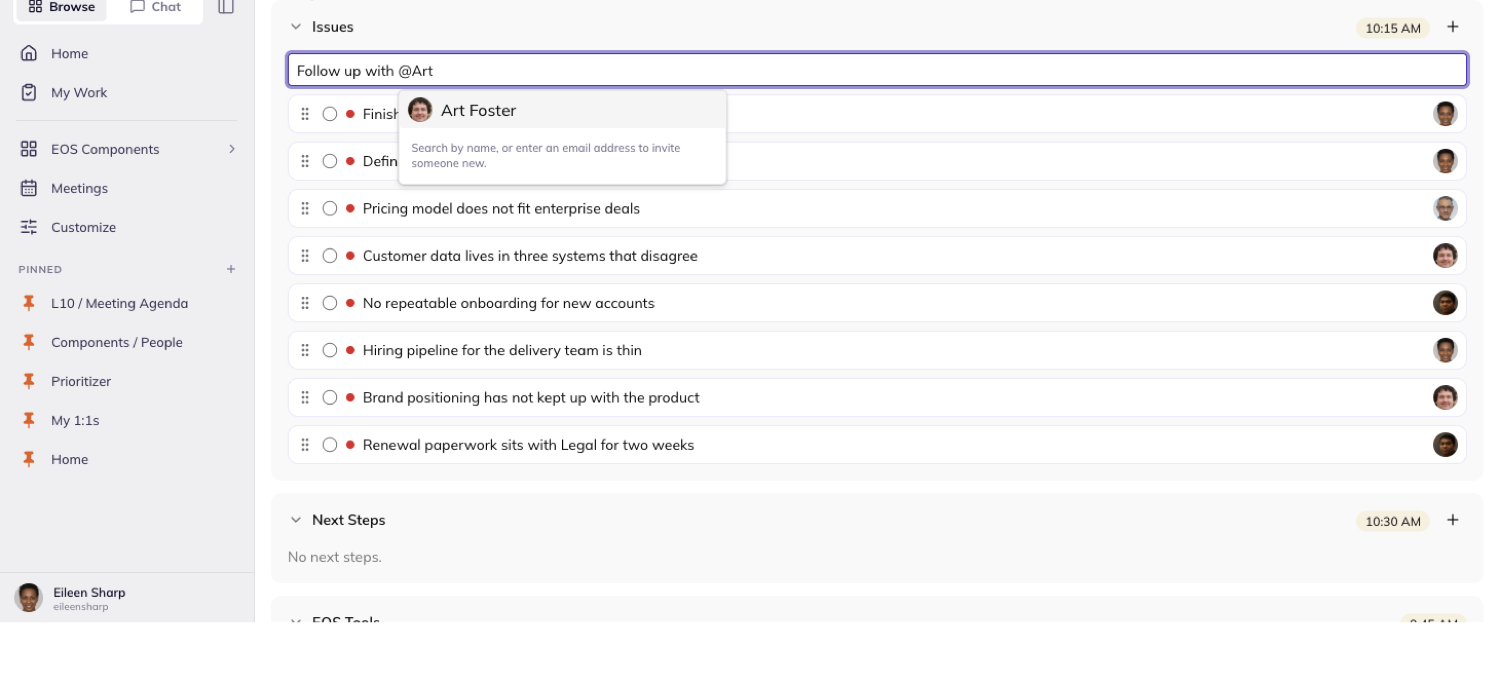
Selecting someone completes their login right into your text. Nothing is created or assigned yet.
Only once you submit does the mention turn into a real assignment, and the row picks up their avatar.
Mark something done
Click a row's completion checkbox, or open its item sheet and complete it there. Either way the row leaves its section at once, before the server confirms.
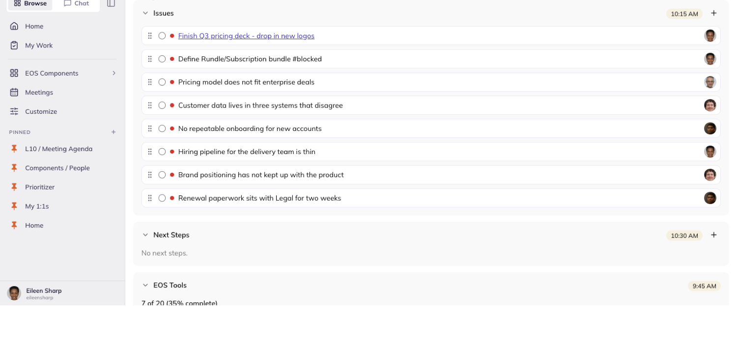
It stays gone after you reload the page.
You can complete an item the moment you add it. Click its checkbox once, right after typing it, and it's marked done and the form closes with it.
Reorder the list
Drag a row by its handle to move it within a section, or across sections entirely. It lands exactly where you dropped it.
The order you set is still there after you reload.
From the keyboard, focus a row and press Alt+Arrow Down or Alt+Arrow Up to move it — no mouse needed.
Dragging never opens the row underneath it, and only a team admin sees drag handles at all.
Move to Vision, the Accountability Chart, or Rocks
The Review V/TO section carries buttons for Vision and the Accountability Chart. Each opens in a new tab.
Your meeting stays open behind it, exactly where you left it.
Click Define Rocks to set the quarter's Rocks. It opens Traction already showing the quarter you're planning for — one quarter ahead of the meeting you're running.
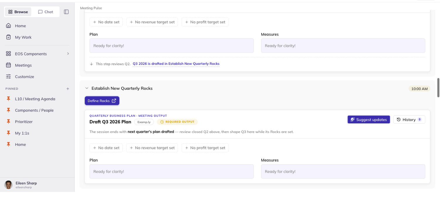
You can add Rocks there without touching a single selector.
On a team that doesn't run EOS, this same button reads Define Goals instead.
If the team has no framework assigned yet, it renders disabled rather than a link to nowhere.
Write the Check In
Click the Check In card to open its editor. Write what the quarter needs to hear.
Save it with the Save button or ⌘+Enter. The card paints your new text immediately, before the server confirms.
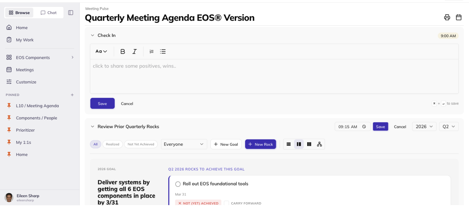
Only a team admin can write it. Everyone else reads it.
A filled-in Check In stays visible to them. An empty one reads N/A rather than showing an empty box.
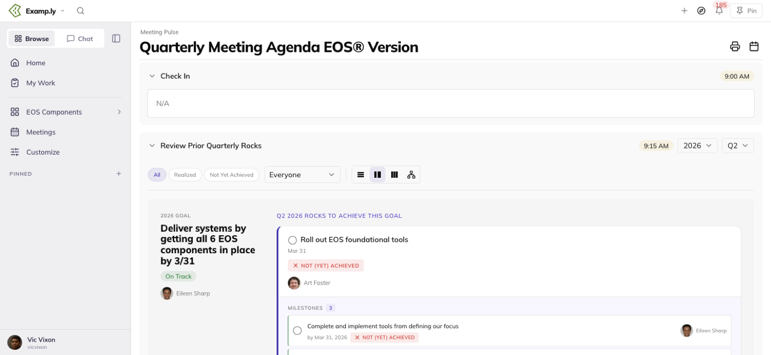
What each row shows
Every row shows exactly one thing in its avatar slot: whoever's assigned, or the item's creator if nobody is. A row is never faceless.
A chip names where else an item lives — a project, another team's list. It shows only when the item isn't simply this team's own routine work.
It never shows when it would expose someone's private planner to the room.
If any row in a section shows a chip, every row in that section shows one, even one that would normally stay hidden as redundant. A section is never half-chipped.
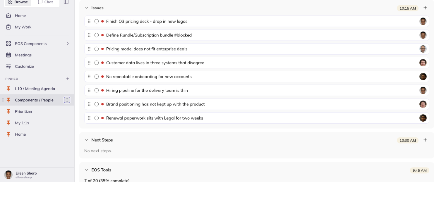
Was this helpful?
Quarterly Meetings — Scoring and Documenting the Meeting
At the end of a Quarterly, everyone rates how it went. The team also writes down what actually happened — wins, what went well, and what's next.
In this article
Both live in the Quarterly screen's Conclude and Check In sections, scoped to whichever quarter you're viewing.
This article covers rating the meeting, reading the score trend, writing the quarter's check-in, and attaching files to it.
Rate the meeting
In the Conclude section's Rate the meeting roll call, click your own empty score placeholder.
Pick a score from 1 to 10. Your row paints it immediately, before the save even finishes.
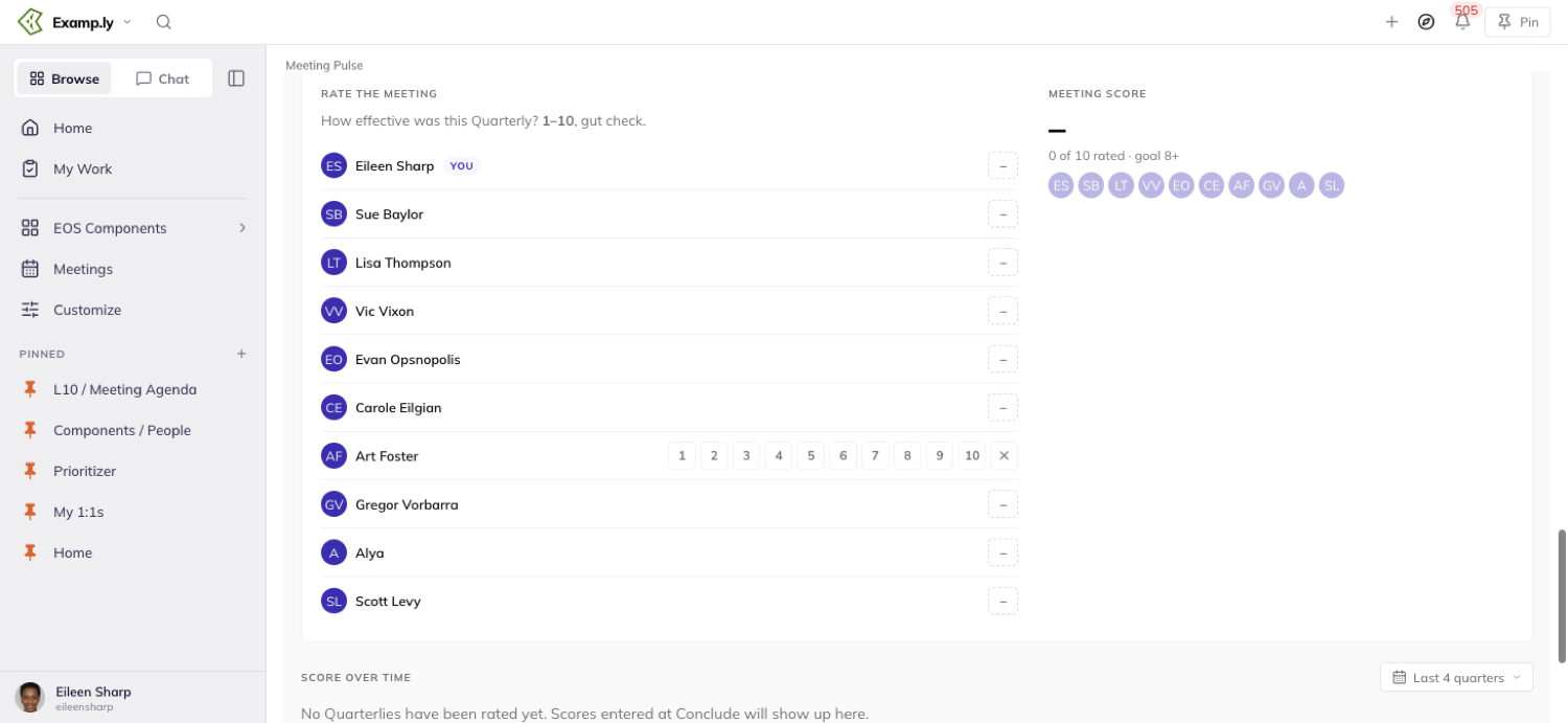
A score of 8 or higher paints with the on-goal treatment. Anything below 8 paints differently.
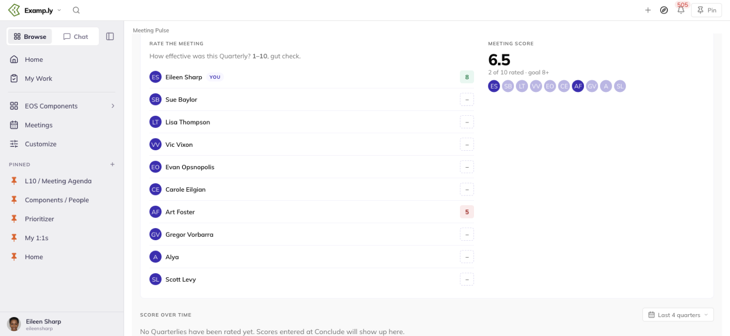
The Meeting score block updates at the same moment. It shows the average and how many attendees have rated so far.
Only your team's admin can open and change anyone else's row. Everyone else can open only their own.
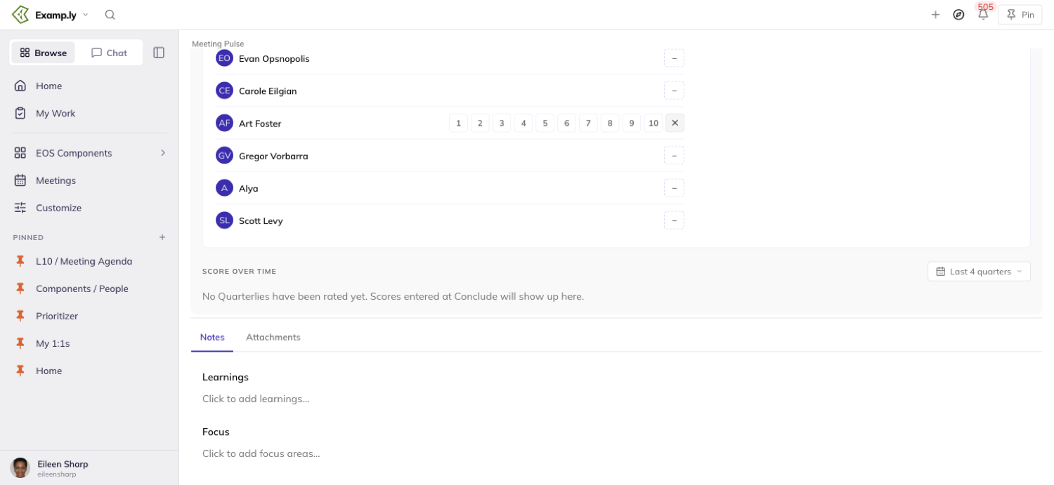
Read the score over time
Scroll down from the roll call to Score over time.
Three tiles summarize it: Last meeting, the 4-quarter average, and Quarters at 8+.
Below the tiles, a trend line plots each quarter's average, with a dashed line marking the goal of 8.
A grid beneath that shows every attendee's score for every quarter in range, colored the same way as the roll call.
Change the range control to look further back. Anyone on the team can do this, not just the admin.
Before your team has ever rated a Quarterly, this section says so plainly instead of showing an empty chart.
Write the quarter's check-in
The Check In tab holds three fields for the quarter: Check In, Learnings, and Focus.
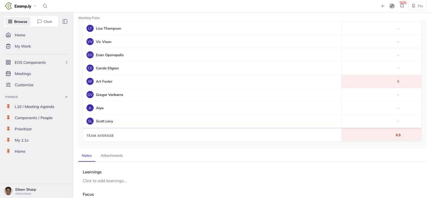
Only your team's admin can write or edit them. Everyone else can read what's there.
Edit just one field and the other two stay exactly as they were. A partial save never touches the fields you leave alone.
Attach a file to the quarter
Open the Attachments tab. It lists only what's attached to the quarter you're currently viewing.
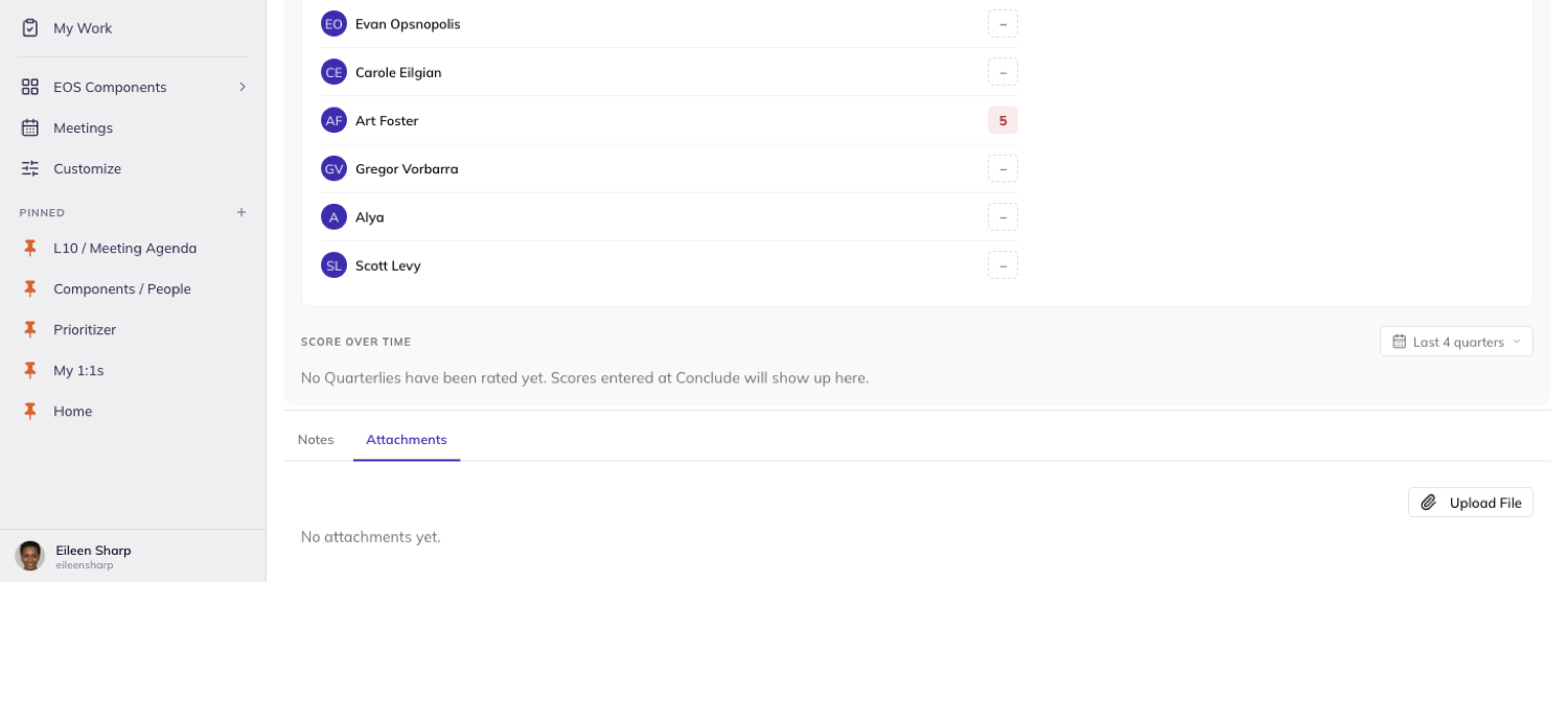
Change the quarter and the list changes with it. A quarter with nothing attached reads "No attachments yet."
As the admin, click Upload File to add one. Everyone else can open what's already there, but sees no Upload File control.
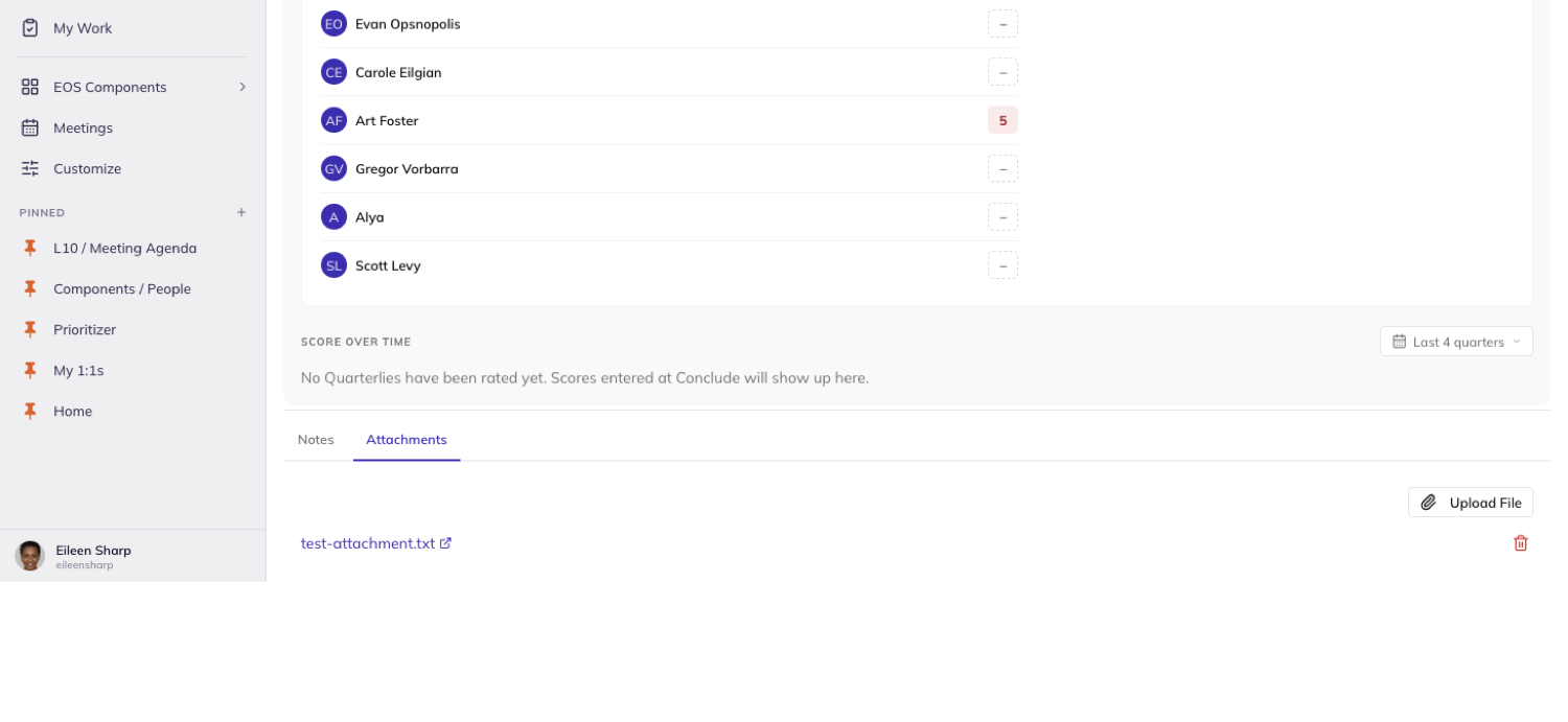
To remove one, click its Delete attachment control and confirm in the Delete Attachment dialog.
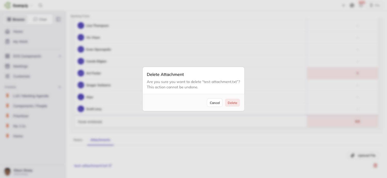
Your Quarterly score and your weekly Level 10 score never mix
Rating a Quarterly and rating a weekly Level 10 are two separate scores, with two separate histories.
One never shows up on the other, even for the same person in the same week.
Attachments and check-in content stay inside their own quarter
A file or a written field only ever shows up on the quarter it was saved to. Nothing carries over when you switch quarters.
Nothing from the weekly Level 10 appears here either — the two meetings keep entirely separate records.
Was this helpful?
Quarterly Meetings — Next Steps, Printing, and Finding Your Meeting
The working part of a Quarterly Meeting ends with a review and a plan for what comes next.
In this article
Whatever the team captures as a next step, or carries forward as a Rock, has to survive the meeting and the reload after it.
Printing the quarter and finding your way back to it live on their own screens, reached from inside the meeting.
This article covers capturing next steps, carrying Rocks into the new quarter, ticking off your team's EOS Tools, printing the quarter, and finding Quarterly Meetings from the Meetings hub.
Capture a next step
Type a next step into the Next Steps section and press Enter, or click Add next step.
Either way, it appears as the first row at once, before the save even finishes.
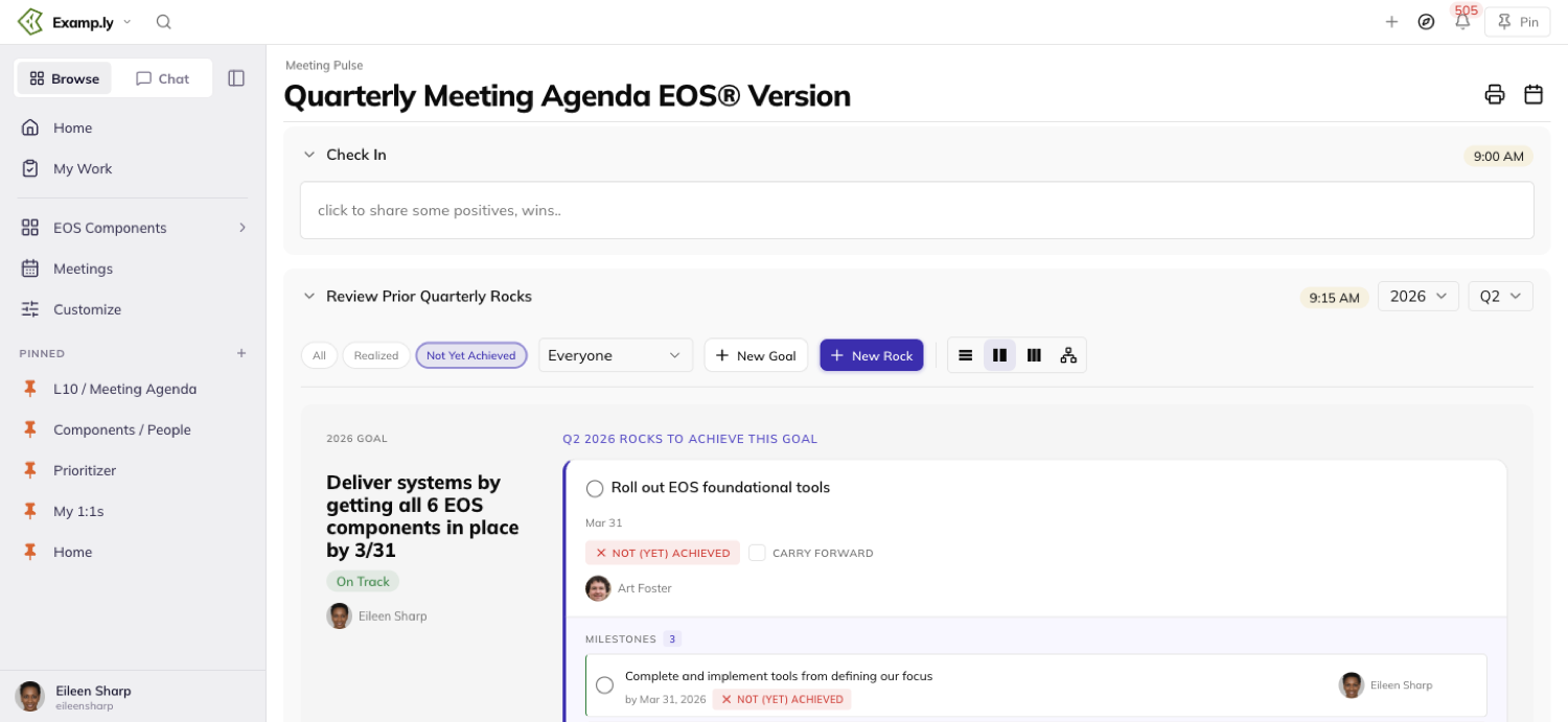
The rows already there move down and keep their own order beneath it.
Reload the page and the new row is still first — the order painted is the order that was saved.
Adding a next step never touches the Issues section beside it. Only the Next Steps list changes.
Carry a Rock into the new quarter
Carrying a Rock forward makes a copy for the new quarter.
The original stays exactly where it was, in the quarter that closed.
Only the Rock's unfinished milestones come across.
Whatever was already complete stays on the record of the quarter that finished it.
The copy starts clean — no on-track or off-track history, no judgement carried over from last quarter.
It keeps the original's owner, not whoever ran the carry-forward.
Carry a Q4 Rock forward and it lands in Q1 of the following year, not back in Q1 of the same one.
Try to carry the same Rock into the same quarter twice and the meeting names why, right on the agenda.
It names the Rock and the quarter pair already carried. Nothing new gets created.
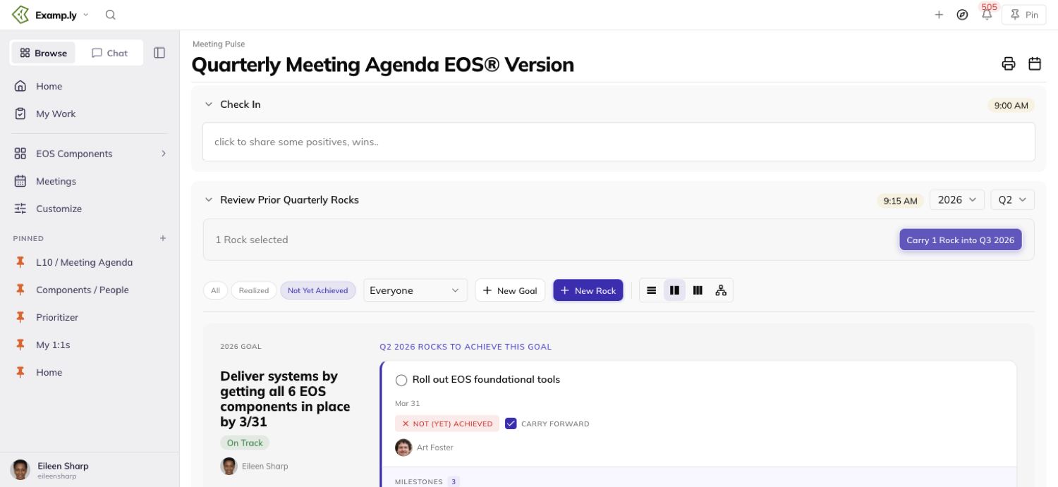
Only a team admin can carry Rocks forward, and only on a team running EOS.
Tick off your team's EOS Tools
The Quarterly agenda carries twenty EOS Tools tiles — the practices a team running EOS checks off as it adopts them.
A team admin ticks and unticks them. Everyone else on the team can only read the state.
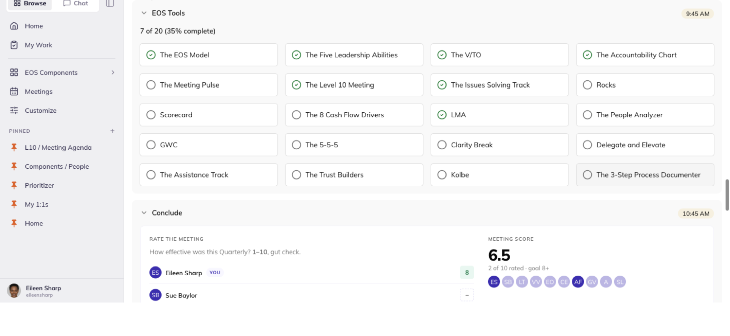
A tile ticked here shows the same way in the legacy app, and the reverse.
Both apps write the one record, not two records kept in sync by hand.
Print the quarter
Click Print on the Quarterly agenda and it opens the Team Business Review — the report itself, not a second print pipeline.
It opens already set to the meeting's own year and quarter.
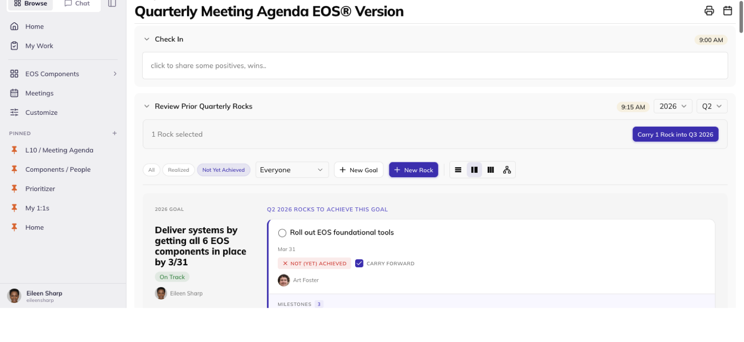
The meeting stays open behind it. Printing isn't limited to team admins — any member sees the same doorway.
From the report, Print in its own toolbar builds the deck in your browser.
It downloads a PDF named for the team and the quarter on screen — no server round-trip.
The deck matches the screen exactly. Every slide shown prints, in the same order.
A section with nothing to show — no Marketing Strategy recorded, say — is left out of both.
Read the report before you print it
The Scorecard section lists every measurable with its owner, its goal, and its weekly values for the quarter.
A week nobody recorded shows blank, never a guessed number.
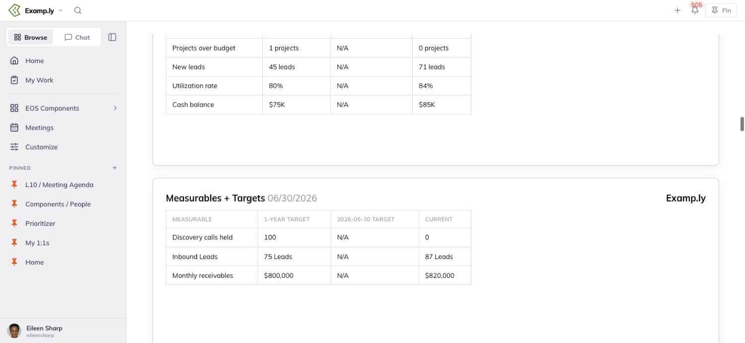
The quarter and year selectors always read the actual quarter, spelled out — "Q2", "2026" — never a bare digit.
The cover slide shows your team's own logo if it has one.
It falls back to the ResultMaps logo if the team has none, or if the stored one fails to load.
Vision fields — Purpose, the values beneath it — show as plain text, however they were formatted when someone typed them.
Under EOS terminology, the card holding Purpose is headed "Core Focus", not "Focus."
Find Quarterly Meetings from the Meetings hub
Open Meeting Pulse and three tiles are waiting: Level 10 first, Quarterlies second, 1:1 (One-on-One) Meetings last.
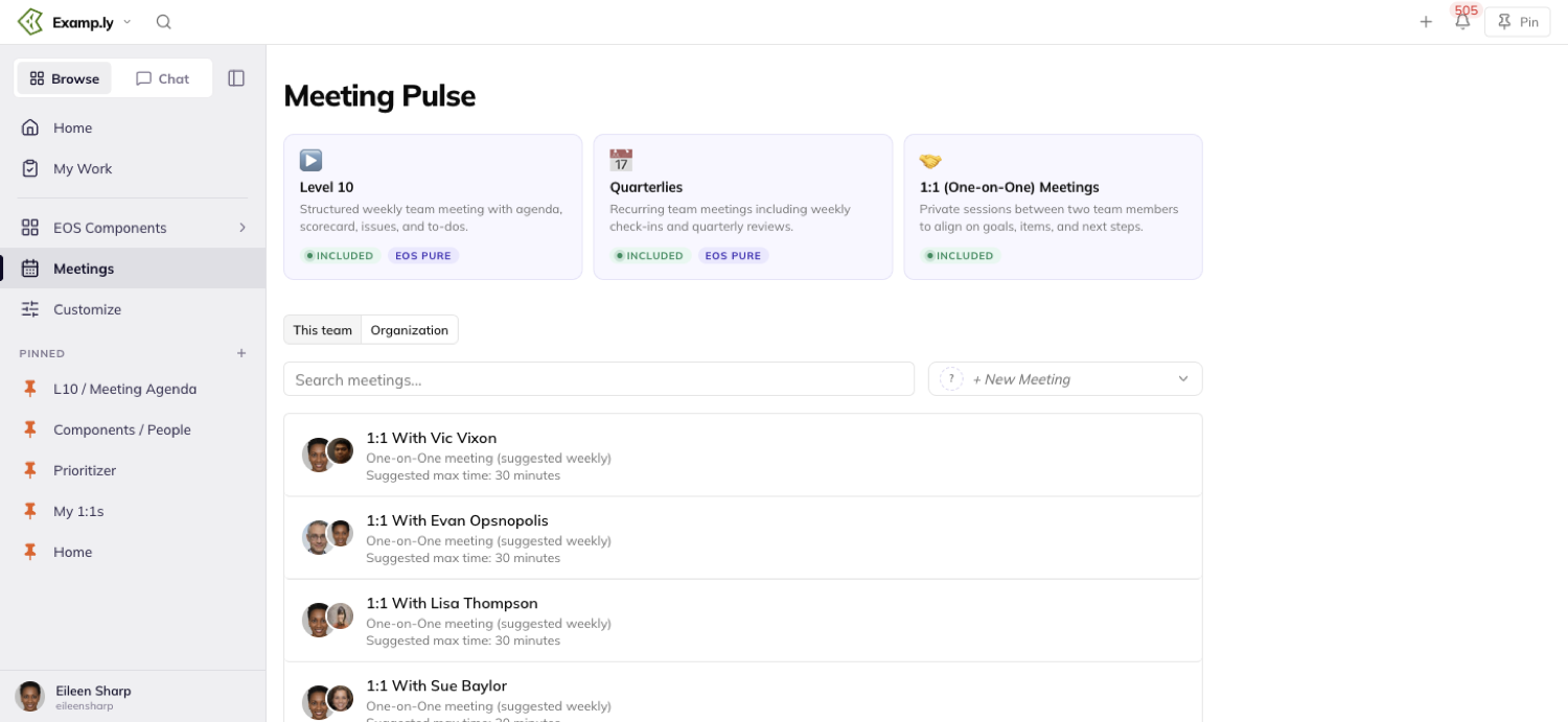
Level 10 and Quarterlies both carry an EOS Pure pill beside their green Included pill.
The 1:1 tile carries neither — it isn't an EOS practice the way the other two are.
Every team member sees the same order and the same marking, whether or not they administer the team.
Seeing last quarter's Rocks from Level 10
The Level 10 Meeting's own Agenda tab has a related control, in its Rock Review section.
It's a switch to show last quarter's Rocks instead of the current ones.
Flip it and the list repaints at once, before the save even finishes.
The choice is remembered — the next time Level 10 opens, even in a new session, it opens the way it was left.
Was this helpful?
Publish a Page to the Web
Every page you write in ResultKit is private to your team until you say otherwise. Publishing changes that for one page at a time: it mints a live link you can hand to anyone, while the page itself stays exactly where it is, in your team's page tree, still yours to edit.
In this article
There are two ways to share, and the difference between them is the whole decision. Anyone with the link means exactly that — no ResultKit account required, the link is the key. Anyone with a ResultKit login keeps the link but adds a door: visitors must sign in to a ResultKit account (any account, from any organization) before they see a word. In this article we'll publish a page both ways, see exactly what each kind of visitor gets, learn how to tell at a glance what your team has published, and take a page back down.
One thing to hold onto before you start: publishing covers the page you publish and nothing else. Sub-pages stay private until each one is published on its own, and the public link never exposes your page tree.
Open Publish to web
Open the page and press the ⋯ menu at the top right, then choose Publish to web….
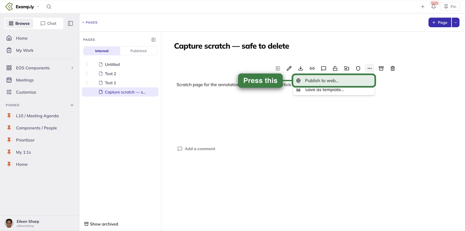
If you don't see the entry, that's the permission telling you where you stand: publishing belongs to the page's author and to team admins. Being able to edit a page is not enough to publish it — putting something in front of the world is a bigger decision than fixing a typo, and the product treats it that way.
Choose who can view
The dialog opens with a warning banner you're meant to actually read: Public even to people outside my organization. That's the honest description of both choices below it.
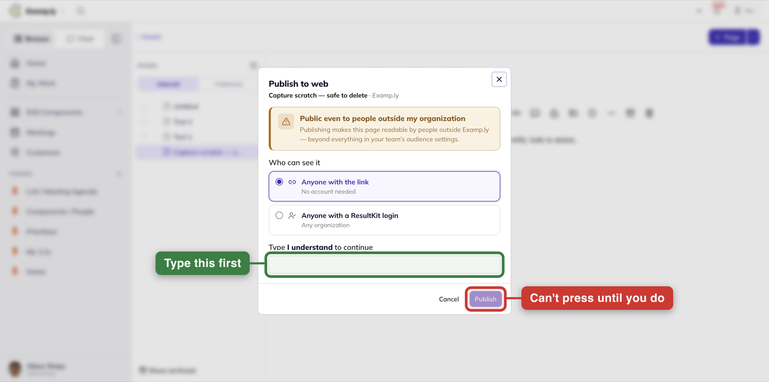
Anyone with the link is the default. The page becomes readable by any person or company you hand the link to — a customer, a candidate, a partner — with no account and no sign-in. The link itself is the only protection: it's long and random enough that nobody will guess it, search engines are told not to index it, and it isn't listed anywhere public. But once you send it, you can't control where it gets forwarded. Publish this way when the content is genuinely fine for the open internet.
Anyone with a ResultKit login is the gated case. The link works the same way, but a visitor must be signed in to ResultKit before the content appears — any live ResultKit account will do, including accounts from other organizations. What this buys you is accountability, not secrecy: nobody anonymous ever reads the page, but it is not limited to your own company. Publish this way for content meant for the ResultKit community rather than the whole internet.
If what you actually want is "only my team" or "only certain people," don't publish at all — that's what the page's regular sharing controls are for.
Say it out loud, then publish
Below the choices sits a field labeled Type I understand to continue, and the Publish button stays disabled until you've typed exactly that — I understand, capital I. It's deliberately not a checkbox. You're making a page public; the product wants one unambiguous moment where you meant it.
The instant you publish, the dialog shows the live link — it looks like resultkit.ai/p/ followed by a long random code — with a Copy link button beside it, the visibility you chose, and a line recording who published it and when. That record is permanent: even after the page comes back down, your team's history of who made what public survives.
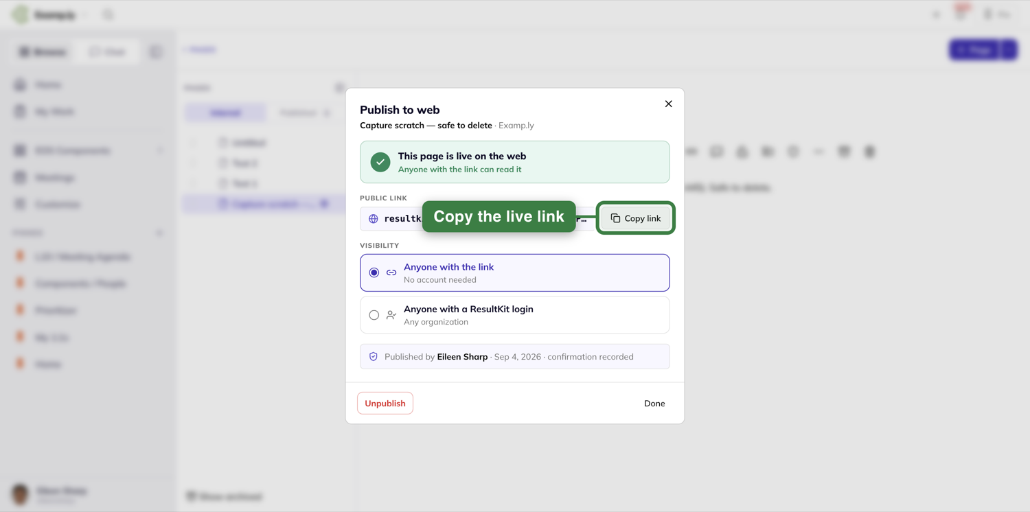
From this moment the link is live, and it stays current. There's no snapshot and no re-publish step — every edit you save shows up at the public link immediately. If the page is a work in progress, remember the world is reading your latest save.
What your visitor actually sees
A visitor to an Anyone with the link page gets the page and only the page: the title, the content, images and all, on a clean reading column with a small Made with ResultKit badge at the bottom. No sidebar, no page tree, no comments, no author name, nothing to click into your workspace. Links inside the page that point at your other, unpublished pages appear as plain text — the public copy never leaks a path into private material.
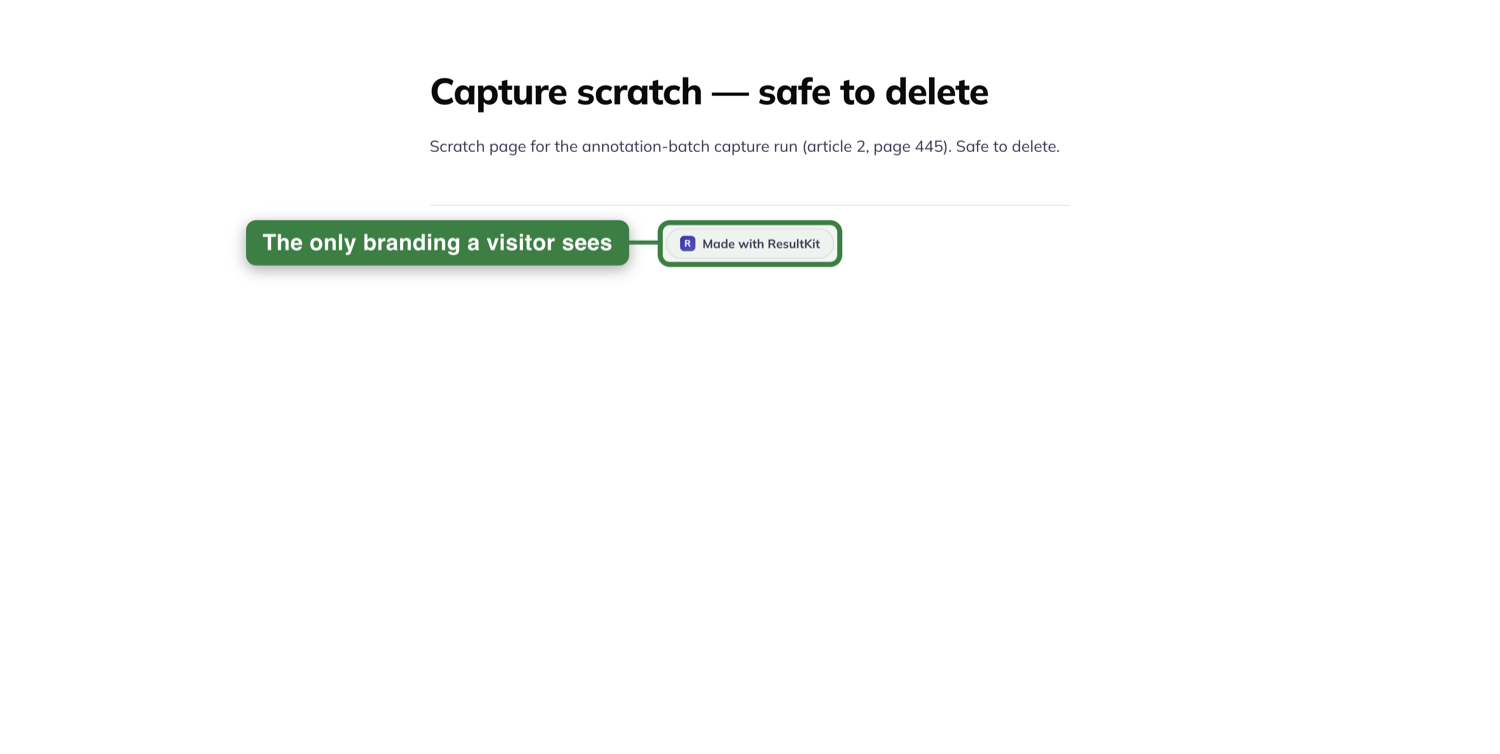
A visitor to an Anyone with a ResultKit login page who isn't signed in sees a gate instead: This page is for ResultKit users — Sign in to view this page — and a Sign in button. None of the content shows until they're through. Once signed in, they get the same clean reading view described above.
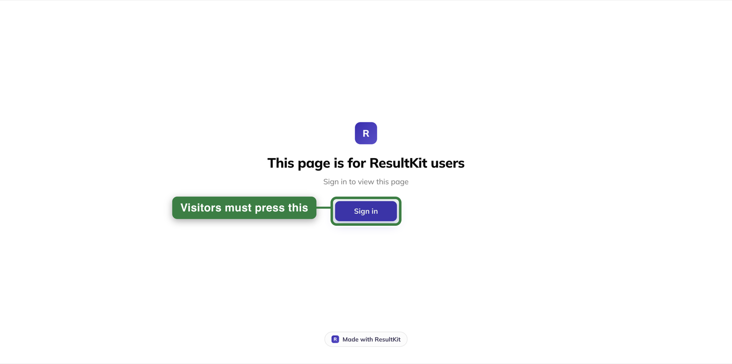
One small exception, and it's a convenience: a teammate who opens the public link while signed in — someone who could already see the page inside the app — gets an Open in app button at the top right, so they can jump from the public copy to the real page.
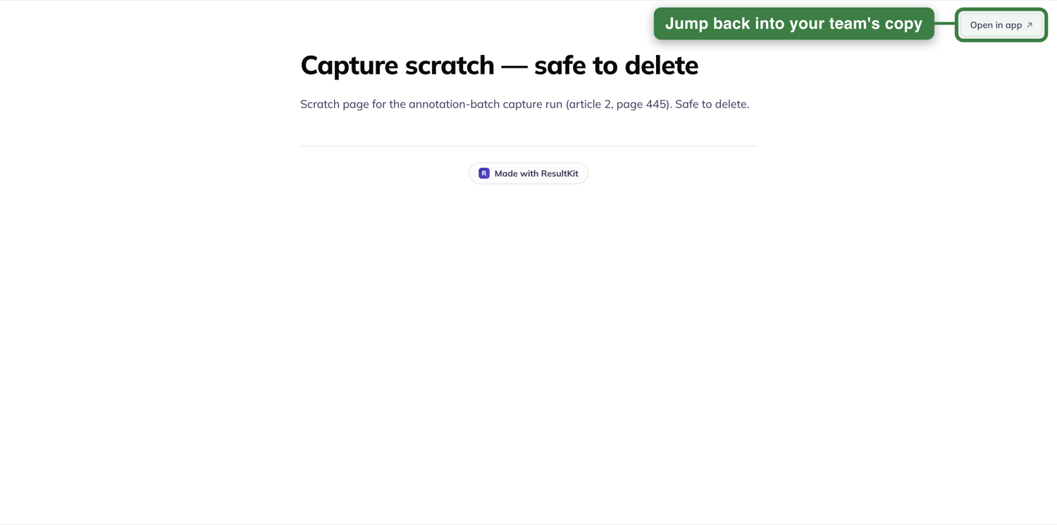
And if a link has been taken down, every visitor sees the same plain "page not found" — a dead link never advertises that something used to be there.
Spot what's published at a glance
Anywhere you can see a page, you can see whether it's public. A published page wears a small globe after its name in the page tree — visible to anyone who can see the page, no admin rights required. Open the page yourself with edit rights, as its author or a team admin, and the same globe appears again under the title, next to your save status.
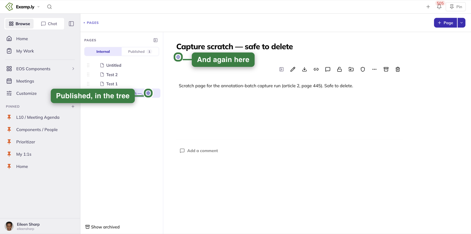
Team admins get one more view. At the top of the page tree sits an Internal | Published switch, with a count of what's currently live. Internal is the tree you know. Published filters that same panel down to only the pages that are public — each with its live /p/ link, who published it, and a green Live dot — the quickest honest answer to "what are we exposing right now?". To grab a page's link or take it back down from here, open the page and return to ⋯ → Publish to web….
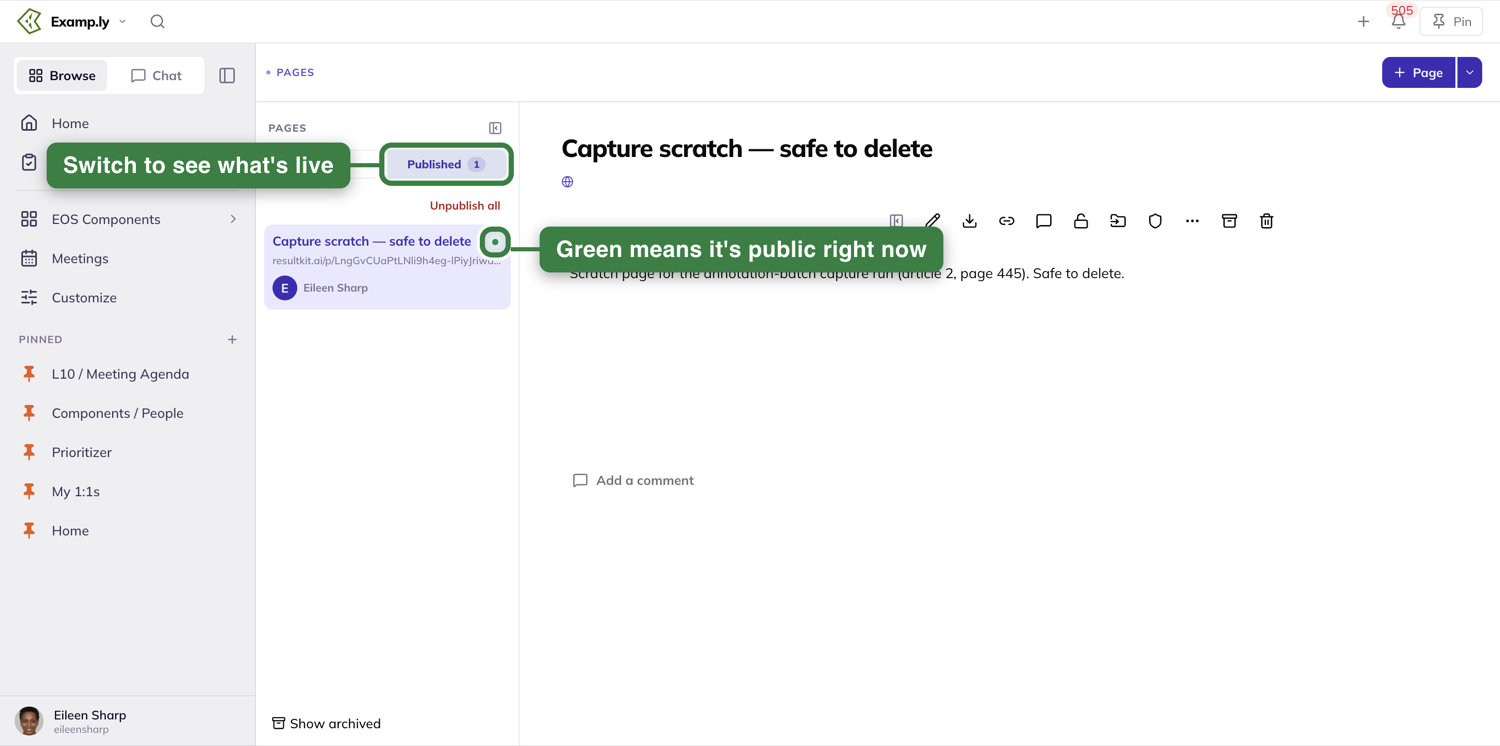
Changing your mind
Everything about publishing is reversible, and the reversals behave the way you'd hope.
Switching the audience — from link-only to login-required or back — happens in the same dialog and keeps the same link. Tighten or loosen the door without re-sending the URL to anyone.
Unpublish — the button waiting in the same Publish to web… dialog once a page is live — kills the link the moment you click. Anyone holding it gets "page not found," and images that were on the page stop loading too. The page itself is untouched — still in your tree, still editable, just private again.
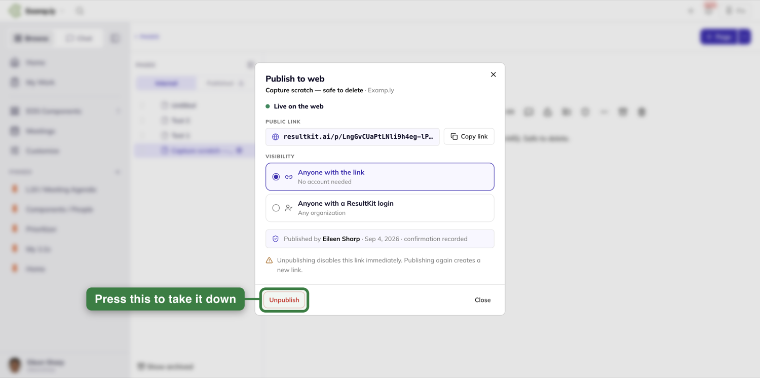
Publishing again creates a brand-new link. The old one is gone for good — intentionally. If a link escaped to somewhere it shouldn't have, unpublish and republish, and the escaped copy is permanently dead while you carry on with a fresh one.
Archiving a published page unpublishes it automatically, and a page restored from the archive comes back private. Nothing quietly stays public after you've put it away.
Was this helpful?
ResultKit Pages — Finding, Creating, and Managing Pages
You need a way to document your processes, knowledge, and meetings so AI can get to it easily without losing context. Your AI and your people can get confused getting business context around processes and knowledge management. Multiple sources of permissions, folders, and noise flood AI and people's brains. We fix that by giving you an AI-first place for processes, knowledge, and AI skills/context files, the things that support your business operating system. It fully integrates with your other systems, and it gives your AI a better way in: one clean place to read from, with the permissions you set. That means you, your AI and your team get to your processes, knowledge and meetings easily, without losing context, and nothing gets buried in every other tool.
In this article
Every team page lives in one tree, down the left of the Pages screen. Open one and it sits beside the tree.
You never lose sight of where a page sits in the library. The tree scrolls, resizes, and hides on its own — none of that touches the page you have open.
This article covers finding a page, creating one, reordering pages, reaching a page by its own link, archiving one, downloading one, and pinning your favorites.
Find a page in the tree
Open Pages. The tree lists your team's whole library down the left.
Each level is indented one step further than its parent.
The page you have open is the only highlighted row. Click any other row's title to open it.
The highlight moves and the title changes. The tree itself doesn't move or reload.
A long title is cut off with an ellipsis rather than widening the tree.
Rest the pointer on a cut-off row and the full title shows in a tooltip.
Click a row's chevron to expand or collapse its children. Clicking the title opens the page instead — only the chevron folds the branch.
Resize or hide the tree
Drag the handle on the tree's right edge to widen or narrow it, anywhere between 200 and 520 pixels.
Double-click the handle to snap it back to its resting width.
Whatever width you choose is remembered for you. It's there again the next time you open Pages, in the browser you set it in.
Click Hide page list — in the tree's header, or in the page action row — to collapse the tree entirely.
The open page widens to take its place.
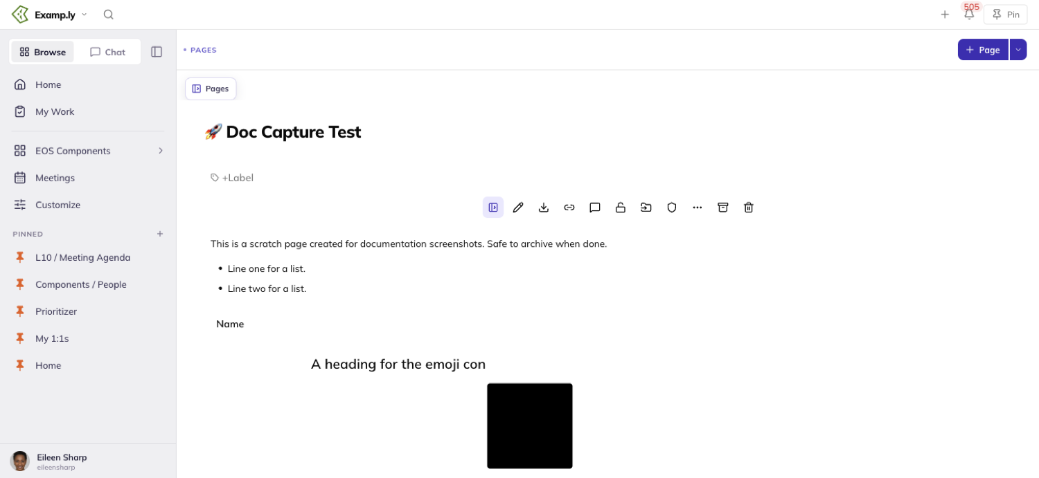
A small Pages chip appears above the page title while the tree is hidden. Click it, or the same toggle in the page action row, to bring the tree back.
Create a new page
Click + Page in the top bar to start a new top-level page.
It appears at once, titled Untitled and already open, before the save even completes.
Hover any row in the tree and click its New sub-page control to nest a page beneath it instead.
The new page lands first among that page's children, above whatever was already there.
A page you drag somewhere else afterward keeps that placement. Being newest only decides where it starts, not where it stays.
Reorder or nest a page by dragging
Pick up a page by its drag handle and move it.
The tree shows you which outcome you're about to get before you let go.
Drag straight down and it reorders among its siblings.
Drag to the right and it nests under the page above instead — the tree names which page it will fold under, before you release.
The page lands exactly where the indicator promised, the moment you release it.
Reach a page by its own link
Every page has its own link. Copy it from the open page.
It identifies that page specifically, not just the Pages screen in general.
Open a page's link and it takes you straight there. If the page belongs to a different team than the one you're in, it switches your active team first.
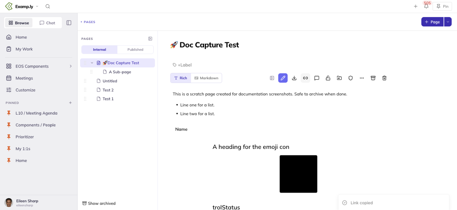
If you're signed out when you open the link, you land on that same page once you sign in — not on a default screen.
A link to a page you can't view refuses the content plainly. It never shows a blank or broken screen.
Archive a page — and bring it back
If you authored a page, or you're an admin of its team, the page action row carries an Archive page control next to Delete page.
Click it and a dialog names the exact page. It states that the page will leave the tree but stay readable, and can come back later.
Nothing archives until you confirm.
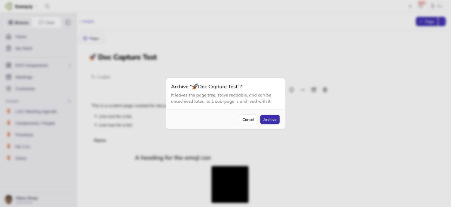
Archiving a page with sub-pages takes them with it. The dialog says how many, and the whole branch leaves the tree together.
An archived page is gone from the tree, but never gone for good.
Click Show archived at the bottom of the tree to reveal it again.
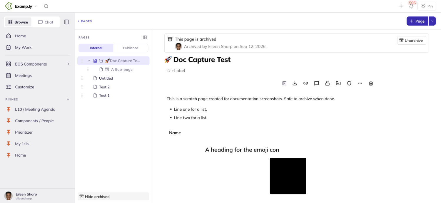
Opening an archived page shows a banner naming who archived it and when, and its body turns read-only.
A page archived before that detail was tracked shows only the date.
An admin or the page's author sees an unarchive control in that banner. Anyone else can still read the page, just not bring it back.
Download a page
Every page carries a download control, open to anyone who can read the page — not only its editors.
Click it and choose a format. Markdown (.md) keeps headings, bold, links, and lists.
Plain text (.txt) strips all of that down to words. Word (.docx) opens as a formatted document in Word or Google Docs.
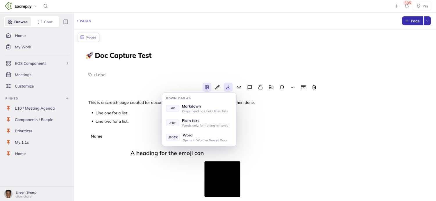
A Preparing… indicator appears the moment you choose. It flips to Downloaded once the file saves.
The file is named after the page's title. It only ever holds that one page's own content — a page with sub-pages downloads without them.
A picture in the body travels inside the Word file and scales to fit the column.
Markdown links to it instead, and plain text marks where it sat with a bracketed line.
Pin a page — and file it in a folder
Click the pin control in the top bar and the page pins immediately, with nothing else to choose.
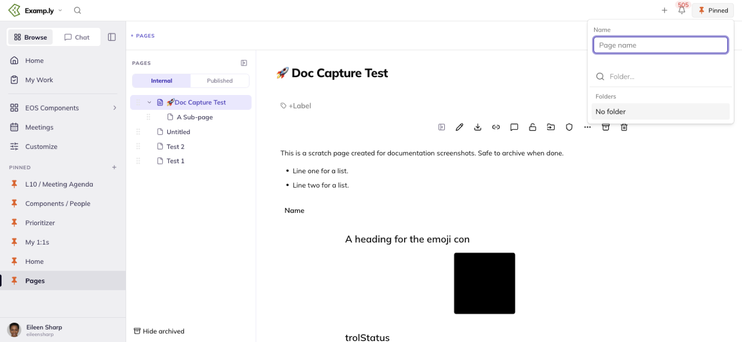
A small menu opens alongside it, offering an optional name and a way to file the page into a folder.
Type an existing folder's name, or a new one — or walk away and leave the page loose.
Pinned pages and folders live in the sidebar's Pinned section.
Click a closed folder to open it, or drag a page onto one to move it in.
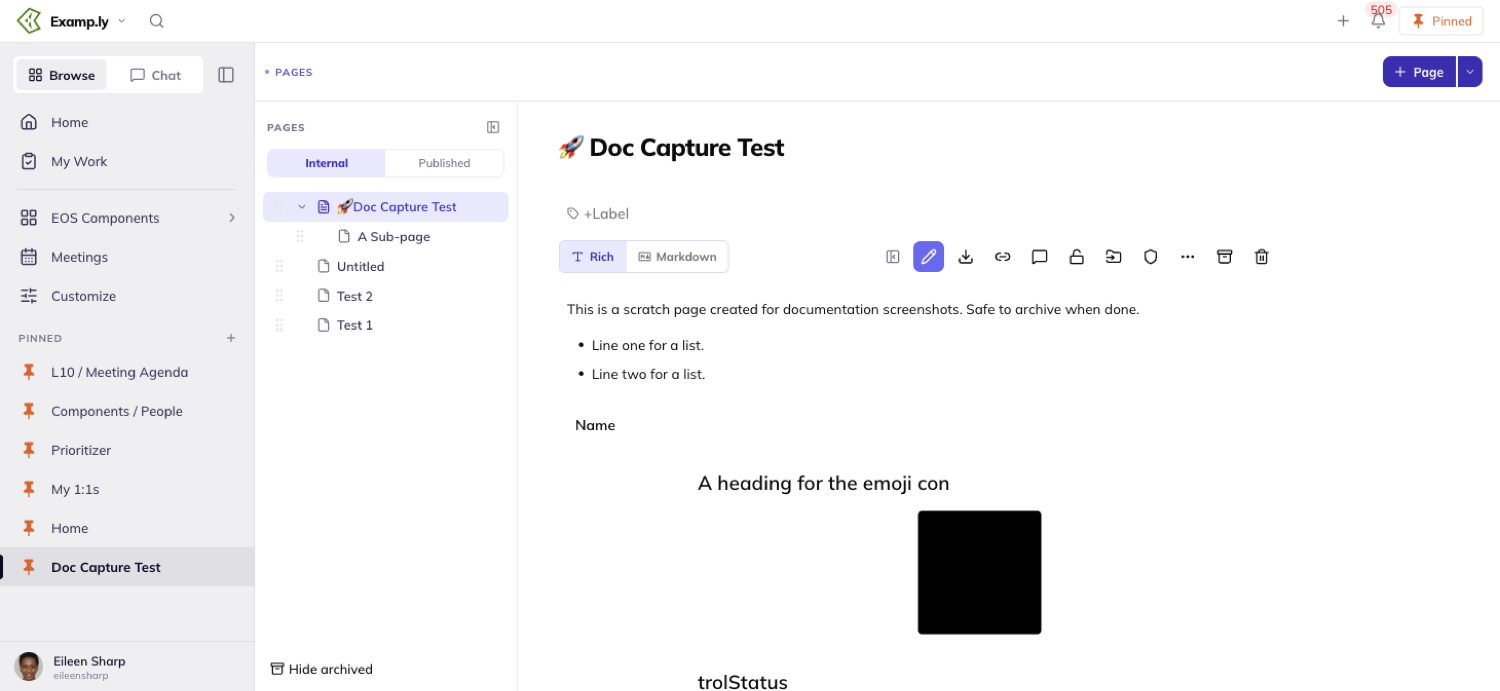
Drag a page below the folders to take it out, or pick Remove from folder from its overflow menu instead.
Deleting a folder never unpins the pages inside it. They drop back to the loose list underneath.
Was this helpful?
ResultKit Pages — Writing and Formatting a Page
A page's body is yours to shape. Select text and a formatting bar appears right over it, with bold, headings, and three kinds of lists. Drop in a picture, add an emoji, or write the whole thing in markdown if you'd rather type than click.
In this article
Click into a title or a body and you're editing — there's no separate mode to open first.
This article covers editing a page, formatting from the selection bubble, markdown mode, tables, pictures, and emoji.
Start editing a page
Click into the title, or anywhere in the body. You're editing at once.
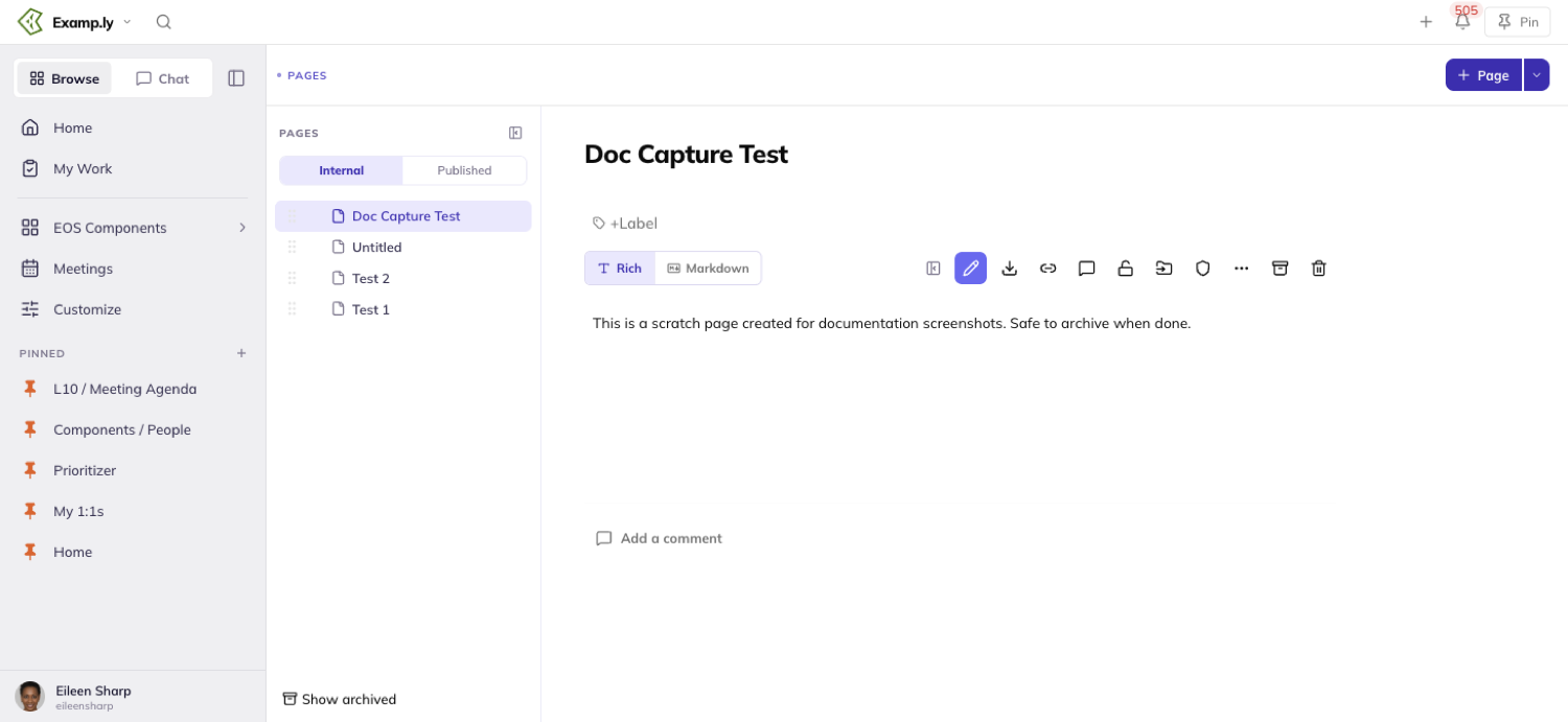
You can also click the pencil in the page's action row. It only appears if you have edit rights, and it disappears entirely on a locked page.
Clicking in and typing nothing, then clicking away, leaves the page untouched. Entering edit mode by itself isn't a change.
Nothing on screen ever announces a save — no "Saving," no "Saved," no spinner. Autosave runs quietly in the background the whole time you're typing.
Format text with the selection bubble
Select any run of text and a bubble appears right above it — or below, if above would cover the action row.
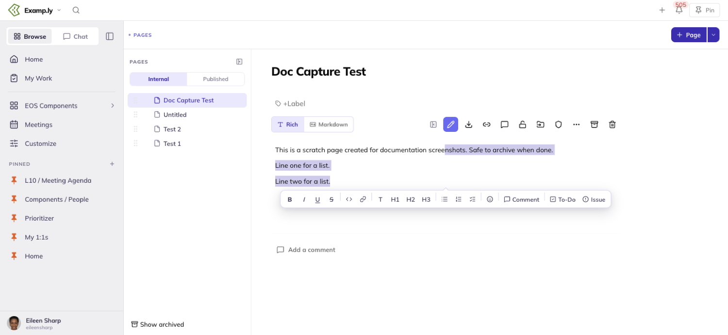
It carries Bold, Italic, Underline, Strikethrough, inline code, a link tool, four text-style buttons — paragraph and three heading levels — and three list buttons.
Click a control and the change paints at once. Click the same control again to undo it.
Keyboard shortcuts work too — ⌘B for Bold, for instance — without ever opening the bubble.
Turn lines into a list or checklist
Select more than one line and click Bulleted list, Numbered list, or Checklist on the bubble.
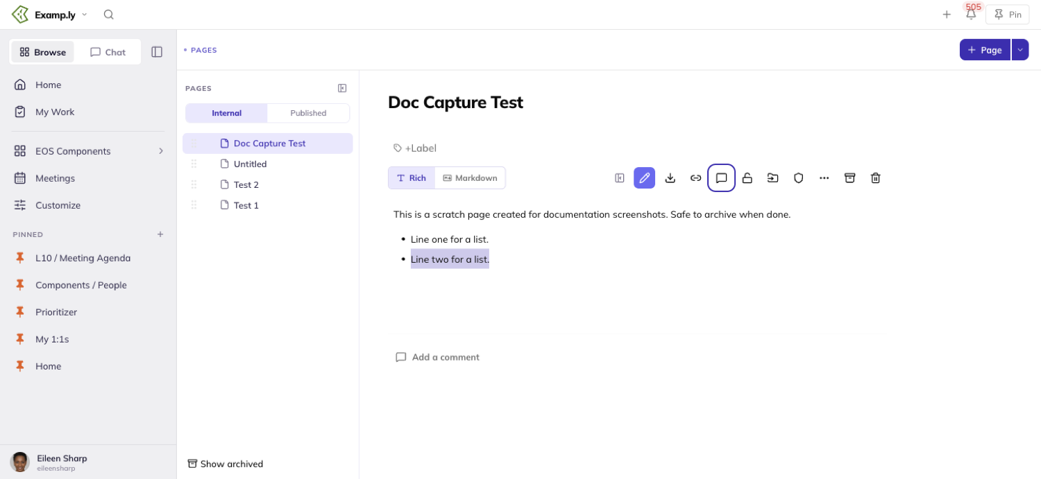
Switching a selected list from one kind to another converts it in place — it never nests one list inside another.
A checklist's checkboxes toggle on their own, independent of the bubble.
Write in markdown
Click Markdown at the left of the controls row below the title, and the page's own content appears as literal markdown — headings as ##, list items as -.
Edit it as text and click Rich to switch back — your changes render formatted immediately.
The shortcuts work in Rich mode too, without switching anything: type # then a space to start a heading, or - then a space to start a bulleted list.
Build a table
In Markdown mode, type a header row and a delimiter row, ResultKit-style — a line of dashes under the headers — then switch back to Rich.
Lining up the dashes with colons controls alignment — a colon on the left, both sides, or the right sets that column's alignment when it renders.
Add a picture
Drag an image file from your desktop into the body, or paste one from your clipboard. It appears right where you dropped or pasted it, immediately.
Paste more than one image at once and both land, in the order they were on your clipboard.
An image the page can't keep — too large, or one that fails to upload — is refused with a reason on screen. It never quietly disappears after you reload.
Drop in an emoji
Hover the title, or put your cursor in it, and an Emoji chip appears just above it.
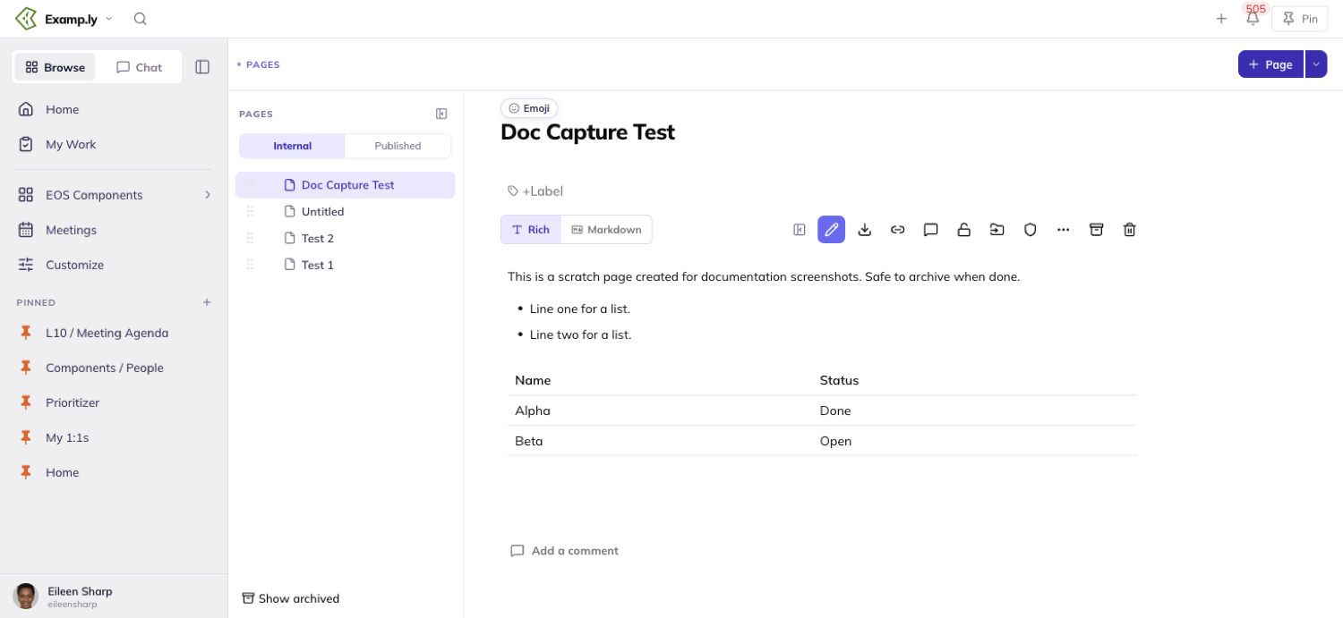
Hover any heading and its own smiley shows in the margin beside it. Select body text and the bubble carries the same smiley.
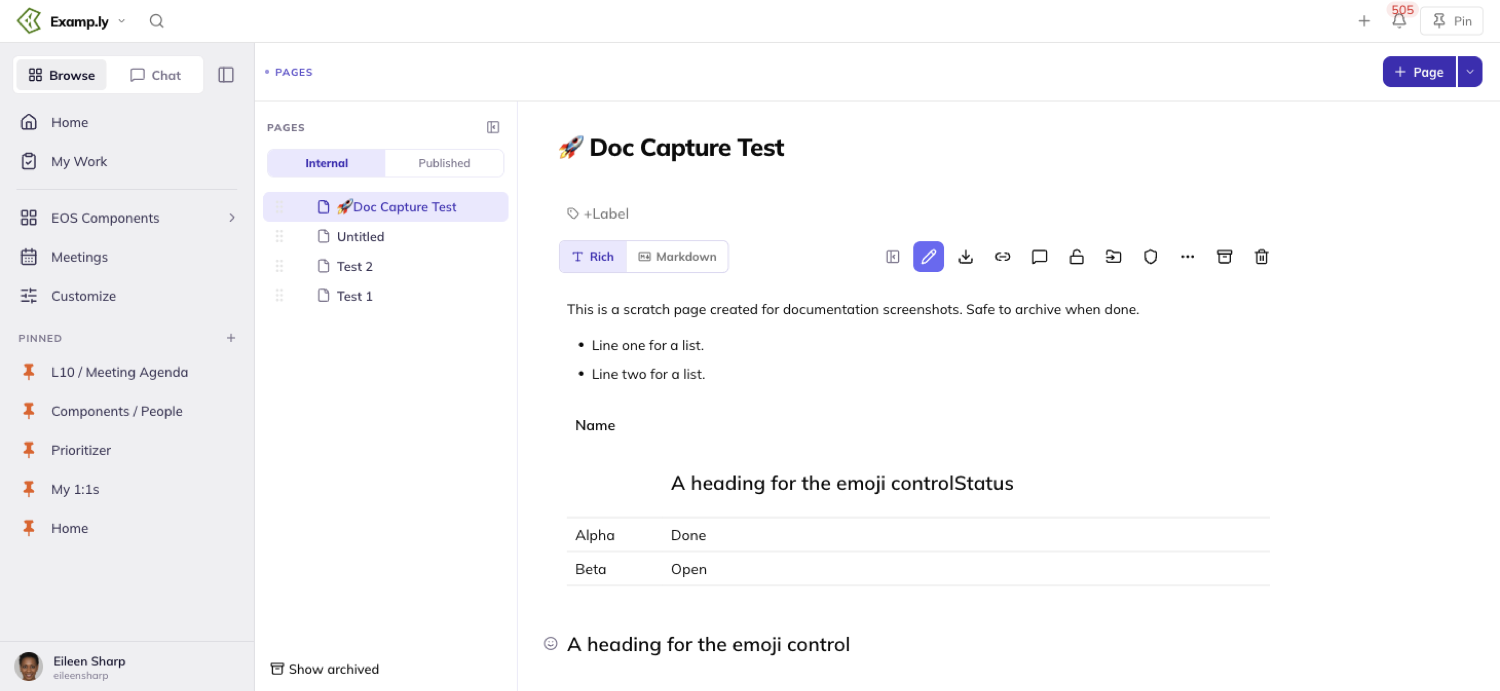
Every path opens the same picker: a fixed grid of thirty emoji, no search box and no categories.
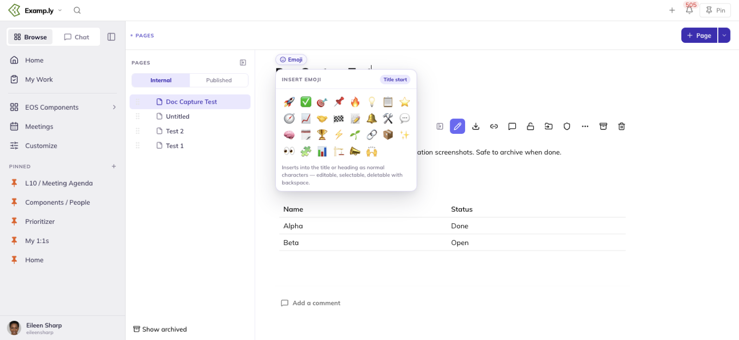
Picking one puts it at the very front of the title or heading, replacing one already there. In the body, it replaces whatever text you had highlighted.
The emoji is ordinary text once it lands — backspace deletes it like any other character.
Who can format a page
Selecting text to copy it works for anyone who can see the page. Formatting it doesn't.
Someone with view-only rights gets no bubble, no pencil, and no emoji controls anywhere — the page stays read-only for them, start to finish.
What a locked page won't let you touch
A locked page shows no pencil, no matter whose edit rights you hold.
Locking changes who may edit — nothing else. Every block on the page, read before the lock, during it, or after unlocking, comes back exactly as it was.
Was this helpful?
ResultKit Pages — Who Can See and Edit a Page
Every page's audience is yours to set — the whole team, specific people you name, or just yourself. That's separate from who can create a page in the first place.
In this article
Two different things govern access. A per-team setting decides who may create a page at all, and a per-page panel decides who can see one once it exists.
This article covers the team-wide creation setting, choosing a page's audience, what a new sub-page inherits, what a team admin can always reach, and how view rights differ from edit rights.
Set who can create pages on your team
Open your team's detail page and find the Who can create pages setting.
It offers exactly two choices: All members and Admins only. All members is the default until someone changes it.
Click Admins only and it takes effect at once, saving behind you.
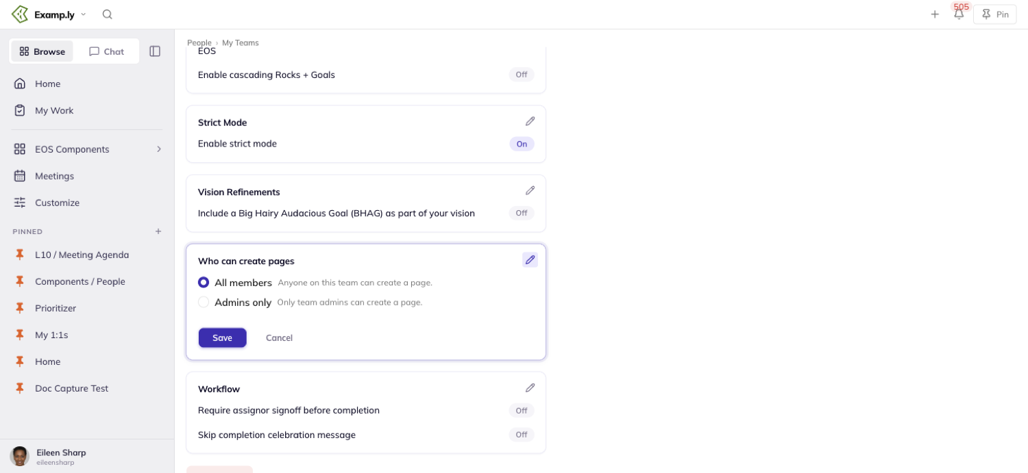
Only a team admin sees this setting at all. Anyone else's team detail page simply has no such control — not a disabled one.
Changing it never touches any existing page. It governs who may create a new one, not who can see the pages already there.
Choose who can see a page
Open Manage permissions from the page's action row to reach the Who can see this page panel.
Every new page starts visible to Whole team, whether or not you name anyone else.
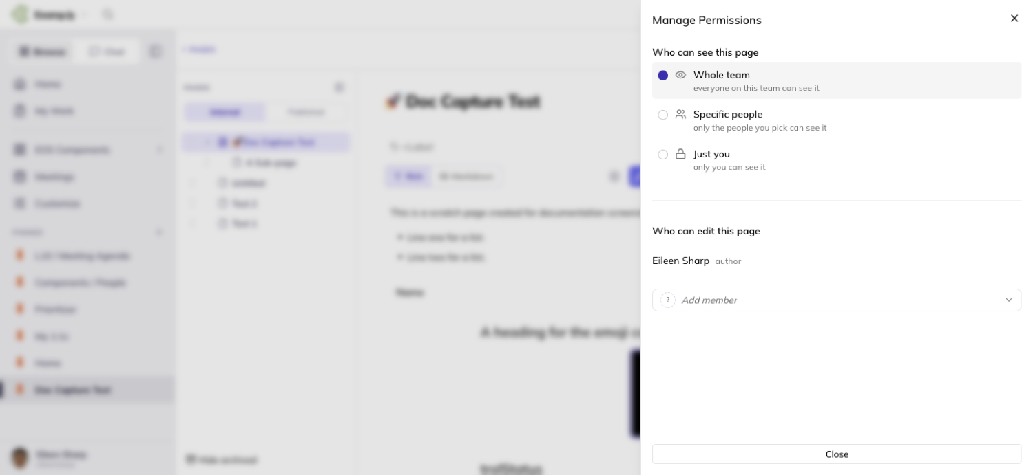
The panel offers three rows: Whole team, Specific people, and Just you. None of them has anything to do with publishing a page to the public web — that's a separate control entirely.
Add or remove specific people
Turn on Specific people and name someone. Their chip appears at once, and the save follows behind it.
Whole team and Specific people are independent grants, not alternatives. Naming someone under Specific people never turns Whole team off — the two simply add together.
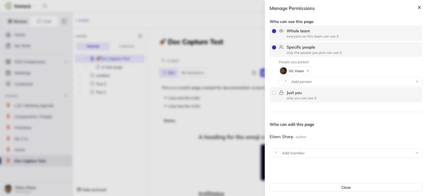
Removing a person's chip takes away only that person's access. Everyone else you named keeps theirs.
The page's own author has no remove control on their own access. Even a direct attempt to revoke it is refused.
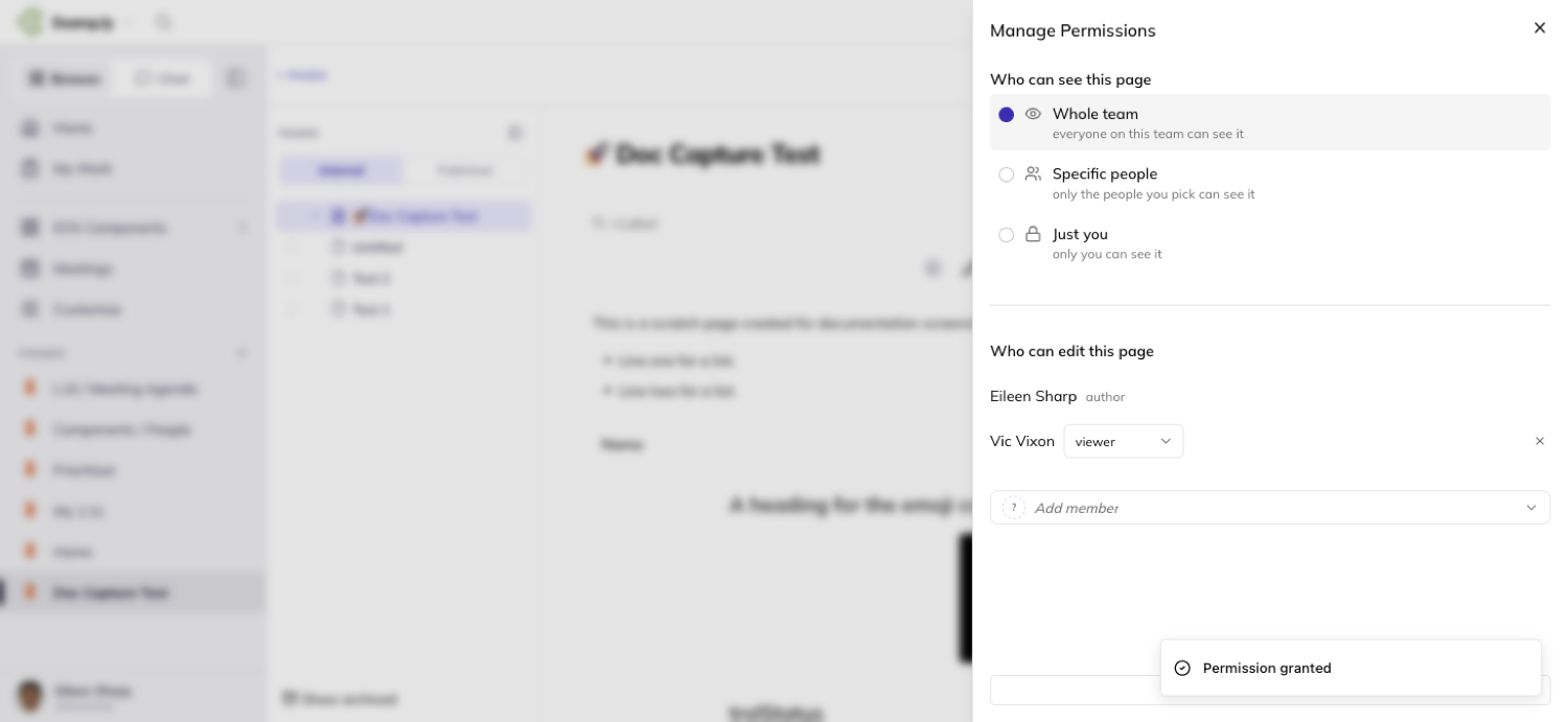
Clear a page down to Just you
Click Just you and both grants clear in the same instant. Whole team turns off and every chip under Specific people disappears.
It's a single action, not a sequence of separate clearings.
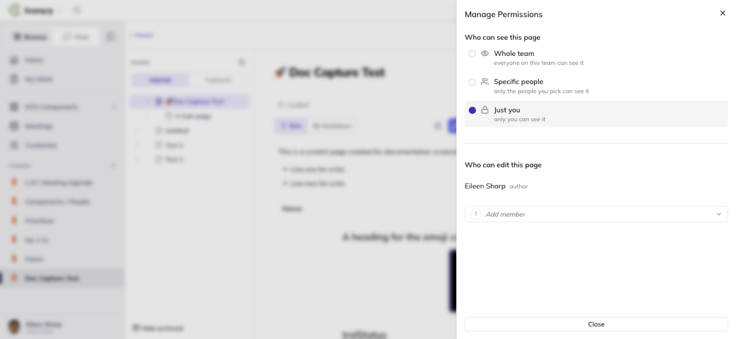
Turn Specific people back on afterward and it starts empty. Nothing remembers who was named before — you name people again from scratch.
Know what a sub-page inherits
A new sub-page starts with its parent's audience, copied at the moment you create it.
After that, the two are independent. Restricting the parent later leaves an existing child exactly where it was, and widening the parent doesn't widen it either.
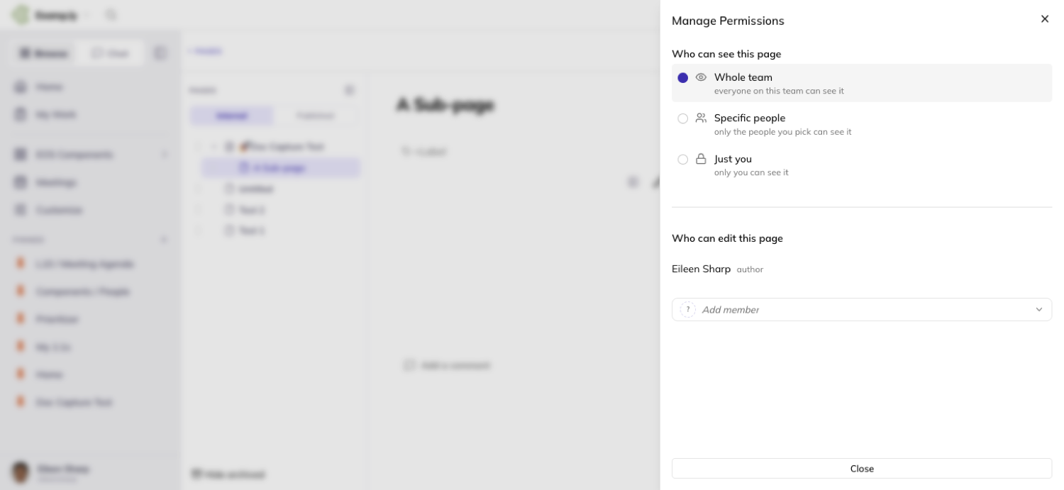
Changing a child's own audience never reaches back up. A page owns its own audience, and neither its parent nor a sibling follows it.
What a team admin can always reach and restore
A private page — one set to Just you — stays out of a team admin's ordinary page tree, exactly like everyone else's.
Nothing on screen hints that such a page exists. Getting to one takes a deliberate restore action a team admin has for pages on their team.
That action isn't silent — it's recorded and readable, and it doesn't change the page's own audience. The author's Just you setting stays exactly as they left it.
The restored access shows up in the page's own Manage permissions panel, naming the admin and the reason. It carries no remove control — a team admin's restored access isn't the author's to take away.
Standing view and edit rights
Being named in a page's audience only ever grants reading it. The audience decides who can see a page, never who can change it.
Editing takes a team admin, the page's author, or someone holding an editor or contributor grant on that specific page.
Commenting needs nothing extra. If you can see the page, you can comment on it — the Comments toggle is simply there once the page is in your tree.
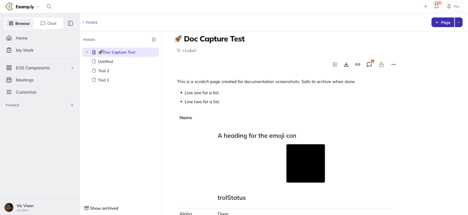
Delete and move stay with the team admin or the author alone, even for someone holding an editor grant. Being able to edit the words isn't the same as being able to remove or relocate the page.
Was this helpful?
ResultKit Pages — Commenting on a Page
Every comment on a page lives in one place — the Comments panel docked to the right of the document.
In this article
- 1Open the Comments panel
- 2Leave a comment on the whole page
- 3Comment on a specific passage
- 4Reply in a thread
- 5Resolve a thread, or reopen one
- 6Travel between a comment and its passage
- 7Filter the panel
- Edit or delete your own comment
- What happens to comments as a page changes hands
- Who can comment
- Who gets notified
That's true whether it's pinned to one passage or addressed to the whole page.
The page body itself carries only two signals.
A subtle highlight marks any commented passage. A row at the end of the document counts the conversation and opens the panel.
This article covers leaving and replying to comments, resolving and reopening threads, and traveling between a comment and its passage.
It also covers filtering the panel, and what happens to comments when a page is archived, moved, or deleted.
Open the Comments panel
Every page loads with the panel closed.
A badge on the toolbar's Comments button and a row at the end of the document are the only signals a conversation exists.
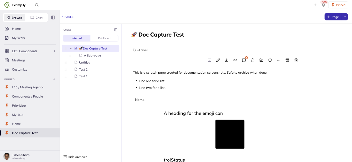
Click the toolbar's Comments button, or the end-of-document row, to open it.
Either one works the same way. Escape, or the panel's own close button, collapses it again.
On a page with no comments at all, the end-of-document row reads "Add a comment" instead of a count.
That's the only thing on screen saying commenting is possible here.
Leave a comment on the whole page
Open the panel and type into its composer at the top — the one that reads "Add a comment to this page…".
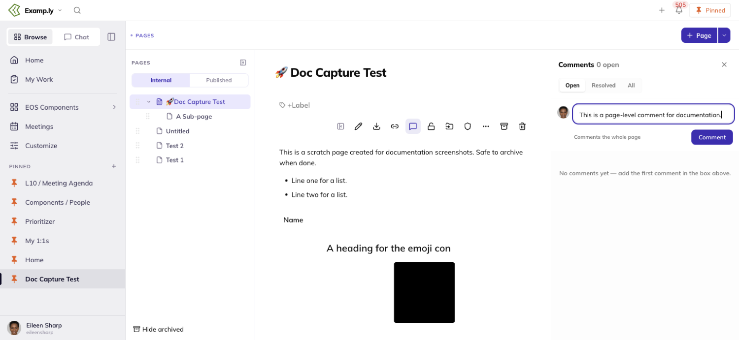
The Comment button stays disabled until you type something.
Click Comment, or press Cmd/Ctrl+Enter — either one posts it.
The new thread appears at the top of the panel immediately.
The page's save indicator settles from "Saving…" to "Saved" right after.
A comment over roughly 65,000 characters is refused with a clear error, not silently trimmed.
Nothing you typed is lost — you just have to shorten it.
Comment on a specific passage
Select a run of text in the document, by mouse or by keyboard.
A small toolbar appears above it with Bold, Italic, Link, and Comment.
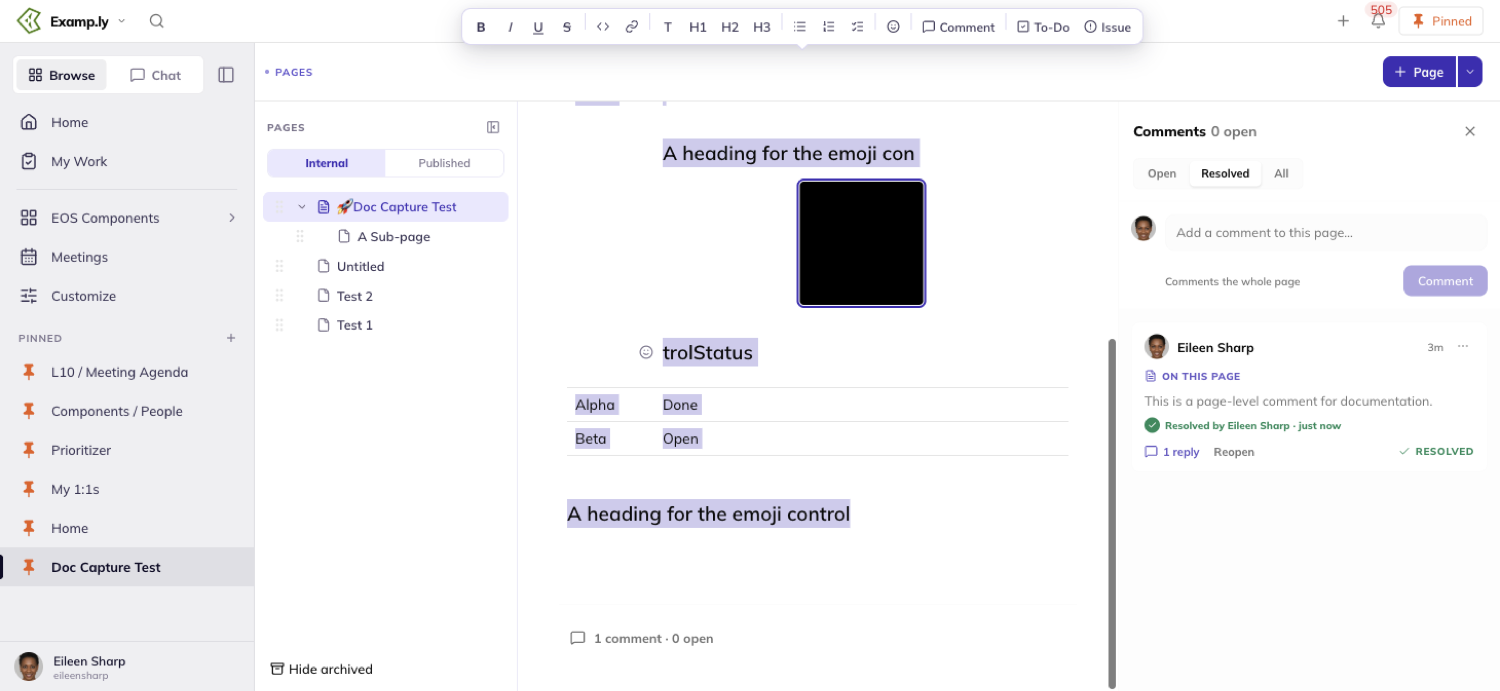
Click Comment and the passage gets a dashed, pending highlight right away.
The panel opens with a composer pinned to the top, already quoting your selection.
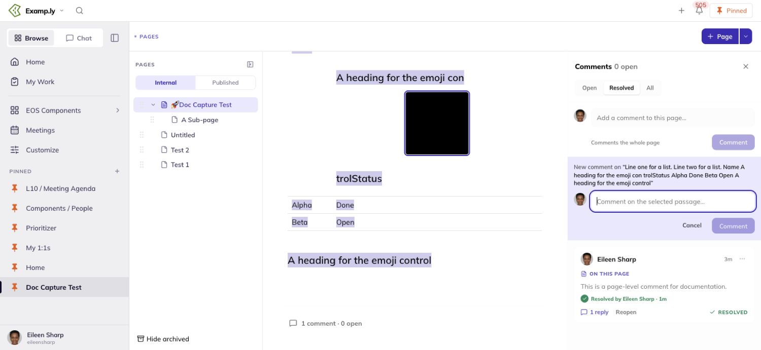
Submit it and the dashed highlight turns solid.
Cancel, or press Escape, and the highlight disappears — nothing is created.
Editing the wording around a commented passage leaves its highlight alone.
If the exact passage gets rewritten or removed, its thread isn't deleted.
It stays in the panel, tagged "original text changed", with no highlight left to click.
Reply in a thread
Click a thread's replies control to expand it, or click straight into an already-expanded reply field.
Type your reply and click Reply, or press Cmd/Ctrl+Enter.
It appears under the thread at once, carrying your own name and avatar — never the name of whoever started the thread.
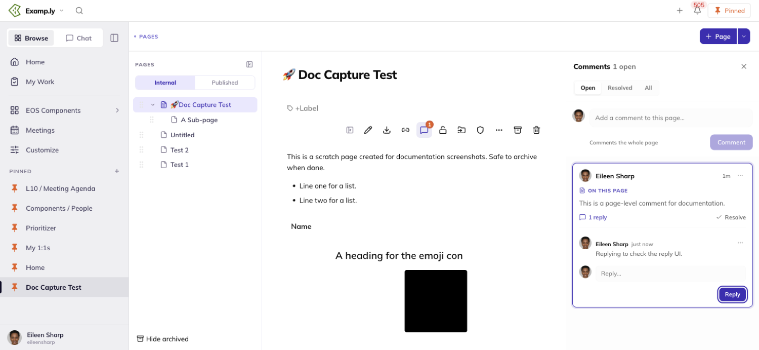
Replying to a resolved thread doesn't reopen it.
It just adds your reply, and the thread stays resolved until someone clicks Reopen on purpose.
Resolve a thread, or reopen one
Anyone who can see the page can resolve any thread — including one they didn't start.
Click Resolve and it leaves the panel's Open view right away.
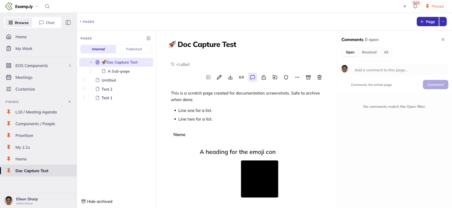
Resolving is silent — there's no "Saving…" indicator, unlike posting or editing a comment.
A resolved passage's highlight switches to a green, resolved style in the document.
Reopen brings a resolved thread back, and shows who resolved it and when.
Reopening it also increments the toolbar badge again.
Travel between a comment and its passage
Click a highlighted passage in the document and its thread opens selected in the panel, scrolled into view.
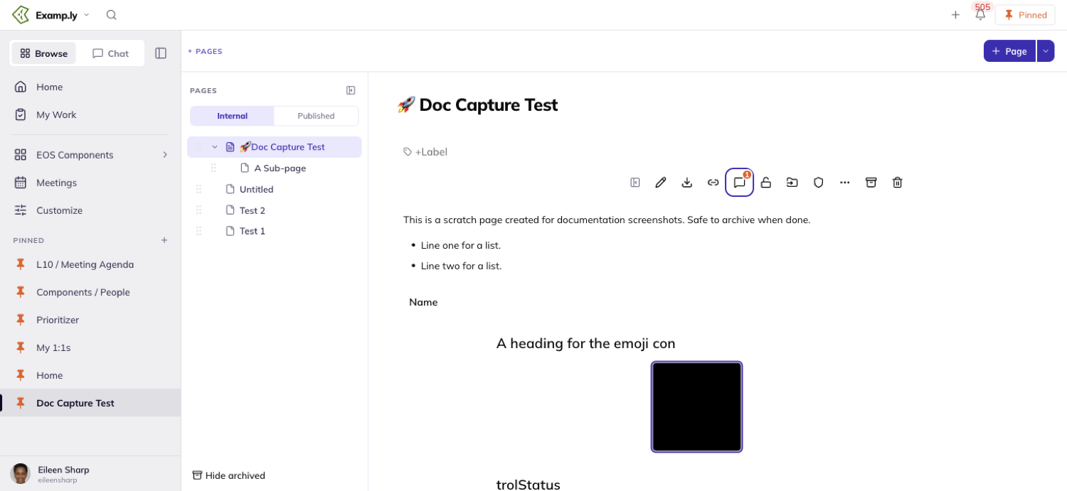
Click a thread's card in the panel instead, and the document scrolls to its passage and flashes once.
Only one pairing holds at a time — one selected card, one active passage.
Clicking elsewhere in the document, or selecting a different thread, clears the old pairing first.
A page-level thread has no passage to travel to.
Selecting it in the panel leaves the document exactly where it was.
Filter the panel
The panel opens on Open by default.
Switch to Resolved or All with the filter controls at its top.
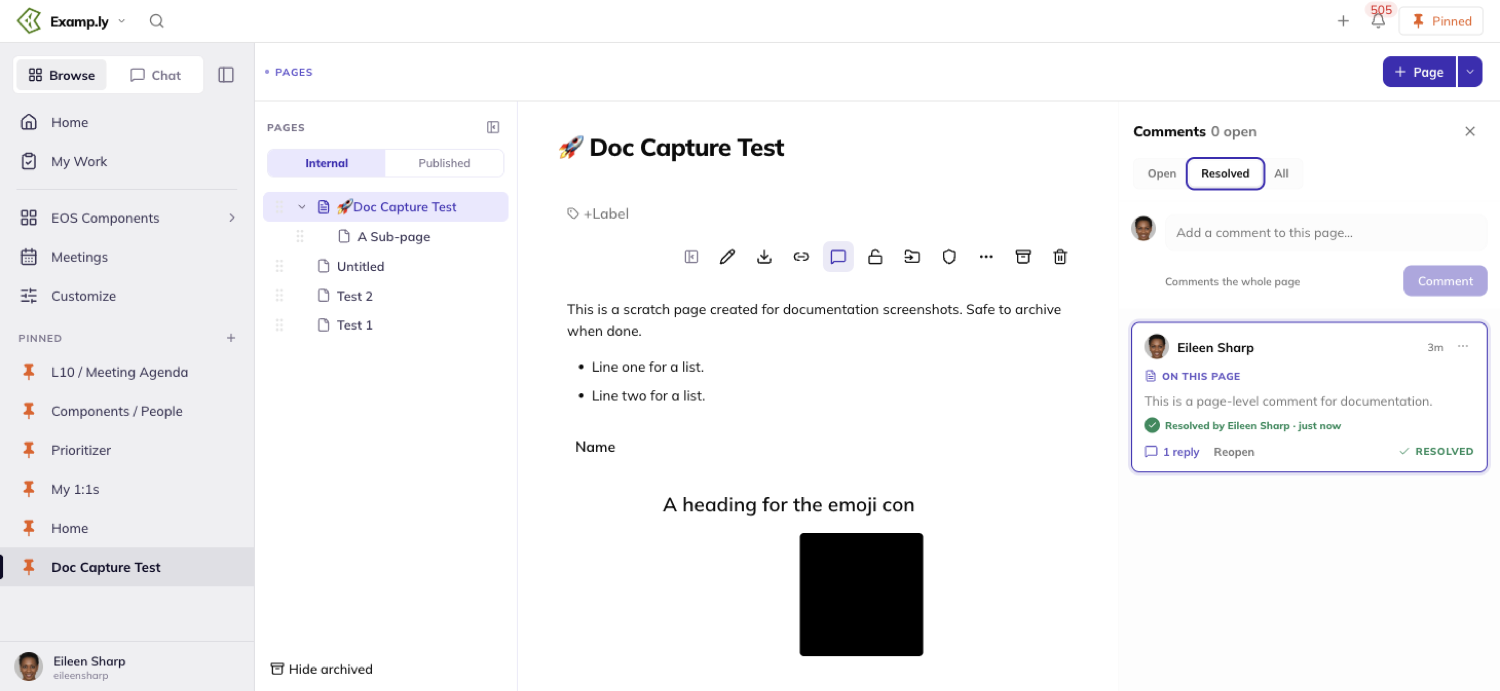
Your filter choice is remembered for you, per page, the next time you open that page's panel.
It doesn't change what you see on any other page.
Edit or delete your own comment
You can edit or delete a comment you wrote, from a control on that comment itself.
Nobody else gets that control on your words — not even a team admin.
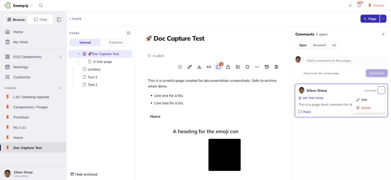
What happens to comments as a page changes hands
Archiving a page freezes its comments read-only.
You can still read every thread, but you can't add, reply, resolve, or reopen until the page is unarchived.
Deleting a page deletes its comments with it.
Restoring a deletable page brings them back intact.
Locking a page freezes its body text, but not its comments — you can still comment, reply, and resolve on a locked page.
Moving a page to another team prompts you to choose: bring its comments along, or leave them behind.
Bringing them along makes them visible to the new team; leaving them behind removes them.
Who can comment
Seeing a page and commenting on it are the same permission.
There's no separate tier that lets you view but not comment.
Someone outside the page's owning team can't open the page at all.
So they can't read, add, or reply to anything on it either.
Who gets notified
Notifications are narrow on purpose.
@mentioning a teammate who already has access to the page notifies them; replying to someone's comment notifies that person too.
Nothing else notifies anyone.
A plain new comment with no mention, and resolving a thread, both stay silent.
Was this helpful?